
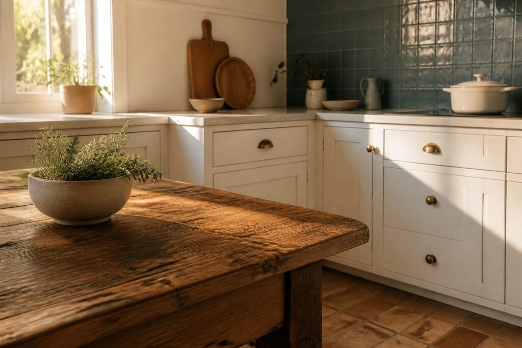
White still wins for kitchen cabinet colors in 2026 because it reflects more light than any other shade, which makes a small kitchen read as larger and pairs with anything you layer on top.
Skip it if your kitchen faces north and you refuse to swap out warm bulbs, since the wrong undertone turns flat under incandescent light.
The detail that matters is testing the swatch at the time you actually cook, not under store fluorescents. A pure white leans modern; a warmer white with a drop of cream softens traditional edges.
Renters get the most from white because swap the hardware or change the wall color in five years and the cabinets still work. They are the last piece you would need to replace.
1. Classic White
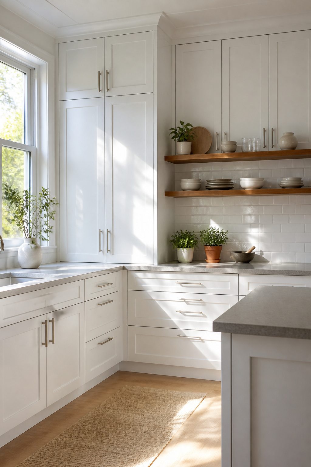
White still ranks as the most popular kitchen cabinet color, and the reason is practical before it is pretty.
It reflects more light than any other shade, which makes a small kitchen read as larger and keeps a north-facing room from feeling dim at 4 p.m. in January.
That same quality lets it sit underneath any design style you might layer on top: marble countertops, open wood shelving, or a saturated tile backsplash all read as intentional rather than busy.
The choice that matters is the undertone. A pure white, something closer to a clean sheet, leans modern and holds its own in a rental with stainless appliances.
A warmer white, with a drop of cream or ivory, softens the edges in a traditional space and keeps the room from feeling clinical under incandescent bulbs.
I have seen the wrong white turn flat under warm kitchen lighting, so test the swatch at the time of day you actually cook, not just under the store fluorescents.
For renters and first-home owners, white cabinets offer one advantage that deeper colors cannot match: flexibility. Swap the hardware, change the wall color, or replace the countertops in five years, and the cabinets do not fight the new plan.
They are the last component you would need to replace, which matters when your project budget is a few hundred dollars and a single weekend.
2. Navy Blue
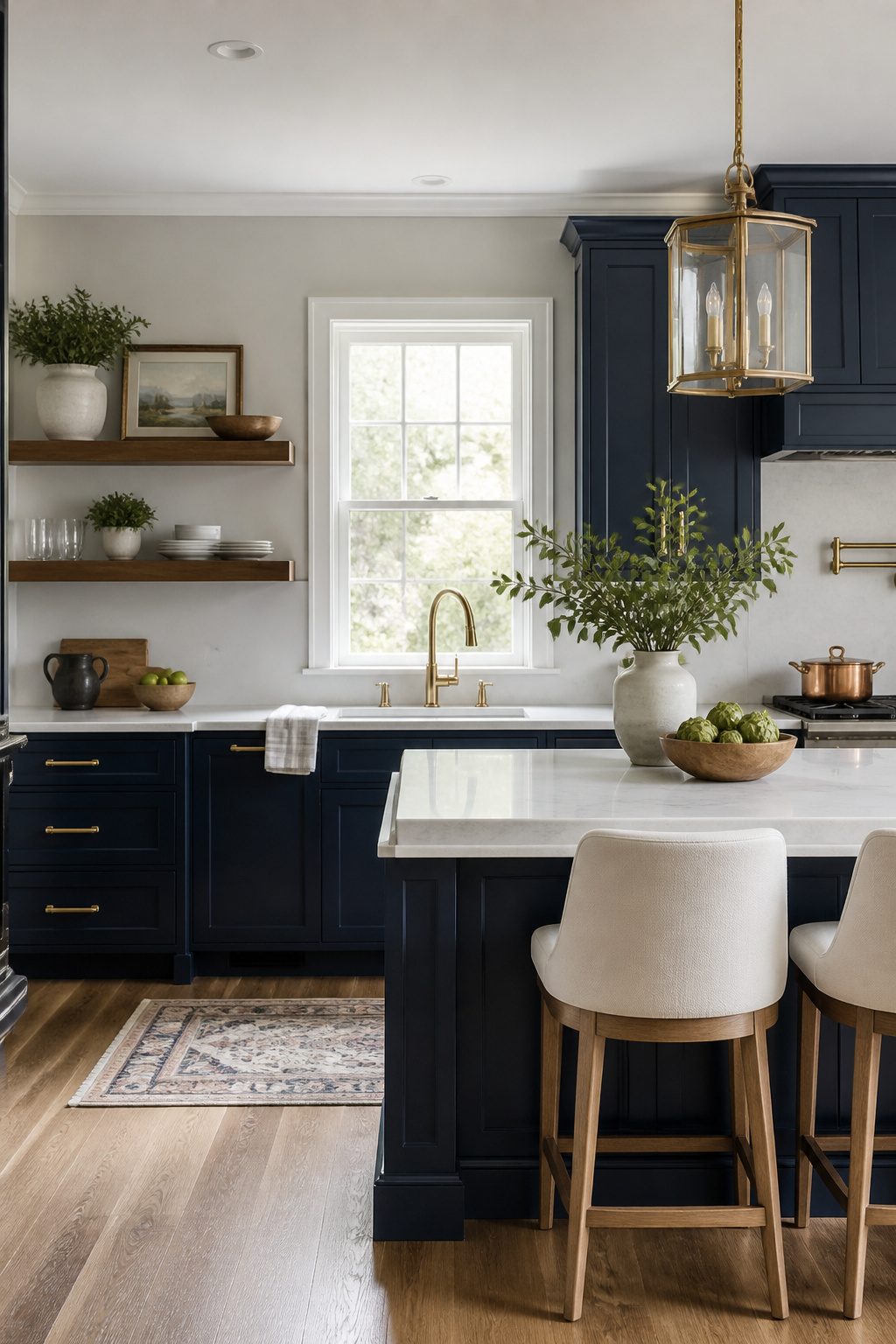
Navy blue has settled in as the color people reach for when black feels too severe. It carries the same weight and formality, but the slight warmth keeps a kitchen from reading as a cave.
Brass hardware against navy is the pairing that comes up again and again: the yellow metal catches light against the deep blue in a way chrome or nickel never quite manage.
Marble countertops complete the look, though white stone works if marble is outside the budget.
The finish matters more with navy than with lighter colors. A satin or semi-gloss sheen keeps the cabinets from looking flat, and it shows the brushwork less than matte would on a dark base.
For renters or anyone hesitant to commit, the island-only approach is the safer play: navy on the island with white or gray perimeter cabinets gives the impact without the risk of a full kitchen that feels dark by February.
Navy ranks just behind white and gray in current kitchen cabinet color popularity, which says something about its staying power.
It functions in a traditional kitchen with raised-panel doors and crown molding, or in a modern flat-slab layout with minimal hardware. The versatility is real, not just a selling point.
Light is the real question: a navy kitchen with one small window and no under-cabinet lighting will feel dim by four o’clock in December. Plan for that, or the color becomes a regret.
3. Sage Green
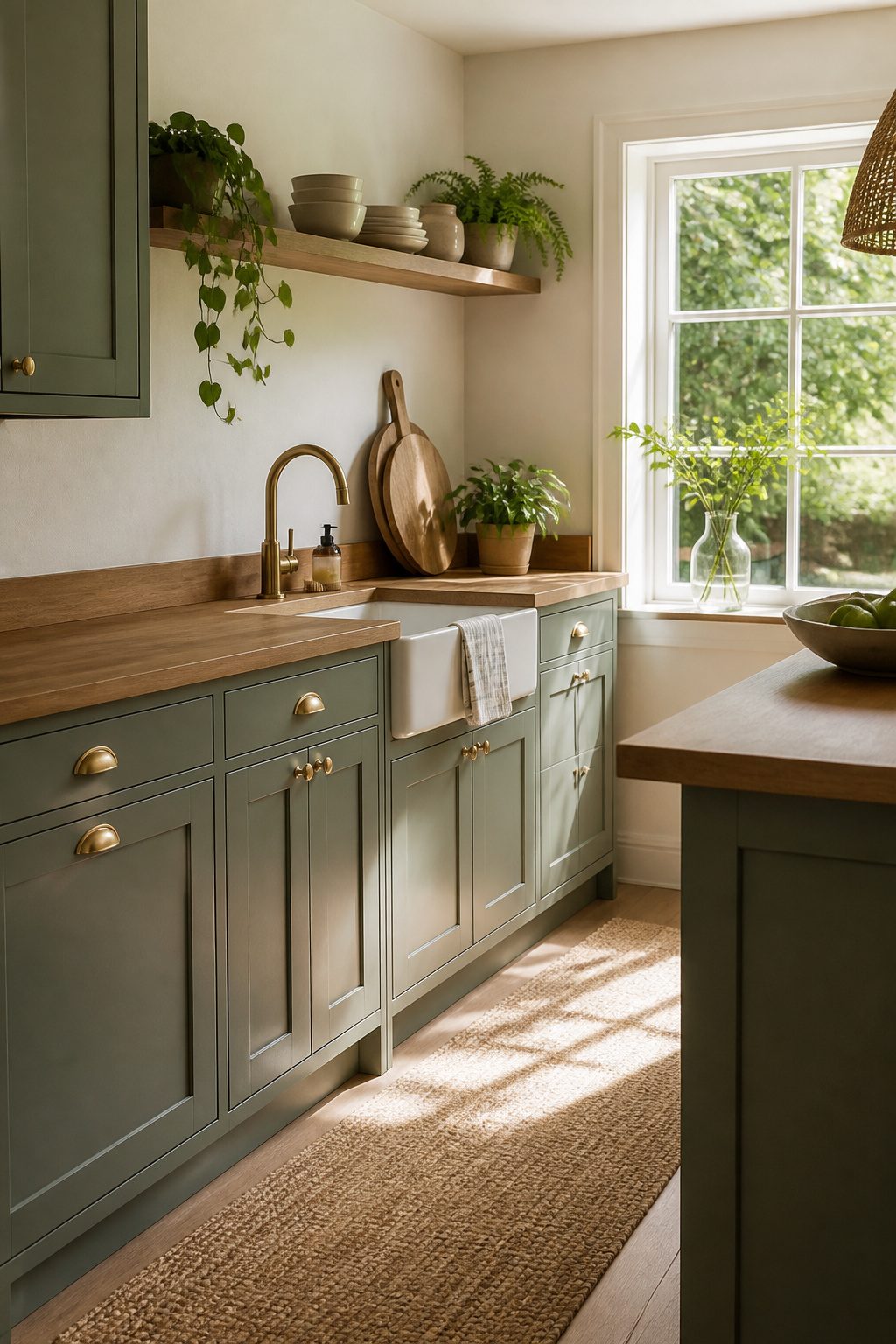
Sage green reads as a neutral that happens to live in the green family: muted enough to feel grounded, present enough to keep a kitchen from going flat.
The shift toward warmer, earthier palettes in 2025 has pushed it forward because it carries that outdoor association without the coldness forest green can bring in a north-facing room.
Brass hardware and butcher block countertops are the pairing that makes this color feel intentional rather than accidental.
The warmth in both materials picks up the yellow undertone that separates sage from a flat gray-green, and the combination lands cottage or farmhouse without requiring architectural details you may not have.
The real advantage here is longevity. Sage sits in a middle zone where it reads as colorful now but will not feel dated quickly: special enough to notice, neutral enough to live with.
That matters for renters and first-time owners who might face the same cabinets for a decade.
Two cautions: it can go muddy under warm overhead lighting, so test your actual bulb temperature, and it needs the warmth of wood or brass to balance it.
Cool stainless against sage green risks a hospital-corridor feel that undercuts the calm the color is meant to provide.
4. Charcoal Gray
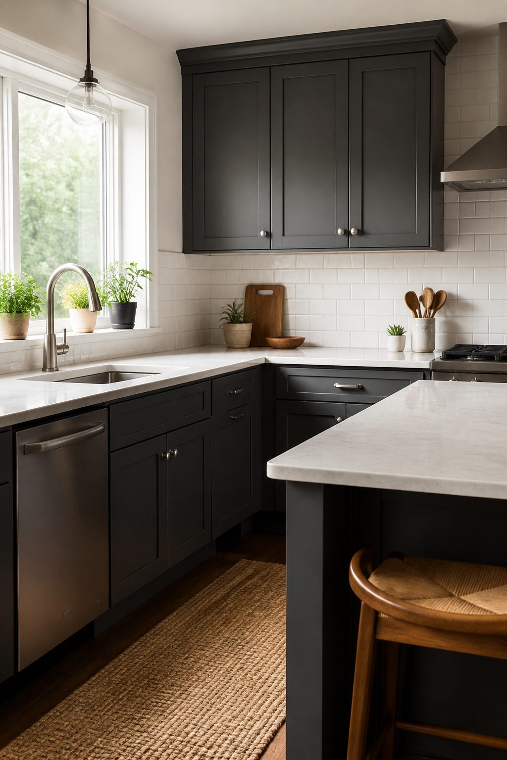
Charcoal gray carries the same depth as black but Studio Green by Farrow & Ball, in the 2023 Whole Home kitchen, proved how this hue stays softer on the eyes.
Pair charcoal cabinets with white walls and light counters so the mood works without weighing the room down.
I see charcoal as the safer move for renters and first-home owners who want drama on a weekend budget.
It photographs nearly as well as pure black for social media, yet it forgives small kitchens where black would shrink the space.
White subway tile and stainless steel sit against it naturally, so you are not locked into one hardware finish.
One trade-off to note: the warmth in charcoal can read muddy under yellow bulbs. I would test the chip in your actual kitchen light before committing a full Saturday to painting.
5. Black
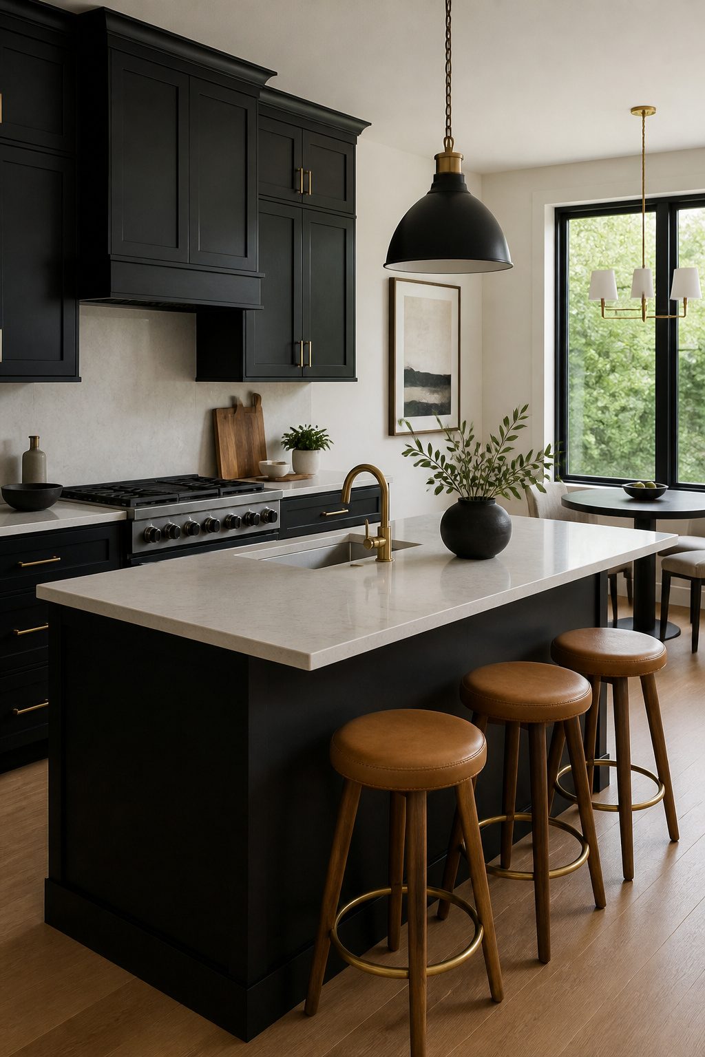
Black cabinets still read current for 2025, though the finish you choose matters more than it used to.
Matte and satin sheens have overtaken high-gloss in most kitchens I watch, partly because fingerprints and smudges show far less on a soft matte surface than on anything reflective.
If you are drawn to the drama of black but worry about maintenance, that single choice of finish does more than any cleaning schedule.
The style question is straightforward: black works best in modern and industrial kitchens, especially when you have stainless steel appliances and enough light to keep the room from feeling like a cave.
Pair it with white marble or light quartz countertops and the contrast carries the whole look.
In a smaller kitchen with little natural light, black can shrink the space, so you will want to keep walls in creams or off-whites to balance it.
Charcoal sits nearby as a softer alternative if straight black feels too heavy.
It gives you the same mood without the intensity, and it pairs more easily with a wider range of wall colors. Either way, lighting, good countertops, and a finish that does not broadcast every touch make it work.
6. Warm Neutrals
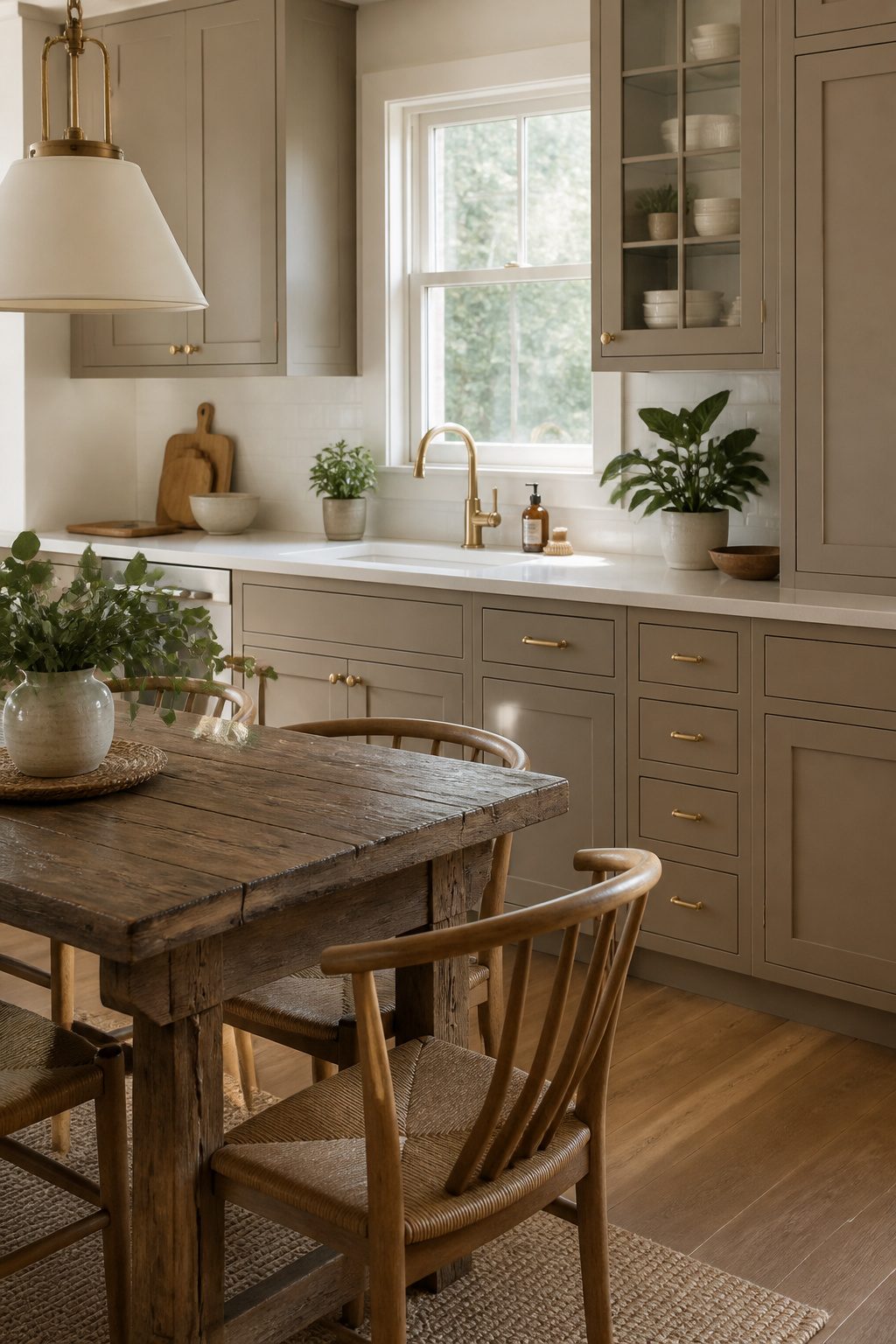
Greige and taupe give you the warmth of beige without the dated heaviness, and the cool structure of gray without the chill. They sit in that middle space where a kitchen feels lived-in from day one.
Greige pulls more gray than beige, which makes it the safer bet if your counters lean cool or your hardware is matte black or brass.
Taupe flips the ratio, carrying more beige, so it reads as a soft putty that warms up against wood floors.
Both pair with quartz, marble, and natural wood without fighting for attention, and both look intentional in a weekend paint project rather than a full cabinet replacement.
A clean white kitchen can feel like a showroom you are afraid to cook in.
These neutrals move the opposite direction: approachable, forgiving, and bright enough to keep the room open. For the renter or first homeowner working with existing boxes and a Saturday afternoon, that forgiveness matters more than a theoretical ideal.
7. Terracotta
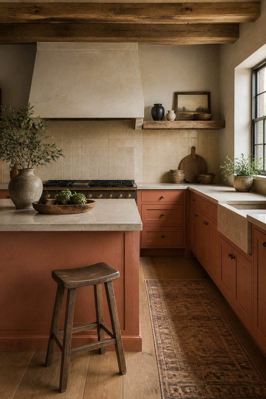
Terracotta sits at the crossroads of orange and brown just far enough from each to avoid the 1970s trap.
In 2025 the color keeps surfacing because it reads as warmth first, statement second, unlike brighter orange cabinets that announce themselves before the kitchen does.
The sources split on how far to push it: one tracks it as muted and organic alongside olive and clay, another leans into Tuscan red intensity, and a third explicitly warns against bright orange in favor of burnt or terracotta versions.
The safer play is the muted, clay-adjacent terracotta, especially if you are pairing it with natural wood accents or stone countertops.
Reclaimed wood and exposed brick handle the bolder end of the range without looking theatrical; farmhouse and rustic kitchens absorb that warmth naturally. Mediterranean styling also works, though it asks for more discipline with the surrounding materials.
What I watch for is the countertop: a busy granite fights terracotta for attention and both lose. Something quieter, a solid stone or a wood surface with minimal grain, lets the cabinets hold the room without dominating it.
8. Sunshine Yellow
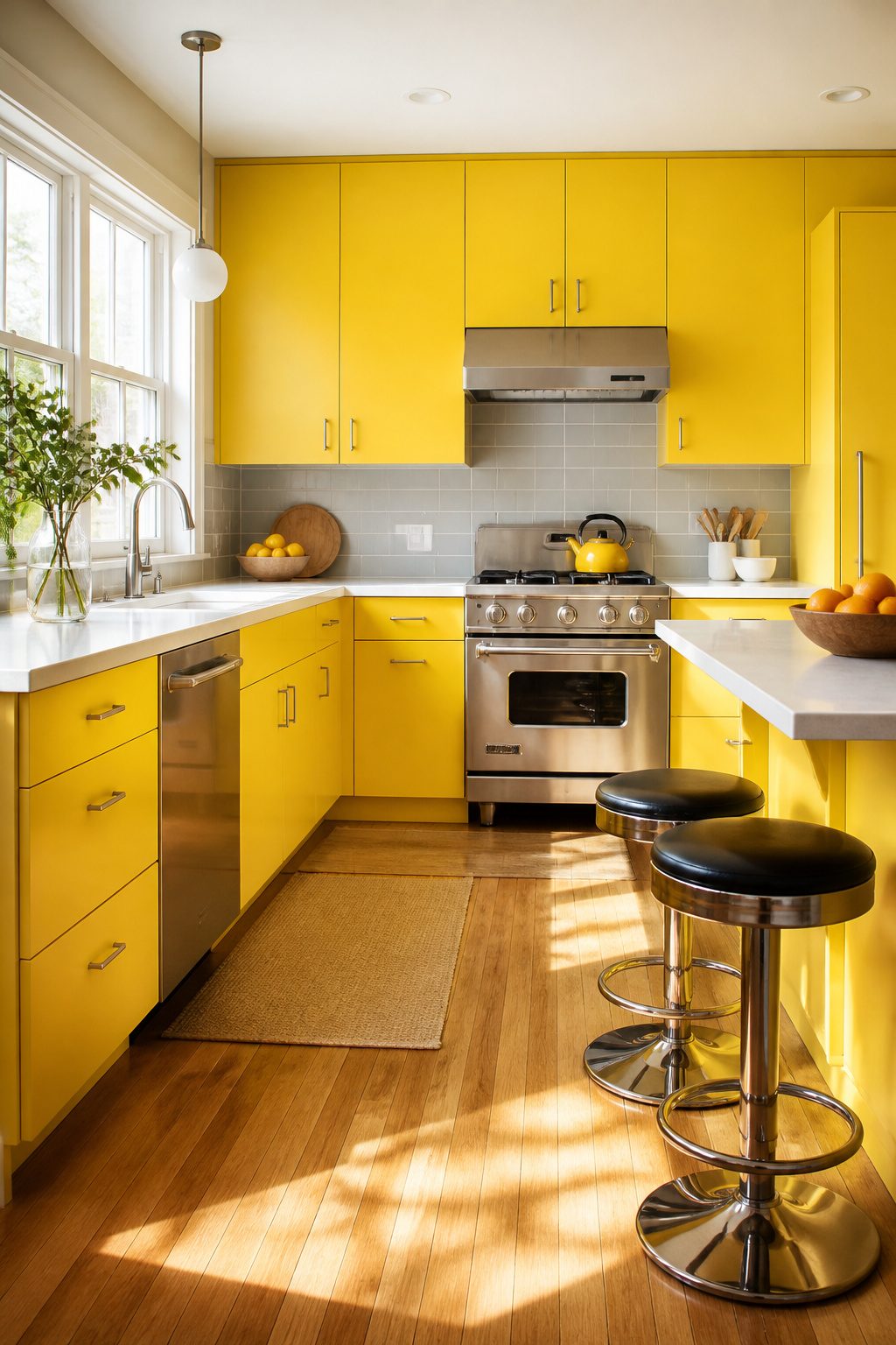
Sunshine yellow wakes a kitchen up faster than coffee.
The color hits the retina first thing in the morning and cues the brain that the day has started, which is exactly why I think of it as a commitment, not an accent.
Paint the cabinets butter yellow if you want the warmth without the shout, or lemon if you genuinely love the energy and will not flinch at it in February when the light is flat.
This one is not for small rooms with a single window. Yellow amplifies sun where there is some, but it compresses a space that already feels dim, turning cheerful into relentless after about a month.
Pair it with white counters and stainless appliances for a retro diner vibe, or with natural wood if you want the softness of a farmhouse table.
Grey backsplashes calm the contrast without killing the mood. Test a full swatch before you commit; yellow shifts more than most colors between morning and afternoon light, and a cabinet coat is not a weekend you want to spend twice.
9. Dusty Pink
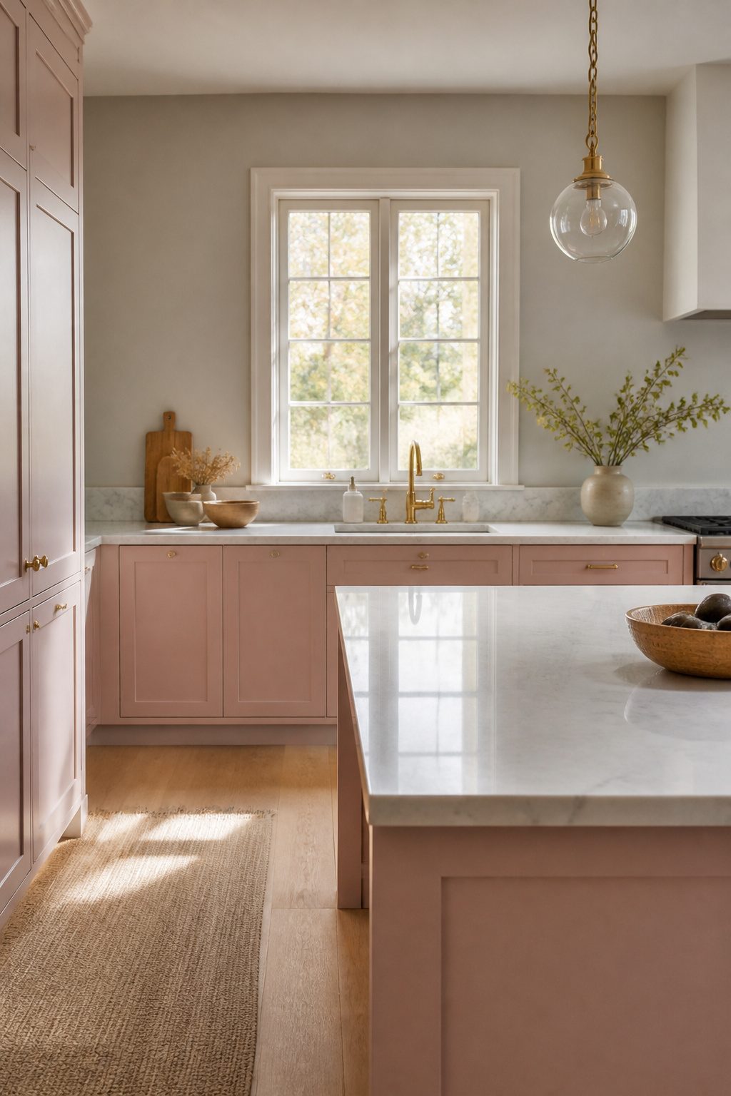
Dusty pink reads at first glance like a risk, but the shade that lands on cabinets is miles from bright or playful.
What works is the muted version, closer to a weathered plaster wall than to anything in the Barbie palette.
The version to ask for sits low in saturation, more grayed-over than candied. That shift is what lets it act as a neutral instead of a statement color.
I would keep the surrounding materials quiet. Gray walls and white countertops give dusty pink its calmest setting; marble and brass hardware push it toward something more deliberately feminine and grown-up.
Two directions, neither wrong, but the first sells itself as everyday livable while the second reads as a designed moment.
For a weekend project on a real budget, the gray-and-white pairing is the safer bet because it forgives cheaper countertops and basic pulls.
Where this choice costs you is in resale and in daylight. Eastern light flattens it to beige; southern light can bring out a rosiness you did not plan for.
I still think it earns its place in 2026 for owners who want warmth without following the sage or terracotta crowd, but I would test a full cabinet door sample and live with it across a morning and an afternoon before committing the whole kitchen.
10. Emerald Green
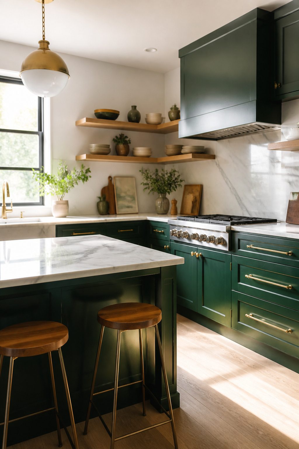
Emerald green reads as the most confident green on this list, a jewel tone that carries enough saturation to feel deliberate rather than accidental.
Where sage slips quietly into a room, emerald announces itself, and that energy is what makes it work across periods and styles.
Designer Palmer Weiss used a high-gloss emerald paint, S6030-G by Fine Paints of Europe, as what she called the "ultimate lever to pull" in a San Francisco dining room transformation, and the same logic applies to cabinets: the color bridges antique settings and modern ones without looking lost in either.
Emerald demands more careful pairing than softer greens. Brass hardware and marble countertops are the combination that keeps it sophisticated rather than theatrical, and the finish matters as much as the color.
Gloss amplifies the drama; a satin or matte finish grounds it. Without that deliberate pairing, emerald can tip toward costume, but with it, the result feels earned.
11. Cream and Off-White
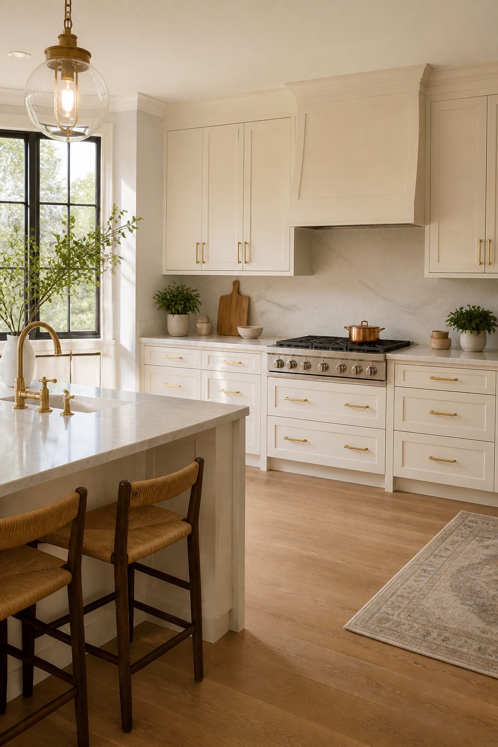
Cream and off-white kitchen cabinet colors hit a balance that pure white usually misses.
The shift from stark white to something like ivory or linen keeps the kitchen light and open, but the slight yellow undertone stops the room from feeling like a showroom.
That warmth matters in a space where you actually cook and live.
Sources call this color family a staple in transitional builds, and I see why.
It pairs cleanly with marble countertops and brass hardware without fighting for attention, and it is one of the safer choices if resale is on your mind.
The farmhouse crowd has leaned on shades like Chapel by Chateau Domingue for years, but matte black hardware or open shelving can push the same cabinet color toward something more current.
Ivory wins over white for anyone who wants brightness without the clinical edge. The cost is small: you lose a little of that crisp, gallery-wall contrast, and cream can read as dated in a kitchen with too much rustic trim.
In a space with clean lines and modern fixtures, though, the warmth reads as lived-in, not old-fashioned.
Two-Tone Combinations
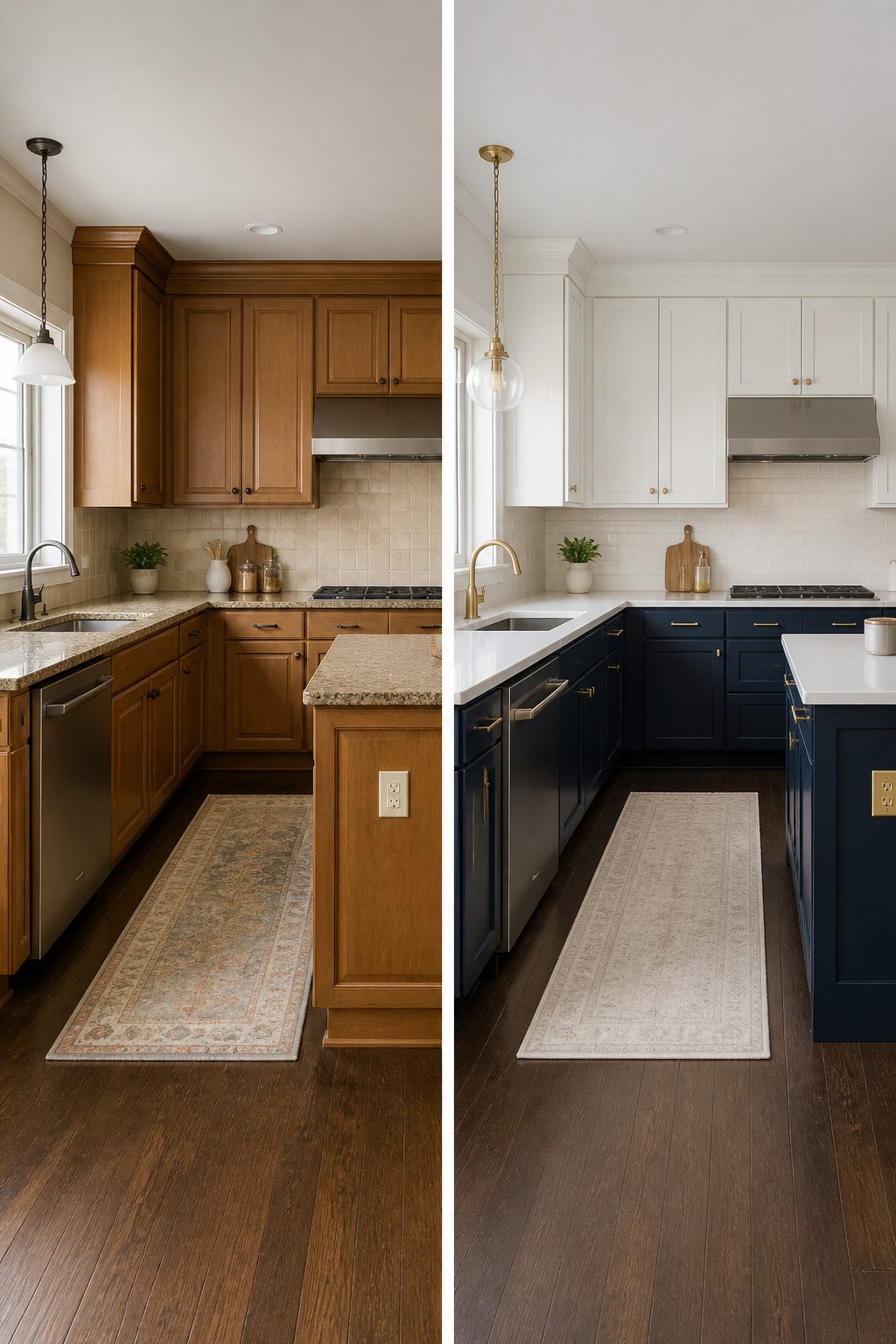
Two-tone kitchen cabinets keep winning because they let you test a bold color without painting the whole room.
The pairings that actually work right now are navy lowers with white uppers, or sage green bases with cream uppers, and light gray uppers with sage green lowers if you want something softer.
The logic on placement matters. Light colors belong up top, where they catch daylight and keep the ceiling feeling high.
Darker or bolder colors sit below, anchored to the floor, where they ground the space without closing it in. Flip that and the room turns top-heavy fast.
This approach shines in smaller kitchens specifically. You get the visual interest of a strong color, but the light uppers prevent the walls from feeling like they’re closing in.
For renters or first-home owners watching their budget, two-tone also means you can stop at the island or the lower bank if the project stalls, and it still looks intentional rather than half-finished.
Testing Colors in Your Kitchen
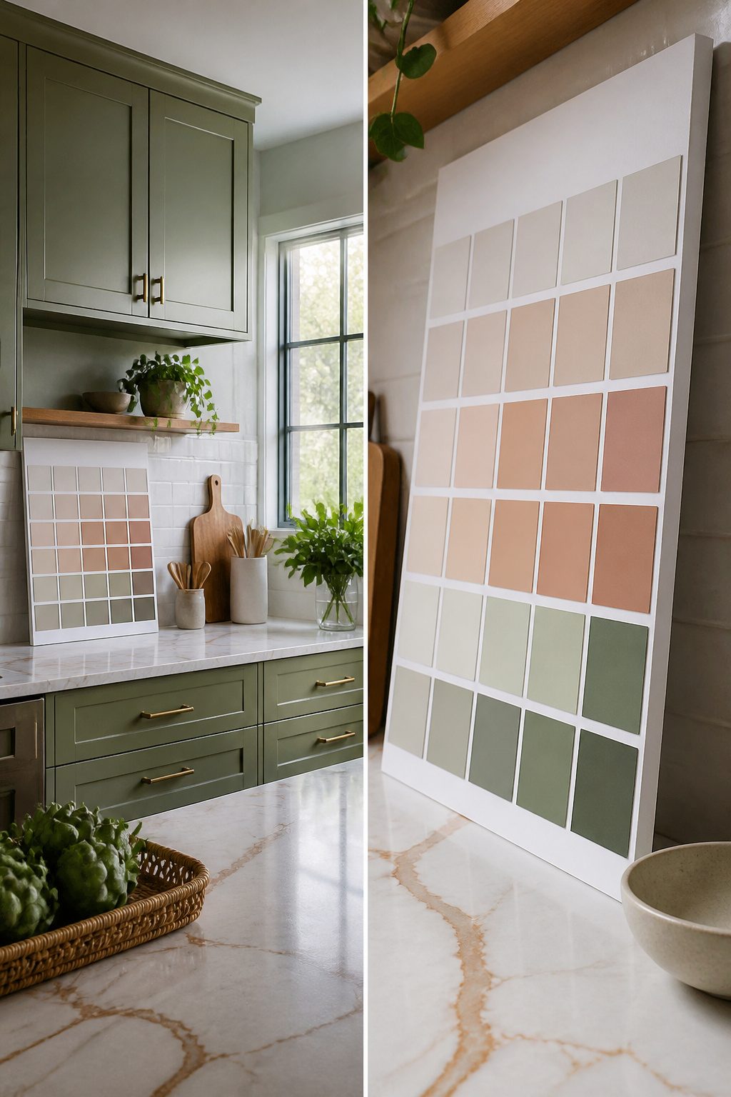
A paint chip under store fluorescents tells you almost nothing about how that cabinet color will read at 7 a.m. versus 7 p.m.
The only test that matters is a large sample board moved through your actual kitchen over a full day.
Morning northern light pulls blue; afternoon southern exposure warms everything toward yellow. Your countertops, backsplash, and flooring sit right there beside the cabinets, and they do not change.
A green-gray that looked balanced online can suddenly pick up the terracotta vein in your countertop and turn muddy. The same color beside a cool white quartz reads completely different than beside cream ceramic tile.
I always tell people to paint two-foot squares on foam core, not the wall itself, so you can shift them against each fixed surface and watch the marriage.
The store lighting is designed to sell paint, not to show you failure.
What Dark and Light Colors Hide
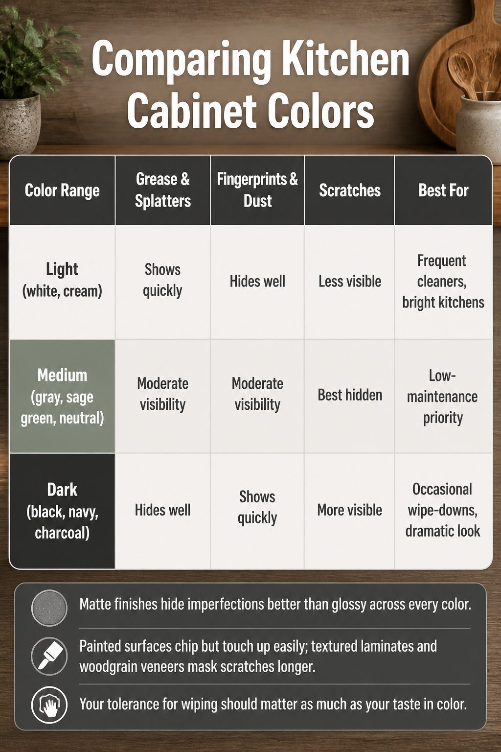
Lighter kitchen cabinet colors, especially white and cream, show grease spatters and cooking residue almost immediately. You’ll wipe them down weekly at minimum if you cook regularly.
Darker colors like black and navy hide that same grime but reveal every fingerprint and water spot the moment they dry. Dust sits visibly on matte charcoal and deep blue surfaces under direct light.
Medium tones, gray, sage green, and similar neutrals, split the difference: they camouflage daily wear better than either extreme.
Scratches don’t read as sharply against them, and neither light smudges nor dark marks jump out the way they do on pure white or true black.
| Color Range | Grease & Splatters | Fingerprints & Dust | Scratches | Best For |
|---|---|---|---|---|
| Light (white, cream) | Shows quickly | Hides well | Less visible | Frequent cleaners, bright kitchens |
| Medium (gray, sage green, neutral) | Moderate visibility | Moderate visibility | Best hidden | Low-maintenance priority |
| Dark (black, navy, charcoal) | Hides well | Shows quickly | More visible | Occasional wipe-downs, dramatic look |
Matte finishes hide imperfections better than glossy across every color.
Painted surfaces chip but touch up easily; textured laminates and woodgrain veneers mask scratches longer. Your tolerance for wiping should matter as much as your taste in color.
Frequently Asked Questions
What color cabinets make a kitchen look bigger?
Light colors like white and soft cream create the illusion of more space because they reflect more light than any other shade.
White in particular makes a small kitchen read as larger and keeps a north-facing room from feeling dim in winter afternoons.
The effect works best when you stick to warm or pure whites rather than colors with heavy gray undertones, which can recede visually.
Are dark kitchen cabinets still in style in 2025?
Yes, dark colors remain current, with navy, charcoal, and black all ranking among the popular kitchen cabinet colors for 2025 and 2026.
Navy sits just behind white and gray in popularity, while charcoal offers a softer alternative to pure black for renters and first-home owners who want drama without the intensity.
The finish matters more with dark cabinets: satin or semi-gloss keeps navy from looking flat, and matte or satin black hides fingerprints far better than high-gloss.
What is the most popular color for kitchen cabinets?
White still ranks as the most popular kitchen cabinet color, with gray coming in second and navy close behind.
The staying power comes from practicality: white reflects the most light, works underneath any design style you add later, and offers flexibility for future updates on a tight budget.
Even as homeowners lean toward warmer tones and richer hues, white remains the default for rentals and first homes because it never fights new countertops, hardware, or wall colors.
What color kitchen cabinets are trending in 2026?
The trending kitchen cabinet colors for 2026 include warm neutrals like greige and taupe, earthy tones like sage green and terracotta, and confident jewel tones like emerald green alongside the enduring favorites of white, navy, and charcoal.
Two-tone combinations, especially navy lowers with white uppers or sage bases with cream uppers, keep gaining traction because they let you test bold color without painting the whole room.
The broader shift is away from all-white kitchens toward colors that add personality and depth while keeping the space inviting.
What paint sheen is best for cabinets?
Satin or semi-gloss sheens work best for most kitchen cabinet colors, with the exact choice depending on the shade and how much wear you expect.
Dark colors like navy show brushwork more than light ones, so satin or semi-gloss prevents a flat, uneven look; matte and satin finishes for black cabinets have overtaken high-gloss because fingerprints and smudges show far less on softer surfaces.
Matte finishes hide imperfections better than glossy across every color range, but they also make dust more visible on dark bases under direct light.
What are some good paint ideas for my kitchen?
Good kitchen cabinet paint ideas start with testing large sample boards in your actual kitchen light over a full day, since morning northern light pulls blue and afternoon southern exposure warms everything toward yellow.
For a weekend project with existing cabinets, white and warm neutrals like greige or taupe offer the most forgiveness and flexibility; if you want more impact, navy on an island only or a two-tone scheme like sage lowers with cream uppers gives you visual interest with less risk.
Always paint two-foot squares on foam core rather than the wall itself, so you can move them against your fixed countertops, backsplash, and flooring to see how the color marries with surfaces that will not change.




