
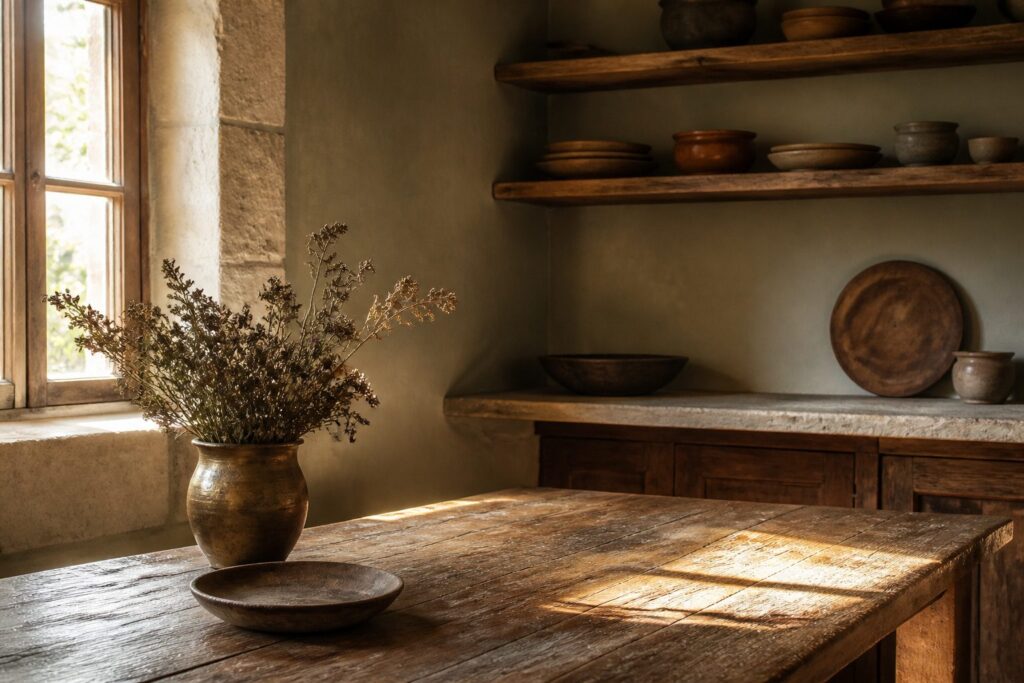
Warmth in an earthy kitchen lives in what you let stay imperfect. Stone that chips, brass that tarnishes, wood that dents: the choice is whether you seal it or let it age.
Honed limestone shifts from cool gray to buttery gold across a morning of direct light, but only if you skip the sheer curtains. That single decision, window dressing, separates a surface that performs from one that sits dead like laminate.
1. Stone & Sunlit Warmth
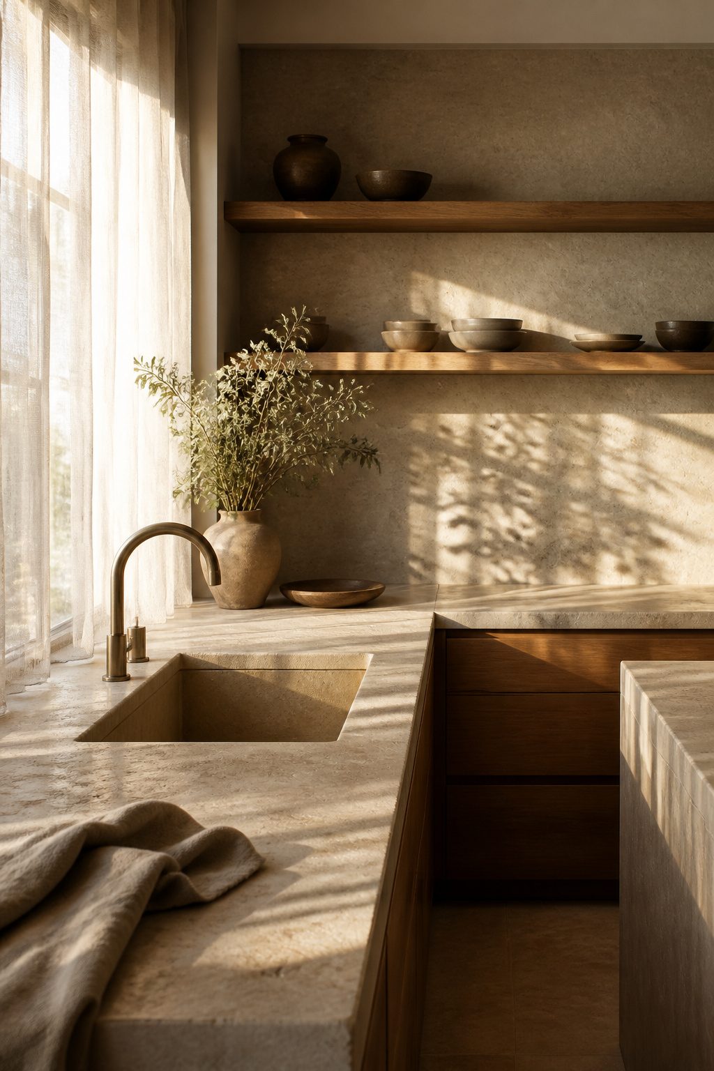
Limestone and sandstone carry a warmth that shifts through the day, and that movement is the whole reason to build a kitchen around them.
Morning light on a honed limestone backsplash starts cool and gray, then turns buttery as the sun climbs.
By afternoon the same surface holds a glow that no paint can imitate, because the warmth lives inside the stone, not on top of it.
Sandstone works harder in direct sun.
Its granular surface breaks light into tiny shadows, so the wall never reads flat even when the light is steady. I think sandstone belongs on a counter that catches east-facing windows, where breakfast light has time to work across it.
Limestone handles softer exposures better; a north window that never blasts direct sun still gives limestone enough to warm its tone from dawn to mid-morning.
Window treatments kill this effect.
Sheer panels diffuse the beam and flatten the color shift into something uniform and dead. If privacy matters, a bottom-up shade set to 18 inches of clear glass above keeps the stone alive while blocking sightlines from the street.
The stone needs unobstructed light for at least three morning hours to show what it can do. Anything heavier, and you have paid for a surface that performs like laminate.
Recommended Products

Premium Grade Moleanos Beige Limestone Chair Rail Tile. Moleanos Beige is a kind of beige limestone quarried in Portugal. The Moleanos beige limestone is a type of natural stone known for its endurance and versatility. Due to its hardness, uniform and light background, the 5/8x12 Moleanos Limestone Chair Rail Molding Tile can be used for kitchen backsplash, bathroom flooring, shower surround, dining room, hall,

Premium Grade Moleanos Beige Limestone Square Mosaic Tile. Moleanos Beige is a kind of beige limestone quarried in Portugal. The Moleanos beige limestone is a type of natural stone known for its endurance and versatility. Due to its hardness, uniform and light background, the 2x2 Moleanos Limestone Square Grid Mosaic Tile can be used for kitchen backsplash, bathroom flooring, shower surround, dining room, entryway, corridor, spa,

Premium Grade Shell Shape Moleanos Beige Limestone Mosaic Tile. Moleanos Beige is a kind of beige limestone quarried in Portugal. The Moleanos beige limestone is a type of natural stone known for its endurance and versatility. Due to its hardness, uniform and light background, the Moleanos Beige Limestone Scallop Shape Fish Scale Mosaic Tile can be used for kitchen backsplash, bathroom flooring, shower surround, dining room, entryway, corridor, kitchen backsplash, spa,
2. Textured Neutrals & Collected Calm
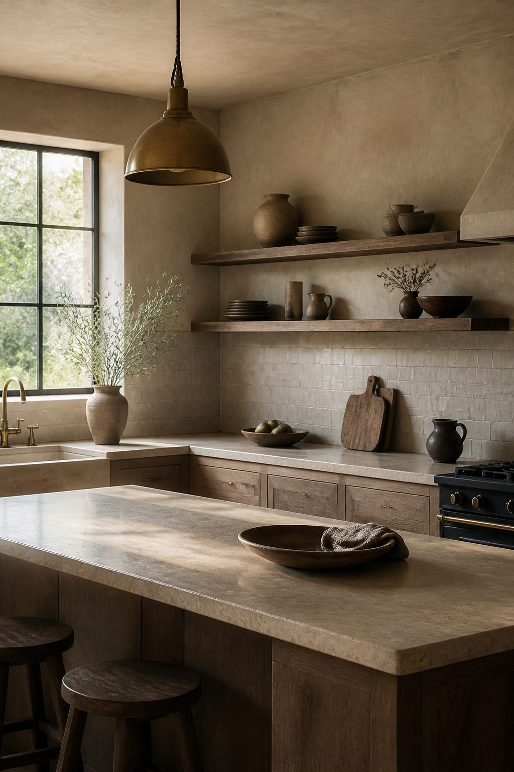
Layered beige, cream, and warm gray finishes work best when they carry enough texture to read as intentional rather than unfinished.
I start with warm limewash or hand-applied tinted lime plaster in aged white, sandy beige, or warm gray on the walls, building two to three thin coats with a wide natural bristle brush in cross-hatch strokes so the surface keeps its organic mottling.
Against that, linen-toned cabinet doors in warm gray-beige rather than cool gray undertones sit quietly without matching exactly.
For the backsplash, unglazed ceramic tile or a handmade Zellige surface adds the slight irregularity that keeps the palette from going flat.
Honed travertine or rough-hewn limestone countertops bring in weight and natural imperfection; polished stone would fight the whole mood.
Open shelves in natural or live-edge timber, styled with hand-thrown ceramics that show their throwing marks and a few dried botanicals, finish the collected look.
Raw linen accessories, a rattan or handmade ceramic pendant, and warm diffused natural light pull it together. The risk is stopping at one texture and letting the room feel like a blank slate rather than a layered one.
Mix plaster, unglazed tile, raw linen, and timber deliberately, and the kitchen reads as gathered over years, not assembled in a weekend.
Recommended Products

[Details]--Beige countertop contact paper, sandstone pattern, matte finish, made of thick vinyl material, strong covering, durable, tear-resistant. Removable, no sticky residue left behind, renter friendly. 15.7 inches wide by 118 inches long, covers 13 sq.ft per roll
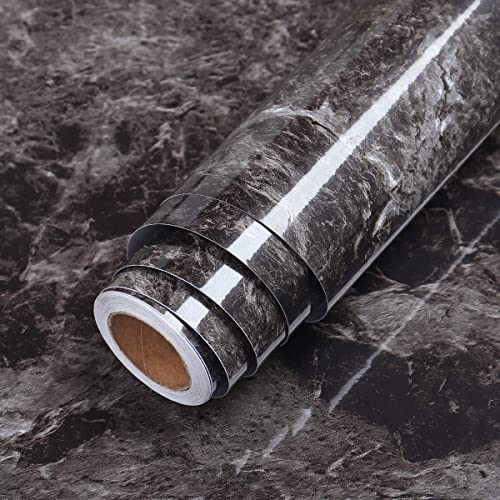
➤ FEATURES: Easy to Apply. Just peel and stick to the object. The marble contact paper is removable, waterproof and clean easily. Protect your furniture from HEAT and MOISTURE.

SLEEK STONE SINK CADDY: Introducing the Dorai Home quick-drying stone sink tray, your perfect sink-side companion for hand soaps, dish brushes, and lotions. Crafted from diatomaceous earth, its raised base promotes rapid drying while preventing gunk buildup.
3. Moody Greens & Natural Movement
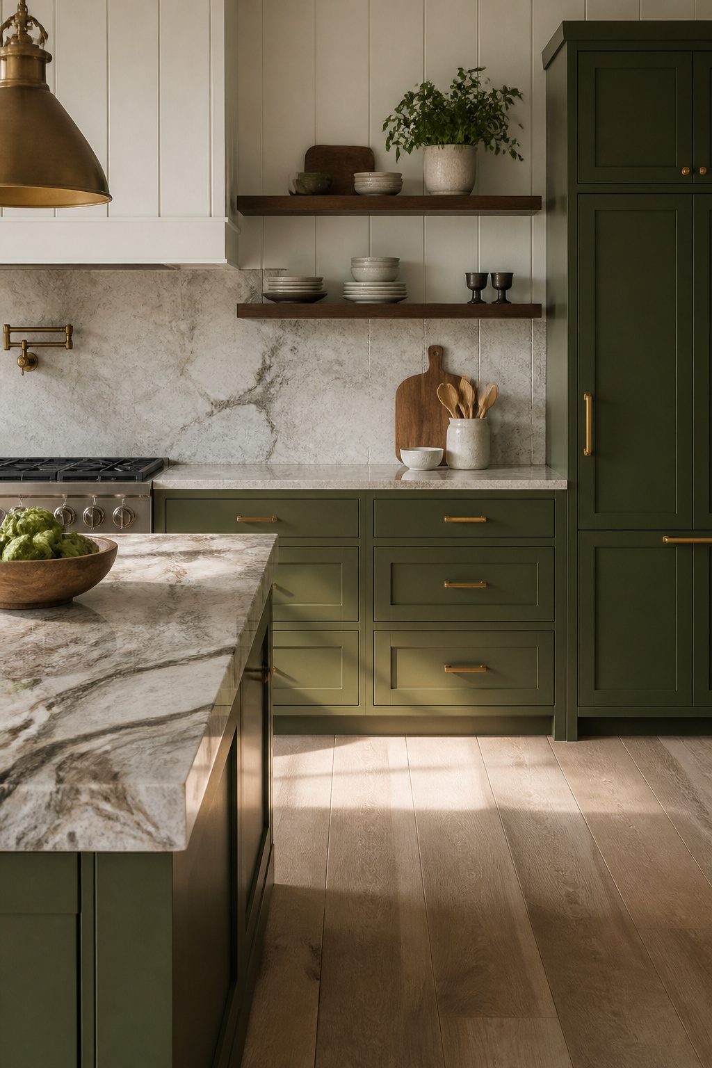
Deep olive cabinets read as flat and heavy until you pair them with something that moves.
Veined marble with active swirling patterns breaks up the darkness the same way a live-edge wood countertop does, its irregular grain and natural contour catching light at different angles through the day.
The eye travels across those organic lines instead of stopping on a solid block of color.
Matte black can work the same way, but forest green carries more warmth to begin with.
Brass hardware against that depth adds a collected-over-time layer that feels intentional rather than staged. Let the natural material take priority over the paint.
When the stone or wood leads, the cabinets become the frame, and the whole kitchen feels grounded rather than dark. White panel walls or a lighter backsplash keep the balance so the richness doesn’t overwhelm the room.
Recommended Products

Premium Quality Ceramic – High-quality ceramic construction with a durable matte glaze and subtle shimmering effect, delivering long-lasting beauty and refined texture for interior wall applications.

Premium Quality Ceramic – High-quality ceramic construction with a durable matte glaze and subtle shimmering effect, delivering long-lasting beauty and refined texture for interior wall applications.

Premium Quality Ceramic – High-quality ceramic construction with a durable matte glaze and subtle shimmering effect, delivering long-lasting beauty and refined texture for interior wall applications.
4. Modern Rustic Serenity
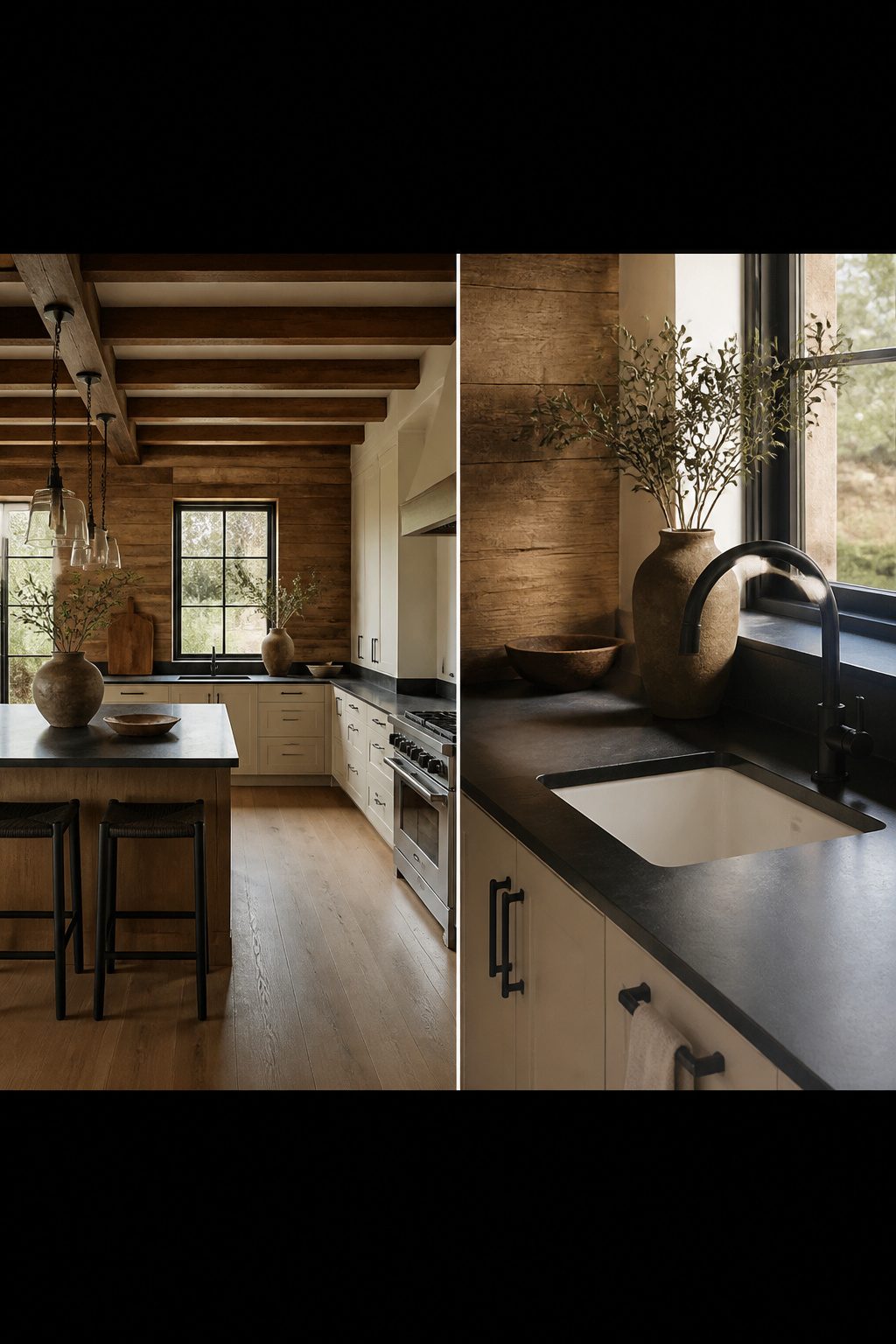
Clean-lined cabinets with matte black or brushed brass hardware read as edited and intentional, but pair them with reclaimed wood beams overhead and the kitchen stops feeling like a showroom.
I like one rough element, not three. A single accent wall of reclaimed wood does the same work as exposed beams for renters who cannot touch the ceiling structure, and it keeps the eye from reading the room as costume.
The hardware finish decides the temperature. Matte black keeps the palette cooler and more graphic; brushed brass warms it toward that terracotta-adjacent feeling without adding another material.
Both work, though I tend toward brass when the reclaimed wood has a redder, barn-plank tone, and toward black when the grain is weathered grey.
Soapstone or honed absolute black granite on the counters bridges the two worlds. The matte surface picks up the flat finish of the hardware and the irregular grain of the wood without competing with either.
Skip the farmhouse sink here; the silhouette is too rural for the restraint this balance needs. A warm white ceramic undermount keeps the lines clean.
Recommended Products

Premium Heavyweight Linen Blend: Thick, non‑sheer fabric features a soft matte finish and elegant draping. It delivers a substantial, pleasant tactile feel for everyday dining‑space styling.

[Large Size]: Each piece measures 78 inches(200cm) x 2 yards(72 inches/182.88cm), 160GSM, meeting your different needs for DIY projects. Note: The fabric is only cut into 2 Yards by 78-Inch(200cm). When you buy more than one, you will get corresponding pieces which is 2 Yards by 78-Inch, not a continuous piece.

100% French Linen with Stone Washed—Woven from certified high grade French flax and stone washed for nice color, glossiness as well as soft hand feeling.
5. Timeless English Charm
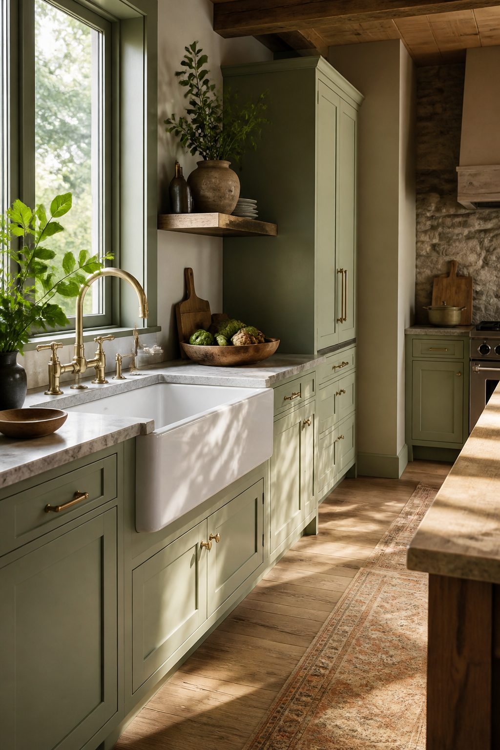
A butler sink earns its place in an earthy kitchen because the deep basin and broad apron front are meant to chip, stain, and dull over decades. That worn-in quality is the goal, not a flaw to prevent.
I pair mine with Shaker cabinets painted in soft sage or putty, both colors sitting low enough in saturation that they let wood and stone read as the richer materials they are.
Brass faucets will tarnish to a living finish, and they look better once they have. Choose a faucet that arrives unlacquered so the aging happens naturally rather than in streaks.
For modern appliances, I skip the restaurant-grade range and opt for a standard-depth refrigerator panel-ready in cabinet-matched paint; the compressor hums behind putty Shaker doors and the line across the kitchen stays quiet.
A paneled dishwasher disappears the same way. The only metal I leave visible is the sink’s brass faucet, now darkening where hands grip it every morning.
6. Vintage Sage & Cozy Glow
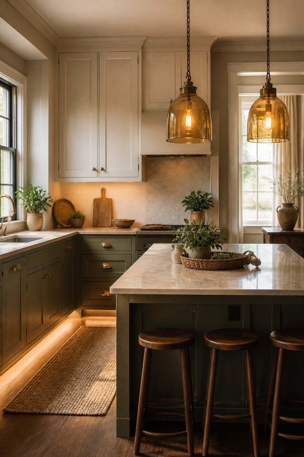
Muted sage or gray-green cabinets need the right light to feel lived-in rather than like a clinic break room.
The color already carries a quiet olive or moss undertone, but 2700K to 3000K is the temperature range that keeps it warm; anything cooler and the gray in the paint flattens into something institutional.
I would put that warmth under the cabinets first. A dim strip washing across the counter brings out the yellow and brown undertones in the green, and it gives you actual working light that still feels like evening.
Overhead, amber glass pendants or aged copper fixtures do the same job from above.
The metal matters here: aged brass or copper with a slightly worn surface adds warmth without throwing in another competing color, and it reads softer than polished chrome would against the cabinets.
The full effect layers. Lower cabinets in that muted green, uppers possibly in a warm cream if you want breathing room, brass hardware that is allowed to look handled rather than showroom-new.
Light at 2700K turns the green moody; 3000K keeps it bright enough for a Monday morning. I would run the strip on a dimmer and land somewhere between the two depending on the season.
Recommended Products

𝐏𝐫𝐞𝐦𝐢𝐮𝐦 𝐌𝐚𝐭𝐞𝐫𝐢𝐚𝐥𝐬:Made of PVC composite laminate, anti-scratch, high impact, color fadeless, more durable and stronger than other plastic self-adhesive tiles. Glossy/Poished surface finishing with realistic ceramic look, high waterproof and stain-resistant performance, protect the walls from splash and iol.

Materials:Made of PVC mix metal, anti-scratch, high impact, color fadeless, durable and strong stickness.Realistic marble texture and Elongated design, which can be installed in Vertical or Horizontal styles, and match with most of the countertop

✿ 1.4 Times Coverage Area: 10 sheets thickened self-adhesive tiles, 12" X 12" each (The small piece is 3.3" X 1.8"), which covers 40% more area than 10"x10" tile
7. Fresh Marble & Organic Woods
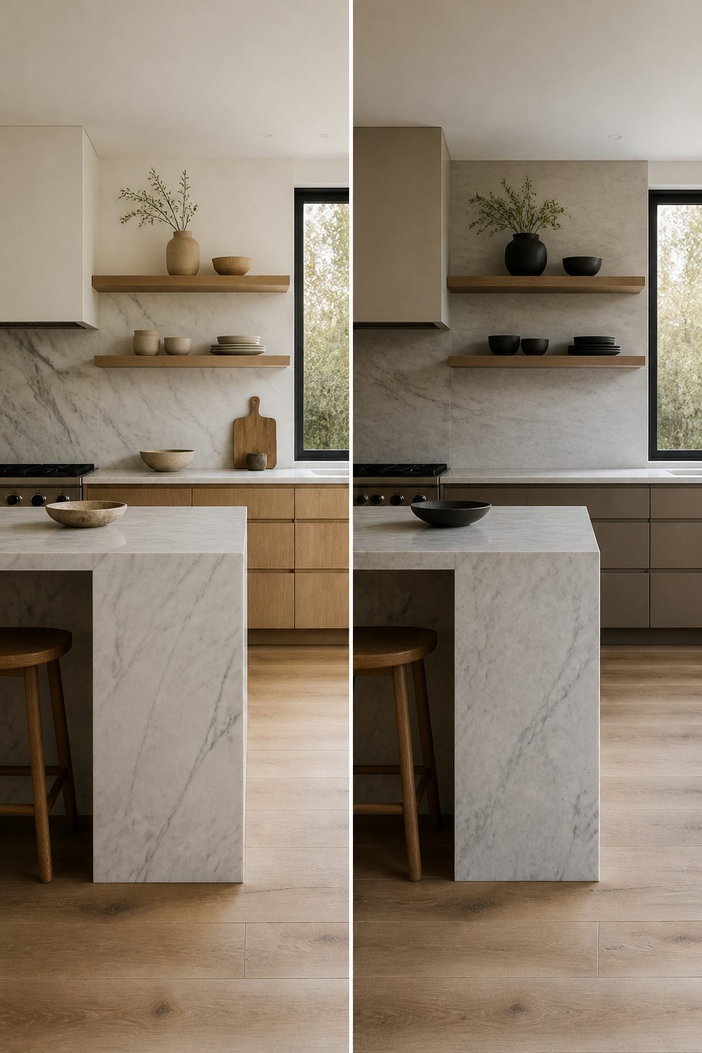
White or light gray marble with heavy, wandering veining needs white oak or ash nearby to keep it from reading as cold.
I would not pair it with painted cabinets. The wood grain is what absorbs the stone’s formality and hands it back as warmth, but the balance is tight.
If the veining runs too bold and the oak is too yellow, the kitchen splits into two rooms that refuse to speak to each other.
Open shelving in the same wood as the cabinets helps bridge the gap. The eye travels from stone backsplash to shelf to cabinet face without hitting a hard stop, and the rhythm of grain against movement settles both materials.
I prefer ash here over white oak when the marble carries cool gray veins; ash reads slightly quieter and lets the stone own the drama without a competition.
Oak wins if the veining is warm-toned, because the honey in the wood picks up the amber threads in the stone and knits them together.
A honed finish on the marble matters more than the exact slab choice. Polish reflects everything, including the wood, and the two materials start performing for each other in a way that feels staged.
Honed stone swallows light, stays flat, and lets the grain stay the star in lower light kitchens. That is the finish that keeps the pairing grounded rather than gallery-like.
Skip the glass-front uppers if you go this route; they frame dishware as display and add another texture the room does not need. Plain wood shelves, plain wood lowers, busy stone above: the restraint is what reads as intentional.
Recommended Products

ELEGANT MARBLE LOOK: Features a thick lines texture resin stone finish that mimics the luxurious appearance of real marble.

Complete Bathroom Set: 5-piece bathroom accessory set includes a 320ML (10.82 oz) soap dispenser, toothbrush holder, bar soap tray, bathroom tumbler, and candlestick for organizing bathroom essentials. Keep your bathroom organized and neat with these stylish organizers

Size & Pattern: 15.7 inches wide by 78.7 inches long, each roll covers 8.6 square feet. Marble contact paper, realistic beige sandstone marble, rustic and elegant style. Made of high quality vinyl, thick, textured finish, durable and tear-resistant, clear print, non-fading for long time
8. Arched Stone & Soft Modern
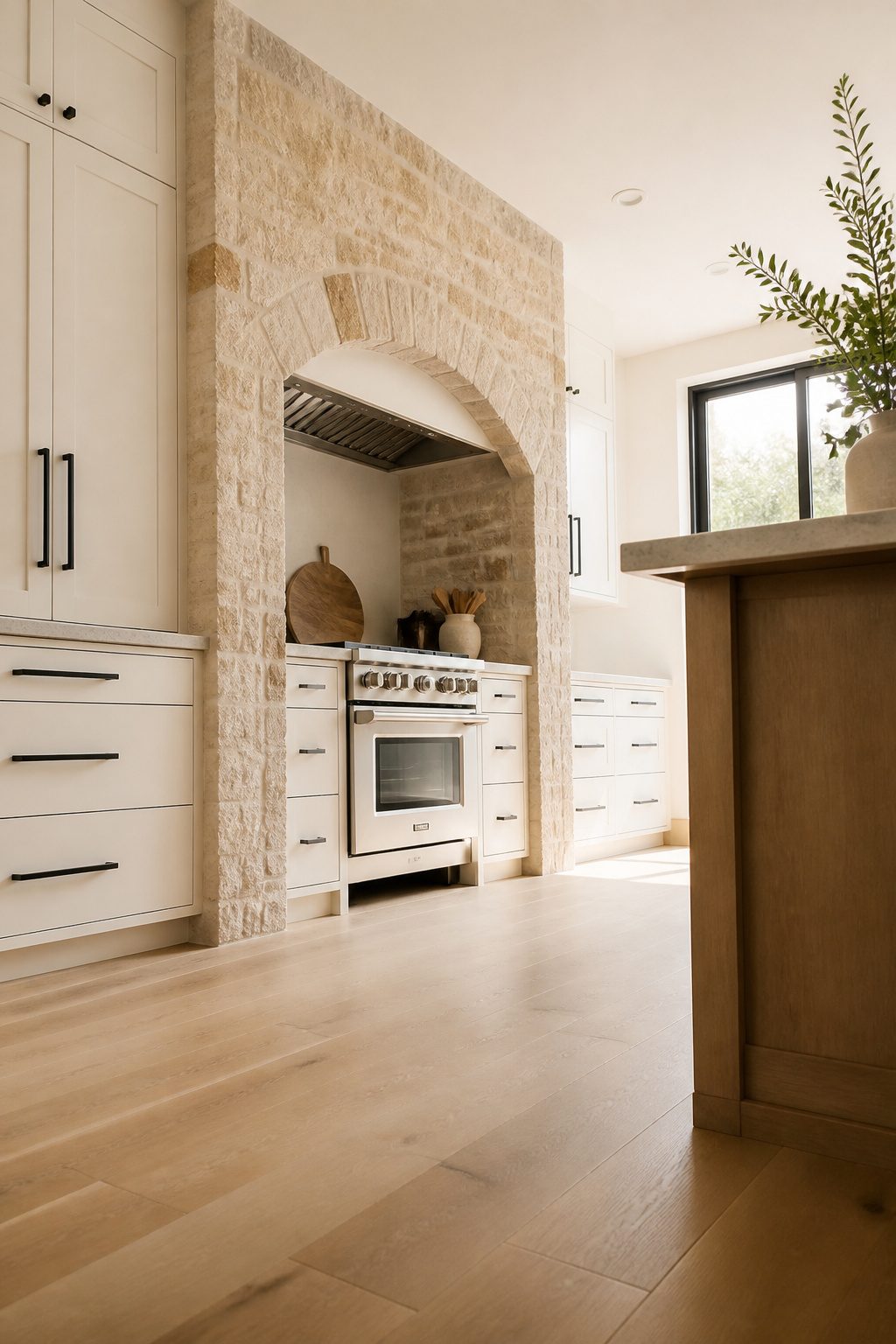
A single arched stone doorway or range hood surround anchors an earthy kitchen without turning the whole room into a period piece. The arch carries weight; it reads as something found and kept rather than installed last Tuesday.
Against flat-panel cabinets in a warm white or pale oak, that stone stops minimalism from sliding into a rental kitchen sterility that no one actually wants to cook in.
I would keep the hardware dead simple: a matte black bar pull or a small unlacquered brass knob, nothing that competes for attention.
The stone is doing the work. If the arch is the range hood surround, a 6–8 inch reveal of stone around the throat of the hood gives enough presence without swallowing the cabinet line above it.
More than that and the kitchen starts feeling like a cellar recreation; less and the stone reads as an afterthought tile border.
You have to accept some imperfection. Natural stone in an arch shape means variation in color and small fissures you do not get with a manufactured surround.
I would not seal it to a high gloss; a penetrating sealer in matte finish keeps the chalky, hand-formed quality that makes the thing feel borrowed from an older building.
Flat panels below demand that honesty. High gloss stone against matte MDF cabinets looks like two kitchens colliding, and not in a useful way.
Recommended Products

Premium Quality Ceramic – High-quality ceramic construction with a durable matte glaze and subtle shimmering effect, delivering long-lasting beauty and refined texture for interior wall applications.

Premium Quality Ceramic – High-quality ceramic construction with a durable matte glaze and subtle shimmering effect, delivering long-lasting beauty and refined texture for interior wall applications.
Premium Quality Ceramic – High-quality ceramic construction with a durable matte glaze and subtle shimmering effect, delivering long-lasting beauty and refined texture for interior wall applications.
9. Warm Woods & Curved Comfort
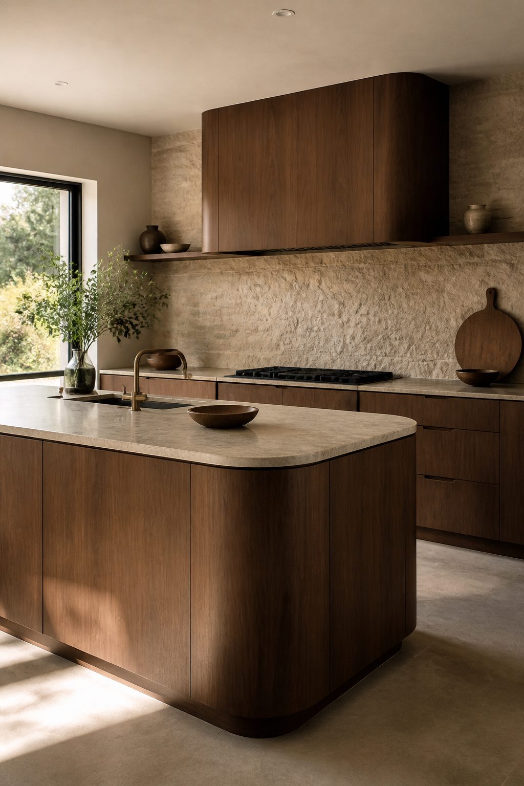
Rounded island corners pull the eye along a gentler path than any sharp edge could, and in a kitchen that already asks a lot of you, that single change softens the whole day.
Walnut or cherry tones carry the curve even further, especially when the grain itself runs continuous across the face.
I have seen flat-front walnut cabinetry kept dead simple, no hardware fighting the line, and the wood does every bit of the work.
A curved range hood in the same tone turns an exhaust necessity into something that reads as carved, not boxed.
The range of options matters because not every kitchen can swallow a full island. Smaller footprints still gain the effect through circular light fixtures above the work surface, or through a bowed counter edge on a peninsula.
Cherry warms faster than walnut under the same yellow paint undertones that infected the lamp I refinished last spring; the difference is real once you live with it.
Either wood, left matte and unfilled, keeps the texture honest and stops the room from feeling assembled from a catalog.
Stone backsplash behind warm wood adds the raw counterbalance the design needs. Without something unpolished, curved comfort drifts toward furniture-showroom soft; a rough backsplash pulls it back to kitchen.
Recommended Products

Realistic Linen Texture & Thick Non-See-Through Fabric: Crafted from high-gramm polyester, this tablecloth boasts an authentic linen texture for a classic, elegant look, with a luxuriously thick construction that ensures full opacity—no table surface imperfections show through, delivering a polished table setting every time.

COTTON FLOUR SACK TOWELS: Keep 13 unbleached tan towels ready for drying dishes, glassware and hands. The ring-spun cotton fabric gives you one practical set for everyday kitchen cleanup and a supply of matching craft blanks.
Realistic Linen Texture & Thick Non-See-Through Fabric: Crafted from high-gramm polyester, this tablecloth boasts an authentic linen texture for a classic, elegant look, with a luxuriously thick construction that ensures full opacity—no table surface imperfections show through, delivering a polished table setting every time.
10. Forest Greens & Fresh Minimalism
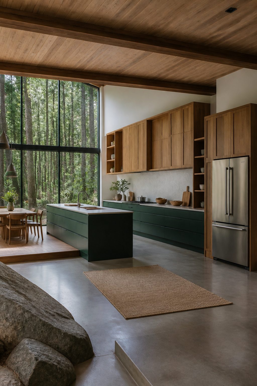
Saturated green lower cabinets paired with white or natural oak uppers create the forest-floor palette that makes this kitchen feel rooted rather than decorated.
The risk is the upper cabinets crowding the view, so I prefer removing them entirely from one wall and installing a single large window or a full glass door there instead.
That wall becomes the room’s lung, pulling in daylight and sightlines to trees or sky.
The storage loss is real, but it is smaller than most people assume.
A 36-inch drawer base under the counter holds more than the same footprint in wall cabinets, because you are not stacking around a blind corner or reaching over a counter to grab the back row.
I would run the uppers only on the cooking wall and nowhere else, then add a floor-to-ceiling pantry cabinet beside the refrigerator. The 24 inches of width you give up there pays back in shelf depth you can actually see into.
A single drawer divider set and a few clear bins keep the lower cabinets from becoming a black hole, since deep drawers without organization turn into the same lost space as a high shelf you cannot reach.
The oak uppers should stay open inside, no interior paint, so the grain reads as one continuous material rather than green boxes floating on wood frames.
Recommended Products

[100% FSC-Certified Elm Wood] – Each 24inch floating shelf is masterfully crafted from certified reclaimed elm wood, ensuring responsible forestry practices while showcasing nature's authentic beauty. The distinct grain patterns, organic knots, and natural live edges are not imperfections—they are the proud hallmarks of genuine, premium timber that add vintage rustic character and warmth to your home.

[100% FSC-Certified Elm Wood] – Each 32inch floating shelf is masterfully crafted from certified reclaimed elm wood, ensuring responsible forestry practices while showcasing nature's authentic beauty. The distinct grain patterns, organic knots, and natural live edges are not imperfections—they are the proud hallmarks of genuine, premium timber that add vintage rustic character and warmth to your home.

Reclaimed Elm Wood Shelves: Marsmiles' wood floating shelves for wall are handcrafted from reclaimed elm wood (FSC-Certified), showcasing the natural beauty of wood knots, grain, and texture for a touch of character in your room decor
11. Fresh Greens & Airy Warmth
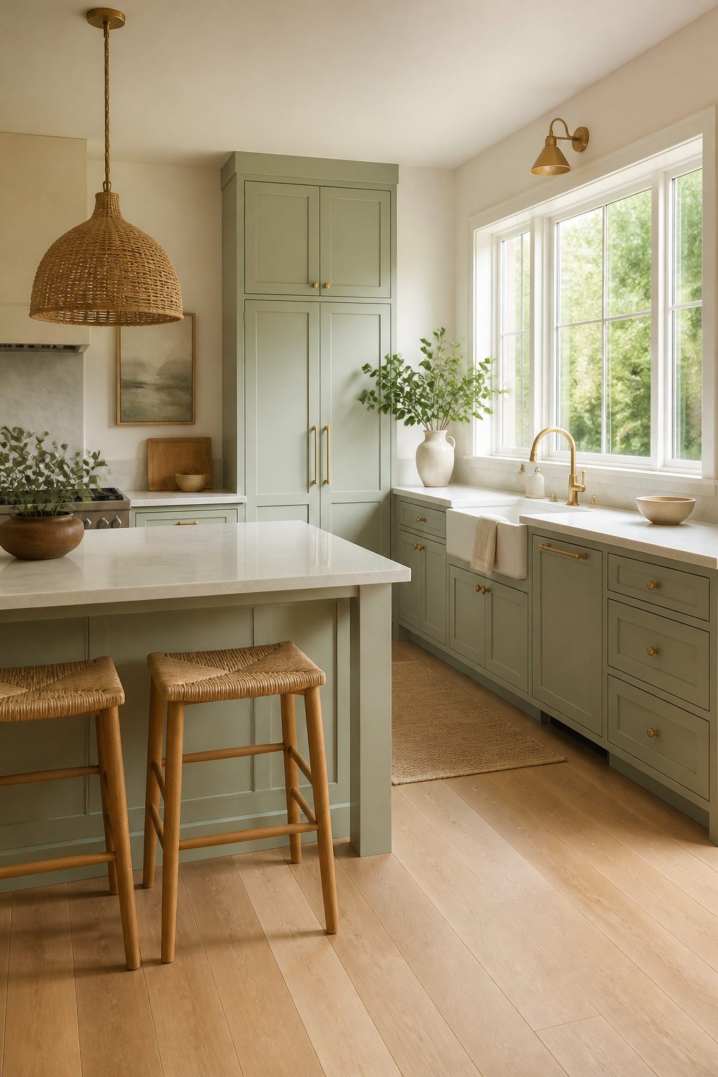
Pale mint, celadon, and soft sage read as color on cabinets without the weight that forest or olive bring.
That lightness matters in a smaller kitchen or one facing north, where deeper greens absorb the limited light and the room starts to feel like evening at noon.
Muted greens with brown, gray, or yellow undertones layer naturally beside stone counters and warm wood trims rather than competing with them.
I would keep the floor pale and the hardware quiet, brass or aged copper at most, so the green stays the single statement.
Woven stools or a pendant add texture, but the effect depends on restraint; too many natural layers and the calm slips into clutter. For a weekend project on a few hundred dollars, paint is the lever.
Cabinets in a quiet sage against existing light floors and cream walls shift the whole room without new counters or appliances. Softer greens show scuffs faster than mid-tones, so a satin or semi-gloss finish earns back its cost in durability.
12. Muted Clay Tones & Collected Calm
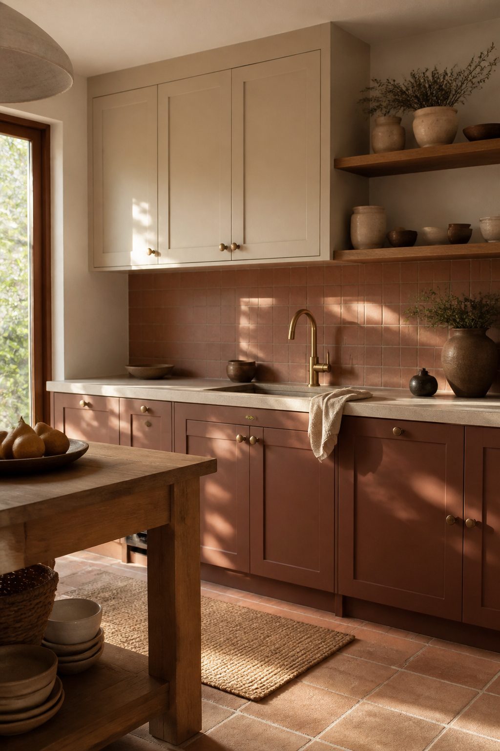
Terracotta reads loud in a small kitchen, so I start with buff or sand on the upper cabinets and keep the deeper clay tone below eye level.
The variation in depth matters more than the hue itself; two tones that sit too close on the same wall flatten into what I call "monochromatic mud," that dull wash where nothing recedes and nothing advances.
A three-tone clay scheme needs at least one surface to break warm from cool, which is why I like a honed sandstone or buff limestone counter between the cabinet layers.
The stone’s subtle veining does the separating work so you don’t have to add another color.
The backsplash is where you earn the collected look. Handmade terracotta or Zellige clay tile with organic glaze variation catches light differently across each piece, giving the wall a weathered quality that reads as texture, not pattern.
Pair it with unlacquered brass hardware and the metal will shift from bright to mellow as it ages, adding another layer that changes over time rather than staying static.
Woven elements keep the palette from feeling too mineral. Rattan mesh on a few upper cabinet fronts, not all of them, adds air where solid clay would feel heavy.
Open shelves in natural wood with stoneware and dried botanicals finish the room without a theme-park Southwestern statement. A kitchen that looks sun-soaked and grounded, like the materials were gathered gradually rather than installed in one weekend.
13. Moody Blues & Marble Drama
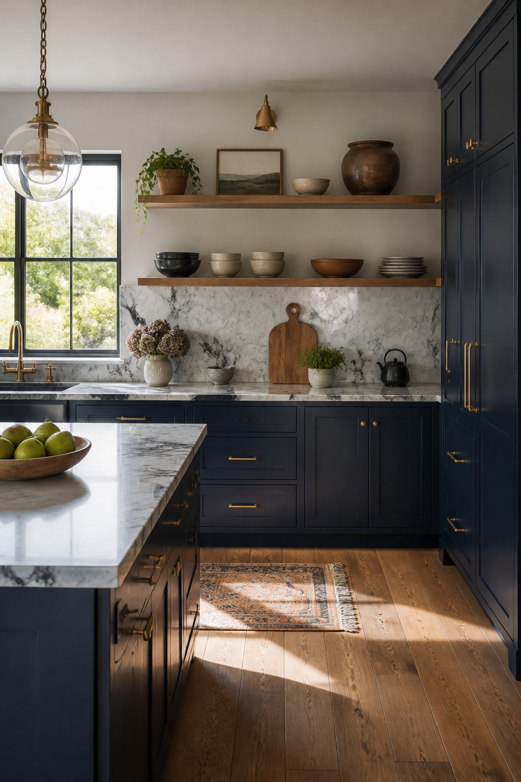
Deep slate or navy cabinets give an earthy kitchen designs option that reads as moody rather than foresty, which is the direction most earthy palettes take.
The risk is literal coldness, and heavy-veined marble in gray and gold can tip the space toward a showroom feel if every surface stays hard.
Brass hardware keeps the light warm in a way chrome or black simply does not, catching afternoon sun the same way a low fire catches in a hearth.
Wood open shelving breaks up the run of painted cabinets and gives the eye somewhere soft to land.
Thick shelves with a simple wood edge, slightly off in tone from any island or floor, hold everyday dishes and a few pottery pieces without looking staged.
Tightly packed shelves read as clutter fast, so spacing matters: leave breathing room between groupings, and keep closed storage nearby for the utilitarian chaos every real kitchen generates.
A wood floor still does the heaviest lifting here.
Stone underfoot with navy cabinets and veined marble turns the room into a gallery of cool surfaces. Wood grounds the combination, turns it livable, turns it into a kitchen where you actually want to stand barefoot on a Saturday morning.
14. Rustic Reflections
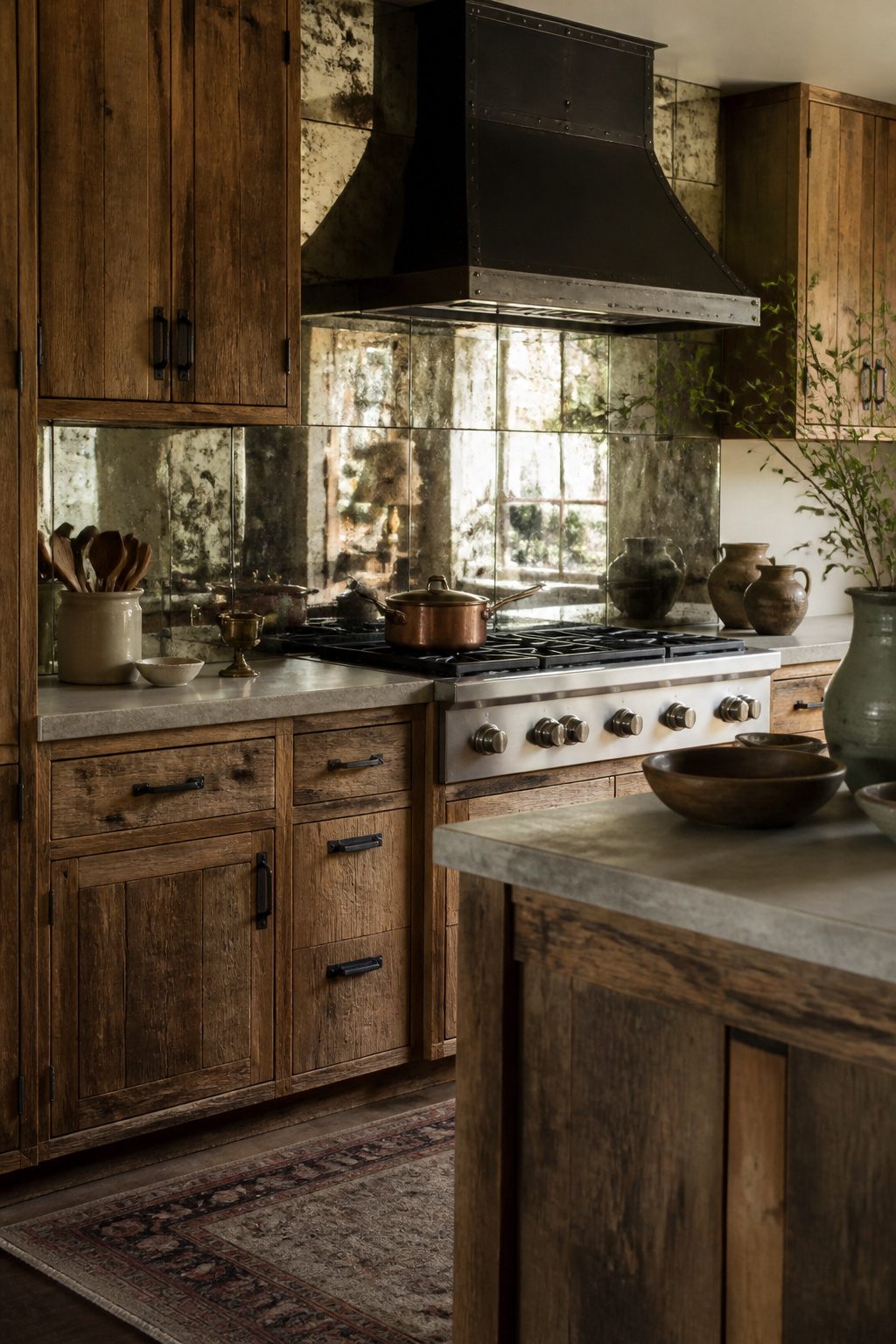
Antiqued mirror set behind a cooktop or between open shelves does something ordinary tile cannot.
The mottled silvering catches window light and throws it back into the room in soft, broken pieces, so the space reads larger without the cold reflectivity of a modern sheet mirror.
I would pair it with rough-sawn pine or oak cabinets left visibly hand-planed, and with hardware in hand-forged iron rather than cast.
The iron has irregular weight and a blackened finish that keeps the mirror from reading as formal. The combination lives in the territory between polished and raw that defines an earthy kitchen.
The risk is installation. Antiqued glass is often thinner than standard backsplash tile, and the silvering can streak if water sits at a seam.
I would set it with silicone behind and a thin bead of white caulk at the counter joint, not grout, so the panel can be lifted if moisture gets behind it.
Cabinet inserts are lower stakes; a single mirrored panel on a pantry door gives the same spatial effect without the splash-zone worry.
Either way, rough wood and wavy glass beat glossy anthracite and quartz for a kitchen that feels gathered rather than built.
15. Terrazzo Texture & Soft Greens
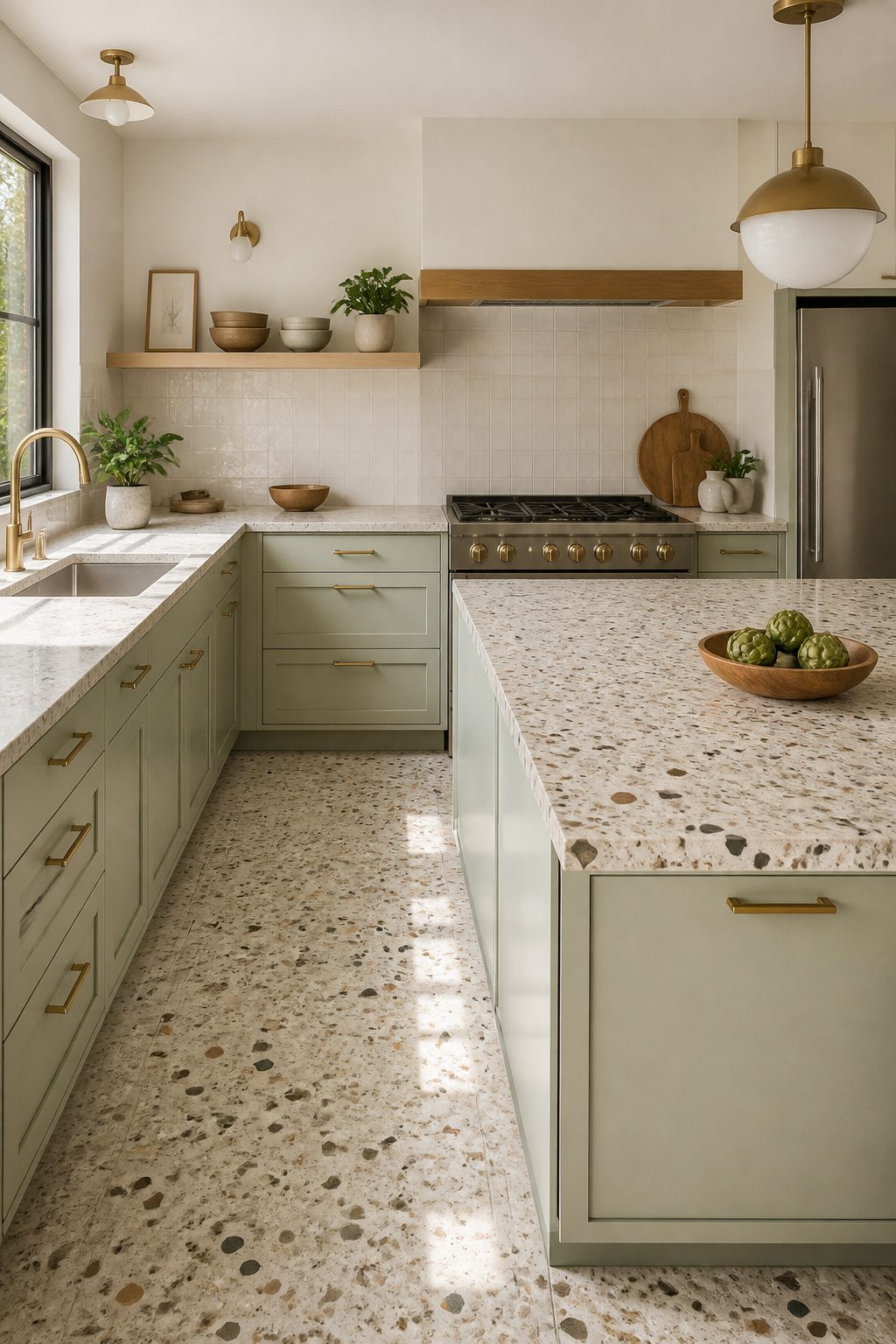
Large-format terrazzo reads as earthy without falling into rustic cliché, but the chip size decides whether you live with it comfortably or feel like you walked into a hotel lobby.
Residential kitchens want chips between 3/8 inch and 3/4 inch; anything larger belongs in commercial spaces where the floor area absorbs the visual noise.
I have seen homeowners install 1-inch chips in a 10-foot galley and immediately regret the restless, broken-up feeling every time they reach for a coffee mug.
Mint or sage cabinets settle that restlessness.
These greens sit low on the saturation scale, so they read as color without competing against the terrazzo’s movement. Brass pulls work here because their warmth bridges the cool stone and the soft cabinet paint, but keep them simple.
Tubular shapes, nothing scrolled or ornate. Ornate brass against busy terrazzo starts to look like two patterns arguing.
The countertop version of this pairing costs more than flooring but lets you test the combination with less commitment.
A terrazzo counter on an island, sage on the perimeter cabinets, and you have the idea without the full-floor gamble. If you tire of it in five years, the island surface is easier to swap than kitchen flooring.
Frequently Asked Questions
What are the key elements of an earthy kitchen?
Warm tones, natural materials, and a connection to the outdoors are the foundation.
How can I incorporate greenery into my kitchen design?
Removing upper cabinets entirely from one wall and installing a large window or full glass door creates the room’s lung, pulling in daylight and sightlines to trees or sky.
A 36-inch drawer base under the counter holds more than the same footprint in wall cabinets, so the storage loss is smaller than most assume.
What colors work best in an earthy kitchen?
Browns, greens, and terracotta form the base palette, with specific temperatures and undertones mattering more than the hue itself. Muted greens need 2700K to 3000K light to stay warm; anything cooler flattens them institutional.
Clay tones need at least one surface breaking warm from cool to avoid monochromatic mud. Deep olive and navy work when paired with veined marble or brass hardware that catches light like a low fire.
What kitchen trends will be outdated in 2026?
Grounded, organic vibes with terracotta tiles, warm wood cabinetry, stone countertops, and muted green accents are the direction for 2026.
What color kitchen won’t date?
Warm limewash or hand-applied tinted lime plaster in aged white, sandy beige, or warm gray keeps organic mottling that reads as intentional.
Soft sage or putty on Shaker cabinets sits low enough in saturation to let wood and stone read as the richer materials.
Pale mint, celadon, and soft sage read as color without the weight that absorbs limited light and darkens over time.




