

Bathroom style splits between neutral backdrops that let fixtures stand out and bold statements that make the color or pattern the first thing you notice—which direction works depends on whether you want the room to feel calm or memorable.
A greige tile surround holds both brass and chrome without favoring either, but a mint-and-lilac tiled powder room with black fixtures commits harder and only reads contemporary when the geometry stays intentional.
Zellige tile, fluted panels, and stone-look slabs all turn a single wall into the feature the rest of the space defers to.
1. Warm, Natural, or Neutral Palettes
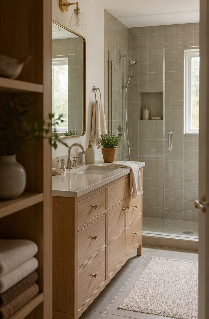
Greige—somewhere between gray and beige—gives you a base that holds both silver and gold fixtures without favoring either.
Daltile’s Perpetuo in Timeless White runs cool enough for modern tile work on shower walls but still reads neutral beside warm wood or brass, and adding a recessed niche breaks up the field without bringing in another material.
Sherwin-Williams picked Universal Khaki as its 2026 Color of the Year, a mid-tone tan that lands warmer than greige and works when you want the room to feel grounded rather than bright.
Creamy ivory and soft beige reflect light like white does but skip the sterile edge, and they pair cleanly with oak vanities or stone-look tile.
Warm white holds more yellow than cool white, so it softens the look of chrome and makes small bathrooms feel less clinical.
Terracotta and clay sit darker on the warm end and show up best as accents—a towel hook, a plant pot—rather than covering a full wall.
2. Bold Color and Contrast
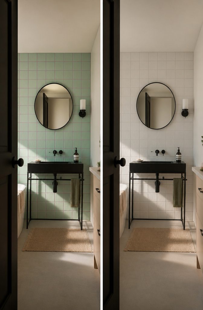
A dark wall or bold cabinet can anchor a bathroom without taking over the whole room.
Swiss Coffee by Benjamin Moore works as a warm cabinet color that holds its own against white tile or marble without going moody, and if you want something sharper, mint green 15×15 tile walls with lilac grout and a black console sink read contemporary rather than Easter basket when the fixtures stay simple and matte black.
Black-and-white schemes land harder in a small space than anywhere else: the contrast makes every edge count, so a thin-legged sink and round mirror with narrow black frames keep the geometry intentional instead of cluttered.
An accent wall lets you commit to one surface and leave the rest quiet.
Tile the wall behind the tub or vanity, paint the far shower wall, or run fluted panels where they catch light, then repeat one finish elsewhere so the focal point feels connected rather than dropped in.
The surrounding walls should stay plain enough that the accent reads as a choice.
3. Patterned, Mosaic, or Statement Tile
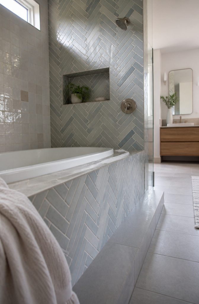
Zellige tile catches light differently across every handmade piece, so a wall of it shifts as you move through the room.
The uneven glaze and slightly irregular edges give shower surrounds and backsplashes a softness that machine-cut tile never quite reaches.
Herringbone and vertical stack patterns work best on floors and tub surrounds, where the repeating geometry pulls the eye along the layout rather than breaking it into small squares.
A geometric mosaic—hexagons, scallops, or a Moroccan grid—turns a niche or a single shower wall into the feature the rest of the room defers to.
I’ve seen penny tile used floor to ceiling in a powder room, and it held attention the way a painted mural would.
The pattern does the work, so the grout line becomes part of the design rather than something to minimize.
4. A Focal Wall or Decorative Surface
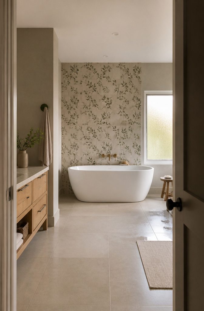
The wall behind a freestanding tub or vanity makes the strongest focal point because it already draws the eye.
I’d pick patterned tile or a stone-look slab for that spot, especially if it sits opposite the door where you see it on entry.
Fluted moisture-resistant panels work too if you want texture without grout lines, and bathroom-rated wallpaper holds up fine when it stays outside the direct splash zone—so the wall perpendicular to a shower rather than inside it.
Water-resistant material is required anywhere spray hits regularly.
Inside the shower itself, tile or solid surface panels handle moisture without curling or peeling. A mural or bold wallpaper belongs on the dry wall across from the shower, not on the wall that gets soaked.
Keep the other three walls quiet. Paint them a solid color or cover them with simple tile that repeats one shade from the accent wall, so the focal surface stays intentional instead of competing for attention.
Bringing that same color into a towel hook or mirror frame connects the room without doubling up on pattern.
5. Natural Materials and Tactile Finishes
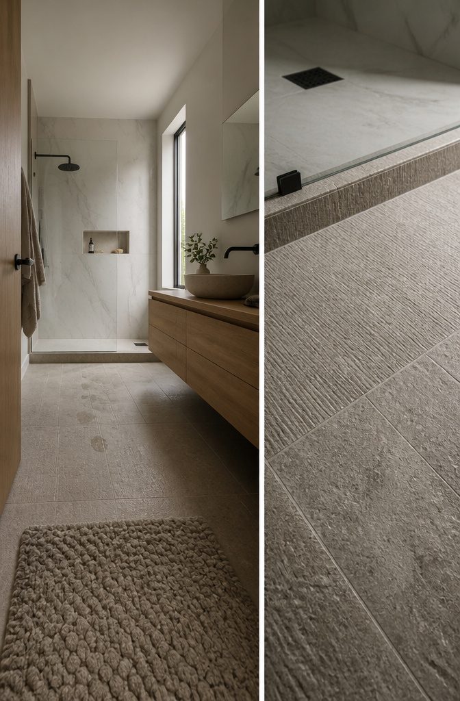
Stone, wood, and marble bring weight and warmth that paint and tile alone do not. In wet zones—shower walls, the floor around the tub—sealed marble and porcelain that mimics stone hold up where solid wood cannot.
Limestone and travertine work on vanity tops if sealed every year; skip them on shower floors where standing water sits too long.
Wood appears most often as vanity cabinetry or a ceiling accent, nowhere the spray hits directly.
Teak and cedar survive humidity better than oak, but even those need ventilation and distance from the shower threshold. Pair a marble-look shower surround with a wood-topped floating vanity and the bathroom reads warmer without risking warp or mold.
Textured stone tile—split-face, honed, wire-brushed—adds grip underfoot and breaks up the gloss of a polished mirror wall.
The same tile running from the shower pan out onto the main floor makes a small bathroom feel larger because the eye does not stop at a grout line.
6. Open, Light-Filled Layouts
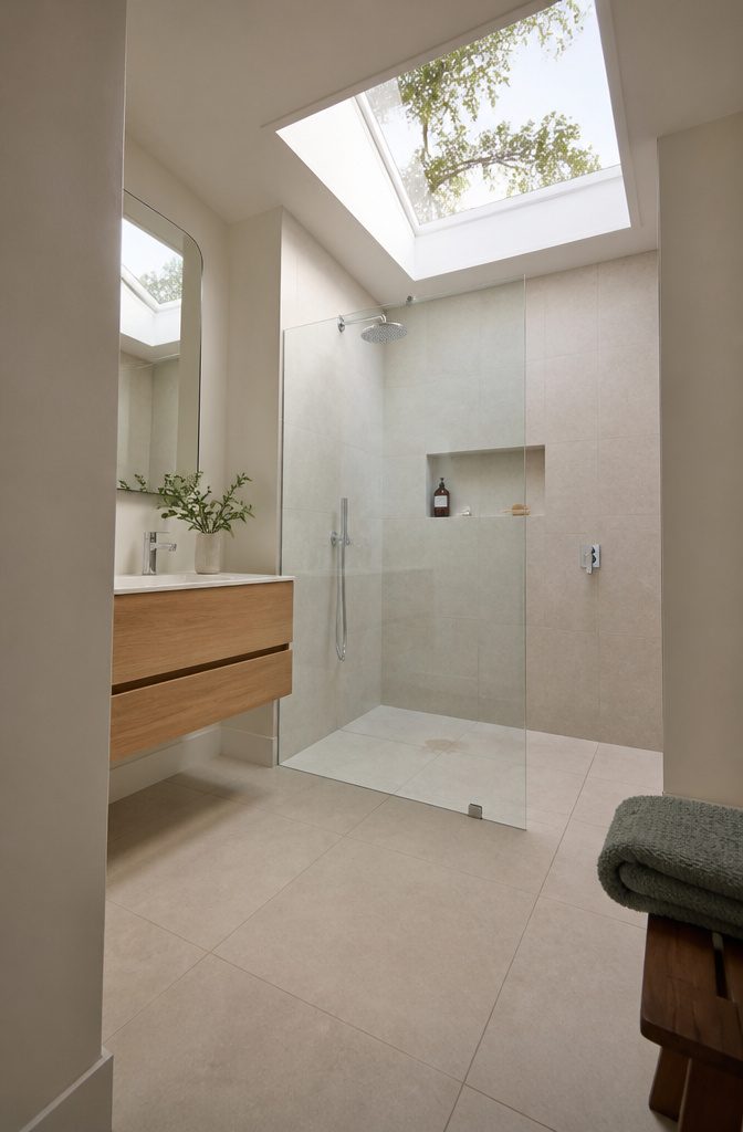
Glass shower doors replace curtains and give you clean sight lines straight through to tile and fixtures.
The transparency keeps the room from feeling chopped up, and in a small bathroom that unbroken view makes the footprint read larger than it is. Frameless glass works best—no metal tracks to catch the eye.
Windows and skylights do the same work from above. Natural light stretches a space better than any fixture, and a skylight drops that light where a wall window can’t reach.
If you’re working with a windowless interior bathroom, a skylight is the one move that changes how the room feels all day.
Floating vanities and barrier-free showers keep the floor visible and the layout open. When the floor runs uninterrupted, even a tight bathroom reads as one continuous space instead of a series of boxed-in zones.
Frameless glass on the shower, a wall-mounted vanity, no curtain breaking up the room—those three together turn a standard five-by-eight into something that breathes.
7. Vanities, Mirrors, and Storage as Design Features
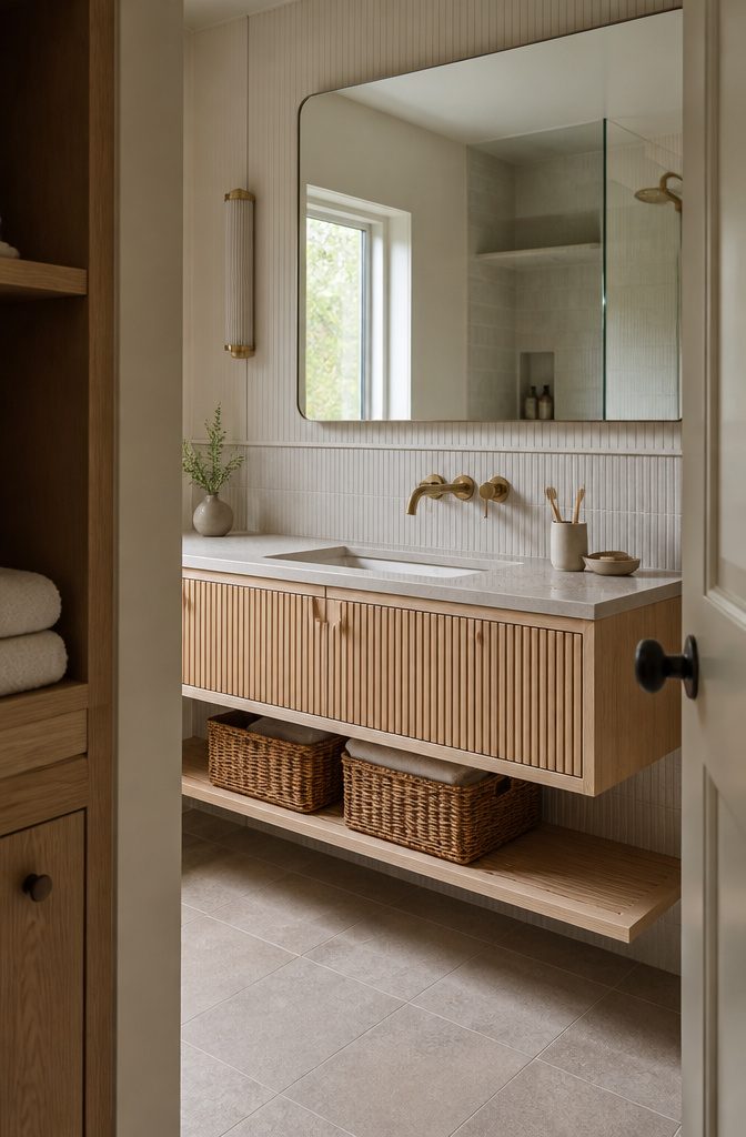
A vanity that looks good closed matters more than one with twice the shelves you never see.
Bertch builds cabinets with fluted fronts and carved pulls that read as furniture, not plumbing, and a floating mount keeps the floor clear when space is tight.
Wall-mounted designs expose more tile and make a small bathroom feel less crowded, though a freestanding unit often stores more if you have the width.
Measure the plumbing centerline and door swing before you shop. A double sink needs at least 60 inches of wall; below that, a single-sink vanity usually gives you more usable counter.
Light finishes—white, warm white, pale oak—work best in low-light rooms, and mixing one warm material like brushed brass or natural wood into an all-white setup keeps it from reading sterile.
Open shelving or rattan baskets under a floating vanity solve the clutter problem without adding visual weight, and a large mirror over the sink reflects enough light to make the whole wall feel taller.
8. Mixed Metals and Refined Fixtures
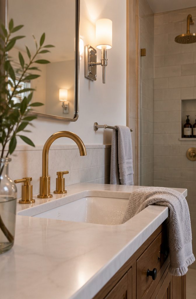
Brass faucets next to chrome sconces used to read as a mistake. Now that pairing is its own look—one that keeps the room from feeling too matched.
Moen fixtures in warm brass or gold anchor the space, and when you layer in a second finish like brushed nickel or matte black on the towel bar or cabinet pulls, the room gains depth without looking cluttered.
The combination works when the finishes share the same level of shine.
Polished brass beside polished chrome holds together; mixing polished and matte reads as inconsistent unless you commit to three finishes and let the matte one act as the bridge.
I keep the largest fixture—the faucet or the shower trim—in the finish I want the room to remember, then pull the second metal in through smaller pieces where it shows up two or three times.
Hardware that feels substantial changes how the whole vanity reads.
A faucet with real weight to the handle and a spout that arcs high enough to clear your hands under it makes the sink feel considered rather than builder-grade, even when the cabinet stays simple.
9. Spa-Like or Wellness-Focused Design
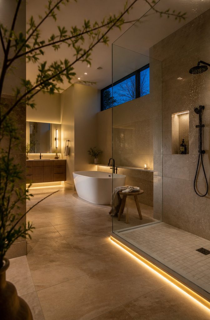
A soaking tub anchors the look, but layered lighting does more to make the space feel restorative—overhead, task, and low-level sources you can dim separately for morning routine or evening wind-down.
Water-efficient Moen shower systems pair conservation with the rainfall or body-spray heads that matter for the experience, and smart lighting controls adapt to when you use the room without you touching a switch.
Walk-in showers with frameless glass keep sightlines open and make the whole bathroom read as one unbroken surface rather than chopped into zones.
The spa effect comes from choices that let you control sound, light, and water pressure more than it does from any single fixture: a tub helps, but a bathroom that lets you set conditions to what you need that day is the part that stays useful past the first weekend.
10. Whimsical, Child-Friendly, or Playful Design
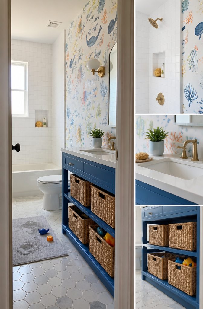
Bathrooms children use can handle bright colors, illustrated wallpaper, and playful storage without looking chaotic if you anchor them with white fixtures and practical materials.
A marine-themed bathroom pairs a white vanity with a cobalt-blue open cabinet and wallpaper printed with whimsical ocean illustrations—the kind of pattern that holds a child’s attention during toothbrushing without reading as juvenile once they outgrow it.
Individual rattan baskets inside the open cabinet keep toys and bath supplies sorted by type, so cleanup takes seconds instead of becoming a negotiation.
The design trick is making the fun parts easy to wipe down. Glossy tile, vinyl wallpaper, and painted cabinetry all tolerate splashes better than fabric or untreated wood.
Pick colors that make the room feel welcoming rather than instructional—a child who likes the space will spend less time resisting the routine it supports.
Adults borrow the same approach when they want a bathroom that lifts their mood: unexpected color on modern furniture, a quirky vintage mirror, cement tile in a bold geometric. The palette changes, but the principle holds.
What to Fix Before You Choose Finishes

Water damage behind tile, a floor that stays wet after a shower, a fan that moves no air, outlets without GFCI protection, and supply lines that sweat or drip all belong at the top of the list.
Fix what is broken or unsafe before you choose grout color. A fresh coat of paint over a ventilation problem just means you repaint sooner, and new tile over bad waterproofing fails the same way the old tile did.
A cosmetic refresh handles paint, a mirror, lighting, and hardware when the room works but looks tired.
A partial remodel replaces the vanity, toilet, fixtures, flooring, and shower door without changing where anything sits. A full remodel opens walls, moves plumbing, rewires circuits, and rebuilds waterproofing.
Moving a toilet or shower adds cost and time because the drain lines have to move with them, so if the layout already works, leave the rough plumbing where it is and spend the budget on what shows.
Making a Small Bathroom Work
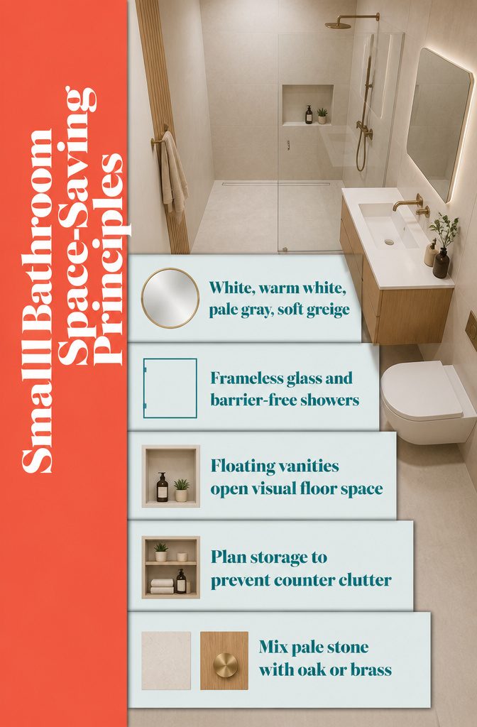
Light colors make a small bathroom feel calmer and more open.
White, warm white, pale gray, and soft greige reflect light and create a flexible background for wood, stone, or metal accents. The restraint lets fixtures and materials stand out without competing for attention in a tight room.
Open-concept layouts help too.
Frameless glass, barrier-free showers, and floating vanities create the illusion of more space while keeping the flow serene. Remove visual barriers without losing function.
Minimalism only works when storage is planned well. Without it, everyday toiletries quickly become visual clutter, and the clean look falls apart.
Built-in niches, recessed medicine cabinets, and wall-mounted shelves keep counters clear. Mix finishes instead of using one flat white everywhere—pair a white vanity with light stone-look tile and one warm material like oak or brushed brass.
Frequently Asked Questions
Which bathroom remodel ideas should you prioritize?
Fix structural and safety problems first: water damage, failing ventilation, unsafe wiring, and plumbing leaks all take priority over cosmetic upgrades.
Once the room is sound, a cosmetic refresh handles paint, lighting, and hardware when the layout works but looks tired, while a partial remodel replaces the vanity, toilet, and fixtures without moving plumbing.
A full remodel that changes the layout costs more and takes longer because drain lines have to move with fixtures, so if the existing arrangement already works, leave the rough plumbing in place and spend the budget on what shows.
What are the top bathroom trends for 2026?
Warmth and wellness define 2026 bathroom design, with homeowners treating the space as a personal retreat rather than a utility room.
Sherwin-Williams picked Universal Khaki as its 2026 Color of the Year, a mid-tone tan that reads warmer than greige and grounds a room without going dark.
Spa-like features such as soaking tubs, walk-in showers with frameless glass, and layered lighting that dims separately for morning or evening routines all support the shift toward restorative spaces, and smart controls that adjust lighting and water temperature without manual switching make the room respond to how you use it that day.




