
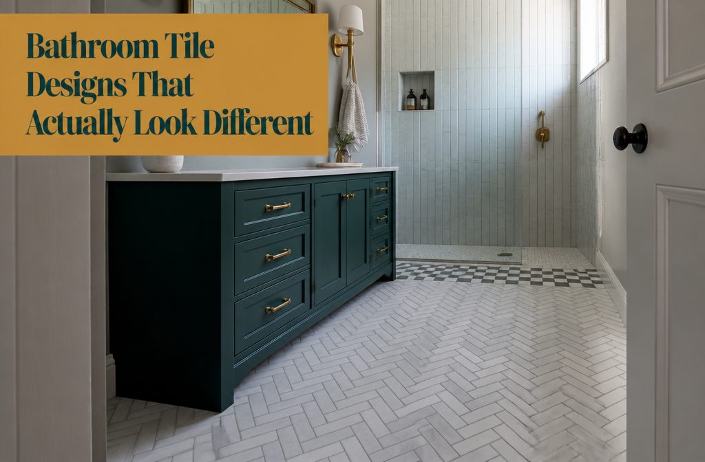
Bathroom tile becomes distinctive when the layout changes, not the tile itself—herringbone costs no more than brick pattern, and vertical stack bond makes a low ceiling look taller without switching materials.
Knowing which geometric trick suits the room: a 1/3-offset pattern breaks up predictable seams, while checkerboard reads familiar enough that resale stays safe.
Carrara Bianco marble is expected to dominate 2025 projects, and honed finishes outperform polished on floors because they hide wear and offer better traction when you step out of the shower barefoot.
1. Distinctive Layouts and Geometric Patterns
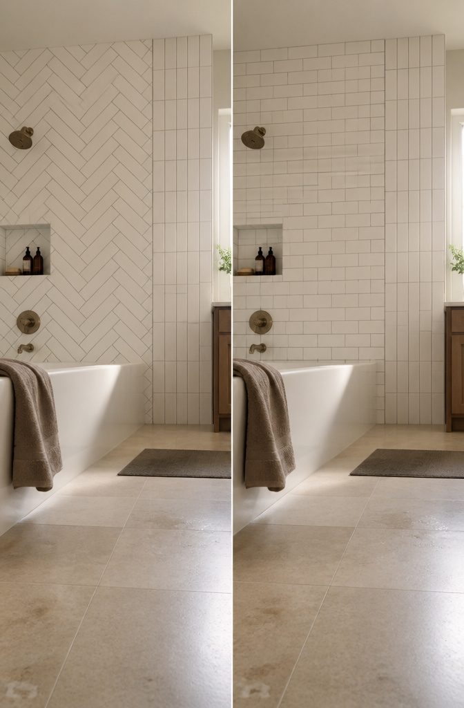
Herringbone turns plain subway tile into something people stop and look at, and it costs no more than the standard brick pattern — the labor is the same, just rotated forty-five degrees.
The 2-by-6-inch version in white reads clean and almost formal; drop down to 1-by-2-inch tiles and the zigzag tightens into something busier but still classic.
Vertical stack bond lines tiles up in straight columns instead of staggering them, which makes a low ceiling look taller without spending a cent on different material.
Checkerboard and crosshatch layouts pull off the same trick subway tile does — they feel familiar enough that you will not want to rip them out in five years.
For renters or anyone worried about resale, a distinctive layout beats patterned tile every time: you get visual interest from geometry instead of color, and the next person is far less likely to hate it.
A 1/3-offset pattern shifts each row by one-third the tile length rather than half, so the vertical seams never line up and the whole wall feels less predictable.
2. Subway Tile in Varied Layouts
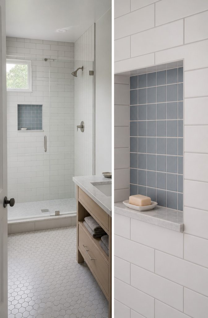
Subway tile stays popular because the format lets you change the pattern without changing the tile.
Running bond—the offset brick-style layout—is what most people picture, but vertical stacking makes the same 3-by-8-inch white tile read completely different: taller, more formal, less safe.
I’ve seen 2-by-6-inch grey subway tile stacked flat in a guest bath, and the unbroken vertical lines made a standard 8-foot ceiling feel a foot higher than the hallway outside.
Pairing sizes works when one stays neutral.
A 4-by-8-inch Vermont Pine subway tile in running bond anchors a shower wall, then 3-by-3-inch denim squares fill the niche in a grid—the shift in scale marks the recess without introducing a third color.
The same principle applies to mixing a 2-by-4-inch denim subway tile with 2-by-2-inch stacked squares as a border: the smaller format defines the edge, the larger one does the work.
3. Marble and Other Stone Looks
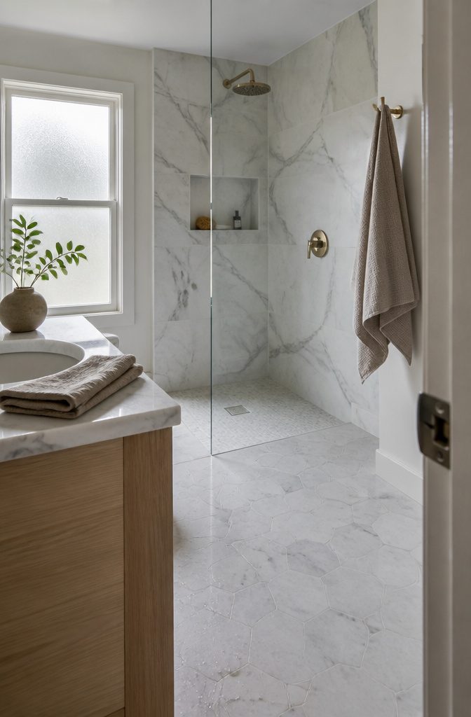
Marble still anchors high-end bathroom design, and Carrara Bianco is expected to dominate 2025 projects for its clean veining and broad appeal.
White and gray marbles like Calacatta Gold and White Dolomite suit small bathrooms especially well, where lighter stone opens up tight corners without losing the weight natural material brings.
Honed finishes outperform polished on floors because they hide wear and offer better slip resistance, a practical trade when you’re barefoot daily.
Beyond white, options run to beige, purply Calacatta Viola, and even green marbles, though green types can warp under poor drainage.
Slate and limestone add texture where marble reads too formal. Travertine works on shower floors and around tubs, giving you warmth underfoot that porcelain cannot match.
Any natural stone in a bathroom needs a penetrating sealer, and shower installations demand contractors who understand waterproofing and proper slope, since white marbles especially can rust if moisture sits wrong.
4. Colorful or Gradient Designs
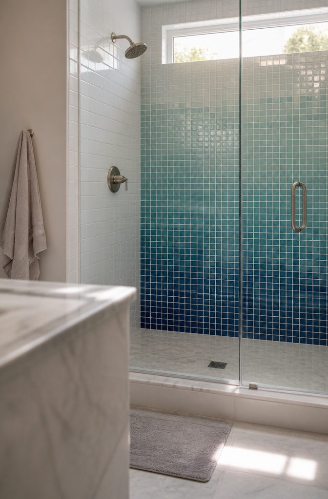
A single wall or shower niche in saturated blue, emerald green, or coral can pull the eye without flooding the room in color.
The rest of the space stays neutral—white subway tile, gray grout, pale stone—and the bright patch registers as intentional rather than left over from another decade.
Gradient layouts step the color across rows or columns, usually from a deep shade at the bottom to near-white at eye level.
The transition reads as texture from a few feet away, which keeps a small bathroom from feeling closed in.
Ombre works best on a feature wall or inside a shower, where you control the sightline and the shift does not compete with mirrors, fixtures, and everything else a bathroom holds.
Small-format tiles—one-by-one-inch or one-by-three-inch mosaics—make the color change smooth because each row shifts by a fraction.
Larger subway tile can step through an ombre if you are working with only three or four shades, but the jumps show more and the look skews bold rather than blended.
5. Hexagon and Penny-Round Tile
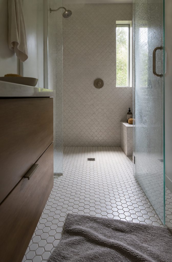
Hexagons and penny rounds split into two camps by size, and the size you pick changes how much grout you see and how much grip the floor gives.
Small hexagons—around an inch across—land closer together, which means more grout lines and better traction when the floor is wet.
Larger hexagons, the kind that run three or four inches point to point, cover ground faster and read cleaner from the door, but you give up some of that slip resistance.
I’ve seen small hexagons paired with oversized fish-scale tile on the walls in tight bathrooms, and the contrast works: the big shapes open the wall up, the small ones keep the floor from feeling like a single slab.
You can also run small hexagons into a chevron or subway pattern in the same shower and let the grout lines do the dividing instead of trim.
Penny rounds behave the same way—more grout, more texture underfoot, and a busier look that either adds energy or asks for a plain wall to balance it.
6. Terracotta and Earthy Tones
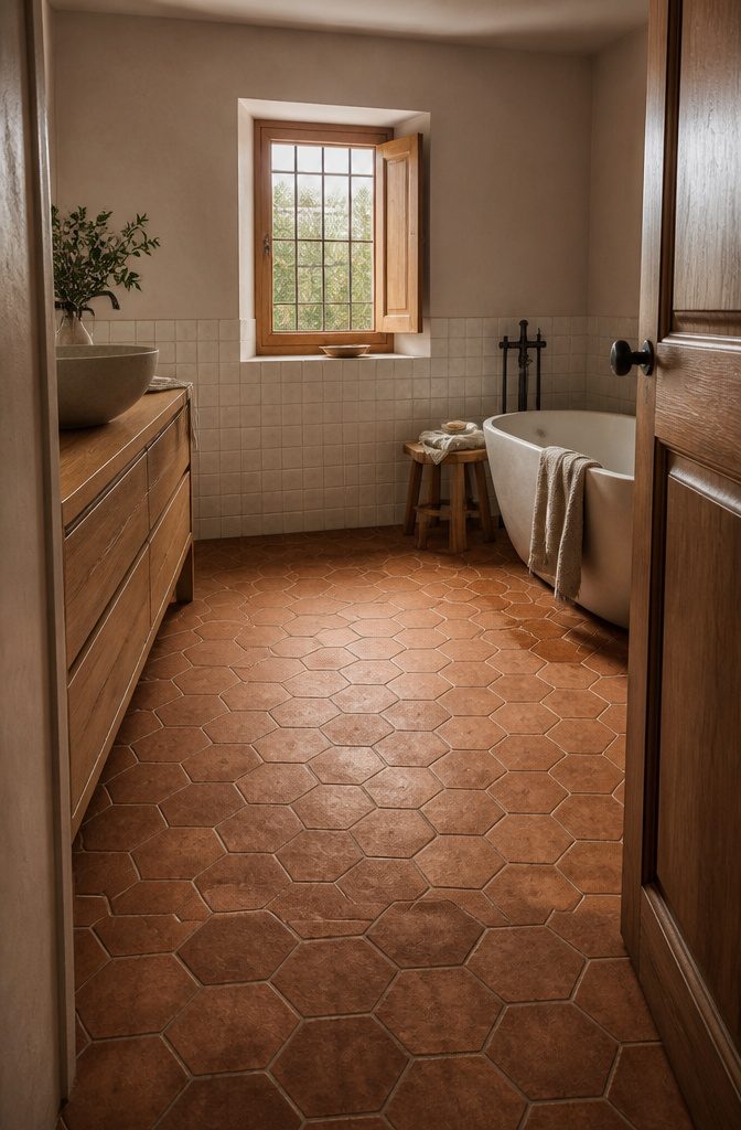
Terracotta brings a warm, rustic edge that feels more Mediterranean villa than suburban refresh. The unglazed versions are naturally slip-resistant, which matters on a bathroom floor, while glazed terracotta cleans easily and works better on walls.
The color range runs wider than the standard red-orange: dusty pink, antique grey, even moody glazed finishes in darker tones. A large hexagon in chestnut or sea-salt tones gives the rustic material a cleaner, more geometric read.
Unglazed terracotta needs sealing at install and avoids acidic cleaners—lemon-based products will etch the surface.
Glazed versions skip that particular worry but still need grout sealing. Over time, unglazed tile develops patina, and how you treat it in the first few years decides whether that patina looks intentional or just worn.
Hire someone who has laid terracotta before if you are going unglazed; staining and efflorescence are harder to fix than to prevent.
7. Textured and Handmade Tile
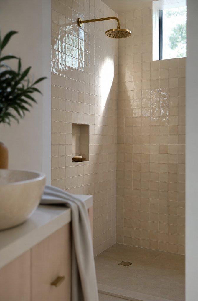
Zellige comes from northern Morocco, where artisans hand-cut and glaze local clay into tiles that show their journey: small chips, pits, and cracks are part of the design, not flaws.
Most zellige is glazed and runs from warm white through midnight blue to gold.
It works best on walls — the glaze keeps slip resistance low — and if you want it in a shower, seal it regularly to protect the grout from staining.
Raw-edge tile adds the same handmade feel without the glaze. The uneven, natural edges read as artisan work, and because handmade ceramic tiles vary slightly in shade, no two sit exactly alike.
That variation mimics what you see in nature and works particularly well in fishscale layouts, where the organic edges soften the geometry. Pair raw-edge tile with clean fixtures and a simple vanity to keep the texture from crowding the room.
Relief tile — like Curve, a 6-by-12-inch white fluted ceramic — brings dimension to a flat wall. The grooves catch light differently throughout the day, so a plain white tile stops reading as plain.
Use it floor-to-ceiling in a small bath to add interest without adding color, or run it as a band at eye level if full coverage feels like too much texture in one room.
8. Fish-Scale Tile
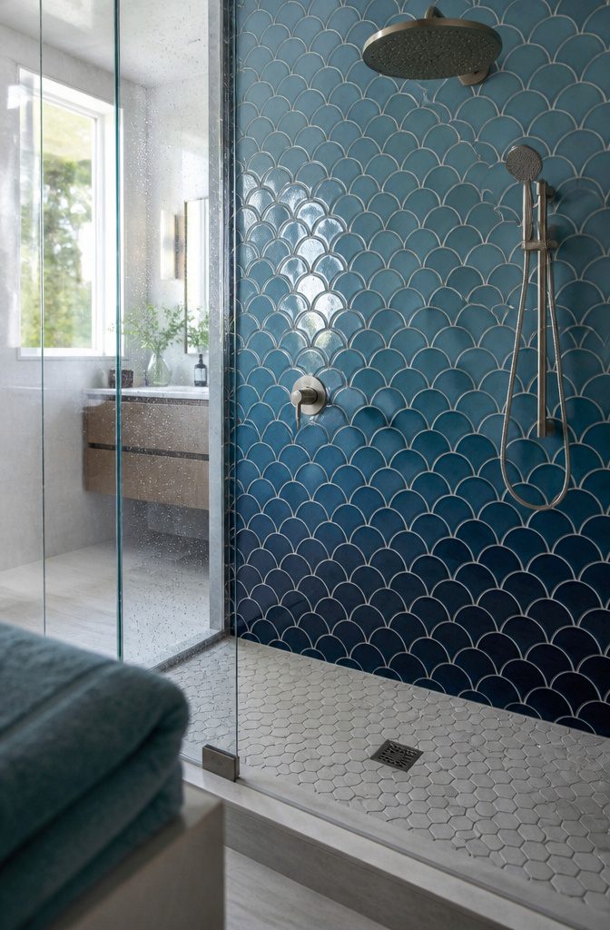
Fish-scale tile runs in overlapping rows that mimic ocean waves, and the curved edges soften hard bathroom lines in a way rectangular tile never will.
The shape works best when you commit to color: gradient blues from deep navy through soft teal read as water moving across the wall, while a single muted tone keeps the pattern visible without fighting other finishes.
Pair large fish scales on the feature wall with small hexagons on the floor—the size contrast makes a small bathroom feel deliberately composed rather than cramped, and both shapes share enough geometry that the transition doesn’t jar.
Glossy glaze adds dimension under bathroom lighting, each scale catching light at a slightly different angle as the curve changes.
9. Decorative and Vintage Motifs
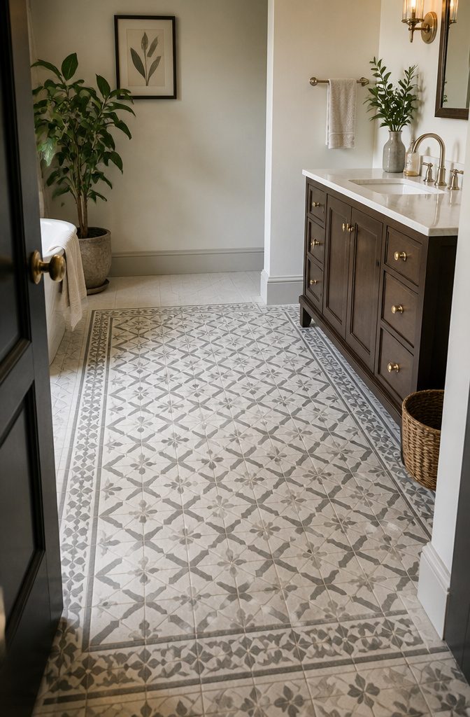
Ornamental tile brings Victorian florals, Art Deco geometry, and other vintage motifs into a bathroom that wants personality over plainness.
The patterns run intricate—interlocking shapes in soft whites, patinas, and muted grays—and they work best on floors where the detail reads clearly underfoot.
A custom Victorian design in white and green creates a distinct vestibule around the toilet, using decorative edging to frame the space rather than letting it blur into the rest of the room.
Art Deco leans on contrast: rich emerald pencil liners and chair rail trim against white subway walls, with dark wood cabinetry and gold fixtures adding warmth.
The green border defines the wall without covering it, so the pattern stays controlled and the room stays bright. Pair it with fresh greenery and framed artwork to keep the vintage look from reading as a reproduction.
10. Black-and-White Tile
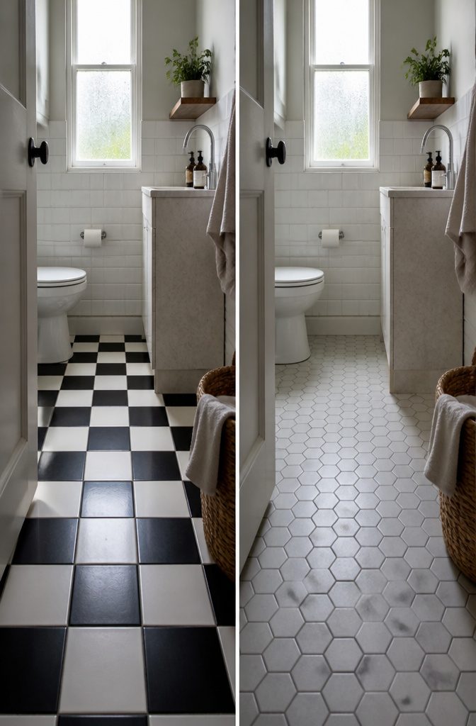
Black and white tile squares—or any black-and-white combination—give you a bold pattern without tipping into high-risk territory.
The pairing has appeared in architecture for centuries across different continents, which means it reads as classic rather than trendy. A checkerboard floor in a bathroom holds attention without needing color or complicated shapes to carry it.
The contrast does the work. Black grout against white tile, or white against black, sharpens the grid and makes the layout obvious even in a small powder room.
I like that it anchors a space without limiting what you hang on the walls or what metal finish you pick for fixtures.
You’re not locked into one decade’s palette the way you are with, say, mint green or harvest gold.
Any tile shape works in black and white—squares, rectangles, hexagons—but the graphic punch stays consistent. That flexibility matters when you’re working with an odd floor plan or a narrow alcove where one shape fits better than another.
Choosing Tile by Material and Use
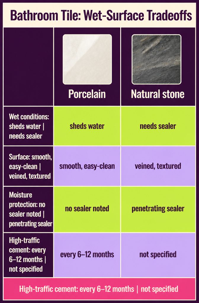
Porcelain and ceramic hold up to wet conditions because they shed water and wipe clean without fuss — that makes them the safe bet for any shower floor or wall around a tub.
Marble and slate give you natural veining and texture but need penetrating sealer to keep moisture from soaking in.
Cement, terracotta, terrazzo, limestone, and slate all need sealing, and cement wants a fresh coat every six to twelve months if foot traffic is high.
Terrazzo stands out for floors: the embedded stone chips give it more grip than most tiles, and it resists staining once sealed.
It reads as a neutral but brings pattern at the same time, so you get visual interest without committing to loud color. Zellige adds handmade irregularity to walls but won’t take the beating a floor needs.
Before you pick a look, check where your drain sits and how plumbing and accessories will mount — those decisions narrow your layout before style does.
Small-Room Effects
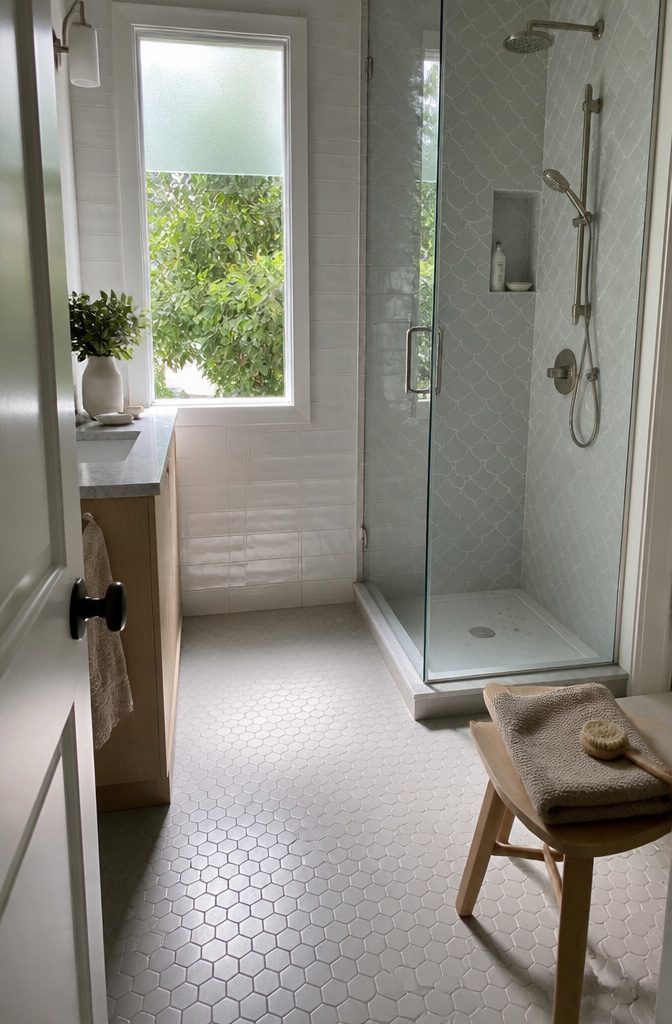
Light tile in a gloss finish opens up a tight bathroom because it bounces more light around the room—soft whites, pale grays, and quiet beiges all work.
Pair glossy wall tile with a matte or honed floor, and you get depth without the visual noise that makes a small space feel smaller.
A contrast in tile size helps too: large Moroccan fish scales on the wall next to small hexagons on the floor keeps the eye moving and prevents that boxed-in feeling.
The muted tones stay cohesive, but the size difference adds enough interest that the room reads as deliberate rather than cramped.
Gentle texture—a lightly embossed zellige or tumbled stone—hides wear and adds a tactile layer without competing for attention.
Frequently Asked Questions
What are popular bathroom tile styles anticipated for 2025?
Carrara Bianco marble is expected to dominate 2025 bathroom projects for its clean veining and broad appeal. Classic checkerboard patterns continue to hold strong because they feel familiar without dating quickly, making them safe for resale.
How does the 1/3 offset tile pattern differ from a standard brick layout?
A 1/3 offset shifts each row by one-third the tile length rather than half, so vertical seams never line up. Standard brick layout (running bond) staggers tiles by half their length, creating predictable vertical alignment every other row.
What type of tile is best for bathrooms?
Porcelain and ceramic work best in wet conditions because they shed water and wipe clean without sealing. Marble and slate bring natural veining but need penetrating sealer, while cement, terracotta, limestone, and slate all require sealing to prevent staining.




