
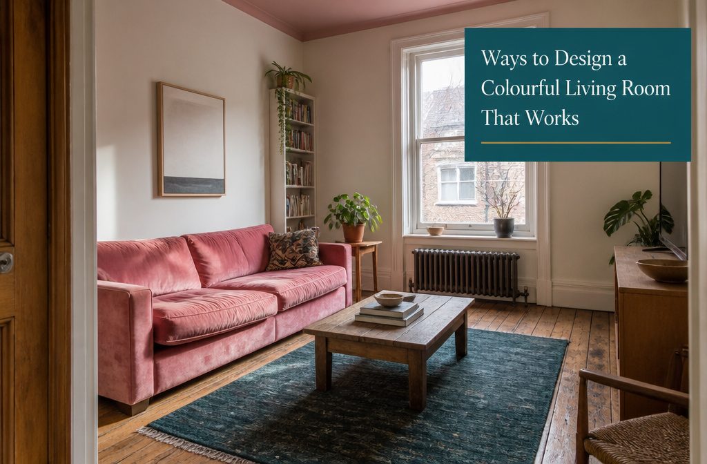
A colorful living room can range from one bold sofa against white walls to jewel-toned paint layered with saturated upholstery and patterned wallpaper.
The approach depends on whether you want the room to feel calm, energetic, or cozy, and how much visual weight the space can carry without reading as cluttered.
Small rooms handle a brightly colored sofa better than most people expect because the sofa takes up visual space, so you need fewer pieces overall.
Benjamin Moore’s Peony 2079-30 on the ceiling with White Dove OC-17 on the walls brings warmth without dominating, the kind of move that works when four bold walls would close things in.
1. Choose a Color Mood or Palette That Fits the Room’s Purpose and Personal Style
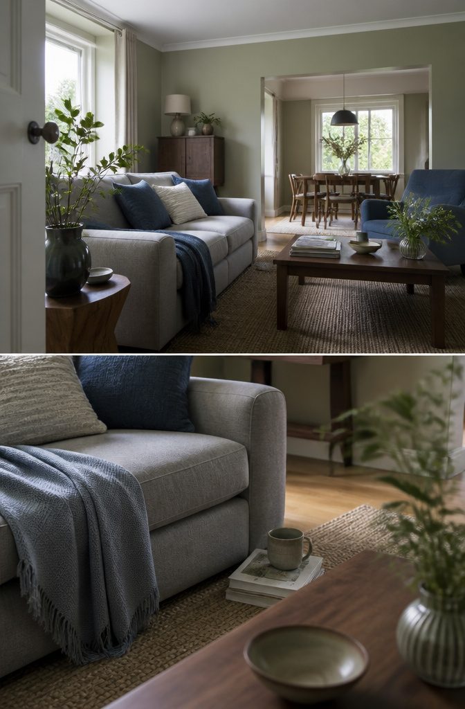
Start by naming the feeling you want the room to give you. If you need calm at the end of the day, reach for restful greens, soft earthy neutrals like stone or warm grey, or gentle blues.
For energy and warmth, terracotta, rust, mustard or deeper reds make the space feel alive. Cozy means rich, encompassing color: deep olive, chocolate brown, wine red, or a saturated neutral that wraps the room rather than receding into it.
Modern rooms stay narrow—two or three strong tones, clean lines, minimal pattern.
Eclectic spaces handle more contrast and layered color, while soft cozy palettes lean on blush, sage, cream and terracotta with plenty of texture to keep beige from going flat.
A minimal colorful room might use white, walnut and one bold accent, which works in small apartments where too many colors compete for attention.
Your style decides the palette, not the other way around. Pick the mood first, then find the colors that deliver it.
2. Use a Colorful Sofa or Other Vivid Furniture as the Focal Point
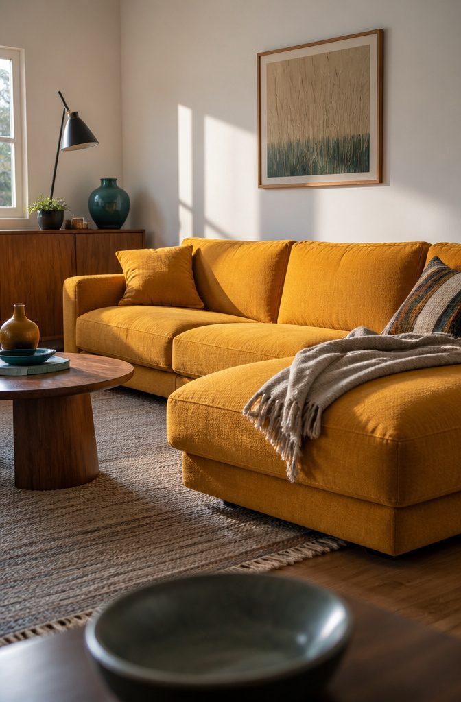
A sofa in mustard yellow, emerald, or hot pink pulls every eye the moment someone walks in, and the rest of the room can stay simple because the sofa already did the work.
I’ve looked at living rooms where a bold sectional or accent chair sits against white walls and neutral rugs, and the color reads as confident rather than overwhelming because nothing else competes for attention.
A single vivid piece of furniture replaces three or four decorative moves — no gallery wall, no patterned curtains, just the sofa in eggplant purple or teal and a few pieces that repeat the color in smaller doses.
Pastel blue and orange work the same way if saturated tones feel like too much.
A pastel blue sofa still commands the space without the intensity of a jewel tone, and an orange sofa balanced with teal accents proves that even warm, bright hues stay grounded when the palette has a plan.
Small rooms handle this better than most people expect: a brightly colored sofa takes up visual space, so you need fewer pieces overall, which suits a tight layout.
3. Build Color Around Art, a Rug, or Another Starting-Point Piece
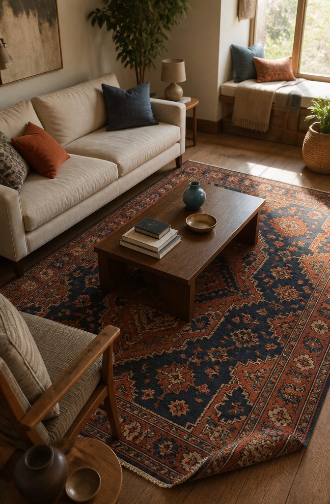
I pick a rug or a piece of art, then pull two or three of its colors into the rest of the room.
The checkered backsplash in one designer’s kitchen set the palette for the whole dining space — the tile colors repeated in textiles and accents against a neutral backdrop that let them stand out.
The starting piece does the hard work of choosing which colors belong together, so you’re not guessing at combinations from scratch.
Pillows, throws, lampshades, framed prints, and ceramics are where I repeat those colors. A rug with rich hues can ground the space while furniture plays along without competing for attention.
Pick the two strongest colors from your inspiration piece and use them in small doses around the room — one might show up in a throw pillow, the other in a ceramic vase or the mat of a framed print.
The room feels intentional because every color traces back to that first piece, not because you forced a match.
4. Repeat Colors Through Accessories and Textiles
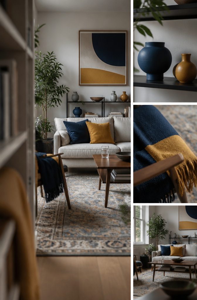
Pillows and throws are where you echo colors without locking yourself into them.
Pick two or three shades from a rug or a piece of art, then repeat them in small doses across the room: a throw on the sofa, a pillow on the chair, a ceramic vase on the shelf.
That repetition is what makes separate corners read as one room instead of a collection of unrelated furniture.
Textiles move faster than paint and cost less than a new sofa, so they are the place to start if the room feels flat.
A navy pillow next to a mustard one links back to the same pairing in a print on the opposite wall.
The room does not need more color everywhere—it needs the same colors showing up in more than one spot.
5. Use a Restrained Palette With a Neutral Base and a Few Color Accents
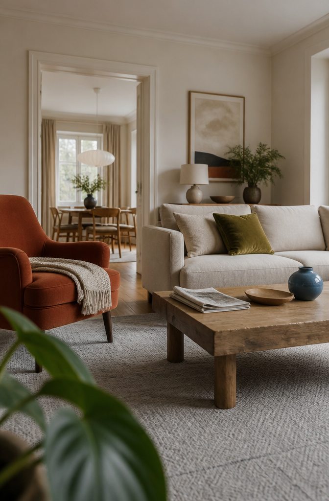
A neutral sofa or rug anchors the room, then color shows up in two or three chosen places — artwork, pillows, a throw, maybe a lamp base.
Source 2 lays out the structure: one base color across the largest surfaces, one style color that sets the mood, and one accent color in the smallest doses.
That gives you three to five visible colors total without the room reading as cluttered.
The base is often the sofa, walls, or a large rug.
The style color might be olive, terracotta, or mustard, carried through a chair or curtains. The accent hits in small objects: a vase, a pillow, a framed print.
Repetition ties it together — if blue appears in art, echo it in a ceramic piece or a book spine. The point is not exact matching; it is rhythm across the room.
6. Go Bold With Layered Colors, Patterns, and Maximalist Decor
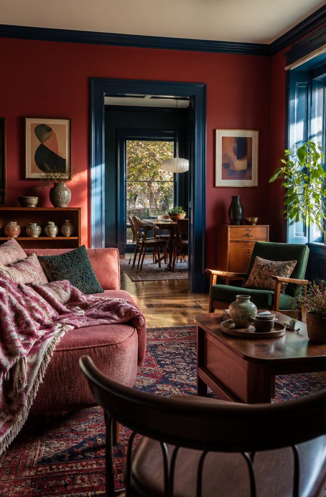
Layering several vivid colors with bold patterns gives a living room a collected, personal feel that a single accent can’t quite reach.
Cochineal Red on the walls, Raspberry Blush on a sofa, and Deep Ocean on trim all together create what designers call controlled chaos—expressive without tipping into clutter.
Keep one color dominant and let the others support it, so the room reads as layered rather than scattered. Three to five visible colors usually hit that balance; past five, the eye loses a thread to follow.
Mid-century furniture in warm wood tones anchors the look when paired with deep greens and eclectic art, the kind of setup that feels luxe but lived-in.
A jewel-box approach—moody walls, a red sofa, mixed patterns—turns up the drama while staying inviting.
Global-inspired decor and abstract art fill in the edges. The gloss sheen on woodwork catches light and sharpens the contrast, which maximalist rooms need to avoid looking flat.
7. Try Soft, Warm, or Pastel Color Combinations
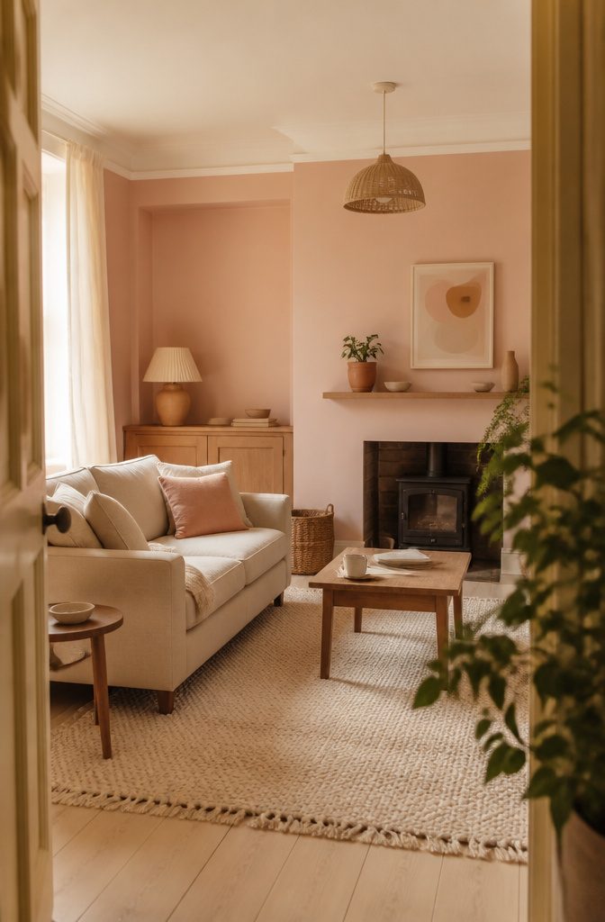
Muted pinks, sage, terracotta, and peach sit between neutral and saturated, giving you color that reads as calm rather than energetic.
Terracotta with cream upholstery, sage with ivory, or blush with warm beige all avoid sharp contrast while still pulling the room away from grayscale.
I find these palettes especially useful when you want the room to feel styled during the day but still settle down at night.
Peach sits between pink and orange and works nearly as well as a neutral. Benjamin Moore’s Frappe AF-85, Peach Parfait 2175-70, and Summer Peach 2167-70 all carry that fizzy warmth without landing in bold territory.
If peach feels like a stretch, pale pastels—Hint of Violet 2114-60, Pale Sea Mist 2147-50, Sun Washed 2169-70—enliven a fireplace wall or single accent surface without demanding attention across the whole room.
For warmer neutrals with subtle pink undertones, Rolling Fog, Lute, Bath Stone, Masquerade, and Mochi all stay in that soft, approachable range.
8. Use Deep, Rich, or Jewel-Toned Colors for a Cozy or Dramatic Effect
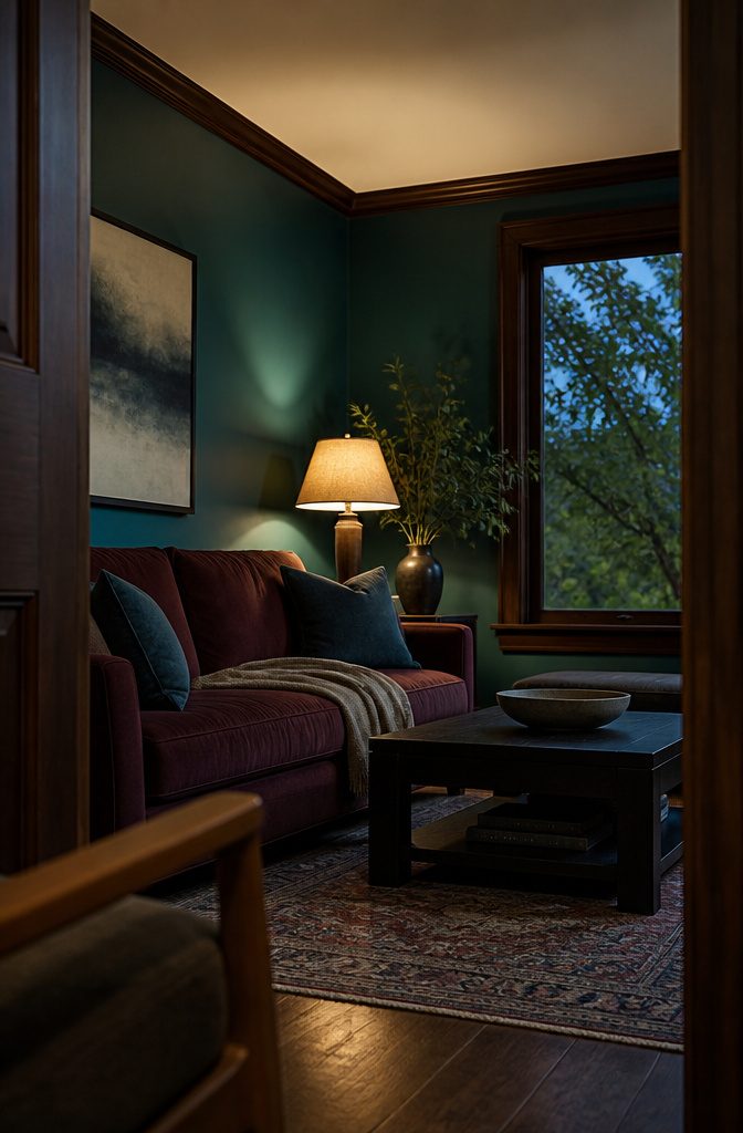
Dark blue, green, and chocolate brown each wrap a room differently. Deep teal like Benjamin Moore’s Gentleman’s Gray 2062-20 brings otherworldly elegance, while Tucson Teal 2056-10 leans greener and makes the walls pop.
Muted blues — Celestial Blue from Little Greene fits this — feel calm and timeless in both traditional and contemporary rooms.
Chocolate Colour delivers cocooning warmth if you want richness without the coolness of navy, and it works on walls and woodwork together.
For drama, saturated reds paired with deep walls turn a living room into a jewel box: bold, moody, and still inviting.
Brown-and-pink combinations like Hearthstone Brown 2109-20 with Soft Pink 2012-70 add sophistication, the contrast between deep walls and a light ceiling sharpening the effect. These shades feel immersive but livable, the kind of room built for long evenings.
9. Paint or Wallpaper a Ceiling, or Use Color on Trim
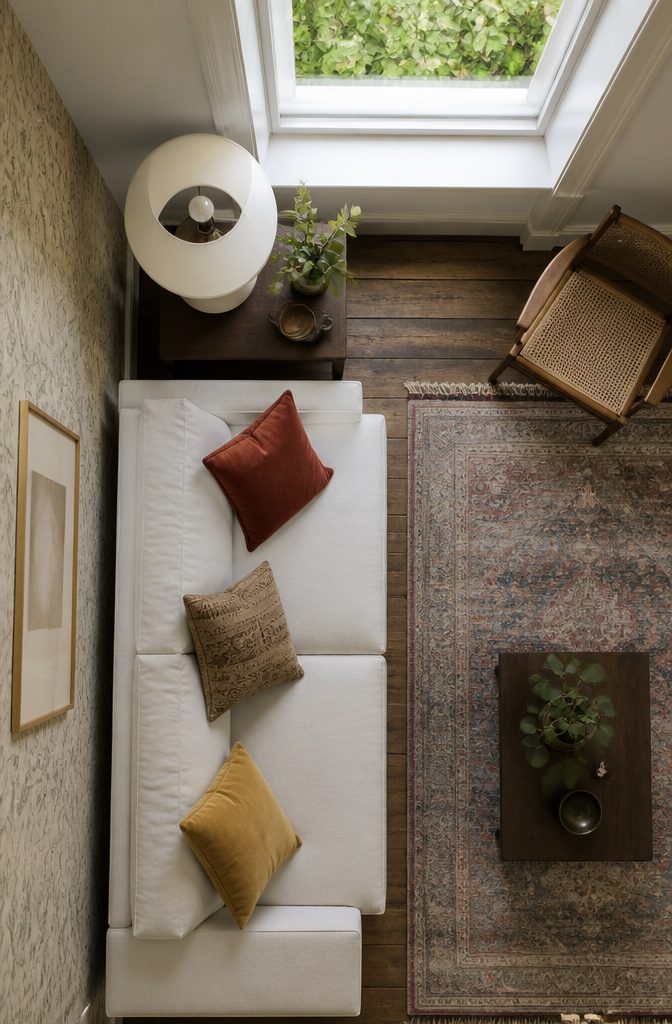
Ceilings and trim carry color surprisingly well when walls feel like too much commitment.
A painted ceiling pulls the eye up and wraps the room in color without dominating the walls, which is why it works even in small spaces where four bold walls might close things in.
Wallpaper works the same way — applied overhead, it reads as a design detail rather than a takeover.
Pair a richly colored ceiling with neutral walls and you get the warmth without the weight.
Benjamin Moore suggests Peony 2079-30 on the ceiling with White Dove OC-17 on the walls, or Kendall Charcoal HC-166 up top with Snow White OC-66 below.
The contrast grounds the room and keeps it from reading as tentative. Trim painted in a bold shade — baseboard in Collector’s Item AF-45 against walls in Gloucester Sage HC-100 — flips the usual hierarchy and adds a deliberate, finished edge.
Cobalt ceilings with leafy wallpaper on the walls create an enveloping effect, the kind of layered look that makes a room feel like somewhere you’d want to stay.
10. Use Wallpaper or a Mural as a Focal Point or to Zone the Room
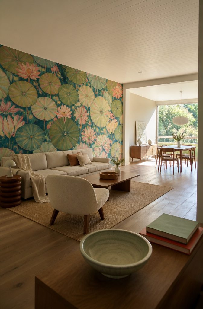
A mural on one wall anchors a spacious living room without overwhelming it. Lily Pads mural wallpaper brings bold botanical scale that suits high ceilings and open floor plans, giving the eye a defined place to land.
The pattern reads as a feature rather than background, so keeping it to a single wall preserves balance.
In smaller rooms, swap large-scale murals for small-scale prints that add pattern without closing the space in. The tighter repeat keeps color present but lets the walls recede, which matters when square footage is tight.
Open-plan layouts benefit from wallpaper used to zone.
A papered section behind the sofa or along one end of the room marks where living space starts and dining or workspace takes over, all without adding furniture or rugs to do the dividing.
Paint and paper together let you shape how the room functions, not just how it looks.
11. Choose a Color Treatment for a Small Room That Preserves Openness
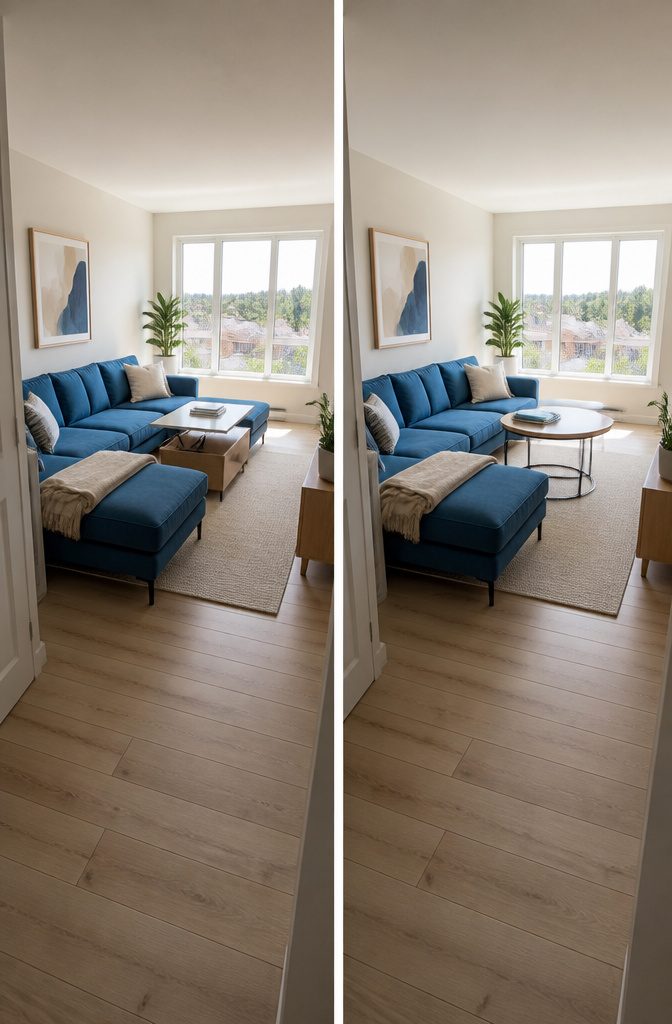
A small room can carry color, but the canvas stays light.
Walls in white, cream, or a soft neutral keep sight lines open, then one strong piece—a bold sofa, a saturated rug, a large piece of art—brings the color without crowding the edges.
A dark gray wall can work if the furniture anchors it with contrast; a blue sectional or an emerald sofa holds the room when the rest stays neutral, black, white, or gold.
Round tables and furniture on slim legs leave floor visible and walkways clear.
Hidden storage and a lift-top coffee table keep remotes and books in reach without stacking surfaces. The room reads as larger when the color concentrates in a single focal point rather than scattering across several competing pieces.
A tiny space handles a brightly colored sofa as long as most of the room is neutral.
The sofa takes up visual space, so fewer furniture pieces work better—a benefit when square footage is already tight. The bold color becomes the personality, and the neutral surroundings give it room to register.
12. Use Green or Plants to Bring a Natural Color Note Into the Room
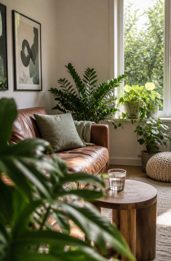
Green works as paint on the walls, in upholstery and pillows, or through actual plants.
Benjamin Moore’s October Mist 1495 and soft sage tones like Vale Mist 1494 add dimension to a room where carpet, flooring and fabrics run neutral, and they bring in elements of nature while keeping the mood calm.
Deeper greens like Fairmont Green HC-127 or Pinelands 446 suit a monochromatic scheme where the color repeats across furnishings and art.
Living plants carry the same effect without locking you into a paint choice. A room with a brown leather sofa, cream walls and black-framed art gains life from green plants placed near the seating or along windowsills.
The color reads as restful and nourishing, especially when textures vary—a velvet pillow next to a matte-painted wall next to glossy leaves.
Balance Color So the Room Feels Intentional
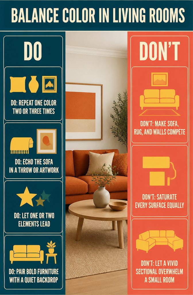
Repeating a color two or three times across the room — in a pillow, a vase, and a print — makes the choice look deliberate rather than random.
If the sofa is burnt orange, pull that orange into a throw or a piece of art so the eye connects them. The repetition builds a thread the room follows.
Pick one or two elements to be the loudest, and let everything else step back.
When the sofa, rug, wall, curtains, and artwork all compete for attention, the room reads as restless. A bold sofa against neutral walls wins; a bold sofa, bold rug, and saturated wall paint all at once usually doesn’t.
The same goes for small spaces: a vivid sectional can fill a basement visually, but only if the backdrop stays quiet.
A neutral base — white walls, a beige or gray sofa, light wood — gives stronger colors room to register without clashing.
Dark walls work the same way in reverse: a jewel-toned sofa against charcoal looks intentional because the wall recedes and the furniture takes the stage.
The balance comes from deciding what leads and what supports, not from dialing every piece down to the same volume.
Color Through More Than Paint
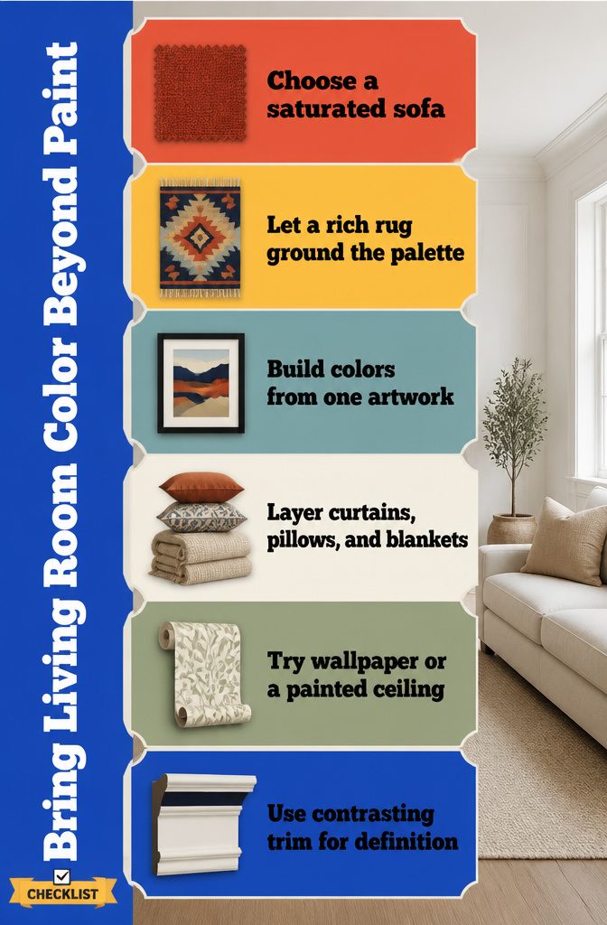
Paint covers walls, but color lives everywhere else. Furniture upholstery, rugs, curtains, art, wallpaper, even the ceiling all offer ways to bring the palette you want without opening a can.
- A sofa in a saturated color can anchor a room that’s mostly neutral, especially effective in a small space where one bold piece reads as intentional rather than crowded.
- Rugs ground the palette — a patterned rug with rich hues lets the furniture stay simple while the floor does the color work.
- Art dictates the scheme in rooms built around a single bold piece; the rest of the palette follows what’s already in the frame.
- Textiles layer it in: curtains, throw pillows, blankets. Start here if paint feels permanent.
- Wallpaper or a painted ceiling adds color overhead, a move I like when commitment to four walls feels like too much at once.
- Trim painted in a contrasting shade sharpens the room’s edges without repainting everything.
The upholstered route wins when you rent, when the landlord won’t let you touch the walls, or when you want the flexibility to change the room’s mood by swapping out a slipcover instead of rerolling the whole space.
Consider Room Light and Test Colors in the Space
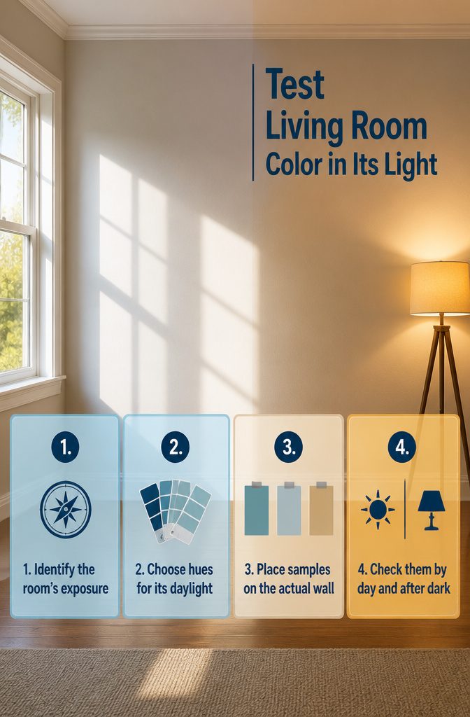
A room facing south or west gets strong daylight most of the day, and colors shift under that much sun — what looked soft in the paint aisle can turn washed out on the wall.
Cooler hues hold up better in bright exposures, balancing the warmth instead of fighting it. North-facing rooms do the opposite: they lean cool and gray, so warmer tones read truer there.
Colors also change between morning light and evening lamps.
Daylight shows the truest version; warm bulbs add yellow and flatten contrast. Before you commit to a gallon, test the color in the actual space.
Brush-on samples let you see how it behaves at different times of day. Peel-and-stick samples work too if you want to move them around, and 4 by 8 inch swatches give you more coverage than a paint chip without opening a can.
Pin them where the color will actually go, check them in daylight and again after dark, and you’ll catch problems before the roller comes out.
Frequently Asked Questions
How many colors should a colorful living room have?
3 to 5 visible colors work best.
Use one dominant base color across the largest surfaces, one or two supporting shades, and one accent color in the smallest doses. Past 5, the room loses a clear thread to follow.
Can a small living room be colorful?
Yes.
Use one strong focal point like a bold sofa or saturated rug, and keep the rest neutral. A brightly colored sofa takes up visual space, so you need fewer pieces overall, which suits a tight layout.
What is the easiest way to make a living room more colorful?
Start with textiles.
Pillows, throws, rugs, framed prints, lampshades, and ceramics let you echo colors without locking yourself into them. Textiles move faster than paint and cost less than a new sofa.
How do I choose living room paint colors?
Consider how much light the room gets, then test samples in the actual space.
A room facing south or west handles cooler hues better, while north-facing rooms need warmer tones. Check samples in daylight and again after dark before you commit.
What colors go with a brown sofa?
Cream, ivory, olive, sage, terracotta, rust, dusty blue, muted yellow, black, and soft pink all pair well with brown. Mix multiple brown tones like caramel, walnut, and espresso so the room feels layered instead of flat.
How do you choose a color palette that matches your style?
Pick the mood first, then find the colors that deliver it. If you need calm, reach for restful greens or soft blues.
For energy and warmth, try terracotta, rust, or mustard. Your style decides the palette, not the other way around.
How can you add color without making the room look chaotic?
Repeat a color 2 or 3 times across the room so the choice looks deliberate.
Pick one or two elements to be the loudest and let everything else step back. A bold sofa against neutral walls works; a bold sofa, bold rug, and saturated wall paint all at once usually doesn’t.




