
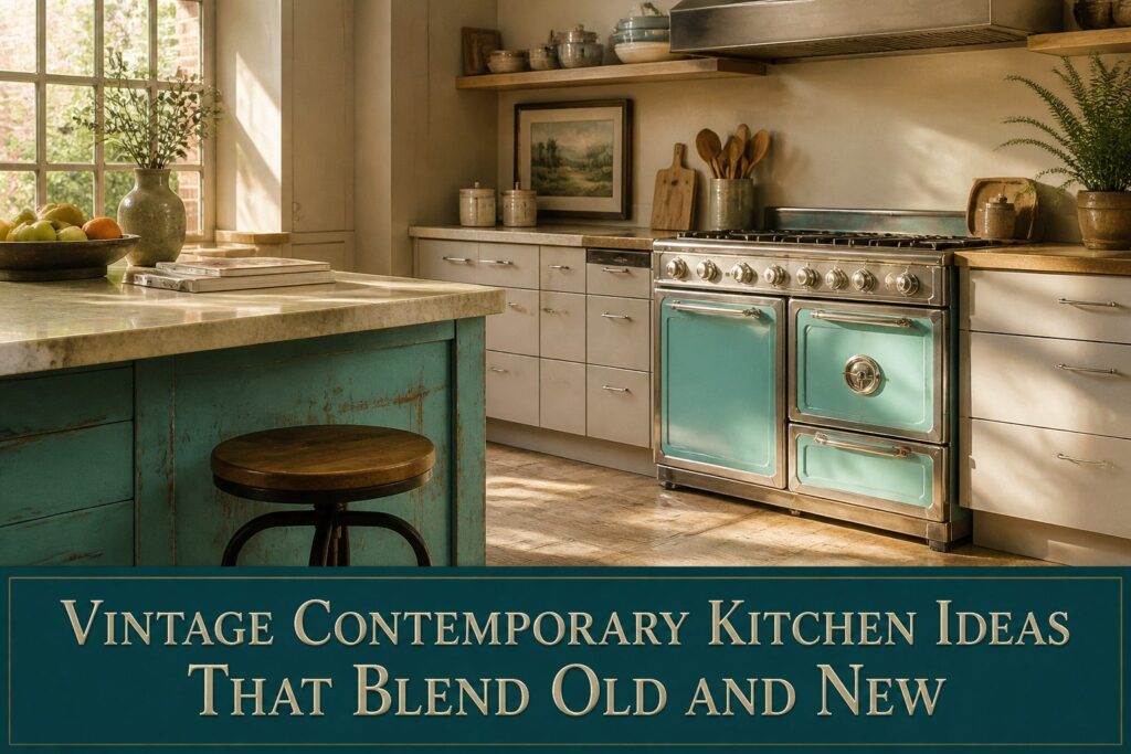
The right vintage contemporary kitchen depends on how much you are willing to edit: one statement appliance, not two; turquoise on the island, not every cabinet; checkerboard only if the rest stays quiet.
The 80/20 rule runs through every decision, and the range at eye level matters more than the rounded refrigerator because it owns the wall.
1. Vintage Appliances With Modern Guts
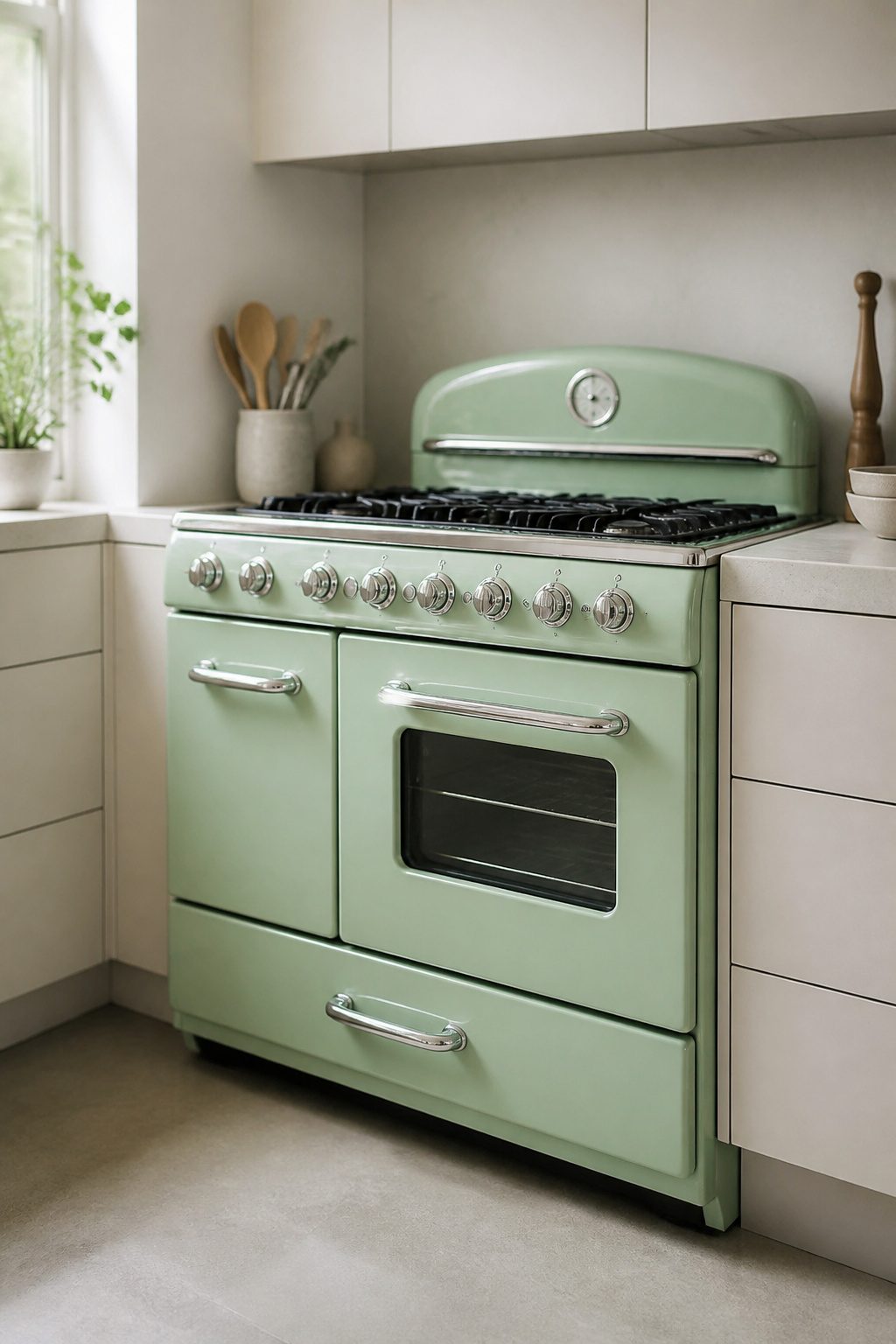
Rounded refrigerators and bold ranges are the obvious move here, and one statement appliance is enough. I would pick the range, since it sits at eye level and draws the eye across the whole room.
A rounded refrigerator is charming, but two retro silhouettes start competing like furniture from a set, and the vintage contemporary kitchen tips into a stage set.
The same logic holds for fixtures. Vintage glass pendants can be rewired with modern guts, and the rewiring keeps the hardware out of landfills.
I like that as the sustainable route, but I would not hang more than two in a single sightline. One fixture above the sink or one over an island reads as found object; three starts to look like a collection.
The balance is visual weight against square footage.
A 36-inch range in mint or burgundy owns a wall in a 10-by-12-foot kitchen. In a galley layout, the refrigerator gets its moment because the range is tucked into a run of cabinets with no wall to itself.
If both appliances face the same sightline, I would keep the refrigerator standard-panel and let the range carry the retro note.
The cabinets and counter should stay quiet, matte, modern. The contrast is what makes either piece feel chosen rather than defaulted.
2. Colorful Cabinetry in Turquoise or Aqua
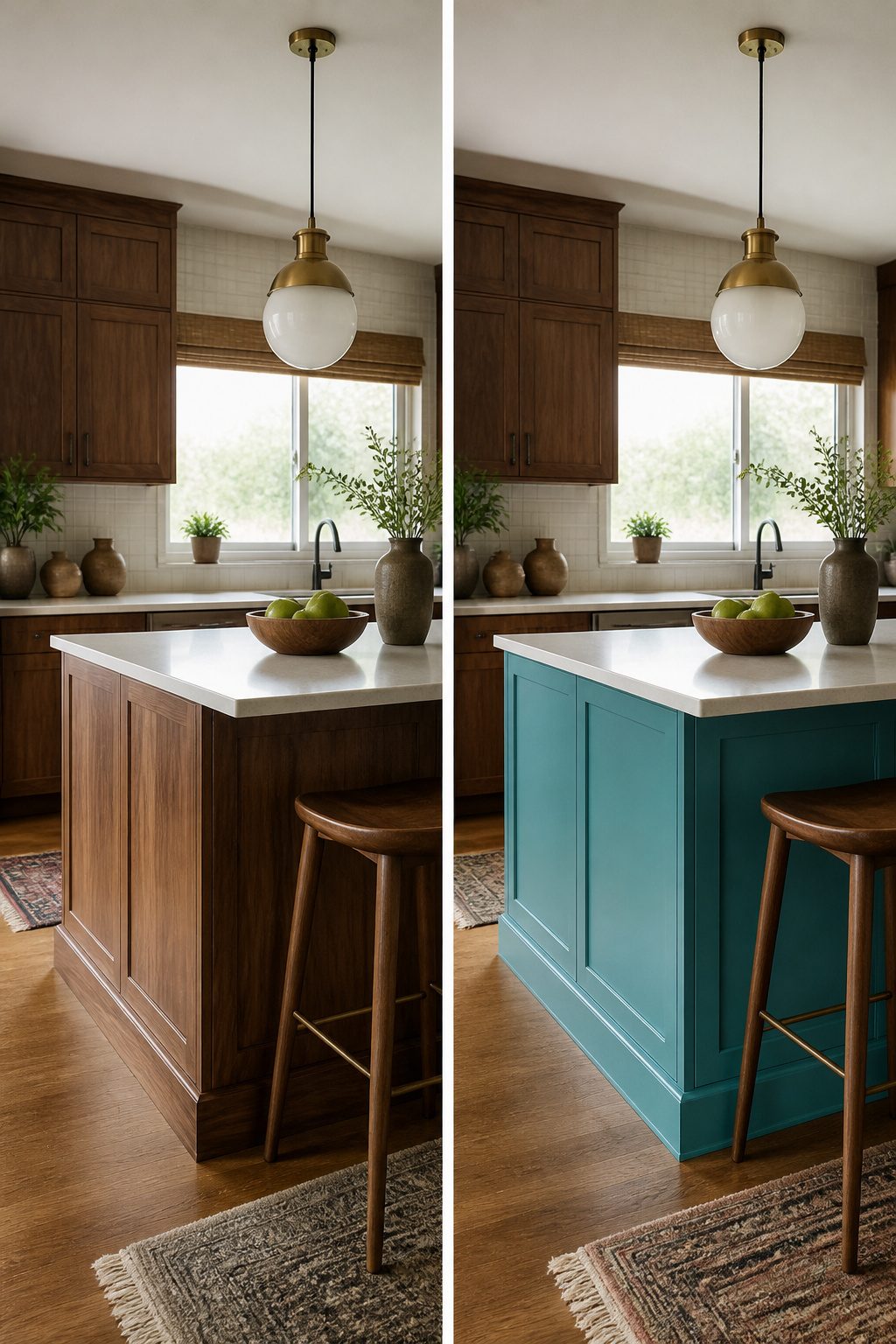
Turquoise or aqua cabinets read as vintage the moment the paint goes on, but the line between character and costume sits in what surrounds them.
I keep the 80/20 rule in mind: 80 percent of the kitchen stays modern or neutral, 20 percent carries the retro punch. That means turquoise on the island or a single bank of lowers, not every surface in the room.
Pull this off by pairing robin’s egg blue with walnut millwork or crisp white uppers, letting the color be the accent rather than the theme.
Chartreuse and turquoise together work because the rest of the space holds back. If your cabinets take the bold color, keep the backsplash quiet, the hardware simple, and the countertops in a tone that does not compete.
Paint quality matters more here than in a neutral kitchen because turquoise shows brush marks and uneven coats. Benjamin Moore, Sherwin-Williams, or Behr all carry shades that hit this midcentury palette without drifting toward teal or baby blue.
I would test two coats on a door you can hide, live with it through a weekend of morning light and evening shadow, then decide if the saturation holds up or needs dialing back.
3. Checkerboard Flooring
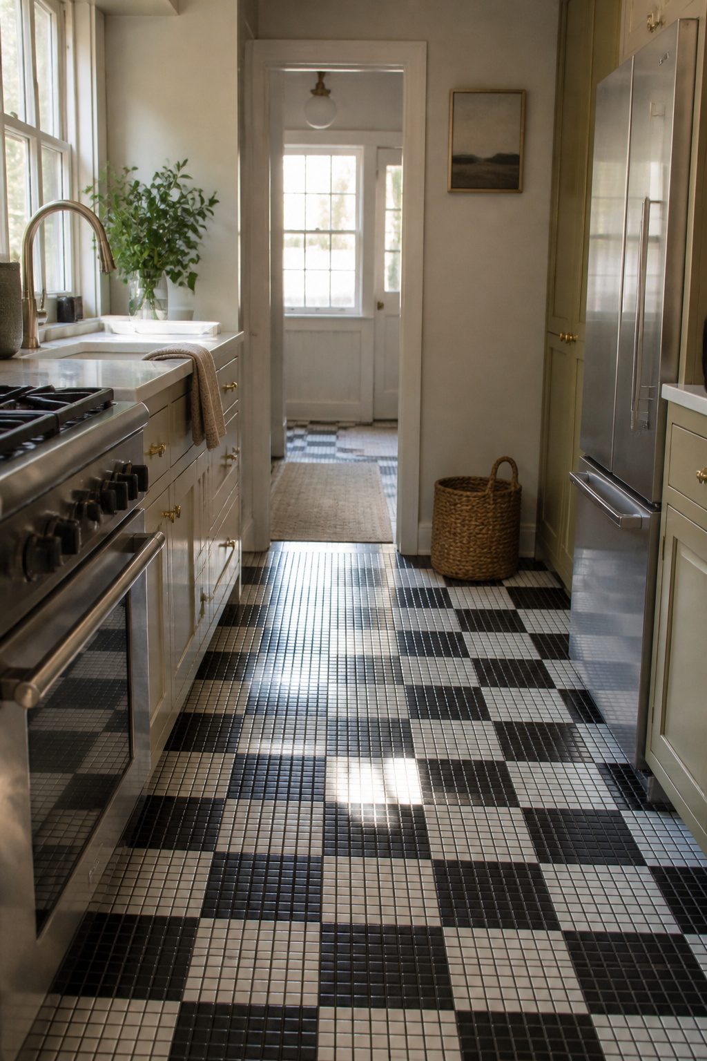
Checkerboard flooring carries the strongest 1950s kitchen signal of any element on this list, which is exactly why it needs restraint.
The pattern showed up in that era’s linoleum and tile installations, then lingered in diners and breakfast nooks long enough to feel both nostalgic and slightly risky.
The comeback is happening at a smaller scale than the original 12 x 12 or 16 x 16 installations. Designers are working with 4 x 4 or 5 x 5 tiles in white marble and travertine, which keeps the geometry but loses the diner-floor shout.
Smaller checks read as texture from a distance; larger checks read as a statement up close. That distinction matters in a kitchen where you already have cabinets, counters, and appliances competing for attention.
For actual kitchen use, stone or porcelain tile holds up to water and dropped pans better than the vintage linoleum that made this pattern famous.
If you are already committed to bold cabinet color or busy backsplash tile, checkerboard belongs on the floor elsewhere in the house.
In the kitchen, this floor works best when cabinets stay quiet: flat-panel doors, neutral paint, minimal hardware. The floor does the talking so nothing else has to.
4. Vintage Lighting Fixtures
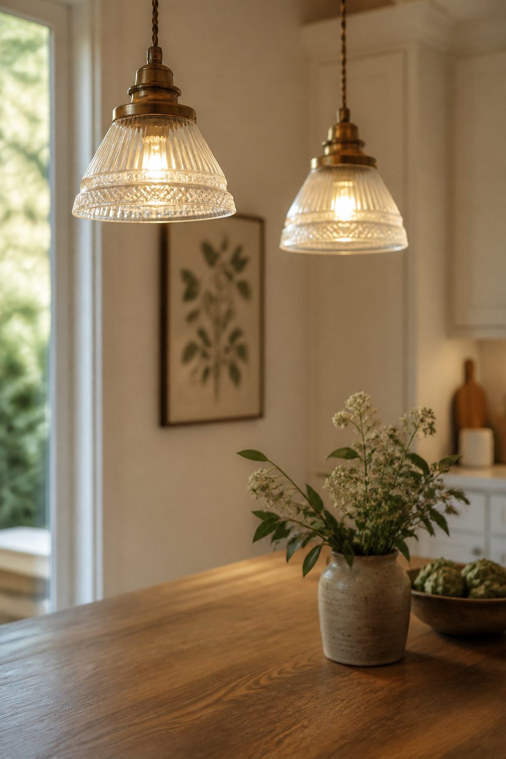
Vintage glass lighting fixtures are poised for a big year in 2025, and rewiring them for modern use is straightforward work any electrician can handle.
You’re keeping a piece of design out of a landfill, and the sustainability is real for a kitchen project that already runs through material fast.
Pendants over the island should be the star vintage piece, maybe one large globe or a clustered set of schoolhouse shades.
Sconces beside windows fill in the layers without competing, especially in a kitchen where cabinets and appliances already fight for attention.
Retro-style fixtures with aged metals and muted finishes anchor the vintage side of the blend, but the metal finish is where this goes wrong most often.
Brass pendants, black sconces, and nickel hardware in one sight line look collected by accident, not design. Pick one dominant metal, carry it through the lighting, and if you need a second finish, keep it minor and consistent.
A vintage fixture rewired with modern guts solves the safety issue without losing the look, and that pairing of old housing with new wiring is exactly what a vintage contemporary kitchen is after.
5. Farmhouse Sinks in Modern Finishes
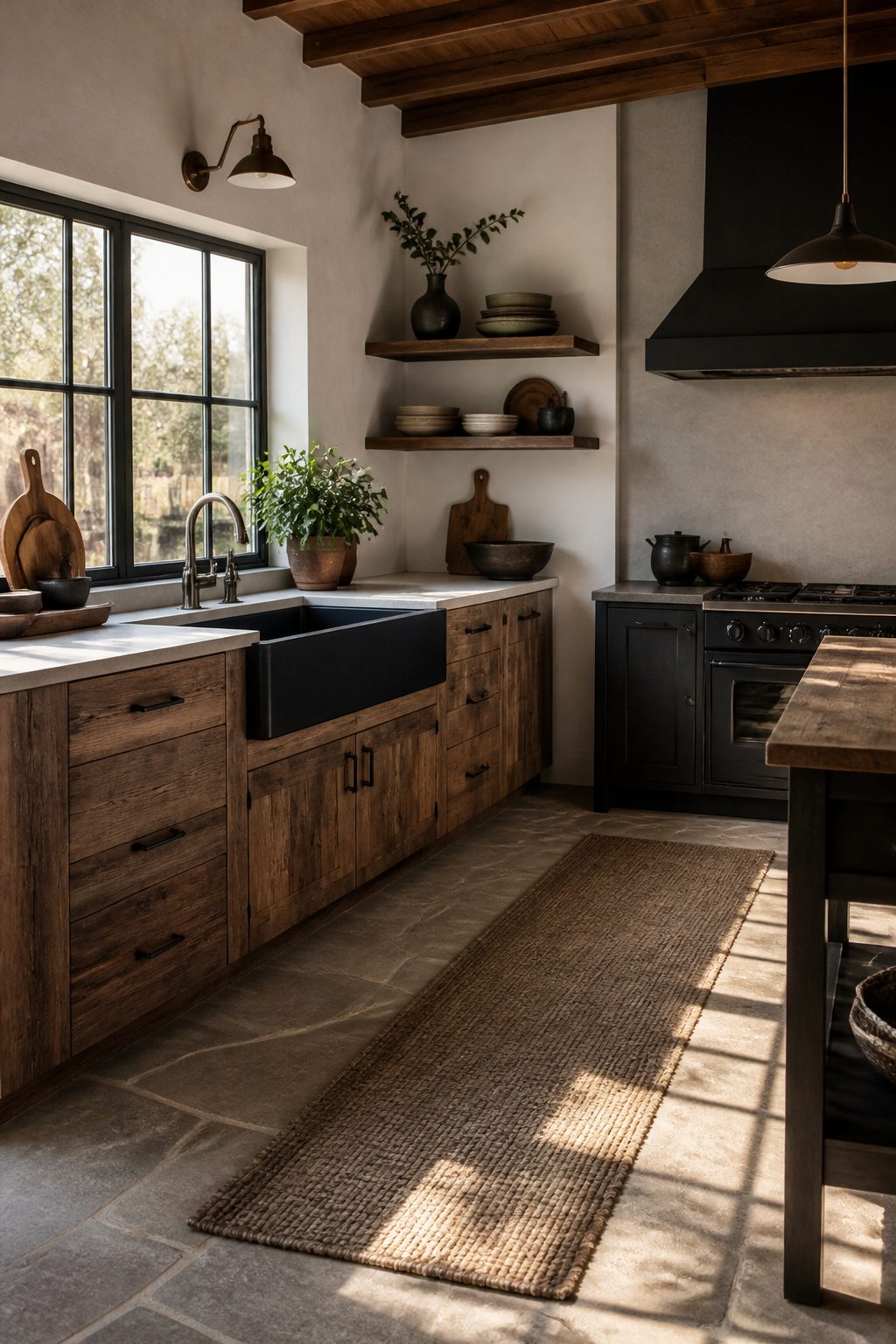
An apron-front sink carries the weight of a vintage kitchen without any retro performance headaches.
The deep, wide basin handles stockpots and sheet pans that a standard 8-inch bowl swallows awkwardly, and the exposed front panel reads as furniture against flat cabinetry.
Modern finishes keep the look from sliding into country-kitsch territory.
Matte black hides water spots better than polished porcelain ever did; brushed gray steel reads almost industrial; copper starts bright and settles into a living patina that changes with the water chemistry in your house.
Each one pairs with hardware in a way fireclay white rarely manages.
Cabinet modification is the real cost, not the sink itself. A standard base cabinet needs its face frame and doors cut away so the apron sits proud, and the drawer box behind it shrinks or disappears entirely.
You lose 6 to 8 inches of functional storage directly below the basin, which in a small kitchen is space you feel.
For a weekend project with a few hundred dollars, I would skip the farmhouse sink unless the base cabinet is already sacrificed to plumbing or a trash pull-out.
The look is strong, but the storage trade is permanent, and renters should know most landlords will not sign off on the cabinet surgery. If you own and the kitchen is short on charm, the visual anchor justifies the cut.
6. Vintage Wallpaper and Graphic Tile Backsplashes
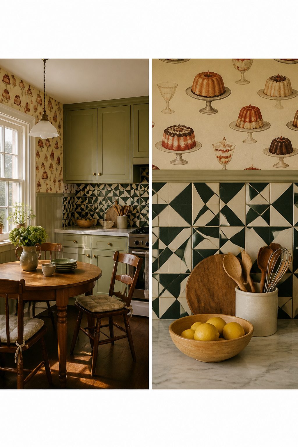
Wallpaper with vintage dessert illustrations or era-reflecting patterns adds whimsy that tile rarely matches, but paper belongs only in low-splash zones: a breakfast nook, the side wall beside cabinets, or anywhere protected by a range hood’s coverage.
Behind the range and sink, graphic tile wins.
Grease and moisture destroy paper over time, and no sealant fully solves this in a working kitchen. The 1960s and 1970s palettes now returning favor bold tile there: multihued patterns or textured distressed tin that reads vintage without the vulnerability.
I would skip floral accent tile unless the rest of the kitchen is deliberately farmhouse; in a mixed-era space, it tilts too sweet.
The practical split is simple: wallpaper for charm where hands and splatter rarely reach, tile for the two walls that take the actual work.
7. Vintage Furniture as Kitchen Pieces
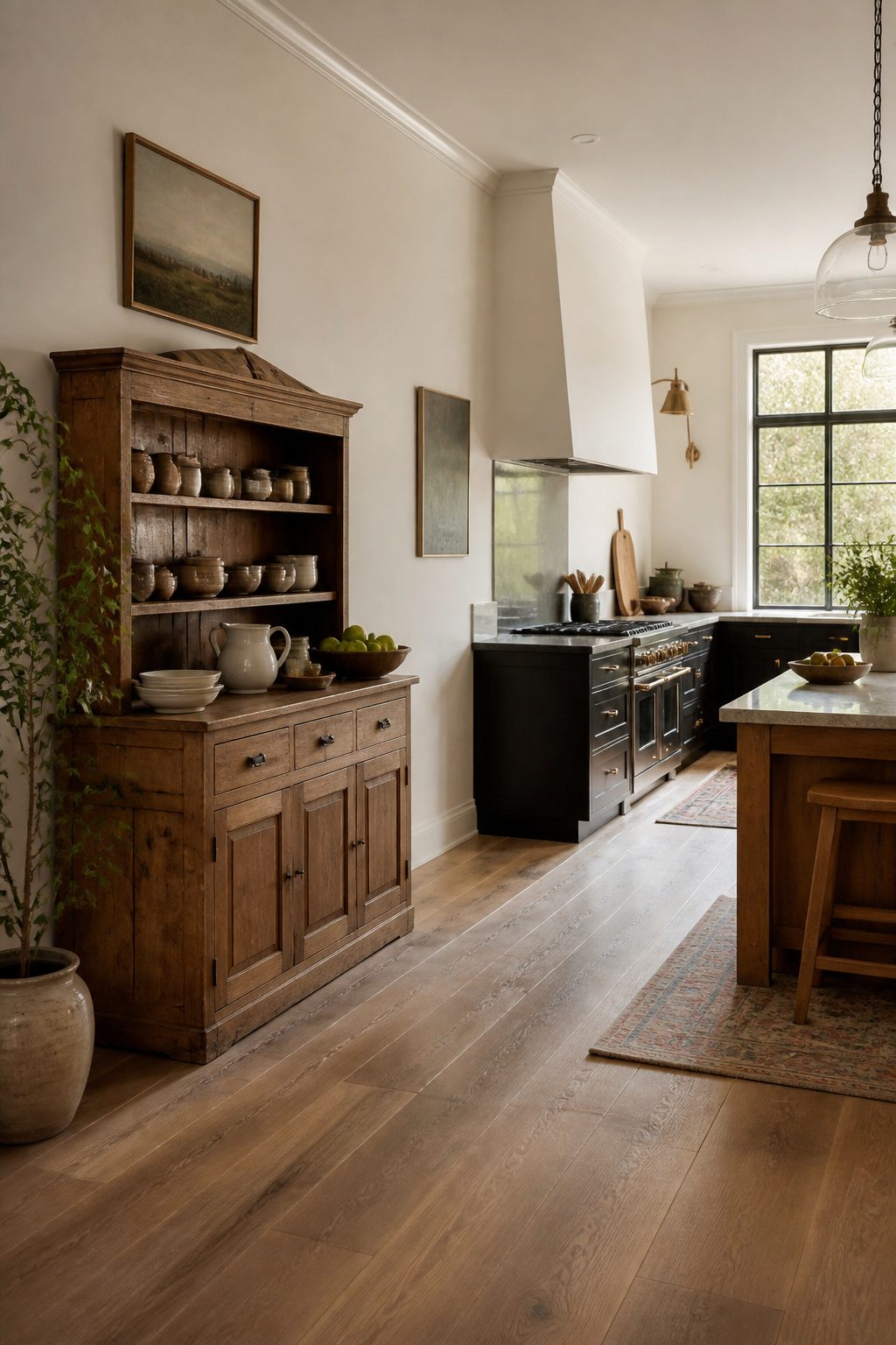
A vintage hutch parked against one wall does what rows of matching cabinets cannot: it makes the kitchen feel gathered over time rather than installed in a single afternoon.
I prefer a freestanding piece for the tension it creates against sleek countertops and flat-panel doors. The eye registers the difference in depth, the slight wear on the feet, the hardware that does not match anything else in the room.
The practical hurdles are real and worth counting before you haul one home.
Electrical access is the first test: most hutches and sideboards were built before anyone planned for a coffee grinder or stand mixer, so map your outlets before you commit to placement. Counter height mismatch is the second.
A standard dining table runs 28 to 30 inches; kitchen counters sit at 36. That gap matters if you plan to prep on the surface, though I find it less annoying for baking or staging than for everyday chopping.
You can live with the difference, or add a thick cutting board to bridge it, but do not pretend the two planes are the same.
Safety is the last consideration and the one I would not skip. A tall hutch on a wood floor will walk during an earthquake or even a heavy door swing.
A furniture strap to the wall stud costs little and takes ten minutes; without it, you are betting the piece stays put forever.
Historic kitchens held multiple furniture pieces because nothing was built in, and that layering is exactly the atmosphere a vintage contemporary kitchen is after. Just build it in enough to keep the china from walking into the next room.
8. Decorative Accents and Collected Kitchenware
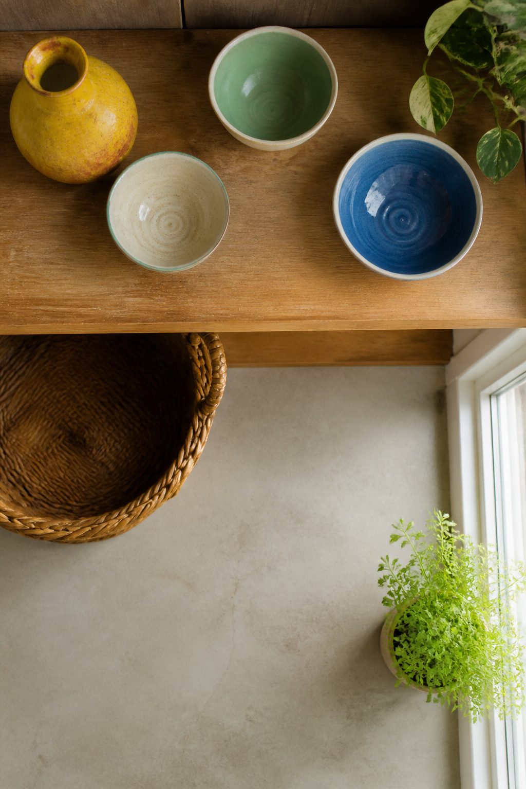
Vintage kitchenware, artwork, and collected objects are where I tell most people to start if they want to test whether a vintage contemporary kitchen actually works for them.
A set of three enameled bowls or a framed botanical print costs far less than swapping cabinets, and it comes back out if the mood passes.
The line between display and clutter is breathing room.
Group pieces by one material, brass with brass or iron with iron, or by a single color family rather than mixing eras randomly. Leave more empty shelf than full; the eye needs somewhere to rest.
I rotate pieces seasonally, four times a year, which keeps the look fresh and stops the collection from becoming invisible background noise. A kitchen counter lamp in wicker or brass, set against open shelving, gives warmth that overhead lighting flattens.
Flea markets and estate sales are the practical source for this layer.
Condition matters less than proportion and patina; a chipped plate reads as history, a crowded shelf reads as mess. This is the lowest-commitment entry point in the whole vintage contemporary mix because nothing is wired, plumbed, or permanently installed.
9. Open Shelving for Display
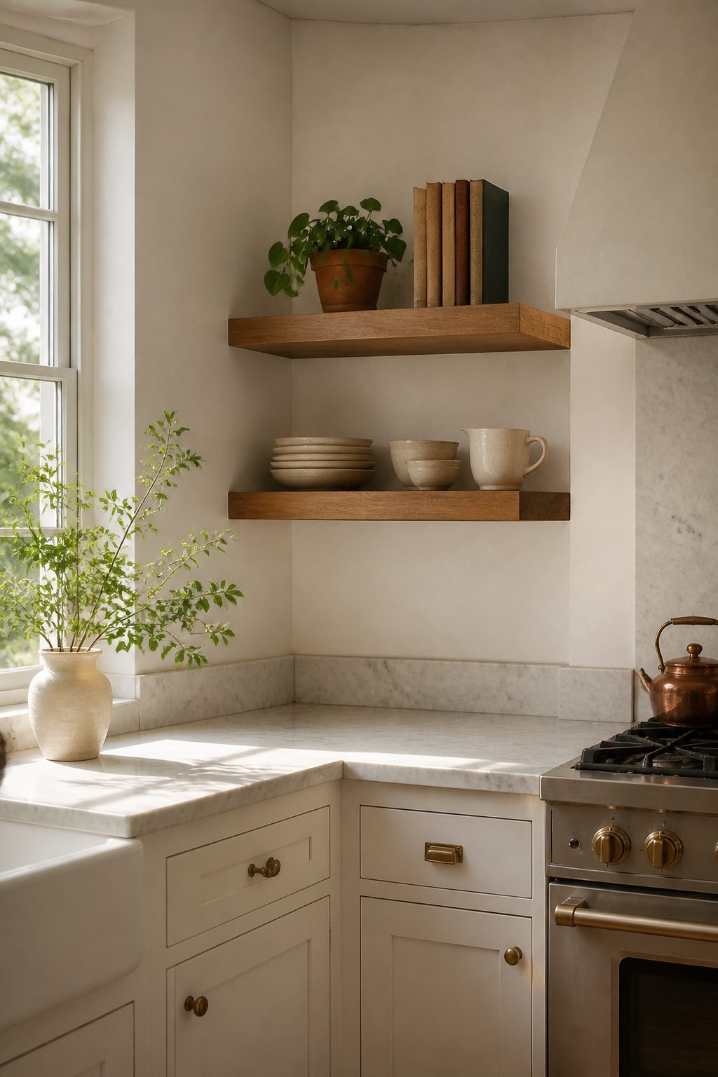
Open shelves in a vintage contemporary kitchen work best when they act as a focused display, not a storage default.
I mount them where grease and moisture are least aggressive, away from the range hood and sink splash zones, because dust settles and cooking residue travels farther than most people account for.
The rule of three applies to what sits there: three antique candlesticks, a trio of ceramic vessels, or a small stack of vintage cookbooks with a single object propped beside them.
Anything you use daily and anything that hides dirt belongs behind closed doors.
Spacing makes or breaks the look. Shelves packed tighter than 12 inches apart read as cluttered even when the objects are sparse; stretches above 24 inches between levels feel abandoned unless you stage tall pieces to fill the vertical gap.
I leave breathing room around each grouping, roughly the width of the object itself, so the eye registers intention rather than accumulation.
The maintenance is real: plan to wipe the shelf face and re-arrange every three to four weeks, or the display drifts into disorder faster than cabinets ever would. Open shelving rewards the objects you love enough to dust.
10. Reclaimed Wood and Natural Stone
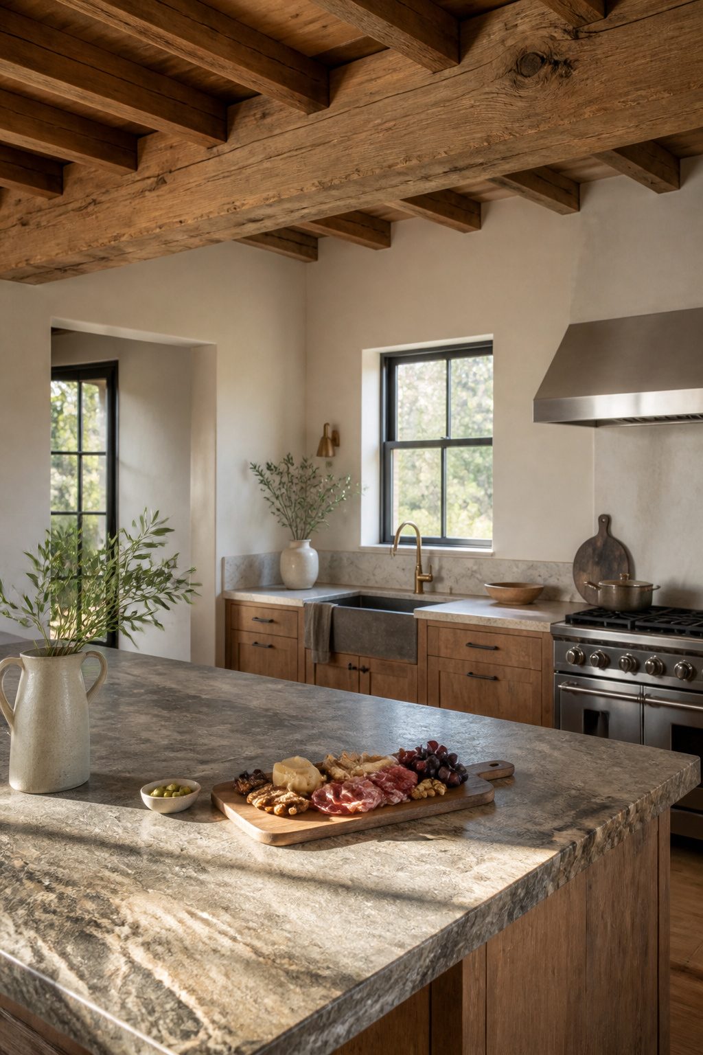
Reclaimed wood and natural stone are the two materials that actually deliver the vintage half of a vintage contemporary kitchen, because both carry texture you cannot fake with paint or laminate.
Wood works best where it catches light from above: open shelves, ceiling beams, or a single exposed rafter. Reclaimed boards with their nail holes and saw marks give you patina that took decades to build, not a factory finish.
New wood can be distressed, but the wear pattern is uniform in a way old timber never is. You will spend more time on upkeep.
Reclaimed wood moves more, checks more, and needs oil rather than polyurethane if you want it to keep breathing. I would not put it near a steam line or a sink base unless it is already stabilized.
Stone belongs underfoot or underhand: countertops, flooring, a backsplash behind the range. A stone wall around a window, even in $150 faux veneer, adds the same grounded weight.
Real stone needs sealing; faux does not, but it also will not acquire the subtle staining that makes limestone or soapstone look settled in after five years of cooking.
Where the two meet, let one lead.
A beam and a stone wall in the same sightline fight each other unless the palette stays quiet, the greens and tans and soft blues that let the materials do the aging for you.
Why the 80/20 Rule Keeps It Coherent
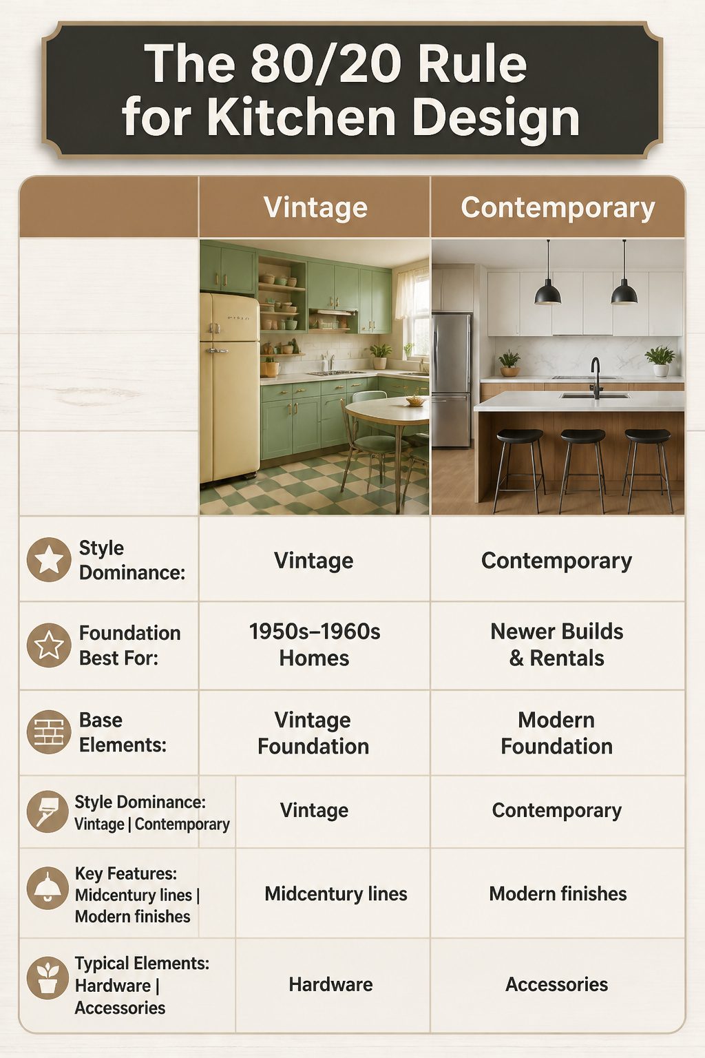
A kitchen that is exactly half vintage and half contemporary reads like a stage set, not a room someone actually cooks in. The 80/20 rule fixes this.
Eighty percent of the space commits to one style as the foundation; the remaining twenty percent brings in the other as deliberate accent. That ratio keeps the eye from bouncing between competing eras.
Which style takes the 80 percent depends on what you cannot change. In a home built in the 1950s or 1960s, midcentury-modern lines already belong to the architecture, so vintage should dominate and contemporary elements layer in through hardware or lighting.
For a newer build or a rental with generic finishes, modern countertops and flooring are the practical foundation, and vintage character arrives through cabinets, textiles, or a collected accessory like a grandmother’s tea towels.
The permanent elements, the ones that cost thousands to replace, should almost always sit in the dominant 80 percent. Paint and smaller pieces handle the 20 percent swing.
Warm Palettes That Bridge Both Styles
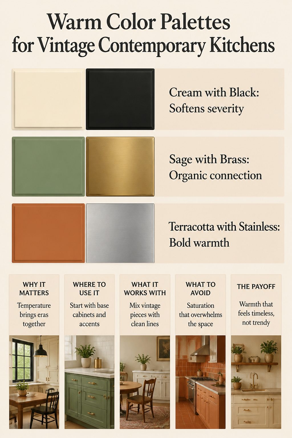
Cream against black is the pairing I keep coming back to when a kitchen risks feeling either too clinical or too dated.
The cream softens the severity of matte black hardware or window frames, while the black keeps cream from reading as builder-grade beige.
In a vintage contemporary kitchen, this temperature play matters more than the specific shades chosen. Warm undertones pull disparate eras toward each other.
Sage with brass operates on the same principle.
The green carries enough gray to feel current, but its organic root connects to the painted cabinets of earlier decades. Brass, particularly when it carries some patina rather than mirror polish, bridges the same gap.
I would use this combination on base cabinets with brass pulls rather than spreading it across uppers too; the restraint keeps it from sliding into theme-park territory.
Terracotta against stainless is bolder and more polarizing. The clay tone introduces the warmth that raw stainless and white surfaces often strip away, and it references the earth-toned kitchens of the midcentury without requiring period reproductions.
The risk here is saturation: a little terracotta, as accent tile or a single wall, does the work. A lot of it, and the contemporary side of the equation gets buried.
What unifies these combinations is deliberate warmth. Vintage kitchens were rarely sterile; contemporary ones too often are.
The temperature of your palette matters more than the specific era each color references. Cool grays and stark whites can leave vintage pieces looking like yard-sale finds rather than intentional choices.
A warm undertone, even a subtle one, lets a 1950s table sit comfortably beside a slab-front cabinet because both feel inhabited rather than displayed.
Layouts That Serve Both Aesthetics
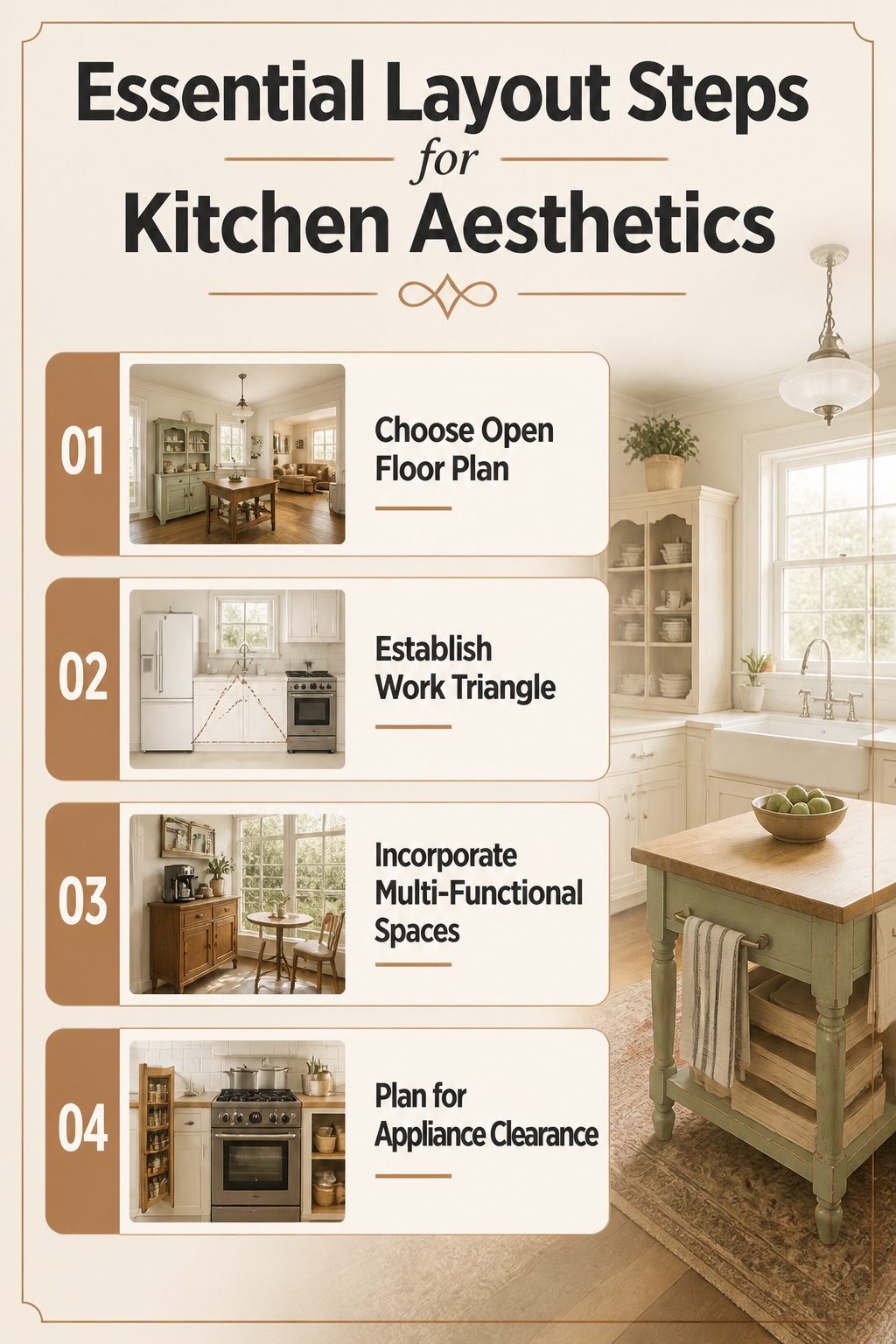
Open floor plans trace back to the post-WWII housing boom, and they still serve a vintage contemporary kitchen better than any walled alternative. Keep that openness while your freestanding pieces do the work walls used to.
A vintage hutch or butcher block island can anchor a prep zone without sealing it off, but you need 36 inches of clearance on all sides for standard appliance doors to swing and for you to work.
Less than that, and the piece becomes an obstacle.
The work triangle still matters, even when your "cabinets" are a 1950s sideboard you found secondhand. I place the refrigerator, sink, and primary cook surface first, then fit the vintage furniture into the gaps.
A bridge faucet with cross handles, like the ones Vintage Tub carries, reads old but connects to modern plumbing; the cross detail gives the eye something vintage to land on without fighting the layout.
Multi-functional spaces are where this pairing gets tense. That same sideboard might hold mixing bowls and serve as your coffee bar, but vintage furniture rarely includes the vented storage or heat shielding a modern appliance demands.
I keep hot equipment on stone or metal surfaces, never directly on wood, and I leave the top drawer empty for trivets.
The solarium-style breakfast nook, borrowed from mid-century indoor-outdoor living, works here: large windows, a small table, and no built-in seating that locks the room into one use.
The light makes the vintage pieces feel intentional rather than crowded, and the space can shift from morning coffee to evening prep without a renovation.
The real limit is appliance clearance. A standard range needs 30 inches of width and 24 inches of depth; a vintage cabinet rarely matches.
I build the gap into the design, using open shelving or a slim pull-out spice rack to bridge the inches. It looks deliberate because it is.
Mid-Century and Farmhouse as Starting Points
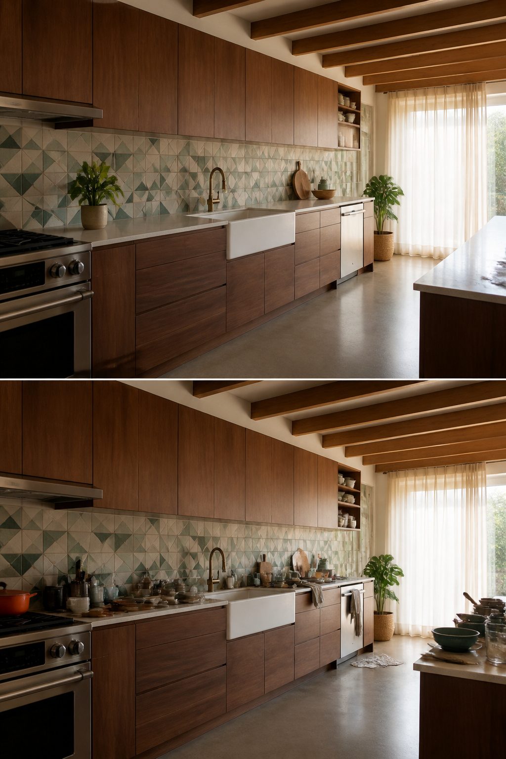
Mid-century modern and farmhouse are the two vintage styles that slide most naturally into a contemporary kitchen, though they ask for different cabinet choices to pull it off.
A mid-century look leans on flat-panel cabinets, walnut millwork, and geometric tile from the 1950s and 1960s.
I pair those with contemporary appliances and bypass sliding doors with round metal pulls for the clean lines that keep it from feeling like a set piece.
The farmhouse route draws on early American rural dwellings: exposed wood ceiling beams, unfinished wood cabinets, natural stone in quiet greens or tans, and a single-basin apron sink.
Shaker cabinets bridge that best with modern layouts, and sheer curtains over the windows keep the light the style depends on.
The overlap sits in the wood itself.
Both styles use natural grain as the warmth that softens contemporary edges, and both favor smart layout over ornament. Choose flat-panel for mid-century, shaker for farmhouse; switch them and the kitchen reads confused, not blended.
Where I see people stumble is forcing the two together: walnut slab doors beside a farmhouse apron sink fight each other unless the palette stays ruthlessly quiet.
Pick one lineage and let the contemporary element be the appliances, not a second vintage story.
Frequently Asked Questions
How do you make a modern kitchen look vintage?
Add vintage charm through decorative accents, textures, and colors rather than replacing major surfaces.
A set of enameled bowls, a framed botanical print, or collected brass objects costs far less than new cabinets and comes back out if the mood passes.
Group pieces by one material or a single color family, leave more empty shelf than full, and rotate seasonally to keep the look fresh.
What are some vintage kitchen design trends?
Retro appliances with rounded silhouettes in mint or burgundy, turquoise or aqua cabinetry, checkerboard flooring in smaller-scale stone or porcelain tile, and vintage glass lighting fixtures rewired for modern use.
Each trend works best when surrounded by quiet, matte, modern surfaces so the vintage element reads as chosen rather than defaulted.
How can I mix vintage and modern kitchen styles?
Follow the 80/20 rule: 80 percent of the kitchen stays modern or neutral as the foundation, and 20 percent carries the retro punch.
In a newer build, let contemporary countertops and flooring dominate and bring vintage character through cabinets, textiles, or accessories. The permanent elements should almost always sit in the dominant 80 percent; paint and smaller pieces handle the 20 percent swing.




