
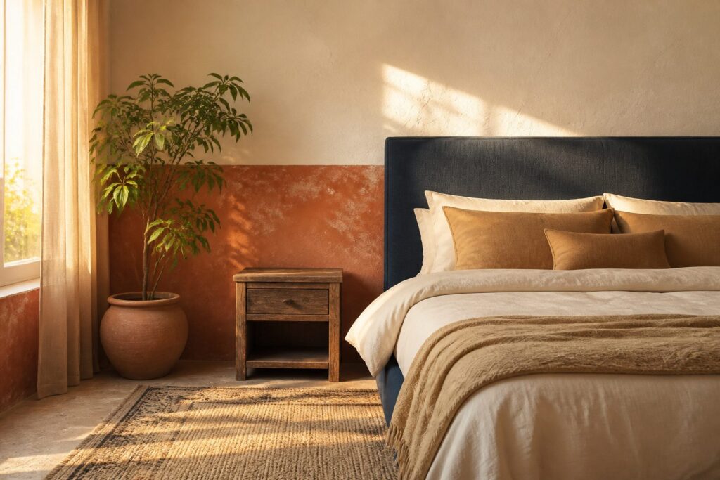
The right master bedroom color depends on which direction your windows face and what hour you actually use the room.
North-facing light turns warm creams muddy and cool grays clinical, while afternoon sun can push beige toward pink whether you want it there or not.
A $35 gallon of terracotta paint behind the bed gives renters the same grounded shelter as stone, but only if the ceiling and trim carry enough yellow to keep the contrast from going chalky.
1. Creamy White
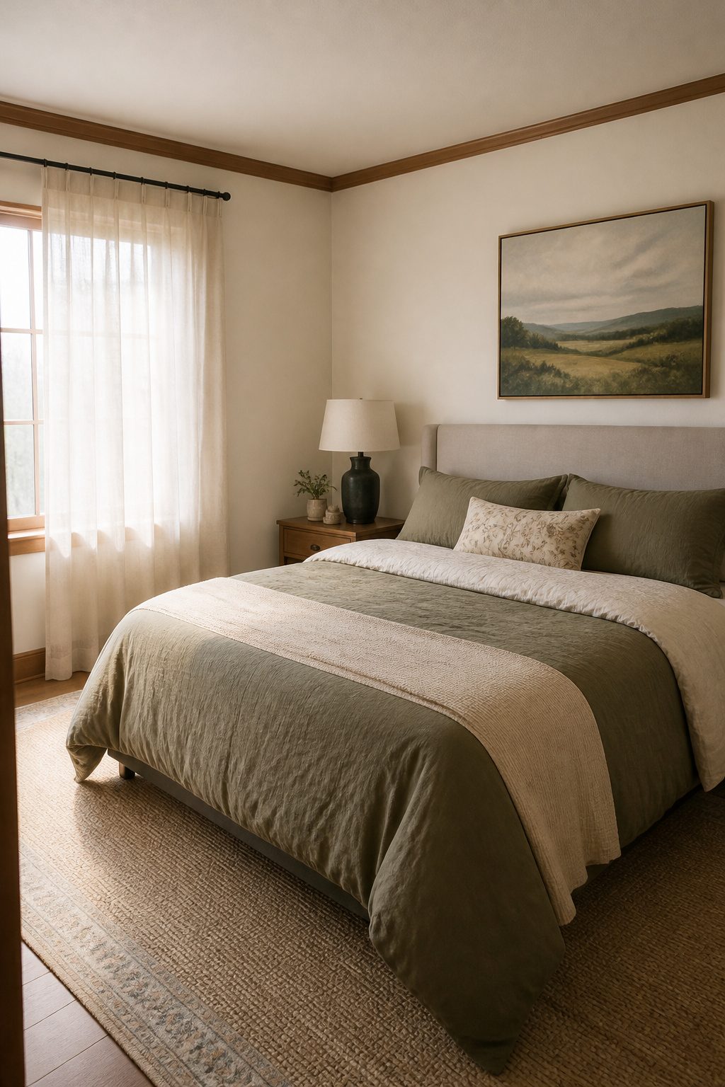
Creamy white carries just enough yellow undertone to read warm instead of clinical, which matters in a master bedroom where you want light without the jolt of a stark white ceiling glare.
It bounces morning sun around a room that might otherwise stay dim, and in mountain homes it sits right against pine or oak trim without the clash you get from cooler whites that lean blue.
I would pick this over pure white for any bedroom that faces north or gets most of its light after noon.
The wall stays quietly in the background, so your bedding, a landscape print, or even a single throw pillow can carry whatever color you want this year without fighting the paint.
Sherwin-Williams Maison Blanche hits this note exactly, a warm white with a subtle creamy glow that reads as a neutral without going beige.
The real limit is the trim. If your baseboards and casings are already a crisp bright white, creamy walls can look muddy next to them.
Either paint the trim to match in a glossier finish, or commit to the contrast and let it read intentional. For renters who cannot touch the trim, this is where I would skip creamy white and look at greige instead.
2. Light Gray
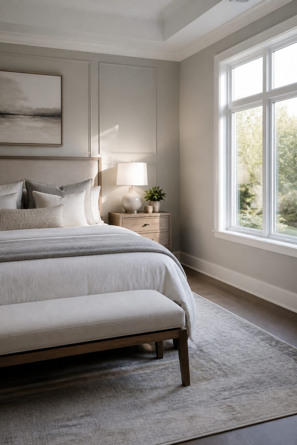
Light gray shifts with daylight in a way that keeps a master bedroom from going flat.
Morning sun pulls out any blue or green hiding in the mix; evening lamps push the same wall toward warmth. That movement is why the color has stayed popular across rooms of every size.
In a small bedroom, light gray reads as depth against white trim without closing the walls in. In a larger space, it keeps the calm from feeling empty.
The undertone decides whether the room feels serene or sterile.
Blue undertones, like those in Benjamin Moore Gray Owl, can turn cold in north-facing light. Green undertones risk looking mint under certain bulbs.
What I would pick for a bedroom that needs to stay warm is a greige undertone: Sherwin-Williams Agreeable Gray carries enough beige to resist the chill, and it stays neutral rather than swinging between gray and tan as the day changes.
Sampling matters here more than with most colors. Paint a test patch and check it morning and evening; low light deepens the shade and the undertone you barely noticed at noon can take over by dusk.
3. Jewel Tones
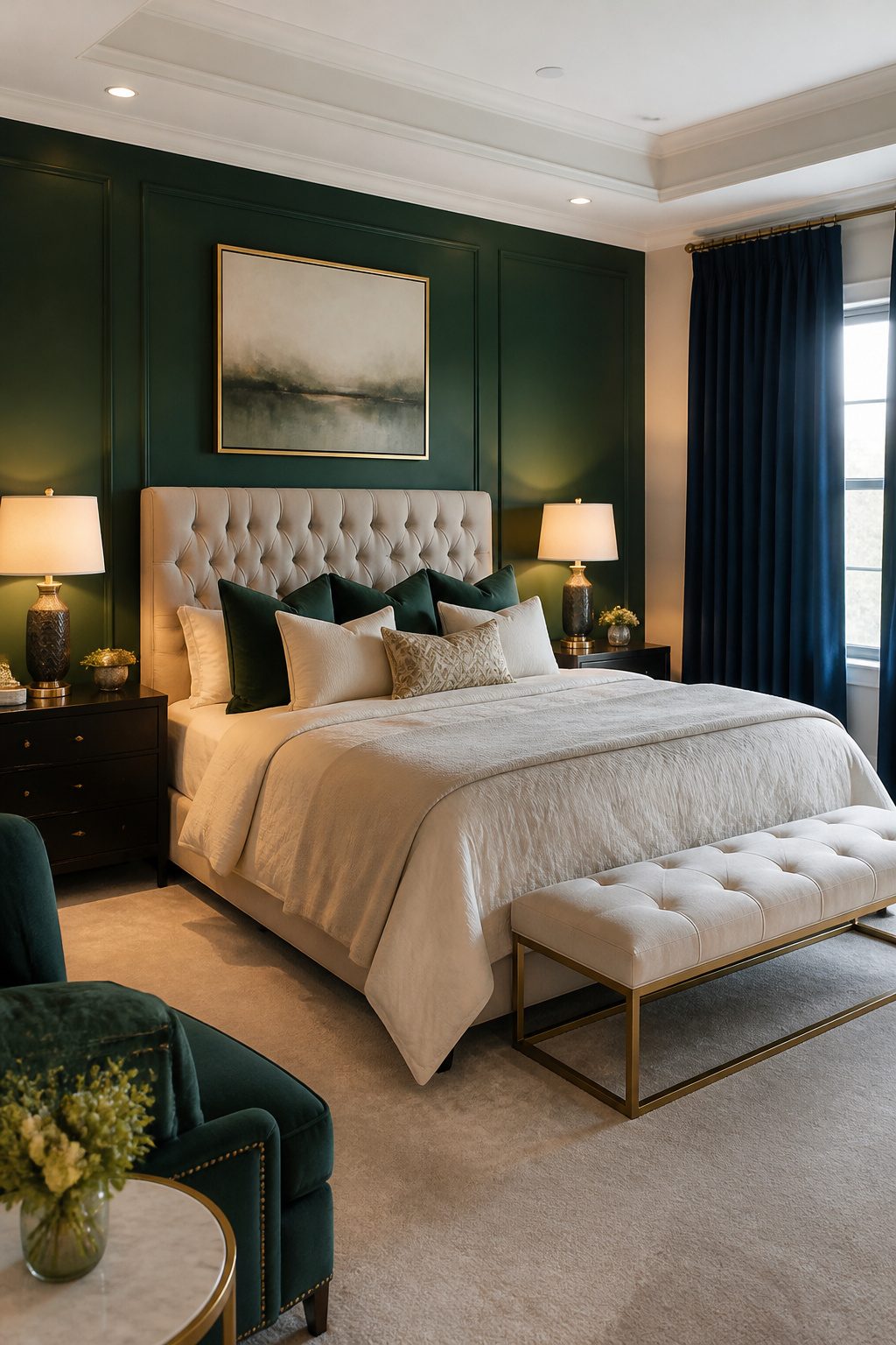
Emerald, sapphire, and amethyst read as expensive, which is exactly why they fail when they wrap all four walls of a sleep space. The saturation keeps the eye moving instead of letting it rest.
I would use any of the three, but only as a single accent against a neutral ground: one wall behind the bed, an upholstered headboard in a velvet emerald, or floor-length curtains that pool slightly on the carpet.
The move that works is pairing that bold piece with bedding kept soft and neutral.
Dark blues and greens carry an earthy, relaxing tone, but only when the room has enough natural light to keep them from flattening into black at dusk.
Skip colors that are overly saturated or bright in a bedroom; the jewel intensity belongs in a living room where you want alertness. In a master bedroom, the drama should feel held back, not staged.
If you want the luxury without the risk, sapphire on one wall with warm white on the other three gives you the depth and lets you sleep.
Amethyst curtains against greige walls do the same. Full-room ruby or emerald reads theatrical in a way that tires by morning.
4. Blue-Gray
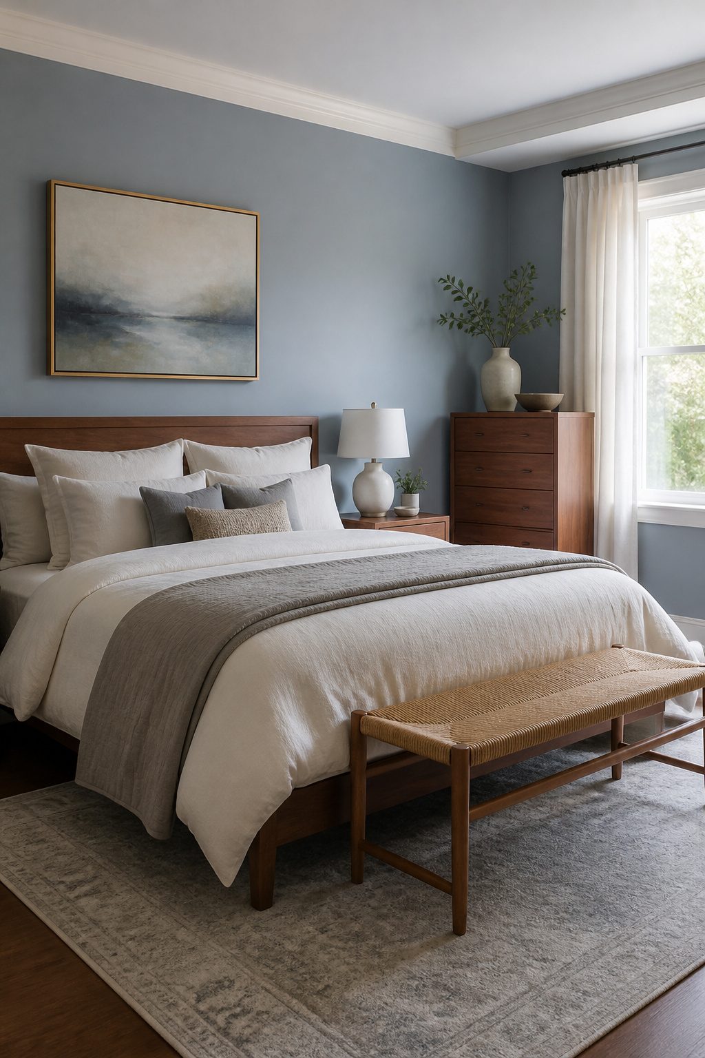
Blue-gray sits right where most master bedrooms need it: gray enough to stay neutral, blue enough to actually help you sleep.
The barely-there blue undertone reads as calm without turning the room cold, and that balance shifts with the light in useful ways.
In a south-facing room that catches strong afternoon sun, the gray comes forward and cools the space down. In a darker north-facing room, the blue steps up and adds the warmth the light itself won’t give you.
I would paint the whole room in it rather than treating it as an accent, because the value is in the overall hush, not a single statement wall.
Pair it with crisp white trim if you want the clean edge, or keep the trim the same tone and let the ceiling be your contrast.
Three colors worth testing: Sherwin-Williams Still Water for a deeper slate that still reads soft, Quietude if you want something closer to a spa wall, or Benjamin Moore Water’s Edge if the room is large enough to handle the extra depth.
Layer in warm wood furniture and soft neutrals in the bedding so the cool tone does not dominate. The mistake is pairing it with more cool gray; it will read institutional instead of restful.
5. Light Sage Green
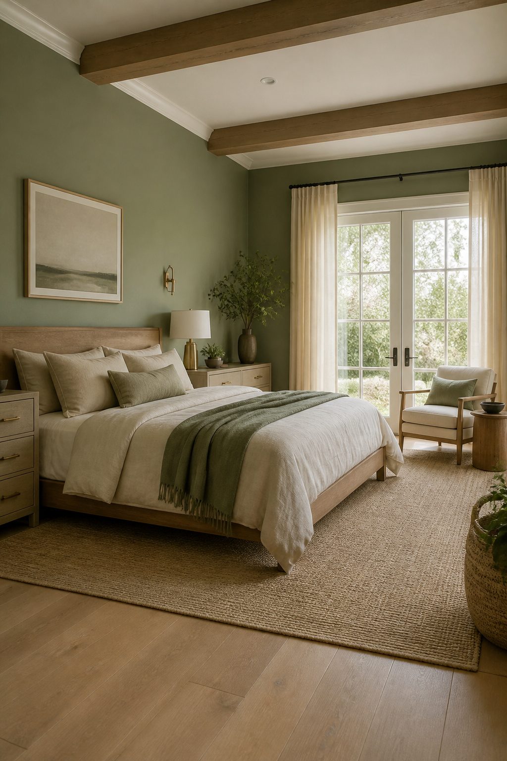
Light sage green reads as a color pulled straight from high-country meadows, and that is exactly why it settles a bedroom so quickly.
The gray undertone keeps it from going nursery-bright, so it works on every wall without closing the space in.
I would pair it with brass hardware and warm white trim, not chrome and stark white.
Brass picks up the sun-faded quality in the sage, and warm white keeps the contrast from looking like a hospital corridor. Linen bedding in oatmeal or undyed ivory finishes the look without adding another competing color.
In a modern mountain bedroom, light sage acts as the quiet backdrop for clean furniture lines and black metal accents.
In a rustic setting, it does the opposite job: it freshens up heavy wood beams and too much brown furniture that can feel like a lodge lobby.
I have seen both, and the color adapts because it is literally the tone of dried mountain grasses.
The only place I would hesitate is a room with very little natural light and cool LED bulbs; the gray in the sage can turn muddy there, and a warmer green or a beige might serve you better.
6. Beige
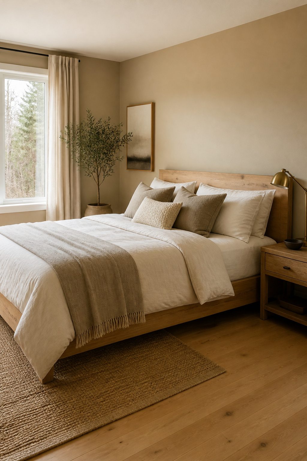
Beige is back, and this time it is warmer than the greige that dominated the last decade.
Where gray can read cold against mountain light, a true beige carries enough yellow to feel like sun on plaster without tipping into cream. The risk is the undertone.
Some beiges pull pink in afternoon western light; others turn flat yellow under warm LED bulbs after dark. Order peel-and-stick samples and move them wall to wall, checking morning and evening before you commit.
I would park a sample next to any stone fireplace or wood headboard already in the room, because beige lives or dies by what sits against it.
Accessible Beige by Sherwin-Williams carries a gray hint that keeps it steady, while Maison Blanche runs warmer and can shift peach in certain light.
Stone and raw wood both lean into beige’s warmth; painted trim in a stark white will fight it. If your bedroom has oak floors or a timber beam, beige is the neutral that lets them speak instead of competing.
7. Lavender
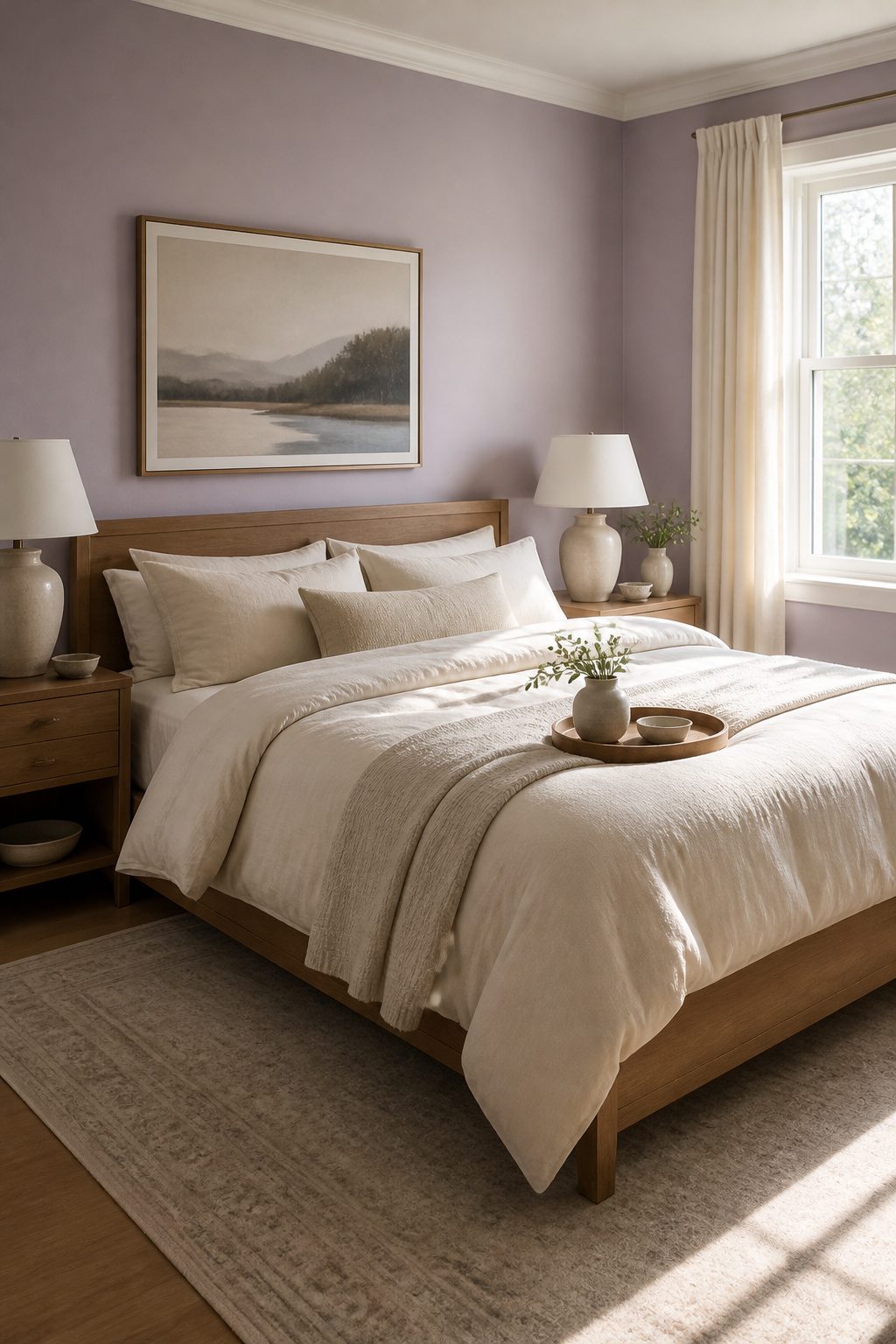
Lavender carries the calm of purple without the energy that keeps you awake.
Muted versions, the dusty ones that read almost gray in certain light, work as wall color because they recede rather than demand attention. Brighter lavenders belong on bedding or a single accent chair, where they add personality without surrounding you.
The color has a longer history in sleep research than most people realize.
Studies on environmental color and rest have included lavender alongside the more commonly cited blues, though the findings point toward softer, desaturated tones rather than the brighter shades sold for nurseries.
That distinction matters when you’re standing in the paint aisle deciding between two swatches.
For a master bedroom, I’d pick a lavender with enough gray in it to avoid reading as pastel.
Something like Sherwin-Williams’ softer offerings or a comparable muted tone from Benjamin Moore reads as sophisticated rather than youthful. The risk with this color is the nursery association, and the gray undertone is what prevents it.
On walls, pair it with warm whites on trim and natural wood tones to keep the room grounded.
As an accent, a true lavender throw or pillow set against cream or light gray bedding gives you the calm without the commitment of four painted walls. The bolder shade works there because it appears in smaller doses.
8. Navy Blue
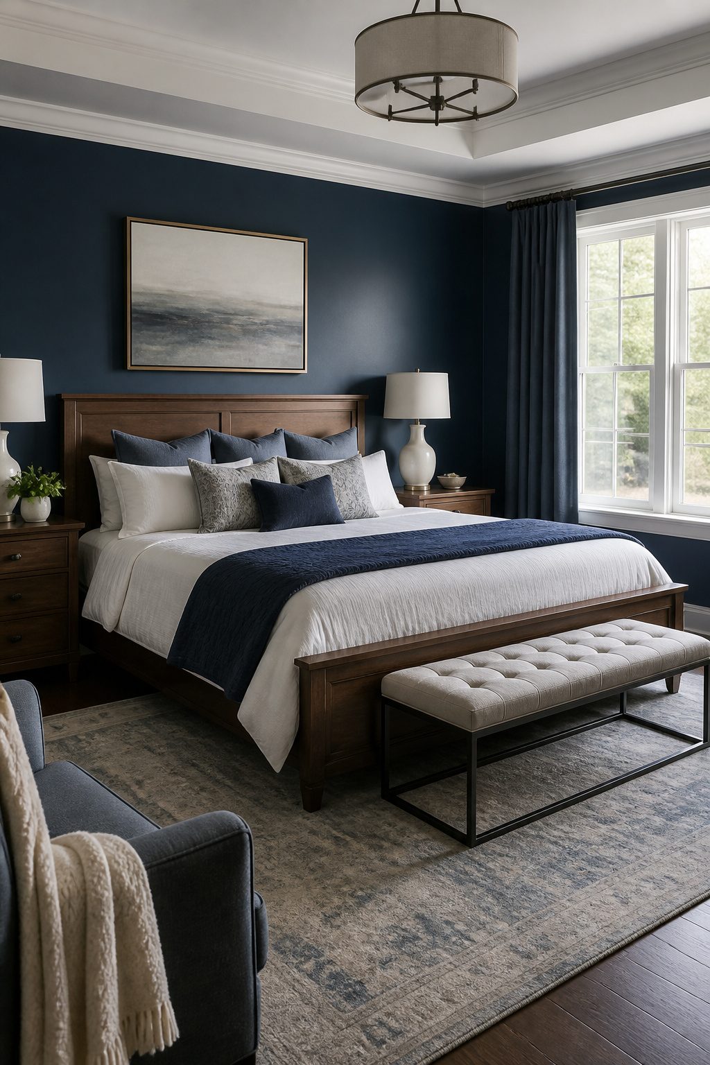
Navy blue carries drama without the gloom that darker colors can bring, and that balance comes from how it interacts with light.
Against white trim, the contrast stays crisp rather than heavy, which keeps a bedroom feeling restful instead of cavernous.
Hale Navy by Benjamin Moore sits at the center of this range: deep enough to read as a statement wall behind a bed, gray enough in its undertone to avoid reading as primary blue in evening light.
The color also recedes visually, which matters more in a master bedroom than people expect. A dark wall that advances would close a small room in; one that steps back reads as depth instead of constriction.
Hale Navy does this particularly well because the gray base cools it down, so the wall seems to fall away rather than press forward.
Where navy earns its place against softer blues is in grounding pattern. A busy duvet, a striped rug, mixed wood tones: all of that visual noise settles against a solid dark anchor.
I would use it on the wall behind the bed and keep the remaining three walls in a warm white or a tone-on-tone lighter variation, the approach that lets a bold color work without overwhelming the space.
Painting the full room navy risks turning restful into submarine; one wall with white trim is the move that lasts.
9. Dark Gray
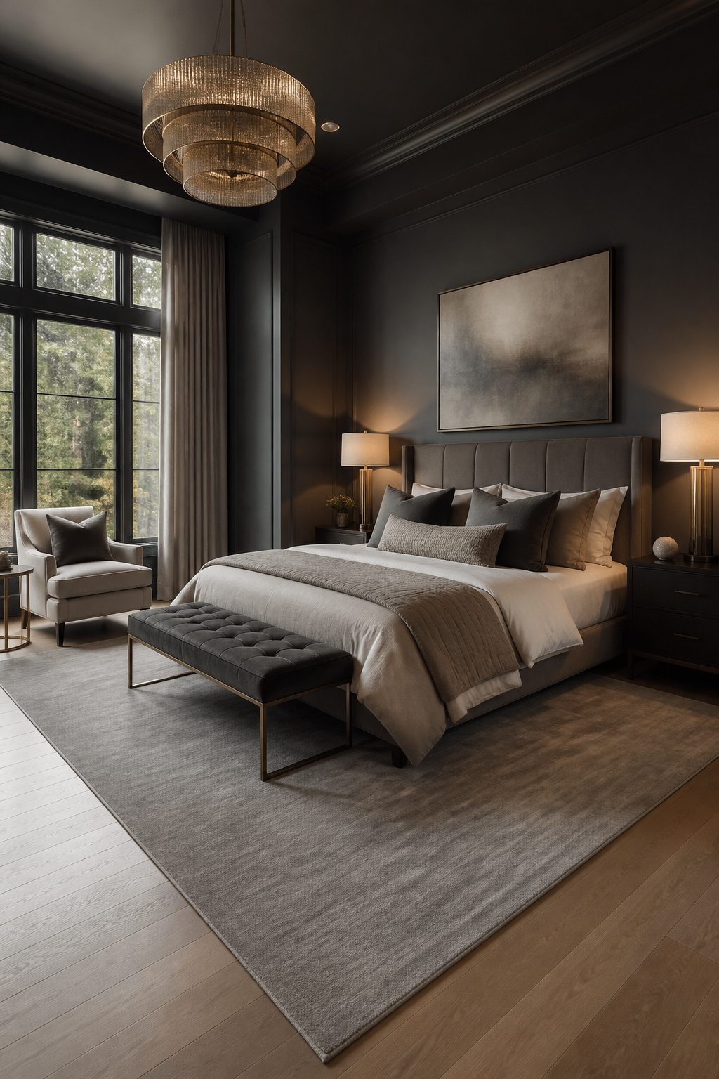
Charcoal and gunmetal sit at the deep end of dark gray, and they earn their keep as cocooning choices in large master bedrooms or on a single accent wall.
The color absorbs light rather than bouncing it back, which softens the edges of a spacious room and wraps it in something close to a physical weight.
I would paint all four walls only if the ceiling is high and the square footage is generous; otherwise the effect slips from intimate to oppressive.
The same absorption that works in a big room becomes the problem in a small one or any bedroom with north-facing windows. Light levels drop fast, and what reads as sophisticated in morning sun turns flat and cave-like by afternoon.
Testing matters here more than with lighter shades: Sherwin-Williams Westchester Gray can look dramatically different depending on how much natural light the room actually gets, so a sample board on the wall for a full day is not optional.
I would skip dark gray entirely in a compact master or one with a single window and no southern exposure.
You do give something up: you gain drama and lose hours of usable daylight. For those rooms, lighter grays or greiges do the same calming work without the penalty.
10. Earth Tones
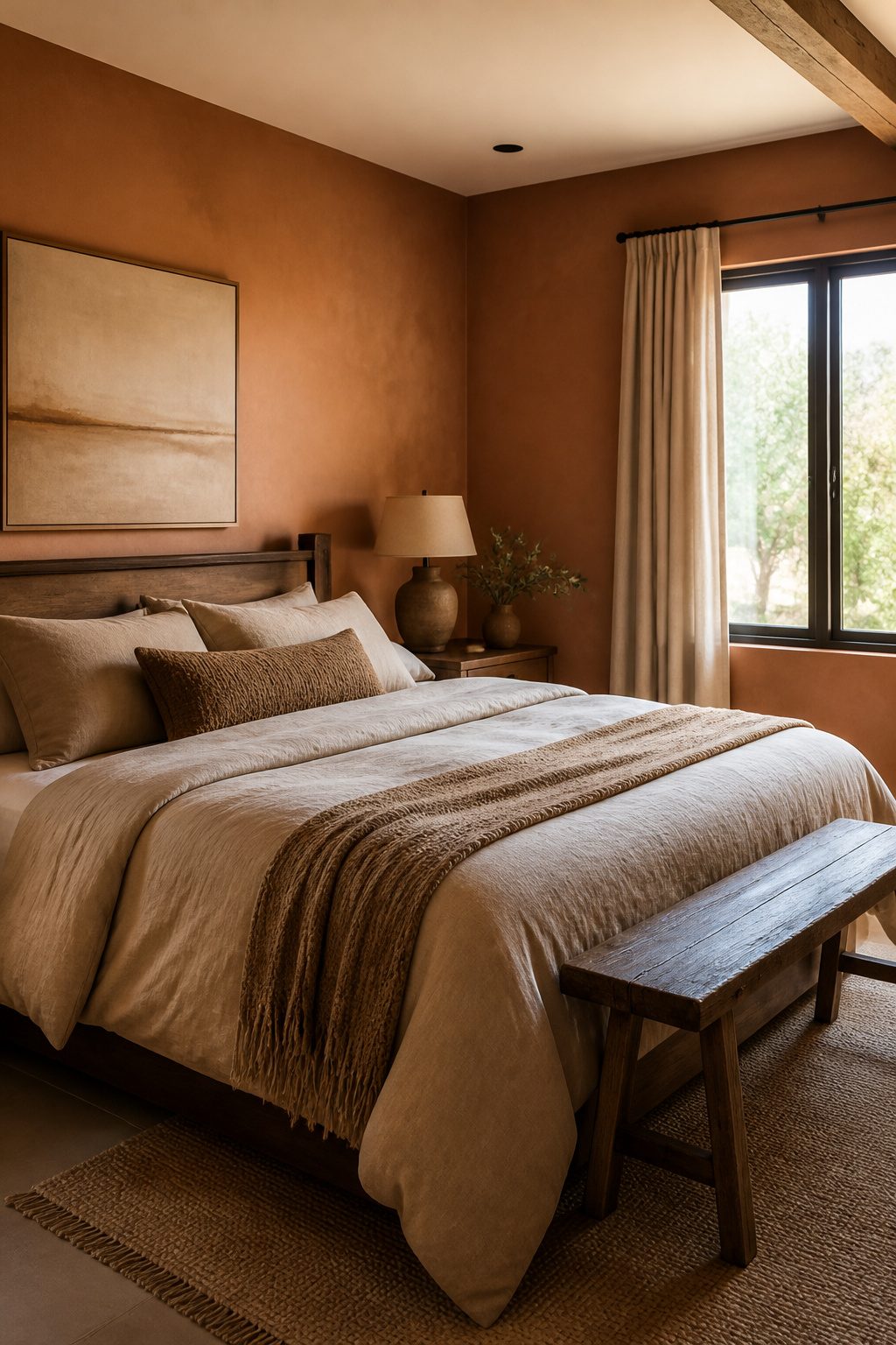
Terracotta, clay, ochre, and rust pull warmth straight from the ground itself. These are the colors of sun-baked canyon walls and the last light hitting a ridgeline before it drops.
In a master bedroom, they do the opposite of what cool colors do: they settle the space rather than open it up, and that weight is exactly what makes a room feel like shelter.
I would use these shades mainly in rooms with south- or west-facing windows, where cooler blues and greens turn flat or cold against all that direct light.
The warm undertones in clay and rust read as intended in golden-hour sun; they do not fight the room’s natural condition.
North-facing rooms are trickier. Without warm light to activate them, these colors can go muddy, and I would skip them there unless the goal is a deliberately cave-like, cocooning effect.
For renters or first-home owners, the practical path is paint, not tile or stone. A gallon of quality terracotta runs about $35–$50, and one accent wall behind the bed gives the whole room that grounded feeling without closing it in.
I would keep the ceiling and trim in a warm white with enough yellow in it to keep the contrast from going chalky.
What you give up is energy.
These colors absorb more visual heat than they reflect, so a small bedroom can feel smaller. In anything under 12 feet across, I would stay lighter, maybe ochre on one wall only, and let the rest breathe.
11. Soft Pinks and Blush Tones
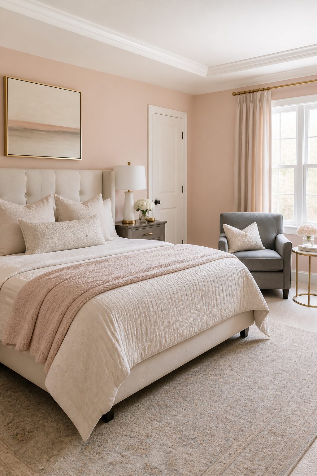
Blush reads as a warm neutral once it carries enough brown or peach in the base, not the cool pastel pink that codes juvenile.
Sherwin-Williams Likeable Sand lands in that zone: a peach-blush with soft warmth that sits quietly on walls without announcing itself as feminine.
I would pair it with gray upholstery or navy bedding, and if the room gets morning light, the tone flatters nearly every skin tone at the hour people actually look in the mirror.
Brass hardware or a brass bedside lamp sharpens the warmth instead of sweetening it further. For shared bedrooms, the advantage is that both partners read it as calm rather than decorative.
Benjamin Moore First Light runs airier and slightly cooler; I would save it for a room with strong southern exposure where the warmth needs balancing, or skip it if the trim is already a stark white.
The risk with blush is crossing into confectionery territory, and the fix is always the same: anchor it with navy, black, or raw wood and keep the finish matte.
12. Warm Neutrals and Greige
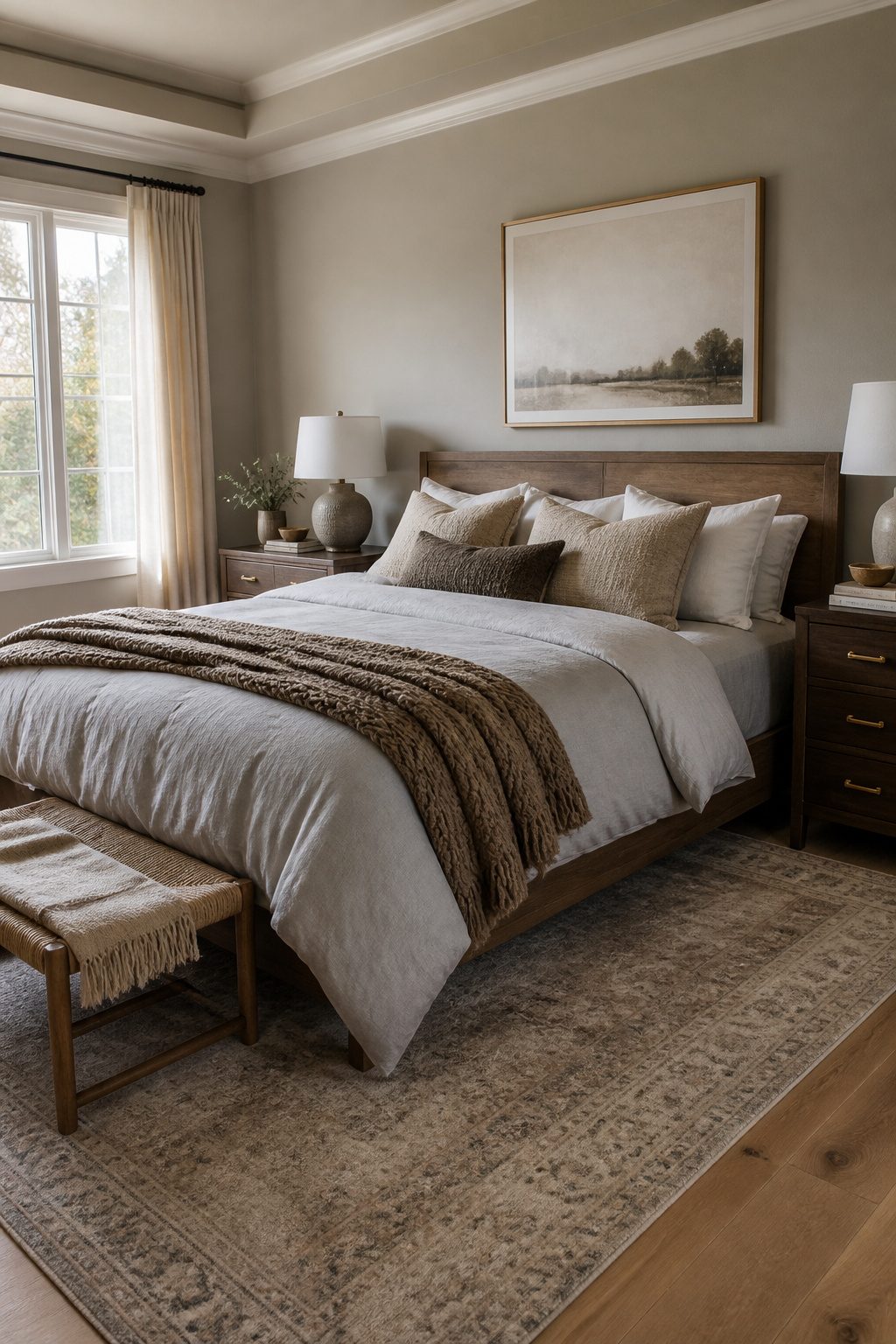
Greige earned its spot in master bedrooms color ideas from three directions at once: designers tired of cold gray, homeowners wary of dated beige, and paint companies mixing formulas that split the difference.
Sherwin Williams Agreeable Gray sits at the center of that overlap, a warm light gray that stays clear of blue or green undertones.
It reads as a soft neutral that goes with almost anything, which explains why it has stayed popular for the better part of a decade.
The problem is the light.
Agreeable Gray shifts with the hour. At noon, under direct daylight, it leans more gray.
At dusk, as the light warms and drops, it turns more beige. That same quality makes it versatile and also means the wall you love at 10 a.m. may feel different by dinner.
I would sample it on two walls, one that gets morning light and one that faces away, then live with it for a full day before buying the gallon.
If Revere Pewter feels too dark or saturated in your space, Agreeable Gray is the lighter cousin to try instead.
13. Nature-Inspired Greens
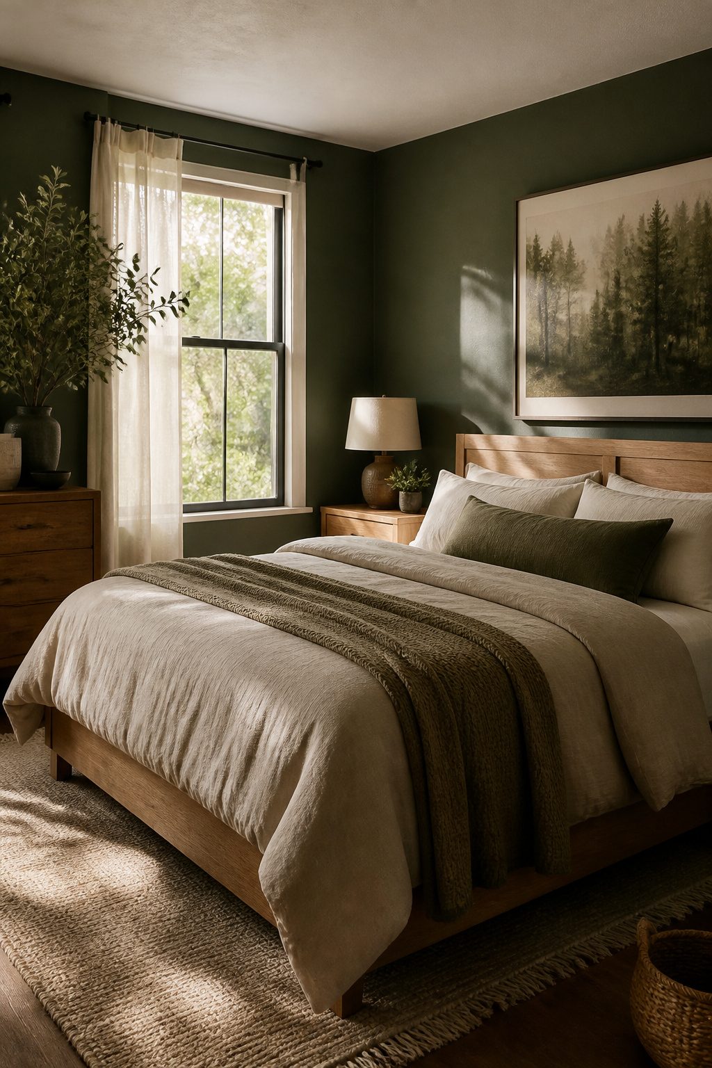
Forest green, moss, and olive sit a few shades deeper than the sage everyone already knows, and that depth is exactly what makes them work in a master bedroom.
These greens read as grounding rather than trendy, which matters when you are waking up in the same four walls every morning for years.
Sherwin-Williams Evergreen Fog and Clary Sage both carry that muted quality, but the darker end of the range, olive-gray tones like Behr Black Bamboo, do something different on a full wall: they flatten visual clutter and let natural materials take center stage.
I would use these greens in three situations. First, when the bedroom looks out on trees or a garden, the color extends the view inward instead of framing it like a picture.
Second, when you already own linen bedding, a rattan pendant, or a wool throw, because olive and moss pull those textures forward in a way white or gray never does.
Third, when you want to paint all four walls but worry about closing the room in; the darker values here read as shadow rather than weight, especially in morning light.
The risk is choosing a green with too much yellow. Black Bamboo works because it stays olive; a brighter moss can turn a north-facing room sour by afternoon.
I would test a 2-foot square on the wall that gets the least sun and live with it for two days. If it still feels calm at dusk, you have your color.
14. Deep Cocooning Shades
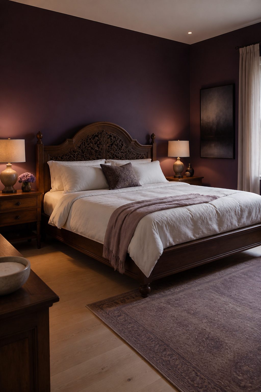
Chocolate brown, aubergine, and near-black read as walls that wrap around you rather than press in, but only if the room gives them space to breathe.
I would reserve these for master bedrooms with generous square footage and at least one window that throws real light during the day. In a 10 x 12-foot box, they turn cave-like fast.
The balance is non-negotiable. Pale wood floors or a bleached oak headboard cut the weight at eye level.
Bedding should read as cream or oatmeal, never another dark layer. I would skip heavy drapes entirely; sheer panels or bare windows keep the envelope from sealing shut.
Artificial light matters more here than in any other palette. A single overhead fixture leaves corners that disappear, so I would plan for bedside lamps at 2,700K plus a floor lamp aimed at the ceiling to bounce warmth back down.
Aubergine sits slightly easier than the other two; it carries enough red to register as color rather than void.
Near-black demands the most discipline, and I would only use it on a single accent wall behind the bed, never wrapping all four. Chocolate brown falls in the middle, forgiving with brass hardware but turning muddy against oil-rubbed bronze.
What you give up is morning.
These rooms do not wake you up; you bring your own energy in. For renters who need the bedroom to double as a calm retreat from open-plan living, that can be worth the extra lamp.
How Color Psychology Works in Bedrooms
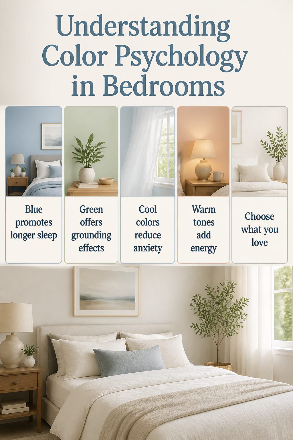
Blue walls correlate with longer sleep and feelings of protection, according to a study in Frontiers in Psychology. That makes blue the safest bet if your bedroom feels wired rather than restful.
Green works similarly, especially the muted, earthy versions like a pale gray-green with a hint of blue, which reads as grounding without going dark. Cool colors lower anxiety; warm colors do the opposite.
A warm neutral or cream can make a room feel cozy and inviting, but the same warmth that wraps around you also raises energy, so it fights the goal if you already struggle to wind down.
The real choice is diagnosing what the room lacks. If you walk in and feel keyed up, go cool.
If the space feels sterile or unwelcoming, a warm tone fixes that, but I would keep it restrained and pair it with plenty of soft white or cream in bedding and trim to keep the temperature in check.
I prefer an airy, serene space myself, so I would reach for an off-white or light gray over anything with strong pigment, but that is only the right call if you actually like waking up in a quiet room.
Paint what you can live with, because even a proven sleep color will not help if you hate looking at it.
Frequently Asked Questions
What color is best for a master bedroom?
The best color depends on what your room lacks: blue and blue-gray lower anxiety and correlate with longer sleep, warm neutrals like cream or beige fix a sterile feeling, and light sage or olive green grounds the space.
South- or west-facing rooms handle earth tones like terracotta well, while north-facing rooms need warmer whites or greiges to avoid a cold read. Test samples on two walls and live with them for a full day before buying the gallon.
How do I choose a paint color for my bedroom?
Order peel-and-stick samples and move them wall to wall, checking morning and evening light before you commit. Hold samples next to fixed materials like flooring, trim, and existing furniture to see how they interact.
Paint a 2-foot square on the wall that gets the least sun and observe it for at least a full day; low light deepens the shade and can shift undertones dramatically by dusk.
Can I use bold colors in my bedroom?
Yes, but use them strategically on one accent wall rather than wrapping all four walls.
Navy, deep green, or charcoal behind the bed reads as drama without overwhelming the space, especially when the other three walls stay in a softer neutral or tone-on-tone lighter variation.
Keep bedding soft and neutral, and make sure the room has enough natural light so bold colors do not flatten into black at dusk.
What are the best colors for a master bedroom?
Timeless choices include creamy white for north-facing rooms, light gray with a greige undertone for versatility, blue-gray for sleep quality, and warm neutrals like Agreeable Gray for flexibility.
Jewel tones, navy, and deep cocooning shades work best as single accent walls. The right pick depends on your light direction, room size, and whether you need the space to feel more settled or more energized.
What are trendy bedroom colors for 2026?
These shift away from cold grays toward warmer, grounded neutrals and desaturated earth tones.
Should I paint my master bedroom and bathroom the same color?
The principles suggest considering each room’s light separately: a bathroom with different window exposure or artificial lighting may read the same paint color very differently.
Test your chosen color in both spaces before committing to a single shade across both rooms.




