
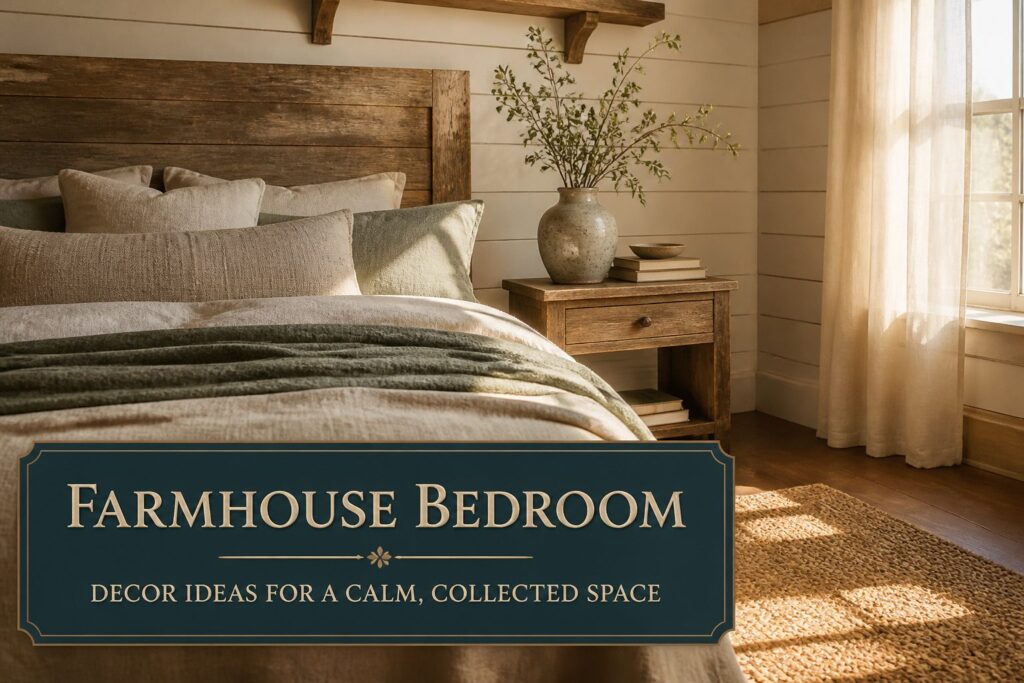
A calm farmhouse bedroom sits somewhere between a catalog spread and a room someone actually sleeps in, and the gap is usually texture.
Too much and the space becomes a chore to maintain; too little and it reads as a stage set.
The difference is whether your bedding stops at two layers or builds to four, whether your shiplap wraps one wall or all four, and whether the wood frame you chose was finished by hand or sealed under lacquer that turns every scratch into a mirror.
1. Layered Neutral Bedding
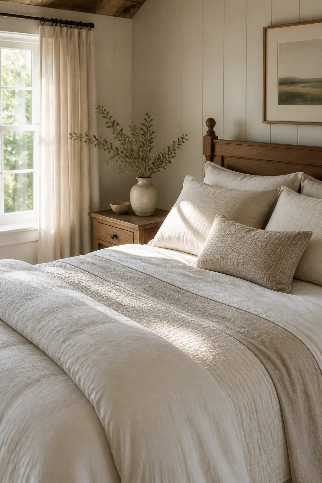
A crisp white fitted sheet sets the foundation, then a linen or cotton flat sheet adds the first real texture.
Over that goes a lightweight quilt or coverlet in cream or soft gray, and I finish by folding a duvet at the foot so the layers stay visible.
Three to four layers is the practical ceiling; past that, making the bed each morning turns into a chore you will skip.
Layered linens, blush-toned accents, and natural light create a graceful, tranquil retreat that feels both elegant and inviting.
That softness is what keeps a farmhouse bedroom from reading as rustic costume. I would skip the blush if the rest of your room already runs warm, but the neutral stack of whites and grays works in nearly any light.
2. Wooden Bed Frames
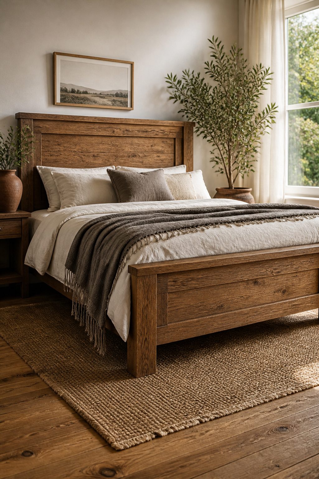
Solid wood frames ground a farmhouse bedroom in a way upholstered or metal alternatives simply don’t.
Upholstered beds read softer and more contemporary; metal skews industrial or cottage. Wood carries the weight and warmth this style needs.
Pine, oak, and reclaimed timber each hit a different price and patina. Pine runs $400–$800 for a queen frame, light in color and easy to scratch, which some people like because it ages fast.
Oak is harder, denser, and usually $200–$400 more for the same size; the grain is tighter and the color deeper. Reclaimed wood climbs to $1,200–$2,500, often with nail holes or saw marks left in, and you pay for that history.
The finish matters as much as the species. A simple platform style with visible grain keeps the look clean; ornate carvings fight the restraint that makes farmhouse work.
Matte or wax finishes show wear more gracefully than high-gloss lacquer, which catches light and turns every ding into a mirror flaw. I would take a raw pine platform with a hand-rubbed wax over a lacquered four-poster every time.
3. Shiplap Accent Walls
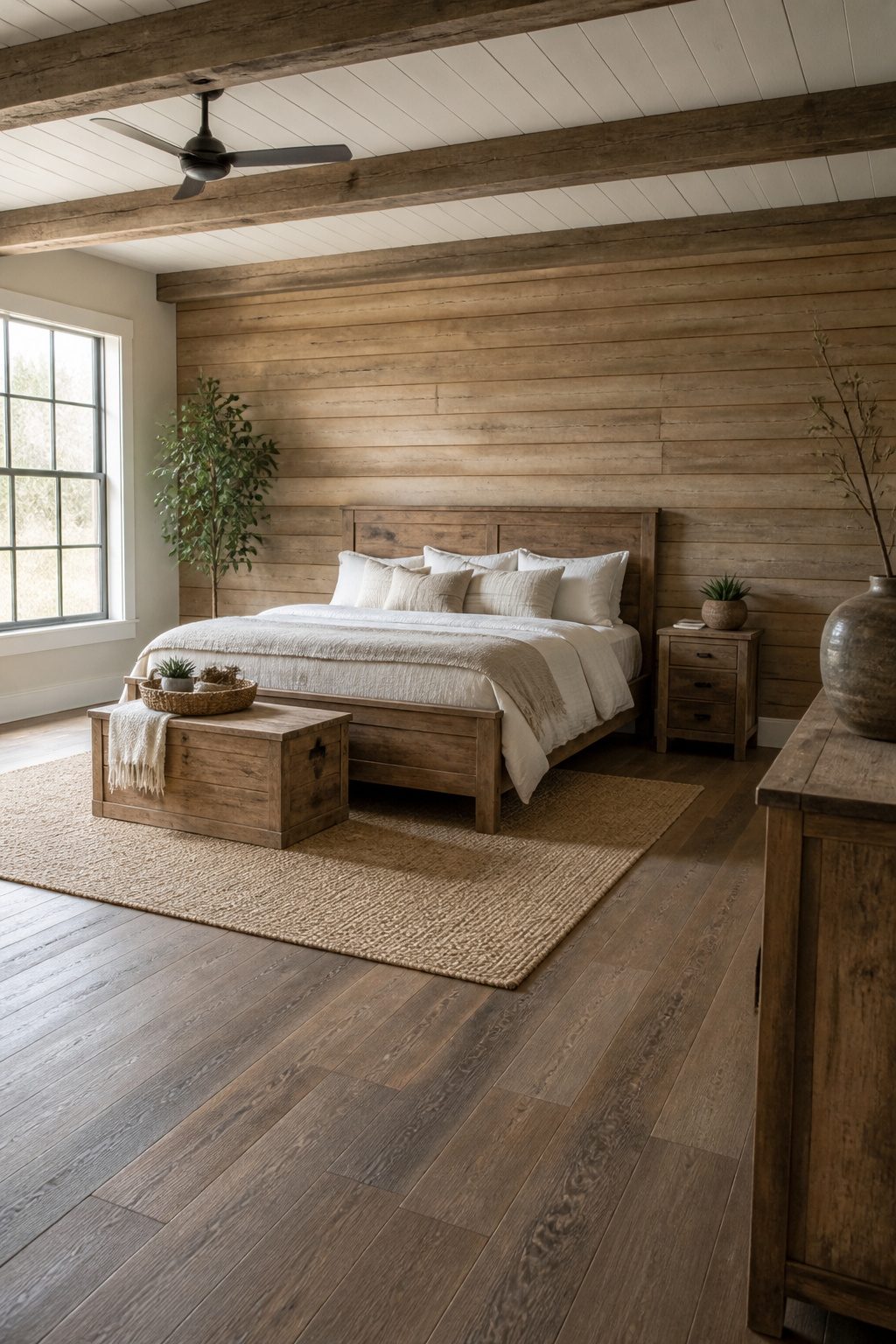
Horizontal boards read farmhouse because the eye travels the way a porch rail does, low and settled. Vertical board-and-batten pulls the gaze upward; it belongs on a Victorian exterior, not a bedroom you want to fall asleep in.
True shiplap carries a rabbet joint that leaves a narrow shadow line between boards. V-groove plywood is the stand-in most big-box yards stock, and at roughly $1.50 per square foot it undercuts real shiplap by a fair margin.
That real stuff runs $4–$6 per square foot, and the difference is in the joint detail, not just the look.
One wall behind the bed is the right dose.
Wrap all four walls and the room starts to feel like a set, not a home. I would keep the other three surfaces simple and let that single horizontal run do the work.
4. Vintage-Inspired Nightstands
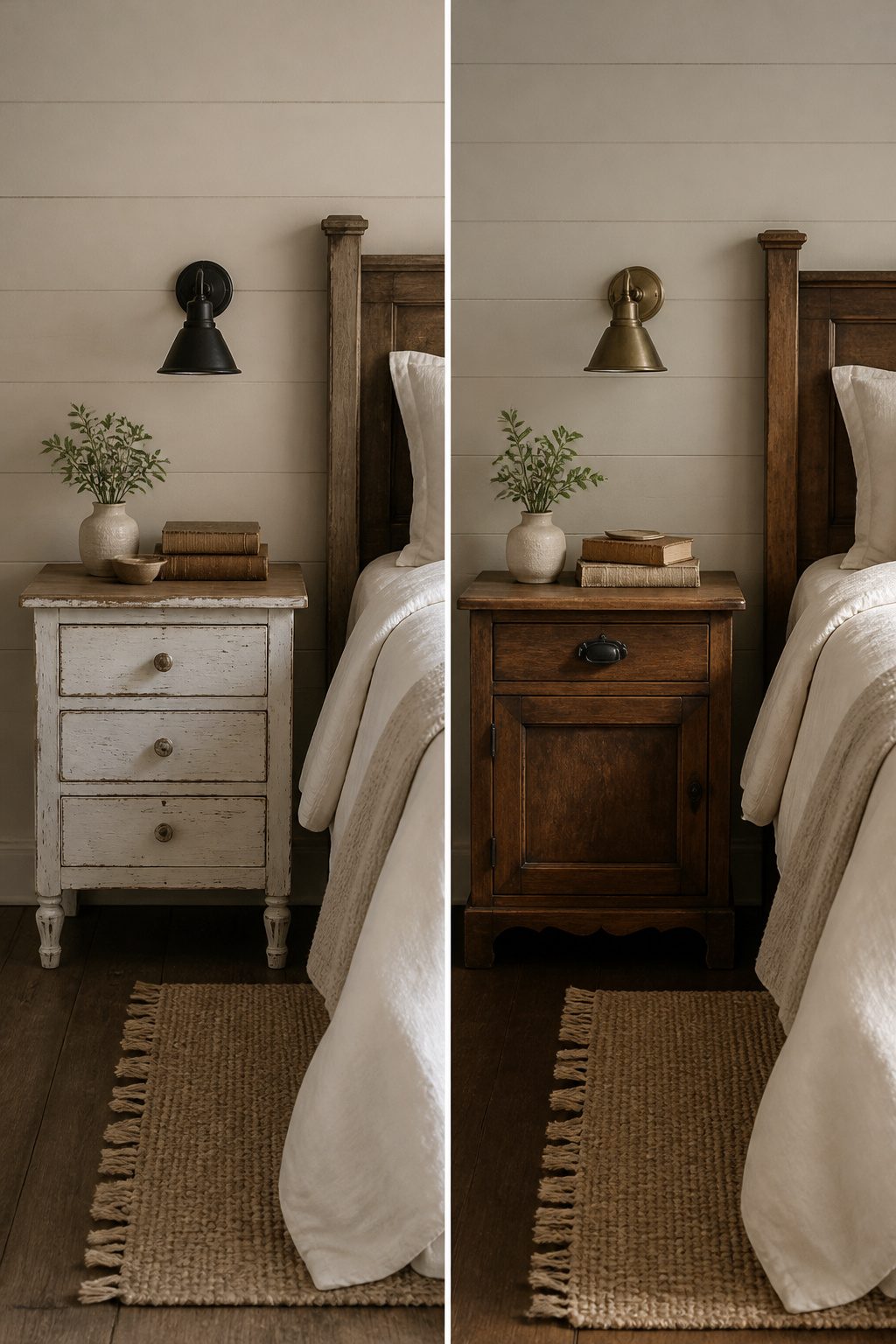
Mismatched nightstands carry more personality than any matching set from a big-box store.
I look for dovetail drawers first; the interlocking joints hold up to daily yanking better than staples or glue, and you can spot them by pulling the drawer out and checking the back corners.
Turned legs and hardware with honest patina, not the faux-distressed kind, tell you the piece earned its age.
One drawer is the minimum I would accept.
Reading glasses, phone chargers, and the book you fell asleep on need somewhere to land that is not the floor. An $80 flea-market find plus $30 in new pulls usually outperforms a $350 reproduction that only looks old from across the room.
The reproductions I have handled tend to use thinner stock and skip the dovetails entirely, which shows up inside of a year when the drawer front starts separating.
If the legs wobble, a shim under the foot or a tightened corner block fixes it in ten minutes.
A stuck drawer needs paraffin on the runners. These are small prices for a piece that did not come off an assembly line last month.
5. Chunky Knit Throws
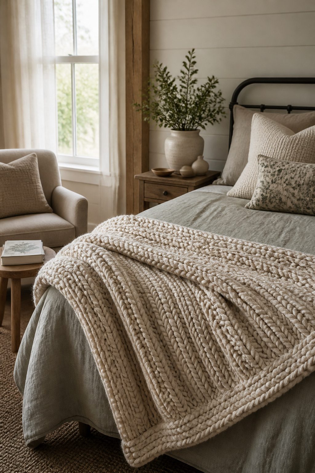
A thick, textured throw belongs at the foot of the bed or over the arm of a reading chair, where it reads as intentional rather than leftover.
Merino or acrylic blends in cream, oatmeal, or pale gray do the work here; pure wool itches against bare arms and sheds enough to turn weekly vacuuming into a chore.
A 50×60 inch throw covers one person properly without dragging on the floor, and that size shifts easily between bed and chair.
Machine-washable is worth the slight texture trade. A blanket that demands dry cleaning ends up folded in the closet, not draped where you’ll actually reach for it.
6. Layered Area Rugs
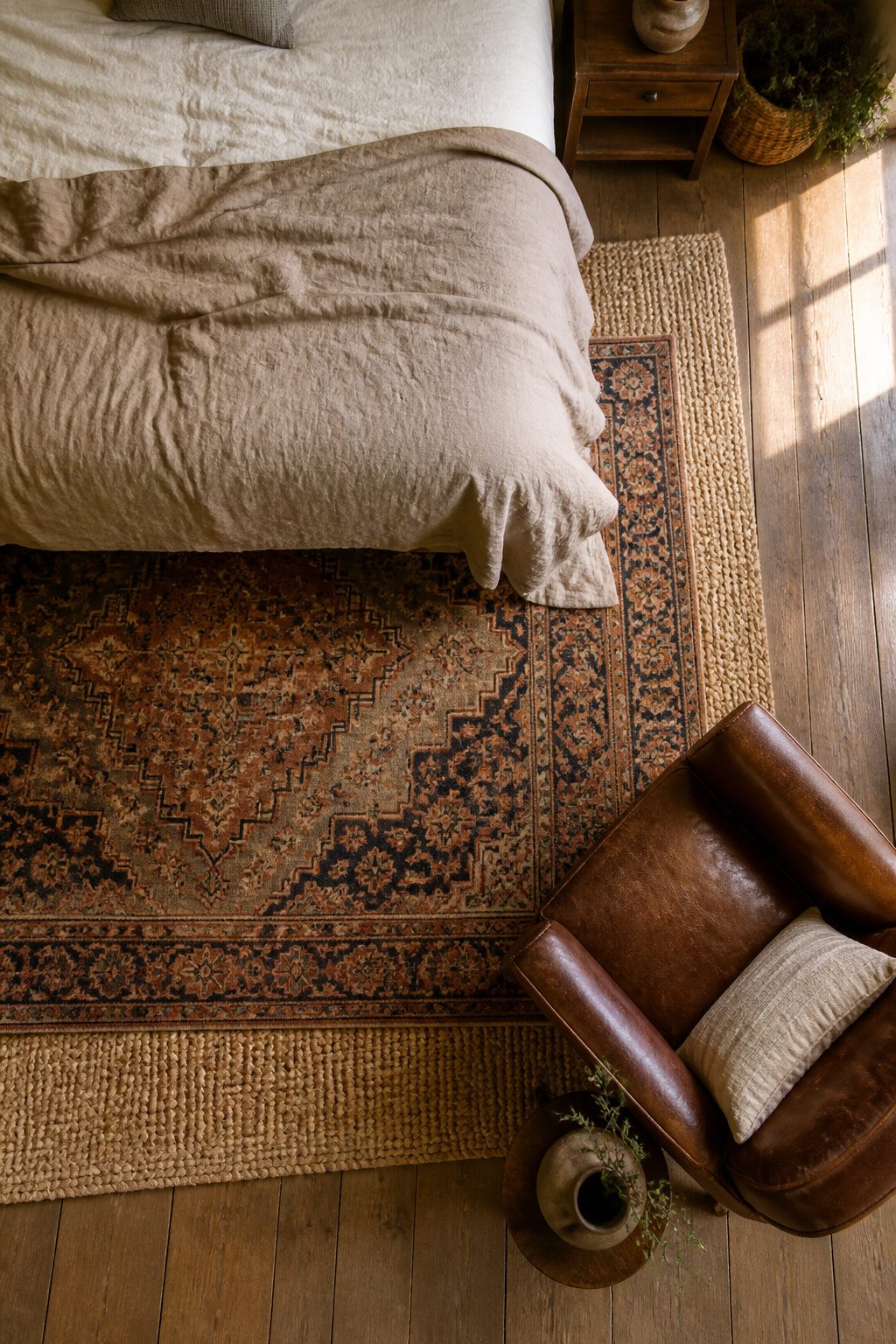
Hardwood in a bedroom looks clean, but it reads cold the second your feet hit the floor in the morning. A rug fixes that, and two rugs fix it better than one.
The base layer should be a natural-fiber rug, jute or sisal, in an 8×10 or 9×12. That gives you texture and coverage without fighting whatever else is in the room.
Over that, add a smaller rug, something with a pattern or a sheepskin, and offset it at the bedside so it lands where your feet actually come down.
The top rug needs to slide at least partly under the bed frame. Leave it floating in open floor and it looks like a bath mat that lost its way.
I would skip matching sets.
The point of layering is the contrast between rough and soft, plain and patterned. A flat jute base with a worn Persian or a cream sheepskin on top gives you the farmhouse warmth without looking staged.
7. Soft White Walls
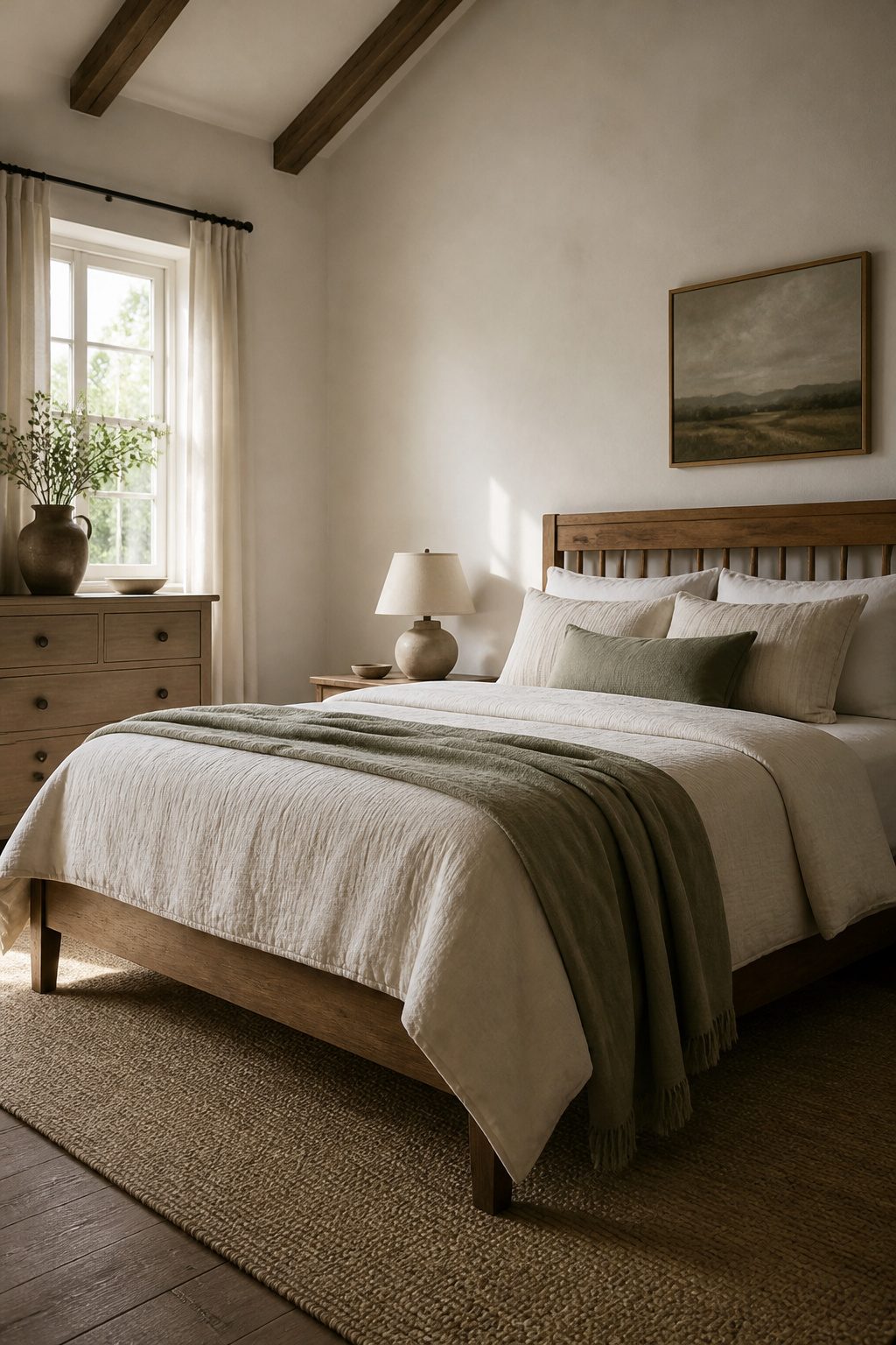
Farmhouse bedroom decor starts with the wall color, and the choice matters more than most people expect.
White Dove by Benjamin Moore, Alabaster by Sherwin-Williams, or Swiss Coffee by Behr will each give you that warm, lived-in base that keeps a bedroom from feeling like a rental blank slate.
I would skip anything with a blue or gray undertone unless the room gets strong southern light all day. North-facing rooms need the extra warmth even more; without it, the space turns clinical by late afternoon.
The finish is where I would spend the extra two dollars per gallon.
Eggshell or satin hides the dings and patch jobs that flat paint turns into spotlights, and in a style built on imperfection, that matters. Flat reads cleaner in a magazine shot, but I would not want to live with it.
8. Woven Baskets for Storage
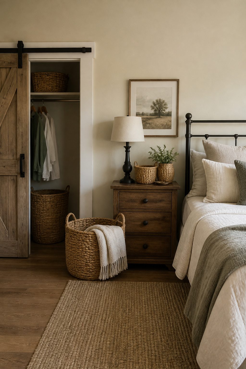
Seagrass, rattan, and water hyacinth each read differently in a bedroom.
Seagrass runs cooler and more uniform, the kind of texture that slides into a neutral palette without announcing itself. Rattan carries more warmth and visible weave, so it works best where you want the basket itself to draw the eye.
Water hyacinth sits between them, with a looser, almost shaggy grain that softens sharp corners on a metal frame or clean-lined nightstand.
I would put the largest basket at the foot of the bed for extra blankets, since that placement fills the visual gap without blocking walkways.
A medium size tucked into a closet corner handles laundry better than a plastic hamper, and it keeps the door-side clutter from looking like an afterthought.
If the bedroom connects to a bathroom, the same material repeated there, for toilet paper or rolled towels, ties the two rooms together without matching sets.
A basket with handles moves easily for vacuuming or rearranging, which matters more than most people expect until they are dragging a full hamper across carpet.
For knitwear or anything that might catch, line the basket with a simple cotton slip; the weave that looks good on the outside will pull loops out of a chunky throw if it sits against bare fiber.
9. Upholstered Headboards
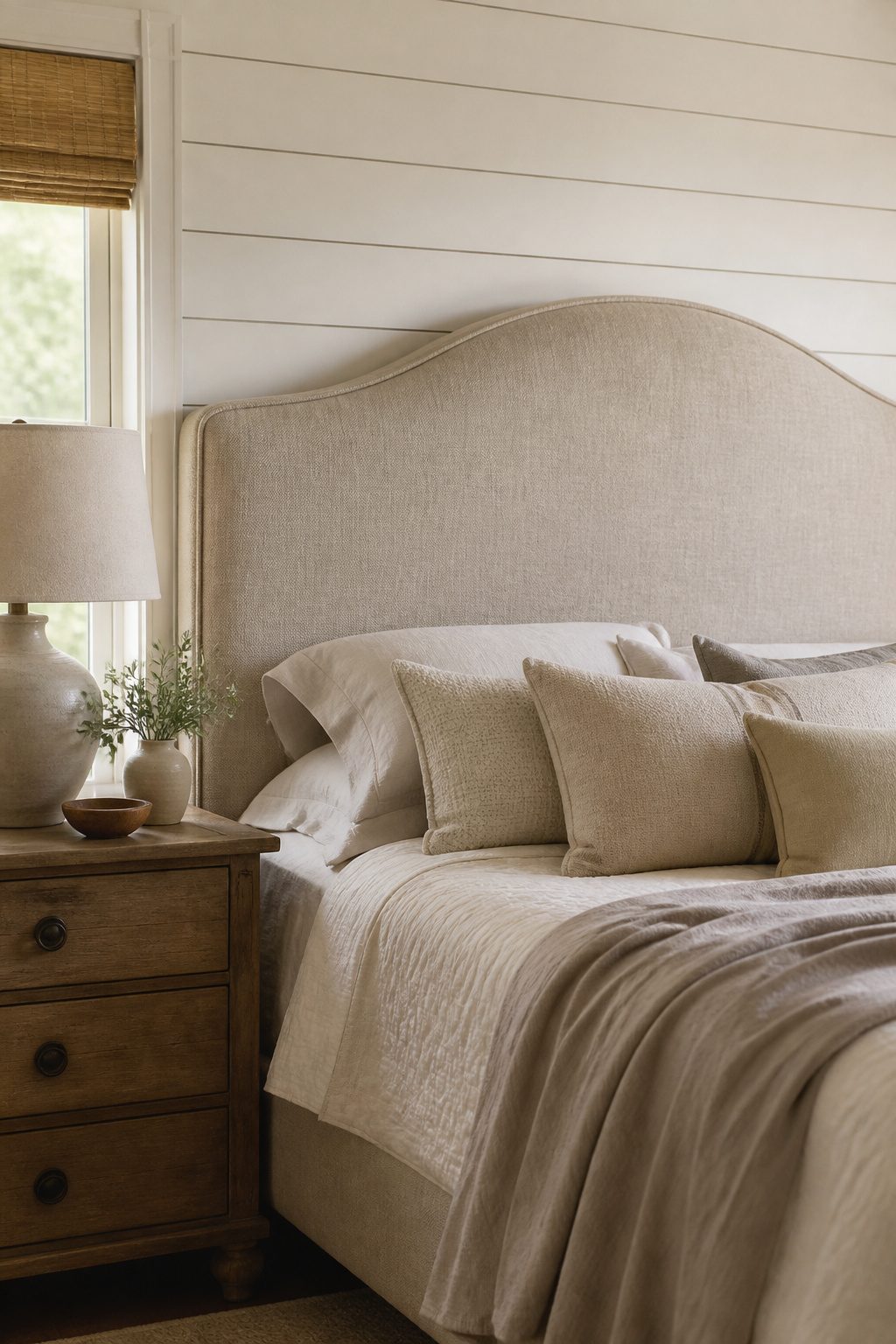
A linen or canvas headboard does what wood cannot when the wall behind it already carries shiplap or board-and-batten.
The texture reads as intentional layering, not competition. I would skip another hard surface in those rooms and let fabric soften the vertical lines instead.
The same logic applies to plaster or concrete walls where the bed would otherwise sit like a crate against stone. Upholstery absorbs sound and shadow; the bed settles in rather than juts out.
A slipcovered headboard can be washed, which matters more than it sounds on a piece that collects hair oil and dust at head level.
Most covers unzip at the back and fit a standard home machine. I would not buy one that does not.
For proportion, a queen headboard 58–62 inches tall fills the visual field under standard 8-foot ceilings without crowding the overhead space. Anything taller starts to read as theatrical; anything lower leaves the wall half-addressed and the room visually bottom-heavy.
10. Earthy Tones and Muted Colors
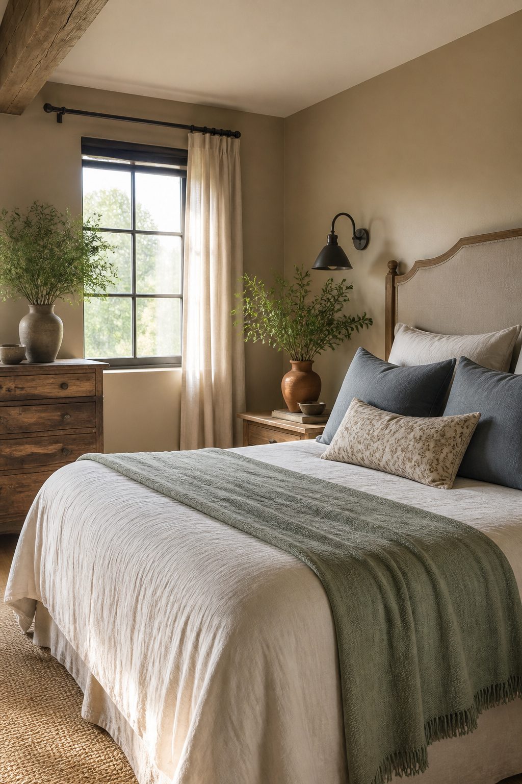
Sage green, dusty blue, terracotta, and warm taupe belong in farmhouse bedrooms, but they work better on things you can swap than on surfaces you cannot.
A muted throw or a set of linen pillowcases in terracotta adds warmth without committing the walls to a color that will feel tired by year five.
Paint is cheap to apply and expensive to undo; textiles are the safer place to experiment.
I keep the room calm with a 60-30-10 split. Sixty percent stays neutral, usually soft white or warm taupe on the larger surfaces.
Thirty percent goes to the secondary muted tone, perhaps sage bedding or a dusty blue curtain. The last ten percent is the accent, a single terracotta vase or a stack of clay-colored books.
Go heavier on the accent and the room starts to read busy, which is the opposite of what most people want from a farmhouse bedroom.
The split sounds rigid, but in practice it means one bold piece, not three fighting for attention.
11. Vintage Artwork and Botanical Prints
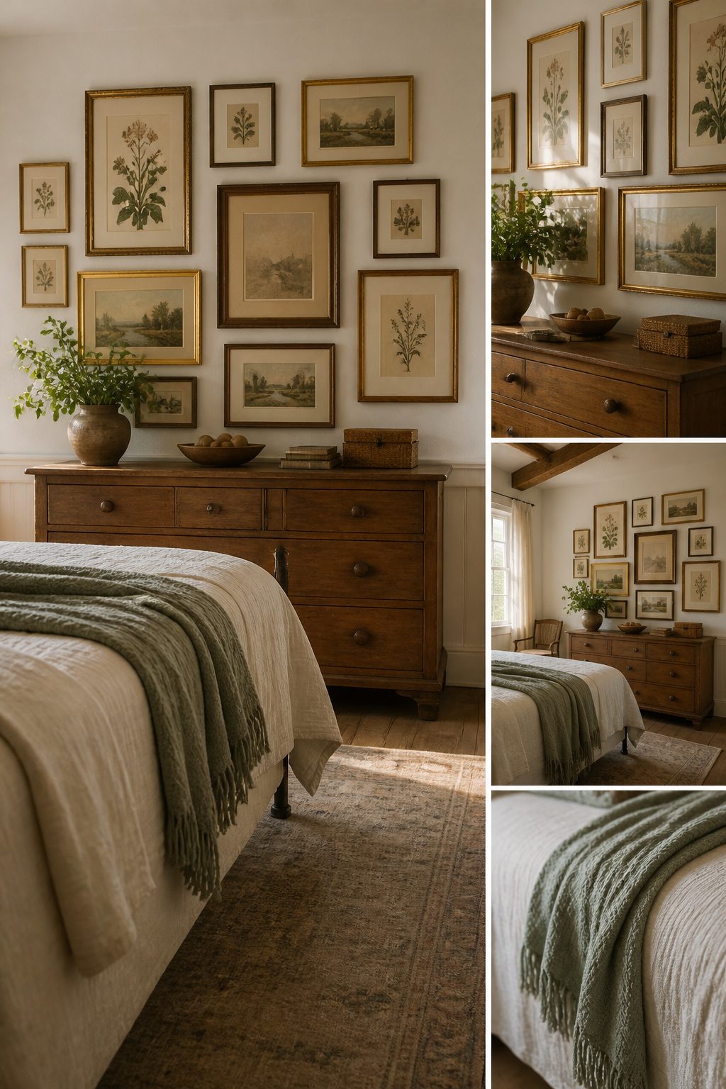
New drywall and fresh trim carry a blankness that reads as sterile until something with age breaks it up.
Flea-market frames in mismatched gold and wood tones pull together if the mats stay consistent, cream or warm white across every piece.
I look for framed botanicals, small landscape etchings, and pages pulled from old field guides or atlases; the foxing and soft ink give the history that a reproduction print never quite manages.
A gallery wall of five to seven pieces works over a dresser, kept tight enough that the grouping reads as one shape rather than scattered thoughts.
On the wall opposite the bed, I would rather commit to one large piece, 24 by 36 inches or bigger, something that anchors the room when you walk in.
The scale matters more than the subject; a faded fern print at that size holds the wall where three small frames would look apologetic.
The cost stays low if you build slowly. A $4 frame with chipped gilt and a $12 botanical print from a estate-sale bin outlasts anything shipped flat from a big-box store.
Time is the real cost: you are hunting for pieces that already look settled, and that takes more weekends than clicking "add to cart."
12. Ambient Lighting
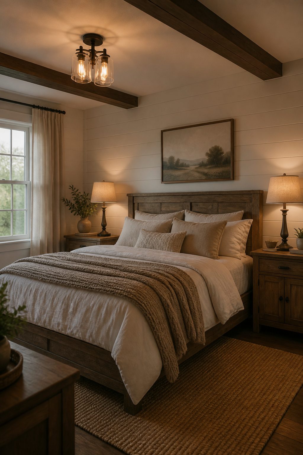
Overhead flush mounts alone flatten a farmhouse bedroom into something closer to a dentist’s office. The style needs light that pools and fades, not a single hard source from the ceiling.
Bedside lamps at 24–27 inches tall sit level with your head when you’re propped on a pillow, which is what makes them usable for reading.
Wall sconces do the same job while leaving the nightstand surface clear for a book and a glass of water.
I would pick plug-in sconces over hardwired if I were renting; the cord tucks behind the headboard and the look is identical from bed height.
For overhead, a dimmable fixture matters more than the fixture itself. You want full output for changing sheets and finding an earring, then low and warm for everything else.
Edison bulbs in clear glass read farmhouse because you see the filament; opaque shades push the same shape toward modern.
Either way, 2700K color temperature is the warm side of white that flatters both skin and wood grain. Anything cooler starts to feel clinical against the soft textures that make this style work.
13. Seasonal Decor Touches
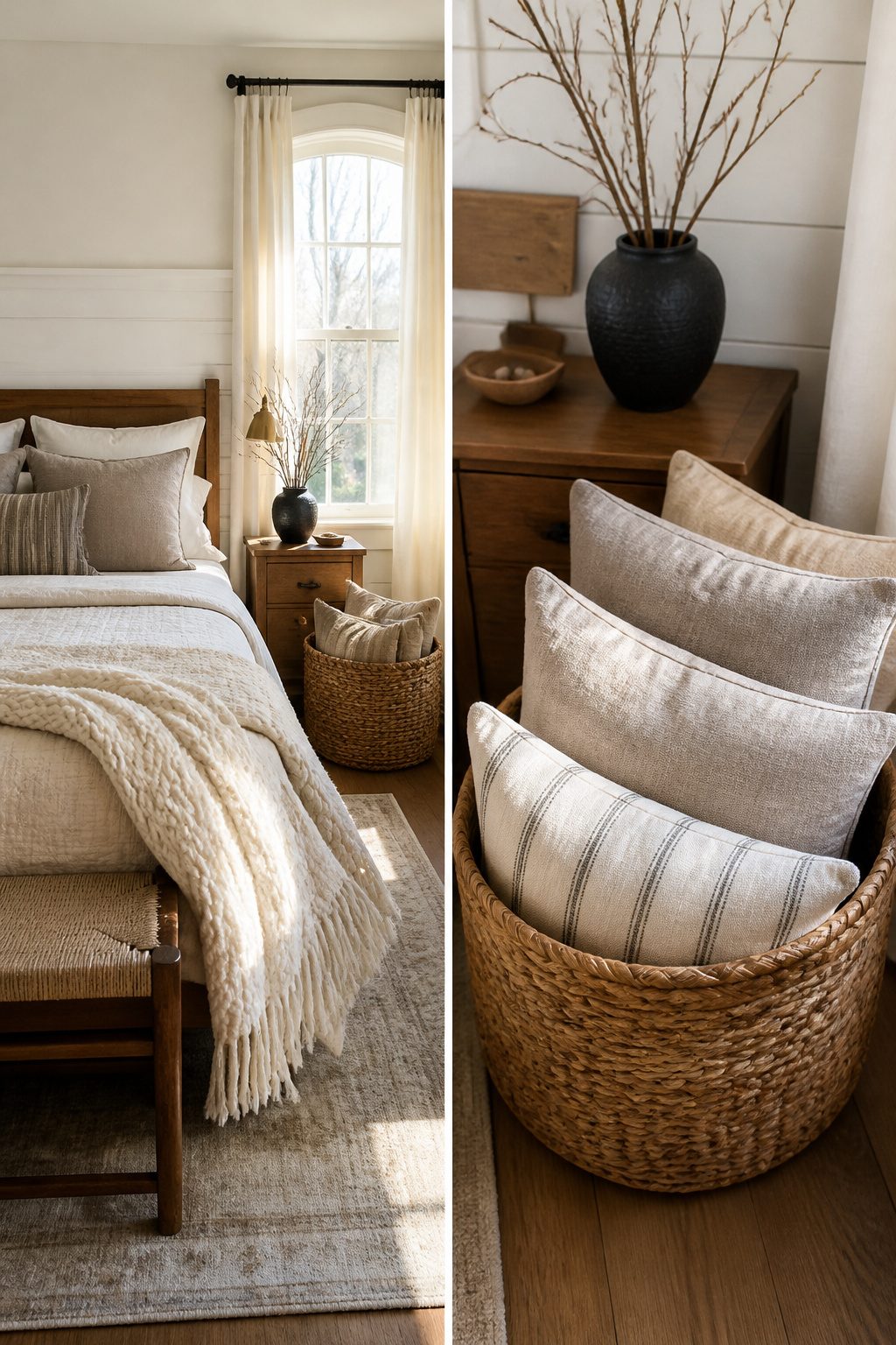
Rotating a few small pieces four times a year keeps a farmhouse bedroom from feeling stale without turning your closet into a storage unit.
I stick to one under-bed box holding four sets of linen pillow covers: rust for fall, cream and evergreen for winter, pale blue for spring, and plain white for summer.
The covers swap onto the same down inserts in about ten minutes, and linen only gets softer with each wash.
A matching throw in the same palette draped over a chair rail or the foot of the bed does the rest.
For stems, I skip the craft-store seasonal kitsch entirely. Fresh branches from the yard in spring, dried hydrangea heads in fall, and bare twigs in winter cost nothing and read as collected rather than bought.
The only rule I follow is keeping the arrangement low enough that it does not block the sightline across the room; a farmhouse space needs to feel open, not crowded by its decorations.
14. Personal Details
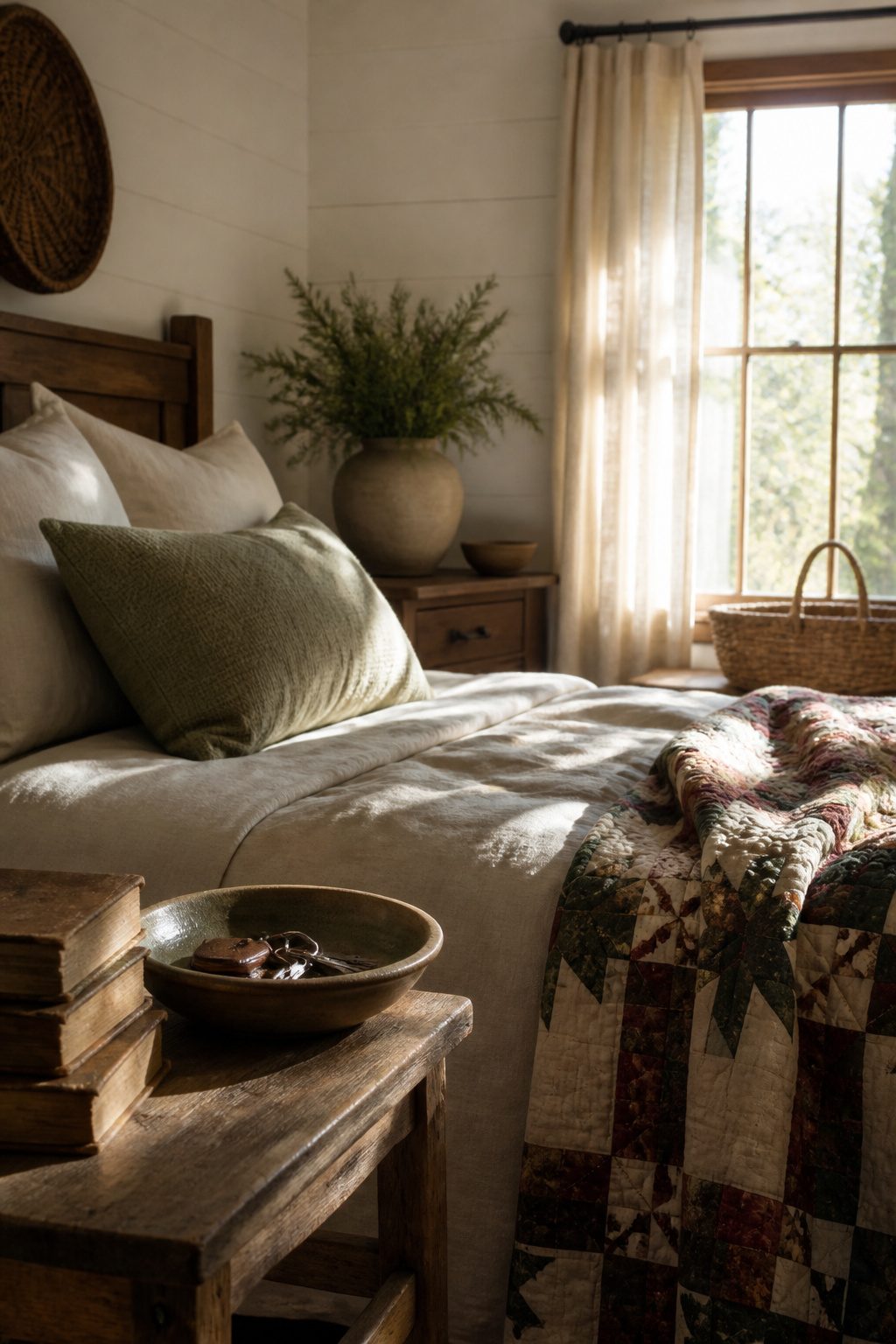
The difference between a decorated room and a home someone actually lives in comes down to what accumulates on the surfaces.
A hand-thrown bowl from a local pottery class, a quilt folded at the foot of the bed that came from your grandmother’s house, a stack of books with cracked spines that you are actually reading through.
These are the things that make a farmhouse bedroom feel collected rather than staged.
But they fail when you force them. The bowl works because you took the class and kept the piece, not because you bought something "artisanal" online.
The quilt works because it carries memory, not because it matches the throw pillows. One or two personal pieces per surface is the limit.
Past that, the eye reads it as clutter no matter how meaningful each item is. I would rather see a single worn book on a nightstand than three carefully chosen ones arranged by spine color.
Let the personal items find their own places as you use them. The book stays where you set it down.
The bowl holds the keys you drop at night. When they serve a daily purpose, they look like they belong there, because they do.
Color Palettes That Calm
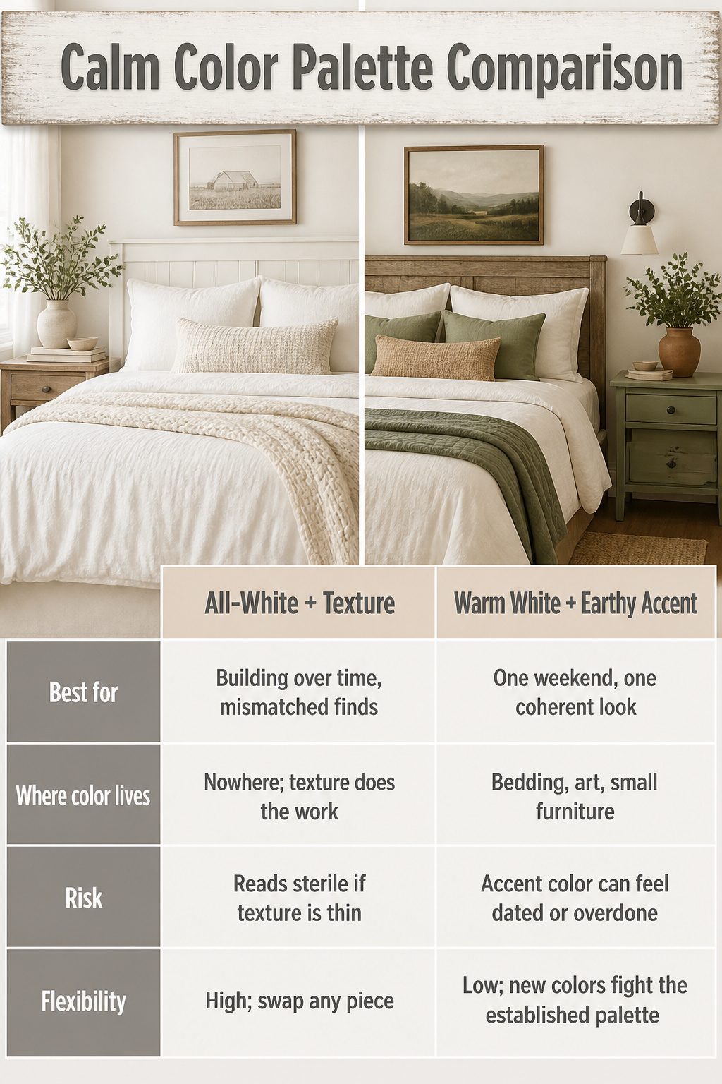
The two most reliable paths for farmhouse bedroom decor both start with white, but they split quickly after that.
An all-white room lives or dies on texture: linen, cotton, raw wood, and matte metal finishes have to carry the interest, because the color itself disappears.
That route is forgiving if you collect pieces slowly; every new item just needs to stay in the warm-to-cool white range.
The earthy alternative pairs warm white walls with a secondary color, usually sage green or terracotta, introduced through bedding, a rug, or a painted nightstand.
It reads warmer and more intentional, but it locks you into that accent early. Swapping a sage throw for rust later breaks the cohesion you built.
| All-White + Texture | Warm White + Earthy Accent | |
|---|---|---|
| Best for | Building over time, mismatched finds | One weekend, one coherent look |
| Where color lives | Nowhere; texture does the work | Bedding, art, small furniture |
| Risk | Reads sterile if texture is thin | Accent color can feel dated or overdone |
| Flexibility | High; swap any piece | Low; new colors fight the established palette |
I would take the all-white path if I were renting or planning to refresh the room piece by piece over a year.
The earthy route wins only if you already own the accent piece that anchors it, a terracotta planter or a sage dresser you intend to keep.
Without that anchor, you are buying into a palette on faith, and the wrong shade of green turns the room toward dentist’s office faster than toward Tuscany.
Frequently Asked Questions
What colors look good in a farmhouse bedroom?
Warm whites, creamy beiges, gentle grays, and muted taupes create the base, with earthy tones layered in for contrast.
Sage green, dusty blue, terracotta, and warm taupe work well on textiles you can swap out. A 60-30-10 split keeps the room calm: sixty percent neutral, thirty percent secondary muted tone, and ten percent accent.
How do I decorate my bedroom farmhouse style?
Start with soft white walls and a solid wood bed frame, then layer neutral bedding in linen or cotton.
Add one shiplap accent wall behind the bed, vintage-inspired nightstands, and woven baskets for storage. Finish with ambient lighting at 2700K, chunky knit throws, and a few personal pieces that carry actual memory.
What are the rules of farmhouse design?
Simplicity and restraint matter more than theme. One shiplap wall is enough; wrapping all four turns the room into a set.
Wood should show honest grain and wear, not high-gloss lacquer that catches every ding. The style fails when personal items look bought to match rather than accumulated over time.
Is farmhouse still in style in 2026?
The focus is on timeless choices: warm white palettes, natural materials, and vintage pieces that age in place rather than chasing trend cycles. A room built on texture and honest wear shifts with the years instead of dating itself.
What is replacing farmhouse decor?
It does note that the earthy accent route locks you into a palette that can feel dated, while the all-white path stays flexible because texture, not color, carries the interest.




