
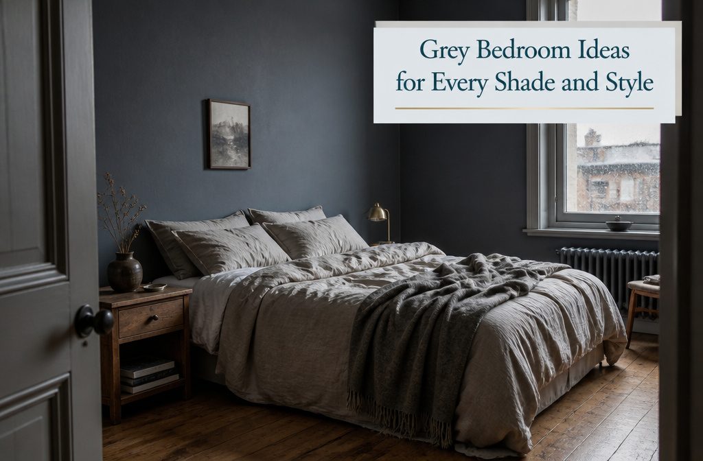
A grey bedroom works or fails on the undertone, and the light in your room decides which one reads as refined rather than institutional. South-facing light pulls warmth out of a grey; north-facing light drains it.
That is why Popular Gray SW 6071 can turn flat on a north wall by four in the afternoon, and why testing at the hour you actually use the room matters more than any swatch in the store.
1. Elegant Grey Tones
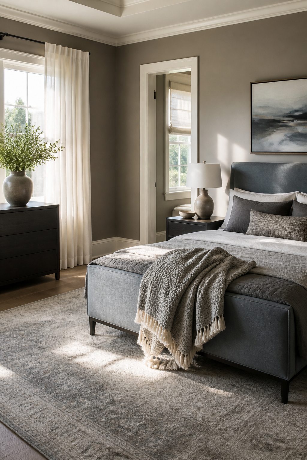
Sophisticated greys live or die by their undertone, and the light in your room decides which one reads as refined rather than institutional.
South-facing light pulls warmth out of a grey; north-facing light drains it. That is why Popular Gray SW 6071 works on paper in the store and can turn flat on a north wall by four in the afternoon.
I would test any sample at the hour you actually use the room, not just at midday.
"Gray is one of those versatile power colors. There’s a sophistication to the color gray, yet it can allow a space to feel enveloped and cozy if you select a gray with a warmer undertone."
The warmer undertone is what separates elegant from office-cubicle. In a south-facing bedroom, a cooler grey with a hint of blue keeps the space from feeling overheated.
In a north-facing room, I would reach for greys that carry a whisper of taupe or greige, the kind that lean toward ochre or natural wood rather than silver.
Pair either with crisp white trim and one accent in a muted blue or soft turquoise, and the grey stops being a background and starts doing actual work.
2. Light Grey for a Fresh Look
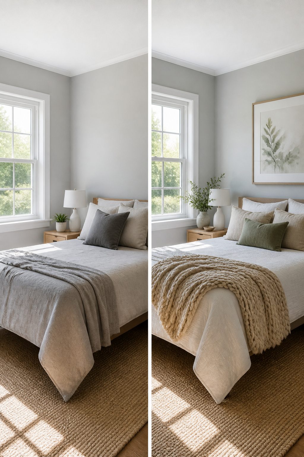
Pale greys like Benjamin Moore’s Gray Owl OC-52 bounce light around a room instead of swallowing it, which makes them the first place I’d look for a small bedroom or one with a single window.
The undertone matters more than the depth here. North-facing rooms pull every color toward blue, so a grey with a warm base keeps the walls from reading chilly.
South-facing rooms already run warm, and a cooler grey balances that sun rather than amplifying it. I’d pair either version with white trim and soft neutral fabrics to keep the look open.
The mistake I see most often is choosing the grey first and figuring out the light later; test the swatch at the actual hour you use the room, because a grey that reads crisp at 10 a.m. can turn flat by evening.
3. Dark Grey for a Dramatic Effect
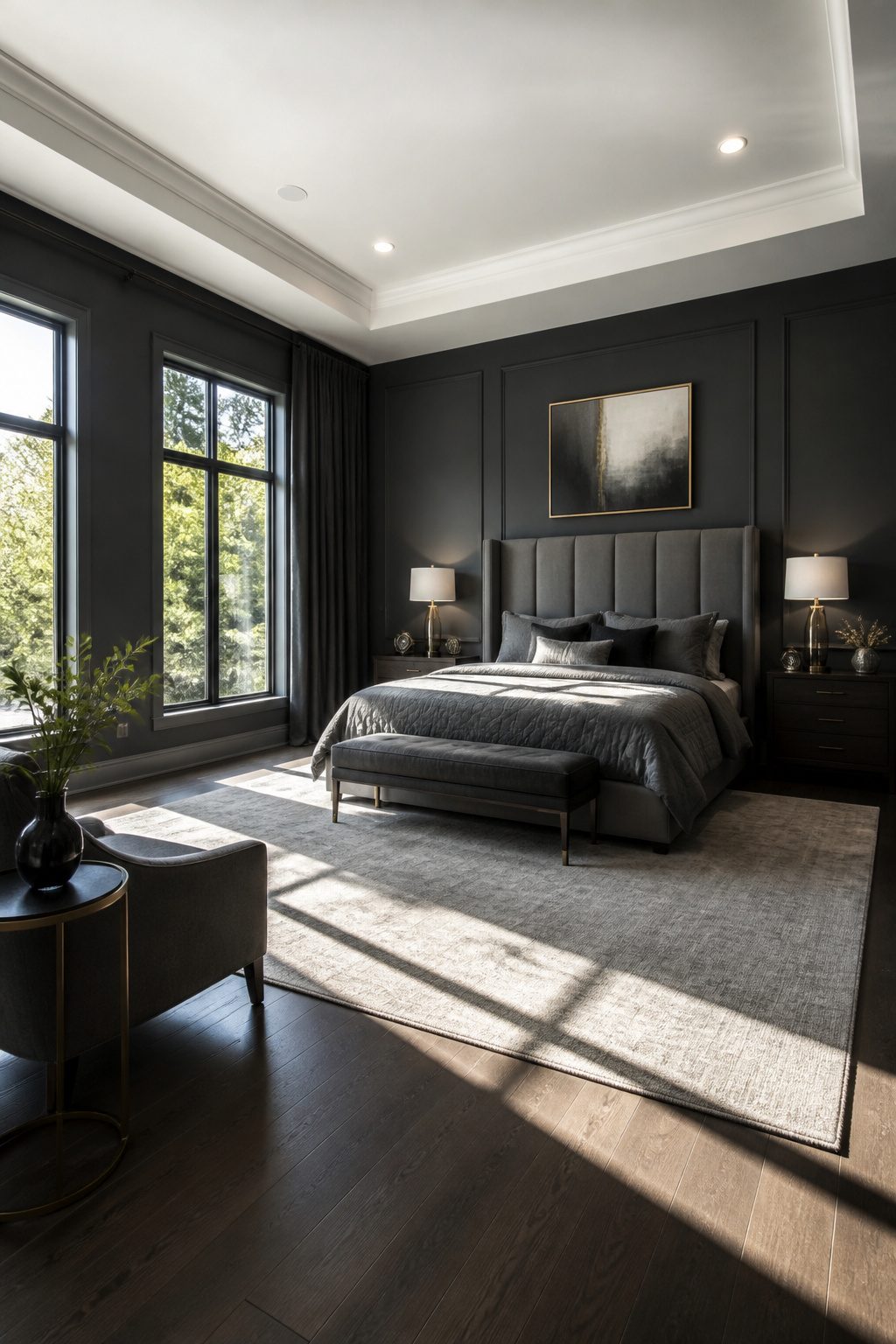
Charcoal walls that border on black work best in bedrooms with good natural light, where they read as sophisticated rather than suffocating.
I would use Kendall Charcoal HC-166 by Benjamin Moore for this, a shade deep enough to add real drama without tipping into gloom.
Pair it with crisp white ceilings, which draw the eye upward and keep the room from feeling like a cave.
For south-facing rooms that get too much sun, these cooler dark greys actually help balance the brightness.
If your grey runs warm, lift it with natural woods and ochre tones; if it runs cool, blues will keep it cohesive. I would skip cool, dark greys entirely in a north-facing room, where they flatten into something oppressive.
An accent wall behind the bed gives you the cocooning effect without the risk of a full room that fights the light, though in a larger bedroom with windows on two walls, I would paint the full room and let the architecture do the work.
4. Grey with Blue Accents
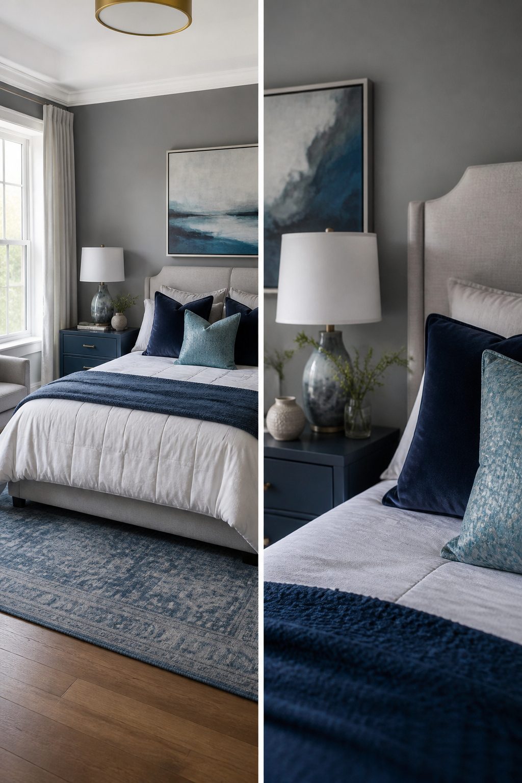
Grey walls set up blue accents beautifully because both colors share that same cool undertone, but the blue you choose changes the whole mood.
Lighter blues against grey read coastal and airy, the kind of combination that feels like open sky.
Navy or indigo do the opposite: they sink the room into something moodier and more layered, which suits mountain-inspired spaces far better than any beach reference.
I would keep the whole scheme either warm or cool and skip the mixed middle. Warm brown-greys pair well with warmer blues in a headboard or rug, while cool greys want the crisper side of the blue family.
Metallic finishes like brushed nickel or chrome push the cool direction further; if you are already working with warm tones, I would avoid them and let the textiles carry the weight instead.
For a bedroom with good sunlight, lighter blues and greys keep the space from feeling closed in.
In a north-facing room or one with heavy tree cover outside, navy textiles or a blue-stained nightstand add the depth that stops grey from going flat.
Soft white bedding still belongs in either version; it is the buffer that keeps two cool colors from turning cold.
5. Grey with Green Accents
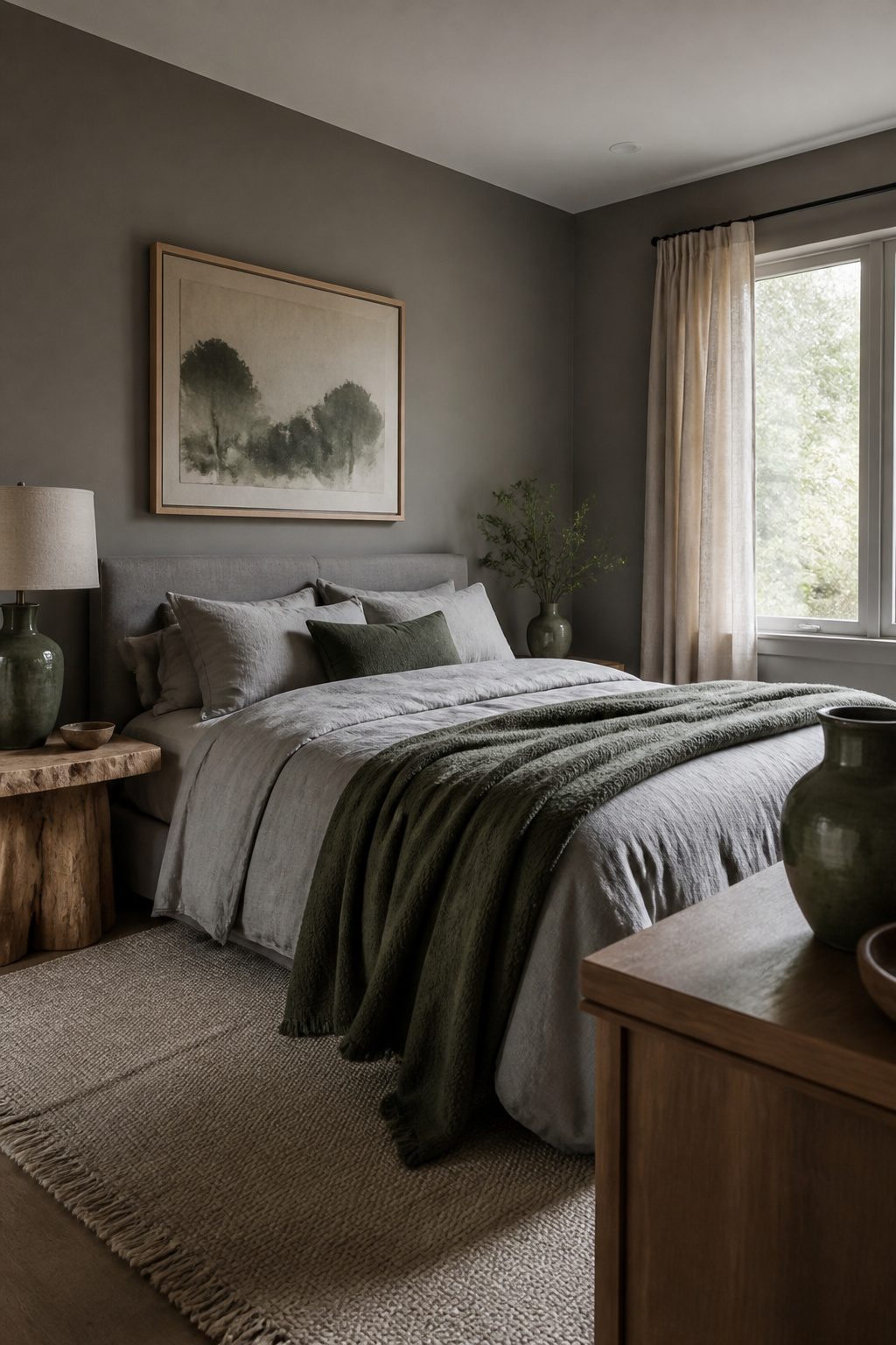
Sage, forest, and olive green each read differently against grey, and the distinction matters more than most color pairings.
Sage against a warm grey reads like lichen on stone, the combination that most clearly carries the mountain aesthetic this site is built around.
Forest green needs restraint; one upholstered chair or a single wool throw keeps it from turning a bedroom into a lodge lobby.
Olive sits in the middle, less expected than sage and less heavy than forest, and it works best in small textiles where its yellow undertone can warm cool grey without fighting it.
Natural materials carry the pairing better than painted ones. Unfinished linen in sage, raw-edge walnut with olive tones in the grain, or a forest green hand-knotted rug with visible wool variation all ground the grey in something that actually grew.
I would skip anything glossy or perfectly matched; the slight unevenness of plant-dyed fabric or live-edge wood is what keeps the combination from looking like a catalog spread.
A ceramic vase with a matte, slightly irregular glaze does more for the room than a perfectly cylindrical one ever will.
For renters, this is a low-commitment move. Swap the textiles seasonally and the wall color stays untouched.
I would keep the green to under 20 percent of the visible surface, concentrated where the eye lands on entry: the bed, a single window treatment, or one large piece you already own and can re-cover.
6. Textured Grey Walls
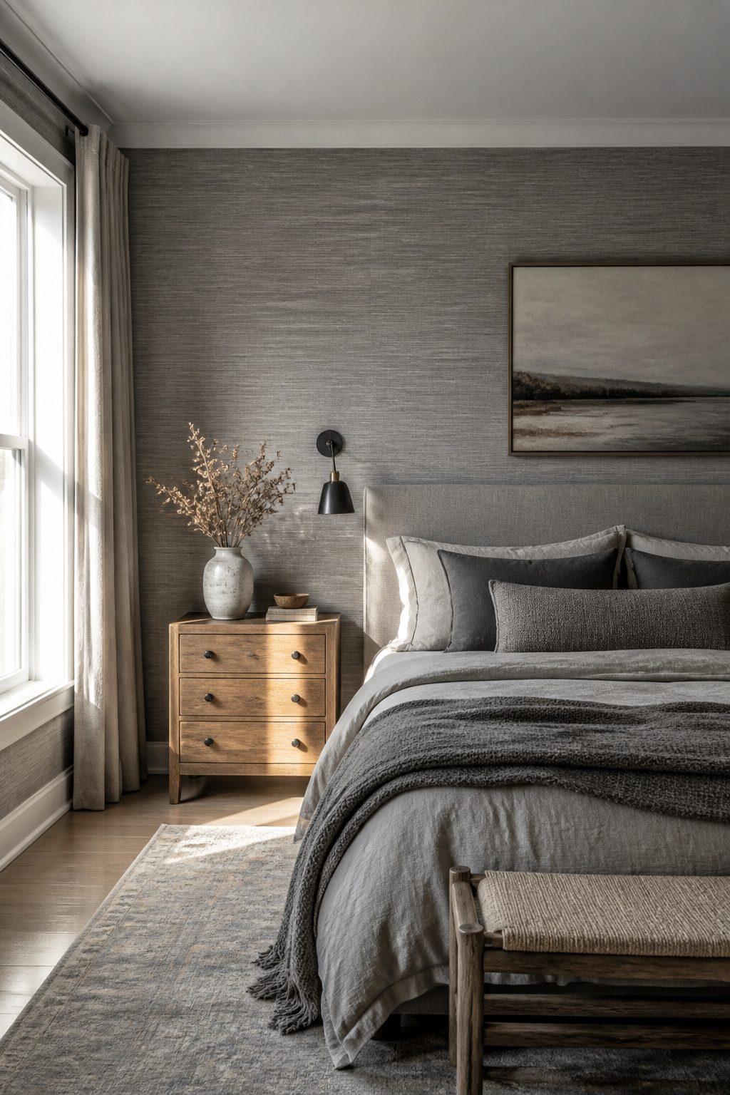
Grey paint on every wall of a bedroom risks reading flat, especially in the lighter shades that read as shadow rather than color.
The fix is texture before tone. Grasscloth wallpaper adds the depth paint cannot, and the weave catches morning light differently than any finish rollered onto drywall.
Phillip Jeffries makes a French gray that designers layer with vintage nightstands and solid beds to ground the room without darkening it.
If full wallpaper feels like too much commitment for a rental, lime wash or a linen-textured paper on the headboard wall only gives the eye somewhere to land while the remaining walls stay in simple matte or eggshell.
The rule I follow: one textured surface minimum in a grey room, two if the grey itself stays cool rather than warm.
Velvet, wood, and linen in the furnishings then have something to play against instead of competing with blank planes.
7. Monochromatic Grey Schemes
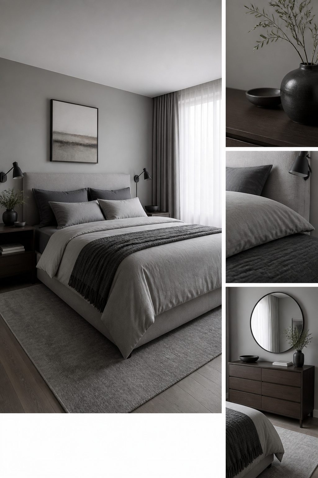
A monochromatic grey bedroom only works if you build in enough contrast for the eye to read each layer as its own plane.
I start with the walls, since they set the temperature for everything else. A pale grey with a blue undertone reads as soothing against the bed, while a grey carrying a pink undertone turns the room nurturing rather than cold.
The undertone matters more than the depth; two greys of identical lightness but different families will clash, not calm.
For bedding, I look one or two steps away from the wall color in value, never in the same spot. A soft grey wall wants charcoal sheets or a dove-grey duvet with texture, not a matching flat tone.
Kit Kemp’s approach of running the same Brunschwig & Fils toile across walls, canopy and bedding succeeds because the pattern itself creates the separation; without that printed variation, the room would blur into a single note.
Furniture is where I anchor the scheme. A grey upholstered headboard or bed frame acts as the tonal midpoint, and I treat it as the fixed point everything else responds to.
Light grey furniture against pale walls needs dark grey dressers or nightstands to keep the floor from floating away. Mixing materials helps here: grey upholstery against wood or metal finishes keeps the eye moving even when the palette stays narrow.
The test is standing at the doorway and squinting.
If the bed, walls and largest piece of furniture collapse into one shape, the contrast is too thin. Add depth with woodwork painted in a grey alternative to white, matching the undertone to the wall color for coherence without sameness.
8. Grey and White Combinations
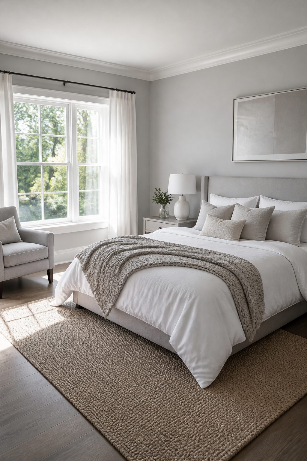
Soft light greys on the walls read as the smarter choice over stark white in a bedroom that needs to feel open without going cold.
The pairing with crisp white bedding or curtains keeps the ceiling height the eye registers, which matters more in a smaller room where every inch of perceived space counts.
I would put the grey below and the white above: walls in a tone close to white but still grey, trim and textiles in the cleaner shade, so the room gets definition without the clinical feel of an all-white box.
Texture is where this lives or dies. A woven throw, linen cushions, or a boucle chair break up the flatness that makes a grey-and-white room feel like a showroom instead of a place to sleep.
I would skip the urge to add a third color and instead layer two or three textures in the same palette. The Scandinavian influence works because it is restrained, not because it is empty.
Natural light helps, but the real fix is that mix of surfaces: matte paint against crisp cotton, something nubby against something smooth. Without that, the room stays sterile no matter how soft the grey.
9. Grey and Pink for a Romantic Touch
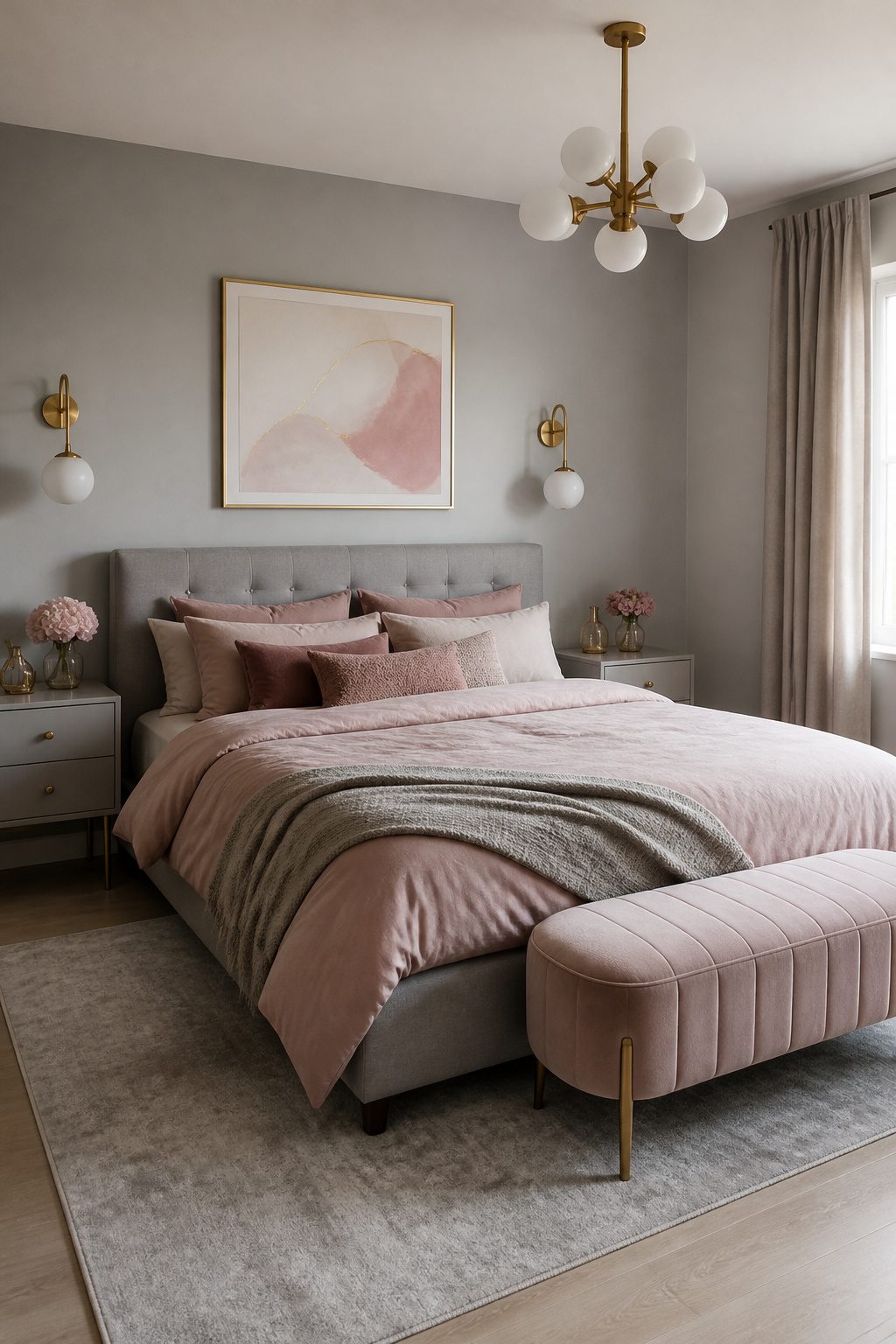
Blush pink against grey only works if you pick the right pink.
Bubblegum or bright fuchsia will read juvenile against any shade of grey; dusty rose and muted blush keep the pairing grown-up. I would skip anything with a purple undertone and look for pinks that lean brown or peach instead.
For walls, charcoal grey with dusty rose bedding gives you the most impact for the least commitment.
Reverse it with pale grey walls and bring the pink in through art, cushions, and drapery if you rent or like to swap colors seasonally. Gold or brass hardware sharpens the look without adding another competing color.
Textiles are the budget move here. A blush throw or set of rose-toned pillow covers runs under $50 and changes the room in an afternoon.
Paint is permanent; fabric you can fold away when the mood shifts. I would start with one textile layer, live with it a week, then add a second if the balance still feels right.
10. Grey and Beige for Warmth
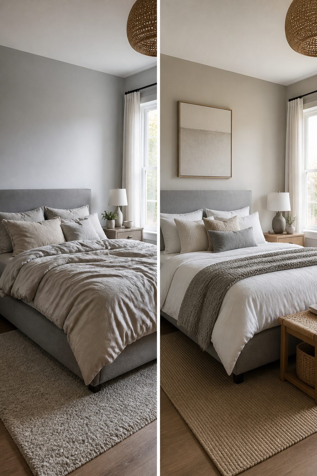
Greige sits exactly where cool grey meets warm beige, and that middle ground matters more than most people expect.
Agreeable Gray and Sherwin-Williams Comfort Gray SW 6205 both pull enough warmth to keep a bedroom from feeling like a showroom floor, but they still read as neutral rather than tan.
For renters who need one paint color to carry through a whole apartment, this is the practical choice: it harmonizes with wood furniture, jute rugs, and brass hardware without fighting against them, and it will not look out of place when you move your same pieces to the next place.
The balance works because greige carries subtle green undertones that sit near the center of the color wheel.
That means it flatters both warm accents, like woven baskets and natural linen, and cooler ones, like white bedding or a grey quilt layered on top.
A bedroom painted in a lightened version of Agreeable Gray, say cut by 50%, still grounds the space while leaving room for darker textiles to add depth.
What I would skip is pairing greige with anything that leans too yellow or too purple.
The undertone clash turns the walls muddy fast. Stick to organic textures and clean whites, and the color does the warming work without extra effort.
Layering Textures Against Grey
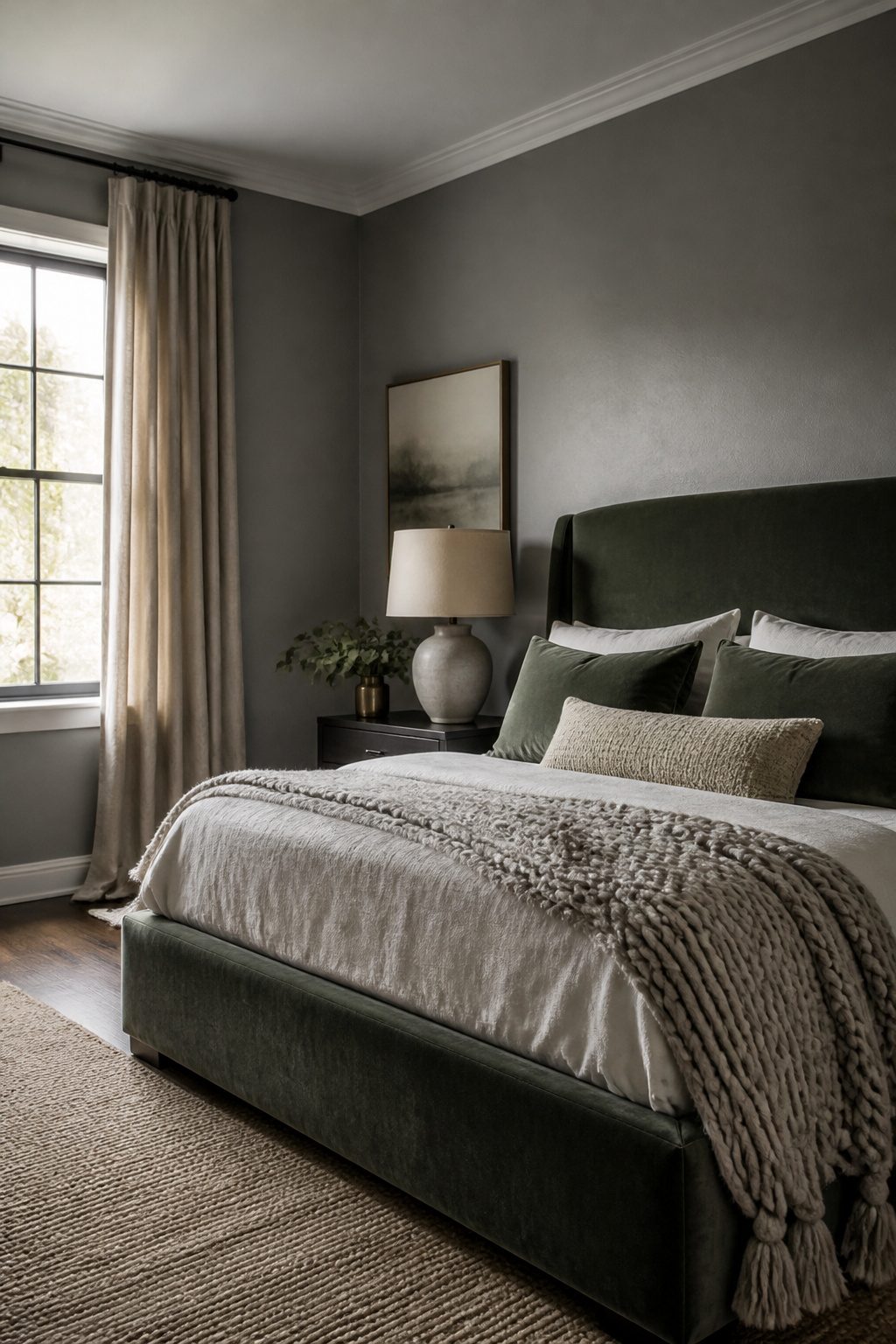
Velvet on the bed is where I would put my money first. A velvet headboard against medium grey walls gives the bed enough weight to anchor the room without shouting for attention.
The pile catches light differently from every angle, so the same wall reads warmer in morning sun and cooler after dark.
Deep green velvet works especially well, though charcoal or even a tone-on-tone grey holds its own if you want quieter drama.
Linen curtains soften what velvet starts. The slubbed weave breaks up flat planes of paint and adds movement where walls sit still.
I would hang them ceiling-height and let them pool slightly at the floor; the extra fabric creates shadow lines that read as texture at the edges of your vision.
Finish with a wool throw or a chunky knit across the foot of the bed. Layering these three fabrics, velvet, linen, wool, keeps a grey room from slipping into cold or corporate territory.
Grey without texture reads flat no matter how warm the undertone. One budget move that works is reupholstering a secondhand headboard in velvet remnant rather than buying new.
The thrift store frame plus a yard of fabric gets you the same look for roughly the cost of a single new curtain panel.
Seasonal Styling in Grey Bedrooms
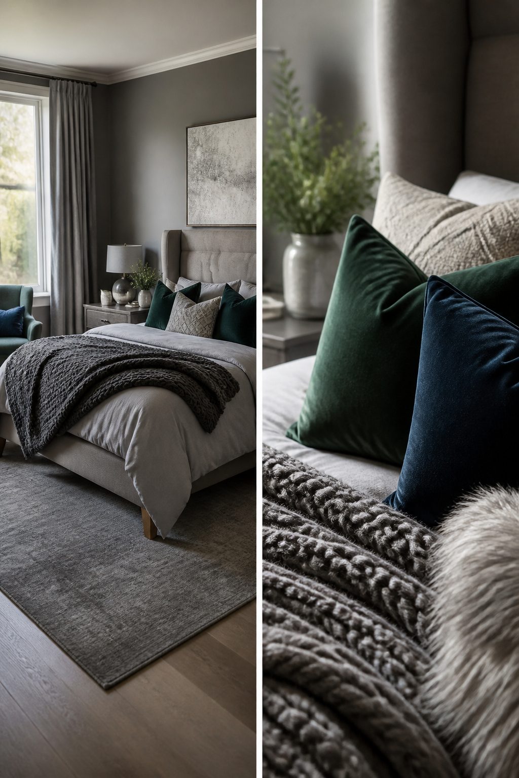
A grey bedroom shifts seasons without repainting a single wall. Get the change right with textile weight and accent depth, not a full restyle.
For winter, I swap in heavier wools, chunky knits, and faux fur throws. Deep accent colors, richer velvets, and layered cushions keep the room from reading cold against grey walls.
In summer, the same space opens up with linen bedding, airy curtains, and lighter, brighter accents. Pastel pillows or a single swap of decorative accessories does the refresh in an afternoon.
The grey itself stays neutral enough to read warm or cool depending on what you lay against it.
I would keep the base bedding in a mid-tone grey year-round and let the throws and cushions carry the seasonal load. It costs less than a new duvet set each season and stores flat in a bin under the bed.
Choosing the Right Shade by Room Direction
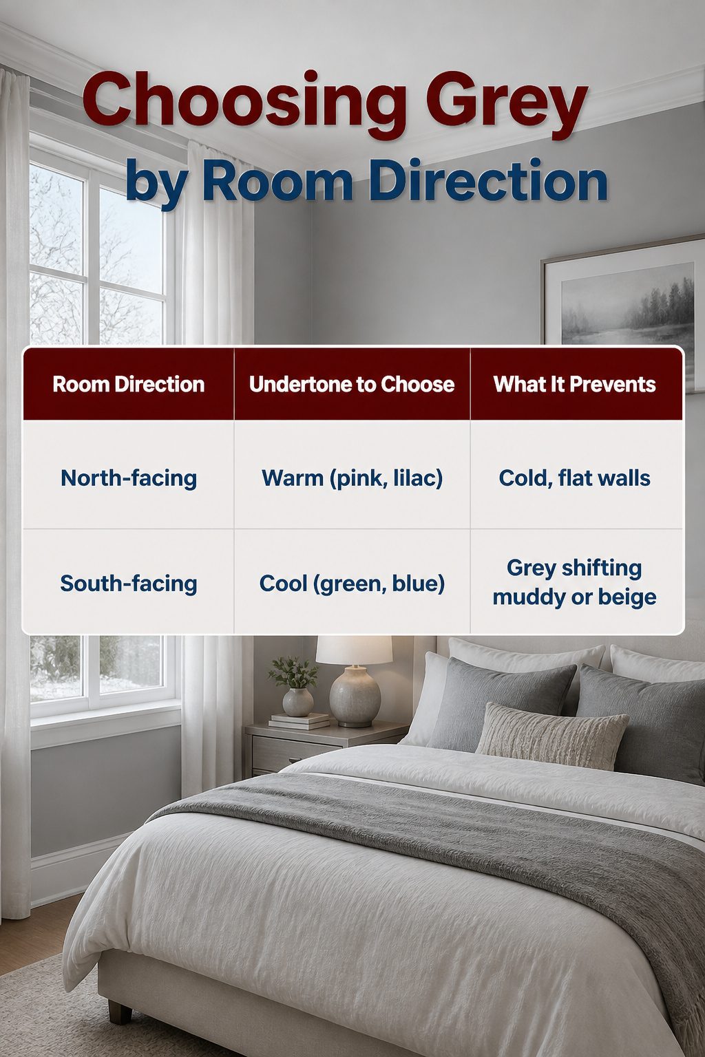
Natural light direction decides whether a grey bedroom reads as cozy or flat-out cold. North-facing rooms get steady but cool light, so a grey with warm undertones, pink or lilac, keeps the walls from feeling like a shadow box.
South-facing rooms are flooded with warm sun, and that same warmth can push a neutral grey toward beige; a grey with green or blue undertones balances it back to crisp.
| Room Direction | Undertone to Choose | What It Prevents |
|---|---|---|
| North-facing | Warm (pink, lilac) | Cold, flat walls |
| South-facing | Cool (green, blue) | Grey shifting muddy or beige |
I would test a 12-inch square on two walls, one that gets morning light and one that does not, then live with it for a full day before committing to gallons.
Paint stores mix samples cheap, and the hour spent watching the shift beats a full room you have to redo.
Furniture That Grounds a Grey Room
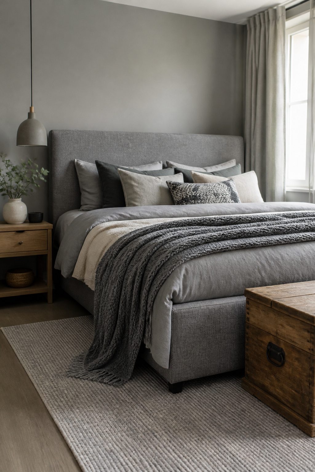
An upholstered bed in grey does more than match the walls; it absorbs sound and softens the room’s edges in a way paint alone cannot.
I would pick a grey upholstered headboard as the anchor piece and build outward from there, letting the fabric’s texture do the work of pattern so the rest of the room can stay simple.
For storage, the Ninette Chest of Drawers sits well beside a grey bed because its proportions read as furniture rather than bulk.
The Brooklyn King Bed works on the same principle: the frame stays low enough that grey bedding layers over it without looking stacked or busy.
Wood tone is where grey bedrooms go wrong. Cool greys with blue or green undertones need warm woods, but not orange ones.
Think walnut or aged oak rather than honey pine. Warm greys handle slightly redder woods, though I would still avoid anything that reads yellow.
The test is side-by-side in daylight: if the wood makes the grey look dirty, it is the wrong tone. If both look quieter together, it works.
Frequently Asked Questions
What colors go with grey in a bedroom?
Grey pairs with nearly every color, but blue is the most reliable partner because both share cool undertones.
Lighter blues read coastal and airy against grey, while navy or indigo create something moodier and more layered. For warmth, sage or olive green ground grey in natural tones, and dusty rose keeps a romantic pairing grown-up rather than juvenile.
Is grey a good color for a bedroom?
Yes, grey works in every bedroom style from traditional to minimalist because it adapts to bright colors, pastels, jewel tones, and other neutrals.
A warmer undertone makes the room feel enveloped and cozy, while cooler undertones keep south-facing rooms from feeling overheated.
Test your chosen shade at the hour you actually use the room, since light direction changes how grey reads throughout the day.
How do I style a grey bedroom?
Build in at least one textured surface, such as grasscloth wallpaper, lime wash, or velvet upholstery, so grey walls do not read flat.
Layer fabrics like linen curtains, wool throws, and velvet headboards to keep the palette from slipping into cold or corporate territory.
Keep the base bedding in a mid-tone grey year-round and swap throws and cushions seasonally; textile weight and accent depth shift the mood without repainting.
What is the best grey shade for a bedroom?
The best grey depends on which direction your room faces and when you use it.
North-facing rooms need warm undertones, pink or lilac, to prevent cold, flat walls. South-facing rooms need cool undertones, green or blue, to stop grey from shifting muddy or beige.
Paint a 12-inch sample on two walls and observe it for a full day before buying gallons, because a grey that reads crisp at 10 a.m. can turn flat by evening.




