
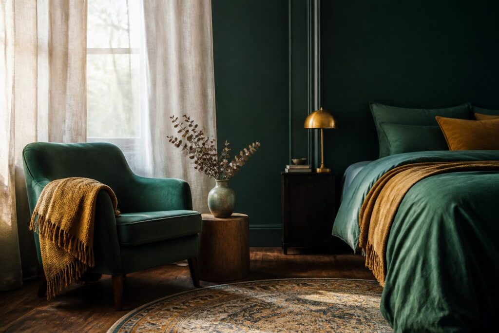
The right dark green bedroom idea depends on whether you own the walls or answer to a landlord. A velvet headboard carries the mood without paint, while a single forest green accent wall demands only one afternoon and one can.
Paint the ceiling the same emerald as the walls, though, and the room wraps around you; skip that step, and the immersive effect collapses against a white lid.
1. Hunter Green Velvet Headboard
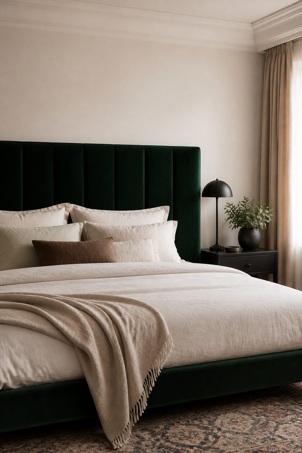
A hunter green velvet headboard carries the whole room’s mood without asking you to paint a single wall.
Velvet absorbs light in a way that keeps a dark green bedroom from looking flat, and its soft sheen reads as depth rather than glare.
I would pick velvet over linen or leather here: linen goes too casual for a moody palette, and leather fights the softness you want in a sleep space.
The texture works best with a tighter weave and a slightly structured silhouette. Loose, overstuffed shapes drift traditional fast, while a cleaner edge keeps the look modern.
For walls behind it, matte paint is the safe pairing; anything glossy competes with the velvet’s own light play.
In a room with awkward proportions or little natural light, keeping the walls light and letting the headboard hold the color prevents the space from closing in.
Cream cotton bedding and matte black accents finish it without cluttering the focal point.
Velvet looks rich but it collects dust and shows every mark, so plan on regular vacuuming and spot cleaning. Velvet shows dust and needs a soft brush vacuum attachment on a regular schedule.
I think the visual weight is worth the upkeep, but I would skip it in a room that gets heavy pet traffic or if you are not willing to keep up with the cleaning.
2. Forest Green Painted Accent Wall
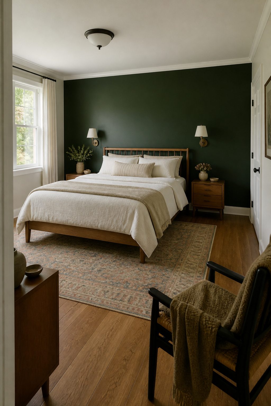
A single forest green wall gives you the mood without the commitment that swallows a Saturday and your security deposit.
The wall behind the bed is where I’d put it; that placement anchors the room and frames whatever headboard or simple bed frame you already own.
Eggshell or matte finish hides the lap marks that high-gloss shows under lamp light, and forest green stays forgiving if your tape line wanders a quarter inch.
For renters, one accent wall means one can of paint and one afternoon, not a full room’s worth of supplies and a second coat you hadn’t planned.
White trim you can’t change suddenly becomes an asset, not a leftover, because that contrast is what makes the green read as intentional rather than apologetic.
The shade shifts enough through the day, toward olive in morning sun and near-black under warm bulbs, that sampling it at three times of day saves you from a color that only works at 2 p.m.
3. Dark Green Wainscoting
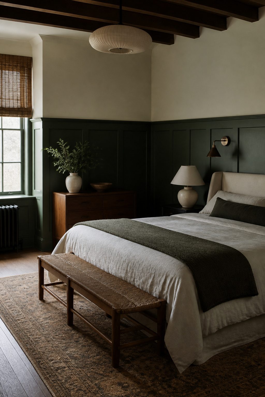
Painted wainscoting gives a dark green bedroom something flat walls never will: actual shadow lines that catch the light differently as the day moves.
Most rooms look best with the paneling running 36 to 42 inches up from the floor, which lands roughly at seated eye level and keeps the proportions from feeling squat.
The lower third in green reads as grounding and intentional, almost like built-in furniture.
Paint it and the upper wall the same color and you erase the architectural detail you just added. I would put satin on the wainscoting itself and matte above; that slight sheen difference creates depth without demanding a second color.
Where this can go wrong is in a room with low ceilings. Taller paneling there pulls the ceiling down visually, so keeping the rail lower and the top edge simple becomes the smarter move.
For a more formal look, this treatment pairs cleanly with grey tones; the paneling itself softens the transition between colors so the room does not feel like two paint swatches arguing.
4. Emerald Green Color Drenched Bedroom
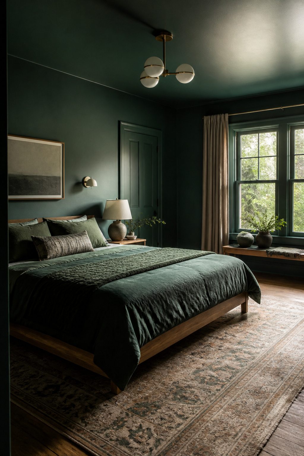
Painting the ceiling the same emerald as the walls is what separates a bold choice from a finished room.
Without that step, the eye hits a white lid and the immersive effect collapses. Carry the color to trim and doors too, and the room wraps around you the way good architecture should.
The ceiling decision changes the proportions. In a room with decent height and some daylight, the continuous surface feels cozy, not cramped.
The color drops visually and the walls read taller. In a low-ceilinged space with weak light, though, the same move can press down hard.
That is the line I would not cross: under 8 feet with small windows, I would paint the ceiling warm white and keep the drama on the walls.
This approach demands better prep than a standard paint job.
Dark saturated emerald shows roller marks, patchwork, and every repair you skimped on. I would spend the extra day on wall repair and buy the premium roller cover, because fixing it after is twice the work.
Furniture gets to sit back and let the walls do the work. A low oak bed frame, tonal bedding in deeper and lighter greens, and warm white bulbs in every fixture.
Cool light turns emerald harsh and cheap; warm light keeps it rich. Minimal pieces, layered light, and the room does the work.
5. Dark Green Bedroom with Brass Accents
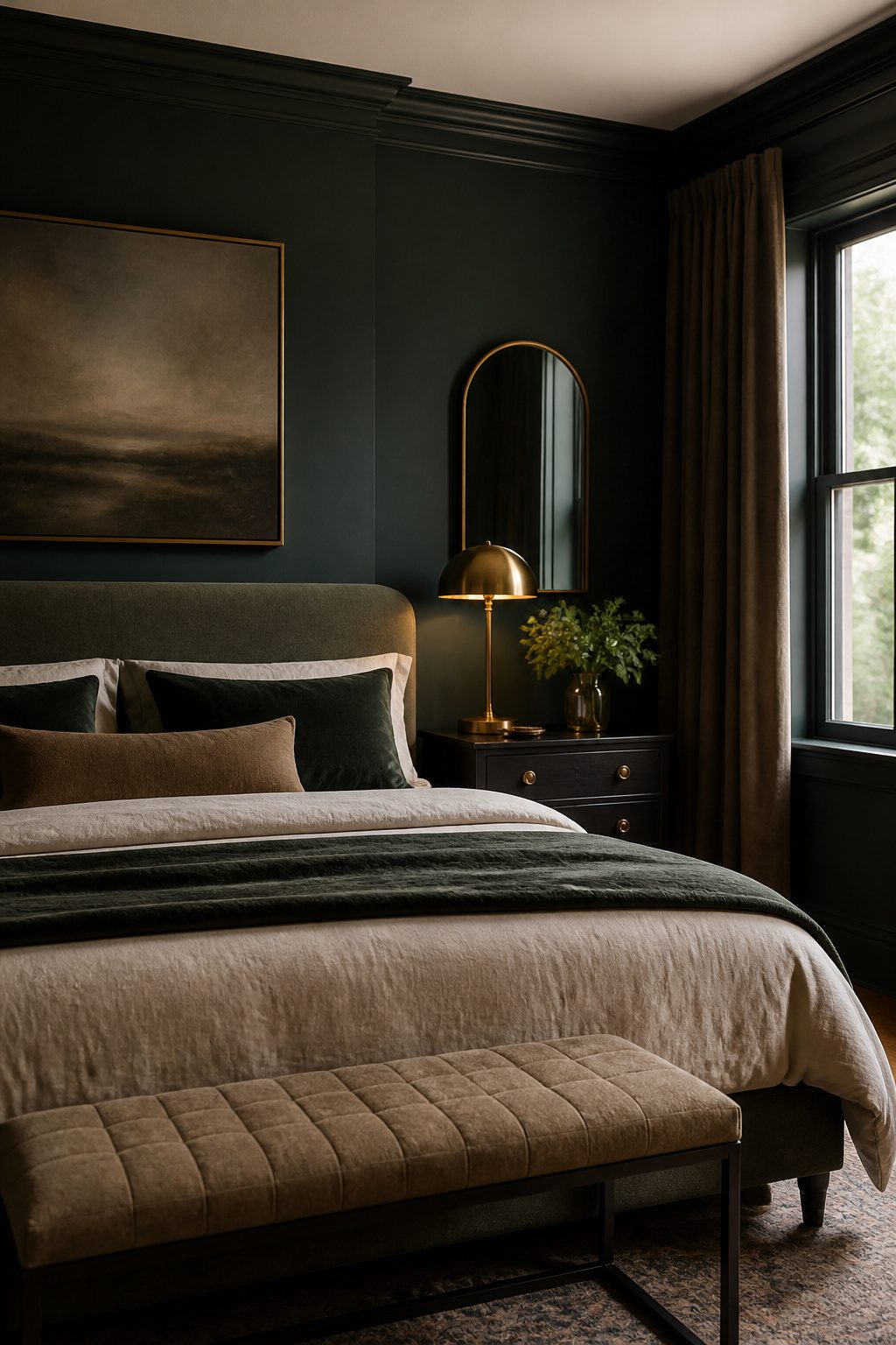
Brass against dark green produces a warmth that matte black or chrome simply cannot replicate.
The green reads as cool and deep, and brass answers it with a low, living glow rather than a hard flash. Limit brass to 2–3 repeated elements so the room stays cohesive and avoids looking like vintage costume jewelry.
Light fixtures are the easiest starting point. Bedside sconces or a ceiling mount in aged or unlacquered brass look grounded against deep green walls, while bright polished brass can tip too flashy and cheap.
Match your bulb temperature to the warmth of the brass finish; too-cool light will make even good brass look muddy and flat.
If you add a second brass element, a mirror frame or drawer pulls keep the scale small and intentional. A third repeats the finish without turning the room into a set piece.
6. Moody Boho Dark Green Bedroom
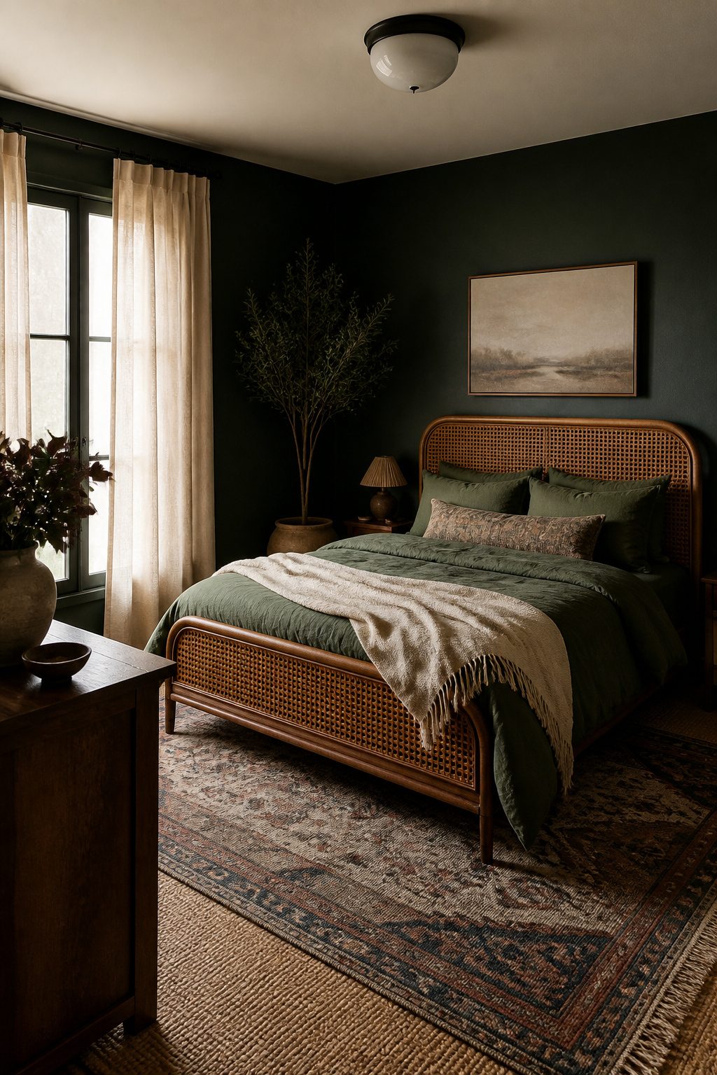
The difference between boho and traditional in a dark green bedroom comes down to what the materials are, not how many there are. Rattan, jute, cane, and linen signal relaxed; mahogany, brocade, and heavy trim signal formal.
I would keep the walls in a deep green and let the textiles do the untucking: a Moroccan rug layered over jute, linen panels that puddle slightly at the floor, and a single macramé piece or vintage textile rather than a gallery of them.
The line between layered and cluttered is one structured piece.
A clean-lined nightstand or a tailored headboard gives the eye a place to rest. Without it, the soft textures collapse into each other and the room reads as messy rather than collected.
For color, sand, clay, tobacco, and muted cream keep the palette earthy; brass or warm wood tones bring out the green without overpowering it.
I would skip bright primaries entirely, and I would limit patterns to one or two scaled-down prints so the dark walls stay the anchor instead of competing for attention.
7. Dark Green Bedroom with Cream Bedding
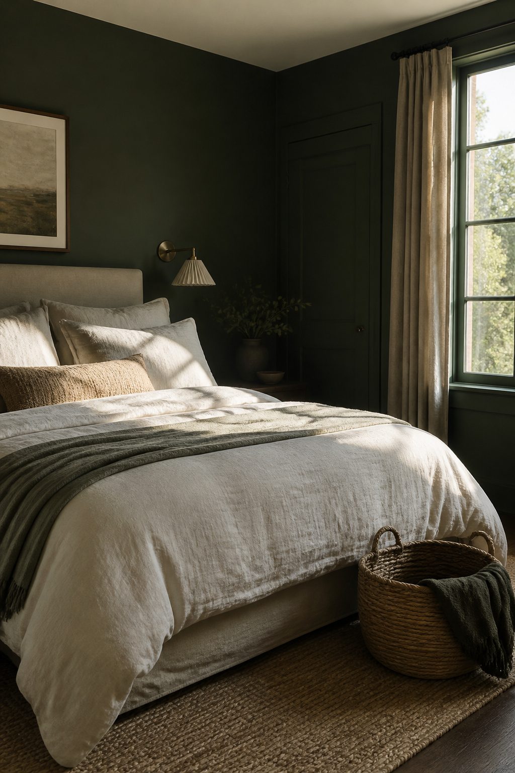
Cream bedding against dark green walls does something pure white rarely manages: it softens the contrast without flattening the depth of the color.
Stark white can read almost clinical against saturated green, especially in a room that does not get much natural light.
The warmth in cream, oatmeal, or warm taupe picks up the undertones in deep green paint and keeps the space feeling layered rather than graphic.
The material matters as much as the shade. Washed linen gives a relaxed, rumpled texture that suits a mountain-inspired room, though it wrinkles easily and needs someone who does not mind that look.
Cotton sateen sits smoother and reads slightly more polished for the same effort. Either works; the choice depends on how much maintenance you actually want.
Where this pairing goes wrong is cool gray bedding against green walls with natural wood furniture. Gray fights the warmth of both.
The wood turns muddy, the green turns flat, and the whole bed starts to look like a color mistake rather than a choice. Skip cool gray entirely if your room has warm wood tones.
Layering two close cream tones, one slightly warmer and one slightly cooler, keeps the bed from looking like a single flat block. That variation reads more intentional and, in practice, more expensive than a solid matched set.
8. Forest Green Bedroom with Black Bed
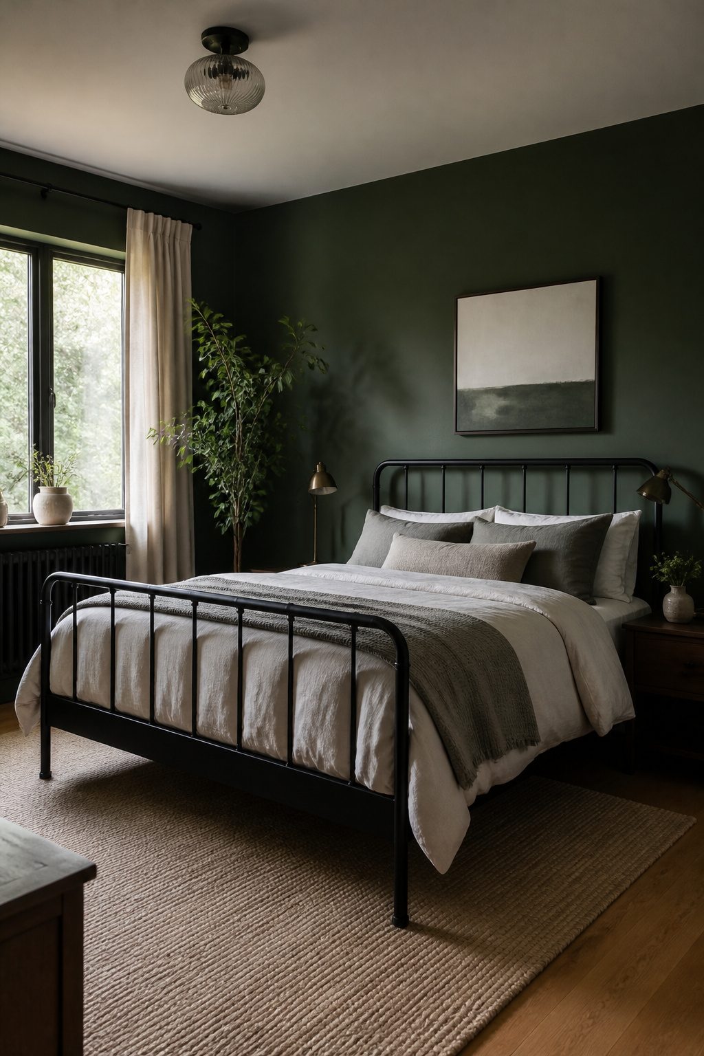
A black bed frame against forest green walls reads modern rather than heavy, but the finish on the metal decides which side it lands on.
Matte black stays flat and graphic, letting the bed silhouette against the paint like a deliberate architectural shape.
Satin or semi-gloss catches light at every angle and starts to read like furniture trying too hard; in a dark room, those highlights fragment the form and add visual noise I would skip.
Too much black turns the room into a cave, so I look for one break in the material.
A matte frame with visible leg clearance keeps the piece from looking visually blocky; seeing floor beneath the rails lets the wall color breathe around it.
Light bedding or a textured rug in a pale tone keeps the contrast working in the room’s favor rather than against it.
Mirrors placed to catch and spread light help too, though I would rather spend the budget on textiles first.
9. Dark Green and Burnt Orange Bedroom
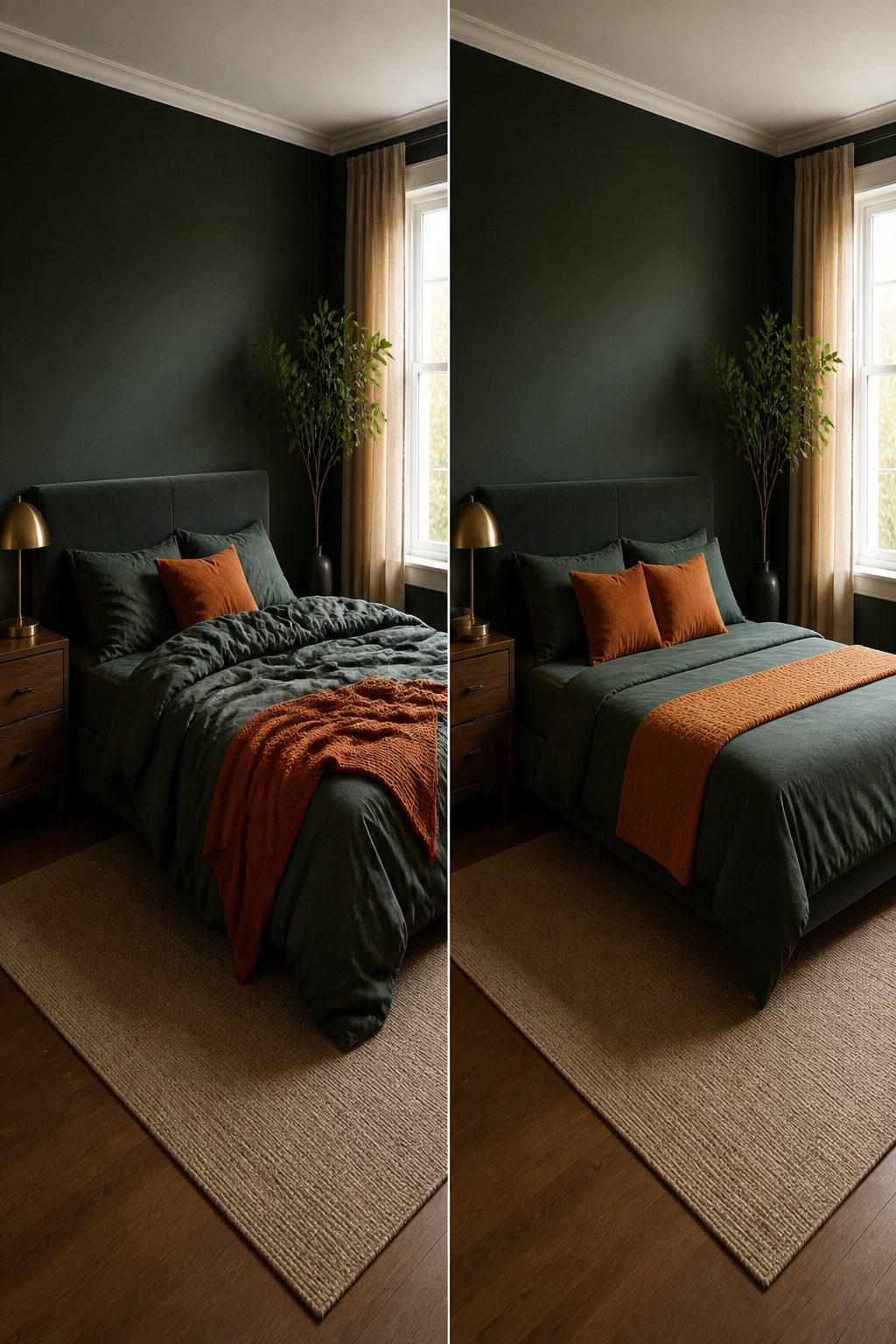
Burnt orange and dark green read as Halloween when the proportions are even, so I follow a 70-20-10 split: let dark green take 70% of the room, burnt orange 20%, and the remaining 10% goes to brass or walnut for balance.
The orange belongs in pillows, a single throw, or one vintage chair, never the walls or bedding.
Not every orange works. Pumpkin and bright orange fight the depth of dark green and look seasonal fast.
I would reach for rust, terracotta, or tobacco-orange tones instead. These carry the warmth without the holiday association.
Walnut wood and brass hardware ground the pairing and keep it from feeling like a costume.
In my own projects, I have skipped this combo when the room lacked natural light; the contrast needs some daylight to keep the orange from going muddy.
If your bedroom faces north, cream or warm taupe accents soften the green more reliably than orange ever could.
10. Dark Green Bedroom with Natural Wood
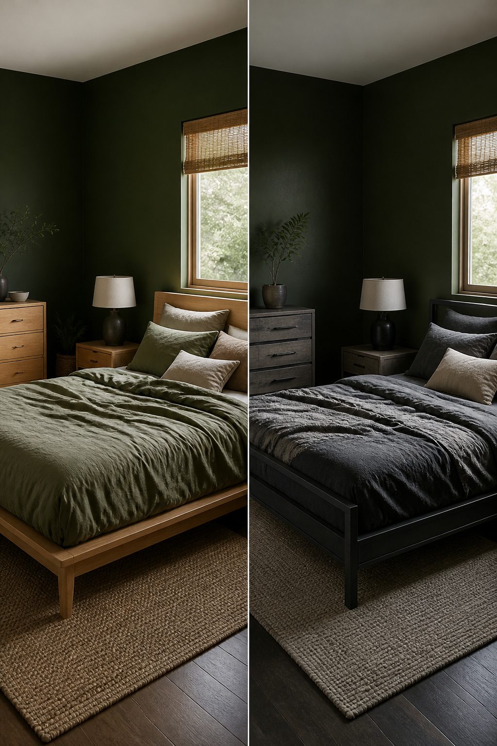
Oak, walnut, and ash each read differently against dark green walls, and the choice between them depends almost entirely on how much sun the room gets.
In a space with limited natural light, oak is the wood to use. Its lighter tone and open grain reflect what light does enter, keeping the room from feeling closed in by the green.
Walnut, by contrast, absorbs light. Against deep green in a dim room, it can read as nearly black and turn the mood from moody to flat.
South-facing windows change the calculation entirely. There, walnut earns its place: the direct sun warms the color, brings out the chocolate undertones, and gives the green something rich to push against.
Ash sits between them, lighter than walnut but smoother and more contemporary than oak. It works in either light condition, though it reads as cooler, which can tip a green-gray palette toward sterile if you are not careful.
The single wood to avoid is mixing too many tones together.
Two is the practical limit. More than that, and the room starts to look accidental rather than designed.
If I were choosing for a dark green bedroom with one wood throughout, I would pick oak for north-facing rooms, walnut for south-facing ones, and keep ash in reserve for spaces where the green already leans warm and you need to cool it down without going gray.
11. Rustic Dark Green Bedroom
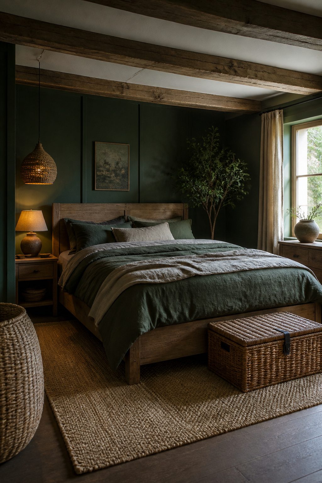
Weathered wood is what keeps dark green from reading as a city apartment with a moody paint job. The difference between rustic and theme-park comes down to which pieces actually look salvaged versus bought distressed.
Reclaimed beams on the ceiling carry the weight. They age in place, and the grain darkens unevenly where the sun hit.
Distressed furniture from a retail floor rarely matches that logic; the wear pattern is too symmetrical, too deliberate. I would put money into one real beam or a single reclaimed headboard before I filled the room with factory-roughed nightstands.
Woven baskets, jute rugs, and linen curtains add the texture that makes the green feel lived-in rather than staged. Wrought iron fixtures work if the scale is modest; vintage lanterns read as collected, not rented.
The line I watch is the number of competing textures: wood grain plus weave plus iron plus patina starts to look like a set designer’s mood board. Two of those, chosen carefully, beats four every time.
Rattan or natural wood bed frames keep the warmth without the costume. A wooden bench at the foot of the bed is practical storage and grounds the green without adding another voice.
I would skip the "rugged elegance" package altogether; pick one element that actually came from somewhere, let the paint do the rest.
12. Dark Green Bedroom with Gold Accents
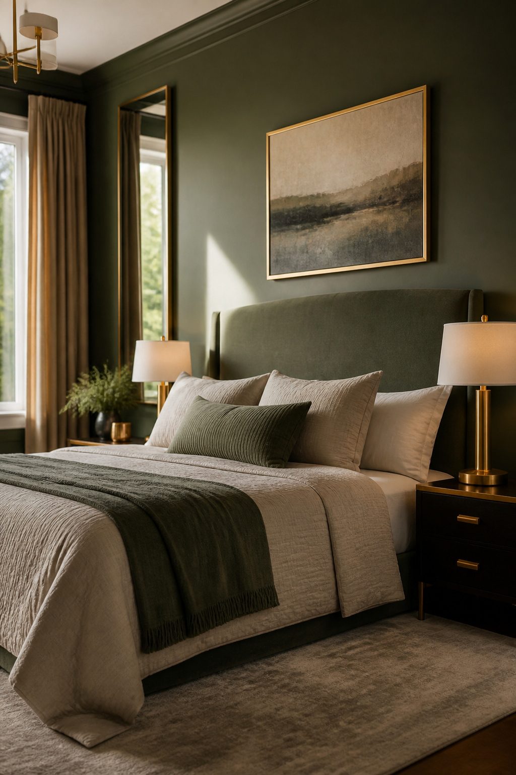
Gold reads brighter and more contemporary than brass against dark green, and that difference matters more than most people expect when they are standing in the hardware aisle.
I would put gold on the pieces that sit closest to the eye: bedside lamps, picture frames, the thin edge of a mirror. The warmth still registers, but without the period weight that brass carries.
Brass, especially unlacquered or aged brass, wins on anything architectural or functional: door hinges, drawer pulls, curtain rods. Those pieces recede, and brass keeps them from looking like jewelry that wandered into the wrong room.
The one finish mistake that cheapens the whole room is mixing bright polished brass with gold. The two temperatures fight each other, and against dark green the clash turns muddy fast.
If your budget only allows replacing two or three metal elements, match them exactly and leave the rest in a neutral like black or oil-rubbed bronze until you can complete the set.
One warm metal, one finish, repeated at least twice is the rule that keeps a dark green bedroom from looking like a collection of accidents.
13. Board and Batten
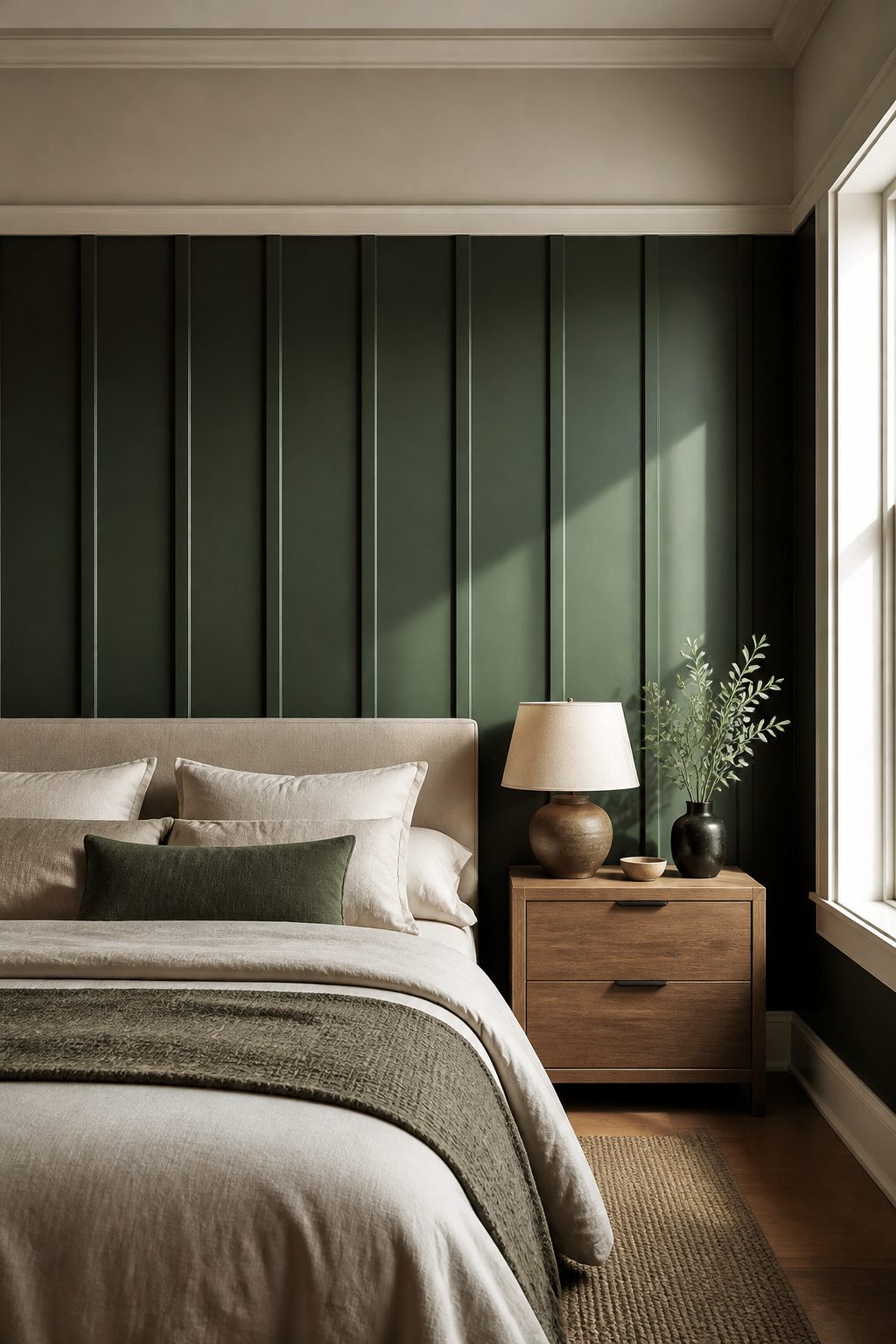
Board and batten in dark green does what flat paint cannot: it builds actual shadow lines that shift as the light moves across the room.
The vertical strips catch morning sun differently than evening lamplight, so the color reads as a living surface rather than a flat wash.
12 to 16 inches between battens is the spacing that looks right in most bedrooms.
Wider than that and the panels feel stretched; tighter and the wall starts to read like a fence. I would run this treatment behind the bed every time.
That wall is already the natural focal point, and the battens frame it like built-in architecture. A side wall works if the bed sits in a corner, but the headboard wall gives you the strongest result for the effort.
One real advantage here is that the battens themselves stay in cream or white while the boards take the dark green. That contrast is doing work you would otherwise have to add with bedding or art.
Sources describe deep British green as the shade that holds up best against that trim, and I would skip any green with too much yellow in the base; it competes with the wood grain that usually shows in batten edges.
14. Dark Green Bedroom with Exposed Brick
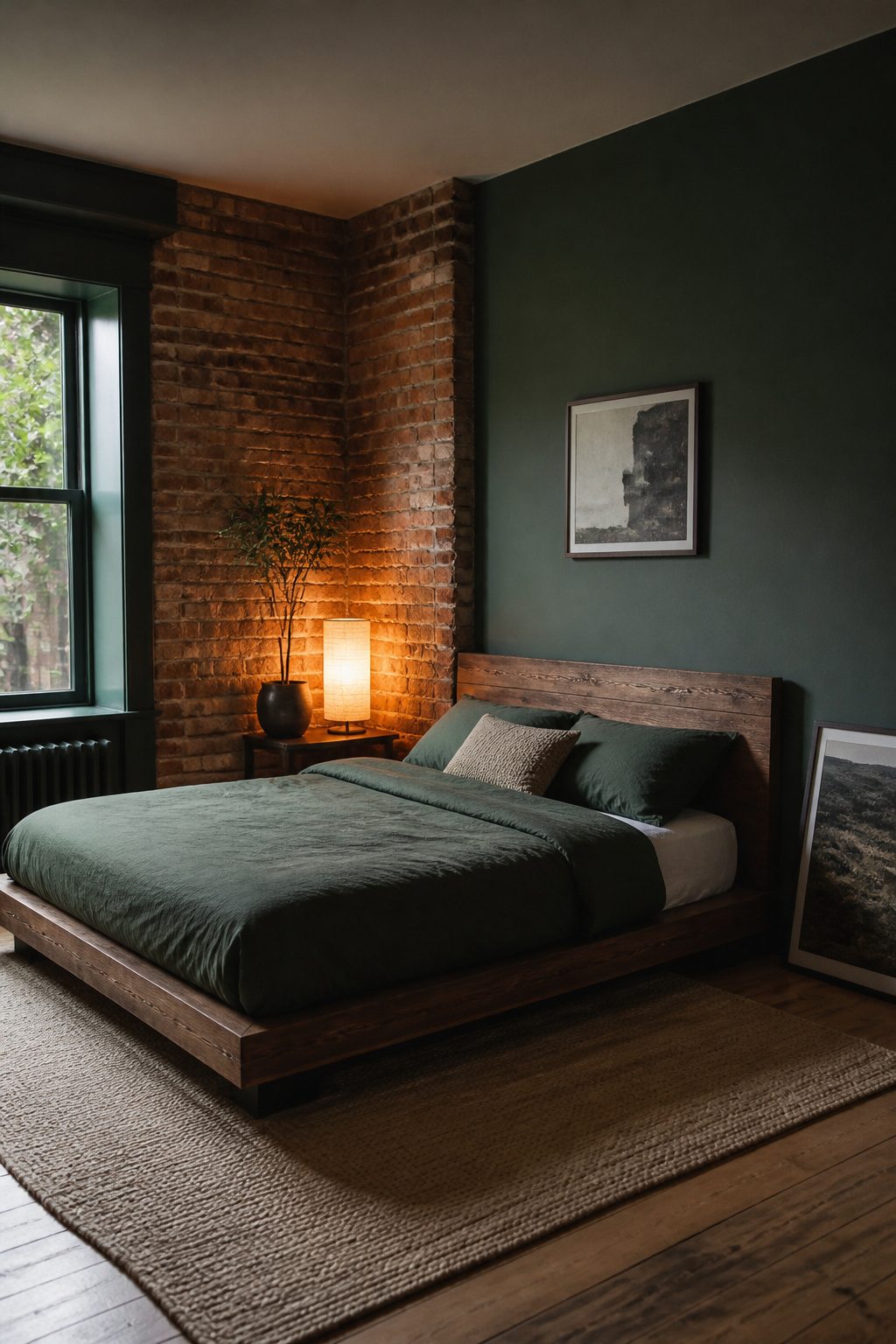
Exposed brick brings a warmth and history that balances dark green’s formality in a way little else can. The rough, irregular surface catches light unevenly, which keeps a deep green wall from reading as flat or institutional.
Most readers, though, do not have brick to expose. Newer drywall sits where brick might have been, and tearing into walls to find it is a structural project most renters and first-home owners will not take on.
Peel-and-stick brick wallpaper or thin veneer panels approximate the effect without the commitment. Wallpaper runs thinner and cheaper, but the repeat pattern can give itself away on a long wall if you do not align the seams carefully.
Veneer adds real texture and shadow, though it costs more and needs adhesive or trim to finish the edges.
I would choose veneer for a single accent wall behind the bed and skip it entirely if the room is under 10 feet wide, where the texture can crowd the space.
Paint the remaining walls a muted dark green and let the one imperfect surface do the work.
15. Black Accents with Dark Green Bedroom
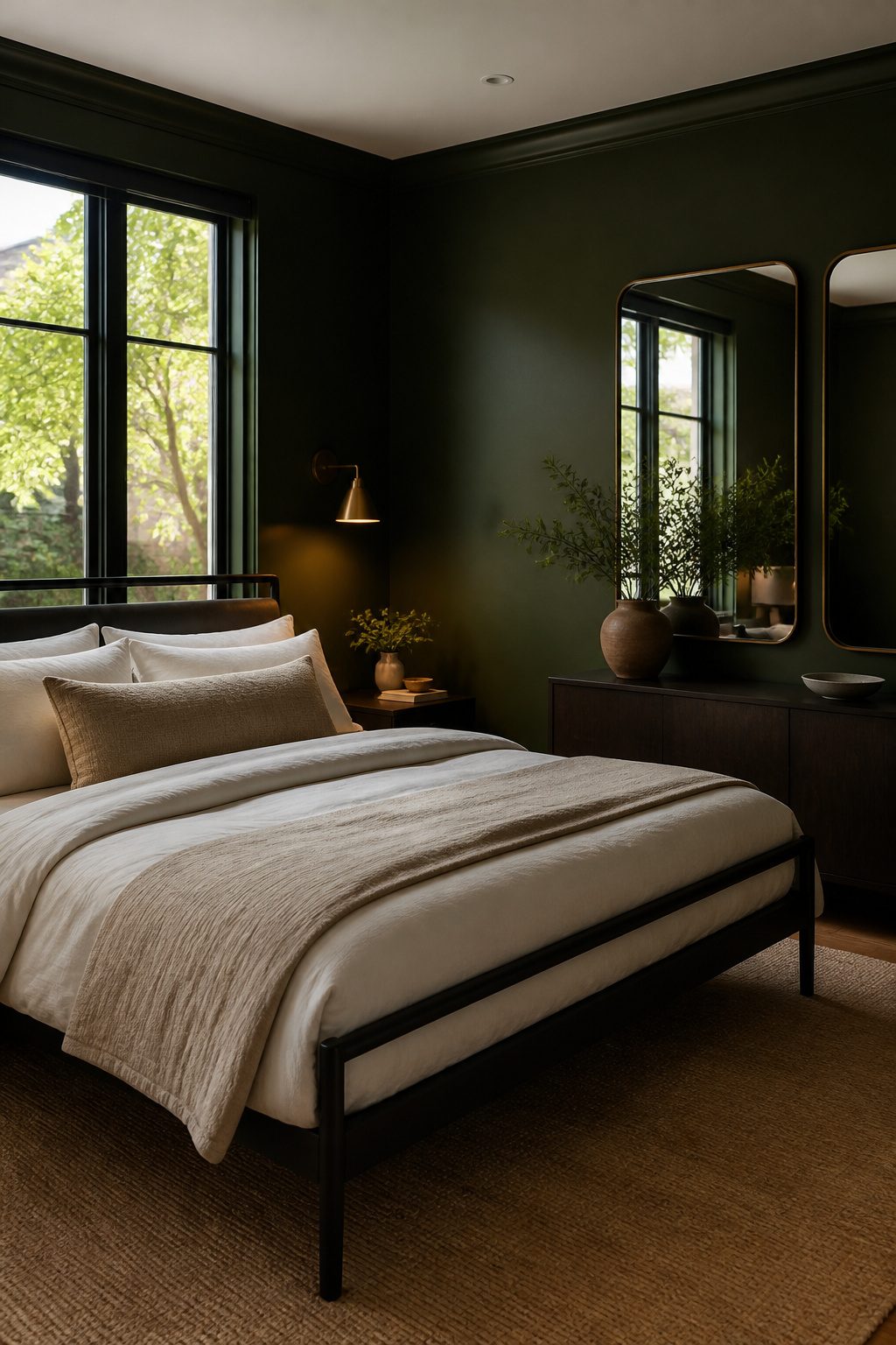
Black works best in a dark green bedroom when it stays in the supporting role. A matte black bed frame reads as a clean graphic shape against the wall, but the real move is the window frame.
Painting trim and sashes black against deep green walls gives you architectural contrast without the visual weight of a black dresser, nightstand, and bed all competing at once.
The risk is the cave effect. Too many black surfaces at eye level, especially with low natural light, and the room loses its edges.
Sources describe this as heaviness; the fix is leg clearance on furniture so you see floor beneath, plus lighter textiles or pale flooring to break up the dark planes.
Mirrors placed to catch what light you have also expand the space back out.
I would keep black to two categories at most: the bed frame or a desk, and the window trim. A black office desk against green-grey walls with beige upholstery nearby keeps the palette intentional rather than crowded.
Skip black on the headboard, the lamps, and the rug; let one material do the dramatic work and leave the rest to texture.
Frequently Asked Questions
What colors go with dark green for a bedroom?
Cream, soft white, brass, blush pink, burnt orange, walnut wood, and warm gray all pair well with dark green walls. Pick two warm tones and one metallic, then stop before it gets busy.
More than that and the palette starts to compete with itself. Cool, saturated greens look richest against warm accents because the contrast keeps the room from feeling cold.
What bedding goes with a dark green room?
Cream, soft white, oatmeal, blush, and warm taupe bedding all work because they bring brightness without harsh contrast. Washed linen or cotton sateen add the right texture.
Avoid pure stark white if your room lacks natural light; the warmth in cream keeps the space feeling layered rather than graphic. Layering two close cream tones almost always reads more expensive than a single solid set.
How to incorporate dark green into your bedroom design?
Adding dark green can be as simple as an accent wall or as bold as full-room coverage. A single forest green wall behind the bed anchors the room without swallowing a weekend and your security deposit.
For the full effect, paint the ceiling the same emerald as the walls so the immersive effect does not collapse when the eye hits a white lid.
Is green color good for a bedroom?
Green works well in a bedroom because it carries depth without the heaviness of black or the coldness of gray.
Dark green in particular absorbs light in a way that feels cozy rather than closed-in, especially when paired with warm textiles and the right bulb temperature.
Balance the saturation with enough warm accents and layered light so the room stays moody rather than oppressive.
What color not to paint your bedroom?
Cool gray bedding against green walls with warm wood furniture is the combination to avoid. Gray fights the warmth of both, turning wood muddy and green flat.
In a dark green bedroom, skip cool gray entirely if you have warm wood tones. Bright polished brass mixed with gold is another clash; the two temperatures turn muddy against dark green fast.
What is the most beautiful color for a bedroom?
Dark green ranks among the most beautiful bedroom colors because it shifts through the day, toward olive in morning sun and near-black under warm bulbs, giving the room a living quality flat colors cannot match.
Emerald, forest, and hunter greens each carry different weights: emerald reads richest, forest stays most forgiving, and hunter carries the most formal depth.




