
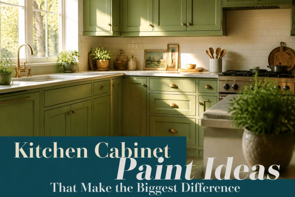
The right paint kitchen cabinets idea depends on how much light your kitchen gets and how much maintenance you will tolerate.
White reflects the most, but it also broadcasts every fingerprint; black reads expensive only if you already have large windows or an open layout, otherwise it turns flat fast.
Benjamin Moore White Dove and Alabaster remain the two whites painters reach for in tight spaces, and the difference between them is daylight versus lamplight.
1. Classic White for a Bright Kitchen
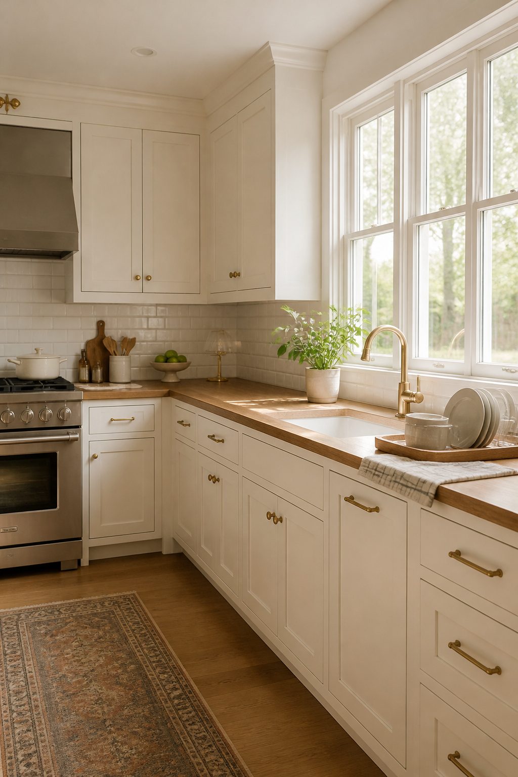
White cabinets still dominate kitchen renovations because they do what almost no other color can: they hand you back the light you already have, and sometimes make you feel like you gained a window.
In a small galley or a kitchen that opens toward a hallway rather than the yard, that borrowed brightness matters more than any trend.
The two whites worth comparing are Benjamin Moore White Dove and Benjamin Moore Alabaster, and the difference is daylight versus lamplight.
White Dove carries a soft, warm cast that keeps a north-facing room from reading sterile. Alabaster sits a half-step creamier, so it pairs better with brass hardware and wood floors that already lean honey.
Either one will reflect more light than a mid-tone gray or sage, which is why painters keep reaching for them in tight spaces.
Finish decides whether the job looks built-in or brush-painted. A satin or semi-gloss sheen wipes clean and resists the grease that collects near the range.
Flat or matte reads beautiful for about a week, then shows every finger mark. I would skip it for anything below eye level.
If the cabinets are solid but dated, white paint is the weekend project that reads like a full kitchen overhaul for the cost of a few gallons and a hardware swap.
You will pay for that brightness in upkeep: the same light that makes the room feel larger also shows the spaghetti sauce you did not catch in time.
Recommended Products
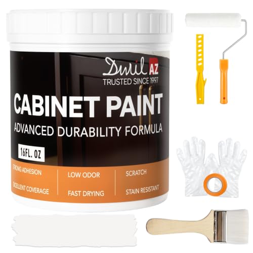
𝙉𝙊𝙏𝙀: Intentional headspace allows room for stirring, dipping, and transit. The stated paint quantity remains unchanged. If you have any questions, please contact our customer service team.

CABINET TRANSFORMATION: Refresh outdated cabinets, vanities, furniture and trim with rich Pure White color and a smooth semi-gloss finish

Use for a variety of indoor and outdoor project surfaces including wood, metal, plaster, masonry or unglazed ceramic
2. Bold Navy and Midnight Blue
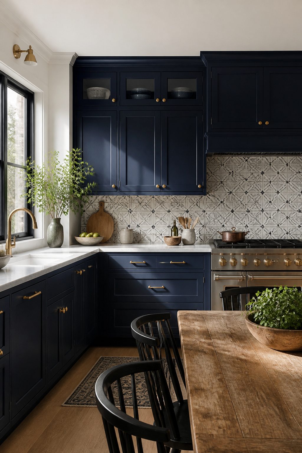
Deep navy and midnight blue carry enough weight to feel like a design decision rather than a color trend.
I like them best in kitchens that already get strong natural light, where the pigment reads as rich instead of oppressive. Dark Navy by Behr builds that kind of depth without tipping into black.
The balance matters more than the shade itself. White countertops or a soft neutral backsplash keep the cabinets from swallowing the room, and the contrast actually sharpens the blue rather than fighting it.
Brass hardware warms the whole thing up; gold reads too flashy against this particular tone, but aged brass hits the right note.
For a lighter counterbalance, creamy tongue-and-groove paneling on an adjacent wall borrows from the same playbook as Skywalker by Backdrop in that Connecticut kitchen: the blue stays bold, the room stays breathable.
Natural wood stools or rattan accents work too, though I find they tilt the look coastal in a way that can feel dated fast.
Stick with the brass and the neutrals if you want the finish to last through a resale.
Recommended Products

All-surface uniquely formulated paint solution: Easily refinish furniture, cabinets, countertops, doors, trim, floors and more

Beyond Paint furniture, cabinets and more all-in-one refinishing paint -gallon- color: Bright white

Beyond Paint furniture, cabinets and more all-in-one refinishing paint -quart and color: Bright white
3. Two-Tone Cabinets
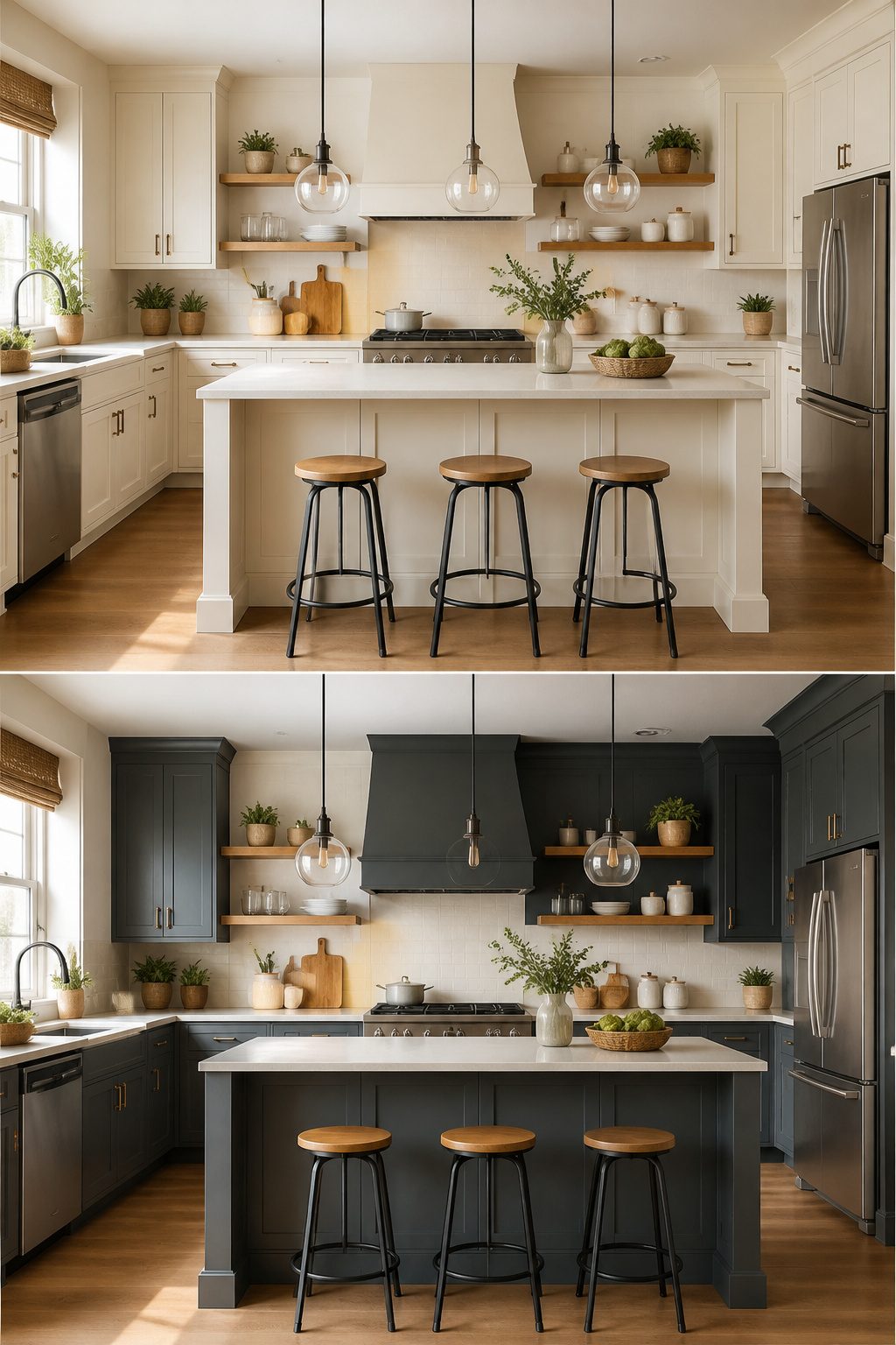
The modern two-tone approach usually splits along one of two lines: uppers against lowers, or the island against the perimeter.
Painting upper cabinets in a lighter shade like white or cream and lower cabinets in a deeper tone such as gray, navy, or sage green draws the eye upward and helps the kitchen feel taller.
This adds depth and visual structure, especially in open-concept homes where one uninterrupted color can flatten the whole room.
The island route works if you want to test color without committing the entire kitchen.
A bold hue like teal, charcoal gray, or deep red on just the island creates a natural focal point and reads as custom without the cost of a full repaint.
The pair has to share a temperature to look intentional.
A crisp white against a warm taupe will read as a mistake, not a choice. Pick two colors of similar warmth and let one element, such as hardware or a repeated accent in stools or light fixtures, tie them together.
Recommended Products

【Ample Storage Space】This blue storage cabinet features 2 doors and adjustable shelves, each offering 3 height options. Effortlessly store towels, toiletries, cosmetics, and other items of varying sizes in bathrooms, living rooms, or kitchens

Timeless Elegance: The fluted design adds a touch of elegance to this trash can, while the shimmering surface shifts beautifully with every angle, adding depth and making it a captivating modern piece that enhances a variety of home decor styles

Ample Flexible Storage Space: This kitchen bar cabinet boasts with a buffet and upper hutch. The upper hutch features 2 wide shelves for storing various items, while the bottom buffet has 4 shelves and 2 drawers to organize utensils, jars, snacks, and wine.
4. Soft Gray
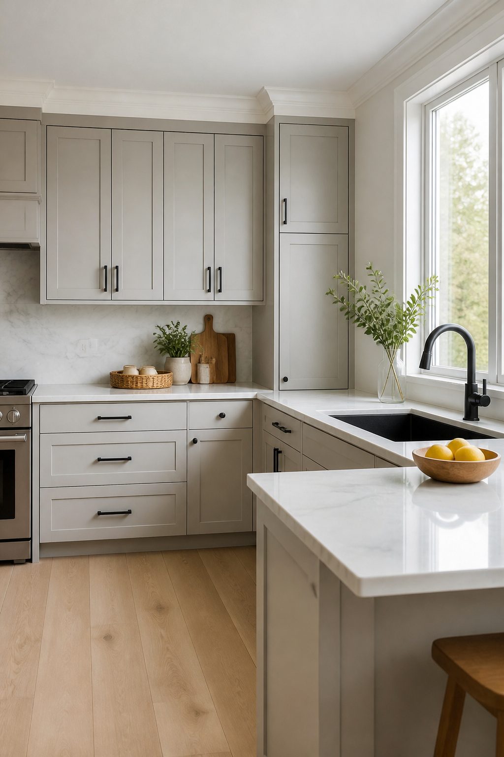
Gray splits the difference between safe white and a color commitment, which is exactly why it works for a kitchen you actually cook in.
Read the undertone before you buy. A gray with brown in it, like the prairie-grass shades that read almost greige, picks up warmth from wood floors and keeps the room from feeling sterile.
Push toward the cooler end and the same cabinets will talk to stone counters instead, but they can turn flat under warm light if you are not careful.
I tend toward the warmer grays for rentals and first projects because they forgive the mismatched materials most of us inherit.
Dove gray or a true greige reads sophisticated the same way a good charcoal sweater does: it looks intentional without looking like you tried.
The practical side matters too. Gray hides the fingerprints and smudges that white broadcasts across every door front, which means the kitchen stays presentable between deeper cleans.
Mid-tone gray in a dim kitchen adds coziness without closing the room in; pale gray in a bright one stays airy.
Either way, keep the hardware simple. Black or chrome against gray does the balancing work for you.
5. Forest Green
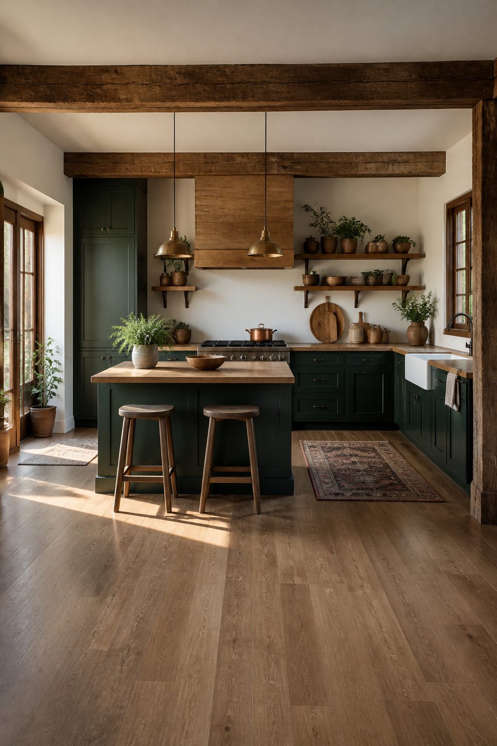
Forest green cabinets work best when they read as intentional, not inherited. The shade matters more than most colors here: a deep forest green with black undertone looks grounded and current, while a yellow-shifted olive veers fast into dated territory.
Benjamin Moore’s Ming Jade offers a cooler alternative that still belongs in a mountain kitchen, especially against crisp white walls where it stays bright rather than moody.
A matte finish keeps the tone looking organic rather than theatrical.
Pair this with brass hardware and warm wood shelving for a cabin-adjacent kitchen that feels collected, not staged. Black hardware works too, though it pushes the look closer to modern farmhouse than rustic.
The real risk with green is installation day regret. Small or low-light kitchens need the lighter end of the forest range; deep tones swallow space without enough natural light.
Butcher-block countertops or open wood shelving add the warmth that keeps green from going flat. skip the glaze and skip any distressed finish here, both of which read as 1970s attempts at rustic rather than the real thing.
6. Black Cabinets
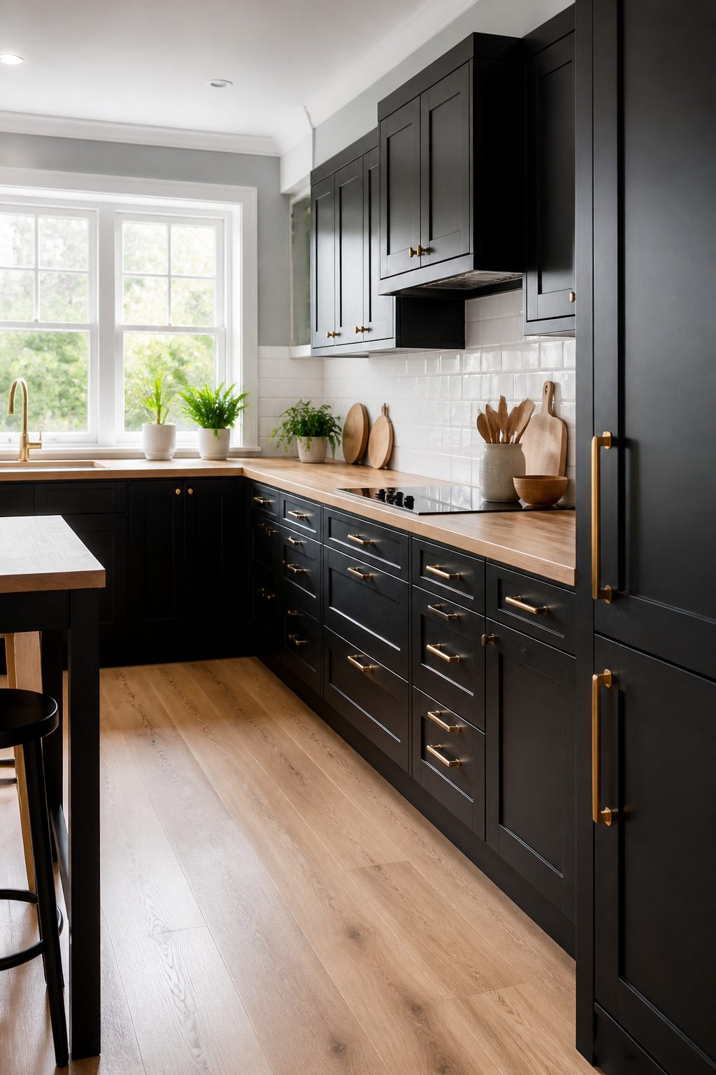
Black cabinets are the riskiest move you make when you paint kitchen cabinets, and the dividing line is light.
I only push this choice in kitchens with large windows or an open layout where natural light floods in across multiple walls.
In that setup, black reads as intentional and expensive. In a small closed kitchen without that light source, black sucks the room in and turns flat fast, and no amount of warm metallic hardware redeems it.
Finish is what saves you from the cheap look. I go satin or semi-gloss so the surface catches and bounces light back out instead of swallowing it.
Pure flat black on cabinets looks like a missed primer coat to me. The sheen gives depth, and under-cabinet lighting sharpens the edges so the color registers as texture rather than void.
If your walls or backsplash is already competing, skip this.
Black cabinets need white or light-gray surroundings to breathe. Pair them, and the contrast does the work for you.
7. Warm Beige and Cream
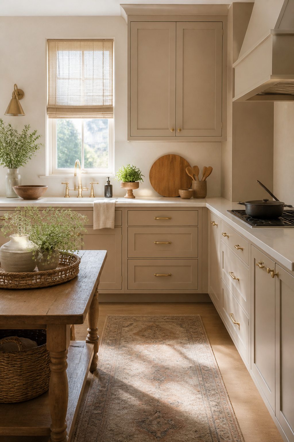
Warm beige and cream have quietly climbed back into kitchens after gray dominated for most of a decade.
I look at the shift as less about a trend cycle and more about what actually lives well in a house you do not plan to gut.
Sherwin-Williams Alabaster and Benjamin Moore White Dove sit at the practical center of this return: both read as warm without yellowing, and both forgive the tan trim and honey oak that first-home owners often inherit.
The real win is compatibility.
Beige cabinetry does not fight existing woodwork; it bridges it. Pair it with brass hardware or a woven runner and the kitchen feels intentional rather than inherited.
What I like less is the instinct to push toward cream so hard that the room turns flat. A touch of contrast, even just through natural wood countertops, keeps the look from drifting into builder-grade sameness.
For renters, the practical limit is clear: paint the cabinets if your lease allows and the kitchen is small enough to finish in a weekend.
Cream and beige repay that labor because they age slowly. Wall colors can shift, backsplashes can be peeled and replaced, and the cabinets still hold.
The cost stays under a few hundred dollars if you prep and spray yourself, and what you get is a kitchen that looks designed rather than tolerated.
8. Color on the Island Only
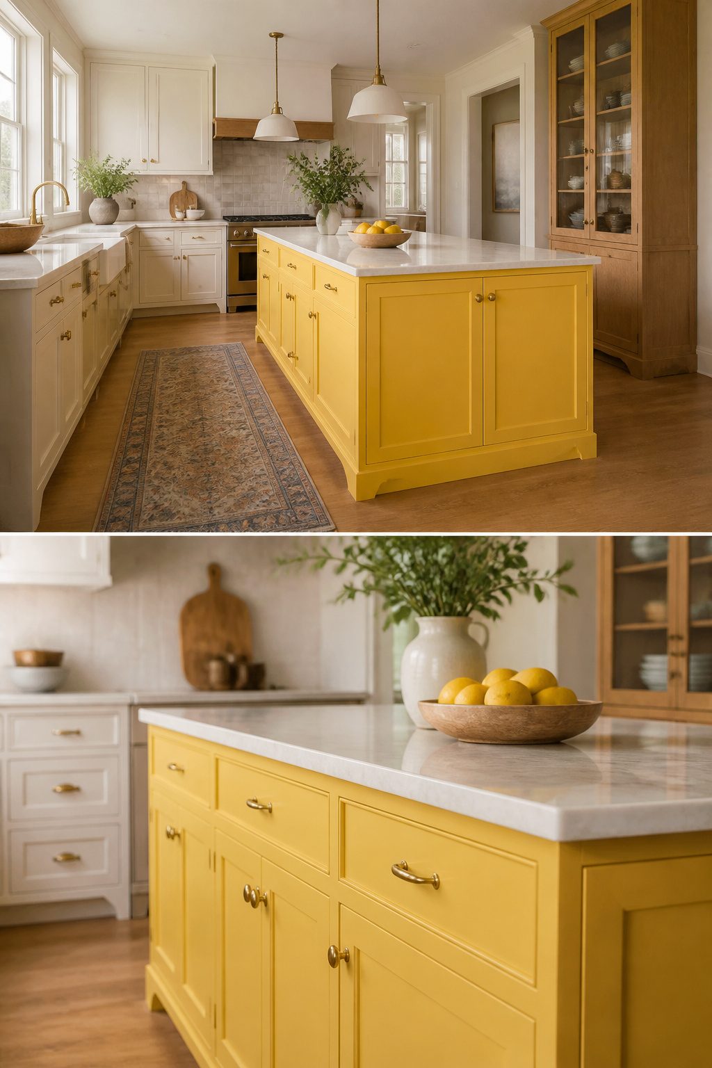
Painting just the island is the lowest-risk place to test color in a kitchen. The surrounding cabinets stay in whatever neutral you already have, so one bold surface does not fight the rest.
Sherwin-Williams Decisive Yellow (SW 6902) is a good example of how far a single block of color can carry. Used on an island, it reads as a deliberate accent rather than a takeover.
Kitchens don’t have to be bland, as designer Courtnay Tartt Elias of Creative Tonic proves by painting the kitchen cabinets in Sherwin-Williams Decisive Yellow (SW 6902) that bestow the space with a pop of color and radiant energy.
What matters for you: if the yellow reads too loud in six months, you are refinishing one freestanding piece, not thirty doors and drawer fronts.
A single island takes about a quart of paint versus four or five gallons for a full kitchen, and a weekend of work versus a week. That is a cheap way to change your mind.
9. Matte Finishes
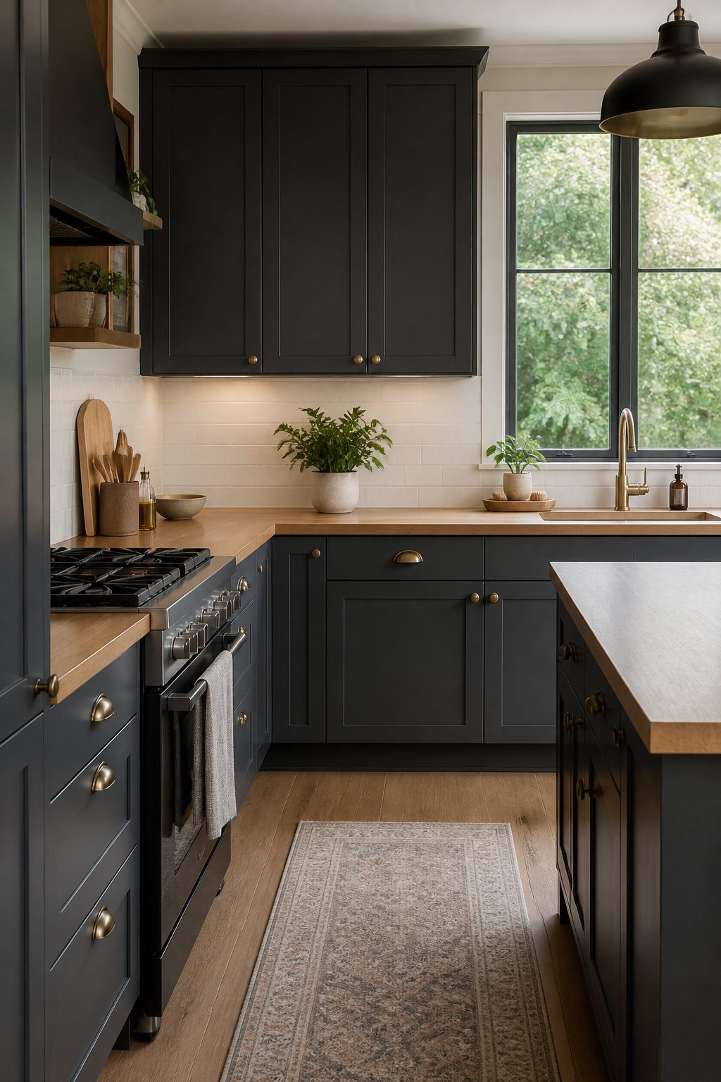
Matte finishes read as modern because they kill reflection entirely. The surface drinks light instead of bouncing it back, which is why charcoal or gray-green cabinets in matte look expensive in a way high-gloss color rarely does.
Matte paint has a weakness: it shows abrasion faster than satin or semi-gloss, and not every formula wipes clean without leaving a sheen mark where you scrubbed.
Chalk paint is not the same thing. Chalk paint dries to a porous, velvety surface that looks matte but has almost no film integrity; it chips at edges and absorbs grease.
Cabinet-grade matte paint is different, built as a crosslinked enamel that cures hard enough to handle a damp rag.
Benjamin Moore’s ADVANCE line makes a matte specifically rated for cabinetry, and INSL-X Cabinet Coat runs in lower sheens that survive kitchen duty.
Both need a bonding primer like STIX underneath and a 180 to 220 grit sand before the first coat, or the finish fails early.
I would skip matte if the cabinets see heavy traffic from kids or if you know you wipe them down daily.
For a secondary kitchen or a rental refresh where the look matters more than a ten-year lifespan, matte wins on style per dollar.
10. Glazed and Distressed Finishes
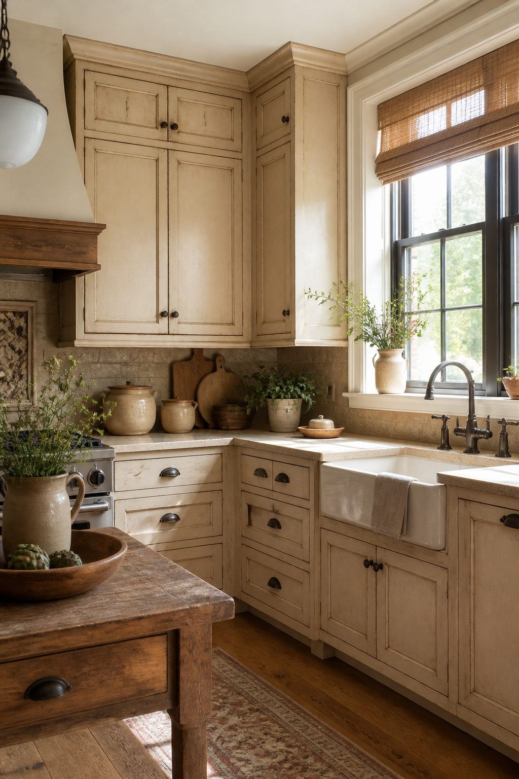
Glazing over a base color gives cabinets depth by settling into grooves and edges, catching light differently than a flat coat ever would.
Light distressing on corners does the same thing with texture, mimicking years of real use without looking beaten up.
The two techniques pair well with warm lighting and antique hardware, and you can dial the effect from barely-there to clearly rustic depending on the house.
Execution is everything. A solid color forgives a slightly uneven roller or a missed speck of dust.
Glazing and distressing do not. The glaze can pool too heavy in one spot and look muddy, or too light and disappear entirely.
Distressing with sandpaper or a chain is easy to overdo, and once the raw wood shows through in the wrong place, the only fix is starting over.
I would put this firmly in the weekend-plus-a-day column, not a single Saturday, and budget for extra paint since mistakes burn through material faster than a clean coat.
Done well, the finish reads as charming, lived-in, personal.
Done poorly, it reads as dated in the way of mass-produced "country" furniture from twenty years back. The line sits in the subtlety of the distressing and the quality of the base color underneath.
If the kitchen already has open shelving or vintage knobs, the look has context. In a kitchen full of modern flat-panel doors and LED strips, the same finish fights its surroundings.
Prep Work That Determines 5 Years from Now
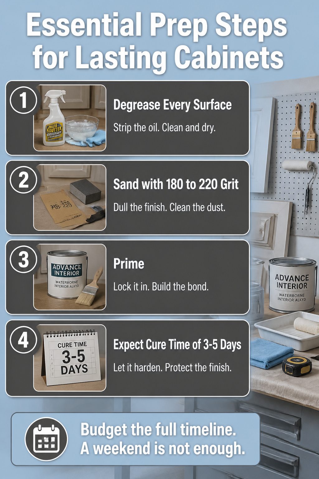
Kitchen cabinet paint fails because someone skipped a step that takes an hour and lost patience on hour five.
- Degrease every surface. Warm soapy water works for newer cabinets; older ones need a degreaser like Krud Kutter to strip the oil buildup that soap leaves behind. Paint over grease and it bubbles in year two.
- Sand with 180 to 220 grit. Dull the finish; do not strip it bare. Paint needs tooth to bite into, especially on laminate or any surface with a sheen. Vacuum the dust, then wipe with a damp rag or microfiber cloth.
- Prime. Skipping this is the fastest way to watch your color block and chip.
- Expect three to five days of cure time before you rehang doors or load shelves. ADVANCE Interior paint and most cabinet-grade finishes need this window to harden. Close the cabinets early and every plate, pot, or pantry item you wedge back in will leave a permanent mark.
Budget the full timeline. A weekend is not enough.
Paint Types and Finishes That Last
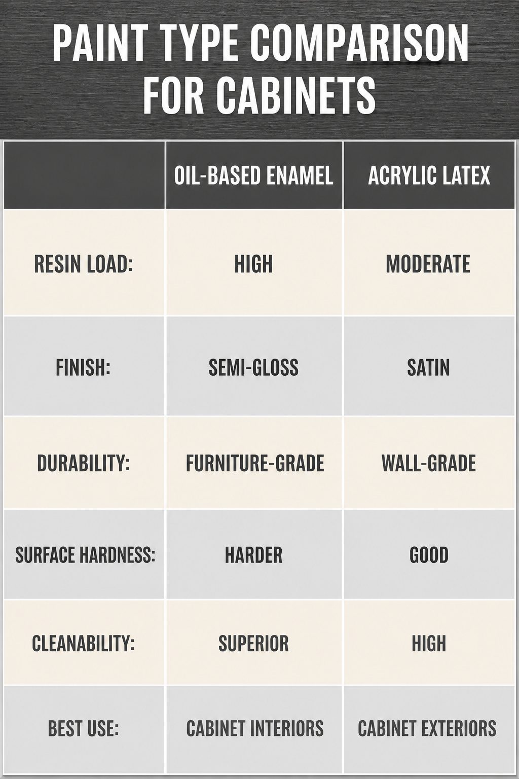
Oil-based enamel still sets the hardest film on cabinets, but acrylic latex has narrowed the gap enough that I reach for it first.
The chemistry matters less than the resin load: cabinet paint packs more solids per gallon than wall paint, which is why a single gallon runs higher and covers fewer square feet.
You are paying for a surface that survives daily wiping without going chalky.
Semi-gloss reflects enough light to keep a kitchen from feeling dim, and the slicker surface releases grease with less scrubbing.
Satin forgives slightly uneven brushwork, which matters if you are rolling the frames by hand instead of spraying. Either finish outlasts flat or eggshell on a door you touch twenty times a day.
The real test is inside the cabinet where dishes slide.
A furniture-grade enamel like Benjamin Moore ADVANCE or INSL-X Cabinet Coat cures to a harder, more washable shell than standard wall formulas. Skip that upgrade and the interior shelves will show wear first, long before the exterior color tires you.
Color Psychology for Kitchens
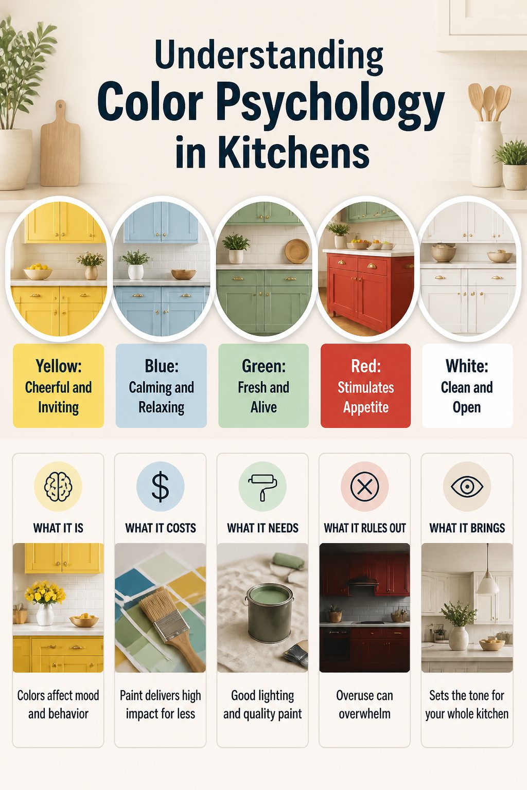
Yellow wakes a kitchen up faster than any other cabinet color, which is why it reads as cheerful and inviting in a space where most families start and end their day.
I would not use it on every surface; one sunny wall of cabinets paired with neutral uppers keeps the energy high without tipping into circus-tent territory.
Blue does the opposite. It quiets the room, slows the pulse, and turns the kitchen into a place where chopping onions feels less like a chore.
Soft sky blue works best here; navy or midnight blue reads heavier and can crowd a small kitchen unless you balance it with light countertops or brass hardware.
Green splits the difference. It carries the calm of blue but borrows enough warmth from yellow to feel alive, and it signals freshness in a room where that matters.
Sage or muted forest green on cabinets gives you the natural, tranquil note without asking the walls to do too much.
Red is the appetite stimulant, the one color that genuinely makes people hungrier.
A red island base or a single bank of lower cabinets adds that vibrancy; full red cabinetry overwhelms most home kitchens and turns the room into a restaurant.
White and greige stay the safe default because they read as clean, open, and uncluttered. They recede visually, which lets your tile, your pendant lights, or that inherited ceramic bowl collection become the focal point instead.
Frequently Asked Questions
What is the best color for a small kitchen?
Bold colors work well in small kitchens because the footprint is small enough to handle them without overwhelming the space. Teal, yellow, mauve, and green all read as fearless choices that add personality rather than closing the room in.
If you prefer safer territory, white or soft gray reflects light and makes the kitchen feel larger, though the same brightness will show every mark.
Do I need to sand cabinets before painting?
Yes. Sand with 180 to 220 grit to dull the finish so paint has tooth to bite into, especially on laminate or any glossy surface.
Vacuum the dust, wipe with a damp rag or microfiber cloth, and prime before the color coat. Skipping this is the fastest way to watch your paint block and chip within a couple years.
What type of paint is best for kitchen cabinets?
Acrylic latex enamel with a semi-gloss or satin finish is the best balance of durability and practicality for most kitchen cabinets.
Cabinet-grade formulas like Benjamin Moore ADVANCE or INSL-X Cabinet Coat pack more solids per gallon than wall paint and cure to a harder, more washable shell.
Semi-gloss releases grease with less scrubbing; satin forgives slightly uneven brushwork if you are rolling by hand.
What are some timeless colors for kitchen cabinets?
White, warm beige, cream, and soft gray stay timeless because they read as clean and open without fighting your tile, hardware, or inherited woodwork.
Benjamin Moore White Dove and Sherwin-Williams Alabaster sit at the practical center of the warm neutral range, forgiving mismatched materials and aging slowly even as wall colors shift around them.
Should I prime before painting cabinets?
Yes, priming is non-negotiable if you want the finish to last. Paint over grease or a glossy surface without primer and you will see bubbling and chipping by year two.
Use a bonding primer like STIX underneath, especially on laminate or previously finished surfaces, or the new coat fails early no matter how good the paint is.
Is it better to brush or spray paint kitchen cabinets?
Spraying gives the smoothest, most factory-like finish on doors and drawer fronts, but brushing or rolling the frames by hand is practical for most DIYers and still looks built-in if you use satin or semi-gloss.
The real difference maker is the prep, not the tool: degrease, sand, prime, and allow three to five days of cure time before rehanging doors or loading shelves.




