
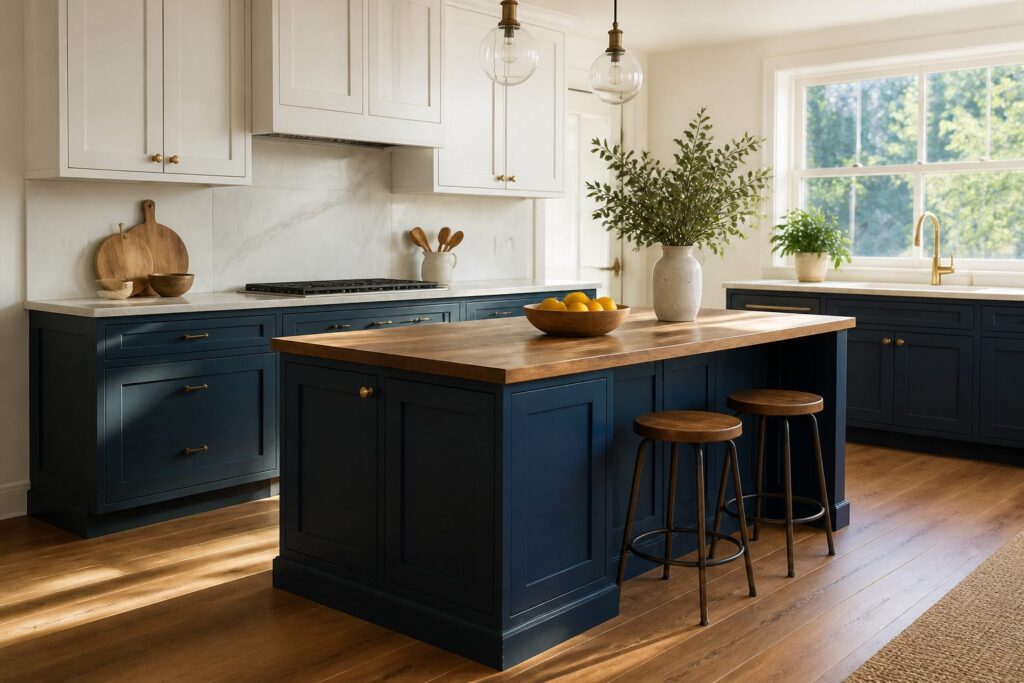
Two-tone kitchen cabinets split your cabinetry into two different colors or finishes rather than one flat shade.
The classic layout puts lighter uppers above darker lowers, but the split can also isolate an island, a tall pantry wall, or a single accent bank.
The 70/30 rule keeps the balance in check: roughly 70 percent in a neutral tone and 30 percent in the bolder accent, so the room reads intentional rather than unfinished.
Upper and Lower Cabinets
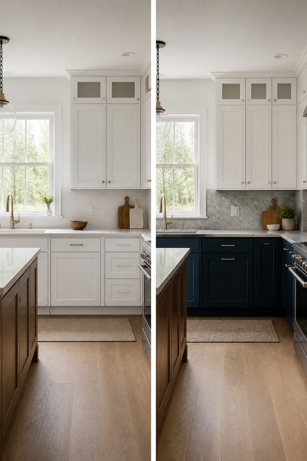
The classic split for two tone kitchen cabinets puts the lighter color up top and the darker shade below.
Lighter uppers catch daylight and let the ceiling feel higher than it measures, while darker lowers do the practical work of hiding scuffs, spills, and the wear that accumulates at foot level.
The 70/30 rule keeps the balance from tipping too far: about 70 percent of the cabinetry in a neutral tone, with the remaining 30 percent in the bolder accent. That usually means the uppers stay bright and the bases carry the weight.
White paired with navy stays the safest bet if you want contrast without risk, and natural wood bases with cream uppers warm the room without closing it in.
Either way, the darker color anchors the space. I would not reverse the order; dark cabinets overhead press the ceiling downward and every overhead light works harder against them.
Statement Island
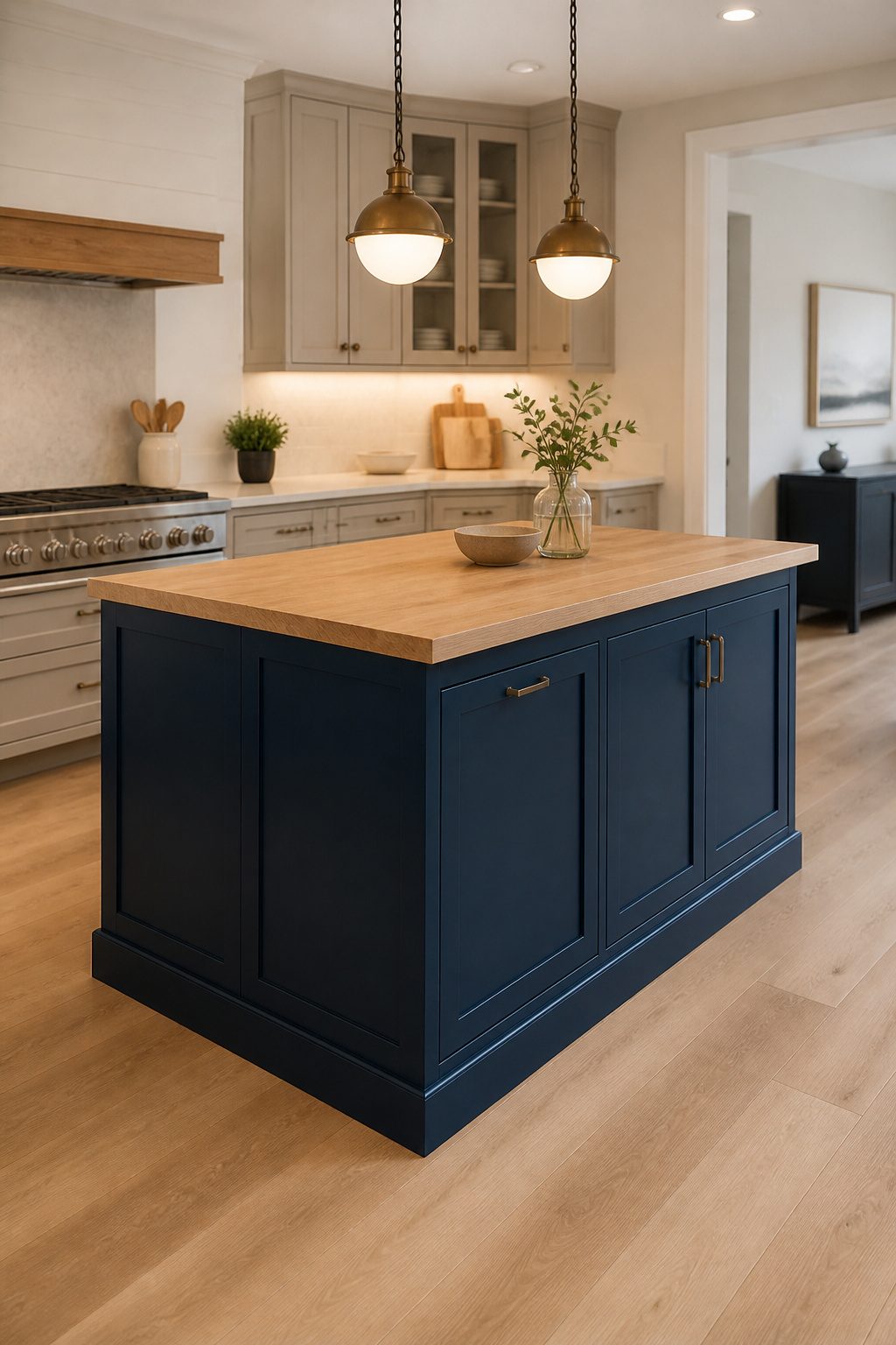
A kitchen island painted in navy, black, or deep green reads as furniture rather than built-in cabinetry. That distinction matters because it lets you bring in a color or finish that would exhaust the eye if it wrapped every wall.
The island becomes the visual anchor while the perimeter stays in a quiet neutral, and the contrast does the work without your having to add molding or hardware to create interest.
This approach suits open-concept layouts especially well, where the island already sits at the center of traffic and sightlines.
In a closed kitchen, the same principle holds, just at a smaller scale; the island still draws the eye first when you walk through the door, but the surrounding walls keep the bold color from spilling into adjoining rooms.
Either way, the commitment is limited.
Should your taste shift, repainting one island beats refacing a full perimeter, and buyers respond well to the look since it signals a kitchen that was thought through rather than defaulted to builder-grade white throughout.
Tall Cabinets One Color, Perimeter Another
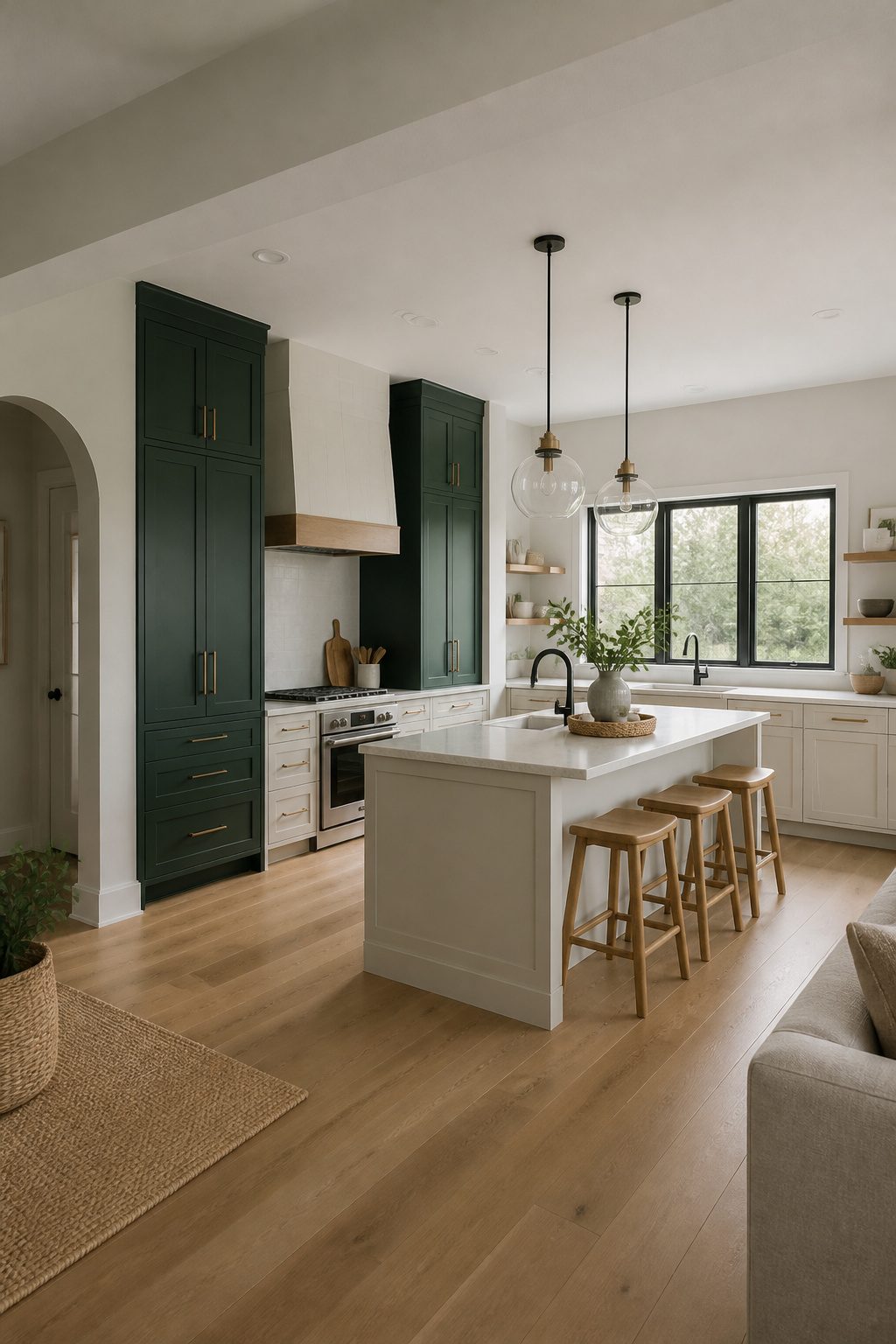
Tall pantry walls are where this layout earns its keep.
Painting the floor-to-ceiling unit a shade apart from the base and upper cabinets running the rest of the room creates a built-in, custom appearance that reads as intentional architecture rather than a cabinet delivery.
The contrast works best in kitchens large enough to carry it without the tall mass feeling like an interruption.
In a smaller galley with only an 84-inch pantry cabinet, the single dark block can look stranded and heavy; the eye needs enough perimeter length for the two-tone rhythm to register as a system.
Wood tones against painted perimeter cabinets merge natural warmth with modern color here especially well, since the tall unit’s vertical grain draws the eye upward and the painted surrounds keep the room grounded.
If your tallest storage is a standard refrigerator panel, skip this approach entirely; the proportion is wrong and the result just looks like a mismatched appliance garage.
Mixed Materials
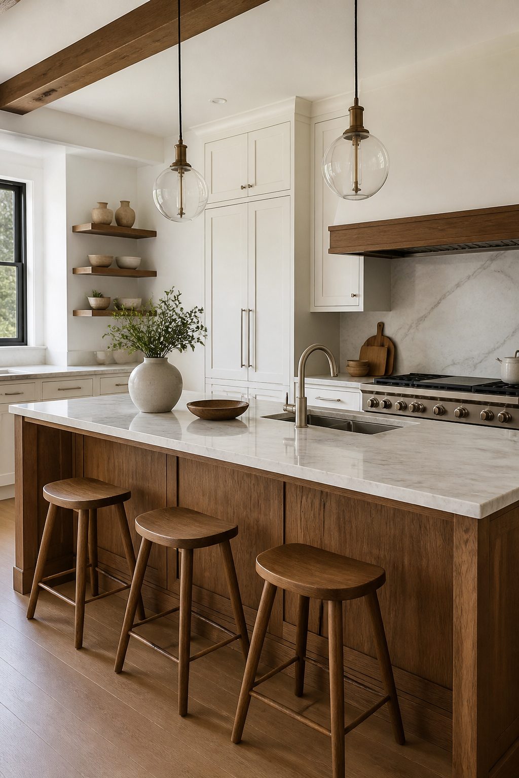
Color alone can flatten a kitchen, but mixing a painted finish with a natural wood stain adds real depth that reads as intentional rather than busy.
Walnut with matte white is the pairing I keep seeing work: the warm grain against a flat, cool surface gives each material something to push against.
Oak with sage green runs close behind, especially when the oak carries a lighter, more Scandinavian tone that keeps the green from reading too cottage.
The details sources keep glossing over matter more than they let on.
Grain direction matters when your eye travels from a painted upper cabinet to a wood island or tall pantry: vertical grain on a flat-panel door reads modern, horizontal on a Shaker frame leans traditional, and mixing the two without a break, like a countertop line, creates visual static.
Sheen matching is just as easy to miss. A satin painted cabinet next to a semi-gloss stained one will look off even if the colors are perfect, because light hits each surface differently.
I would drop both to the same sheen level, usually satin or matte, and let the material itself do the contrasting.
The unifying element that saves mixed-material kitchens from feeling random is often the countertop: veining or flecks that pick up both the wood tone and the paint color pull the two camps together.
Same door style across both finishes helps too. A Shaker frame in painted birch and a Shaker frame in stained walnut still reads as one coherent kitchen, where different door profiles would fight each other.
Accent Colors
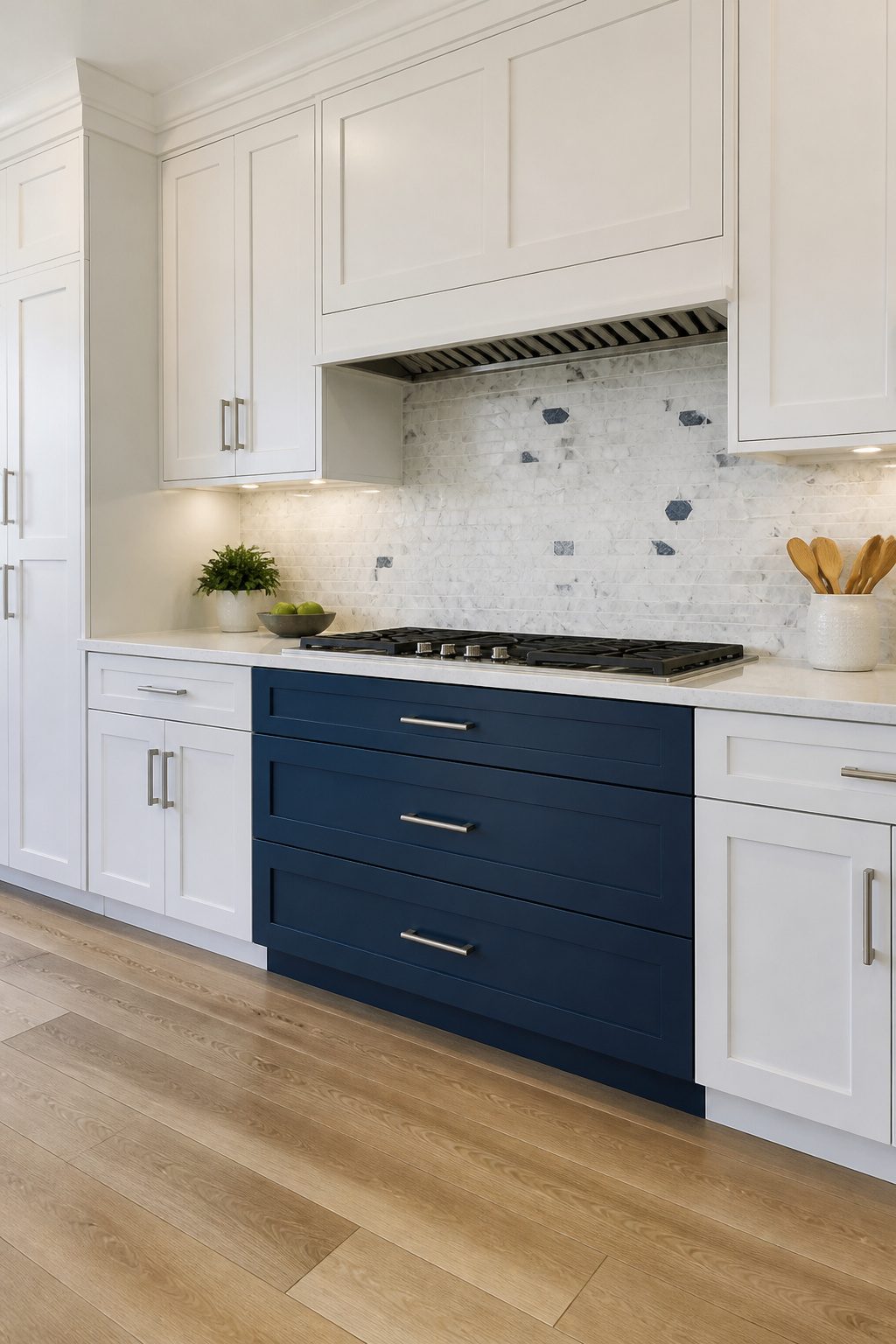
A single bank of drawers in navy against a wall of white uppers and lowers reads as a deliberate accent, not a leftover can of paint.
The same goes for a hutch section or the back panel behind open shelving. These spots work because they sit inside the larger layout rather than floating on their own.
The risk is looking like you stopped instead of chose.
I avoid that by keeping the door style identical across both colors. A Shaker door in white and the same Shaker door in forest green ties the two together even where the paint splits.
The countertop helps too. A slab with veining or flecks that pick up both cabinet colors makes the accent feel planned from the start rather than added later.
Keep the accent to roughly one-fifth of the total cabinet face, or it starts competing with the room instead of punctuating it.
In a smaller kitchen, I would rather see the bold color on a narrow drawer stack than on a full island.
An island in a strong hue can dominate a compact space; a drawer bank just gives the eye a place to land.
What Two-Tone Cabinets Actually Are
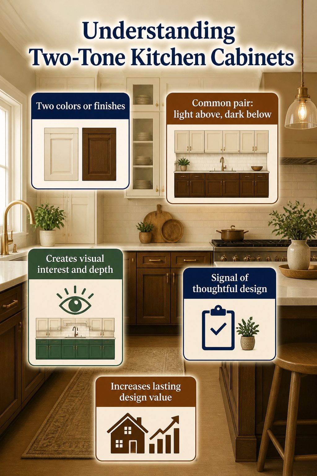
Two-tone kitchen cabinets means exactly what it sounds like: two different colors or finishes on your cabinetry instead of one flat shade.
The most common approach is lighter cabinets above with deeper, richer tones below, though the pairing can run in any direction you want.
Painted cabinets mixed with natural wood, bold colors against soft neutrals, and earthy tones with crisp whites are all fair game. Medium wood and soft beige read warm and natural.
Blue or green paired with white feels modern and clean. Two neutrals, one deeper than the other, stay calm and complementary.
Black or mahogany below pure white turns elegant. Gray and white carries the broadest appeal.
The effect on a room is immediate. A single color runs flat; two tones add layers of visual interest and depth that read intentional rather than accidental.
The contrast draws the eye and creates natural zoning between upper and lower areas, which can make a small kitchen feel more structured and a large one less cavernous.
Real estate pros note that buyers respond well to the look because it signals a kitchen that was thought through rather than assembled from a catalog.
That perception of care translates to lasting design value, which is why the approach still holds favor with designers and homeowners alike.
Color Pairings That Work
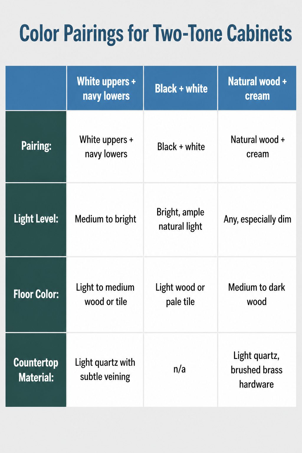
The most reliable two-tone kitchen cabinet pairings fall into three camps, and the right one depends on what your kitchen already gives you to work with.
| Pairing | Light Level | Floor Color | Countertop Material |
|---|---|---|---|
| White uppers + navy lowers | Medium to bright | Light to medium wood or tile | Light quartz with subtle veining |
| Black + white | Bright, ample natural light | Light wood or pale tile | n/a |
| Natural wood + cream | Any, especially dim | Medium to dark wood | Light quartz, brushed brass hardware |
White and navy works when you want the room to feel grounded but still open; the white uppers reflect light while the navy does the visual heavy lifting below.
Black and white reverses that risk, it can read stark unless your floors are pale enough to keep the dark lowers from swallowing the room.
Natural wood and cream is the forgiving choice, brightening a dim space without the clinical edge that all-white can bring.
What separates a polished result from a mismatch is the countertop. A surface with flecks or veining that pick up both cabinet colors ties the two together so the contrast reads intentional, not accidental.
I would keep the door style consistent across both tones, one Shaker profile throughout, so the eye has somewhere to rest.
Layout Options Compared
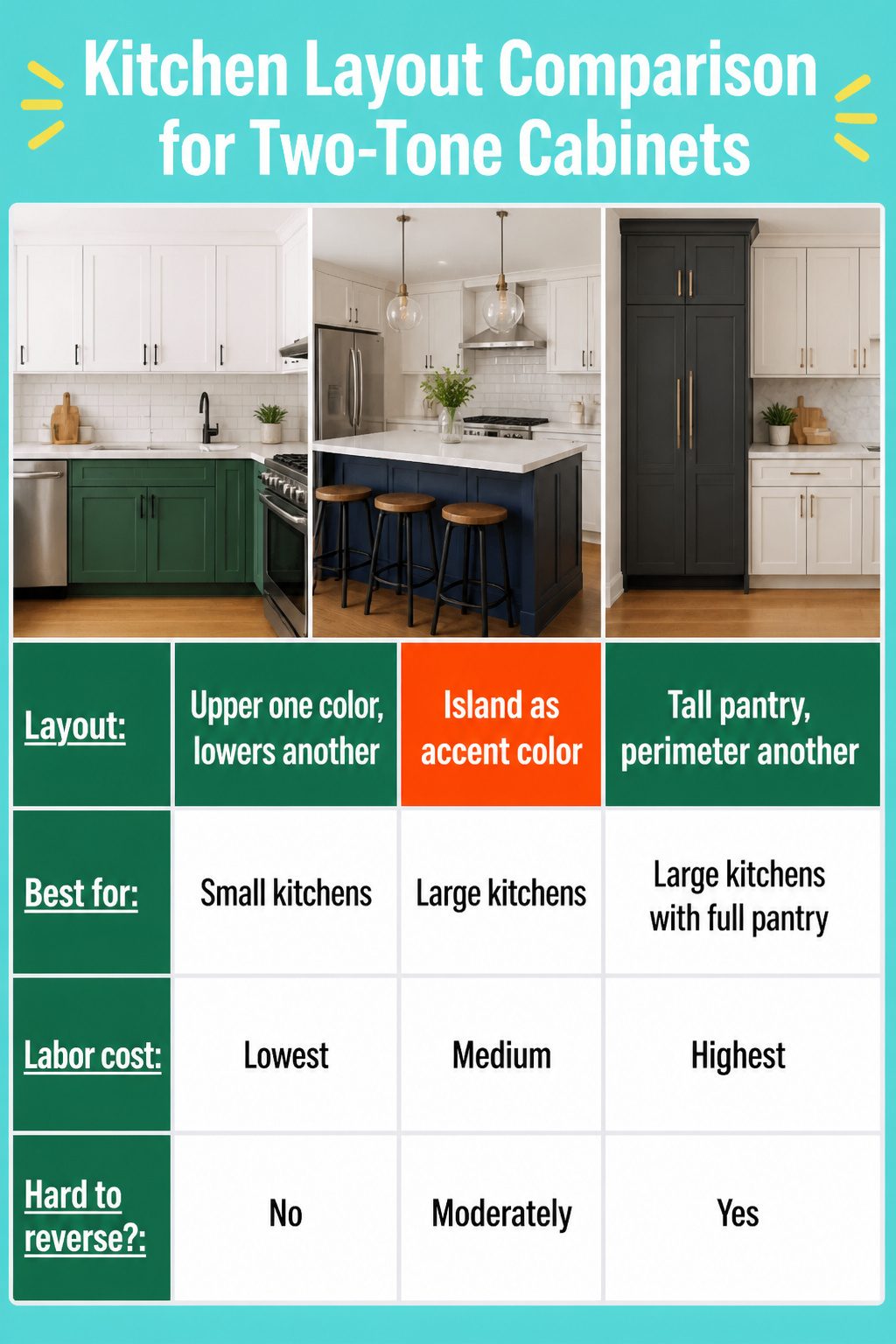
The three main ways to split color in a kitchen each carry a different labor cost and a different risk if you change your mind later.
| Layout | Best for | Labor cost | Hard to reverse? |
|---|---|---|---|
| Upper cabinets one color, lowers another | Small kitchens; the horizontal line at counter height adds structure without taking up space | Lowest; standard cabinet order, just two colors | No; doors swap like any other |
| Island as accent color | Large kitchens with a center island; gives one focal point | Medium; island boxes may be a separate order | Moderately; island is contained to one unit |
| Tall pantry one color, perimeter another | Large kitchens with a full pantry wall; reads as built-in | Highest; tall units need precise color matching to perimeter | Yes; pantry wall dominates visually and repainting tall cabinets is a multi-day job |
The island accent is the safest first experiment. It limits your second color to one compact unit, and if the contrast feels off in three years, you have one cabinet run to repaint instead of a whole wall.
The tall pantry approach looks the most custom, but only when the kitchen has the square footage to absorb that much vertical contrast; in a smaller space, the pantry reads as a block that cuts the room in half.
Why the Look Still Holds
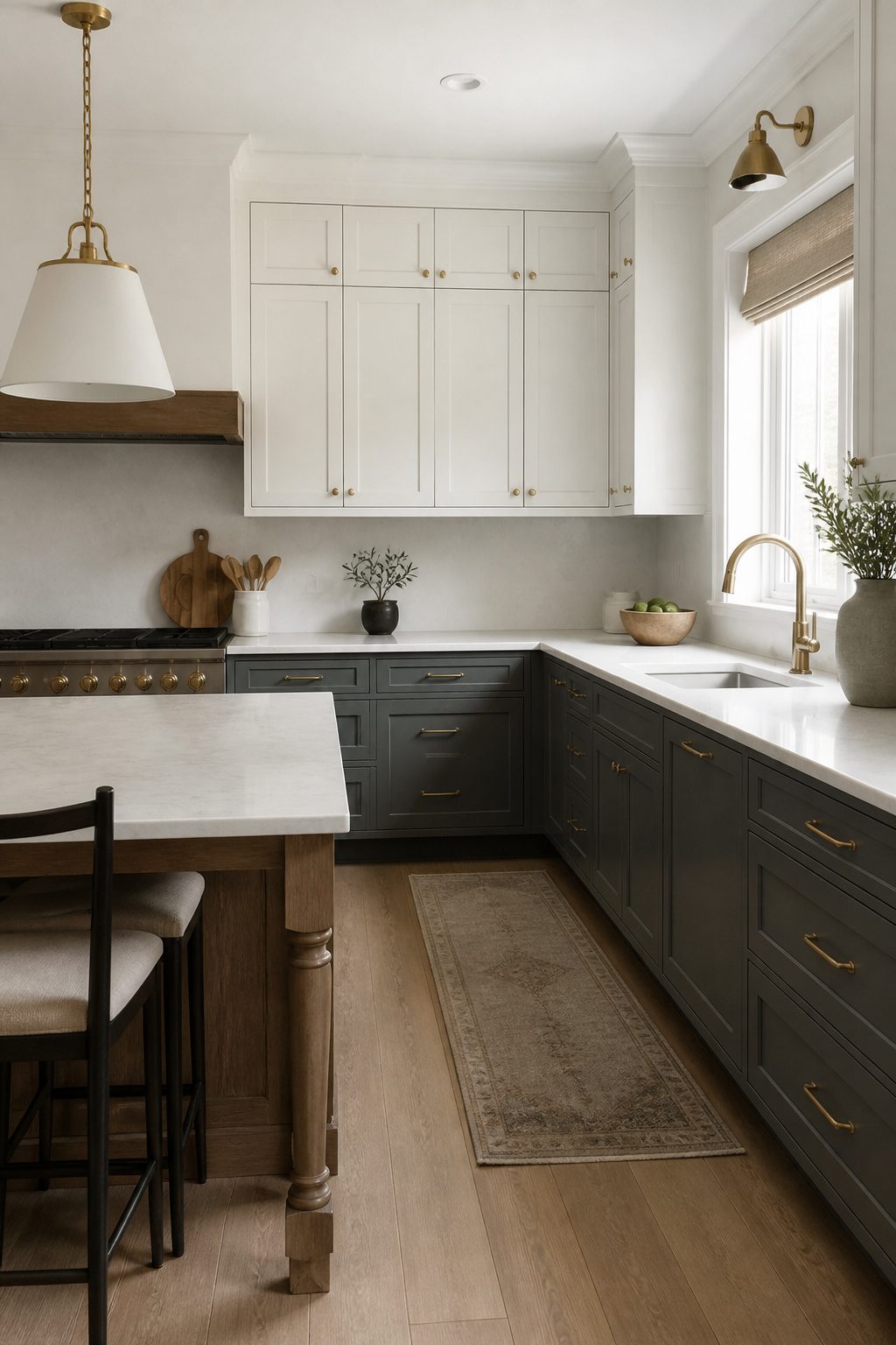
Two-tone kitchen cabinets are still very much in style, and the reason is simpler than most trends that come and go.
Where a single color across every surface flattens the room, two tones create visual zoning that lets the eye rest and move at the same time.
I see this working across modern kitchens with sharp contrasts and traditional ones where softer shifts between cream and sage do the same job more quietly.
The look has lasted because it adapts to personal taste rather than fighting it.
You can pair navy lowers with white uppers for something crisp, or stain the island base while keeping perimeter cabinets painted, and both read as intentional rather than dated.
Real estate pros note that buyers respond to this signaling: a kitchen that looks considered, not mass-installed.
What separates two-tone from flash-in-the-pan trends is that it solves actual problems.
It breaks visual monotony, adds depth without demanding more square footage, and lets you highlight one zone, the island or the tall pantry wall, without a full custom budget.
Other looks have ridden the same Pinterest wave and burned out because they only offered novelty. This one gives you a tool that still works when the novelty fades.
Frequently Asked Questions
Are two-tone kitchen cabinets still in style?
Yes, two-tone kitchen cabinets remain very much in style in 2026.
The look has lasted because it solves real problems: it breaks visual monotony, adds depth without demanding more square footage, and lets you highlight one zone without a full custom budget.
Real estate pros note that buyers respond well to the look because it signals a kitchen that was thought through rather than assembled from a catalog.
What is the rule for two-tone cabinets?
There are no strict rules, but the most common approach puts lighter cabinets on top and darker ones below.
The 70/30 rule helps keep the balance: about 70 percent of the cabinetry in a neutral tone, with the remaining 30 percent in the bolder accent.
Lighter uppers catch daylight and make the ceiling feel higher, while darker lowers hide scuffs and wear that accumulates at foot level.
How do I choose the right two-tone combination for my kitchen?
Start by considering your natural lighting, kitchen size, existing flooring, and countertops. White paired with navy is the safest bet for contrast without risk; natural wood bases with cream uppers warm the room without closing it in.
A countertop with flecks or veining that pick up both cabinet colors ties the two together so the contrast reads intentional, not accidental.
What are the trendy two-tone kitchen cabinet colors for 2026?
Navy with white, natural wood with cream, and sage green with oak are among the pairings carrying strongest into 2026.
Walnut with matte white and oak with sage green are especially popular for mixing painted finishes with natural wood stains. Black or mahogany below pure white turns elegant, while gray and white carries the broadest appeal for resale.
What kitchen cabinet colors will look outdated in 2026?
What separates a polished two-tone result from a mismatch is not the color itself but how it interacts with your specific space: pairing two trendy colors together risks dating quickly, while one wood or timeless neutral anchored to a trending hue tends to hold longer.
The safest approach keeps one tone in a classic, neutral family.




