
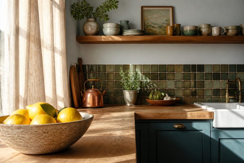
The difference between a kitchen that looks styled and one that looks staged usually comes down to how long an idea can survive real cooking.
Most of these fourteen ideas cost under a hundred dollars and an afternoon, but the one that fits your kitchen depends on whether you rent, cook daily, or need the space to still work at 6 p.m. on a Tuesday.
I swapped one upper cabinet for a single 36-inch oak shelf last spring, and the immediate change in how the wall breathes taught me that open shelving punishes mismatched mugs but rewards discipline.
That trade-off runs through everything below: bold backsplash or neutral ground, vintage copper or clean flat-panel, fresh herbs that need twice-weekly watering or a single rosemary plant that forgives neglect.
Pick the condition you can live with, and the style follows.
1. Modern Kitchen Aesthetic
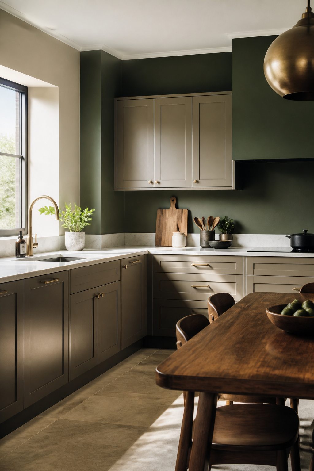
A modern kitchen aesthetic lives or dies on the color you put on the walls and cabinets.
Warm neutrals, earthy greens, and deep blues all work here, and the choice between them comes down to how much contrast you want against your countertops and flooring.
I tend toward the greens and blues because they hide the wear of daily cooking better than pale tones, but a warm neutral on cabinetry with a deeper shade above it is the safer bet if you are painting only once.
For the walls, Modern Emulsion is the finish that matters. It is scrubbable and stain-resistant, which means the splatter from a frying pan or sticky fingerprints near the light switch clean off without taking the color with them.
The same performance finish line covers cabinetry too, so you can carry one palette across both surfaces without switching products.
2. Timeless Kitchen Design
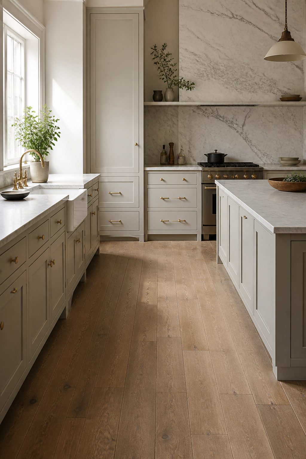
A kitchen that still looks right in fifteen years starts with restraint on color.
The Polished Provincial design keeps the palette quiet: engineered hardwood floors with a wire brushed finish, marble running floor to ceiling behind the range, and counters to match. Nothing here fights for attention, which is exactly why it lasts.
I prefer engineered hardwood in kitchens over site-finished solid plank because the factory coating holds up to the traffic and the occasional spill better than anything I could seal myself.
The wire brushed texture matters more than most people notice; it hides the scuffs that a smooth satin surface broadcasts after six months of real cooking.
The marble backsplash is where this look risks becoming too polished. Floor-to-ceiling stone reads luxury, but in a working kitchen it also reads commitment: acidic ingredients etch it, and no sealer changes that.
For renters or anyone who cooks with tomatoes and citrus more than twice a week, I’d stop the marble at the hood line and paint the upper wall in a warmed white that nods to the stone without matching it.
The farmhouse sink and broad counters stay non-negotiable; they are what make the kitchen usable rather than just photographic.
3. Retro Kitchen Design
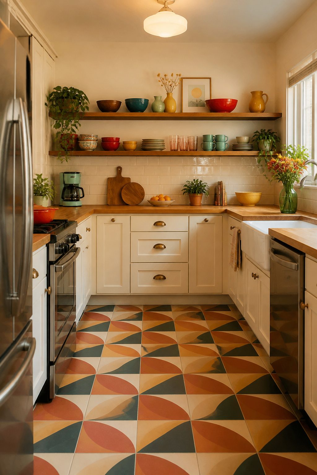
Bold color and patterned tile mark a retro kitchen, but the difference from modern or timeless styles comes down to how you balance them.
A strong floor pattern paired with a neutral backsplash anchors the look without tipping into cartoonish territory, while butcher block countertops replace the heavy wood paneling of mid-century kitchens for something lighter that still reads as warm.
I’ve seen the same square footage feel both playful and dated depending on one choice: whether the color sits on a permanent surface or a replaceable one.
Painted cabinets or a patterned floor you can live with for five years makes sense. Tile that outlasts your enthusiasm for chartreuse does not.
Where modern kitchens often go monochrome and timeless ones play it safe with material rather than hue, retro builds its energy from contrast.
The tile accent might be geometric or floral, but it needs some breathing room. Clash it against a competing pattern on every surface and the eye has nowhere to land.
One bold move, one restrained partner: that is the recipe that holds up in a real kitchen with coffee grounds on the counter and three grocery bags to unpack.
4. Modern Kitchen Design
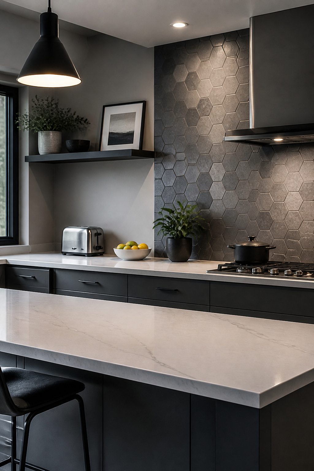
A grayscale palette stays interesting only when the geometry shifts.
The Sensible Modern kitchen gets this right: soft grays and crisp whites run the full length of the room, but the walls carry hexagons, picket strips, or a herringbone layout that catches light differently as you move through the space.
Without that variation, monochromatic reads flat. I would skip the herringbone on a short backsplash wall; it needs enough run to show the rhythm.
Hexagons work tighter and hold up better where counter space interrupts the line. The picket shape splits the difference, vertical enough to read clean, simple enough to install in a weekend if you are working with peel-and-stick tile.
The Sensible Modern approach wins for renters and first-home owners because each geometric choice reads intentional without demanding custom anything.
Grout color matters more here than in a busier palette: one shade too dark and the pattern disappears into a grid you did not plan for.
5. Kitchen Countertop Decor
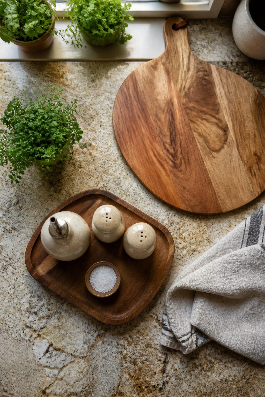
Kitchen countertops eat up visual space faster than any other surface in the room, so the items left out need to earn their spot.
I group everyday tools on a small wood tray: a matching salt and pepper set, an oil dispenser, the few things I reach for while cooking.
The tray keeps them from drifting across the counter and makes the whole arrangement read as intentional, not leftover.
For anything that sits out purely for looks, keep it to one piece.
A framed print leaned against the backsplash or a large wood cutting board propped upright adds warmth without chewing into workspace you actually need. Two decorative objects on a counter starts to look like clutter; one reads as deliberate.
6. Change Cabinet Hardware
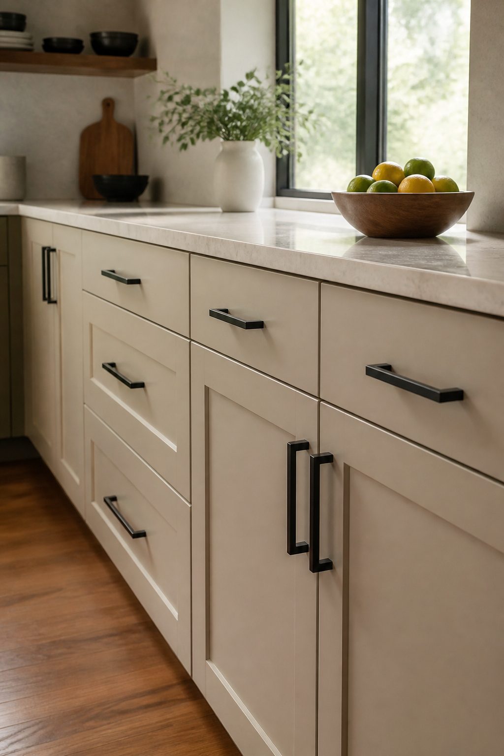
Cabinet hardware wears out its welcome faster than almost anything else in a kitchen.
The brass knobs that looked current eight years ago now read dated, and the finish gets dinged at the edges where hands grab a hundred times a day.
Swapping them out takes an afternoon, a screwdriver, and roughly the cost of a nice dinner out, which is why this update keeps showing up as one of the most popular small kitchen makeovers.
Sizing matters most. Most modern pulls run 5 to 7 inches center-to-center, and that extra length against old 3-inch holes changes the whole proportion of flat-panel doors.
If your holes do not line up, fill them with wood putty, sand flat, and drill fresh. It adds an hour, but it frees you from whatever the last owner chose.
Finish matters more than shape here. Oil-rubbed bronze reads warm and hides water spots; satin nickel stays quiet in a mixed-metal kitchen; matte black pops against white or sage cabinets without shouting.
I tend toward matte black on rental kitchens because it photographs well and the touch-up paint is cheap if a pull gets scratched during a move-out.
What stops me from changing hardware just for the sake of change is simple: if the existing pieces are solid, the style is plain, and the finish still works, leave them.
The money goes farther on a fix that actually needs fixing.
But when the pulls are worn, pitted, or brass from a decade you do not want to revisit, this is the fastest return on a Saturday and under a hundred dollars in the whole kitchen.
7. Kitchen Organization Ideas
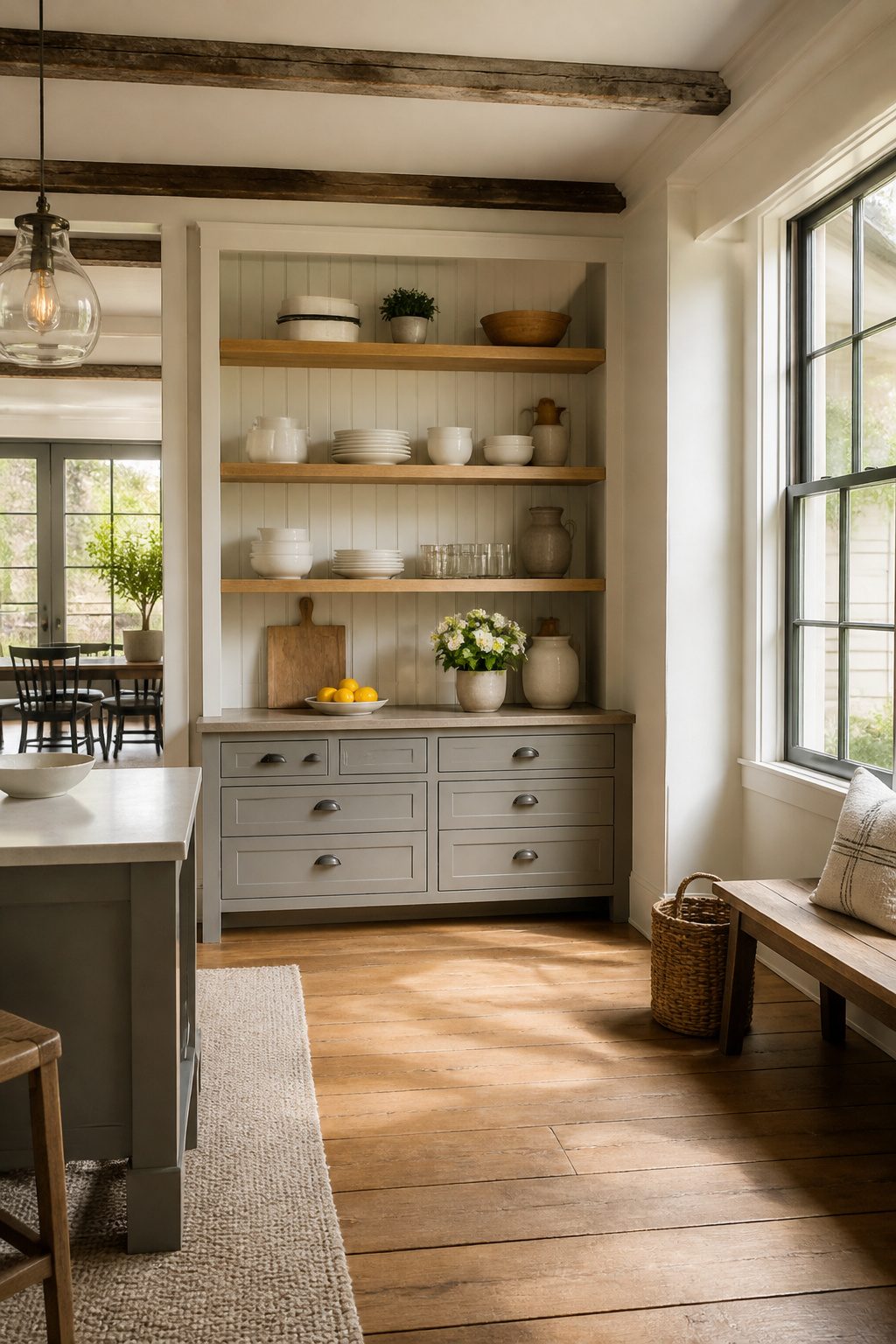
A cluttered counter costs more than it looks. Every item left out is workspace you lose, and in a kitchen that is already tight, that trade stops working fast.
I start by clearing the surface, then move to the drawers, one at a time. One drawer, then the next keeps the job from stalling out, and the habit matters more than any organizer you buy.
Open shelves only stay useful if what sits on them earns its spot. I treat them as working storage dressed up, not display cases.
The seasonal pieces can rotate in, but the everyday stuff has to fit back into cabinets when the cooking starts. Good organization changes how a space functions long before you spend on new hardware or paint.
8. Install New Lighting
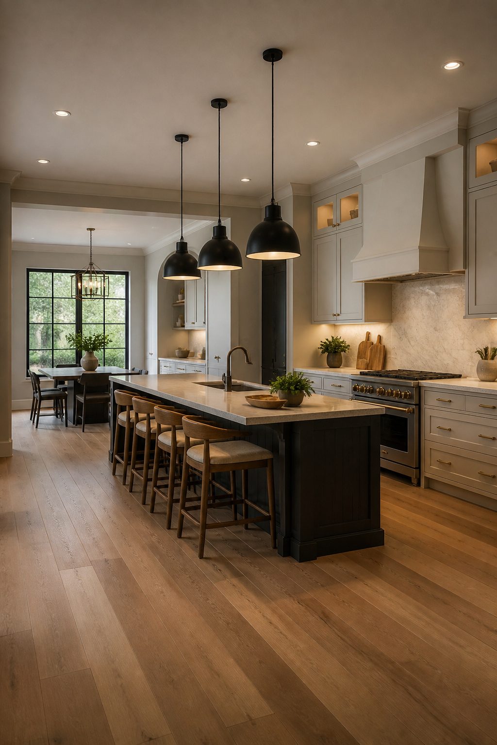
The right light fixture can reset a whole kitchen without touching a cabinet or wall.
Pendant lights over the island swap out in an afternoon and run far less than even a partial renovation, yet they sit at eye level and shape how the room feels every time someone walks in.
Metal shades are the practical choice here. Glass collects grease and fingerprints near a stove; I skip it in kitchens for exactly that reason, and metal eliminates the constant wiping that turns a fixture into a chore.
Matte black or brushed brass each read as deliberate in a way standard builder-grade domes do not.
Vintage lanterns add warmth to transitional spaces, while linear LED bars suit cleaner, more minimal lines. Either route, the fixture becomes the conversation piece sources describe, not background noise.
Your move is to treat the light as part of the decor the same way you would a chair or a vase: pick it for the mood it makes, not just the lumens it delivers.
If you rent, keep the old fixture in a closet and swap back at move-out. The holes are already there; the upgrade is yours to take with you or leave behind as you choose.
9. Use Fresh Herbs as Decor
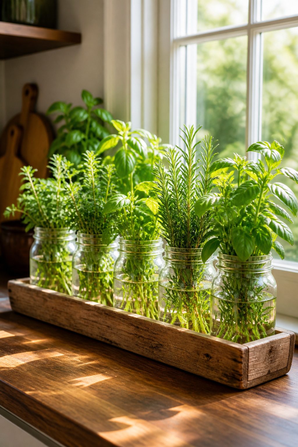
Small mason jars, pitchers, or vases filled with fresh herbs give you kitchen decor inspiration that still earns its counter space. The scent hits when you walk in, and the plant is right there when a recipe calls for it.
I keep mine grouped on a wood tray near the window so they read as one intentional piece instead of clutter scattered across the surface.
If your counters are tight, the windowsill is your backup.
A vertical row of small jars works there too, or you can move the look above the cabinets where it reads as greenery from a distance but stays out of the cooking zone.
The herbs themselves will lean toward the light, so rotate the jars every few days or the stems grow crooked and start looking ragged against the clean lines of a kitchen.
You will need to water and trim them.
A basil plant in a mason jar dries out faster than one in the ground, and wilted leaves work against you decor-wise. I plan on replacing or watering twice a week, the same way I treat a vase of flowers.
If that rhythm sounds like too much, a single rosemary plant in a terracotta pot lasts longer between drinks and still gives you that fresh green hit against white tile or wood counters without the fuss of a full windowsill farm.
10. Statement Backsplash
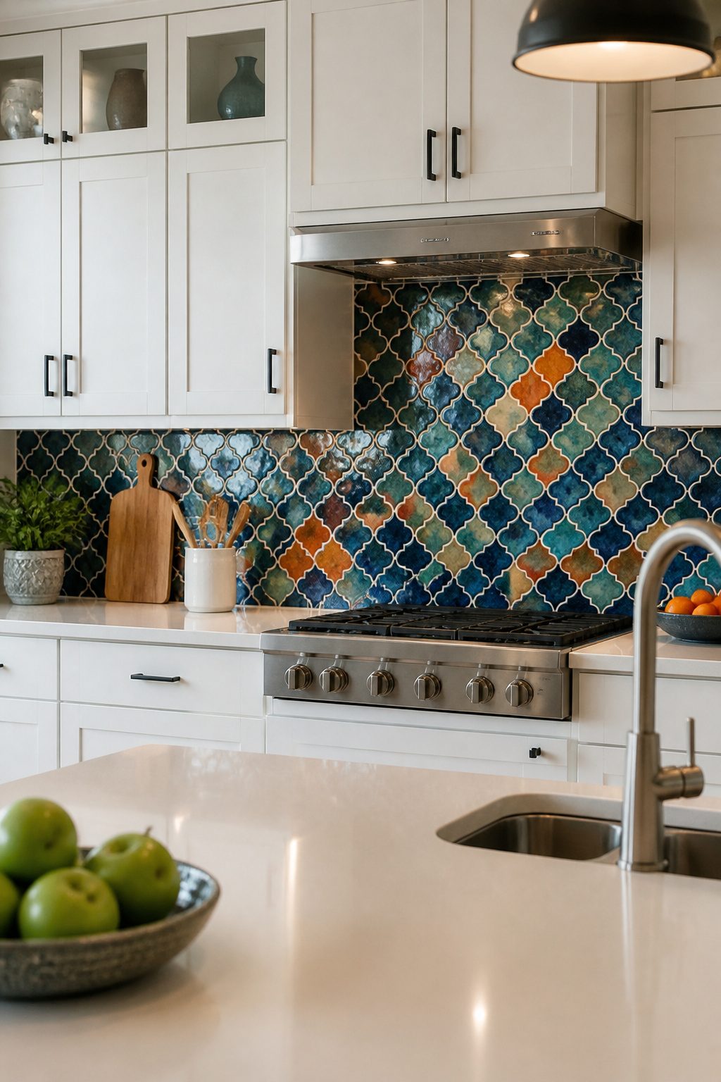
A backsplash is the one kitchen surface where you take a real risk and it usually pays off.
Tile runs from painted beadboard to luxury marble, so the investment is what you decide it will be, but the job itself wraps in a weekend.
Here is the choice you actually face. Neutral subway tile locks you into nothing; an intricate mosaic or full mural makes the room.
I land on the bold side every time, because cabinets and counters already give you the safe neutral ground and the backsplash is where a kitchen finds personality.
If permanent feels too big, bold peel-and-stick designs give you the visual punch with an exit strategy. A few days of work, a relatively affordable outlay, and the whole room reads differently.
11. Open Shelving
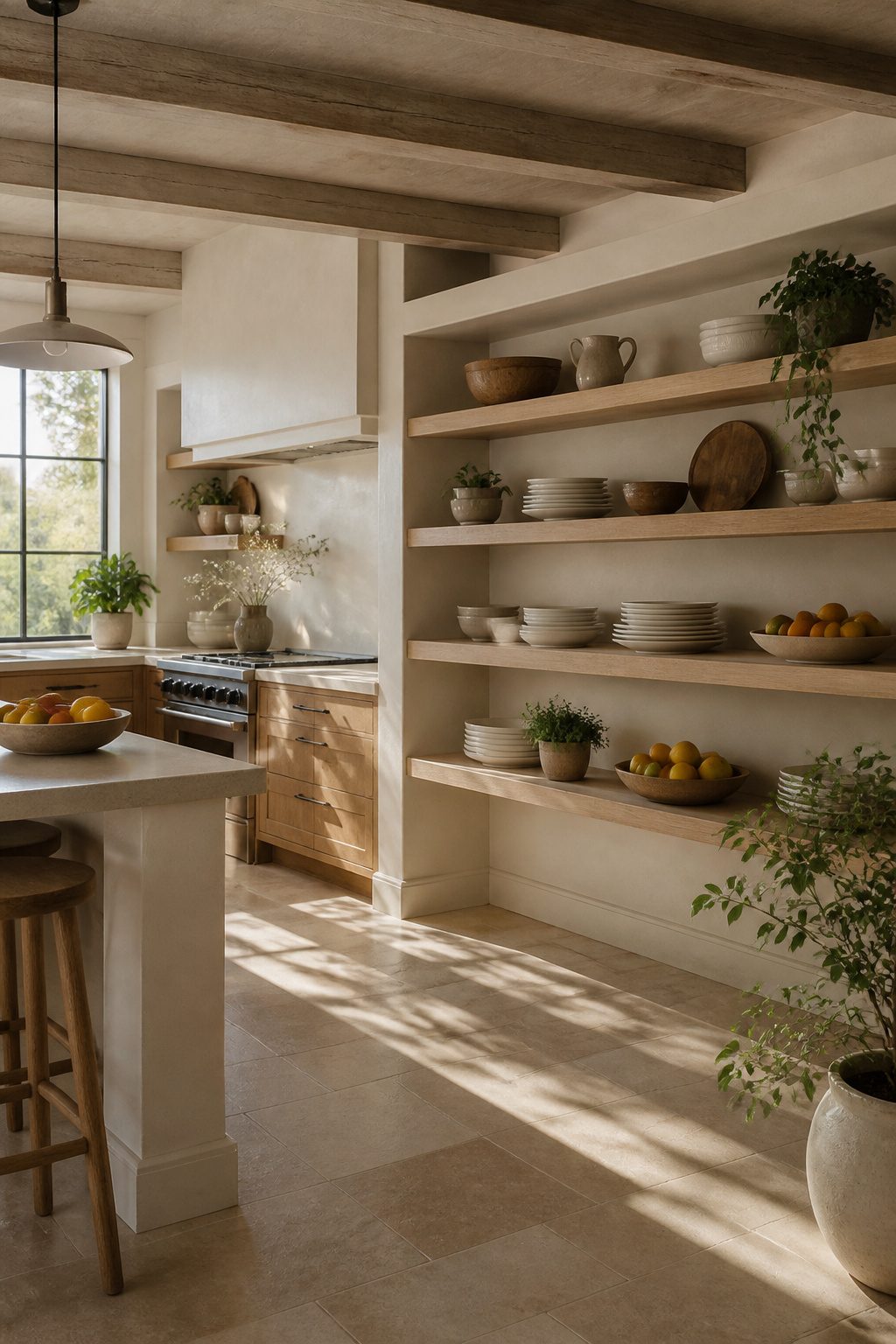
Open shelving has become one of the most popular kitchen update ideas right now, and the reason is straightforward: it replaces heavy cabinets with breathing room and gives you a surface to style.
I swapped one upper cabinet for a single 36-inch oak shelf in my own kitchen last spring, and the difference in how the wall feels is immediate.
You want to keep shelves to 8-10 inches deep if you are storing everyday dishes; anything deeper and you are stacking plates in shadow where you will not reach for them.
What you put on those shelves makes the difference.
A stack of white plates, a small bowl of lemons, and a plant you already own rotates through seasons without requiring a shopping trip. Open storage shows dust and demands editing in a way cabinet doors never do.
If you cook daily and own mismatched mugs, this trend will punish you. For renters, floating shelves with hidden brackets install with four screws and patch out in twenty minutes when you leave.
That combination of lightness, low commitment, and the chance to change the look every few months is why open shelving keeps showing up in kitchen decor inspiration searches.
12. Incorporate Gold Accents
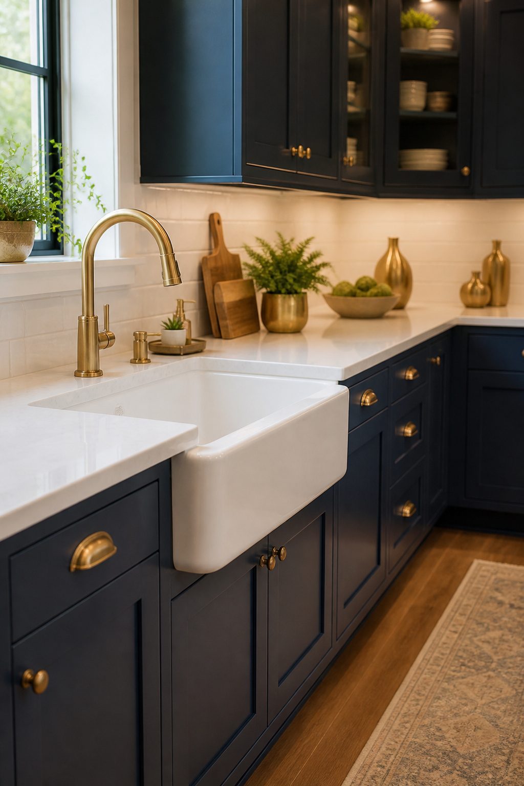
Gold finishes read differently depending on what surrounds them. In a kitchen with flat-panel cabinets and cool grays, a brass faucet looks costume jewelry.
Pair that same faucet with deep navy paint or black countertops and it becomes the detail that makes the room feel finished. The contrast is what does the work, not the metal itself.
I would start with hardware and the faucet before committing to anything larger. Cabinet pulls and a single-handle faucet in brushed or satin gold run about $150 to $400 for the pair, and they come back out if the tone reads wrong.
A warm, slightly muted gold wins over high-polish brass in most kitchens because it picks up both daylight and bulb light without flashing mirror-bright.
A gold kitchen island base or wire barstools carry more visual weight than smaller accents, but they also lock you in.
I would test the metal’s temperature against your cabinets first. Cool gold against warm wood reads as mistake; warm gold against crisp white reads as intentional.
The barstool option works best when the surrounding palette is already restrained, one or two colors plus the metal, so the gold becomes punctuation rather than noise.
If you are renting, stick to hardware, a faucet, or a single pendant. The investment stays portable, and the effect is nearly the same.
13. Mix Textures
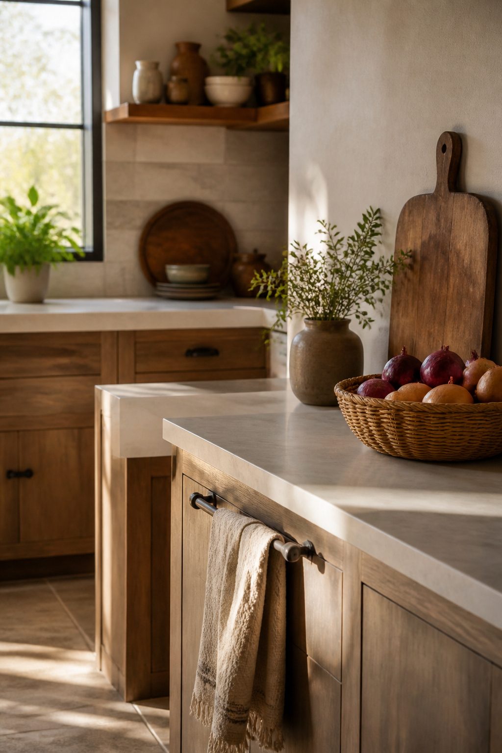
A kitchen full of hard surfaces runs cold fast.
Tile, stone, and metal are easy to clean but they do not invite anyone to linger. The fix is mixing textures that soften the room without fighting its function.
Start with what you already own. A worn cutting board leaned against the backsplash, a linen tea towel draped over the oven handle, or a small woven basket for onions adds warmth that costs next to nothing.
The contrast matters more than any single piece. Rough against smooth, matte against reflective, loose weave against tight grain, that interplay is what makes a kitchen feel layered rather than decorated.
Patterns work the same way.
A striped or floral textile against plain cabinetry draws the eye without demanding a full redesign. In a neutral modern farmhouse kitchen, that pop of pattern does most of the visual lifting.
Rougher surfaces need more frequent cleaning. Fabric near the stove collects grease; wood near the sink swells.
I keep textiles to areas that see splashes less often, and I choose materials I can wash or sand rather than ones that need coddling. Aim for lived-in warmth, not pieces you stress over keeping perfect.
14. Vintage Elements
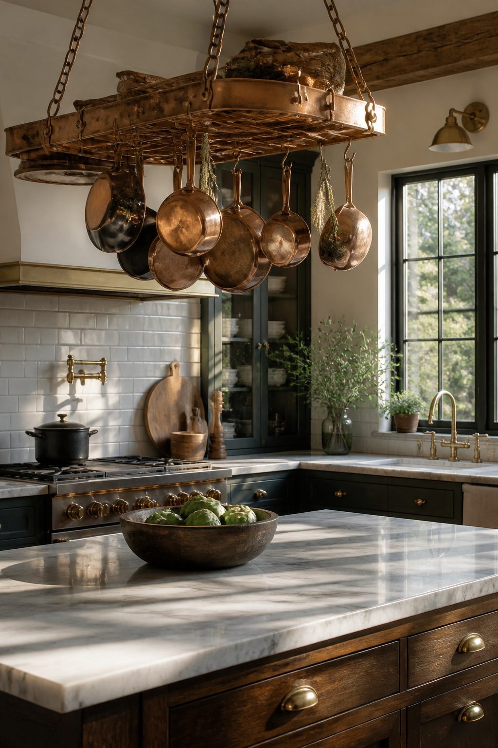
A single vintage piece does more to anchor a kitchen than a room full of reproductions.
Patinaed copper and Calacatta marble read old-world without feeling like a museum diorama: a little aging on metal or stone warms up painted cabinetry rather than fighting it.
Designer Amber Lewis steered her clients toward a demure color palette that meshes old-world elements with New England charm. The patinaed copper and Calacatta marble lean more vintage, while the painted cabinetry and linen seating reflect a casual coastal style.
What this means for a weekend project: one copper pot rack, one marble cutting board, or one set of antique brass pulls is enough.
The painted cabinets and casual fabrics in Lewis’s kitchen keep the vintage elements from stiffening into formality. I would skip the bright yellow she rejected; that heat competes with aged metal instead of letting it settle in.
For renters, hardware is the move.
Brass pulls swap back out in twenty minutes. Homeowners with a slightly bigger budget might hunt a single vintage chandelier or hang decorative plates as wall art, the way earlier generations displayed china.
The balance to strike is one statement piece against otherwise simple surroundings. Two or three, and the kitchen starts collecting eras rather than honoring one.
Color Schemes That Hold Up
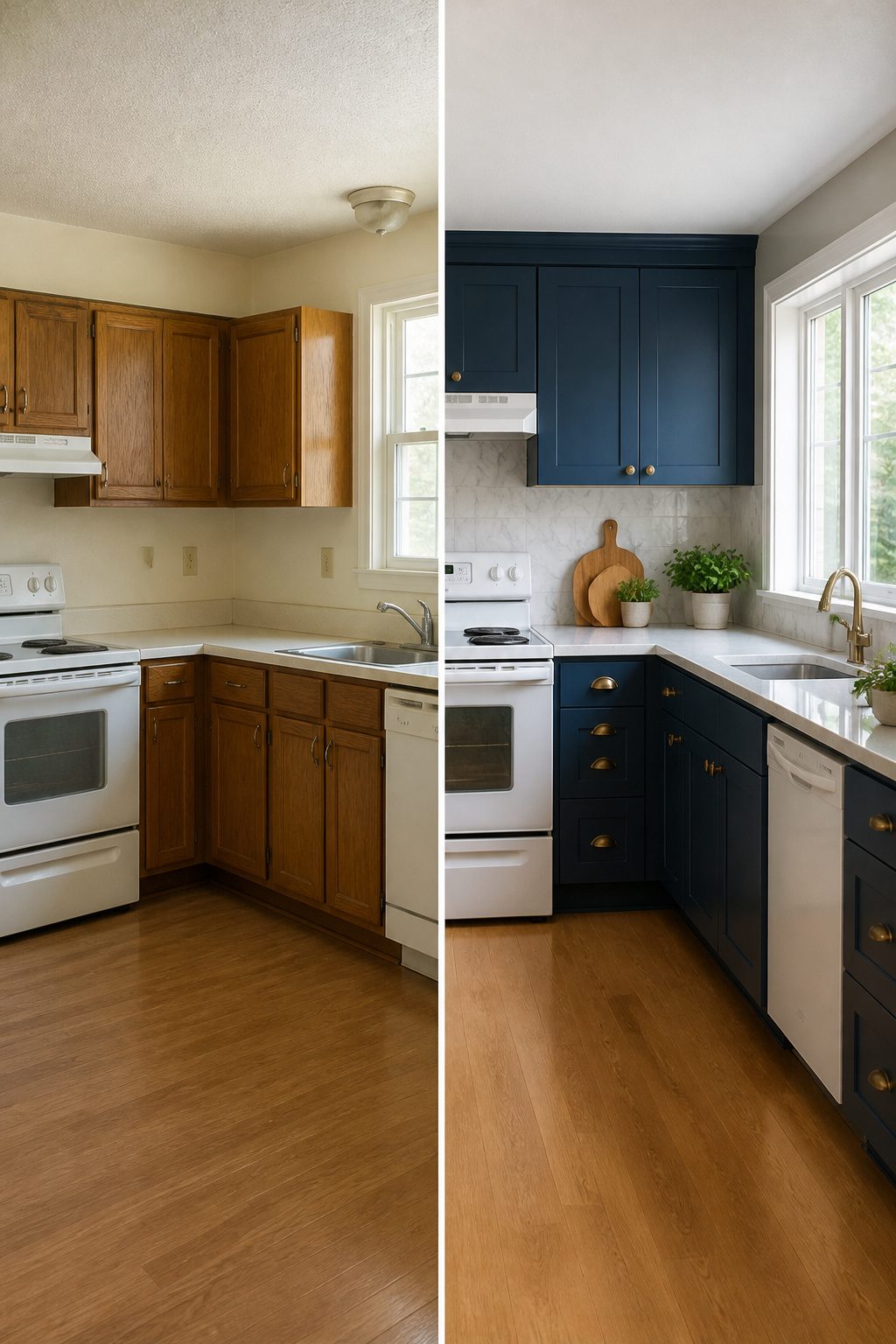
Warm neutrals, earthy greens, and deep blues all work in a kitchen, but the finish matters more than the shade.
Modern Emulsion on walls stands up to steam and splashes, and it wipes clean without marking. For cabinets, the right finish depends on traffic: high-gloss shows every fingerprint, matte hides them but needs more care.
Test a swatch where light hits it at breakfast and at dinner, because a color that reads cozy at 7 a.m. can feel muddy by evening.
Two approaches split the difference on bold choices. One keeps the backsplash neutral, white subway tile or painted beadboard, so the room stays flexible.
The other treats that same strip as the place to commit, since a backsplash takes a weekend and a few hundred dollars, not a contractor.
Monochromatic schemes, walls and cabinets in close tones, need texture to keep from going flat: ribbed glass, brushed hardware, or the grain in wood open shelving.
The cost of getting it wrong is a weekend lost to repainting. The cost of getting it right is living with a color that still looks intentional five years in.
Frequently Asked Questions
What are some kitchen decor ideas?
Fresh herbs in small mason jars or pitchers, swapped cabinet hardware in matte black or brass, and gold accents on pulls or faucets are all easy wins.
Open shelving, a statement backsplash, and mixed textures like linen or wood against hard surfaces also refresh the room without a full renovation. Even changing a light fixture to metal shades can reset the whole space in an afternoon.
How can I organize my kitchen?
Clear the counters first, then tackle one drawer at a time so the job does not stall out.
Group everyday tools on a small wood tray to keep them from drifting, and treat open shelves as working storage that gets edited back into cabinets when cooking starts.
Every item left out costs workspace, so only pieces that earn their spot stay visible.
What color should I paint my kitchen?
Warm neutrals, earthy greens, and deep blues all work, and the choice comes down to how much contrast you want against countertops and flooring.
Test a swatch where light hits it at breakfast and dinner, since a color that reads cozy at 7 a.m. can feel muddy by evening.
Modern Emulsion on walls stands up to steam and splashes, and it wipes clean without marking.
What is the 3-5-7 rule in decorating interior design?
The closest related principle here is keeping countertop decor to one piece, since two decorative objects starts to look like clutter while one reads as deliberate.
What are 2026 kitchen trends?
The styles it covers include modern, timeless, retro, and modern farmhouse aesthetics, with an emphasis on warm neutrals, earthy greens, deep blues, gold accents, mixed textures, and vintage elements like patinaed copper and Calacatta marble.
What’s trending for kitchen decor?
Fresh herbs as living decor, bold backsplashes including peel-and-stick options, and matte black hardware also keep appearing in current kitchen decor inspiration.




