
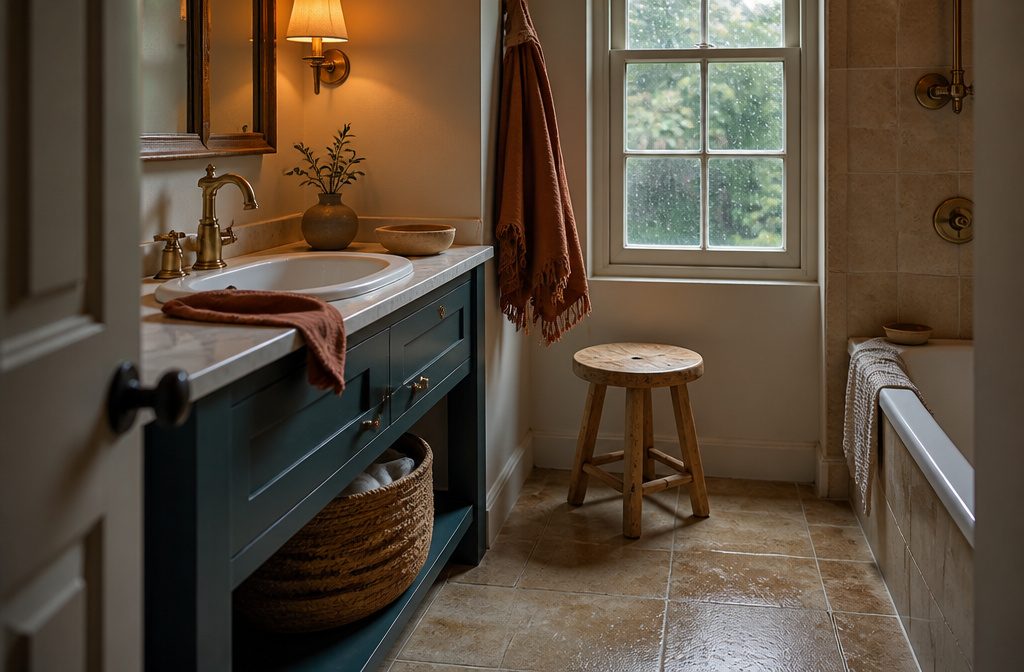
A neutral bathroom can run beige and safe or it can layer texture and tone until the room feels calm without looking flat.
The difference sits in contrast—one dark faucet, wood against tile, linen next to porcelain—and in whether the neutrals share the same temperature.
Woven baskets, unglazed ceramics, and towels in the 2700K to 3000K range do more to warm a space than another coat of taupe ever will.
1. Add Wood for Warmth
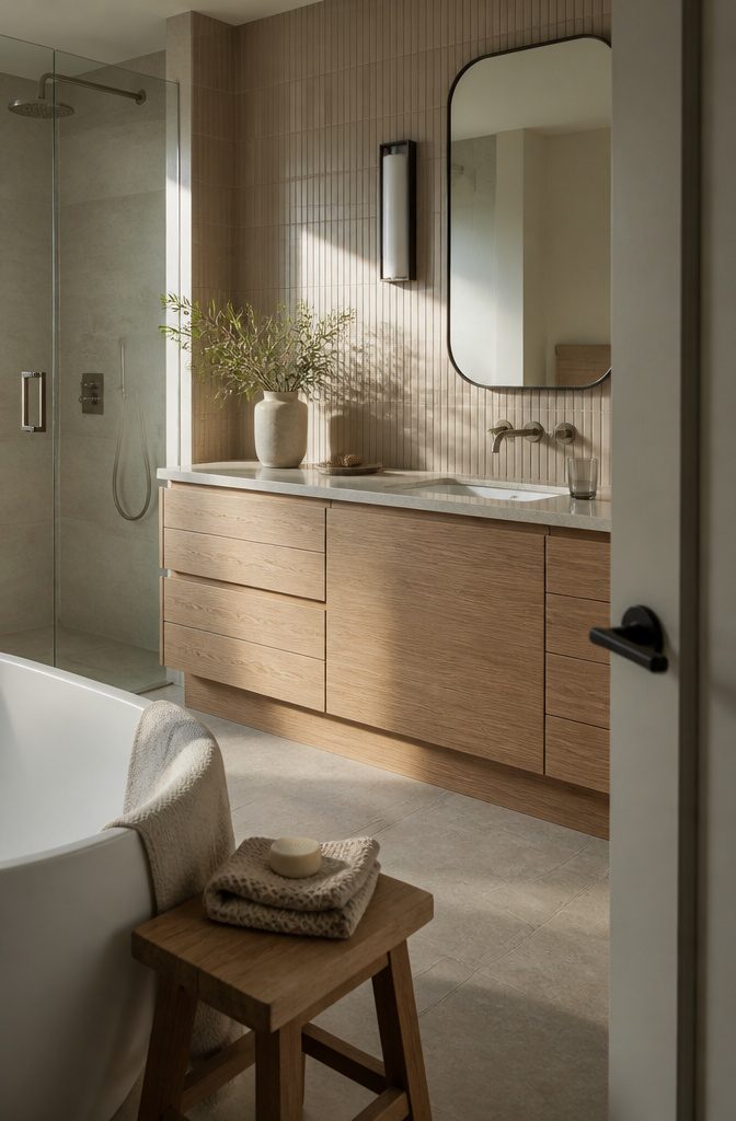
Wood pulls a neutral bathroom back from clinical.
A vanity in oak or walnut gives the room an anchor that white tile and gray paint never do on their own, and even a small stool beside the tub or a tray on the counter shifts the temperature.
I keep a wooden stool in reach of the shower for a towel or a robe—it works harder than it sounds, and the grain breaks up all that smooth porcelain.
Teak holds up to water without sealing or worry, which is why it shows up in so many wet spaces.
If a full wood vanity is out of budget or the layout won’t take it, wood-look tile on one wall adds warmth without the maintenance.
Ribbed or slat tile draws the eye up and gives a small bathroom more presence than flat white ever could.
A floating shelf in solid wood over the toilet or beside the mirror costs less than a hundred dollars and does most of the work a vanity would.
2. Use Plants and Greenery
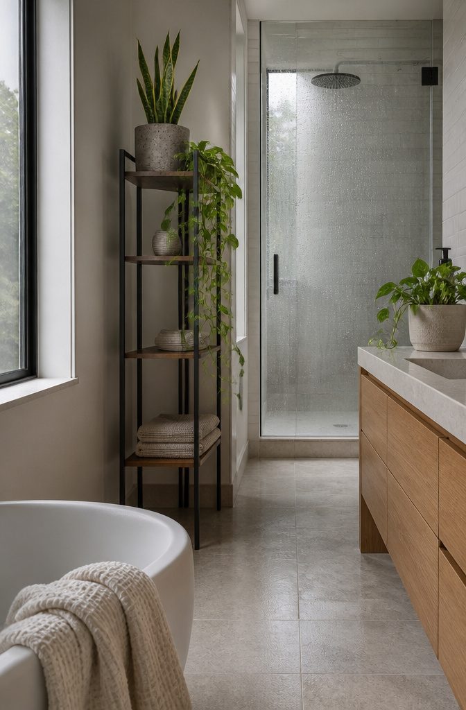
Plants soften hard tile and stone in ways fabric alone can’t. A snake plant or pothos on a tall shelf brings the eye up and trails down to break up straight lines, and both handle bathroom humidity without much fuss.
Aloe vera does well on a windowsill or counter where it gets some light, and the thick leaves suit a rough concrete pot better than something glossy.
Eucalyptus hung from the showerhead holds up to steam and puts out a clean scent that reads more spa than air freshener.
If you want something sculptural that needs no water, pampas grass in a tall vase gives you the organic shape without the maintenance.
Even a small bunch of dried stems makes the space feel less clinical, and you’re not replacing them every week.
3. Layer Neutral Shades and Add Contrast
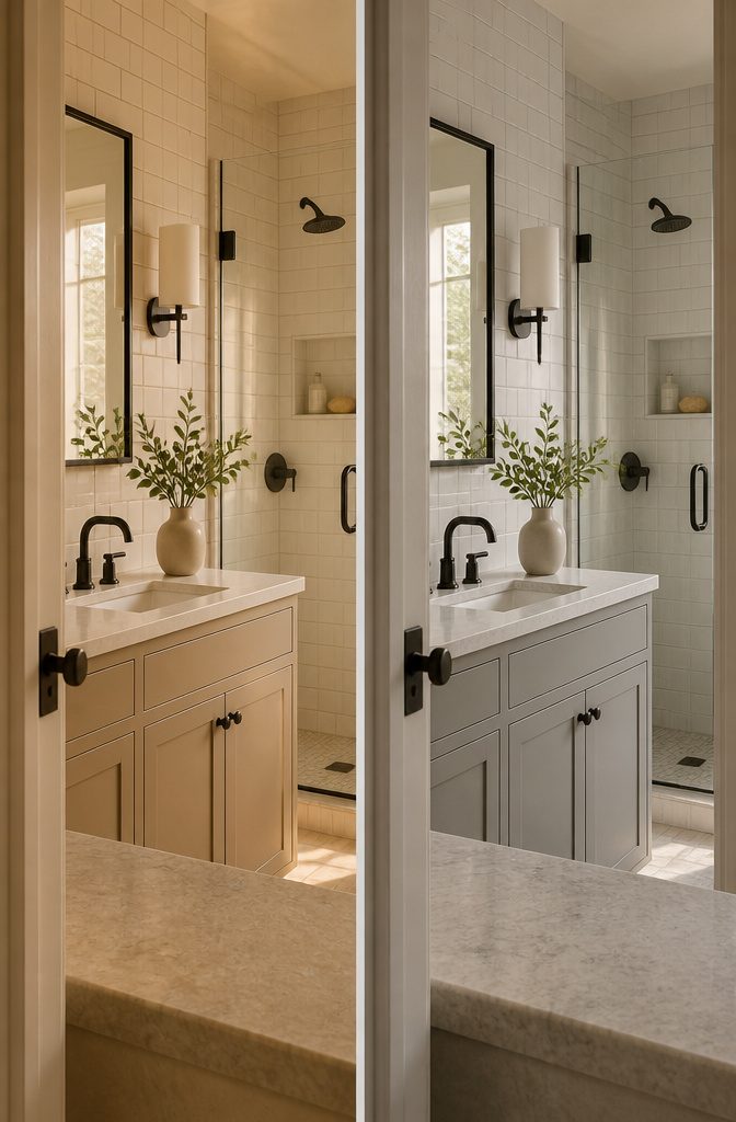
A neutral bathroom can look washed out if you work in only one shade.
I layer whites with warm grays and beiges so there’s depth without introducing pattern or color. Keeping all the neutrals in the same temperature range — all warm or all cool — stops the room from looking muddled.
A white subway tile pairs well with linen-toned grout and a soft taupe vanity; they sit together without clashing because they share the same undertone.
Contrast keeps layered neutrals from blending into a single flat surface. I add black or charcoal in small doses: a matte black faucet, dark cabinet pulls, or a black-framed mirror.
The dark element gives the eye somewhere to land and makes the lighter shades read as deliberate choices rather than builder-grade defaults.
4. Use Textured Materials
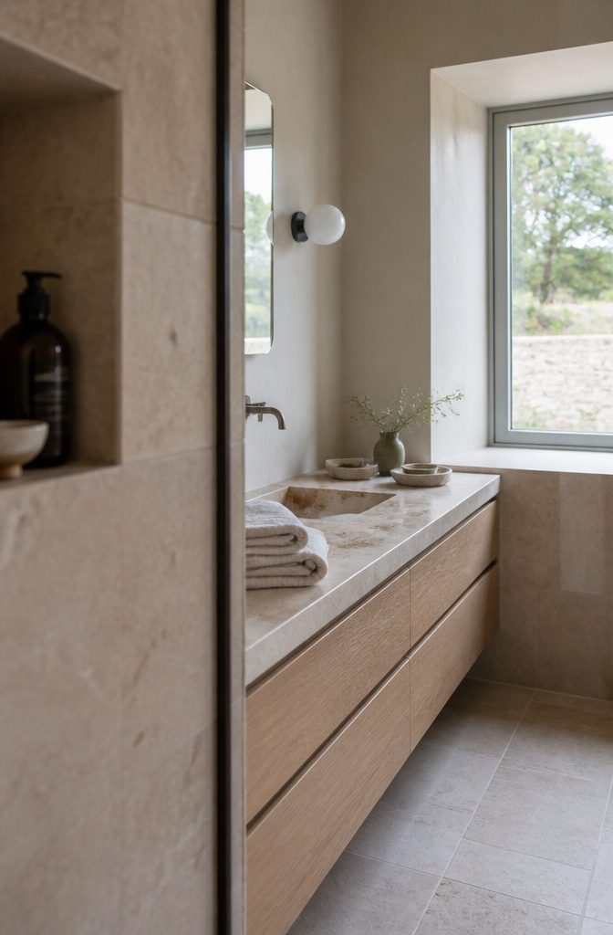
Woven baskets, unglazed ceramics, and rough stone keep a neutral bathroom from reading flat. The surfaces do the work color used to do.
I reach for linen towels over standard cotton — they add softness and a subtle, irregular weave that makes the room feel less clinical. Turkish cotton works the same way if you want more weight.
Travertine brings warmth without breaking the neutral palette. A small tray or decorative sphere in beige travertine sits on the vanity and gives you that open-pored, sand-toned texture natural stone is known for.
Porcelain tiles that mimic marble or travertine cost less and skip the maintenance headaches real stone brings; many people regret choosing actual marble once the staining starts.
Tiles like terrazzo or porcelain in a natural stone work well for warmth.
Mix finishes when you tile: pair gloss with matte, or run mosaic next to medium-format square.
Handmade ceramics — soap dispensers, a dish for bar soap — carry slight glaze irregularities that make the space feel less manufactured. Matte metals absorb light instead of bouncing it harshly, which keeps fixtures from reading sterile.
5. Choose a Mirror or Reflective Surfaces
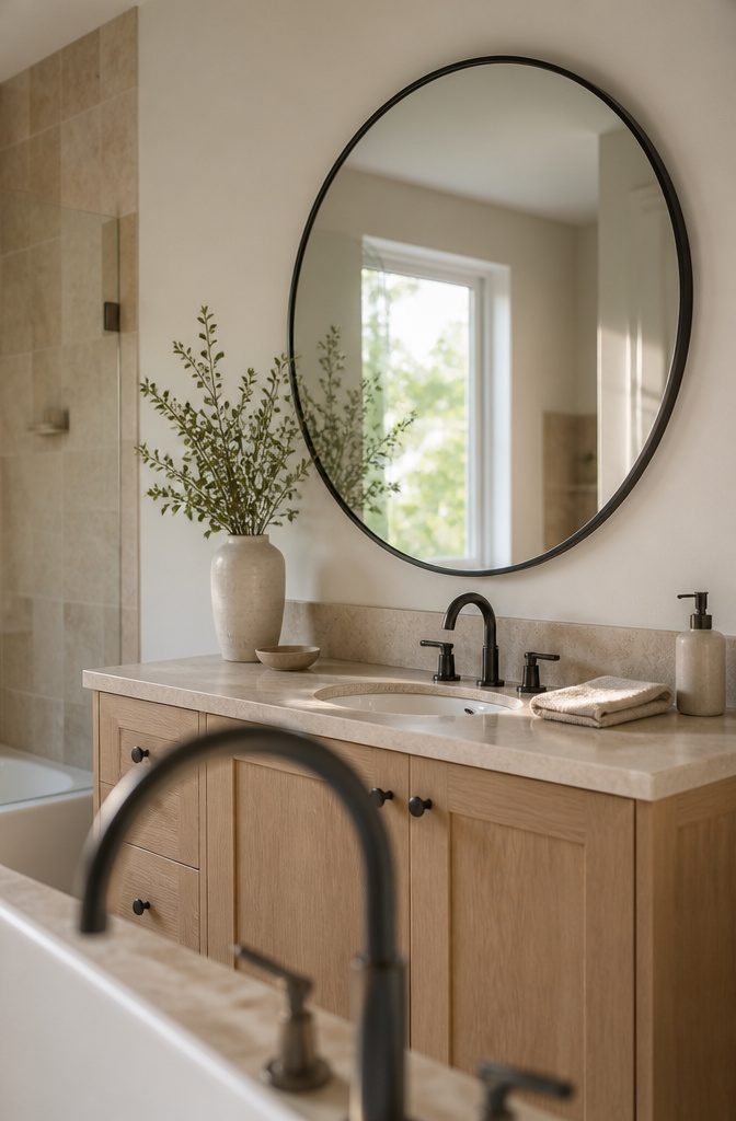
A mirror does more than hang on the wall — it doubles the light that hits it and sends it back into the room, which makes a neutral bathroom feel less enclosed.
A round mirror softens the straight lines most bathrooms are full of, and one sized around 24 to 34 inches across works in most single-sink setups without crowding the wall or looking lost on it.
The Marlowe round mirror measures 33.8 by 24.3 inches and sits at $171.99, which puts it in reach for a weekend upgrade.
The black metal frame gives it enough presence that the wall does not need much else, and the shape keeps a beige-and-white scheme from reading too clinical.
If your bathroom gets dim in the mornings, positioning the mirror across from the window turns one light source into two.
6. Add Storage That Keeps Clutter Contained
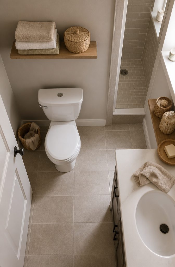
Clutter shows fastest in a neutral bathroom because there’s nothing else competing for attention. Woven baskets work under the sink or on open shelves — they hide what you don’t want to see while keeping the texture soft.
Installing one or two shallow shelves above the toilet or beside the vanity gives you a place for folded towels and everyday items without making the room feel closed in.
Choose storage pieces in the same neutral range as the walls so they register as part of the design rather than as additions.
A lidded basket on the counter holds cotton rounds and swabs where you can reach them but can’t see the pile, and that small move keeps the whole vanity looking deliberate instead of busy.
7. Use Rugs or Soft Textiles
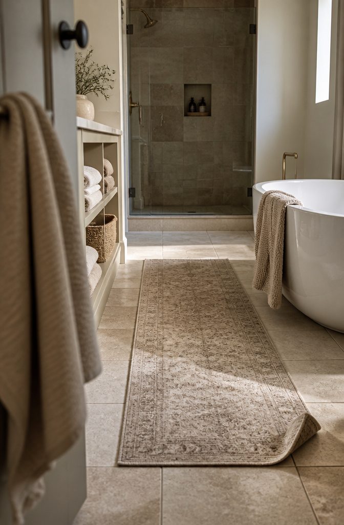
A runner instead of a standard bath mat changes how the room reads — less utility, more intention.
A washable vintage piece in warm greige sits well in a neutral scheme without disappearing into it, and the length gives you something closer to a hallway moment than a square of terry cloth by the tub.
Turkish cotton and waffle weave towels add texture where flat white would flatten out, and stacking them folded on open shelves in white and sand tones keeps the look clean without going sterile.
A rug with subtle pattern or texture works better than solid flat pile because it breaks up all that tile and porcelain without pulling focus.
It adds warmth underfoot, which matters more in a bathroom than in most rooms — nobody wants cold stone first thing in the morning.
8. Select Bathroom Lighting for a Soft, Warm Effect
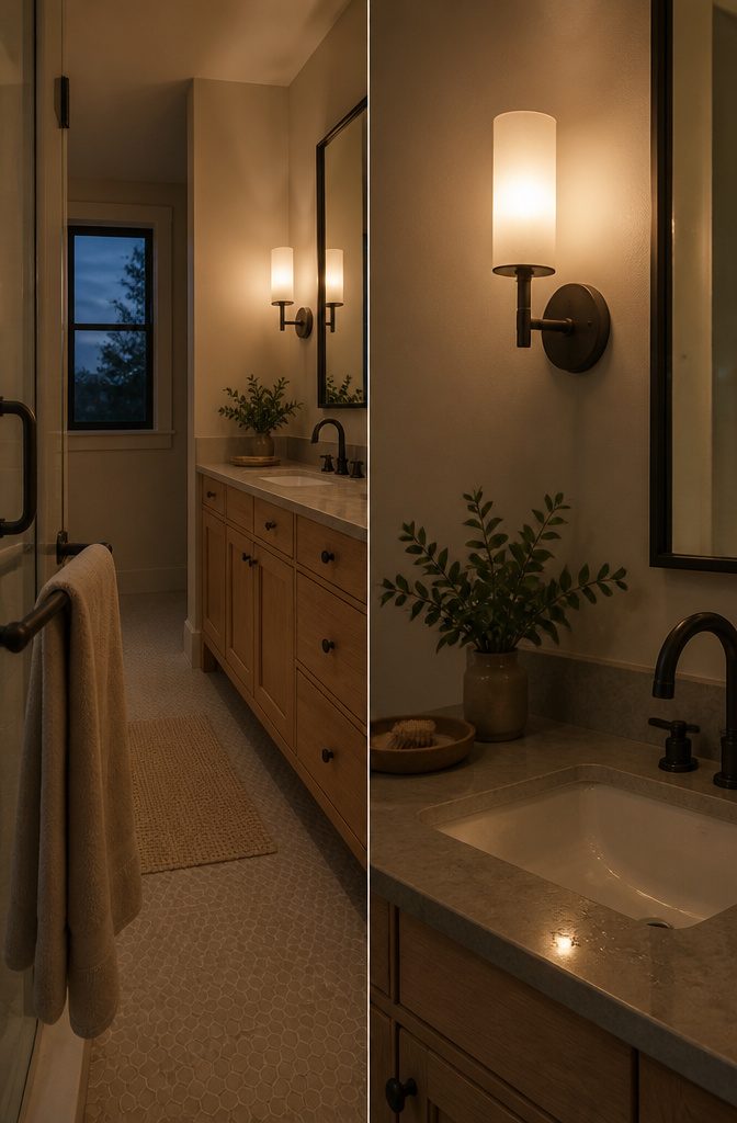
Warm lighting is the first thing that decides whether a neutral bathroom reads calm or cold.
Bulbs in the 2700K to 3000K range keep the space feeling soft rather than clinical — anything cooler flips the room straight into hospital territory, and all the beige in the world won’t pull it back.
I’d swap standard vanity bulbs for fixtures with fabric shades or frosted glass. The diffusion flatters skin tone and takes the edge off overhead light, which matters more in a bathroom than in any other room.
Vintage-style sconces work well here, but the shade material does more of the work than the fixture style.
Cool white has no place in a neutral palette. The color temperature is the detail that makes or breaks the whole look.
9. Coordinate Fixtures, Hardware, and Accessories
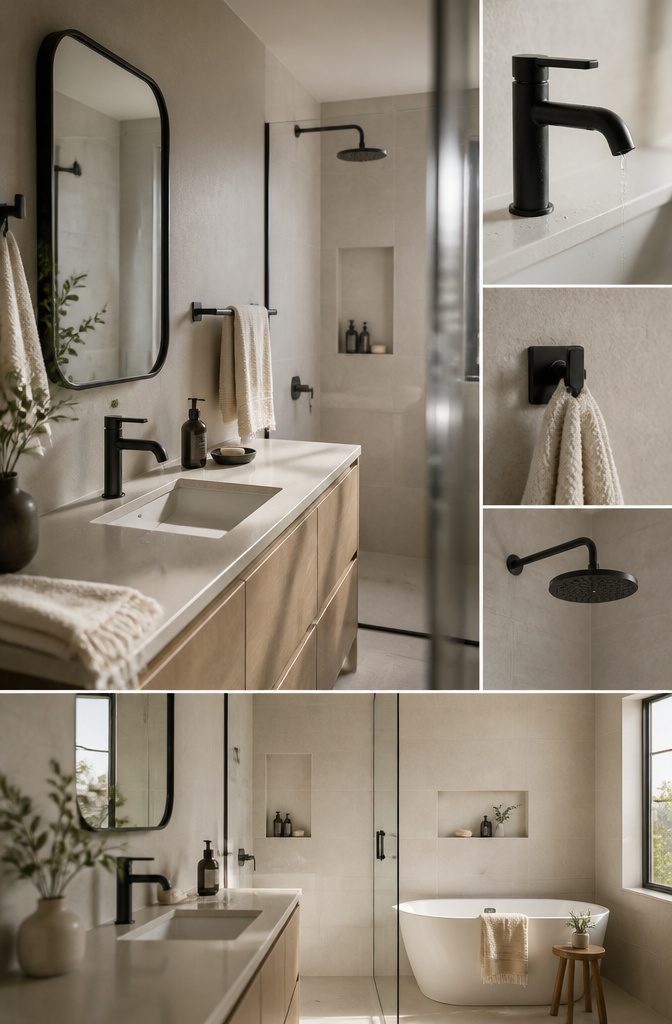
Fixtures in a finish that pulls through the space make the design feel intentional rather than collected at random.
Matte black faucets, showerheads, and towel bars work particularly well in light-toned bathrooms—the contrast reads as deliberate without taking over. Carry the finish into the mirror frame and hooks so the black becomes a thread, not an island.
Gold fixtures in a brushed or matte finish add warmth and a vintage edge; pair them with greige walls and cream towels to keep the palette grounded.
High-gloss gold skews flashy, and the softer finish holds up better against other textures in the room.
Accessories benefit from the same restraint.
Soap dispensers, toothbrush holders, and containers in a single tone prevent the counter from reading as cluttered. Match undertones across the room—all warm or all cool—so that slight variations in shade feel like layering rather than mismatch.
10. Add Restrained Color Through Small Accents
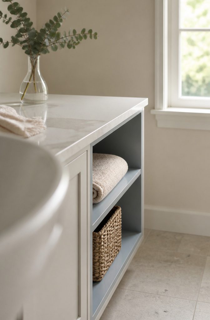
Fresh flowers bring instant life to a neutral scheme without much commitment.
I keep a small glass vase on the vanity and swap in eucalyptus branches or whatever’s fresh that week — the green reads as an accent without fighting the palette, and you can pull it when you want the space completely pared back.
If you want color that stays put, soft gray, taupe, or blue-gray work because they hold enough pigment to register as distinct but still sit inside the neutral range.
Gray Lake 2138-70 and Taos Taupe 2111-40 both add quiet depth on a feature wall or inside open shelving, and Abalone 2108-60 leans slightly warmer if your lighting skews cool.
Test samples in your actual bathroom light before committing — natural light from a north-facing window will pull different tones than a south-facing one, and evening bulbs shift everything warmer.
11. Use Artwork or Decorative Objects
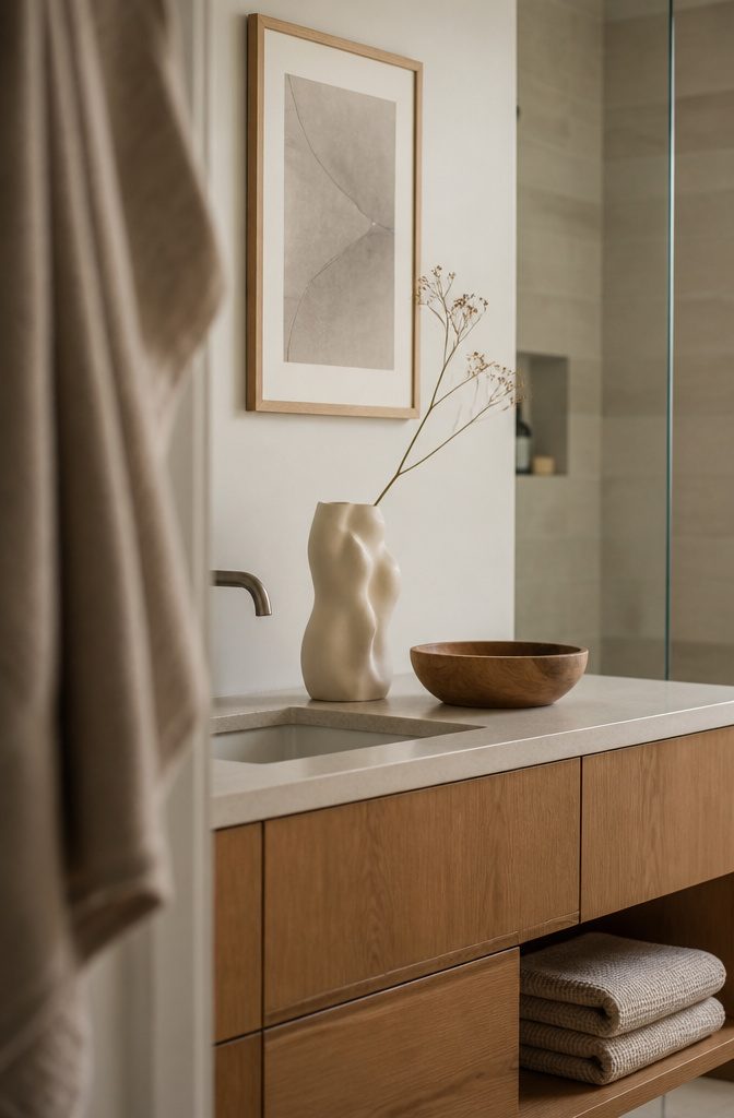
Artwork in a neutral bathroom does more than fill blank space — it anchors the room without adding color noise.
Abstract prints, line drawings, or simple nature scenes in black, white, cream, or soft gray keep the palette intact while giving the eye somewhere to land.
The frame matters as much as the print: matte black or natural wood reads as deliberate, while ornate gilt feels like it wandered in from another room.
Decorative objects work the same way.
A sculptural vase, a small stack of linen-bound books, or a turned-wood bowl on the counter adds dimension without breaking the calm. Edit hard: one or two pieces per surface, nothing busy.
A bathroom already has visual clutter built in through bottles and hardware; what you choose to add should feel like it earned its spot, not like you were filling space because it looked empty.
12. Add Scent as Part of the Atmosphere
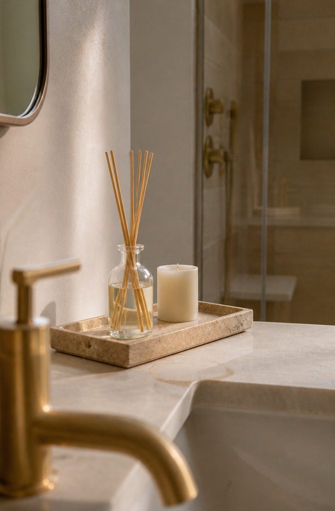
I keep candles on a small stone tray next to the sink, and the scent changes how the room feels the moment I light one.
Sandalwood, bergamot, and vetiver are the scents that hold up best in a bathroom — earthy enough that humidity doesn’t flatten them, and they read calm rather than cloying.
A diffuser or reed sticks in a simple glass bottle work if you want continuous fragrance without thinking about it.
I’ve used fragrance sticks on the same tray, and they give off a subtle scent for weeks, which makes the space feel more like a spa than a utility room.
Candles give you control over when the scent is there, and I prefer that flexibility. Either way, pick one signature fragrance for the room and stick with it — rotating scents weekly just muddles the atmosphere you’re trying to build.
Choosing Neutral Paint
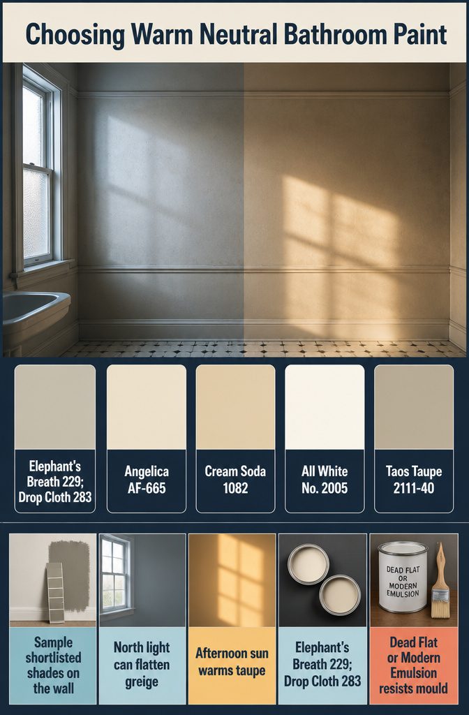
Paint color sets the foundation, so sample any shortlisted shade on the wall before committing.
Lighting and the direction a room faces change how the same color reads—what looked like soft greige on a swatch can turn flat beige under north-facing light or warm taupe when afternoon sun hits it.
Farrow & Ball’s Elephant’s Breath No. 229 and Drop Cloth No. 283 both work as warm neutrals that don’t go cold in artificial light.
Benjamin Moore’s Angelica AF-665 and Cream Soda 1082 lean warmer still, while All White No. 2005 stays clean without the starkness of pure white.
Taos Taupe 2111-40 falls in the middle, reading taupe-grey depending on exposure. For the finish, Dead Flat or Modern Emulsion on walls and ceilings gives you mould protection without the sheen that amplifies every flaw in older plaster.
Making Small Bathrooms Feel Larger
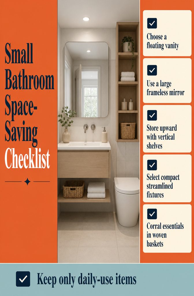
Light neutral tones reflect rather than absorb light, which makes a small bathroom feel more open than it is. A few layout choices amplify that effect.
- A floating or wall-mounted vanity opens up floor space, which makes the room read as larger even when the square footage hasn’t changed.
- A large frameless mirror or one with a minimal rim bounces light around the room and doubles the sense of depth without taking up physical space.
- Vertical shelving draws the eye upward and uses wall height instead of floor area for storage.
- Streamlined fixtures—a compact toilet, a wall-mounted faucet—free up room that bulky versions would consume.
- Woven baskets tucked under open shelving or inside a vanity corral what you need without visual clutter.
Keep what you store to what you actually use daily, and the space stays calm instead of crowded.
Frequently Asked Questions
What are neutral colors for a bathroom?
Neutral bathroom colors include white, beige, gray, taupe, greige, and soft earth tones.
They can also extend to warm wood tones and muted pastels that stay in the same temperature range. Stick to one undertone (all warm or all cool) so the palette feels cohesive rather than muddled.
How do I keep a neutral bathroom from looking boring?
Layer different shades within the same temperature range and add texture through materials like linen towels, woven baskets, unglazed ceramics, and wood.
Introduce contrast with matte black fixtures or hardware so the lighter tones read as deliberate choices rather than flat defaults.
Can I mix warm and cool neutrals?
You can, but it usually reads as muddled rather than layered.
Keeping all neutrals in the same temperature range (all warm or all cool) prevents the room from looking mismatched. Choose one undertone and work within it for a more cohesive result.
What is the best color for a calm bathroom?
Soft whites, warm beiges, and light grays create the calmest bathrooms, especially when layered with texture.
These tones reflect light without feeling sterile, and they pair well with natural materials like wood and stone that add warmth without breaking the palette.
Can neutral paint colors make a small bathroom feel larger?
Yes.
Light neutral tones reflect rather than absorb light, which makes a small bathroom feel more open. Pair the paint with a large mirror, floating vanity, and vertical shelving to amplify the effect.
How do I choose the best neutral bathroom paint colors?
Narrow down a few options, then test them with brush-on samples or peel-and-stick swatches in your actual bathroom light.
Natural light from different window directions and evening bulbs will shift how the same color appears, so what looks soft greige in one room can turn flat beige in another.
Which paint finish is best for bathrooms?
Dead Flat or Modern Emulsion work best for bathroom walls and ceilings because they protect against mould without the sheen that amplifies flaws in older plaster. These finishes handle humidity better than standard flat paint.
How can I create room in a small neutral bathroom?
Install a floating or wall-mounted vanity to open up floor space, and use vertical shelving instead of floor storage.
Keep fixtures streamlined (compact toilet, wall-mounted faucet), and tuck woven baskets under open shelves to hide what you need without visual clutter. A large frameless mirror or one with a minimal rim bounces light and doubles the sense of depth.
Are neutral bathrooms hard to maintain?
Not if you choose durable materials.
Porcelain tiles, washable linen or Turkish cotton towels, and teak or wood-look tile hold up to moisture without constant upkeep. Real marble stains and requires more work, so many people regret it once the maintenance starts.
What’s the biggest mistake in neutral decor?
Using only one shade flattens the whole room and makes it look lifeless. Layer different neutrals in the same temperature range and add contrast through texture or dark accents like matte black fixtures so the palette has depth.




