
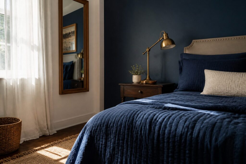
A navy bedroom can run from a single set of throw pillows to a fully painted ceiling, and the right stopping point depends on whether you rent, how high your ceiling sits, and how much light the room actually gets.
The accent wall behind the bed is usually the safest first move, but only if you test the paint through a full daylight cycle; navy shifts from near-cobalt to almost black between morning and evening, and the wrong sample will close the room in rather than open it up.
1. Navy Blue Accent Walls
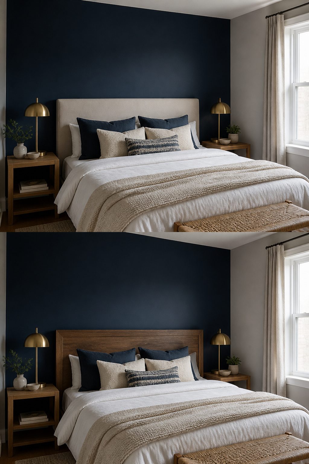
A single navy wall adds depth without boxing the room in, because the dark color recedes visually while the lighter surrounding walls advance to keep the perimeter open.
The wall behind the bed is usually the right choice, since it anchors the room’s natural focal point and gives the headboard something to sit against.
A side wall works better when the bed is centered on a window or the architecture already draws the eye elsewhere, but it risks feeling arbitrary rather than intentional.
Paint the sample and live with it through a full light cycle.
Navy shifts dramatically, reading almost black under evening lamplight and opening up to near-cobalt by morning window light. What holds steady at 9 a.m. may turn muddy by 8 p.m., so the test patch needs to pass both inspections.
The adjacent walls should stay in white, soft gray, or warm beige to keep the contrast clean.
White keeps things crisp and modern, soft gray adds sophistication without competing, and warm beige keeps the room from feeling too nautical or cold.
I would skip anything with a green undertone, since it tends to clash with navy’s own blue base and can make the whole room feel dated.
Gold or mustard accents warm the pairing further, but the wall color itself does the heavy lifting.
The sample test under both morning and evening light is the step most people skip, and it is the one that separates a wall that glows from one that closes in.
2. Navy Blue Bedding Sets
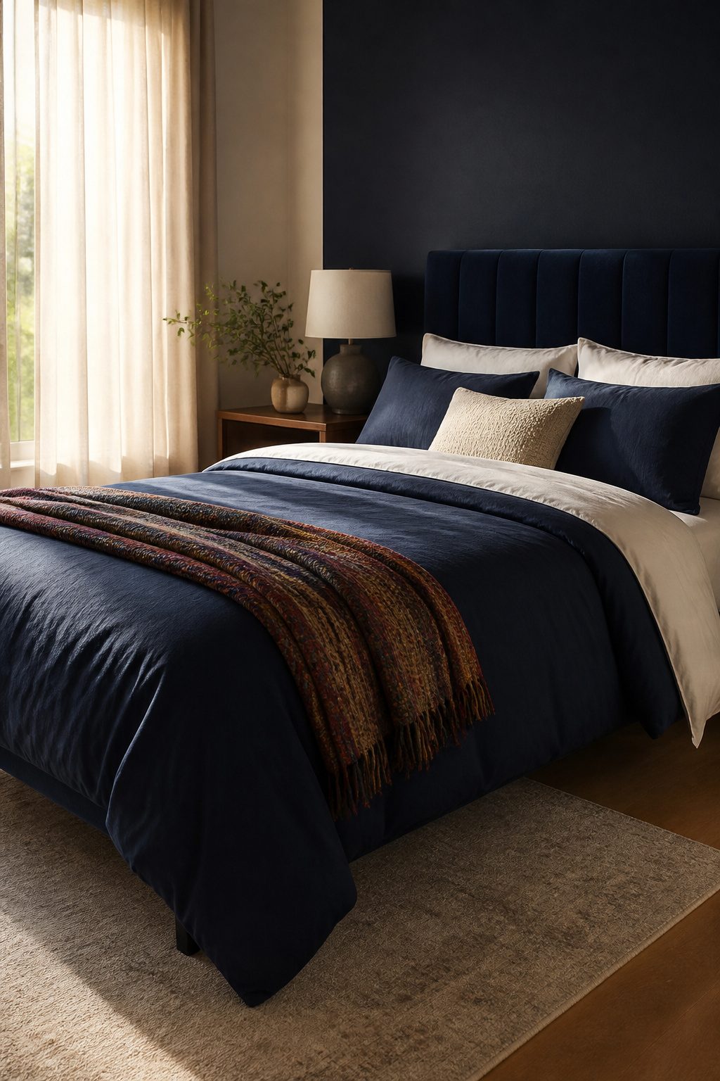
A navy duvet or comforter grounds the bed without reading as heavy, but only if you break up the mass.
Light sheets, pillowcases, and a throw at the foot do the actual work here. White or gold against navy keeps the look refined rather than cavernous; the contrast lets the dark tone read as depth, not weight.
Cotton percale in navy feels crisper and stays visibly blue even under warm lamplight. Navy sateen, with its tighter weave and sheen, can drop almost to black in low light.
I would skip sateen unless the room gets strong morning sun or you plan to layer in enough pale elements to keep the value difference clear. For most bedrooms, percale wins on reliability.
3. Navy Blue Area Rugs
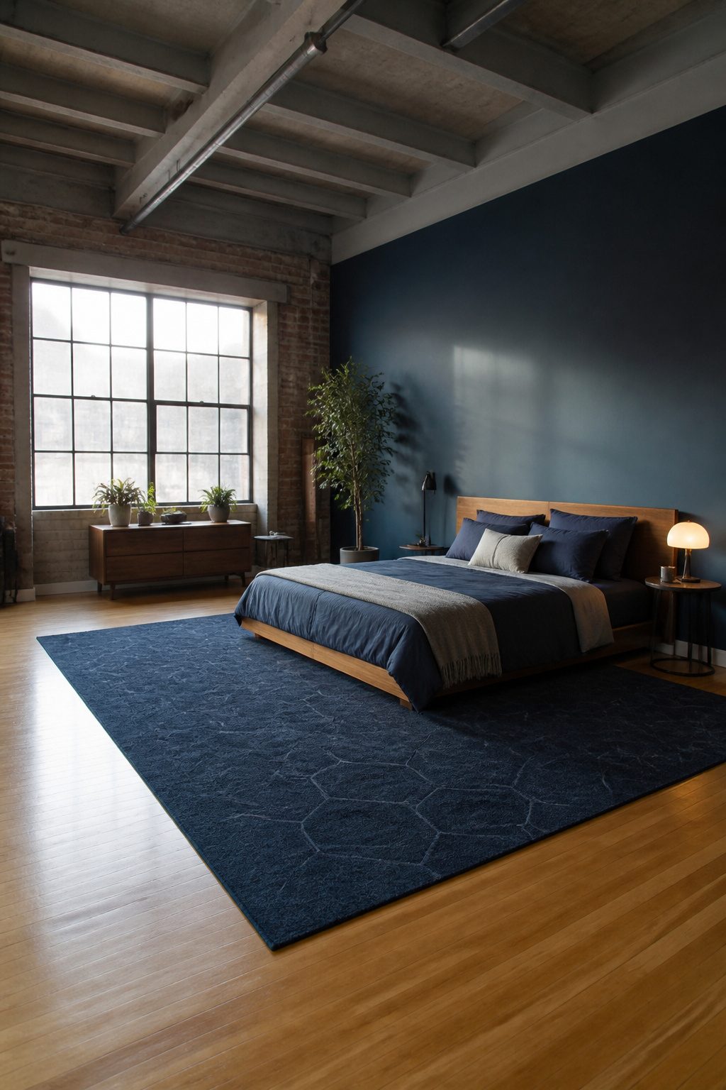
A navy rug under the bed draws a clear border around where sleep happens, which matters in studios or lofts where the bedroom bleeds into living space without walls to stop it.
Keep pile height under half an inch for bedrooms; anything taller traps dust that vacuums struggle to lift and can jam a door that swings over the edge. I would pick a patterned navy weave over solid color every time.
Solid navy shows every pale fiber the moment it lands, while a subtle geometric or distressed motif breaks up the surface so lint and pet hair stay invisible between cleanings.
Low-pile synthetics run cheap and hold their dye well, though a flat cotton dhurrie feels better underfoot if you are walking barefoot to the bathroom at 2 a.m.
Cotton stains faster and needs a rug pad to keep from sliding on hardwood.
4. Navy Blue Curtains
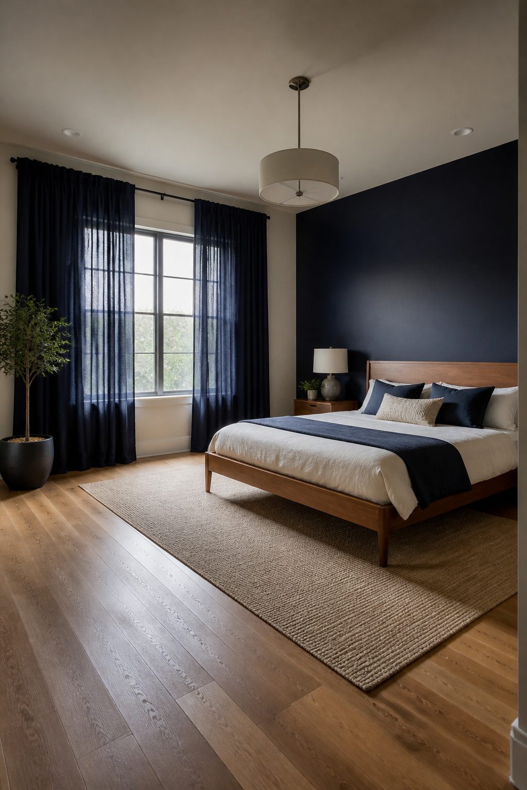
Navy curtains earn their place in a bedroom that already carries one other large navy element, like an accent wall or upholstered bed.
Without that second anchor, the windows can feel like a dark hole punched in the room. With it, the curtains read as intentional framing.
The lining choice matters more than the fabric itself. Blackout lining belongs in rooms where morning light wakes you up before your alarm does; the extra weight also helps the panels hang straighter and last longer without sun-bleaching.
In a room where navy already dominates the walls or a major furniture piece, I would skip the blackout and go unlined so the fabric stays slightly luminous during daylight hours.
Solid navy with no light coming through turns flat and heavy fast.
Mount the rod 4–6 inches above the window frame, not right on top of it. That small lift draws the eye up and keeps the wall from feeling chopped into horizontal bands.
For a standard 8-foot ceiling, I would stop at 6 inches; anything higher starts to compete with the crown molding or the ceiling plane itself.
5. Navy Blue Furniture
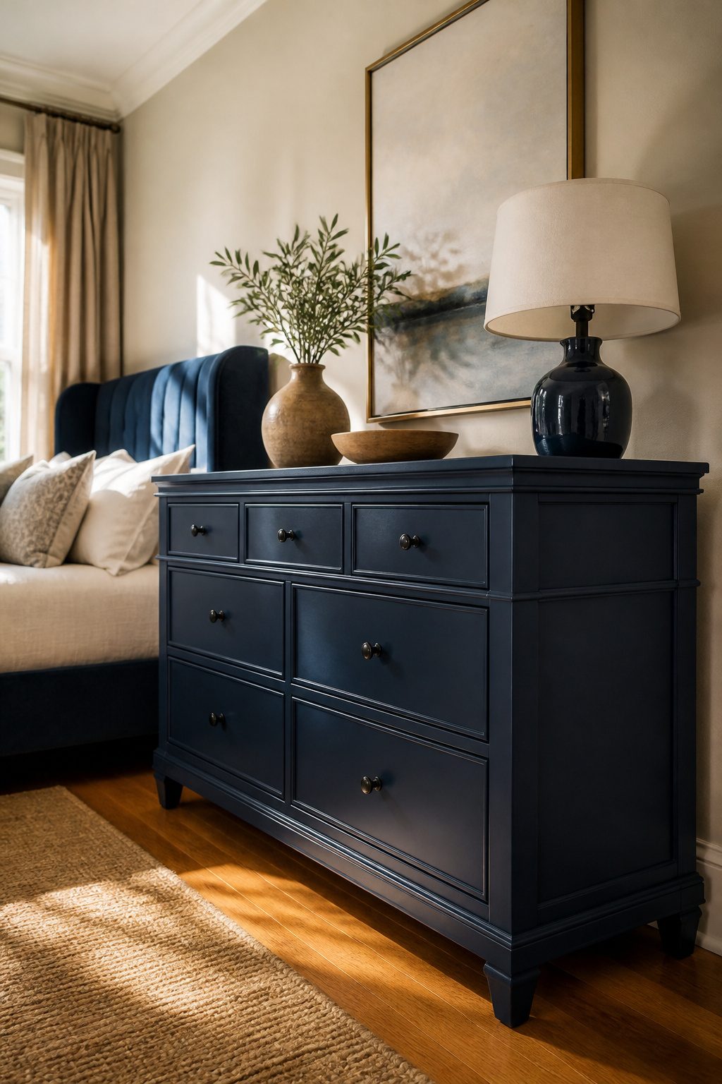
Painted navy dressers and nightstands read casual, almost like something you finished yourself over a weekend.
The brush marks or slight unevenness in the coat gives them a relaxed, cabin-adjacent feel that works well with light walls and raw wood accents.
I would pick this route for a first bedroom setup where the budget is tight and the look should feel collected rather than staged.
Upholstered headboards in navy velvet or linen lean the other direction, toward formal. The fabric catches light differently than paint, softening the silhouette and adding depth that a flat finish cannot match.
A navy headboard against a white wall delivers the effect of an accent wall without the paint commitment, which matters if you are renting or simply do not want to tape and cut in around trim.
Between the two, I would skip the painted headboard. It tends to look like a compromise, neither crisp enough to feel modern nor textured enough to feel intentional.
If you want the softness of upholstery but worry about the cost, a linen blend in navy holds up better than velvet against daily wear and still reads polished against pale bedding.
6. Navy Blue Throw Pillows
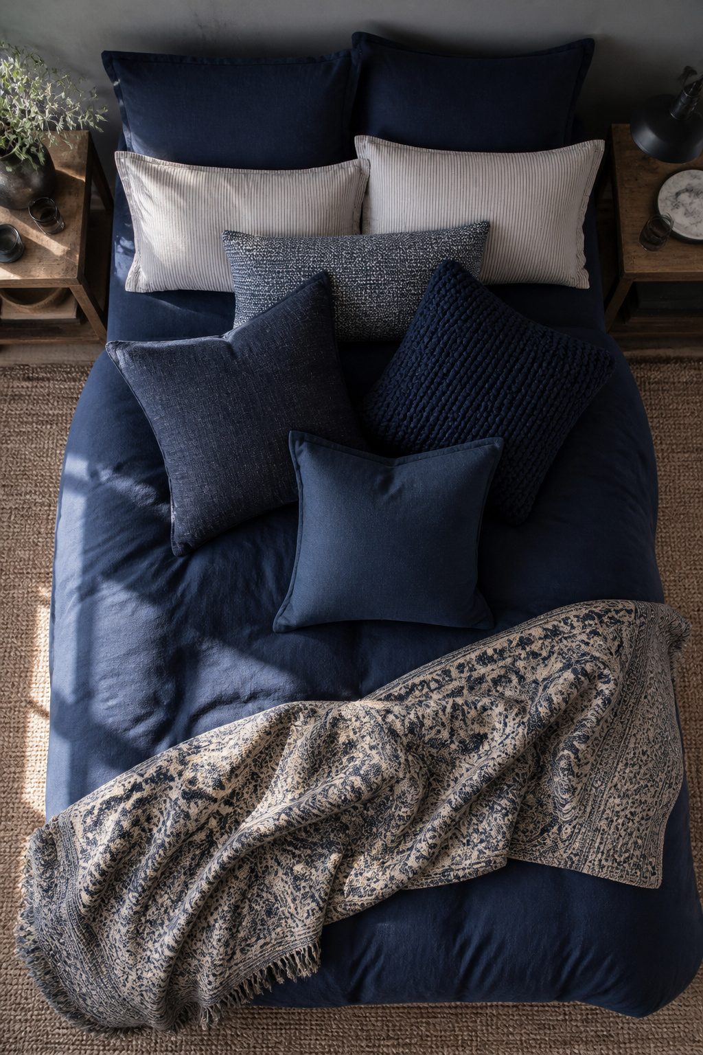
The safest way to test navy blue in a bedroom is with throw pillows, because they move out as easily as they move in.
Three pillows in the same color but different textures read as collected rather than bought as a set: a slubby linen, a chunky knit, and a smooth cotton twill layer together without looking like you tried too hard.
Use 18-inch squares on a full or queen bed, 20-inch on a king; anything smaller gets lost against standard sham sizes. I would skip the matching navy tassels or embroidery, which tips the look toward a catalog page.
Solid texture does the work. If you tire of the color in six months, you are out maybe sixty dollars and a trip to the storage bin, not a gallon of primer and a weekend with a roller.
7. Navy Blue Accent Chairs
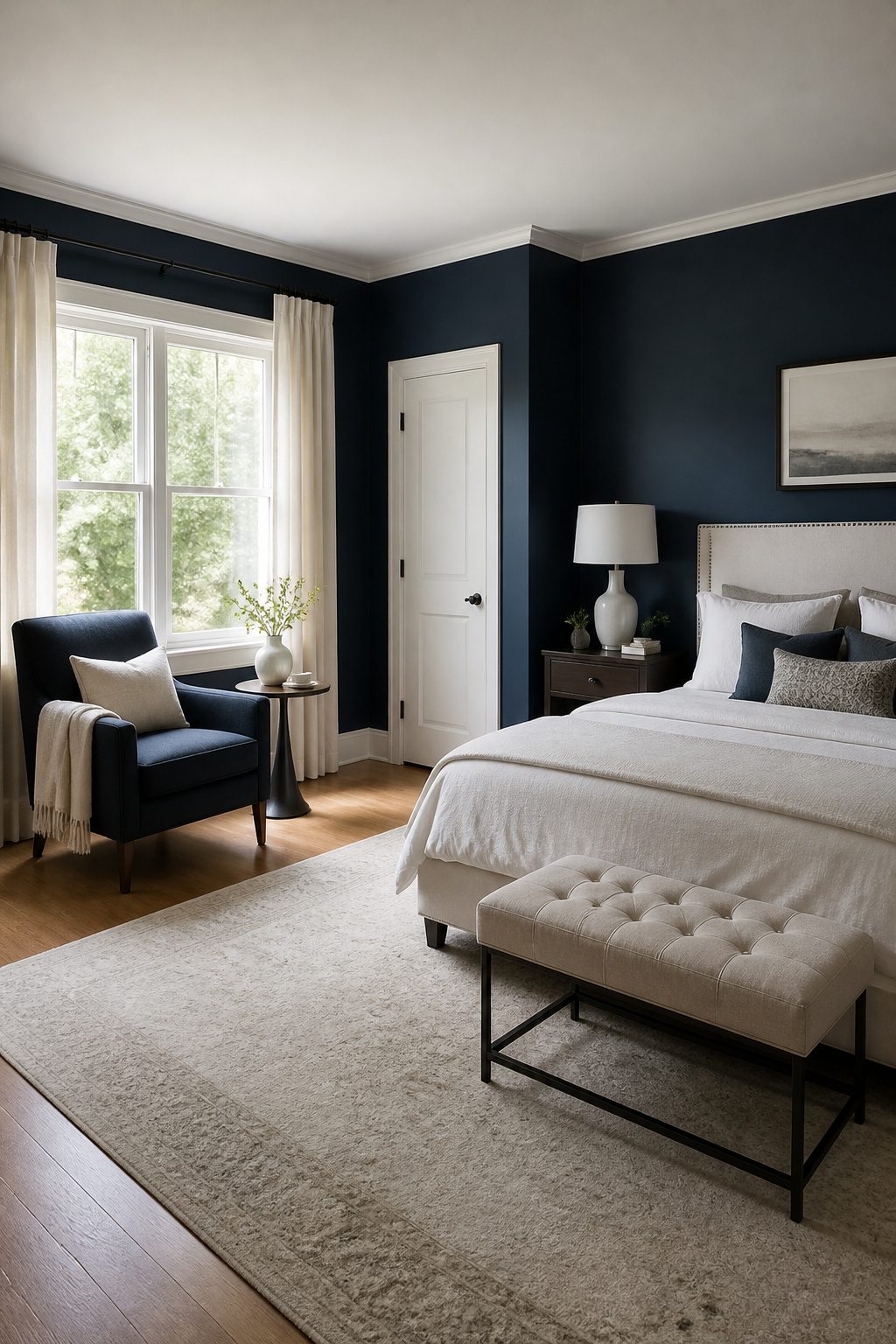
A navy blue accent chair belongs in the corner by a window, where it catches enough light to read by, or at the foot of the bed if the room is 12 feet wide or more.
Any narrower and the chair blocks circulation and the bed already dominates the sightline.
Upholstery wins over painted wood for a bedroom chair you will actually sit in. A navy fabric seat gives under your weight, takes the temperature of the room, and wears in rather than wearing out.
Paint on wood looks crisp in a catalog but sits hard against a pair of jeans night after night, and the finish chips where the frame meets your shoulder blade.
I would pick a tight-back linen or a low-pile velvet in navy, something that reads as a solid block of color from the doorway, and skip the wooden accent chair entirely unless it is purely decorative.
If you want the navy to pull its weight, add a side table within arm’s reach and a throw in a lighter blue or cream.
The chair then becomes a place to end the day, not just a color statement taking up floor space.
8. Navy Blue Wallpaper
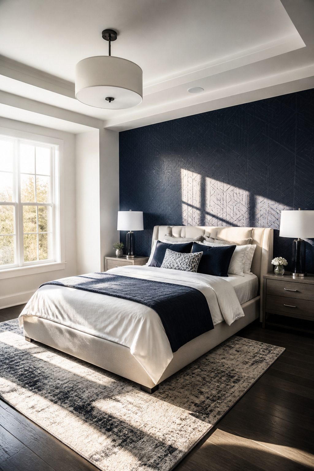
Small patterns or textures in navy read as richer than flat paint ever could. A tight geometric or subtle stripe in navy catches light differently through the day, giving a bedroom depth that a single coat of color flattens out.
I would choose wallpaper for any wall that faces a window, where the shift matters most.
For renters, paste-the-wall products peel away in full sheets when it is time to move.
Traditional paste bonds to the paper itself and tears on removal. The difference is not in the paper price but in the hours you will spend patching drywall later.
Navy grasscloth adds warmth that paper cannot match, and I would use it in a heartbeat for a room that needs softening.
You do get a seam. Grasscloth is natural fiber, so each strip varies slightly, and the joins show under direct light.
I would skip it on the wall across from a bedside lamp and save it for a wall that stays partly shadowed, where the texture wins and the seams fade.
9. Navy Blue Bed Frames
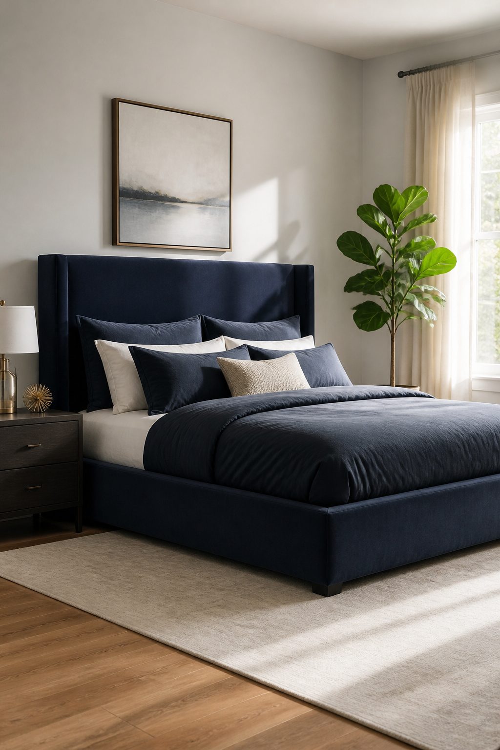
A navy metal bed frame reads industrial in a way that works best with clean white walls and minimal clutter around it.
The finish hides scuffs better than black, but the thin lines can feel cold if the rest of the room stays too spare.
Wood frames in navy lean coastal or traditional depending on the silhouette. A simple plank style with a slatted headboard gives off Cape Cod energy; something turned or carved reads more classic bedroom set.
Paint wears on the edges over time, which I actually like, though someone who wants the color to stay crisp should budget for touch-ups every few years.
Upholstered navy frames are the most tailored of the three.
The fabric softens the visual weight of the color, and the silhouette usually stays lower and tighter than a wood headboard. Velvet or a tight linen weave both work; microfiber tends to look cheaper up close than either.
A navy frame against navy bedding flattens out unless you break it up. Light sheets in cream or pale gray create the contrast your eye needs.
Even a single row of white pillowcases across a navy duvet keeps the bed from reading as one solid block. I’d skip matching the frame to the bedding exactly and let one piece stay lighter or darker than the other.
10. Navy Blue Art and Decor
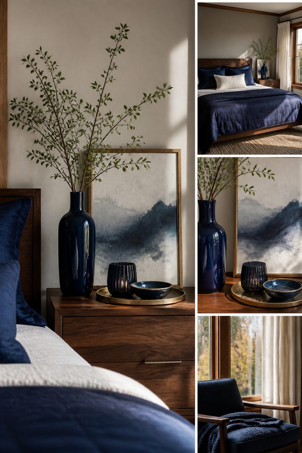
Accessories in navy walk a fine line between pulled-together and heavy.
The rule of three keeps it in balance: one large piece, one medium, one small, each placed in a different zone of the room so your eye travels instead of landing on a single dark cluster.
A tall ceramic vase on the dresser, a mid-size frame above the nightstand, and a small trinket dish on the desk does the work without crowding.
Navy frames on white mats are the move for gallery walls.
The white space keeps the wall from going dim, while the matching frames tie mismatched prints into something intentional. I would skip navy mats entirely; they swallow the art and turn the whole arrangement into one dark block.
11. Navy Blue Lighting Fixtures
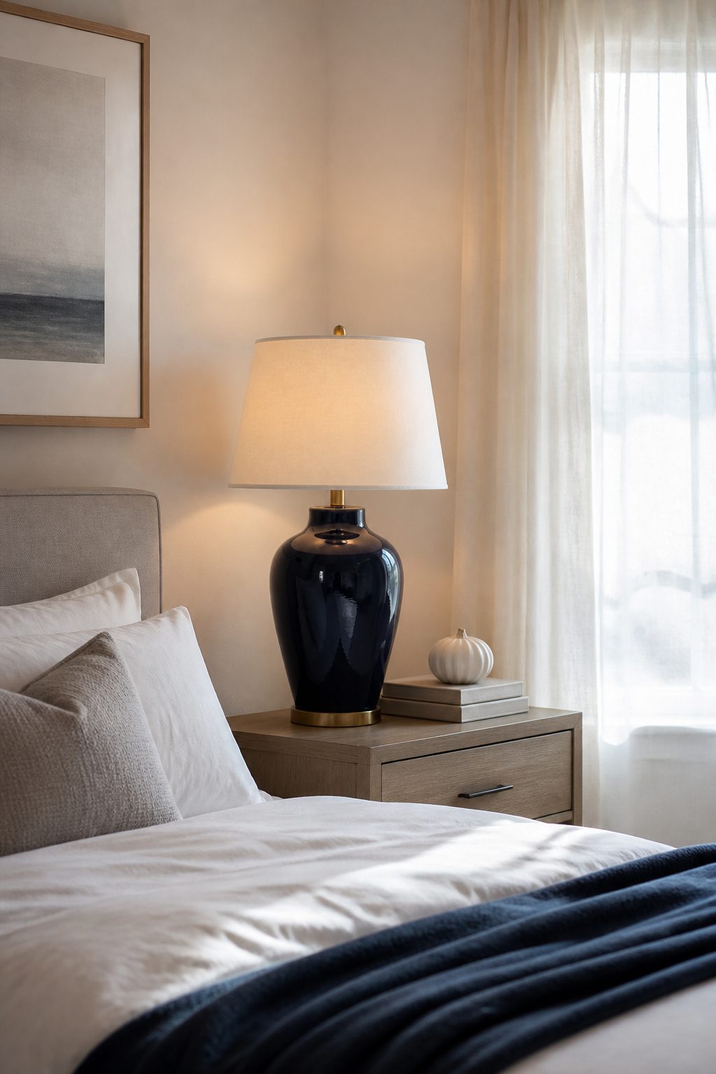
A navy ceramic table lamp base catches the lamplight differently than painted metal does.
The glaze warms from within, giving off a glow that reads closer to indigo than to black, while a navy metal base stays cooler and more literal in color.
Either works, but ceramic tends to soften the edge of such a dark tone in a bedroom.
Pendants and sconces in navy run into the same problem: a navy shade blocks more light than it diffuses unless it is lined in white or cream.
An unlined navy drum shade turns a reading corner dim and muddy. I would skip navy shades entirely and put the color on the base or the arm instead, where it frames the bulb rather than filtering it.
A navy table lamp on a light nightstand gives the highest contrast and the most readable light for nighttime tasks.
The dark base recedes visually against a white or pale wood surface, so the light pool itself becomes the point of focus.
That contrast also means you notice the lamp less as an object and more as a tool, which is what bedroom lighting should be after dark.
12. Navy Blue Accent Ceilings
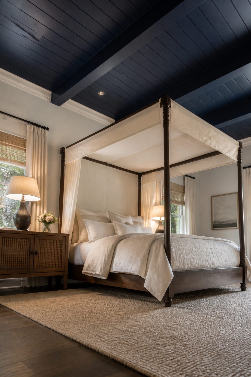
A navy ceiling reads dramatic in a room that can take it.
I would only paint one if the ceiling sits at 9 feet or higher, or if beams break up the surface so the color does not press down as a single slab.
A four-poster or canopy bed helps too, since the fabric or frame stops the eye well below the ceiling line and gives the dark color breathing room above.
Old plaster with waves and patches smooths out under navy in a way white never does, because the dark tone swallows shadow instead of throwing it.
That same absorption costs you 6 to 12 inches of perceived height, so an 8-foot ceiling ends up feeling closer to 7.
I would skip this entirely in a basement bedroom or any space where headroom already feels tight, no matter how much you love the look in photos.
13. Navy Blue Upholstery
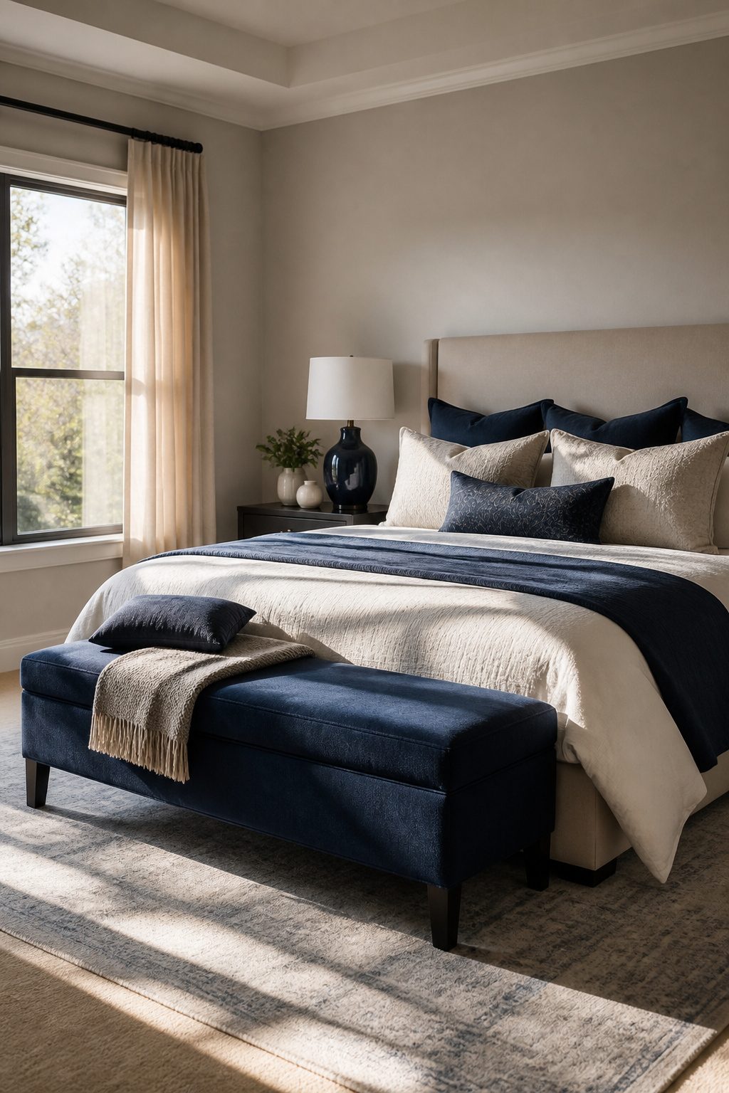
A navy headboard gets all the attention, but the smaller upholstered pieces are where a bedroom actually earns its keep.
A bench at the foot of the bed or a slipper chair in the corner carries the color without the commitment of a wall, and you can move them when the layout starts to feel stale.
Polyester blends win here, especially if the bedroom doubles as a dog bed or a kids’ landing pad.
They brush clean with a damp cloth and do not watermark the way natural fibers do. Navy velvet looks richer in photos, but it telegraphs every lint particle and pet hair within minutes of walking into the room.
I would skip it unless I was prepared to run a lint brush over it weekly, and I am not prepared to do that for furniture I actually sit on.
A tight-weave performance fabric in the same deep tone gives the same visual weight with about a tenth of the maintenance.
14. Navy Blue Bedding and Curtains Combo
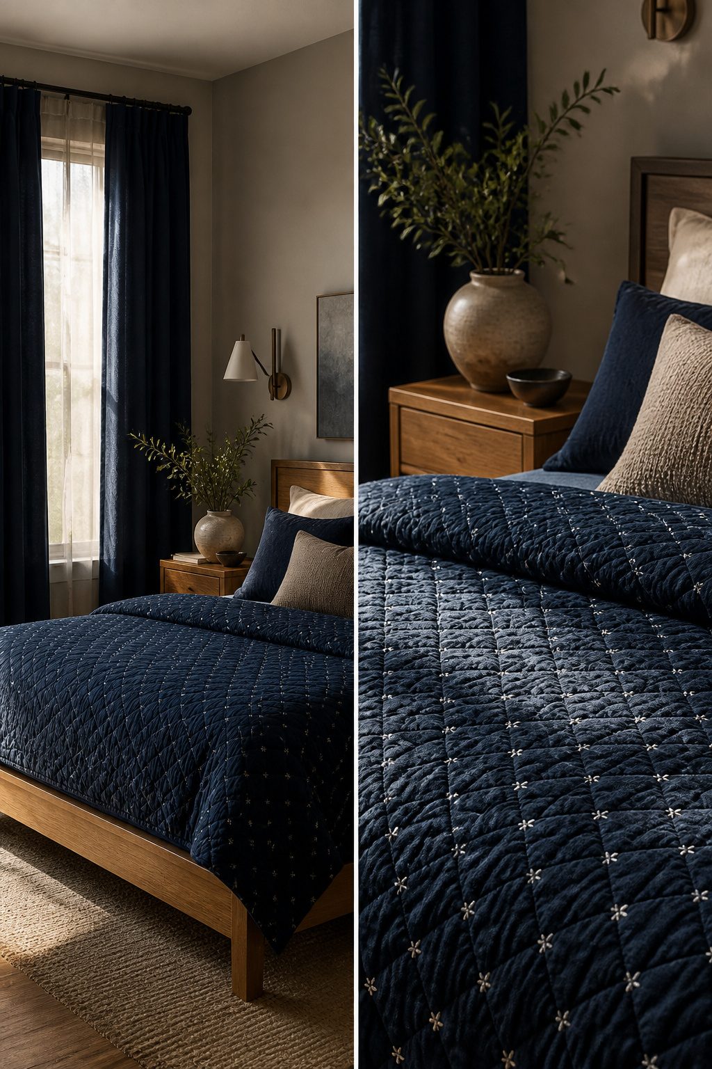
Matching navy bedding to navy curtains works when the two pieces carry different textures or weights, not the same flat dye lot.
Solid curtains against a patterned duvet, or heavy linen panels paired with lighter cotton quilted bedding, gives the eye something to move between. Without that variation, identical navy on both surfaces reads institutional, like a hotel block or dorm room.
White trim on the bedding, or a natural wood bed frame between them, breaks the monochrome enough to save the look. I would skip trying to match the blues exactly; close but not perfect usually clashes worse than intentional contrast.
If the curtains and bedding are both plain and both the same navy, one of them needs to change, or the room will feel dressed rather than designed.
15. Navy Blue Accent Decor
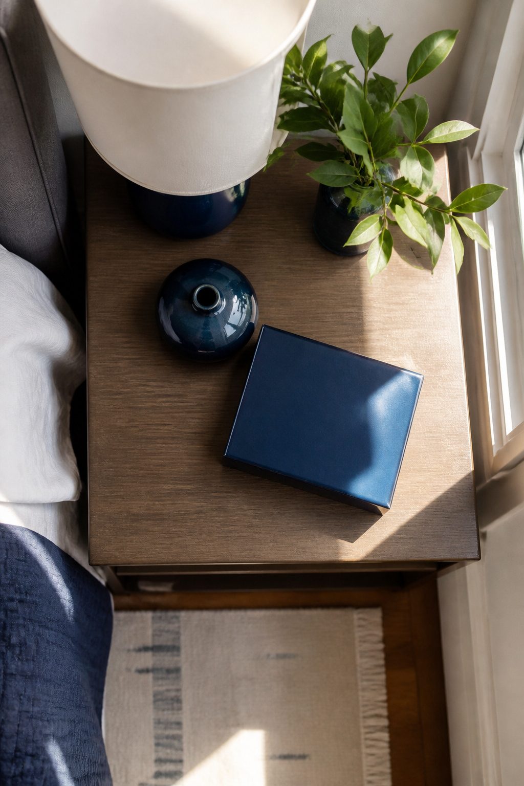
Small navy objects need to sit close enough to read as a set. Three or four pieces within arm’s reach on a nightstand or dresser do what a single scattered piece cannot: they convince the eye this was deliberate.
A navy ceramic vase, a stack of books with navy spines, a lacquered tray catching the morning light. The grouping builds a single pulse of color instead of noise.
The stronger move is the one you almost miss. A navy clock face, a navy lamp cord, the lined interior of a jewelry box — these signal intention because they required a choice no one demanded.
Anyone buying a blue vase knows it reads as decoration. A navy cord on an otherwise plain brass lamp takes more noticing, and that noticing is what makes a room feel considered rather than shopped.
I would skip the temptation to navy every accessory in the room. Two clusters, maybe three, and the rest left alone.
The restraint keeps navy from becoming a theme park version of itself. One unexpected piece per cluster is enough; more than that and the surprise flattens into pattern.
Frequently Asked Questions
How can I balance navy blue with other colors?
Pair navy with white, soft gray, or warm beige on adjacent walls and textiles.
Gold or mustard accents add warmth without competing. Keep contrast clean and skip anything with a green undertone, which clashes with navy’s blue base and can date the room.
What are some ways to lighten a navy blue room?
Break up large navy masses with light sheets, cream throws, and pale pillowcases.
Use white or natural wood bed frames between navy bedding and curtains. Mirrors help, but the main move is contrast: a single row of white pillowcases across a navy duvet keeps the bed from reading as one solid block.
Can navy blue work in a small bedroom?
Yes, but use it strategically. A single navy accent wall recedes visually while lighter surrounding walls keep the perimeter open.
Skip navy ceilings under 9 feet, since dark color swallows shadow and costs 6 to 12 inches of perceived height. Low-pile navy rugs under the bed can also define space without closing it in.
How do I choose the right navy blue shade?
Paint a sample and observe it through a full light cycle.
Navy shifts dramatically, reading almost black under evening lamplight and near-cobalt by morning window light. What holds steady at 9 a.m. may turn muddy by 8 p.m., so the test patch needs to pass both inspections before you commit.
What types of furniture pair well with navy blue?
Neutral tones like white, gray, and raw wood balance navy furniture without competing.
Painted navy dressers read casual against light walls; upholstered navy headboards lean formal against white. Natural wood accents add warmth, and metallic finishes like brass lamps or gold frames keep the look from going flat.
Is navy blue a good color for a bedroom?
Navy works well when you control where and how much you use it.
It grounds a bed as a duvet or headboard, anchors a room as a single accent wall, and adds depth in small doses through throw pillows or lamp bases.
The risk is overuse: matching navy bedding to navy curtains to navy walls flattens the room into one dark slab.
What colors complement navy blue in a bedroom?
White stays crisp and modern, soft gray adds sophistication, and warm beige prevents a cold or nautical feel.
Gold and mustard warm the pairing further. For bedding, white or gold against navy keeps the look refined; for walls, anything with a green undertone clashes and should be avoided.
What color walls with navy blue bedding?
White walls deliver the highest contrast and keep the room from dimming.
Soft gray adds sophistication without competing, and warm beige softens the overall effect. A navy headboard against a white wall gives the impact of an accent wall without paint commitment, which helps if you are renting or want flexibility.




