
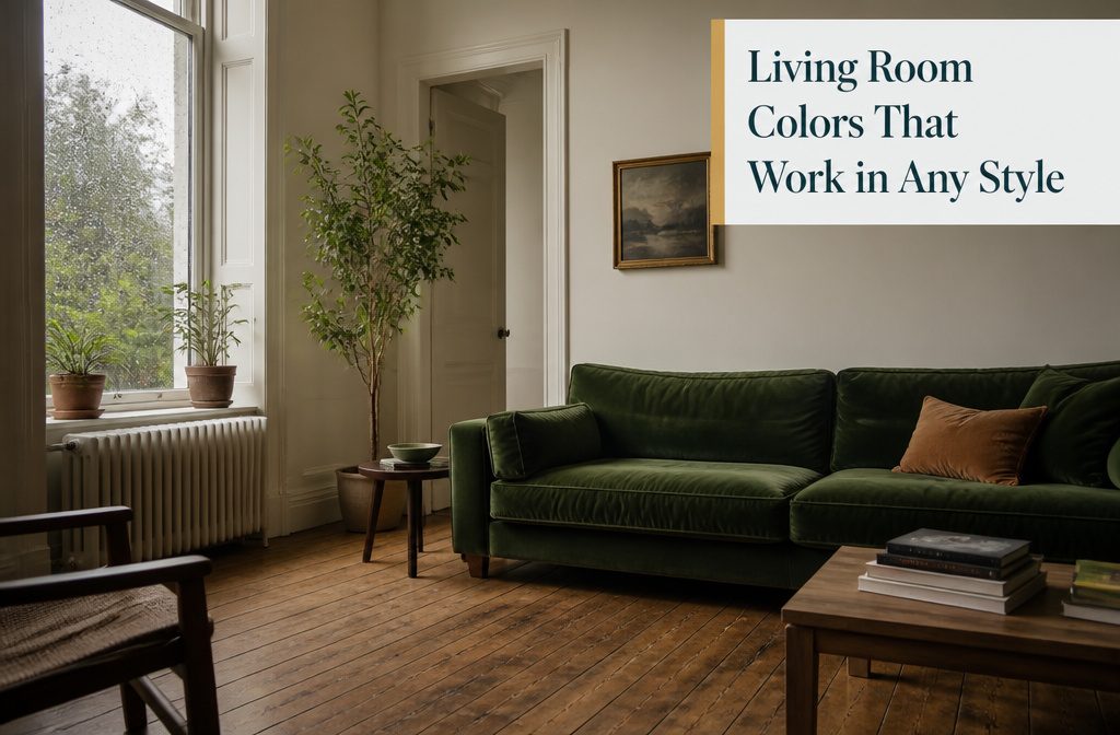
White and warm white give you the cleanest backdrop and the widest range, but cooler whites turn blue in shadow and starker ones read sterile under evening light, so the warmth of the undertone matters more than the brightness.
Benjamin Moore Chantilly Lace shows up in enough living rooms to prove it: soft, not sterile, with an LRV that reflects light without glare.
1. White and Warm White
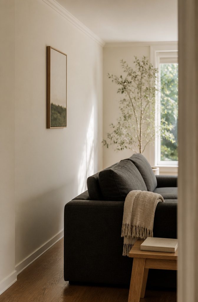
White gives you the cleanest backdrop and bounces light into every corner, which matters if the room faces north or sits away from big windows.
I keep coming back to it when a space needs to feel larger or when bold furniture deserves a quiet wall behind it.
Warmer whites read more inviting than stark cool ones, especially under incandescent bulbs or in evening light.
Benjamin Moore Chantilly Lace shows up in enough living rooms that it proves the point: soft, not sterile, and it doesn’t turn blue in shadow.
White Dove OC-17 leans a shade warmer still, with an LRV around 83, so it reflects plenty of light without the glare you get from a pure white.
Both work across styles. A white wall doesn’t declare modern or traditional; it waits for what you put in front of it.
2. Cream, Ivory, and Beige
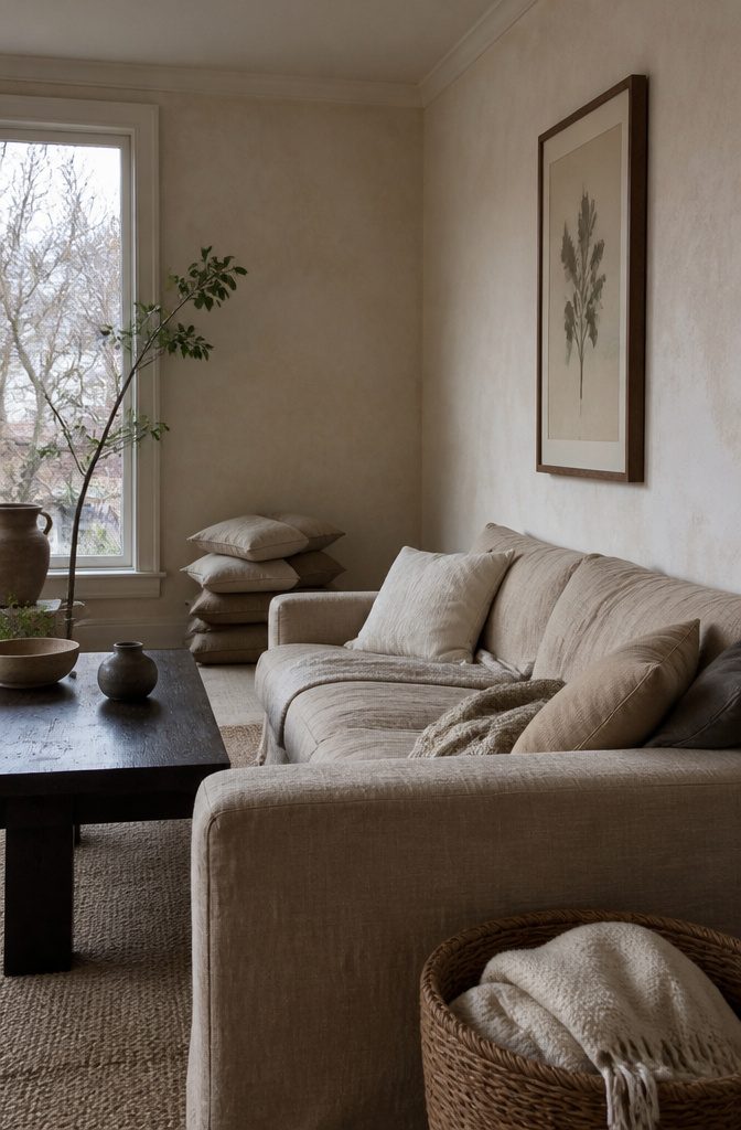
Cream, ivory, and beige give you the brightness of white with more warmth, which makes them easier to decorate around when you don’t want a stark backdrop.
Farrow & Ball’s Pointing is a classic ivory that reads as creamy off-white with warm undertones, reliable in rooms that get indirect light or feel cold in winter.
Portola’s Brooks adds texture that looks almost marbled, which keeps a minimalist room from feeling flat without pulling focus from furniture or art.
Beige and greige—a gray-beige hybrid—are replacing pure gray in living rooms right now because they hold that same neutral flexibility but don’t read as cold, which matters more after a few years of wanting rooms that feel like refuge rather than display.
Recommended Products

PACKAGE CONCENTS--24" X 394"/Roll(In other words,1.97’x 32.8’/Roll ), it covers 64.6 sq.ft per roll.Comes with a plastic scraper ,Installation instruction and LIFETIME...
3. Gray and Greige
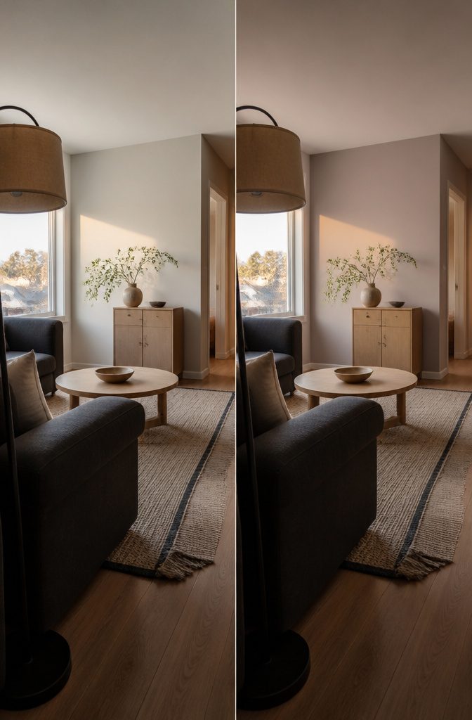
Gray holds its place when you want something that recedes behind furniture, and greige brings just enough warmth to keep the room from reading cold.
Benjamin Moore Pale Oak OC-20 sits between white and beige with a faint pink-violet undertone that flatters charcoal upholstery, though that same undertone can read blush in hard south sun, so it belongs in north or west rooms.
Sherwin-Williams Agreeable Gray SW 7029 works in open plans because it stays warm without turning beige and rarely flashes purple the way cooler grays do.
If you already have a gray sofa, a warm white or light greige on the walls keeps the room from feeling flat.
Recommended Products

CONVENIENT SIZE - This Apple Barrel Acrylic Paint comes in a versatile 2 oz size that is great for basecoating, stenciling, and so much more

Professional Acrylic Paint: Amsterdam Standard Series Acrylic Paint in Warm Grey 718 features a medium viscosity formula for smooth application, visible brush strokes, and strong coverage

SUPERIOR COVERAGE ON VARIOUS SURFACES: Dive into your next DIY project with our all-in-one paint, designed for superior coverage on multiple surfaces. Tackle wood, laminate, metal, glass, resin, or cement with ease. Achieve a smooth finish with fewer coats for maximum impact. Whether you’re after white wood paint for furniture, matte black paint, or pink paint for walls, our versatile furniture paint no sanding all in one works with spray guns and airbrushes for seamless application.
4. Blue and Blue-Gray
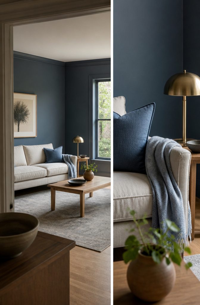
Blue covers more ground than almost any other living-room color. Pale powdery blues read calm and airy, the kind of backdrop that works in a coastal cottage or a minimal modern space without pushing either direction too hard.
Mid-tone blues—think the color of faded denim or a afternoon sky—give you enough presence to anchor a room without overpowering the furniture.
Deep blues like Benjamin Moore Hale Navy HC-154 bring drama and read almost neutral once they’re on the wall, especially in a room with good natural light during the day and warm lighting at night.
Blue-gray sits between the two and solves a common problem: it gives you color without committing to a single mood.
In north light it leans cooler and quieter; in afternoon sun it warms up and feels softer. That shift makes it flexible enough to work whether your style skews traditional or spare.
Recommended Products

[You Will Get]: you will receive 4 pieces of abstract living room wall decorations, with each measures about 12 x 4 inch, different patterns provide you a wide choice forbedroom living room wall decor

Complete Home Decor Set: you will receive 4 pieces of metal vase holder wall decor, 8 pieces of artificial pampas bouquet, 4 pieces of non marking hooks and 4 pieces of adhesive heart shaped wall hooks, sufficient quantity for decorations, also sweet to share with others, practical for making your places more warm and cozy
The package includes: you will receive 4 pieces of mirror wall stickers, including 4 letters [HOME], each letter size is 12 x 10 inch, large size wall stickers are very suitable for decorating the room
5. Green, Sage, and Olive
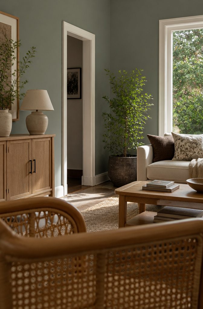
Green works as a muted backdrop or a saturated statement, depending on how much gray you mix in.
Sherwin-Williams Evergreen Fog SW 9130 sits right in the middle: gray enough to read as neutral behind patterned textiles, green enough that the room feels like a choice was made.
It pairs cleanly with oak, cane, and unlacquered brass, and at an LRV of 30 it needs a south or west window to keep from going dim.
Olive green skews warmer and plays well with cream, brown, plum, and brass. It feels cozy when the days shorten, then shifts mood as spring light comes through.
A muted sage green stays neutral enough to hold the wall when you bring in jewel tones—useful in a house with small children, since it hides scuffs better than white.
For a richer look, a deep green like Farrow & Ball’s Green Smoke wraps the room in drama without swallowing a bold sofa.
Recommended Products
Color Your Own Way - Make your design stand out with Glacier White accents, color blocks or painted details on compatible fabric projects.
Sfpt Opstk Soft Matte White 2Oz

△ PRO FACE BODY FAINT SET - Black and white painting stick is grease cream with waterproof texture. Blendable, buildable with brush, sponge or fingers. This kit also contained translucent setting powder gives matte finish without ruin your looks. More importantly, it will help your artistic looks to lasts longer and avoid transferring and smudging.
6. Brown and Earth Tones
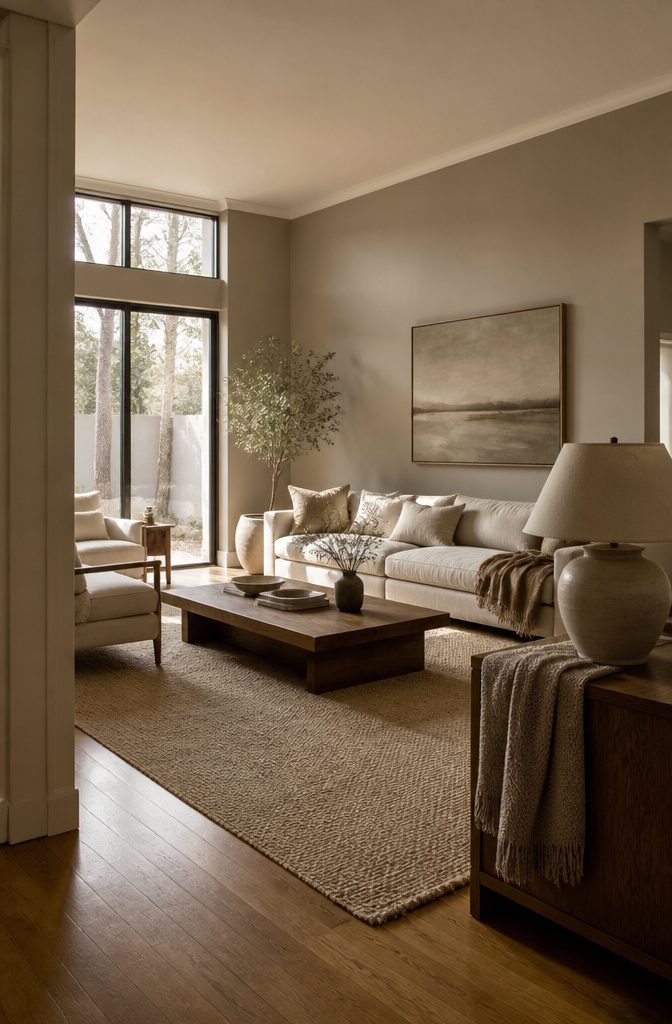
Brown covers the color range builders skip and decorators lean on hardest: the taupes and bronzes that read warm without announcing a theme.
Light taupe keeps the room feeling open and pairs with nearly any furniture finish, while deeper browns—chocolate, bronze, walnut—work best where the room gets strong natural light or where you want a den that feels intentional.
Sherwin-Williams Urbane Bronze SW 7048 sits in the darker end of this range.
It’s a brown-gray with a green edge that reads as a rich, soft dark rather than black, and it suits a television wall where it swallows the black screen or a den used mostly by lamplight.
Pair it with warm whites on the trim, not bright ones, or the contrast looks harsh.
Chocolate brown still holds up as part of the warm tone palette, especially in modern interiors where a red-toned brown on walls and ceiling proves the color’s power without feeling dated.
Treat brown as the grounded base it is: layer it with textured fabrics, plush rugs, and soft lighting to finish the look.
Recommended Products

Safety and Environmental Friendliness: Our electric Candl Warmer Lamp gently melting the candle from the top down. With no open flame, it eliminates concerns of flame, smoke, soot, and pollution. Ideal for homes with children and pets, it offers a safe and clean ambiance for households, apartments, and offices.

High-Performance Fabric: Made from 92%Polyester & 8%Spandex, the ski pants are designed to keep skiers dry and comfortable in various snow conditions. The fabric effectively resists snow and water infiltration while allowing sweat to evaporate, helping to eliminate internal moisture and reduce sweat accumulation.
7. Yellow
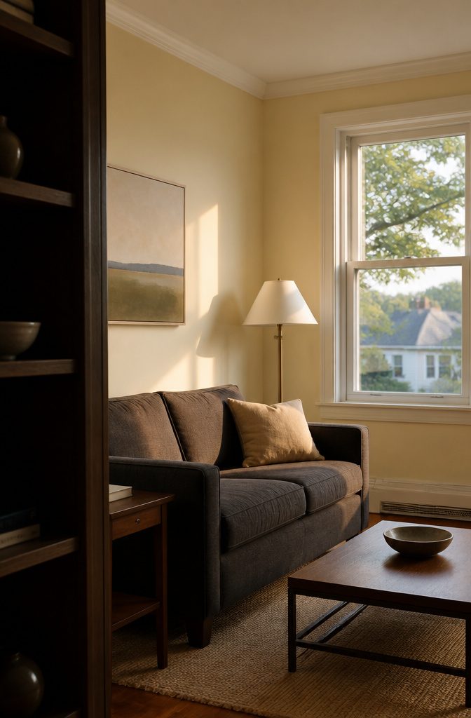
Yellow pulls warmth into a living room without needing strong color, and the range runs from barely-there cream to something closer to gold.
Benjamin Moore Swiss Coffee OC-45 sits on the softer end—a warm yellow-beige with an LRV around 84 that reads as off-white until a cool room makes the warmth obvious.
It works in north- or east-facing spaces that stay dim past noon, though west light at 5 p.m. can push it buttery enough to test first.
Stronger yellows like butter yellow or marigold bring more energy and pair well with white trim and dark or neutral furniture.
A rich yellow with neutral undertones replaces cream in traditional rooms without losing the classic feel, and extending a golden beige onto the ceiling adds depth in a way plain white does not.
Recommended Products

[Solid Color Wallpaper]:Cream removable wallpaper is made of vinyl material, with self-adhesive design. Its viscosity can ensure that the product will not fall off after pasting and will not affect your use. Removable feature allows you to change the style you want at any time, renter friendly wallpaper

【6 USB Beige Power Strip】Compare with other 15W power strips, the power strip beige provide 3 usb-c for Apple devices, each USB-C port delivers up to 5V/3.1A 15.5W, all usb ports output is 5V/4.8A, 24W max. Beige extension cord with smart charging technology, it can automatically detect your connected devices and can achieve faster charging efficiency, which would charge your devices WITHOUT a variety of converters.

Cream Paisley Bandana for Men and Women: The timeless paisley print on a cream 22 x 22 inch cotton square, for free spirits who love boho and vintage style. Wear it for hair scarves, head wraps, festivals, road trips and beach days.
8. Pink, Mauve, and Plum
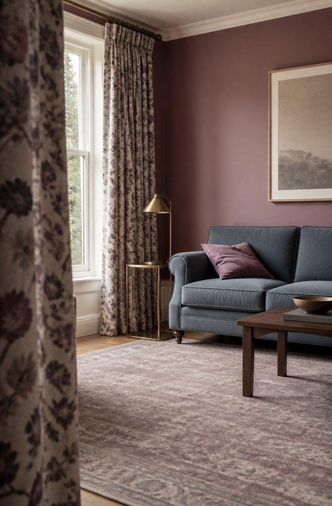
Pink sits at the softer end and feels romantic without tipping into overly feminine territory—Benjamin Moore’s Setting Plaster is the blush-like hue designers reach for when they want warmth that doesn’t shout.
Pair it with brass or gold fixtures and the pink picks up a quieter kind of luxury. Mauve brings more gravity, a pinkish-purple with enough neutral undertone that it works in rooms where straight pink would feel out of place.
It anchors well against blue-gray or white trim, and floral drapes in a mauve-heavy print pull the whole palette together without reading as whimsical clutter.
Plum and magenta push further into saturation—Twilight Magenta defines a two-story living room in a way that beige never would, especially when you weave in white accents for contrast.
The darker the pink or purple, the more it needs light walls or charcoal to keep the room from feeling closed in.
Recommended Products

Thick, creamy with satin finish; Good pigment load

12 Shades of Grey acrylic olors provide unique shades of hard-to-find greys; Highly pigmented and processed on triple mills, these oil paints will enable you to achieve sultry effects like you've never seen before

PREMIUM WALL PAINT: Interior paint and primer in one designed to protect from everyday life
9. Red, Burgundy, and Oxblood
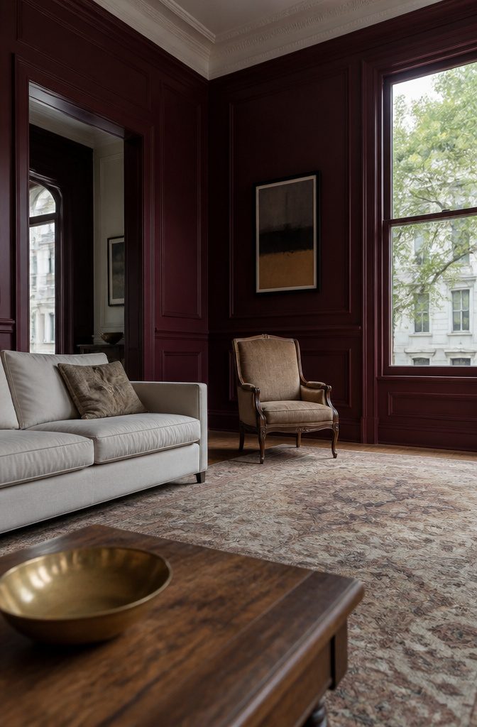
Red, burgundy and oxblood sit at the warm, dramatic end of the spectrum.
They anchor a room with weight and make walls feel closer — which means these work best in larger living rooms where you can step back and take them in without the space feeling tight.
A deep burgundy reads formal in a room with paneling or vintage furniture, while a brighter red leans modern when paired with graphic art and clean-lined pieces.
Oxblood splits the difference: dark enough to feel grounded, warm enough to keep the room from going cold. This choice asks for commitment.
Red holds attention in a way that beige never will, so the rest of the room has to support it — neutrals on the furniture, restraint with pattern, and enough natural light that the color doesn’t go flat by evening.
Recommended Products

Watercolor Printing:Hand draft painting by our designer.Designed inspiration from aesthetics of stunning natural flowers blend of luxurious blossom hydrangea,cornflower,eucalyptus,lavender,and wildflower.Soft and muted color for decorating spring and summer seasonal themed apartment.

PAINTING MATERIAL: This blue wildflower wall art uses a quality canvas fabric and a strong wood frame to ensure the durability and durability of the painting, while protecting it from damage and maintaining its luster for a long time.

High quality printed artwork stretched to fit on durable and shrink-resistant canvas.
10. Teal and Blue-Green
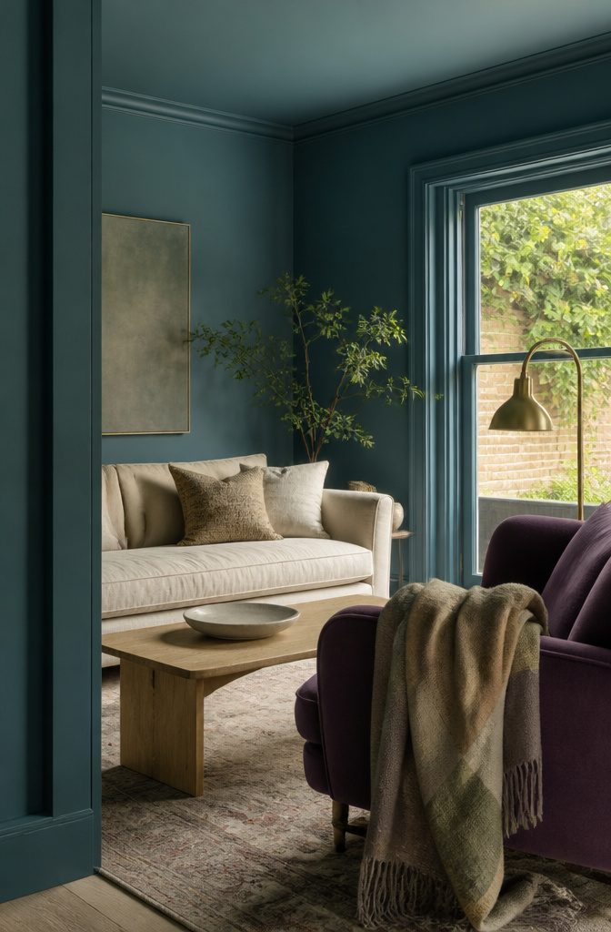
Teal and blue-green sit at the bolder end of the spectrum, the kind of color that commits to a mood rather than fading into the background.
Farrow & Ball’s Vardo and Hague Blue both deliver that depth, though Hague Blue skews darker and needs good natural light to keep the room from closing in.
Vardo holds up better in dimmer spaces and pairs cleanly with green velvet or jewel tones without fighting for attention.
The monochrome approach works: walls, trim, and molding all in the same teal flatten the architecture in a way that feels intentional rather than safe, especially when the furniture contrast is strong enough to hold the room together.
If you have stained wood trim, Sherwin-Williams’ Waterloo plays the warmer route—blue-green that pulls out the warmth in oak or walnut through subtle contrast rather than covering it.
Farrow & Ball’s Green Smoke runs deeper and works when you want the walls to recede behind saturated furniture, the kind of backdrop that makes a purple couch feel grounded instead of loud.
Recommended Products

WASHABLE FORMULA: White kids paint easily washes from skin and most washable clothing, making cleanup quick and simple after art projects.

Make your home a place of comfort with better light that minimizes unnecessary blue light and eye-strain. With 800 lumens of brightness and a color temperature of 2700K, see the clear difference TruWave technology can make in your home.

➤【Reduce The Cost And Trouble Of Replacement】 Save Up To 90% On Electricity Bill Of Lighting By Our 5W MR16 LED Bulb! No Need To Change Frequently With Long Lifespan Of 30,000 Hours. 5W 12V 3000K Soft Warm White, 450Lm GU5.3 Bi-Pin Base, GU5.3 MR16 12V Spotlight Bulb, 50W Halogen Equivalent.
11. Black and Charcoal
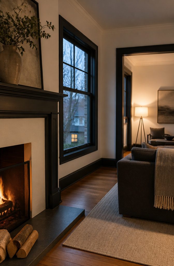
Black walls and charcoal trim create a bold, defined look that works best when you commit fully.
Benjamin Moore Wrought Iron on a fireplace gives you the contrast without darkening the whole room, and pairing deep black or near-black on windows, doors or millwork with crisp white walls adds depth while keeping the space open.
A single dark wall in a small living room usually reads wrong—the contrast chops up the space—but the rule bends if the room is used mostly at night.
Evening light softens the effect, and you lose the harsh divide that daylight exposes.
If you watch a lot of TV during the day, moody black on all four walls cuts glare better than a lighter color and pairs well with dark gray upholstery.
For a less dramatic version, use charcoal gray or off-black on trim with white or neutral walls. It skews masculine and works well in a living room that doubles as a library or game room.
12. Purple and Lavender
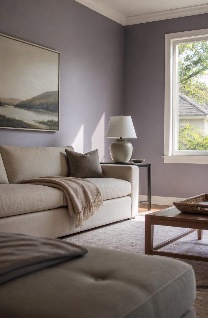
Purple pulls a living room away from neutrals without committing to the intensity of pure jewel tones.
Dusty lavender reads almost gray in low light, which makes it workable in rooms where a bold color would overwhelm the furniture or compete with art.
The cooler the undertone, the more it pairs with silver hardware and white trim without clashing.
Richer purples—plum, eggplant—anchor a room the way navy does, but they throw warmer light back instead of cooling it down.
That warmth keeps a purple accent wall from feeling cold in a north-facing room, though it does make the wall advance visually, so I’d keep it to one surface rather than boxing the whole space in.
Test samples next to your couch fabric first; purple shifts more than most colors under incandescent bulbs, and what looked soft in the store can turn muddy at night.
13. Terracotta and Orange
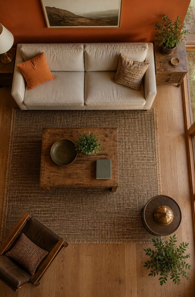
Terracotta and orange bring the warmth of desert clay and sunset into a living room without feeling heavy.
Sherwin-Williams Cavern Clay or Sierra Redwood work particularly well in mountain-inspired or southwestern-leaning spaces, where the color echoes red rock and canyon walls.
Pair either shade with crisp white trim to keep the room from reading too dark, or layer in antique brass hardware and natural wood furniture to lean into the earthy direction.
The palette stays modern when you use terracotta as an accent wall rather than wrapping the whole room.
A single wall in burnt orange or siena behind a sofa adds character without overwhelming the space, and it gives white or beige furnishings something to anchor against.
If the room gets strong afternoon light, these tones warm up fast; in a north-facing room, they can look flat unless you add enough contrast with darker furniture or rugs.
14. Multicolor and Jewel-Tone Palettes
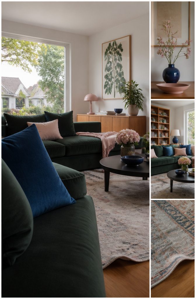
A jewel-tone palette lets you run saturated colors without tipping into chaos if you anchor them with neutrals or distribute the weight across three to four colors: dominant, secondary, and one or two accents.
Citrine and aquamarine hold together when off-white and black split the difference. Plum and dark green stay grounded against a soft warm neutral, and the lighter wall keeps the layered darks from closing the room in.
The 60-30-10 rule gives you the proportions: the dominant color takes walls or large upholstery, the secondary covers rugs or drapes, and the accents land in pillows or small decor.
White walls work as the permissive backdrop here — sapphire, blush, peach, and a thread of black all coexist when the field stays neutral. Warm woods and golds push jewel tones warmer; crisp white and graphic black pull them modern.
Match Color to How the Room Is Used
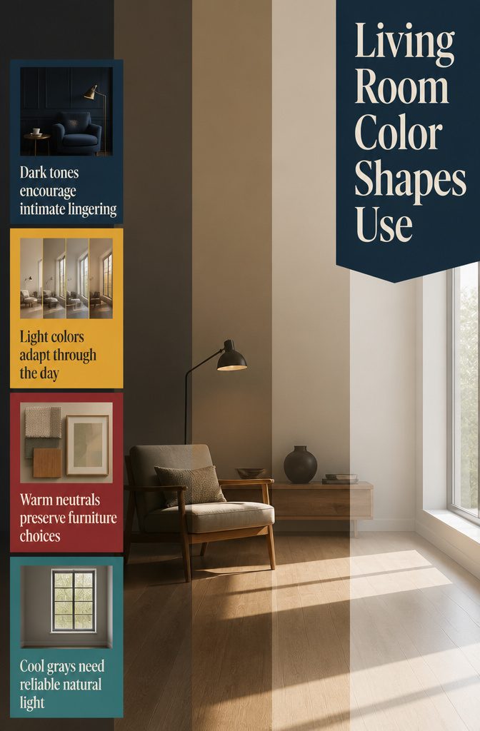
Color works when it suits what you do in the space. A living room used for quiet reading or family time calls for something different than one built for hosting a crowd.
Darker tones pull a room inward and feel more intimate, which helps if you want to settle in and stay a while.
Lighter colors open things up and keep the mood less fixed, better for a room that shifts purpose through the day.
Warm whites and soft neutrals create calm without closing off your options for furniture or art. Warm tones—from pale cream through deeper browns—read as welcoming the moment someone walks in.
Cool whites and grays feel cleaner but less forgiving if the light is poor. The choice rides on whether you want the walls to soften the room or stay out of the way.
Frequently Asked Questions
What colors make a living room look bigger?
Light neutrals with an LRV between 70 and 85 make a living room feel larger because they reflect plenty of light without glare.
White, warm white, cream, and pale beige all work, and using the same color on walls and trim removes visual breaks that chop the space into smaller pieces.
North-facing rooms or spaces away from big windows benefit most from these lighter shades.
What color is replacing gray in living rooms?
Beige and greige are replacing pure gray because they offer the same neutral flexibility without reading as cold.
Greige is a gray-beige hybrid that holds up as a backdrop for furniture while feeling warmer and more welcoming than the cooler grays that dominated a few years back.
What wall color goes with a gray sofa?
A warm white or light greige keeps a gray sofa from looking flat or cold.
Benjamin Moore Pale Oak and Sherwin-Williams Agreeable Gray both work well, bringing just enough warmth to balance the cool tone of gray upholstery without competing for attention.
Is dark paint a good idea in a small living room?
Dark paint can work in a small living room if the space is used mostly at night and the color wraps all 4 walls, which makes corners blur and the room feel enveloping rather than cramped.
A single dark wall in a small room usually reads wrong because the contrast chops up the space, though evening light softens the effect.
Should the ceiling be the same color as the walls?
Not usually. A flat white ceiling or white tinted to about a quarter of the wall color keeps the room bright and open.
Painting the ceiling the full wall color works with deep shades in rooms with higher ceilings, but most spaces benefit from the contrast.
How many colors should a living room color palette have?
3 to 4 colors work best: a dominant color for walls or large upholstery, a secondary color for rugs or drapes, and 1 or 2 accent colors for pillows and small decor.
This structure gives the room enough variety without tipping into chaos, and the 60-30-10 rule helps proportion them out.
What is the best color to do a living room?
Warm tones ranging from creamy whites through chocolate brown make a living room feel welcoming the moment someone walks in.
These shades work across styles and pair well with most furniture, while cooler whites and grays feel cleaner but less forgiving if the light is poor.
What is a timeless living room color palette?
White or cream walls, warm wood, and one accent color like navy, cognac, or deep green create a timeless look that holds up across decades.
The neutral backdrop stays flexible while the accent color adds character without locking you into a passing trend.
What is the most popular living room color palette right now?
Warm neutral and earth-tone palettes are popular right now, with shades like taupe, beige, terracotta, and muted greens showing up in more living rooms.
Moody high-contrast schemes pairing deep colors with crisp whites or blacks are also gaining ground, especially in spaces with strong natural light.




