
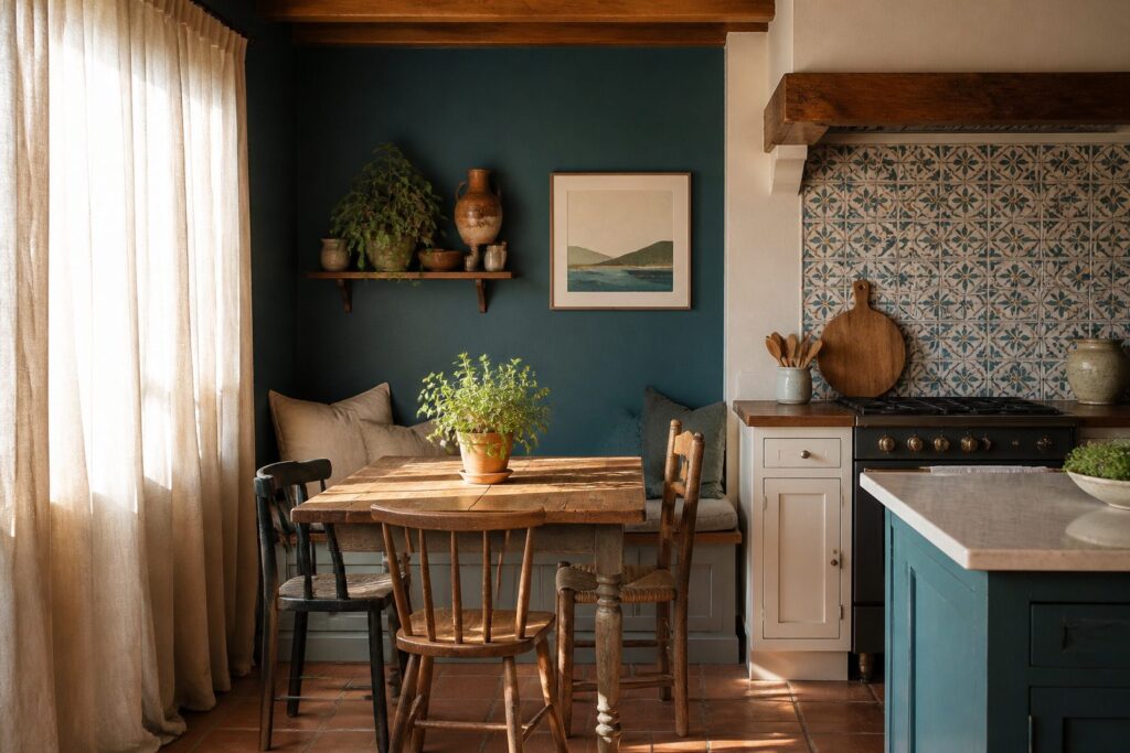
Kitchen interior design is the planning of layout, materials, color, and storage that makes a kitchen function day after day.
The difference between a kitchen that works and one that fights you usually comes down to measurements most people skip: 12 inches of knee clearance at a counter overhang, 30–36 inches from pendant to surface, 4 to 9 feet between sink, stove, and refrigerator.
Get those wrong and even expensive finishes become daily annoyances.
Counter Chairs
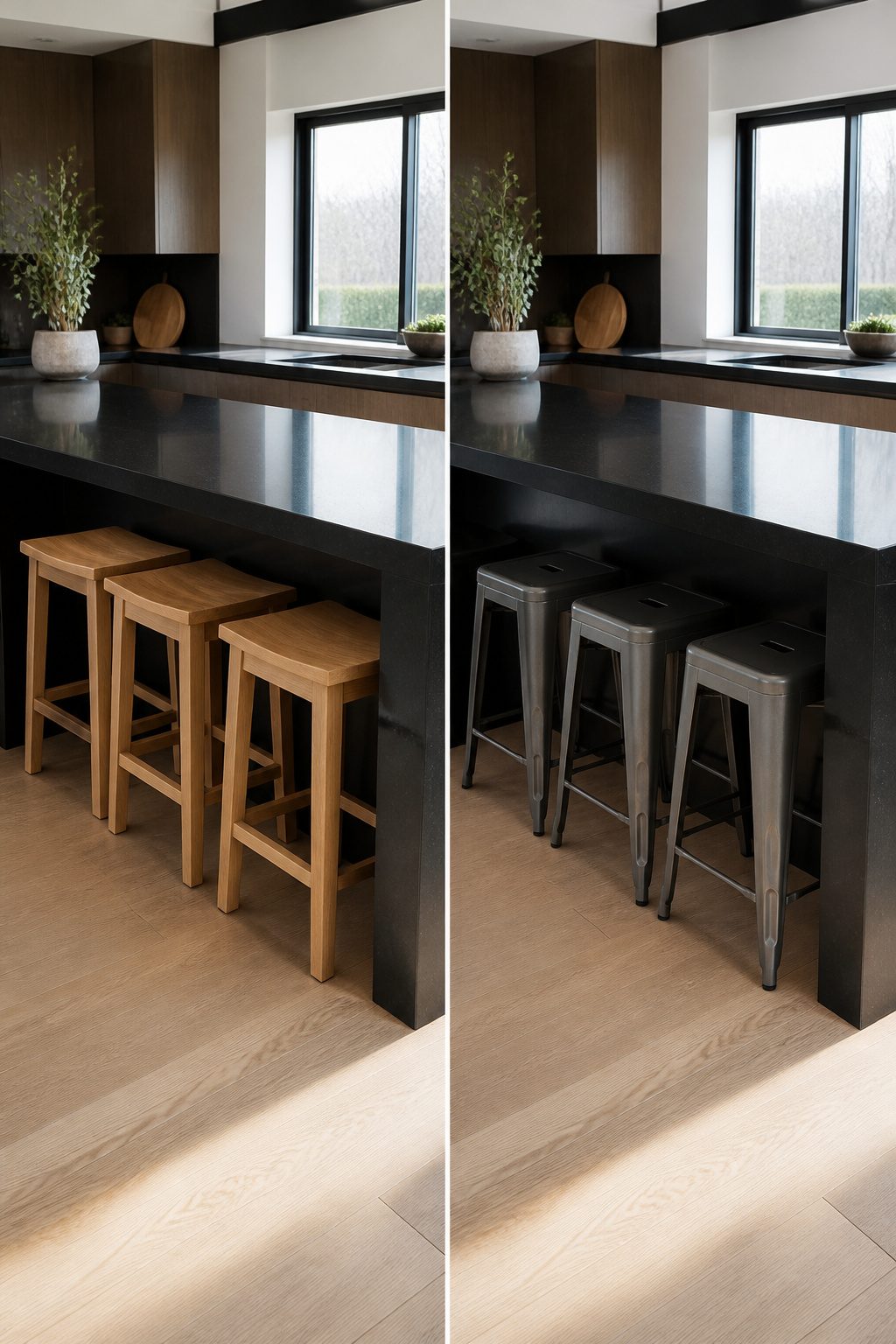
Counter stools sit 24–26 inches high, bar stools hit 28–30 inches, and the distance between seat and counter overhang matters more than most people notice at first.
I measure for 12 inches of knee clearance every time: less means someone six feet tall will knock their knees on the apron by month two, and that overhang is where Saturday morning pancakes actually happen.
Backless stools slide clean under the counter when you need floor space for a project or kids running through.
A back earns its keep if that counter doubles as your WFH desk or dinner spot three nights a week, since two hours in a backless seat rounds your shoulders forward and you feel it the next day.
For a tight galley kitchen where the counter bridges living space, I lean backless. If the island faces a window with a view and you linger there with coffee, the back wins.
Wallpaper Styles
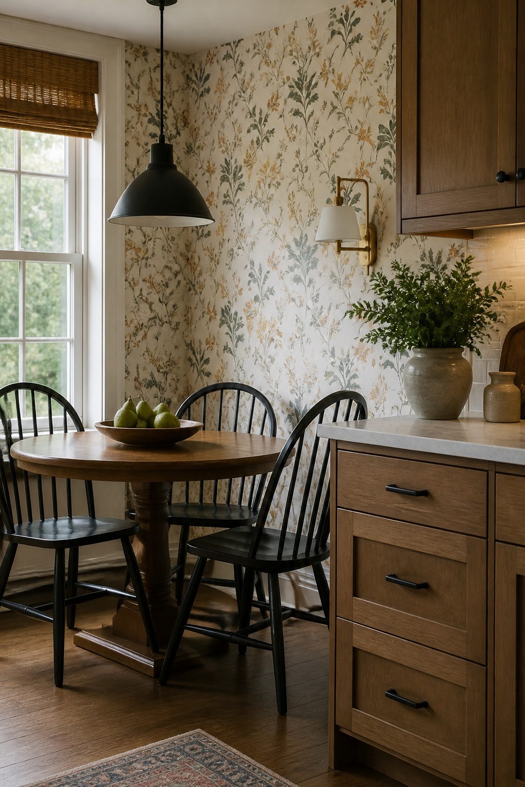
Vinyl-coated and washable papers are the only grades I would hang anywhere near cooking grease, and even then I keep them to backsplashes and breakfast nooks rather than the wall behind the range.
Steam, spatter, and high heat break down the adhesive and the paper face faster there; a scrubbable vinyl survives wipedown on a side wall but looks tired within a year facing the stove.
For a weekend install, paste-the-wall products cut the job in half because you roll adhesive straight onto the drywall and drop the dry panel into place.
Traditional prep requires soaking paper in a tray, booked time, and more mess than most kitchens can absorb between Saturday morning and Sunday evening.
Peel-and-stick options skip paste entirely and come back up when you move, though the seams lift easier in a humid kitchen than they would in a bedroom.
If you want pattern behind open shelving or a banquette, washable vinyl paper is the move. Behind the cooktop itself, stick with tile, glass, or a wipeable panel you can replace in one piece.
Glossy Countertops
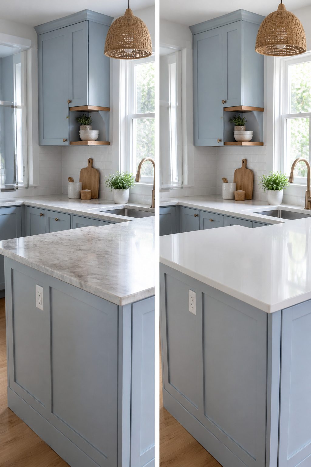
Glossy laminate countertops throw light back into a room better than any other finish, which matters when your kitchen interior design is working with one window and a tight footprint. The reflectivity can feel like gaining another light source.
CenturyLaminates builds ViroKill Technology into its glossy lines, an antiviral and antimicrobial layer that handles bacteria, viruses and fungi on the surface itself. Some of their decorative laminate ranges carry a 7-year warranty on color fastness and structural integrity.
Glossy countertops look stunning but need regular wiping to keep them that way. Every fingertip, water spot and breadcrumb shows on gloss; I would not recommend it for households that recoil from a daily wipe-down.
Honed finishes hide the mess better but absorb light, and satin splits the difference with less drama in both directions.
For a small kitchen you are touching up before dinner guests arrive, gloss rewards the effort. For a household that cooks three meals a day and cleans on Sundays, satin probably wins.
Quirky Oven Area
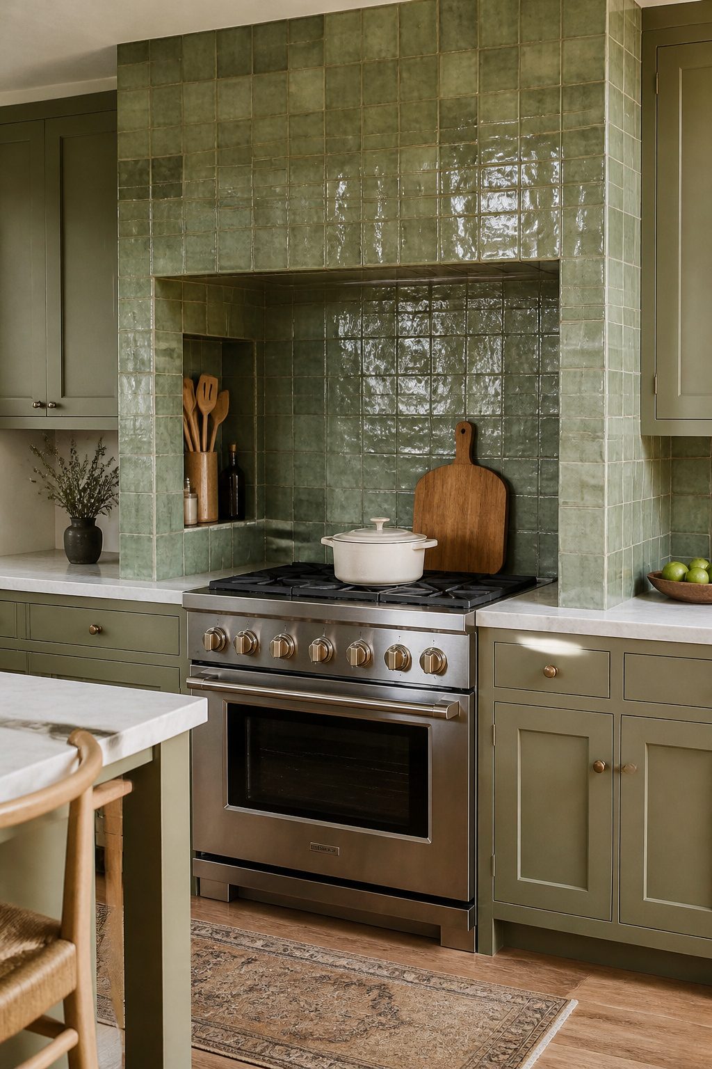
The range wall draws the eye whether you plan it or not, so I treat it as the kitchen’s natural focal point and build around that.
A tile surround that runs floor to ceiling behind the stove anchors the whole room better than a standard 18-inch backsplash that stops awkwardly mid-wall.
I like zellige or a handmade subway tile here because the slight variation catches light from the burners and gives the eye something to rest on without shouting.
A recessed niche beside the range, sized to hold oils and the spoons you actually cook with, keeps the counter clear and puts tools where your hand reaches without looking.
I put mine at elbow height, not up where it becomes display shelving for bottles you never open.
Color and pattern on this wall only work if the rest of the room quiets down. In a kitchen with busy countertops or multiple finishes, I keep the range wall neutral and let the niche or hardware do the talking.
Where cabinets and counters are already subdued, a saturated tile or a dark painted surround behind the oven gives the room a center of gravity that feels intentional rather than like an appliance gap you tried to hide.
Window Decor
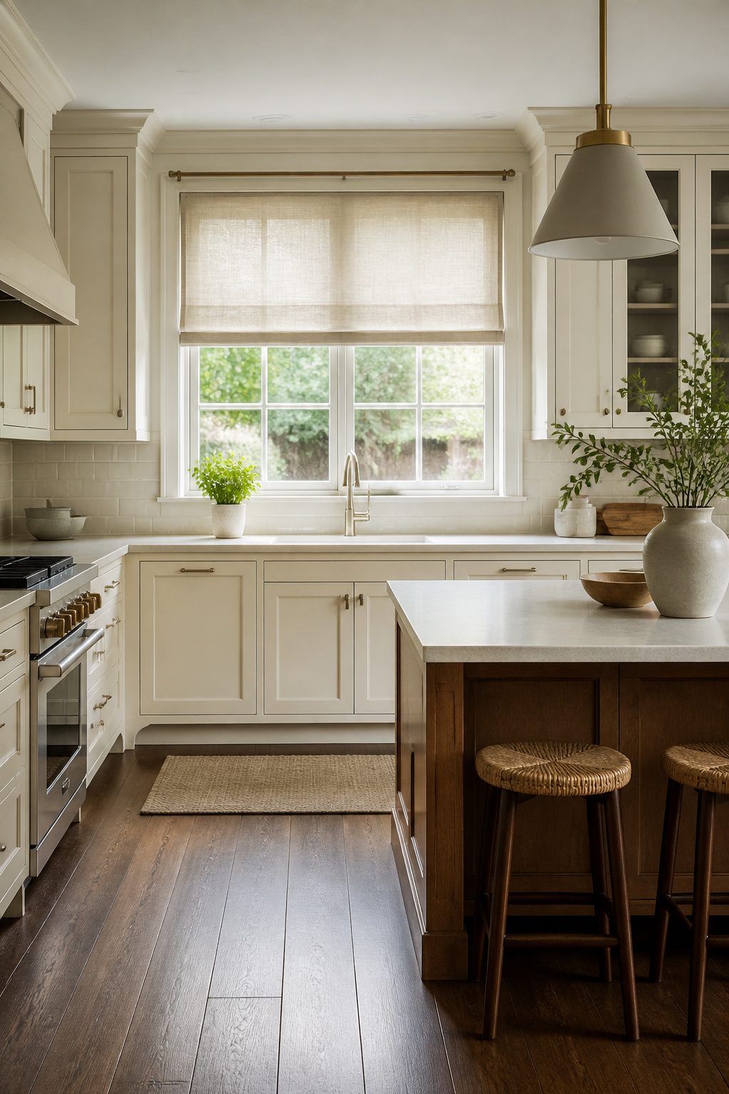
Roman shades give a kitchen the cleanest line at the window and pull up tight enough to leave the view and the work light alone.
I like them in a flat, unlined cotton or a linen blend that filters glare without going dark, and I always specify a moisture-resistant lining if the sink sits directly below.
Steam rises, and standard lining will mildew where you cannot see it.
Café curtains work when the window faces a neighbor or the street and you need privacy only from the waist down.
A simple rod across the lower sash, hung about halfway up the glass, keeps the upper half open for daylight and your own sight line out.
The fabric should be the same washable cotton you would use for a dish towel, nothing that needs dry cleaning.
Floor-length drapes near a sink are a mistake I have seen too often.
The hem sits in splash range, picks up grease, and traps moisture against the cabinet face. If you want softness at a kitchen window, keep the fabric above the sill or choose a shade instead.
Hardware finish matters more here than in a dry room. Brass and oil-rubbed bronze both hold up to humid air, but cheap plated steel will spot and peel inside two years.
Buy the rod or the rail once, and match it to your cabinet pulls so the window does not read as an afterthought.
Favorable Fabric for Seating
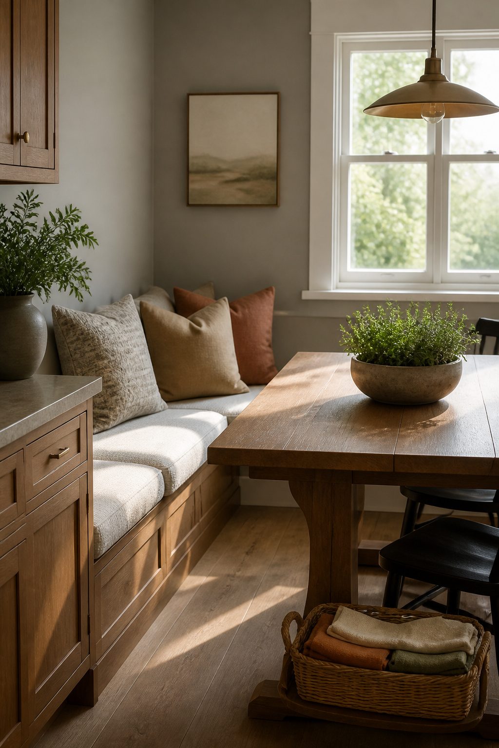
The fabric on your kitchen seating takes more abuse than upholstery anywhere else in the house.
Performance fabrics like Sunbrella and Crypton are built for exactly this, engineered to repel water and resist stains at the fiber level rather than relying on a topical spray that wears off.
I have seen a glass of red wine bead up on Crypton the same way it would on vinyl, then blot away with a paper towel.
Vinyl earns its place for pure practicality.
A quick wipe with a damp cloth handles most messes, and the material does not absorb cooking odors the way textiles can. Favorable fabric for seating means choosing between how it looks and how it feels to sit on.
Vinyl can feel sticky against bare legs in summer and cold in winter, and after a few years the surface often cracks at stress points.
That brings me to what I would skip. Pure linen and silk are beautiful in a formal dining room where meals last two hours and guests use cloth napkins.
In a kitchen where someone eats toast in a hurry or the dog jumps up after a walk, they are a mistake.
Linen wrinkles permanently, stains immediately, and offers no stain release. Silk degrades under UV exposure from nearby windows and water-spots from the slightest splash.
Washable covers change the math entirely. A sofa or chair with a zip-off cover lets you throw the whole skin into the machine instead of spot-treating for the rest of its life.
Check that the cover is labeled dry-clean-only before you buy, because some manufacturers use that shortcut.
Machine-washable covers with a cotton-poly blend shell and a separate waterproof liner underneath give you the best of both worlds: the look of real fabric with a lifespan that matches how kitchens actually get used.
Storage Panels
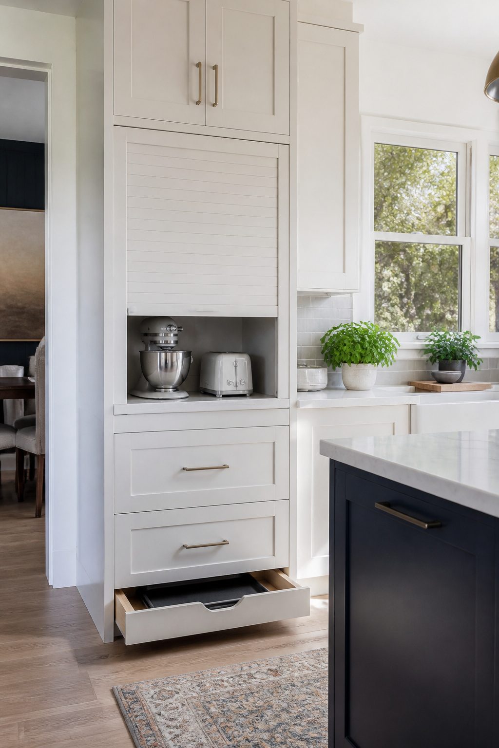
The cleanest counters still need a place for the toaster and the stand mixer. A tall cabinet with a lift-up door that drops back out of sight handles this without the visual noise of a countertop garage.
The unit sits on the counter itself, so you are not carving into base cabinets, and the shuttered front keeps the appliances accessible but hidden. Drawers or pull-outs inside keep the cords and attachments from becoming a tangle.
Toe-kick drawers are the move for flat items you rarely think about until you need them.
That four-inch gap at the bottom of your cabinets, the one that collects dust and the occasional dropped spoon, can house a shallow drawer for baking sheets or serving trays.
It costs you nothing in wall space and almost nothing in floor space, though the hardware has to be low-profile or your toe will catch it every morning.
I would skip it if your kitchen floors are uneven; the gap tolerance is tight and a drawer that sticks is worse than none.
A repurposed dresser or armoire can work as kitchen storage if it matches the room’s scale and you add a protective top coat against moisture.
It can work in a pantry or an eat-in corner, but in the main kitchen run it reads as furniture that wandered in from another room.
Built-in panels keep the line continuous, and for a first-time owner trying to make the space feel intentional, that continuity is worth more than the storage it replaces.
Floor Tiling
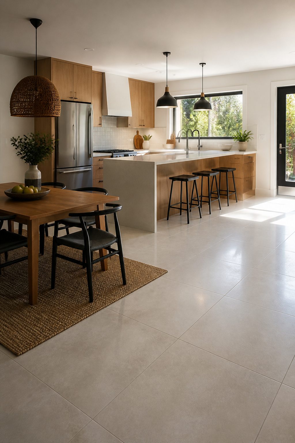
Porcelain carries a higher PEI hardness rating than ceramic, and that difference matters the moment a cast-iron skillet slips from your hand.
I put porcelain in kitchens every time for exactly that reason: it resists the abrasion that slowly dulls ceramic’s surface under years of grit and traffic.
Both handle water fine, but only one shrugs off a dropped knife tip without chipping.
Larger format tiles, 24×24 inches or bigger, mean fewer grout lines catching grease and requiring scrubbing.
The 12×12 inch tile that dominated kitchens fifteen years ago now reads as busy and dated; the eye breaks every few inches instead of resting on a cleaner plane.
For a weekend project, the larger tile also installs faster once you have the layout set.
In cold climates, a heated floor mat underneath thinset changes the room entirely.
I think of it less as luxury and more as functional: stone-cold tile at 6 a.m. turns a kitchen from a space you endure into one you actually want to stand in.
The mat adds roughly $200–400 to the job and draws standard 120-volt power, no separate circuit needed in most cases. Tile floors are permanent; if you ever want vinyl plank later, the mat stays trapped underneath.
Happy Colors
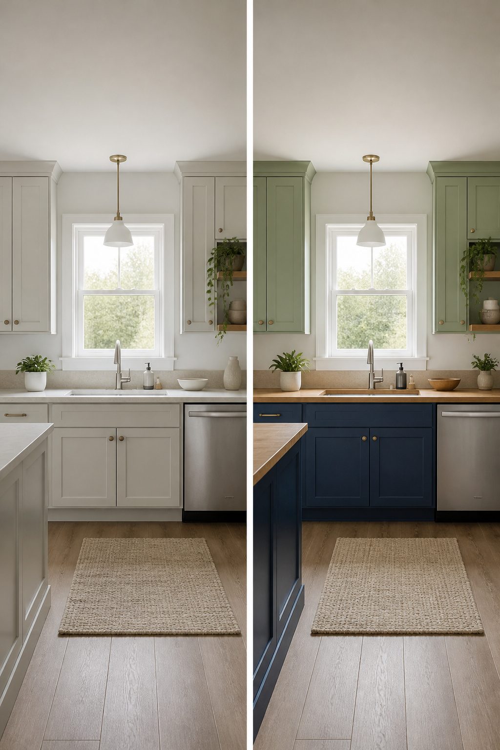
The all-white kitchen is finally giving way to colors that can live with you through years of morning coffee and midnight snacks.
Sage, terracotta, and navy are the three that pull it off, each deep enough to hold the room together but muted enough that they do not shout by year three.
Sage reads as a soft gray-green in low winter light and opens up in summer, terracotta warms the cold side of a north-facing window, and navy does the heavy lifting of a dark color without the severity of black.
Splitting the color between upper and lower cabinets is the move that makes any of these work in a smaller space.
The lighter shade belongs up top, where it catches the light and keeps the walls from closing in; the deeper tone anchors the base cabinets and hides the scuffs that collect at foot level.
A cream and pale yellow pairing does something similar if you want the contrast without the drama, especially against wood countertops that already bring their own warmth.
The ceiling is where I would test the color I am not brave enough to commit to cabinets.
Paint it sage, paint it the palest yellow, paint it anything. If it fails, you are out a weekend and a gallon, not a kitchen full of cabinetry.
New Storage Units
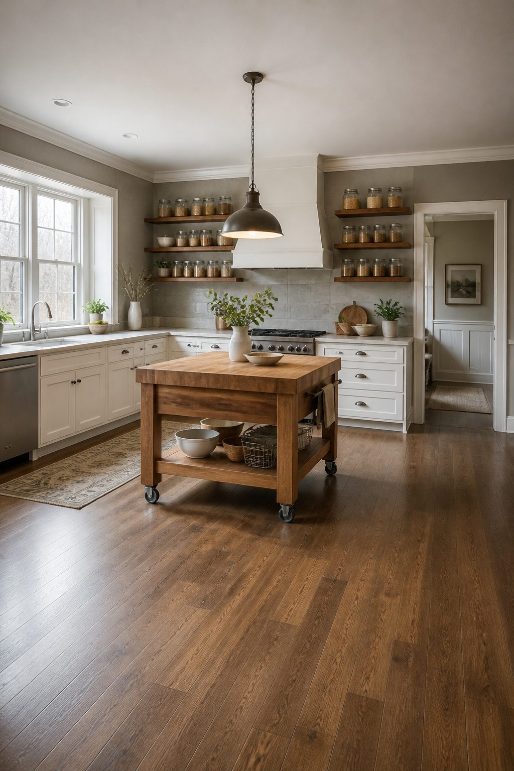
Freestanding storage fills the gaps that built-in cabinets leave behind. A rolling island on locking casters lets you park prep space exactly where you need it for a weekend project, then roll it aside when the kitchen becomes a throughway.
Butcher block carts give you a solid cutting surface and a place to tuck the stand mixer, though most need a fresh coat of food-safe mineral oil every few months or the wood dries out and warps.
Pantry cabinets sized for alcoves turn dead wall space into vertical storage for the things you reach for daily, not just the holiday platter buried in the back of a base cabinet.
The detail that decides whether a unit helps or hinders is the electrical situation. A cart with an integrated outlet means the coffee maker lives where you actually use it, not across the room from the only plug.
Without one, you are running extension cords or accepting that the appliance stays in its old spot.
I also watch the footprint against the work triangle. A 24-inch unit sounds reasonable until it sits between the sink and the stove and you are dancing around it with a hot pan.
Measure the clearances you walk now, then buy to that number, not to the wall space alone.
Pendant Lights
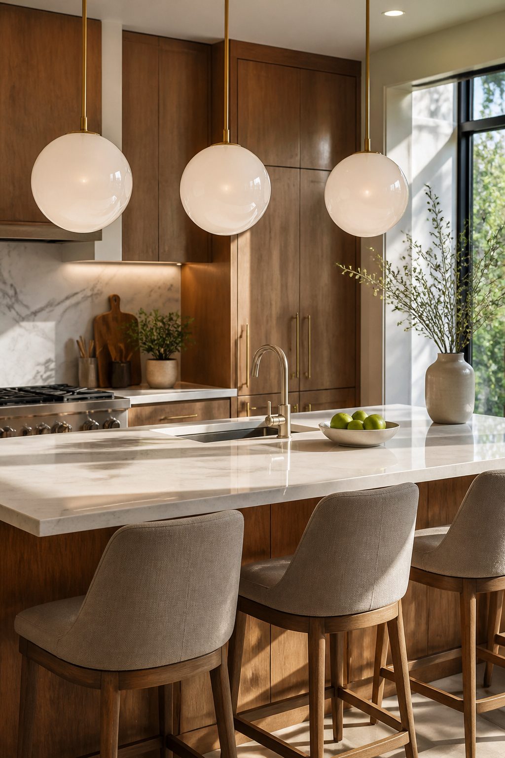
Pendant lights sit where your eyes land first, so they earn their keep as both lamp and focal point.
Hang them 30–36 inches above the counter; lower than that blocks sightlines across the kitchen, higher and the light pools weakly instead of hitting the work surface.
If you are running multiples over an island, keep them 24–30 inches apart so the beams overlap without crowding.
Ceiling height changes what shape reads right.
An 8-foot ceiling wants a flatter profile, something that tucks up visually so the room still breathes. Ten feet gives you clearance for a taller globe or a longer drop without the fixture feeling like it is looming.
Modern globe shapes in opal glass spread light evenly and suit clean cabinets; vintage schoolhouse styles with their wider, flared bases throw a broader beam and read warmer against wood or painted brick.
I lean schoolhouse in kitchens where the counters already feel sleek, because a little contrast keeps the room from going sterile. Globes win when the cabinetry itself is traditional and needs the counterweight.
Scale matters more than style. A pendant too small over a six-foot island looks like a mistake, not a choice.
Bold Backsplash
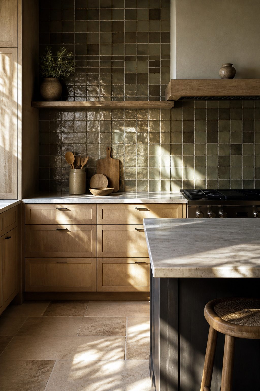
The backsplash is the one place in a kitchen where you can spend a little more per square foot and not regret it, because the quantity is small and the visual return is immediate.
I tend to steer people toward three materials depending on what their cabinets and countertops are already doing.
Zellige tile gives you an uneven, handmade surface that catches light differently across every piece.
The glaze pools thicker in the low spots, so the color shifts subtly across the wall. It reads as texture more than pattern, which works when you want warmth without busyness.
Lippage between tiles is real and expected with a bold backsplash, so you need an installer who has done it before, not someone who will try to grind it flat.
Graphic cement tile goes the opposite direction: bold pattern, flat surface, matte finish. The designs are usually geometric and repeat across the field, so the backsplash becomes the statement of the room.
I think this works best when the rest of the kitchen is quiet, because the tile will fight a veined countertop or ornate hardware.
These also need sealing, and the pattern can look muddy if the grout line is too wide.
Full-slab stone behind the range or across the whole run gives you one continuous surface, no grout, no pattern repeat.
It is the most expensive of the three, but for a minimal kitchen with flat-panel cabinets, it is often the right call. The stone should relate to the countertop without matching exactly, or the effect is too sterile.
Grout color is where most people lose the plot at the last minute. With zellige, I like grout one shade lighter than the tile so the variation reads.
With cement tile, matching the grout to the background color of the pattern lets the design breathe instead of turning into a grid. With slab stone, there is no grout, which is partly the point.
Open Shelving
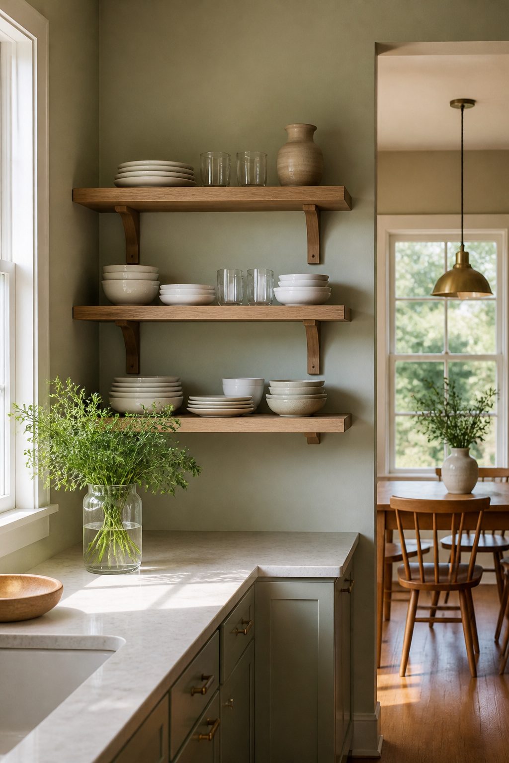
Open shelving lives or dies by what you leave off. I have watched friends install beautiful pine planks, load them with every souvenir mug they own, and wonder why the kitchen still feels crowded.
Twelve inches is the practical depth limit for wall-mounted kitchen shelves; anything deeper turns into a black hole for lids and small appliances you forgot you owned.
Bracket choice sets the tone. Hidden floating hardware keeps the look clean and costs more, while exposed industrial brackets run cheaper and read as deliberate.
Near a range, the dust-grease film builds fast. I would not run open shelves within two feet of a cooktop unless you wipe them weekly and mean it.
What actually works on display: stacks of white plates, clear glassware grouped by height, a single row of matching wood cutting boards.
Random mugs from five different vacations read as clutter from across the room. The discipline is the design.
Fresh Paint
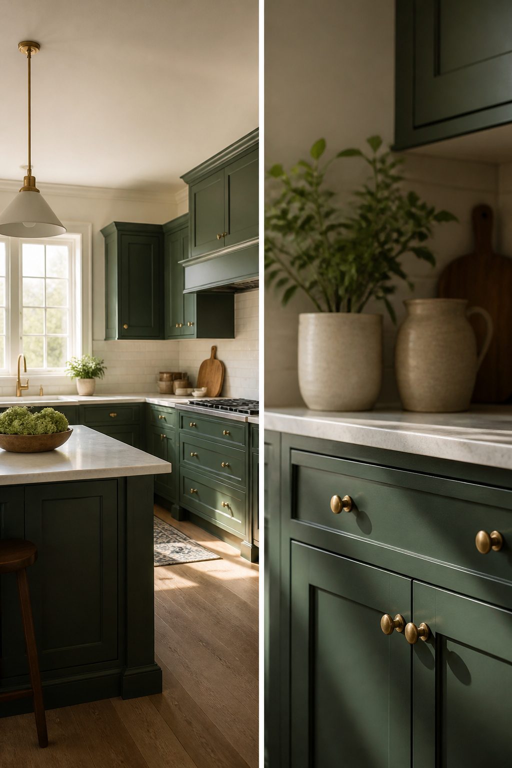
Fresh paint is the fastest kitchen change I know, which also means it is the fastest way to go wrong. Most weekends are lost to cabinets that were not prepped, so the enamel chips by Thanksgiving.
Start with deglosser, then a light sand, then a shellac-based primer.
Oil paint or latex enamel in satin or semi-gloss will survive the grease near a stove. Eggshell on kitchen walls fails there; moisture and splatter stain it, and scrubbing lifts the pigment.
Ceilings are different. Flat paint hides the uneven texture left by decades of humidity, and no one touches a ceiling with a sponge anyway.
I stop the job after the second coat of enamel and let it cure for a full week before I rehang hardware. The wait costs nothing; the shortcut costs a redo.
Kitchen Layouts
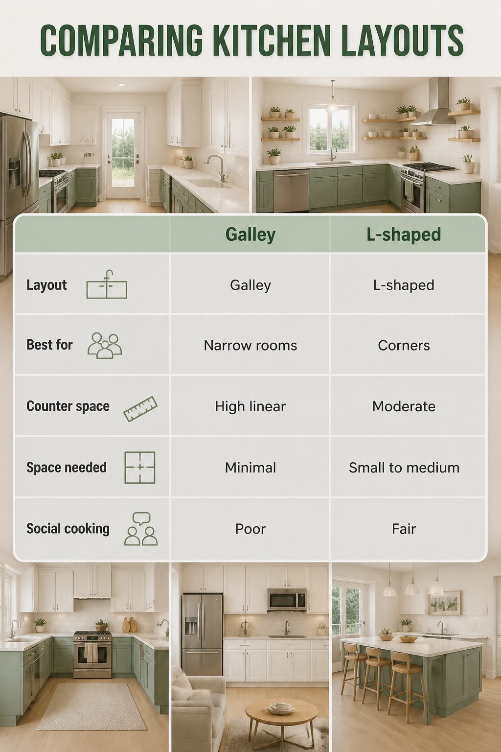
Reading a kitchen layout starts with the shape of the room, not the appliances you want to squeeze in. The six basic arrangements each solve a different spatial problem.
A galley kitchen runs two parallel walls facing each other, usually long and narrow, and works best when only one person cooks at a time. A galley layout gives you generous counter length and cabinet storage in a tight footprint.
An L-shaped layout uses perpendicular walls in a corner, freeing the center for movement; it fits square rooms well but can work in small rectangular spaces if the width does not shrink toward galley proportions.
U-shaped wraps three walls and gives the most continuous counter surface of any standard plan. A one-wall or straight layout lines everything along a single counter, common in apartments where the kitchen must share space with living areas.
An island kitchen needs an open plan with enough clearance on all sides; the island adds prep space but can break the work triangle if placed without thinking.
A peninsula offers a partial divide, attaching a counter to one wall and screening the kitchen from adjacent rooms without the island’s floor space demand.
The work triangle still matters regardless of shape. The sink, stove, and refrigerator should sit 4 to 9 feet from each other, with no major traffic path cutting through the middle.
| Layout | Best for | Counter space | Space needed | Social cooking |
|---|---|---|---|---|
| Galley | Narrow rooms | High linear | Minimal | Poor |
| L-shaped | Corners | Moderate | Small to medium | Fair |
| U-shaped | Maximum prep | Highest | Medium | Fair |
| One-wall | Apartments | Lowest | Minimal | Poor |
| Island | Open plans | High with island | Large | Good |
| Peninsula | Partial divides | Moderate | Medium | Good |
Frequently Asked Questions
What are the best kitchen interior design ideas for modern homes?
The best modern kitchen interior design balances clean-lined cabinetry, smart storage, and a balanced color palette with statement lighting and sleek hardware.
Glossy finishes by CenturyLaminates add a high-end look while throwing light back into tight spaces. Sage, terracotta, and navy are the three colors that hold up over years of daily use without shouting.
What are the best materials for kitchen interior design?
Decorative laminates are a strong choice for kitchen interiors, offering modern aesthetics, scratch resistance, and easy maintenance.
CenturyLaminates builds ViroKill Technology into its glossy lines for antiviral and antimicrobial protection, with some ranges carrying a 7-year warranty on color fastness and structural integrity. Porcelain tile outperforms ceramic on floors for hardness and chip resistance.
How do I choose a kitchen layout?
Start with your room’s shape, not your dream appliances. Galley kitchens suit narrow spaces with one cook; L-shaped fits corners; U-shaped maximizes counter surface; one-wall works for apartments; island and peninsula layouts need more open floor space.
The sink, stove, and refrigerator should sit 4 to 9 feet from each other with no major traffic path cutting through.
Which style is best for a kitchen?
No single style wins; the right choice depends on how you cook and live. A household that cleans on Sundays should skip high-gloss countertops that show every fingerprint.
Families eating quick meals need performance fabrics or vinyl on seating, not linen that stains permanently. The range wall should anchor the room as a focal point, whether with floor-to-ceiling tile or a dark painted surround.
What is the 3 kitchen rule?
The classic work triangle still governs efficient kitchen interior design: the sink, stove, and refrigerator should each sit 4 to 9 feet from the other two points.
No major traffic path should cut through the middle of this triangle. The shape of your room, whether galley, L, U, or island, determines how cleanly this triangle can form.




