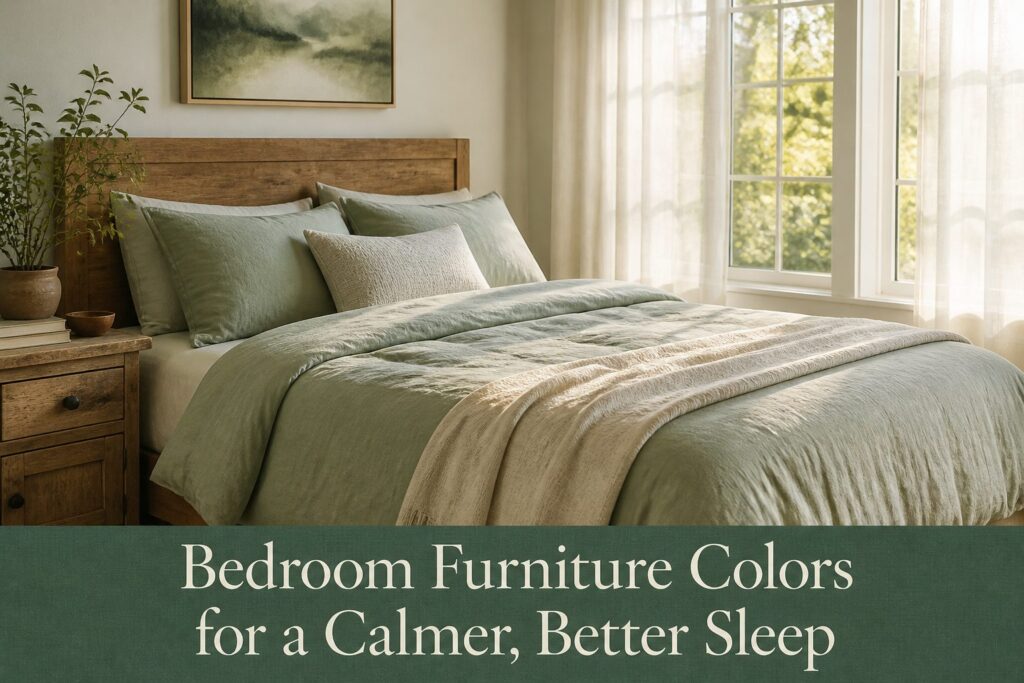
The right bedroom furniture color depends on which direction your windows face and how much wood is already in the room.
Warm neutrals like Accessible Beige forgive a quick brush job and keep east-facing morning rooms from feeling clinical, but they lose their edge if you wanted a sharper, modern look.
Cooler blues and greens lower your heart rate visually, though only at half saturation or below; anything bolder and the room reads like a nursery.
1. Warm Neutrals for a Calming Base
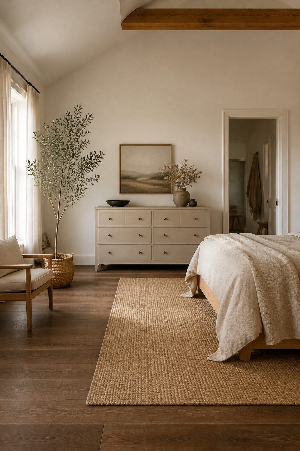
Warm neutrals carry a faint undertone of yellow, red, or brown that keeps a bedroom from feeling like a clinic.
Accessible Beige (SW 7036) and Alabaster (SW 7008) sit right in that zone: enough pigment to feel grounded, not so much that they compete with sleep.
Accessible Beige reads as a true greige on furniture, shifting slightly warmer under incandescent bulbs at night. Alabaster is cleaner, almost an off-white, and works best when you want the calm of neutral without the visual weight of a mid-tone.
These colors earn their place in mountain-inspired rooms by letting raw textures do the talking.
A dresser in Accessible Beige against raw linen bedding or an unfinished pine bench does not fight for attention; the warmth in the paint picks up the same tones in the wood grain.
Cooler grays, especially those with blue or green undertones, can make unfinished wood look pink or yellow by comparison, which reads as error rather than intention.
I would pick warm neutrals over cool grays in any bedroom that gets morning light from the east or has substantial wood elements already in place.
Edge comes at a cost: cool grays photograph sharper and feel more contemporary, but they also run colder in a room you use mainly after sunset.
For a weekend project with a gallon of paint and a brush, warm neutrals forgive uneven application better and need less exact matching to existing trim.
Recommended Products

CONVENIENT SIZE - This Apple Barrel Acrylic Paint comes in a versatile 2 oz size that is great for basecoating, stenciling, and so much more

[Gingham Floral Wall Art]: This framed floral artwork features a vintage gold ornate frame and is available in 9 x 11 inches, 12 x 16 inches, and 16 x 24 inches. Choose the size that best fits your kitchen, bedroom, dining area, hallway, or other wall display space.

[Premium Quality Materials] High definition modern artwork printed onto industrial grade framed canvas.
2. Soft Blues and Greens for Sleep
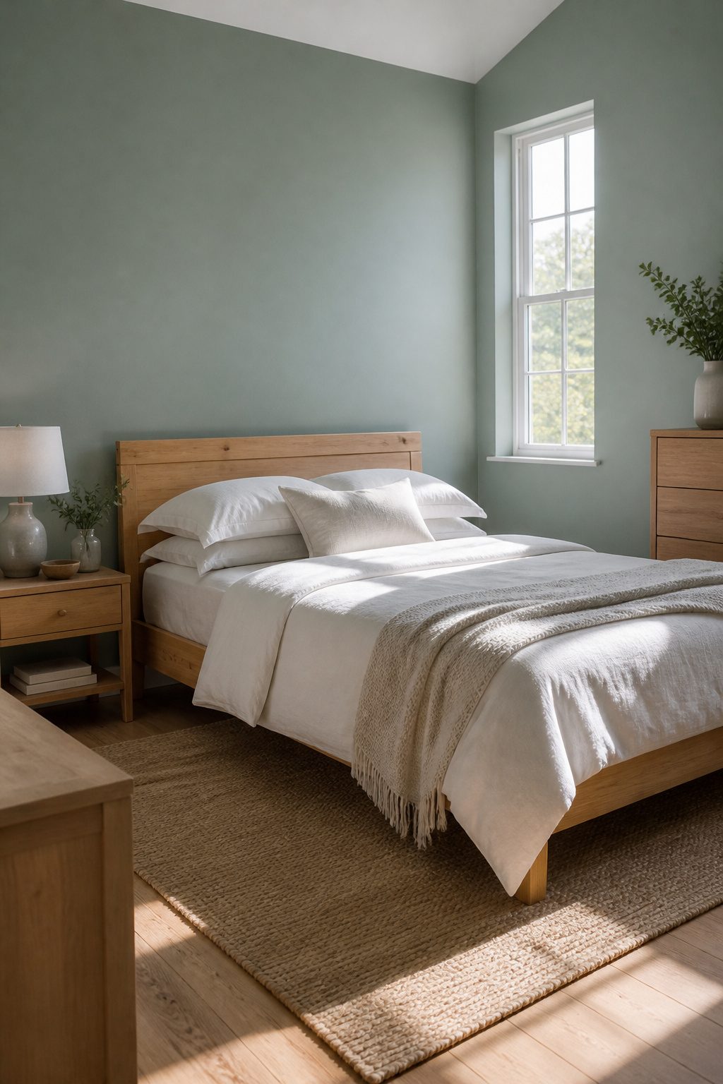
Sleepy Blue SW 6225 sits at the center of this category for good reason.
It carries enough green to read as a true blue-green rather than a baby blue, and that slight shift is what keeps an adult bedroom from feeling like a nursery.
The hue works because cool tones lower heart rate visually; your body reads the space as cooler and calmer than it actually is, which is exactly the signal you want when you are winding down.
Natural wood furniture, the kind already common in mountain homes, grounds these colors in a way white painted pieces do not.
A pine or oak bed frame against Sleepy Blue warms the wall without competing against it. The mistake I see most often is pushing the saturation too far.
A bolder aqua like Benjamin Moore’s Opal Essence can work in a guest room with crisp white linens and strong natural light, but in a primary bedroom with typical north-facing light, it reads juvenile fast.
Keep the blue or green at 50% saturation or below if the room is where you actually sleep.
Lighter shades also preserve the sense of space in smaller bedrooms. Soft blue-greens add personality without closing the walls in, which matters when you are working with a few hundred dollars and a single weekend, not a gut renovation.
Recommended Products

Exquisite Prints: 16x24 inch Unframed set of 3. Our art prints is made of natural canvas combined with advanced printing technology, which is extremely beautiful, eye catching, and refreshing. The material also uses high-quality UV resistant ink, which can achieve high requirements. Every printing art is carefully crafted by us, providing special charm for your living space.

【3 Lighting Modes baby night light】DORESshop color-changing night light comes with 3 different levels of lighting control settings: Solid color/3000K warm light/multicolor (cycle for 8 color). LED night lights plug into wall give the room appropriate illumination based on your choice.

【Blue Hydrangea Wall Art Set】 This set of 3 framed canvas wall art features a calming combination of blue hydrangea flowers, inspirational quotes, and minimalist design, bringing a soft and elegant touch to any room decor.
3. Earthy Tones for Warmth
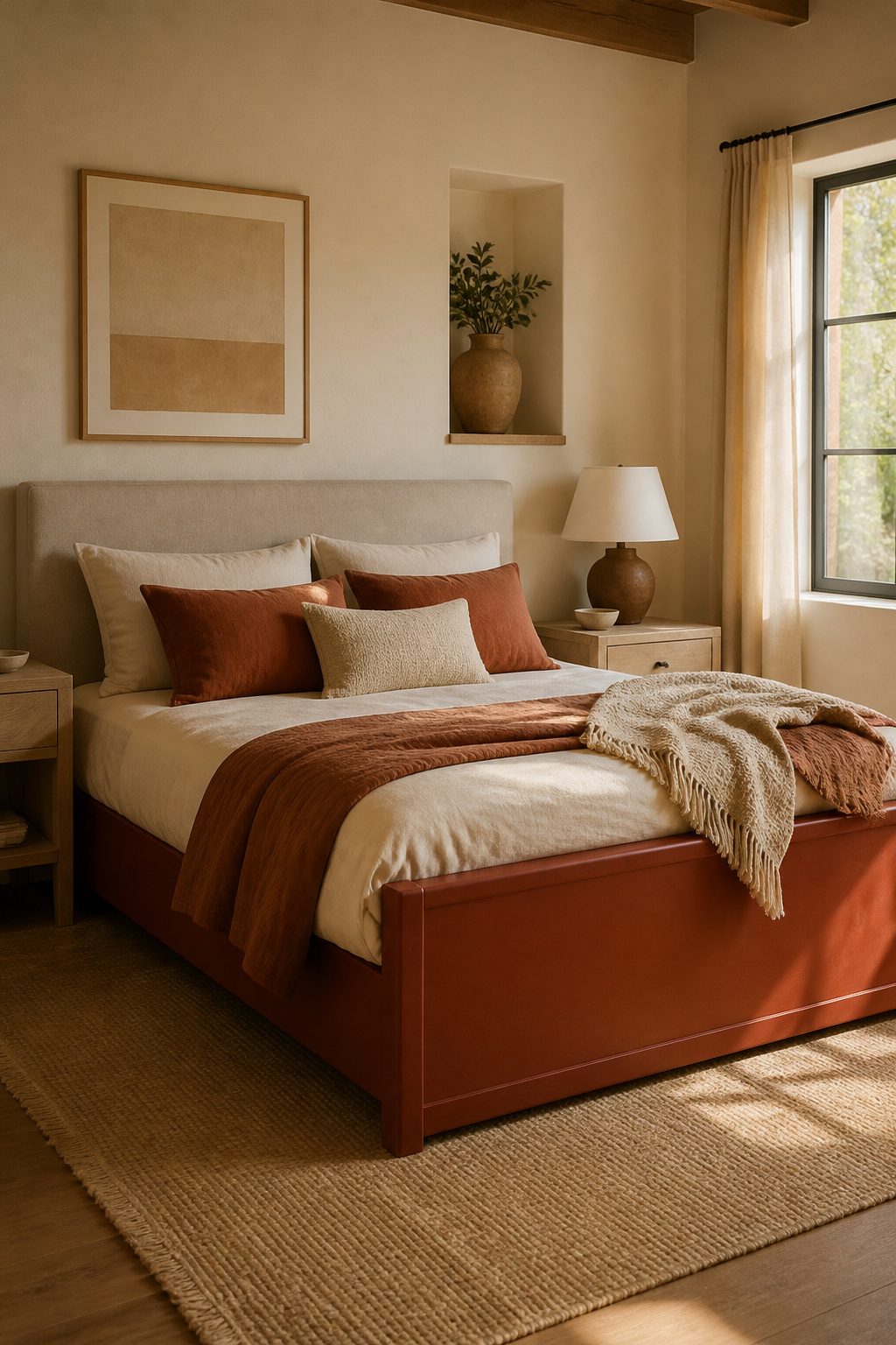
Terracotta and rust read differently on furniture than they do on walls.
A painted wall in these hues spreads the color thin; on a dresser or bed frame, the pigment sits in solid planes that hold the eye and warm the whole room. That density is the point, and also the risk.
The wood tones around them matter more than people expect. Orange oak, the kind common in 1990s builder-grade dressers and many still-circulating bed frames, fights terracotta instead of complementing it.
The two oranges turn muddy together. I would pair these furniture colors with ash, walnut, or a light, cool pine, and keep any orange-toned wood out of the same sight line.
I limit terracotta or rust to one major piece per room. Two large surfaces in this family, and the warm embrace tips into heaviness.
One dresser, one bed frame, maybe an upholstered headboard in a rust linen, and the rest of the room stays neutral. The single piece becomes an anchor without the space feeling decorated to a theme.
Recommended Products

BOTANICAL WALL DECOR: Eucalyptus stems and rounded green leaves arranged in a clear glass vase create a calm nature inspired focal point for living rooms, bedrooms, bathrooms, offices, entryways, dining areas, and other relaxed home interiors today.

Elegant Botanical Watercolor Design – This sage green wall art decor set of 3 features delicate botanical paintings with soft watercolor floral details. Each picture captures the beauty of greenery and flowers, adding a calming, nature-inspired atmosphere to any space.

5 panels gallery wrapped purple flowers trees canvas wall art, stretched and ready to hang out of box.
4. Pastel Shades for Softness
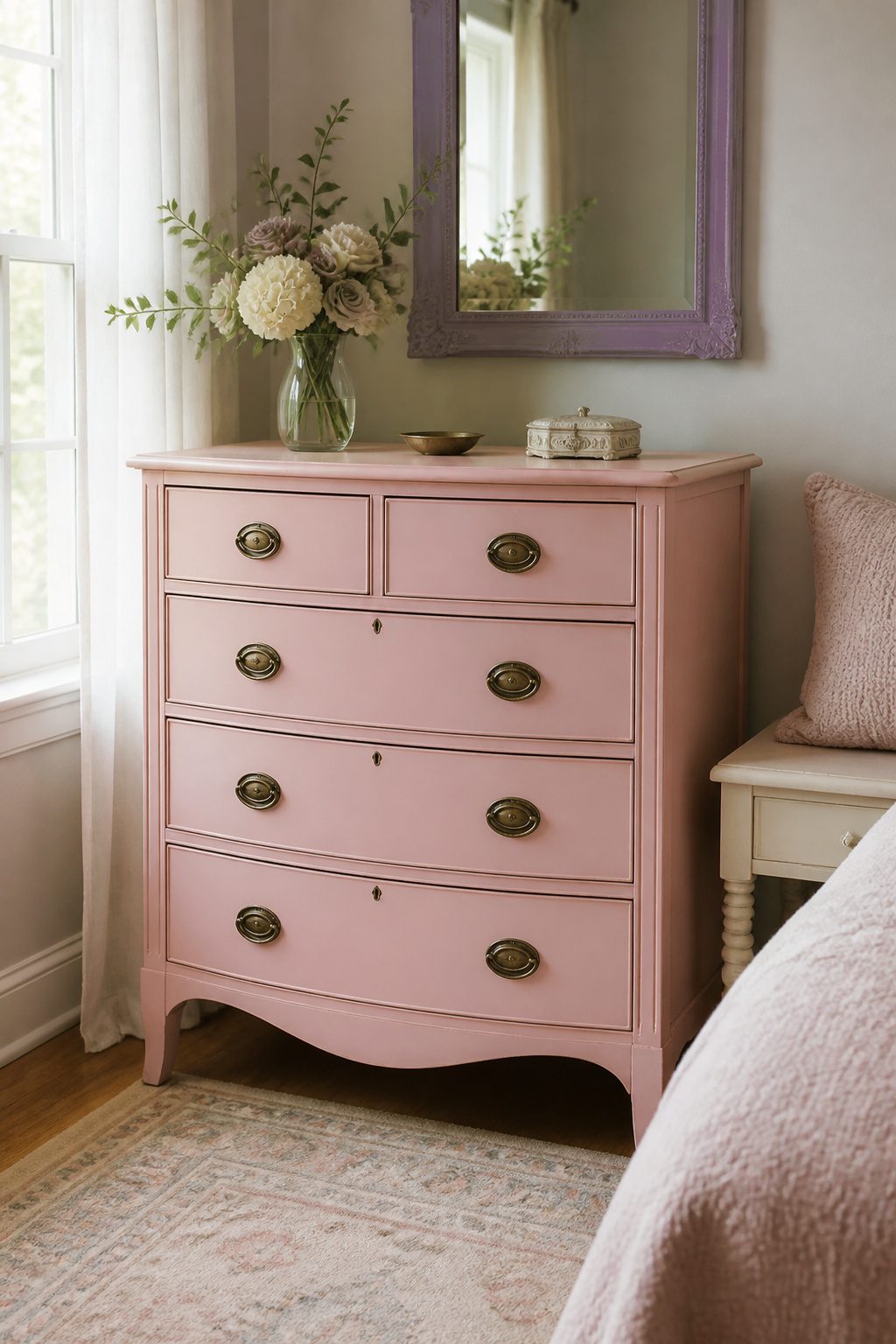
Blush pink and lavender read as bedroom furniture colors only when the piece already has some age to it.
A brand-new painted dresser in either shade looks like it belongs in a nursery; the same color on a bow-front chest with original brass hardware feels intentional and grown-up.
Brass pulls warm pastels toward sophistication, while chrome or nickel finishes push them younger than most adults want their sleeping space to feel.
The light in the room matters as much as the piece itself.
Pastels amplify quickly, and a blush-painted bed frame that looks soft at dusk can turn saccharine by 7 a.m. in a bedroom with strong eastern exposure. I would skip this direction entirely for rooms that get aggressive morning sun.
"Most blush and rose colors are restful and flattering."
That restfulness holds up best in dimmer spaces or on smaller accent pieces: a nightstand rather than a whole bed, a painted mirror frame rather than a wardrobe.
If the room is bright and the furniture is large, cooler dusty tones with gray undertones stay calmer longer than true pastels.
Recommended Products

Designed for Lake House Decor: This canvas wall art captures a serene lakeside sunset with two Adirondack chairs, creating a peaceful retreat atmosphere. The balanced composition and warm light evoke relaxation, perfect for creating an inviting space.
Designed for Lake House Decor: This canvas wall art captures a serene lakeside sunset with two Adirondack chairs, creating a peaceful retreat atmosphere. The balanced composition and warm light evoke relaxation, perfect for creating an inviting space.

[EARTH TONE HEADBOARD KING Featuring an original headboard design with soft brown, green, yellow, orange, and light natural brown wood colors handcrafted with real solid wood planks.
5. Dark Colors for Drama
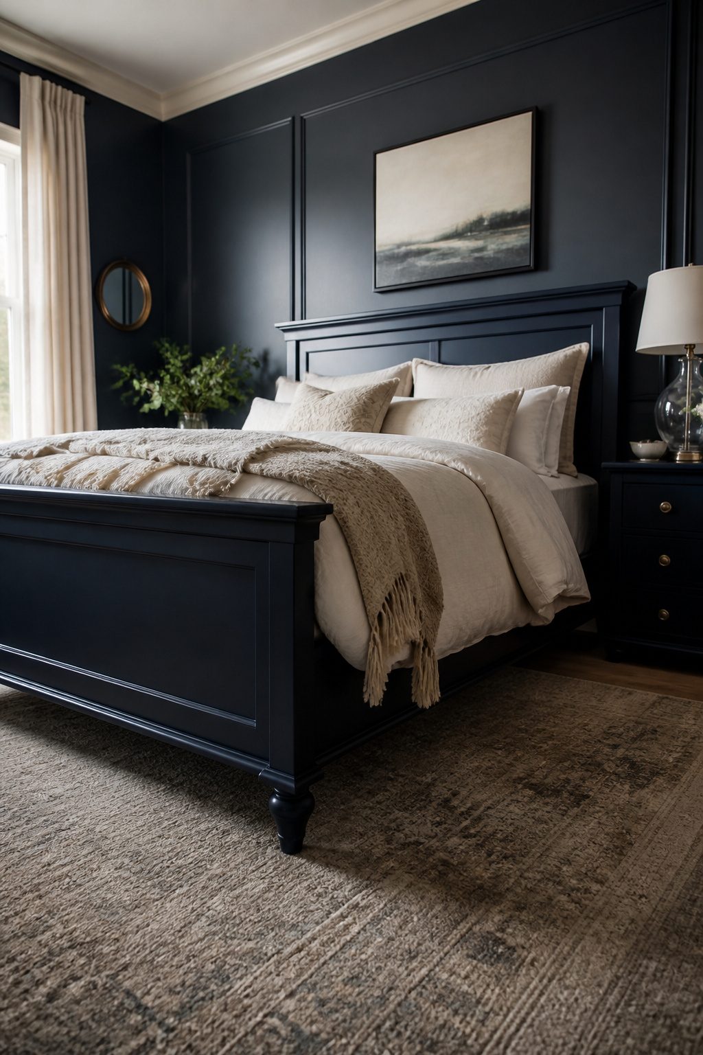
Navy and charcoal read as intentional only when you treat the wall behind them as part of the same decision.
Dark furniture against a dark wall in a small bedroom collapses the room into itself; the piece becomes a visual hole instead of a statement.
I always pair dark pieces with walls two to three shades lighter, and I add one reflective surface nearby, a mirror or a glass lamp, to keep the eye moving.
Between the two, I reach for navy before charcoal in north-facing rooms.
Charcoal pulls even cooler in weak light and can feel like leftover office furniture. Navy keeps some depth without that institutional flatness.
The finish matters as much as the color. A satin or low-luster sheen on painted dark furniture catches enough light to show the shape of the piece; matte reads as unfinished and grim.
Satin is the one finish that makes dark painted furniture feel like a choice rather than a mistake.
Dust and fingerprints are the price: they show faster on dark satin than on light matte.
I accept that for the visual lift. If you want the drama without the maintenance, a dark wood stain in navy tone, not paint, hides wear better while keeping the same weight.
Recommended Products

PAINT + PRIMER: KILZ TRIBUTE is a low VOC, 100% acrylic advanced technology paint and primer in one formulated for superior hide and coverage with exceptional durability. Paint and primer covers light-medium stains and light-dark color changes.

*Prestige Paints has created a comparable color based on color specifications of the original color using industry leading technology.

Quiet Low-Profile for Small Rooms: Designed for US low-ceiling indoor houses, lofts and apartments, this 20 inch flush mount fan features a no-downrod slim profile to save indoor space. Upgraded ultra-quiet motor supplies steady powerful airflow without buzzing. Modern sleek finish matches all home styles, offering silent ventilation and soft ambient light for work, study and daily rest
6. Why I Skip Bright Colors
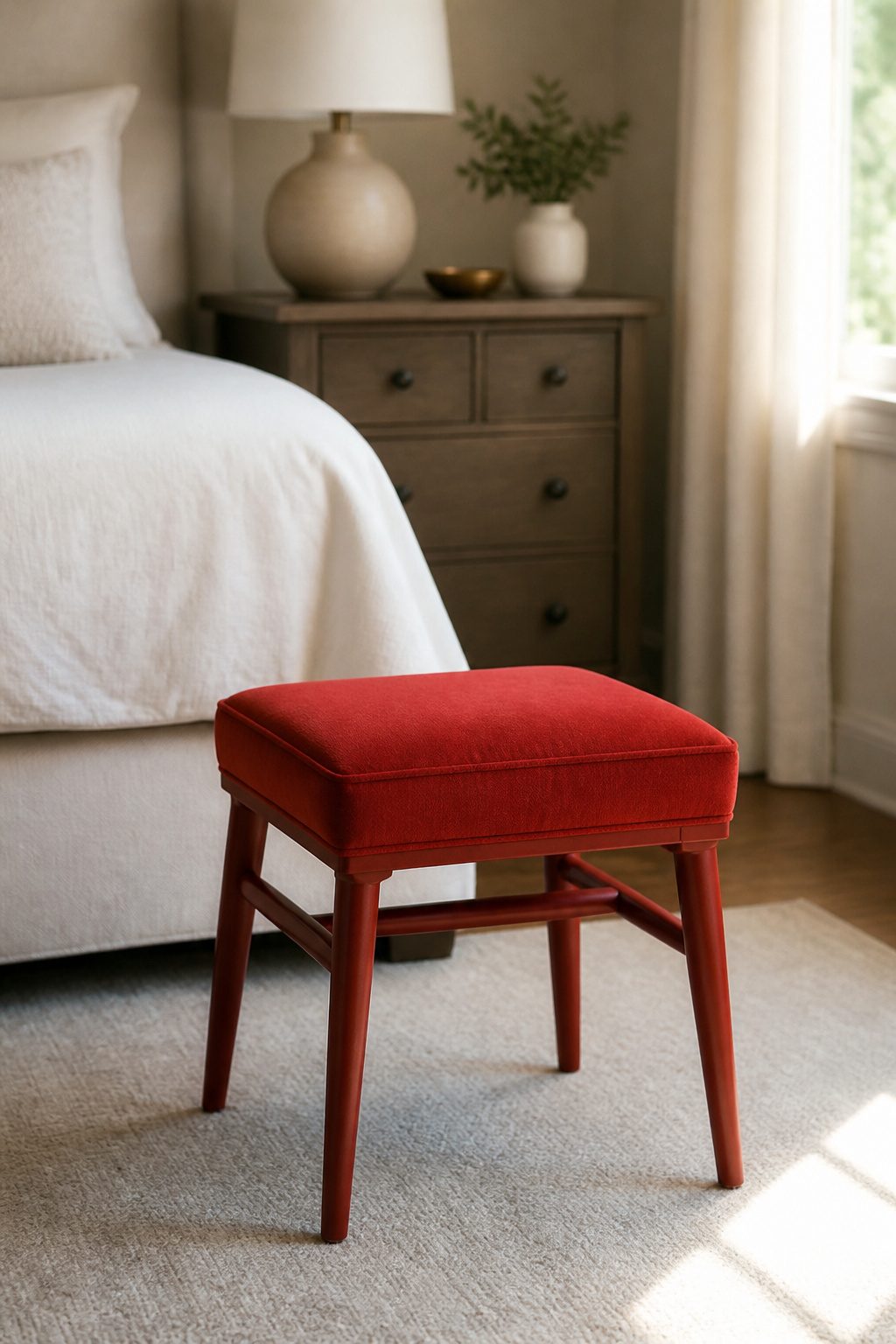
Red and yellow are the two colors I would never build a bedroom around, no matter how much someone loves a cheery look. The problem is not brightness itself.
It is the wavelength. Short-wavelength reds and yellows signal alertness to the brain and delay melatonin production in a way that still matters after you flip the light switch off.
Blackout curtains block the streetlamp, but they do not block the color you painted your dresser from continuing the same cue every time you walk in at night.
Four separate design guides flag these two specifically for bedrooms, and I think they are right.
My one exception is a single small piece, painted and placed deliberately.
A stool at the foot of the bed, a small box on the nightstand. Something you can move to the closet when sleep is the only job of the room.
That scale keeps the effect where you want it: a hit of energy in the morning, not a argument with your nervous system at 11 p.m.
Recommended Products

VERSATILE PAINT - These artist-quality acrylic paints are rich and creamy and are perfect for basecoating, stenciling, and more. This color comes in a handy 16 oz size

CONVENIENT SIZE - This Apple Barrel Acrylic Paint comes in a versatile 8 oz size that is great for basecoating, stenciling, and so much more

TRENDY QUOTE FRAMED ART: This Coquette Aesthetic Canvas Art Painting features the " It Feels So Good to Be Home" slogan for a welcoming entryway
Calming Versus Energizing Colors
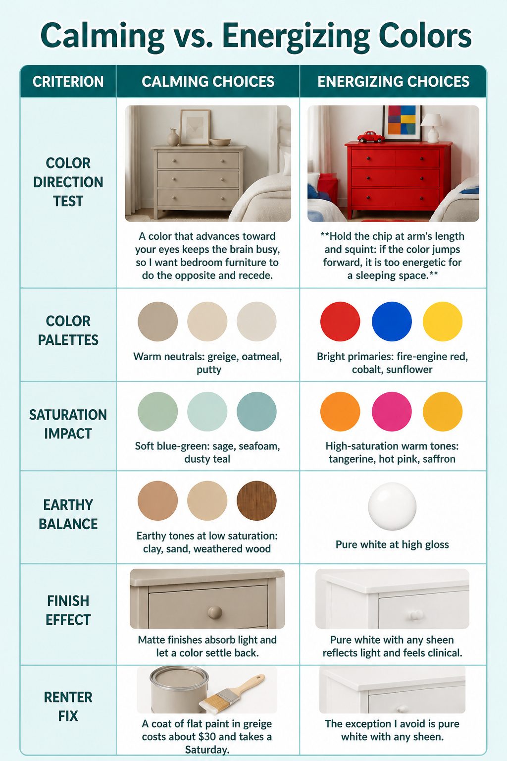
A color that advances toward your eyes keeps the brain busy, so I want bedroom furniture to do the opposite and recede.
Hold the chip at arm’s length and squint: if the color jumps forward, it is too energetic for a sleeping space.
| Calming choices | Energizing choices |
|---|---|
| Warm neutrals: greige, oatmeal, putty | Bright primaries: fire-engine red, cobalt, sunflower |
| Soft blue-green: sage, seafoam, dusty teal | High-saturation warm tones: tangerine, hot pink, saffron |
| Earthy tones at low saturation: clay, sand, weathered wood | Pure white at high gloss: reflects light and feels clinical |
I use the squint test because saturation matters more than hue.
A muted terracotta reads as calming; the same color at full saturation reads as alert. Gloss level changes the effect too.
Matte finishes absorb light and let a color settle back, which is why I always choose matte or eggshell for bedroom furniture, even when the underlying tone is technically warm. The exception I avoid is pure white with any sheen.
It bounces morning light around and feels like a clinic, not a refuge. For renters who cannot replace a glossy dresser, a coat of flat paint in greige costs about $30 and takes a Saturday.
Recommended Products

Unique Design - Moon shaped neon signs night light is the ideal eye catching decoration for your party or home table and wall.

3D Printing - The Travel Map Tapestry is made of polyester fabric, which durable enough to be home decor for wall art. This hanging tapestry comes with vivid colors bring happy feel with you and your family.

【ROOM DECOR FOR TEEN GIRLS】: Yellow bow wall art poster picture decor, room bedroom bathroom dorm christian wall art decor aesthetic essentials for teen girls, simple bow room decor bring infinite art beauty.
Light Versus Dark in Small Bedrooms
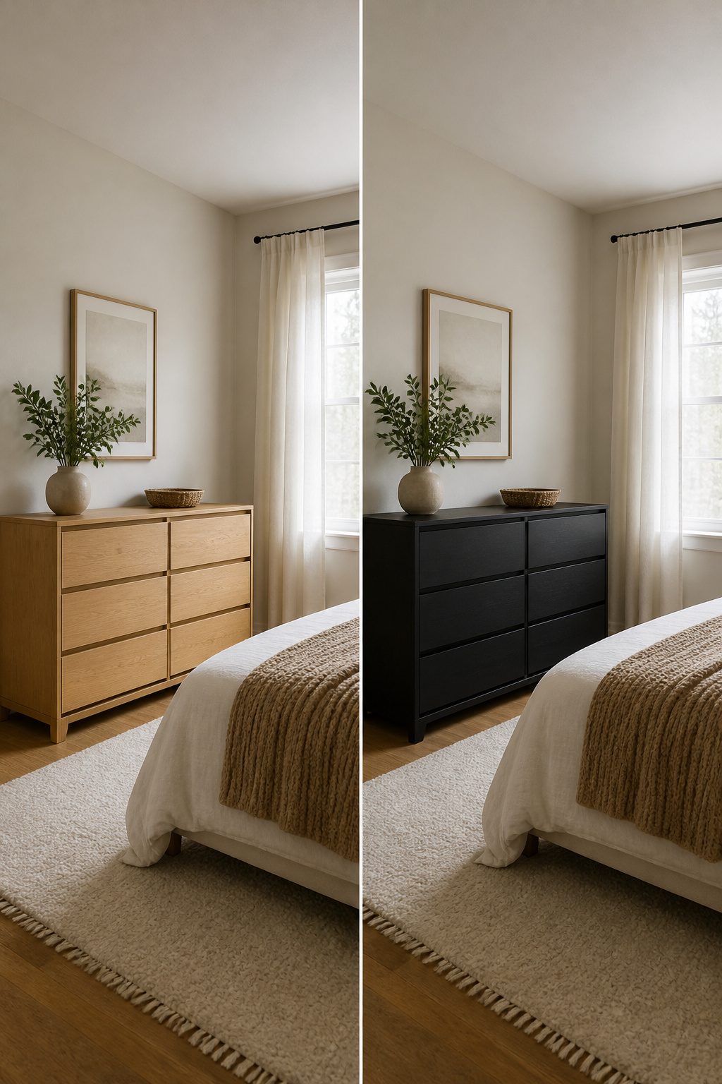
Lighter furniture colors bounce more light around the room and read as more spacious, while dark colors absorb light and pull the walls inward.
I switch my recommendation at about 120 square feet. Below that, I lean toward light oak or a pale painted finish to keep the room from feeling like a closet.
Above it, a medium to darker tone works fine and adds the warmth that makes a bedroom feel finished rather than temporary.
Wall color matters more than floor area for making either choice succeed.
A soft white or warm off-white wall, something close to Alabaster SW 7008, lets light furniture float and gives dark furniture enough contrast without the starkness that reads as restless.
Dark furniture against light walls works when the tone is warm and deep, not solid black; pair it with creamy linens and a textured throw and the room still cocoons.
Ceiling height matters more than square footage in this decision. An 8-foot ceiling with dark furniture starts to press down no matter how large the floor plan is.
A 9-foot ceiling or higher can handle darker tones even in a room under 120 square feet because the vertical space keeps the airiness intact.
If the ceiling is low and the room is small, light furniture and light walls are the safer play; save the moody pieces for the next bedroom.
Recommended Products

Elegant Botanical Watercolor Design – This sage green wall art decor set of 3 features delicate botanical paintings with soft watercolor floral details. Each picture captures the beauty of greenery and flowers, adding a calming, nature-inspired atmosphere to any space.

ARTWORK THEME:A coordinated two piece botanical composition featuring flowing leafy branches in pale green and cream against soft blue backgrounds The loose organic forms create an airy serene nature inspired mood

Sage Green Inspirational Wall Art – Calm & Uplifting: This floating framed canvas wall art features soothing tones of sage green with inspirational quotes, bringing a peaceful and stylish vibe to your space. Perfect for creating a fresh and calming atmosphere throughout your home.
Balancing Mixed Wood Tones
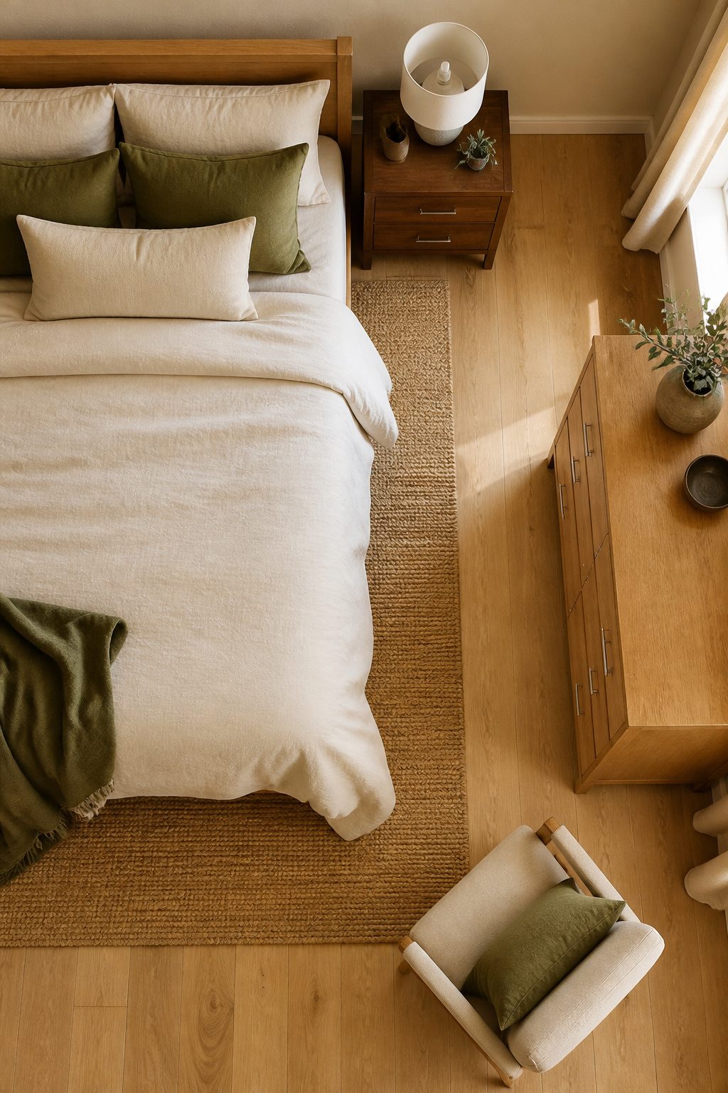
Mixing wood tones in a bedroom only works if one tone is doing most of the work.
I cap it at two finishes, with the dominant wood covering roughly 70 percent of the furniture surface, the secondary wood around 20 percent, and the last 10 percent going to metal, fabric, or paint.
Three wood colors in a small bedroom starts to look like a furniture store floor, not a room someone actually sleeps in.
The undertone matters more than the tone itself.
A light oak and a dark walnut can live together fine if both read warm, but put that same oak next to a grey-stained ash and the oak turns orange and the ash turns dirty.
I check this with a sheet of white printer paper held against the grain in daylight; the underlying hue, golden or grey, shows itself in about two seconds.
When the two woods do not share an undertone, I bridge them with hardware rather than forcing a match.
Brushed nickel is the safest middle ground: it picks up the cool grey in ash without fighting the warmth of walnut, and it shifts enough in different light that neither wood looks wrong beside it.
A two-toned piece, like a side table with a grey-ish acacia top on a metal base, can do the same bridging job if you need one anchor to marry the set.
Recommended Products

Inspired by Nature: This lake canvas wall art captures a tranquil forest shoreline and water reflections, blending classic landscape painting techniques for a cozy, serene mood in any interior.

Boho-Inspired Design: Featuring a unique bohemian pattern with intricate tufted details, this pillow cover brings a chic and artistic flair to any living space
Designed for Lake House Decor: This canvas wall art captures a serene lakeside sunset with two Adirondack chairs, creating a peaceful retreat atmosphere. The balanced composition and warm light evoke relaxation, perfect for creating an inviting space.
Frequently Asked Questions
Recommended Products

ALL-IN-ONE Paint - NO Sanding, NO Priming, NO Top Coat Required, Low Luster, Velvet Sheen Finish

*Prestige Paints has created a comparable color based on color specifications of the original color using industry leading technology.

Quiet Low-Profile for Small Rooms: Designed for US low-ceiling indoor houses, lofts and apartments, this 20 inch flush mount fan features a no-downrod slim profile to save indoor space. Upgraded ultra-quiet motor supplies steady powerful airflow without buzzing. Modern sleek finish matches all home styles, offering silent ventilation and soft ambient light for work, study and daily rest
What is the best color for a bedroom?
The best bedroom color is the one that makes the room feel restful to you personally, though soft blues, greens, and warm neutrals are the most reliable choices for sleep quality.
Cool tones lower heart rate visually, signaling your body to relax, while warm neutrals like greige or oatmeal keep the space grounded without stimulation.
Bold colors can work as accents, but they belong on small pieces you can move out of sight at night.
What colors should I avoid in a bedroom?
Red and yellow are the two colors to avoid on bedroom furniture because their wavelengths signal alertness and delay melatonin production even after lights out.
Bright primaries, high-saturation warm tones like tangerine or hot pink, and pure white with a glossy finish also energize the brain rather than settling it. If you love a cheerful color, limit it to one small movable piece.
How can I create a calming atmosphere in my bedroom?
Choose furniture colors that recede visually rather than advance toward your eye, using the squint test: if the color jumps forward, it is too energetic.
Stick to warm neutrals, soft blue-greens at 50% saturation or below, and earthy tones in matte or eggshell finishes that absorb light.
Pair dark furniture with walls two to three shades lighter and add one reflective surface to keep the eye moving without overstimulation.
What is the most popular color for bedroom furniture?
Warm neutrals like greige, oatmeal, and putty dominate because they pair easily with existing wood tones and forgive uneven DIY paint application.
Soft blue-greens such as sage and seafoam run close behind for their proven effect on lowering visual heart rate. These choices stay popular because they work across morning and evening light without shifting into unintended territory.
What colors are good for bedroom furniture?
Good bedroom furniture colors fall into four groups: warm neutrals for a grounding base, soft blues and greens for physiological calm, earthy terracottas or clays for warmth at low saturation, and deep navy or charcoal for drama when balanced with lighter walls.
Pastels like blush or lavender can work on aged pieces with brass hardware but turn juvenile on new furniture or in strong morning light.
What are the top 5 bedroom colors?
The five most reliable bedroom furniture colors are warm greige, soft blue-green, low-saturation terracotta, dusty blush on vintage pieces, and navy with a satin finish.
Each succeeds for a different reason: greige for flexibility, blue-green for lowering heart rate, terracotta for concentrated warmth, blush for softness in dim spaces, and navy for depth without the institutional flatness of charcoal.
What are the top 3 bedroom colors?
The three safest choices are warm neutral greige, soft blue-green, and low-saturation earthy clay.
Greige works with any wood tone and any light direction, blue-green actively signals the body to calm, and clay adds warmth without the heaviness of full terracotta.
All three read as intentional at matte or eggshell finishes that let the color settle back rather than bounce light around.