
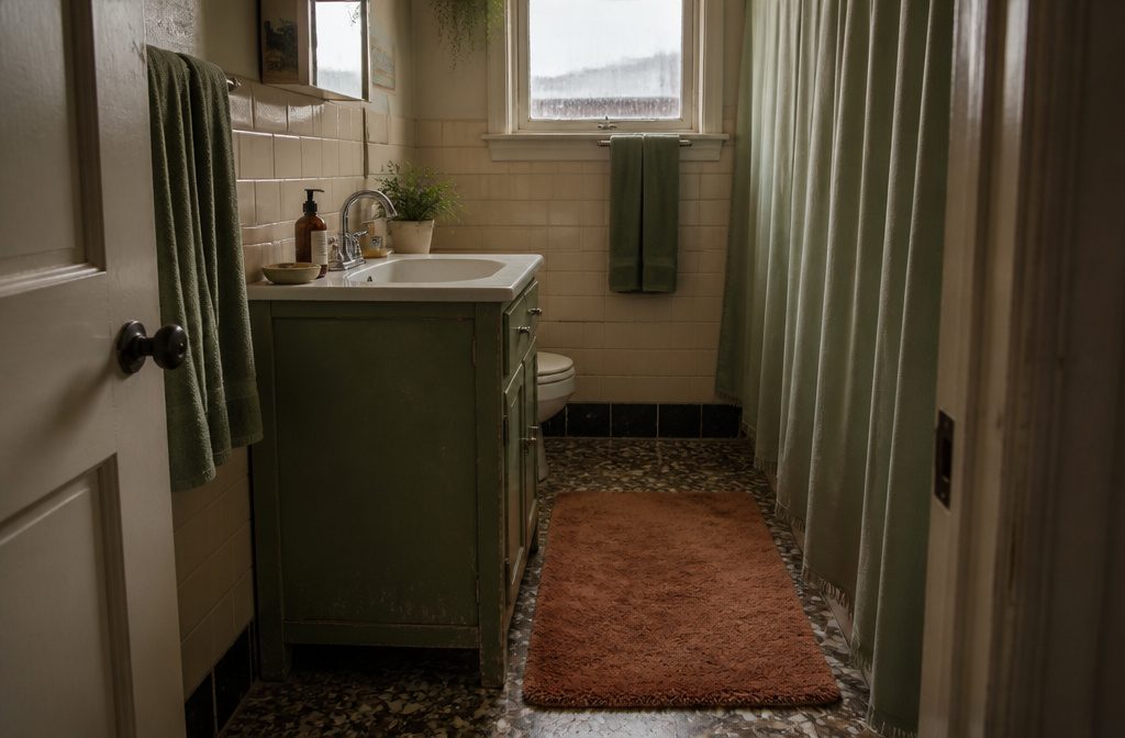
Sage green works in bathrooms from a rental-safe swap of towels and a shower curtain up to full color drenching across walls and ceiling, and the version you pick depends on how much natural light the room gets and whether you can paint.
In a dim bathroom, light sage washes out; deeper shades like Sherwin-Williams Clary Sage hold up better where daylight is scarce.
A sage vanity changes the room faster than four walls would, and if you rent, painting one piece of furniture is easier to undo than tile or permanent fixtures.
1. Sage on Walls or Paint
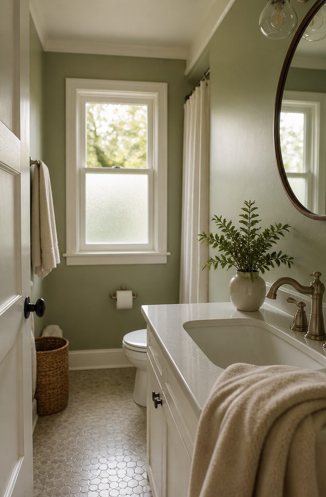
Painting all four walls in sage brings the calm through the whole room, and keeping the ceiling in white—something like Sherwin-Williams Extra White—stops the color from closing in.
An accent wall works when you want sage without committing the full space: Sherwin-Williams Basil behind a mirror adds depth, and Sherwin-Williams Clary Sage on the remaining walls keeps the base light and easygoing.
Lower-half treatments give you the color at eye level and white or neutral above, which helps in a bathroom with limited natural light.
For a bolder move, color drenching covers walls, ceiling, and trim in one shade.
Benjamin Moore Potpourri Green is a brighter option that covers the walls completely, though it reads playful rather than strictly serene. Matte finishes soften the look; pair them with white fixtures to keep the space feeling clean rather than heavy.
2. Sage Tile or Wall Panels
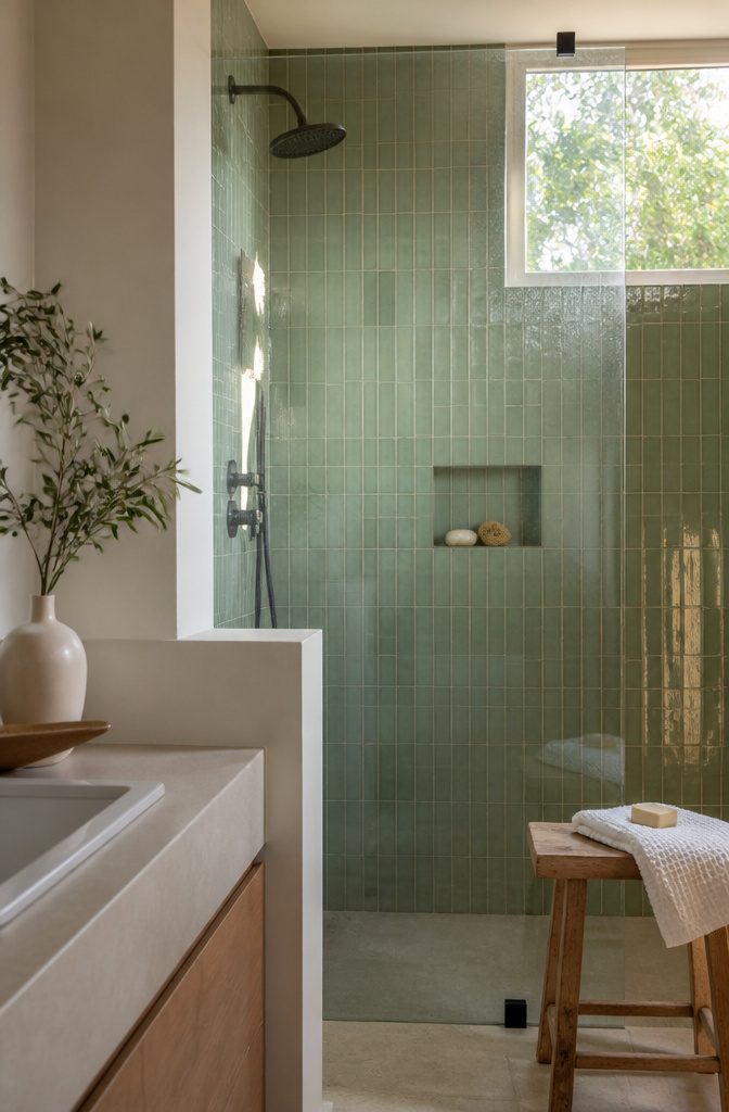
Sage tile can anchor the whole room or define a single surface. Rosemary tile from Fireclay brings a soft, hand-glazed finish with subtle variation that keeps the look from feeling flat.
For a sharper contrast, emerald green vertical subway tile plays well against white Carrara porcelain, the green reading darker and more saturated than typical sage but still in the same family.
Large-format tiles cover walls or floors in unbroken color, which works when you want the green present but not busy. Smaller tiles add texture and visual interest, particularly in a shower surround where the grout lines break up the surface.
Matte finishes hold the calm, spa-like mood; glossy tiles reflect more light and lean slightly more polished. Panels and beadboard offer the same coverage without grout, though they lack the hand-glazed depth that makes tile feel less manufactured.
3. Sage Cabinetry or Vanity
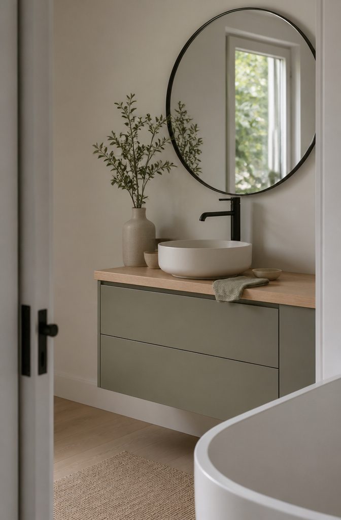
A sage vanity anchors the room without fighting for attention the way four sage walls would.
The cabinet becomes the focal point, which means you can go a shade or two deeper than you’d dare on the walls—think Clary Sage rather than a whisper-light mint—and still keep the room feeling open if the walls stay white or cream.
Floating vanities work especially well in tight bathrooms because the floor runs unbroken underneath, which makes the room read larger than it is.
Pair a wall-hung sage cabinet with a round black mirror and matte black hardware, and the look sharpens without losing its calm. Pale oak or walnut-toned vanities in sage give you built-in warmth, so the green never tips cold.
If you rent or just want the smallest possible commitment, painting an existing vanity is a weekend project that changes the whole room.
It’s easier to redo than four walls and a ceiling, and sage on a single piece of furniture still gives you the color without the risk.
4. Sage Textiles and Accessories
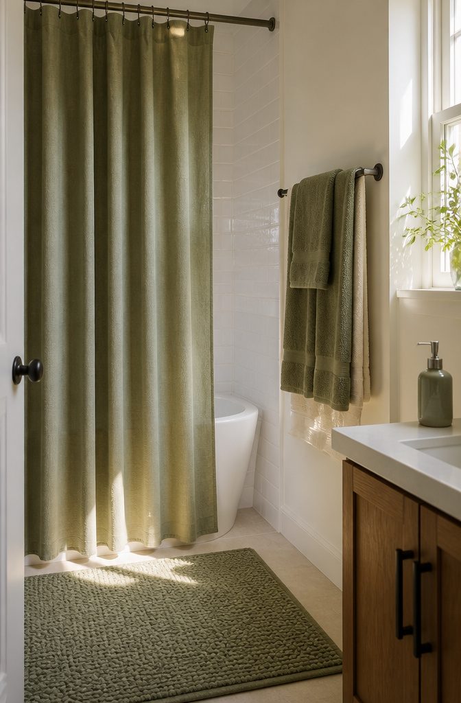
Towels, bath mats, and a shower curtain are the fastest way to test sage without painting or tiling.
Sage green bathroom towels layered over white or cream ones bring color to the rack without committing every surface, and a sage linen set against white subway tile reads spa-like in minutes.
A sage shower curtain anchors the palette if the walls stay neutral, and switching it out takes one afternoon when you want a different look.
Matte finishes keep sage looking soft and natural, especially on cotton or linen towels. Glossy materials—ceramic soap dispensers, glazed trays—add a little formality if the rest of the room leans modern.
Textured bath mats in sage, whether waffle weave or looped cotton, give the floor visual weight without pattern, and a bamboo mat in pale wood works just as well if you want the green only at eye level.
5. Pair Sage with White, Cream, or Soft Neutrals
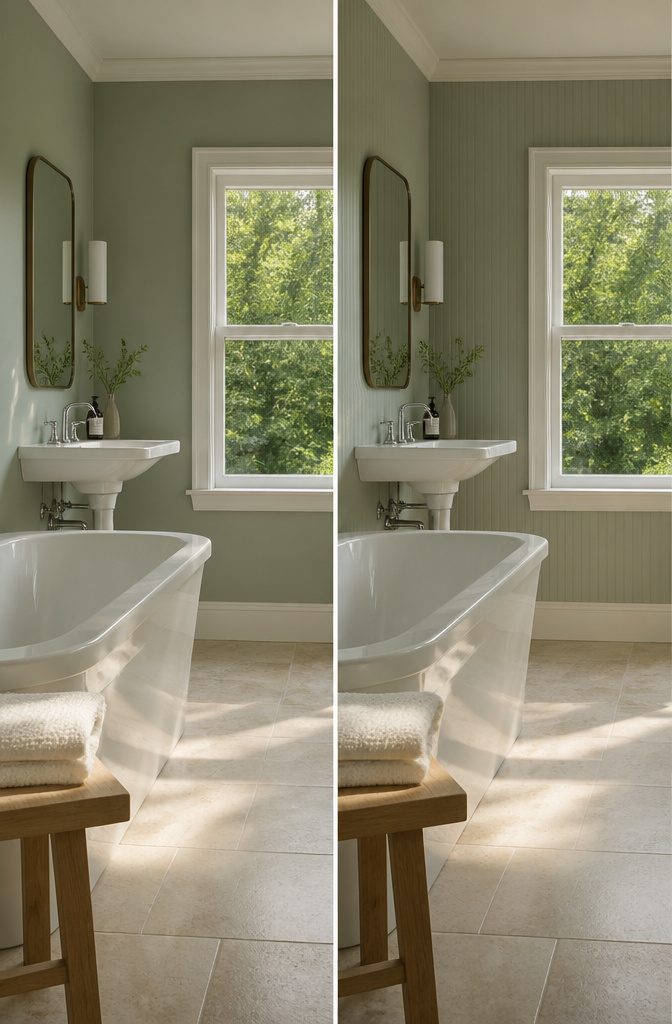
White porcelain fixtures — the bathtub, sink, and toilet — give sage the contrast it needs to stay fresh rather than dull.
The white reflects light and keeps the room from reading as dim, which matters in a small bathroom with one window or none.
That pairing of sage walls and white fixtures is what makes the color work without the space feeling enclosed.
Cream or soft gray works the same way if pure white feels too stark. Sherwin-Williams Alabaster on trim and ceiling keeps sage grounded without the crispness of Extra White, and it layers well with warm wood or woven texture.
White Duck runs a shade warmer still and pairs cleanly with deeper sage tones like Clary Sage.
You need enough contrast that the sage reads as intentional color rather than muddied beige. A sage-and-cream scheme that lands too close in value flattens out and loses the calm the color is supposed to deliver.
6. Natural Materials and Woven Texture
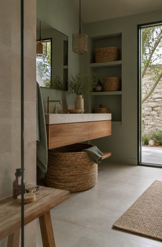
Wood and stone bring the warmth sage needs to feel grounded rather than clinical. A floating wooden vanity or teak bath accessories add organic texture without competing with the green, and the combination reads immediately as nature-inspired rather than retro.
Woven storage does two jobs at once: it hides the visual clutter of shampoo bottles and styling tools, and it introduces the same warm straw tone that brass fixtures would.
One large seagrass or water hyacinth basket under the sink and two smaller rattan ones on open shelves will handle most of what a family bathroom needs accessible but out of sight.
Pair sage walls with cream travertine or pale stone, and the whole room softens. Rustic brick tile works the same way if the space leans traditional—the rough texture and earthy red-brown keep sage from reading too precious.
Terrazzo and marble bring a more refined edge, especially when the green lands somewhere between Coastal Plain and Sea Salt rather than pushing darker.
7. Brass or Other Metal Finishes
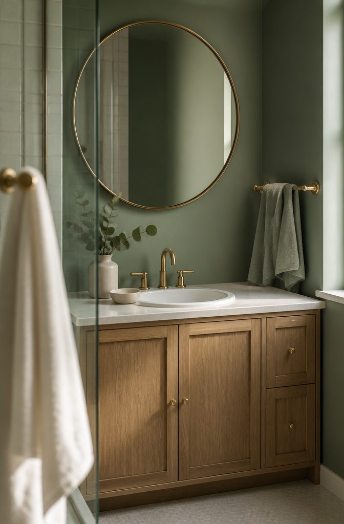
Brass fixtures bring warmth without fighting sage’s natural coolness. I’ve found two or three brass touches in the room is enough — a faucet, a mirror frame, maybe a towel bar — before the contrast starts to feel busy rather than grounded.
Brushed gold and satin brass read quieter than polished finishes, which can tilt formal in a space meant to feel restful.
Chrome and matte black are other routes if you want contrast that stays cooler in temperature. Warm brass lifts sage toward gold hour; chrome keeps it closer to morning light.
Copper falls between the two and picks up any pink or terra-cotta nearby, so it works best when those tones are already in the tile or the floor.
8. Plants or Botanical Details
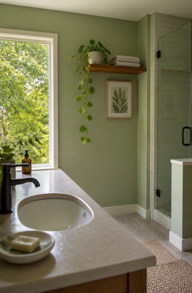
Ferns sit well on a shelf or windowsill and hold up in bathroom humidity without much fuss. Snake plants do the same and need almost no attention—water every few weeks and they stay upright.
Succulents bring clean, geometric shapes if the bathroom gets enough light, and pothos trails down from a high shelf or cabinet in a soft arc that mirrors the relaxed feel sage already sets.
Air plants need no soil, so they tuck into a wall-mounted holder or rest on a tray near the sink without taking counter space.
Botanical prints or a small vase of eucalyptus branches work when live plants are not practical. The green tones layer with sage without competing, and the shapes—leaves, stems, fronds—pull the nature reference through without requiring a watering schedule.
9. Mirrors or Glass to Open Up the Room
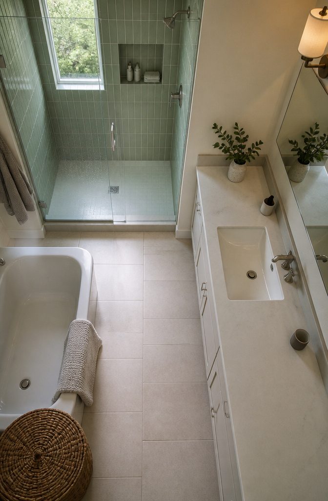
A large mirror above the vanity or along one wall reflects both daylight and fixture light back through the room, which makes a small bathroom read as bigger than its actual square footage.
Frameless glass shower doors work the same way: the eye travels straight through to the back wall instead of stopping at a frame or curtain, so the whole floor plan stays visible at once.
That openness matters more in a sage green bathroom than in a stark white one, because the color already brings warmth — you want the space, not the boxed-in feeling.
Rattan-wrapped mirrors add texture without blocking light. The woven border catches the natural fiber trend that pairs well with sage, and the mirror surface still does its job of bouncing light around.
If the bathroom is small and windowless, a full-length mirror on the door or an oversized round one centered above the sink pulls double duty: it gives you a place to check your work and makes the ceiling feel higher than it is.
10. Artwork or Wallpaper for Personality
A framed print series in sage, cream, and brass—four coordinating pieces in 8.5 × 11 inches and 5 × 7 inches—fills a narrow wall without drilling multiple holes or hunting for a single oversized frame.
The repetition reads as deliberate; the mixed sizes keep it from looking like a grid stamped out of a kit.
Wallpaper carries more pattern than paint allows.
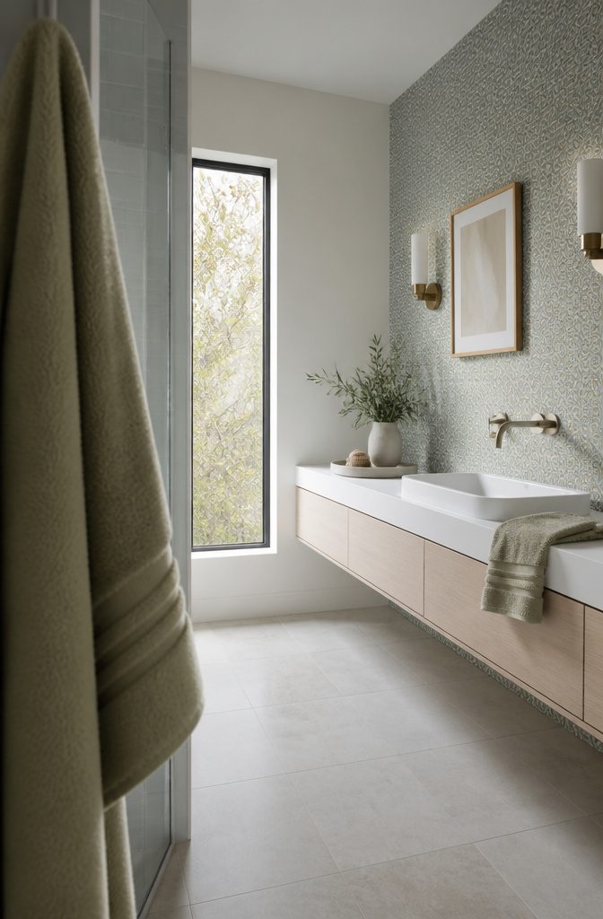
Cole & Son’s quartz wallpaper works behind a wall-hung vanity when the geometric stays small enough not to tilt the room, and a green palm print brings that lush island-retreat feeling into a guest bath where commitment matters less.
Grasscloth from Peter Fasano or a linen-textured paper adds the depth that keeps sage from reading flat, and the texture shows best on the wall opposite the mirror where light hits it straight on rather than washing it out in reflection.
Why Sage Reads as Calm
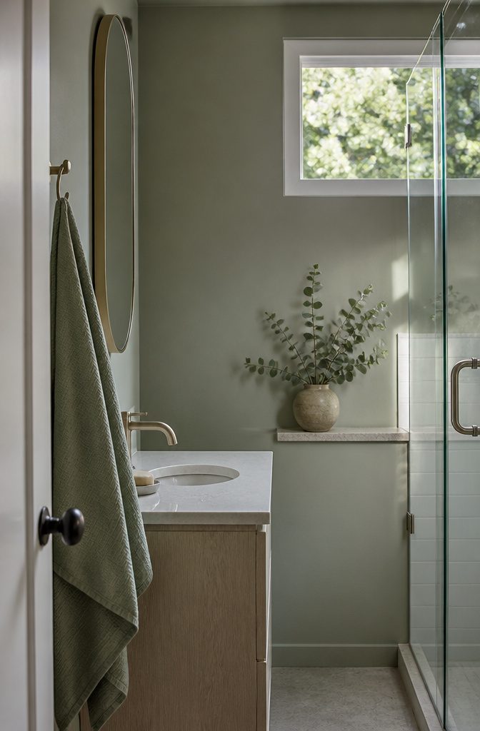
Sage sits between gray and green, and that position alone explains why it reads as restful.
The color lacks the sharpness of pure green or the clinical feel of straight gray, so it doesn’t demand attention the way a saturated hue does.
Bathrooms benefit from that quality because the space is already full of reflective surfaces and hard edges — tile, glass, metal — and sage softens the whole composition without adding visual noise.
The association with nature runs through every passage on the color, and it’s not just metaphor. Sage mimics the muted tones you see in dried herbs, eucalyptus, and weathered stone, so the brain reads it as organic rather than synthetic.
That perception translates directly into how the room feels: less like a functional box and more like a place where you can slow down.
If you’re aiming for a spa atmosphere, sage does most of the work before you add a single candle or plant.
Choosing a Shade for the Room’s Light
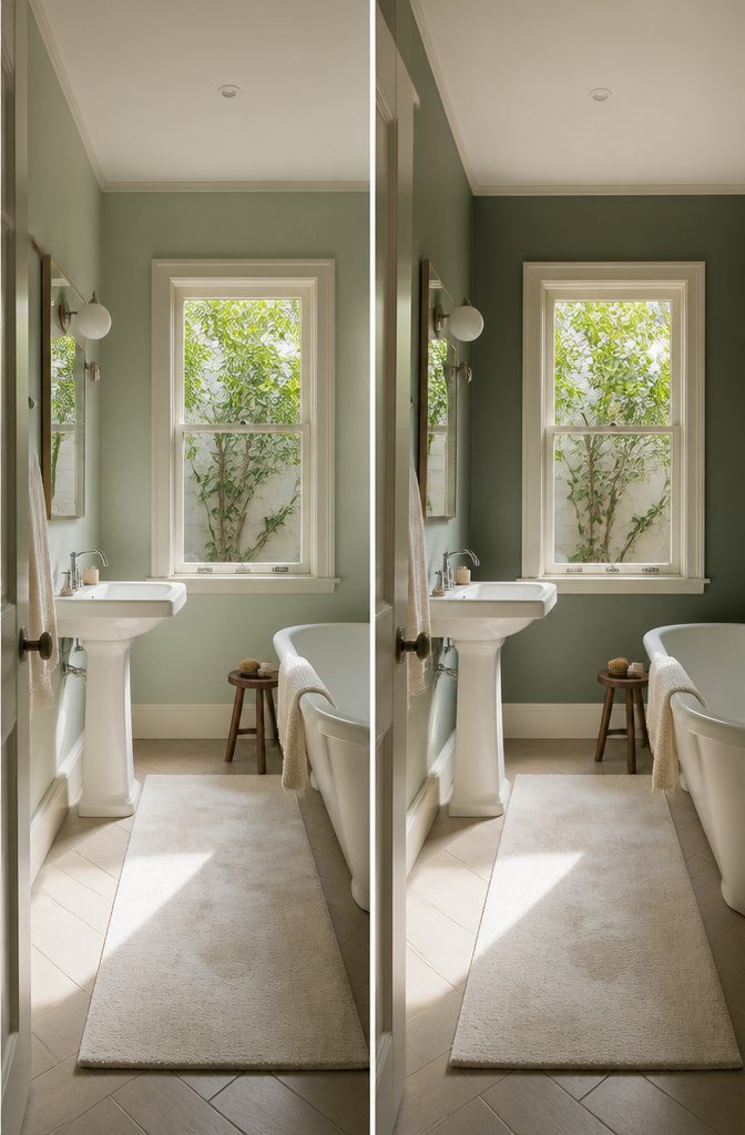
The shade that works in a bright bathroom will feel off in a dim one.
Lighter sage handles a bathroom with good natural light—the brightness keeps it from washing out. In a room with little daylight, a darker sage reads better; the depth compensates for what the window does not give you.
Deep green on a large surface changes how the room feels.
In a small or dark bathroom, saturated green across a wall or as a full shower curtain can feel heavy, the kind of weight that makes the space shrink rather than settle.
The same shade works as an accent—on a single wall, in tile behind the vanity, or as a narrow stripe in a curtain pattern—where it adds color without taking over.
Frequently Asked Questions
What colors complement a sage green bathroom?
White, cream, and soft neutrals pair best with sage green in bathrooms.
White fixtures and trim provide the contrast needed to keep sage feeling fresh rather than dull, while Sherwin-Williams Alabaster or White Duck adds warmth without the starkness of pure white.
Brass, natural wood, and woven textures bring additional warmth that keeps the color grounded.
Can sage green work in small bathrooms?
Yes, sage green works well in small bathrooms when paired with enough white or cream to maintain contrast.
A large mirror and frameless glass shower doors help the space feel open, and lighter sage shades handle limited natural light better than darker tones. A sage vanity or textiles bring the color in without committing every surface.
Is sage green a trendy bathroom color?
Sage green has become popular for bathrooms because it delivers calm without reading as cold or clinical.
The color sits between gray and green, which gives it the restfulness people want in a spa-like space, and it pairs easily with the brass, wood, and natural materials that define current bathroom design.
Its versatility across traditional and modern styles makes it both fashionable and practical.
What color is sage green paint?
Sage green sits between gray and green, reading as a muted, soft tone rather than a saturated hue.
Sherwin-Williams Clary Sage and Benjamin Moore Potpourri Green show the range: Clary Sage leans lighter and more neutral, while Potpourri Green is brighter.
The color mimics dried herbs and weathered stone, which is why it reads as organic rather than synthetic.
Is sage green out of style in 2026?
Sage green remains a strong choice for bathrooms in 2026 because it solves a functional problem: creating a restful space without the coldness of gray or the clinical feel of pure white.
The color’s tie to nature and wellness trends keeps it relevant, and its flexibility with different design styles gives it staying power beyond short-term trends.




