
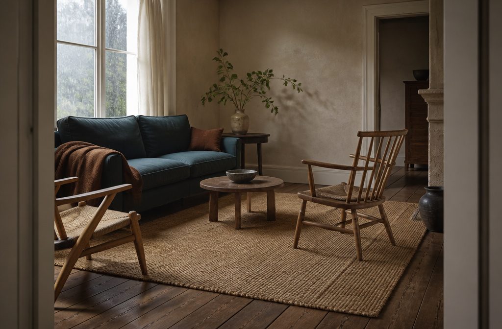
A neutral room lands warmer through layered texture than through color, and the choice between cool and warm base tones decides whether your accents pull sage or rust.
Light direction overrules personal preference: north-facing rooms need oatmeal or greige to counter the blue cast, while sun-flooded spaces hold cooler whites without reading sterile.
An 8′ × 10′ jute rug anchors a full seating arrangement and gives you the raw, woven surface that beige walls need to avoid flatness.
1. Layer Tactile Textures
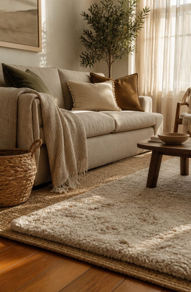
Cushions and throws are where texture actually shows up. Velvet holds light differently than linen does, and faux fur reads plush next to a flat cotton weave.
I keep at least three textures in play on a sofa — a woven throw over one arm, velvet cushions in the corners, maybe a silk or pom-pom detail on one accent pillow.
The variety gives a neutral palette something to catch the eye when color isn’t doing that work.
Rugs layer the same way. A jute rug under a high-pile wool one adds dimension underfoot, and the contrast between flat-weave and plush keeps a large neutral room from feeling too open.
I’ve done this in spaces with honey oak or walnut floors, and the texture pairing pulls the floor into the scheme instead of leaving it separate.
Window treatments matter more than you’d expect. Voiles let natural light through without losing the layered softness the room needs, and they don’t compete with heavier textures elsewhere.
A chunky knit throw or woven basket introduces weight where the room needs grounding. The textures do the lifting when the color stays quiet.
Recommended Products

🛋️ Fits all Interiors : This Versatile Neutral Boho Rug 8' x 10' area rug blends natural jute and wool to create a stylish boho rug that fits beautifully in living...
2. Vary Neutral Shades and Tones
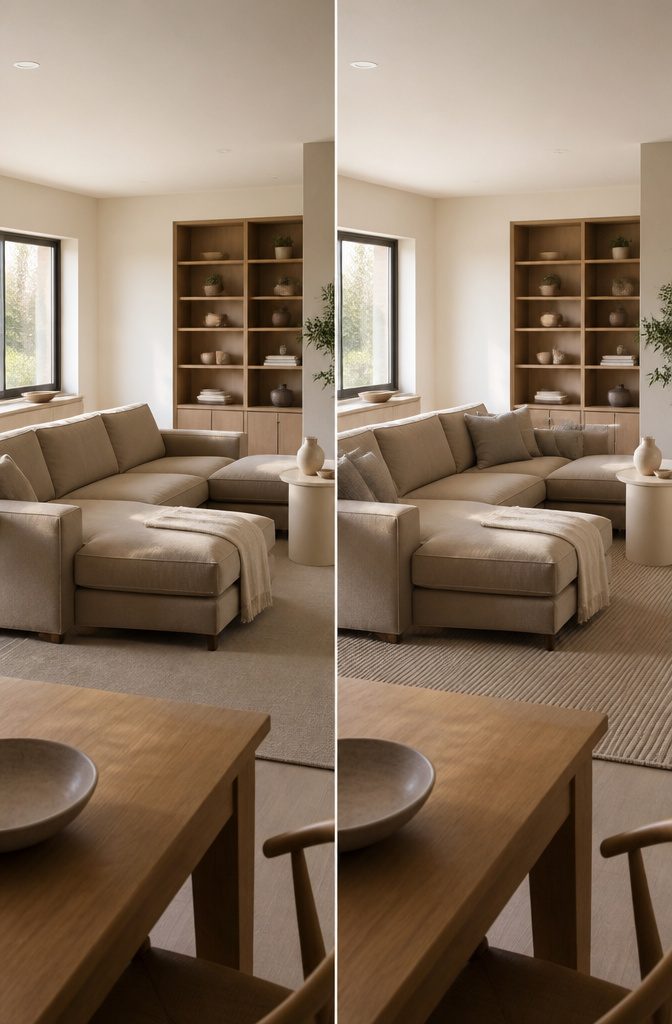
A room in all-warm beige reads one way; add cool gray-toned linen or a soft greige sofa and the space gains dimension.
Warm beiges and creamy whites work as your base — walls, larger upholstery, the anchoring pieces — then bring in taupe or ivory through smaller furniture, pillows or a throw to shift the temperature without breaking the palette.
A living room in three shades of the same neutral, one warm and two cool, or one dark and two light, holds interest where a single tone flattens.
Monochrome schemes layer depth through contrast instead of hue. Pair a deep oatmeal sectional with pale ivory walls and a mid-tone taupe rug; the range from light to saturated keeps the eye moving even when every surface stays neutral.
Gentle earthy tones — soft clay, warm sand — sit between beige and taupe and let you shift warmth across the room without landing on obvious brown or gray.
Recommended Products

PREMIUM EMBOSSED VELVET: Soft polyester velvet with a raised textured pattern creates rich visual depth and a refined decorative look for sofas, beds and accent chairs
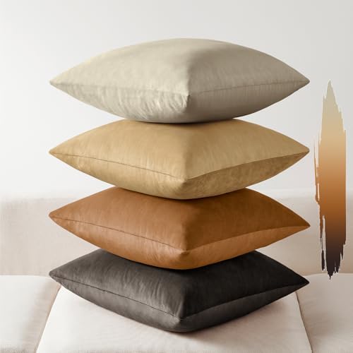
PREMIUM ULTRA-SOFT LUXURY VELVET (4 PACK VALUE SET) - Crafted from high-quality plush velvet, this set of 4 pillow covers delivers an ultra-soft, smooth, and cozy touch with a luxurious feel. Perfect for instantly upgrading your space and creating a warm, cohesive, designer-inspired home aesthetic with an elevated look.

PREMIUM ULTRA-SOFT LUXURY VELVET (4 PACK VALUE SET) - Crafted from high-quality plush velvet, this set of 4 pillow covers delivers an ultra-soft, smooth, and cozy touch with a luxurious feel. Perfect for instantly upgrading your space and creating a warm, cohesive, designer-inspired home aesthetic with an elevated look.
3. Add a Measured Accent Color
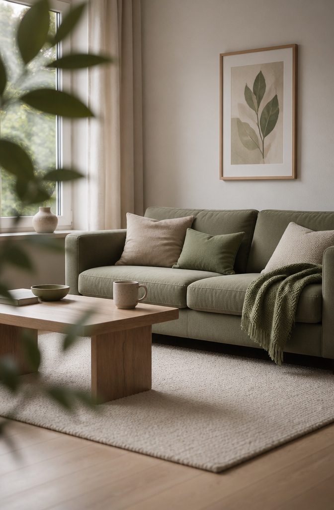
A single richer color against all that neutral can ground the room without taking it over. Keep it to about 80% neutral and 20% accent—a ratio that lets the color register as deliberate rather than scattered.
A sage green sofa, a set of blush cushions, or a navy armchair each work, and the choice depends mostly on whether your base reads warm or cool.
Warmer neutrals—beiges, taupes, soft grays with yellow underneath—pull toward rust, terracotta, pink, or mustard. Cooler ones—true grays, whites with blue in them—pair better with deeper blues, soft greens, or cooler pinks.
I’d stick to one accent shade and repeat it in two or three places: pillows, a throw, a single upholstered piece. More than that and the restraint that makes a neutral room work starts to slip.
Recommended Products

CONSTRUCTION & SIZE: Throw measures 50x60" and is made of 100% high quality woven cotton with a 2. 5" decorative fringed finish that won't unravel in wash

SIZE AND MATERIAL: Measures 50 x 60 inches, a classic throw size for a couch, armchair, or the foot of a bed; woven from 100% cotton with a 2.5-inch decorative fringe built to hold up in the wash without unraveling

SIZE AND MATERIAL: Measures 50 x 60 inches, a classic throw size for draping over a couch, armchair, or the foot of a bed; made of 100% cotton and finished with decorative fringe
4. Bring in Natural Materials
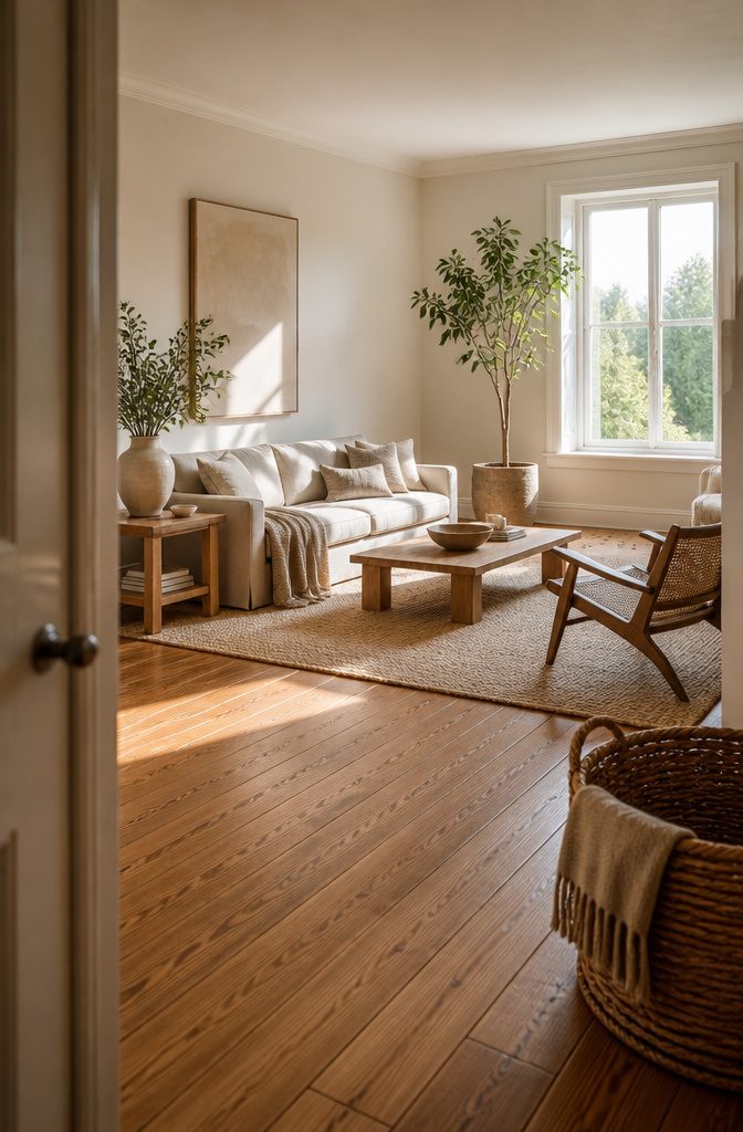
Wood, rattan, jute and linen bring the warmth a flat neutral palette can lack on its own.
A jute rug or woven basket reads as tactile even from across the room, and light woods like birch, stripped pine and light oak keep the palette open without feeling stark.
I lean toward materials that show their grain or weave rather than hiding it—the texture does half the work.
Linen burlap made from flax holds up well on a sofa and the slub gives it dimension under shifting light. Pair it with wool throws, cotton cushions or a sheepskin draped over a chair arm.
Stone elements and ceramic vases add weight without color, and a tall houseplant softens sharp corners while pulling your eye up. The natural curves and greens offset beige walls better than another neutral object would.
If your floors and trim already run warm with wood, double down on natural fibers—jute, sisal, leather. The repetition of organic material ties the room together without requiring a single bold move.
5. Use Art and Personal Accessories
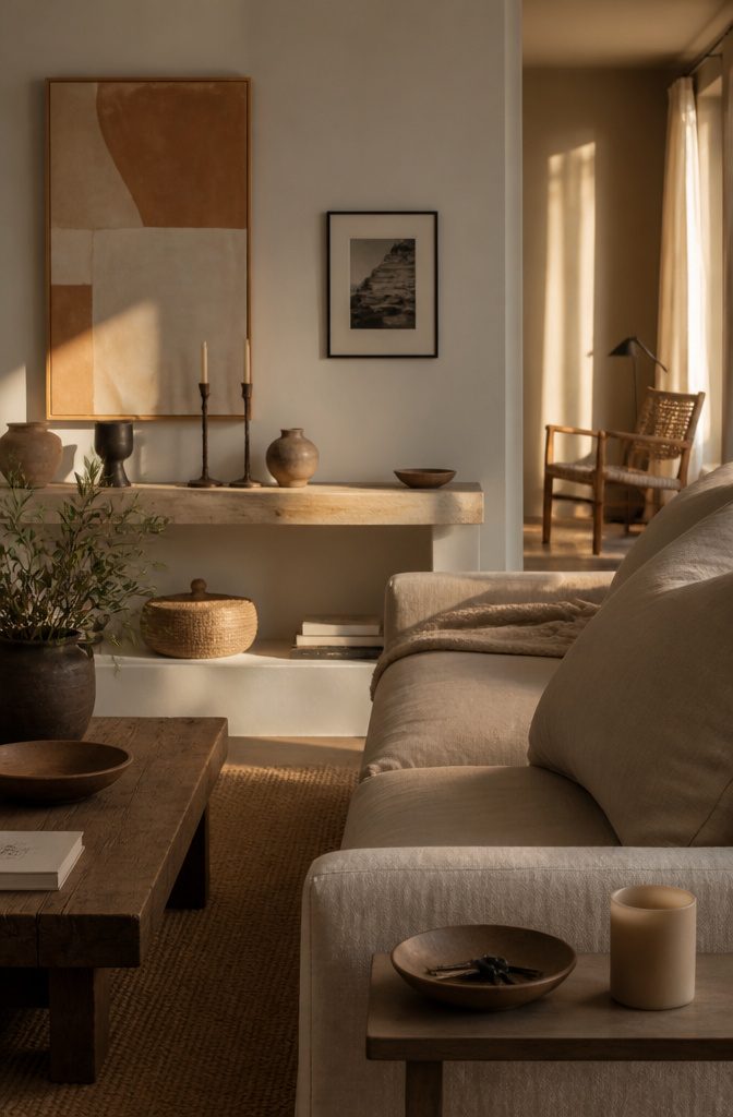
A piece of abstract art or a black-and-white photograph pulls the eye without breaking the palette. Sculptural wall hangings work the same way — they add visual weight but stay quiet in tone.
If you want more color, a single gallery wall does the job; vintage prints or tea-stained maps keep it interesting without pushing into bright territory.
Accessories fill in the rest.
Vases, candles and ceramic pieces in soft earthy tones sit on shelves or side tables and tie the room together. Keep each item deliberate: a small living room turns cluttered fast if every surface holds three things instead of one.
Built-in shelving helps: you can layer objects by height and texture, and the whole arrangement reads as intentional rather than accidental.
Nothing needs to shout. The personality shows up in what you choose, not how loud it is.
6. Use Rugs for Texture and Definition
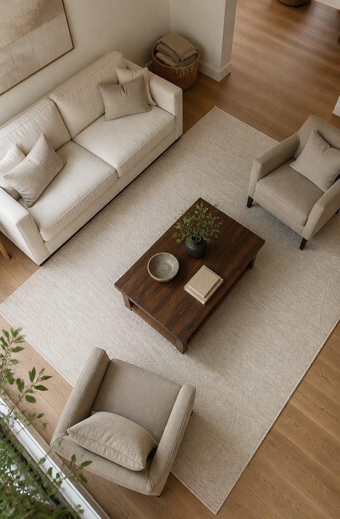
A rug grounds a neutral room and gives you a way to introduce texture without adding color. Jute works well if you want that raw, woven feel underfoot—it reads natural and pairs cleanly with linen or cotton upholstery.
Wool brings more softness and holds up better in high-traffic spots. Cotton rugs stay lightweight and work when you want something you can throw in the wash.
Size matters more than most people expect. An 8′ x 10′ rug anchors a full seating arrangement and makes the room feel intentional rather than like furniture floating on wood.
Go smaller—5′ x 7′ or 6′ x 9’—if you’re marking off a reading corner or defining space in an open floor plan.
The nuLOOM grey hand-woven chunky loop jute in 6′ x 9′ gives you that textured look at a price that doesn’t require a second mortgage, and the grey keeps it from pulling too warm or too yellow against most neutrals.
Contrast with your floor.
Dark jute over light oak adds weight; a lighter wool over walnut keeps the room from feeling too heavy. If your floor is already doing the talking, a flat-weave rug in an off-white holds the space without competing.
7. Make an Architectural Feature the Focus
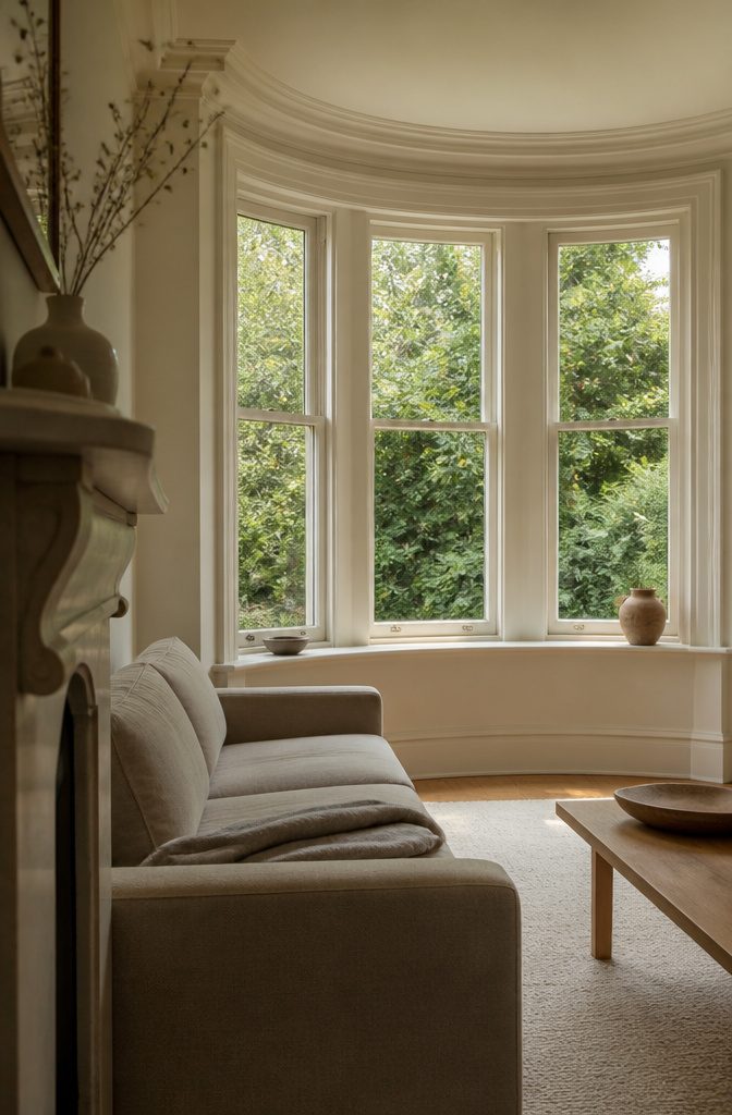
A fireplace with clean stone or a bay window framed in original trim already gives you a focal point—neutral walls and furniture let it hold the room instead of fighting for attention.
When the architecture has presence, the palette steps back. I’ve seen rooms where beams or paneling got painted over in bold colors, and the detail that made the space interesting disappeared under the distraction.
If you have exposed brick, wood beams, or wainscoting, keep the sofa and walls in cream or greige so the texture and line of the feature read clearly.
A neutral scheme doesn’t flatten the room when the bones are strong; it clears the stage.
The bay window example from older homes works the same way—curved glass and deep sills become the view when the rest of the room stays quiet, rather than one more thing competing with patterned curtains or a jewel-tone wall.
8. Use Black or Dark Accents for Contrast
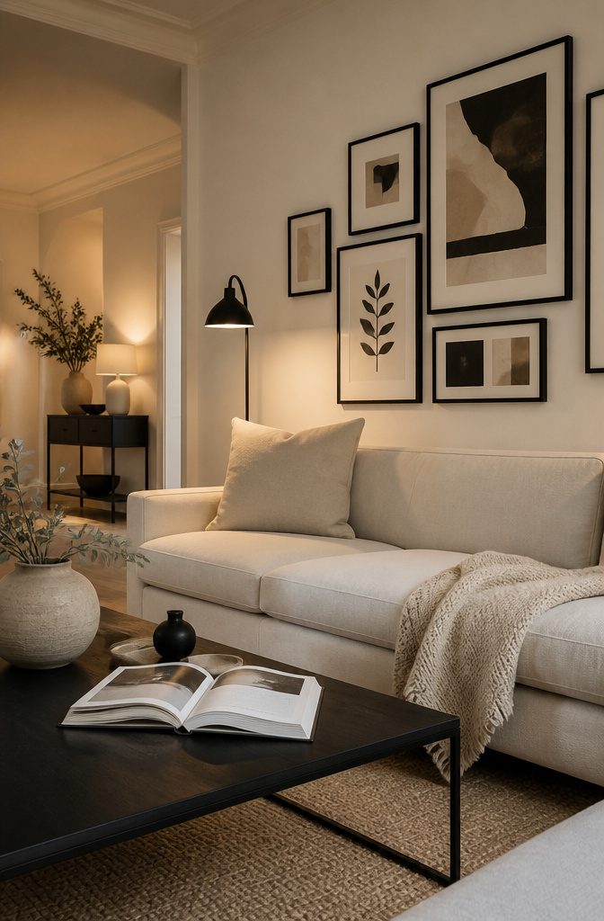
Black anchors a neutral room the way a shadow defines a shape.
Frames are the quickest win—a black gallery wall against cream or greige immediately sharpens the space without adding furniture. Hardware follows: cabinet pulls, curtain rods, door handles.
Then legs. A sofa on black legs reads cleaner than the same frame on wood, and a black metal coffee table base gives glass or marble something to sit against instead of floating.
Stick to about 80 percent pale neutral and 20 percent dark accent.
More black than that and the room tips contrast-heavy rather than grounded. Lighting counts as accent too: a black pendant or floor lamp with an exposed bulb adds structure and still leaves the ceiling light.
The contrast works because it sets a boundary. Beige on beige needs texture to separate one layer from the next, but beige next to black needs nothing else—the line is already there.
9. Choose Lighting That Adds Warmth
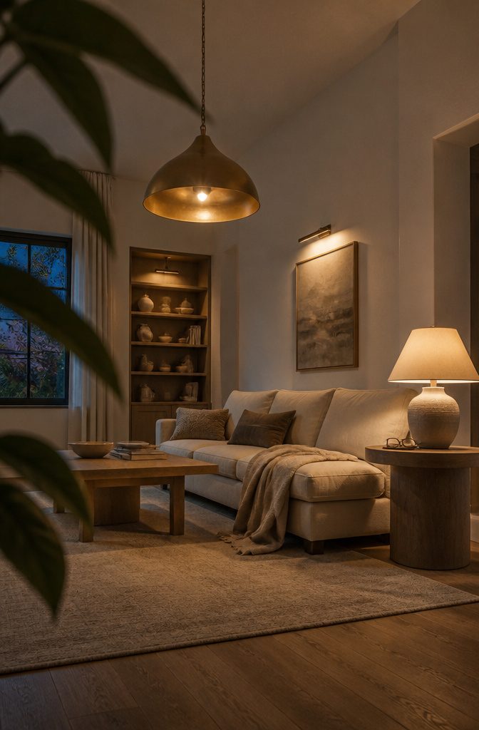
A statement fixture sets the tone before the furniture does.
I look for chandeliers or pendants that bring shape into the room without pulling focus from the rest of it — sculptural rather than ornate, and sized so they anchor the space without crowding it.
Warm-toned metals like brass or brushed gold lift a neutral scheme without reading as contrast the way black does.
Layering matters more than the fixture itself. Ambient light from a ceiling fixture covers the room; table lamps and sconces add pools of task light where you read or work.
Accent lighting — a picture light, an uplight behind a plant — gives depth. When all three sit in the same room, the result feels inhabited rather than staged.
Bulb temperature shifts the whole mood.
I stick to 2700K to 3000K for warmth in a neutral living room; anything cooler flattens beige into gray and makes cream look clinical. The fixture may be modern, but the light inside it should feel like late afternoon.
10. Choose Wall Color Based on Light and Mood
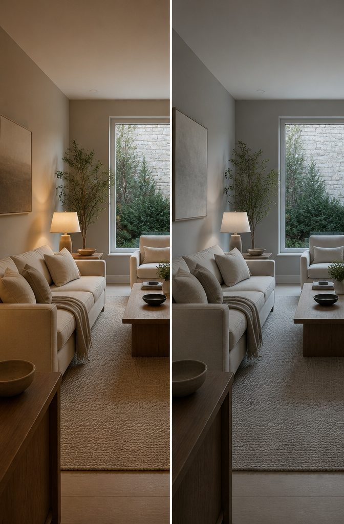
Natural light decides which neutral wins. Rooms flooded with sun hold up to cooler whites — bright whites with blue or gray undertones — without reading cold, because the light itself warms them.
Lamp-lit rooms without strong daylight, or north-facing spaces with little sun, need the opposite: warmer taupe, cream, or greige with more pigment so the walls don’t flatten under artificial light.
Before picking a neutral tone look at the way your room faces and the amount of natural light it gets. There are of course exceptions, but the general rule tends to be, north-facing rooms that lack natural light work best with warmer tones to counteract the darkness and coolness.
That means you’re picking the paint for the hours you actually use the room, not the aspirational morning light that hits for 20 minutes in July.
11. Use Symmetry or Balanced Placement
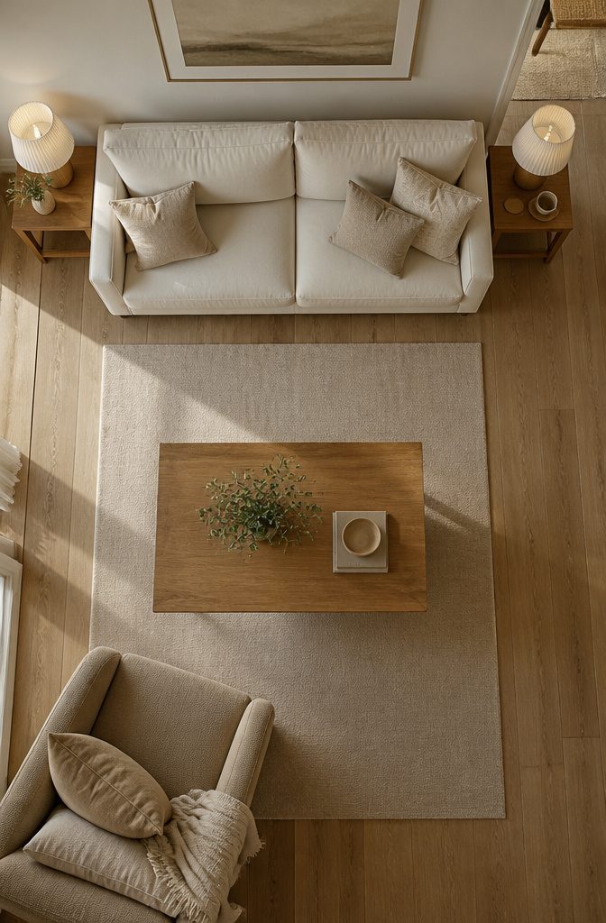
Symmetrical placement anchors a neutral room without rigidness—matching table lamps flanking a sofa, a pair of armchairs facing each other, or art centered above the mantel creates visual order that reads as calm rather than contrived.
The repetition works because neutral palettes already hold restraint; symmetry amplifies that quality instead of fighting it.
Balanced arrangements feel warmer when the pieces themselves carry texture or slight variation.
Two linen chairs in the same frame but different weaves, or lamps with identical bases and shades in two close tones, keep the symmetry from landing cold. The structure stays, the surface shifts enough to feel lived-in.
Asymmetry wins when the room itself lacks symmetry—a single window off-center, a fireplace that doesn’t split the wall evenly.
Forcing balance onto an unbalanced architecture makes both look wrong. A single large piece on one side, weighted by smaller items grouped on the other, follows the room’s actual logic and still holds the space together.
12. Keep a Small Room Visually Open
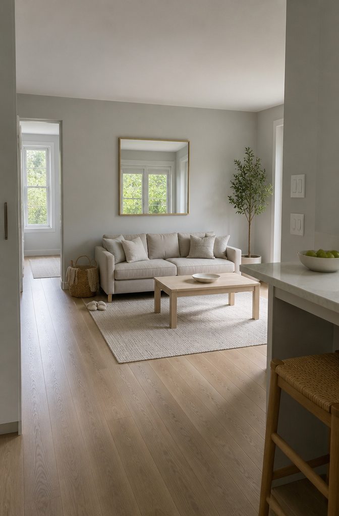
Light neutrals keep a small room from closing in on you.
Dove gray or soft beige throws more light around than a darker tone, and the reflected brightness makes the space read larger than its footprint. A 450-square-foot apartment gains breathing room from this alone, no renovation required.
A 39.25 × 39 inch gold mirror at $548 doubles that effect—it bounces light and visually extends the wall behind it.
Hang it where it catches a window or a lamp rather than a blank corner, and the room opens up twice: once from the reflection, once from the light moving through the frame.
Keep styling minimal. Fewer objects on surfaces means the eye travels farther before it hits a stopping point, and that read translates to space.
Light wood furniture or wicker baskets hold the neutral palette without adding visual weight, so the room stays open even when it is furnished.
13. Choose a Style Direction
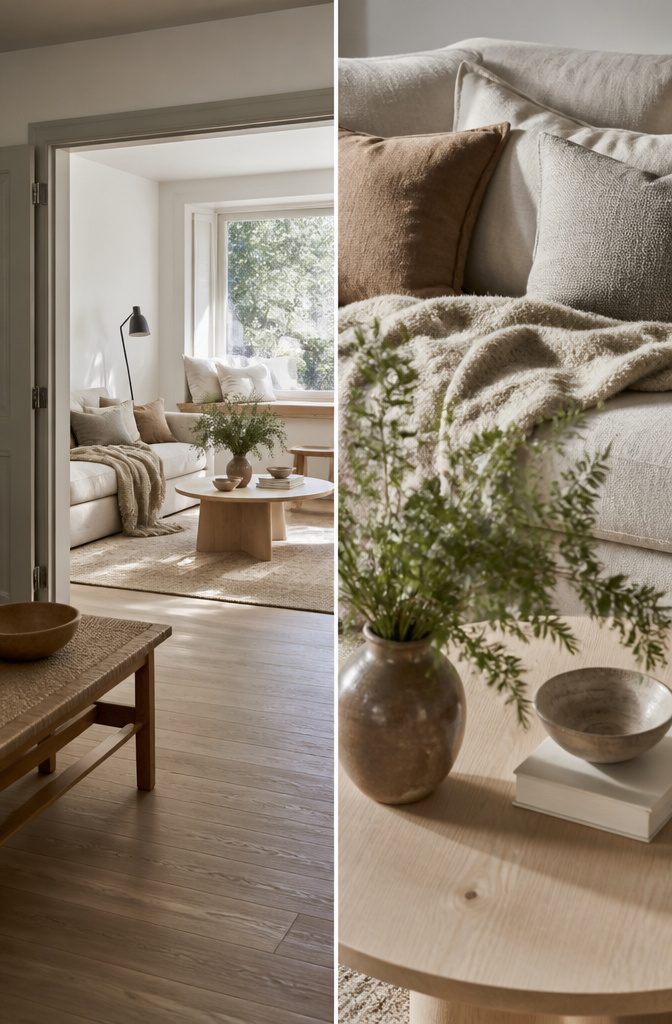
A neutral palette shifts character entirely when you decide whether you want modern minimal, rustic farmhouse, or Scandinavian cozy.
That decision controls material and form from there: modern minimal pulls toward smooth plaster walls, low-profile furniture with clean lines, and surfaces in concrete or matte metal.
Rustic farmhouse wants reclaimed wood, visible grain, linen slipcovers and pieces that look like they have a past. Scandinavian cozy sits between the two—streamlined silhouettes but warmer materials, birch and wool and soft cottons that invite touch.
Without that style anchor, you end up with a room that reads as beige rather than restful.
The same oatmeal sofa works in all three, but what you set it against and what you layer onto it makes the whole picture either cohesive or confused.
How Paint Choice Responds to Natural Light
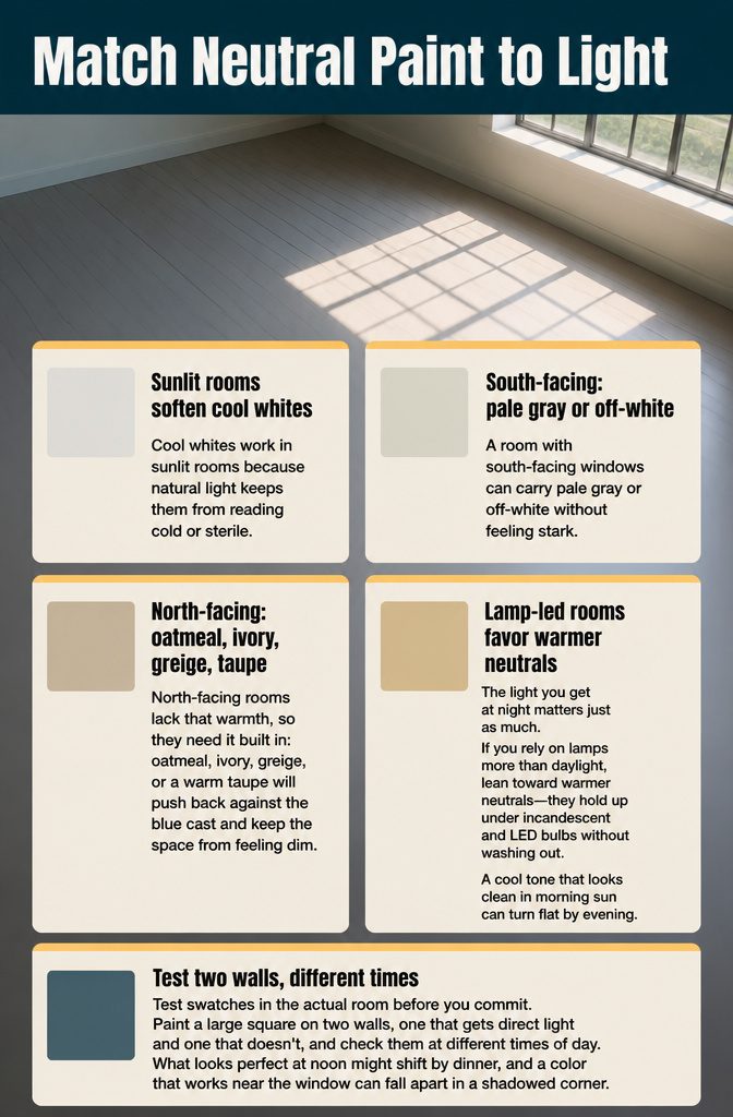
Cool whites work in sunlit rooms because natural light keeps them from reading cold or sterile. A room with south-facing windows can carry pale gray or off-white without feeling stark.
North-facing rooms lack that warmth, so they need it built in: oatmeal, ivory, greige, or a warm taupe will push back against the blue cast and keep the space from feeling dim.
The light you get at night matters just as much.
If you rely on lamps more than daylight, lean toward warmer neutrals—they hold up under incandescent and LED bulbs without washing out. A cool tone that looks clean in morning sun can turn flat by evening.
Test swatches in the actual room before you commit. Paint a large square on two walls, one that gets direct light and one that doesn’t, and check them at different times of day.
What looks perfect at noon might shift by dinner, and a color that works near the window can fall apart in a shadowed corner.
What Defines a Neutral Color
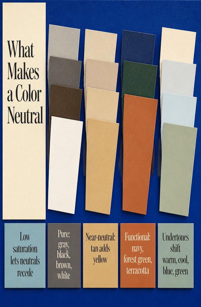
A neutral is a color with low saturation — grey, brown, black, white, beige, taupe, cream — that sits quietly enough in a room to go with nearly anything.
These shades lack intensity, so they recede rather than compete, which makes them reliable backdrops for furniture, art, or whatever detail you want noticed first.
Pure neutrals are the straight versions: grey, black, brown, white. Near-neutrals are those same shades mixed with a hint of primary color — tan is brown with a touch of yellow stirred in.
Both types work as base layers across styles, from minimalist to boho, because they let the eye move without snagging on the wall color itself.
Some colors act like neutrals in a room without being neutrals by definition. Navy, forest green, and terracotta show up as "functional neutrals" in design writing, meaning they pair easily and anchor a scheme the way a true neutral would.
But they carry more color than the definition allows, so the label fits their job rather than their saturation.
Even true neutrals carry undertones — a grey can lean blue or green, a white can read warm or cool — and those tints matter when you’re matching them to existing furniture or carpet.
The undertone decides whether the color feels cohesive or slightly off in your light.
Frequently Asked Questions
What is a neutral color for a living room?
A neutral color is any shade with low saturation that sits quietly in a room: grey, brown, black, white, beige, taupe, or cream.
These colors lack intensity, so they recede rather than compete, making them reliable backdrops for furniture and art. Even true neutrals carry undertones that lean warm or cool, and those tints matter when matching them to existing pieces.
What neutral colors make a room look bigger?
Lighter neutrals like dove gray or soft beige reflect more light and make a small room feel larger.
A 450-square-foot space gains breathing room from light walls alone, and a mirror placed where it catches a window or lamp doubles the effect by bouncing light back into the room.




