
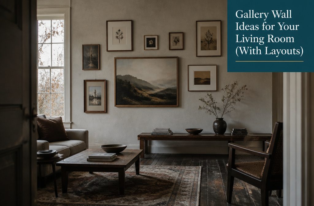
A gallery wall can look cohesive with mixed frames and subjects, or scattered with matched ones.
The difference is whether you picked a single thread to hold it together: one color family, one subject, or one anchor piece that the rest answer to.
Most people skip the floor layout and regret it. Interior designer Amy Studebaker spent nearly a decade collecting the pieces in her entryway arrangement, leaving gaps for what she’d find next.
1. Use a Cohesive Palette or Theme
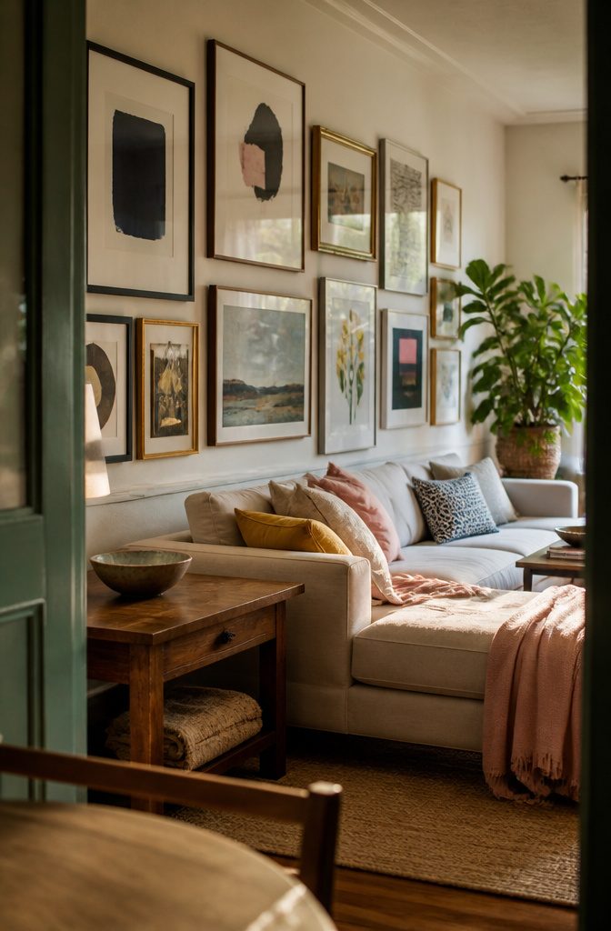
A cohesive color palette gives you permission to mix all kinds of objects without the wall looking scattered.
Monochrome schemes work especially well for this: staying within one color family lets you layer tone and texture without worrying whether things clash.
Black-and-white prints anchored by a few pops of pink or yellow pull the eye through the wall and into the rest of the room, especially when those accent colors show up again in your furniture or textiles.
Subject matter works the same way. An abstract motif holds an eclectic arrangement together without forcing every piece into the same medium or frame style.
Genre matters more than you think: a collection of vintage paintings in neutrals, blues, and gold reads as intentional rather than random, even when frame styles differ.
The shared thread gives your eye something to follow instead of bouncing between unrelated images.
2. Start with a Large or Central Anchor
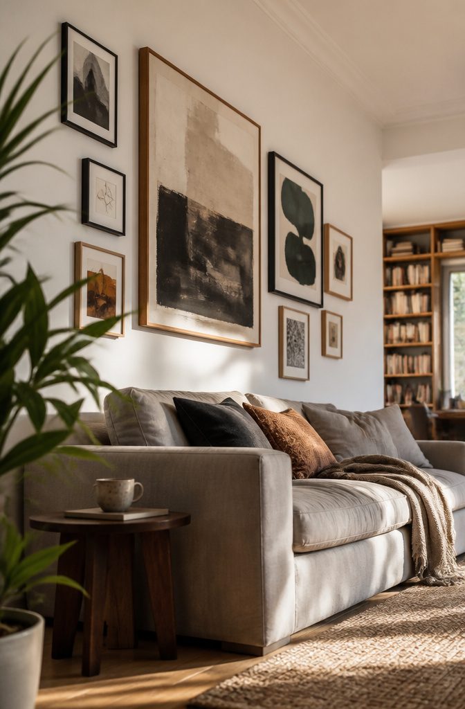
I place the biggest piece slightly off-center, toward the middle but not smack in the middle, then build everything else around it. Your eye travels around the arrangement instead of stopping dead at center.
If the collection is smaller, the anchor can sit in one of the four outer corners; larger walls usually want it pulled in from the edges but still off the main axis.
Some designers start with a strong central piece and grow symmetrically outward on both sides, which works when you want balance to anchor the room.
The off-center approach reads more casual and lets you add pieces over time without the whole thing looking unfinished.
Once the anchor is down, the second-biggest piece goes diagonally from it—either right next door or on the opposite side of the wall. That gives you two fixed points, and the smaller pieces fill the gaps between them.
3. Mix Sizes, Orientations, and Media
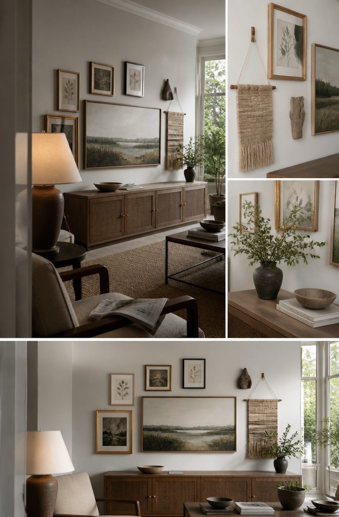
Pairing a tall vertical piece with a wide horizontal one keeps the rhythm from flattering — and once you add a third orientation, maybe something nearly square, the wall starts feeling less like a grid and more like a collection.
I like to place a smaller vertical frame next to a large horizontal piece, either centered on it or aligned at the bottom edge, so the pairing reads as intentional rather than random.
Beyond orientation, mixing media adds depth that uniform prints can’t deliver: a textile piece or a small sculptural object breaks the plane, and suddenly the wall has layers instead of just surface.
Photography next to a painting next to a vintage find gives you texture contrast without needing busy frames.
Frame profiles can vary too. Limit yourself to three frame styles maximum if the wall is small or you want control — say, black, white, and a light wood.
On a larger wall with more pieces, you can bring in a fourth, maybe an ornate gold frame as punctuation.
If mixing frames feels chaotic, keep them similar and change the mat sizes instead; that variance is quieter but still prevents monotony.
4. Choose a Layout Style
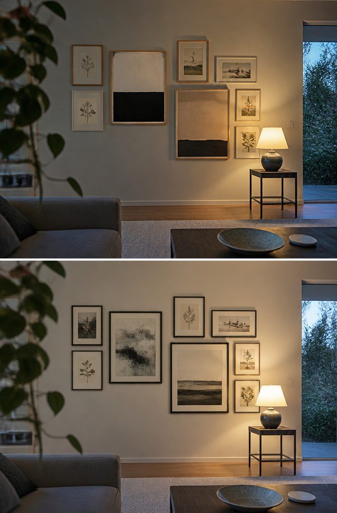
Grids and symmetrical layouts read clean and intentional—pieces line up along invisible lines, spacing stays uniform, and the whole wall looks planned. That structure works best when you want the display to feel polished rather than accumulated.
The downside: grids take more measuring upfront, and if you plan to add pieces later, you’ll need matching frames in the same size. Buy extras when you set it up; they’re often discontinued by the time you’re ready to expand.
Asymmetry gives you more freedom. You can start with one or two larger pieces and build outward without committing to perfect spacing or alignment.
The irregular border makes the wall feel collected over time rather than installed all at once, and you can keep adding to it without redoing the layout.
It takes less measuring but more trust in your eye—you’re balancing visually, not geometrically.
5. Make It Personal and Let It Grow
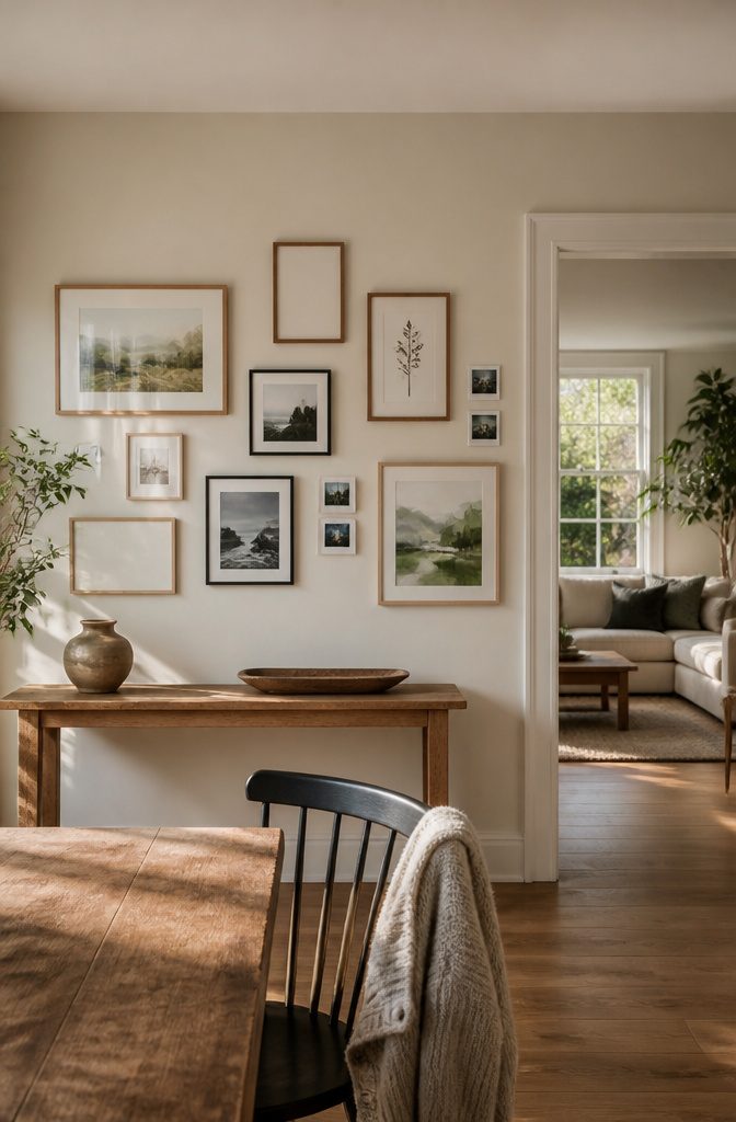
A gallery wall built from things you actually care about—travel prints, family snapshots, a watercolor from a friend—reads differently than one assembled in an afternoon from a matching set.
Interior designer Amy Studebaker collected the art in her entryway for nearly a decade, and she treats that slow accumulation as part of the design.
Start with pieces you love and leave room for more.
That breathing room matters. A wall that feels finished the day you hang it can look too calculated, while one with a few open inches invites the next piece when you find it.
I’d rather see a grid with two empty spots than a grid crammed full of filler art bought to complete the pattern.
Personal pieces cost nothing and carry more weight than another abstract print: your grandmother’s photo at your age, a cocktail napkin from a first date, an ultrasound, even your wedding vows in a simple frame.
A Polaroid printer moves a phone snapshot onto the wall in minutes, and it breaks up the uniformity of digitally printed art. The wall should reflect what you like, not what a staging company would choose.
6. Fit the Display to the Room or Wall
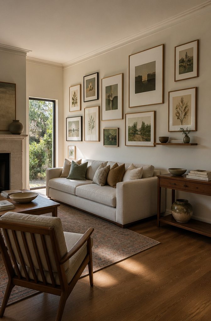
A gallery wall above a sofa needs about 8 to 12 inches of clearance from the back cushions — enough that someone sitting down does not feel crowded, but close enough that the arrangement reads as anchored to the furniture below.
If you have a console table or floating shelves along the same wall, work the frames around them rather than trying to impose a grid that pretends the furniture is not there.
A floor-to-ceiling arrangement that flows past a chair or fireplace looks collected; one that stops dead at the furniture line looks timid.
Corners and stairways give you walls that most people leave blank because the shape feels awkward.
A corner gallery fills that dead zone by wrapping frames across both planes with even spacing between them, turning the angle into the point instead of the problem.
On a staircase, hang along the slope so the frames climb with you — the diagonal line leads the eye up instead of fighting it.
Plan the Arrangement Before Hanging
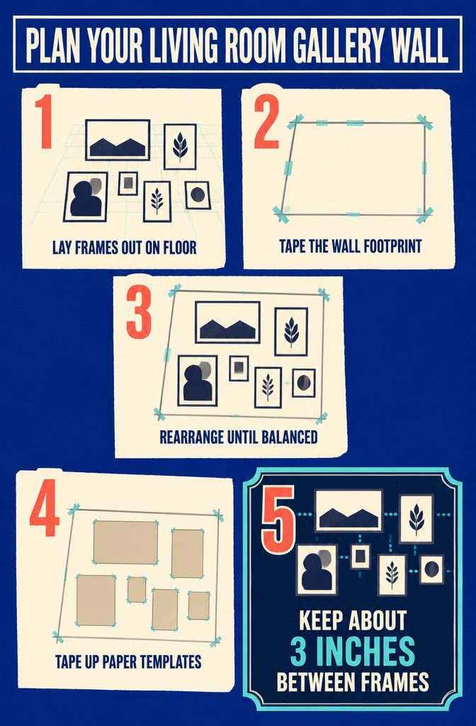
Lay everything on the floor first. Tape off the footprint you want the wall to fill, spread your frames and art inside it, and move pieces around until the composition feels right.
This is where you test whether a symmetrical grid looks too stiff or an asymmetrical cluster has enough balance—all without putting a single hole in the wall.
If you have craft paper, cut templates the size of each piece and tape those up instead; you can step back, judge spacing from across the room, and adjust before the hammer comes out.
Keep about 3 inches between frames so the wall reads as one collection rather than a crowd.
A tiny print might need a larger neighbor to anchor it, or your favorite piece could look better offset to one side than dead center.
The floor layout shows you that before you commit, and it cuts out the "I already hung this but now I hate it" regret that comes from winging the arrangement as you go.
Keep About 3 Inches Between Pieces
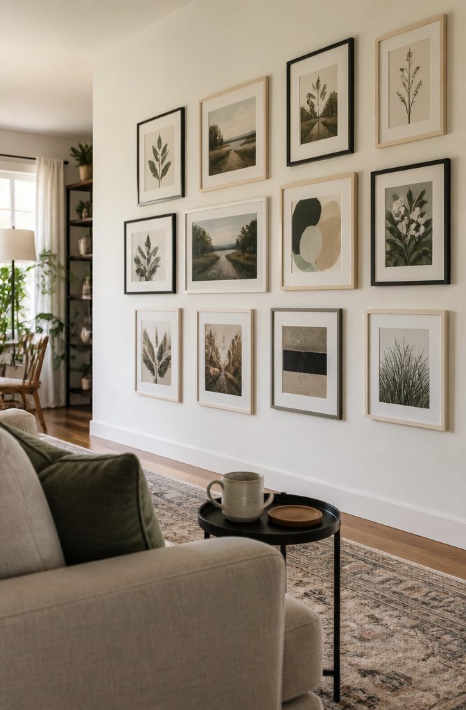
Consistent spacing holds a gallery wall together. Aim for 2–3 inches between frames—close enough that the collection reads as one unit, but open enough that each piece gets room to register on its own.
Too much space and the wall starts to feel like unrelated art that happens to share the same surface.
Too little and it turns cluttered, the frames competing instead of cooperating. That narrow band in the middle is what makes a dozen frames look like a single considered arrangement instead of a pile that ended up on the wall.
The spacing matters as much as the frames themselves.
It’s not decorative; it’s structural. Keep it even across the whole wall, and the layout pulls together without any other intervention.
Frequently Asked Questions
What is the rule for gallery walls?
Keep 2–3 inches of space between frames so the collection reads as one unit rather than competing pieces. That consistent spacing holds the arrangement together and makes a dozen frames look like a single considered display instead of scattered art.
How do you do a gallery wall in a living room?
Place the largest piece slightly off-center and build around it, leaving 8–12 inches of clearance above the sofa.
Mix sizes and orientations while maintaining 2–3 inches between frames, and lay the full arrangement on the floor before hanging to test spacing and balance.
How do you layout a gallery wall?
Tape off the wall footprint on the floor, spread your frames inside it, and move pieces until the composition works.
This lets you test symmetrical grids against asymmetrical clusters without putting holes in the wall, and you can step back to judge spacing from across the room.
What do you put on a gallery wall?
Art, photos, and framed objects work equally well: paintings next to photography next to textiles or small sculptural pieces.
Personal items like travel prints, family snapshots, vintage finds, or even a cocktail napkin from a first date carry more weight than filler art bought to complete a pattern.
Are gallery walls out of style in 2026?
Gallery walls remain current but have evolved toward more color, texture, and varied materials rather than strict symmetry.
The style shifts with design trends, but the concept of a wall collection stays relevant because it adds personality that makes a space feel collected over time.
What is replacing gallery walls?
Nothing is replacing gallery walls outright.
The style has adapted to include mixed materials, sculptural objects, and layered textures alongside traditional framed art, so current versions look less uniform than earlier grids of matching frames but still serve the same purpose.




