
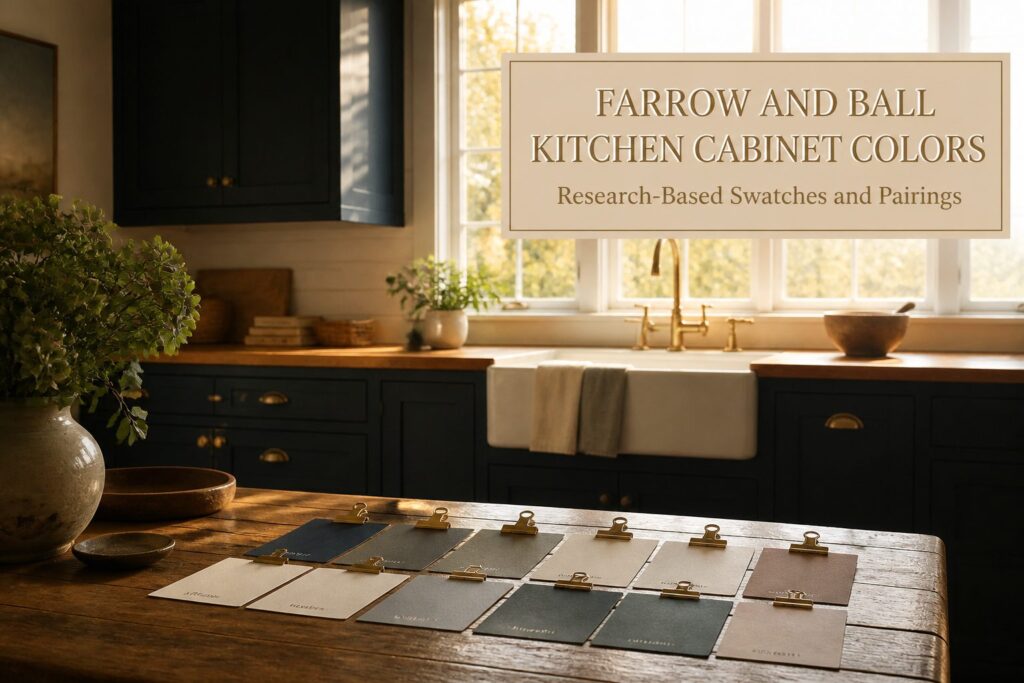
Farrow and Ball cabinet colors range from near-black navy to warm plaster blush, and the right one depends almost entirely on which way your windows face.
Railings reads as pure navy at the counter but photographs flat black, a split that sinks resale listings yet rewards daily use.
The only reliable test is a sample board watched across two full days on the cabinet plane itself, where shadow pools and countertop bounce change everything a wall swatch promised.
1. Railings
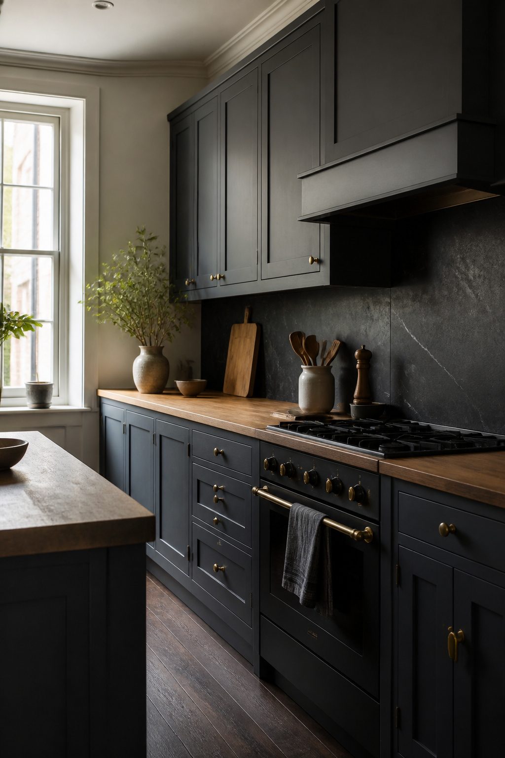
Railings reads as near-black on the chip, but what you get on a cabinet face is the darkest navy possible, an inky charcoal with blue undertones that earns its number 31.
Morning light pulls the blue forward; by evening it sinks to something closer to soot.
That shift is exactly why designers specification it for small kitchens. The color recedes, so the walls feel farther off than they are and the room settles into itself.
I would keep metals to brass or unlacquered nickel here. Chrome fights the warmth hidden in that blue base and turns harsh under LED spots.
Stone pairings run toward soapstone or a honed black granite with faint white veining. Anything heavily patterned competes with the depth and wins, which is not the point of choosing a color this quiet.
The one trade-off worth naming: Railings will read as pure black in photographs, so if you are planning this kitchen partly for resale listing images, expect to lose the nuance you paid for.
The viewer sees black; the person standing at the counter sees the navy. That living shift is the reason to use it, not a reason to avoid it.
2. London Clay
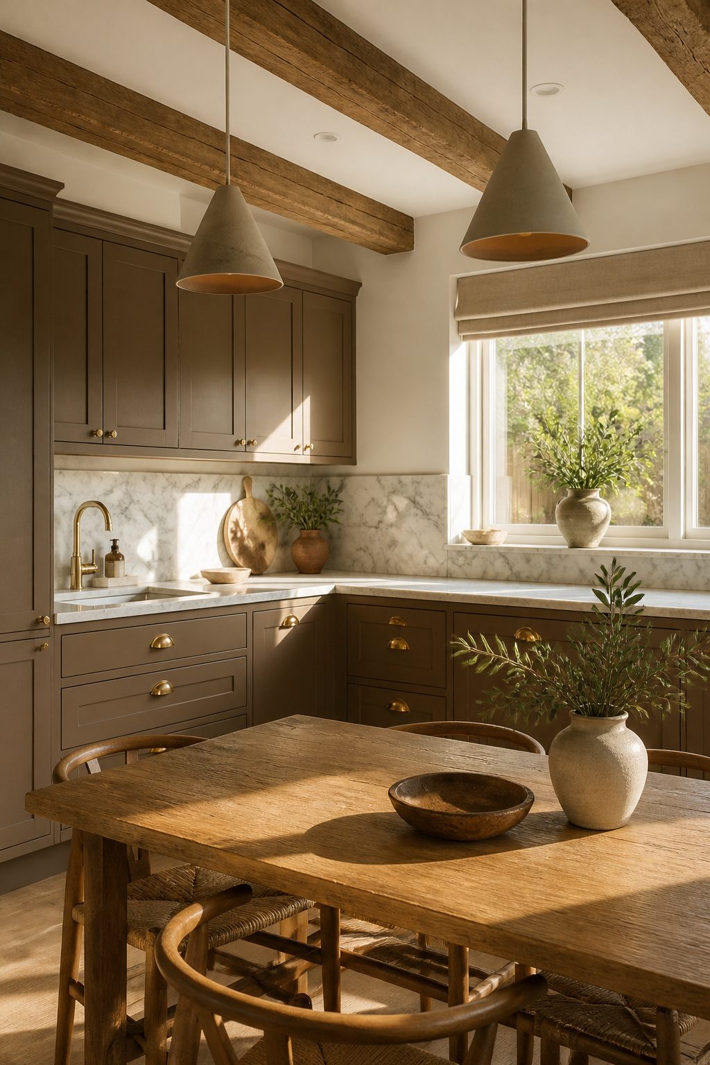
London Clay earns its place in a kitchen because it shifts with the light instead of fighting it.
Morning sun pulls out a soft, warm brown; lower evening light deepens it toward something more grounded, but it never reads as heavy or closed-in.
That adaptability makes it forgiving across the day and across seasons, which matters when cabinets are a fixed surface you live with for years.
I see it as a middle path between the starkness of white and the commitment of a true dark color.
It carries enough pigment to add depth and architectural weight, yet it steps back enough to let your materials do the talking. If you are drawn to natural stone, honed marble is the pairing that makes the most sense here.
The matte, slightly porous finish of honed marble sits at the same visual register as London Clay’s muted warmth, and the veining reads as intentional texture rather than contrast for contrast’s sake.
Limestone works on the same principle if you prefer something more uniform.
Warm woods like oak or walnut layer in naturally, and aged or unlacquered brass keeps the palette from feeling too finished.
The overall effect is welcoming without being rustic, intentional without being staged. For a few hundred dollars in paint and a weekend of brushing or spraying, that is a solid return.
3. Shaded White
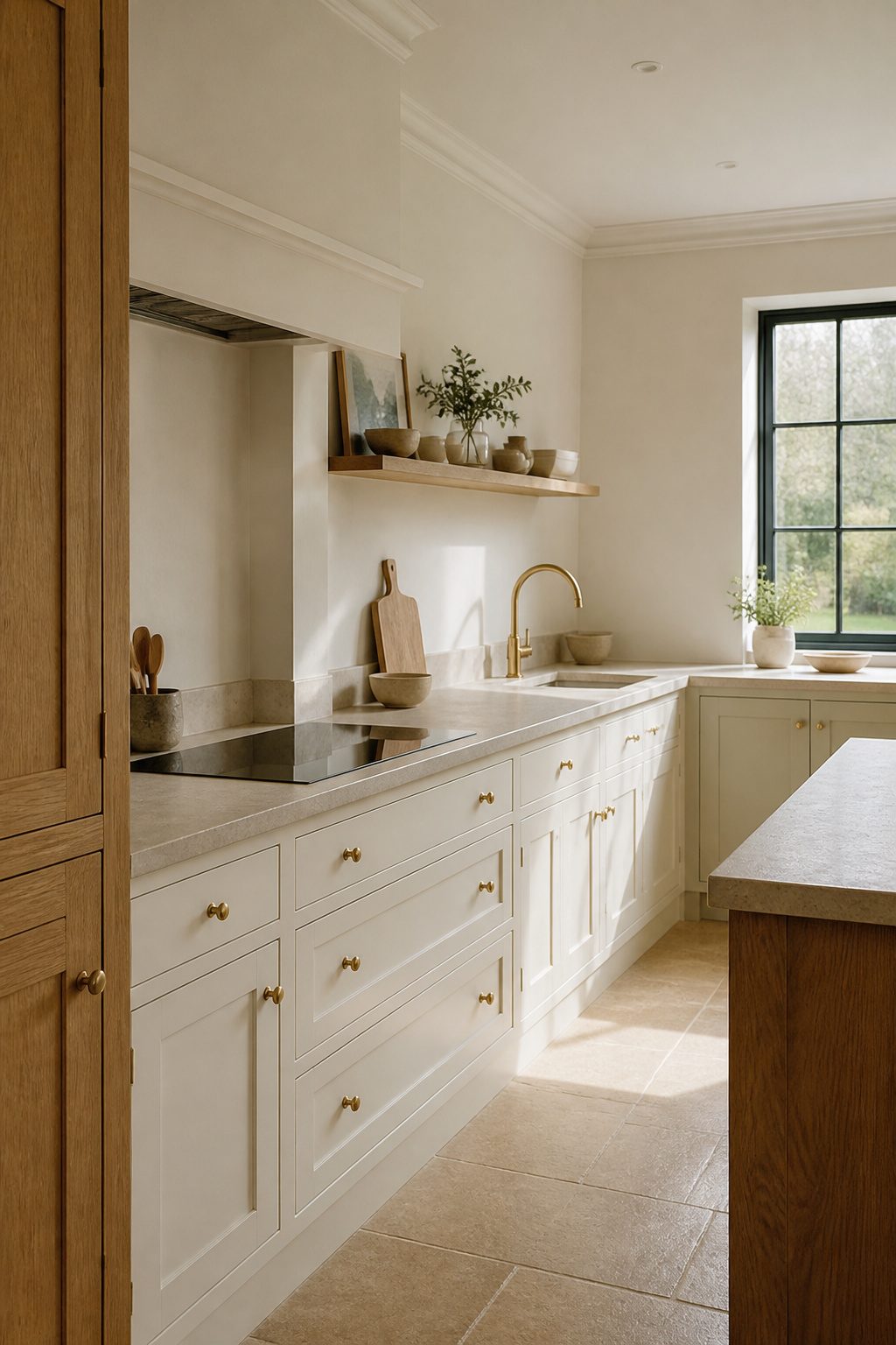
Shaded White carries enough gray to stay warm and enough beige to stay interesting, a middle-ground neutral that avoids the clinical flatness of purer cabinet whites.
In north-facing light it settles toward a soft, dirty cream with a green-gray undertone that keeps a kitchen from feeling cold or starved of sun; turn it south and that same complex base brightens without ever tipping into starkness.
I would pair it with honed limestone or tumbled travertine countertops, where the stone’s natural variation echoes the paint’s own shifts across the day.
For hardware, unlacquered brass or aged bronze draws out the warmth without competing, and I would avoid polished nickel here, it pushes the tone toward institutional.
Shaded White asks for texture elsewhere: flat slab cabinets in this color can read muddy, but a simple shaker profile or a beadboard detail gives the eye the variation it needs.
If your kitchen faces north and feels perpetually dim, this is the color I’d reach for first; if you have abundant southern exposure, you might consider whether you want this much nuance or would prefer something cleaner.
4. Down Pipe
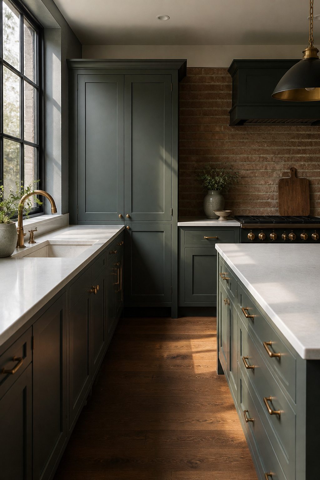
Down Pipe is the Farrow and Ball shade that keeps shifting on you. In some kitchens it reads almost pastel; in others, near-black.
Most of the time it settles somewhere in that dark gray-blue-green zone, but the exact balance of those three notes depends on the light source, the time of day, and what you place next to it.
That chameleon quality is the whole appeal and the whole risk. North-facing light pulls the blue forward and can leave cabinets looking cold by afternoon.
Warm afternoon sun from the west drags out the green and softens the whole thing. If your kitchen windows face east, you get a brief, sharp gray in the morning that most people never see because they are at work.
Order a sample pot and watch it for two full days before you commit. I have seen the same De VOL kitchen photographed in Down Pipe look like two different colors six hours apart, and both images were accurate.
The color works best when you treat that variability as the point: pair it with Shaded White on adjacent walls and the contrast stays interesting because both colors drift rather than clash.
It fails when you need a cabinet color to anchor a scheme.
If your countertops, backsplash, and hardware all demand a fixed neutral, Down Pipe will fight you. Use it where a little uncertainty feels alive, not where consistency matters more than character.
5. Pavilion Gray
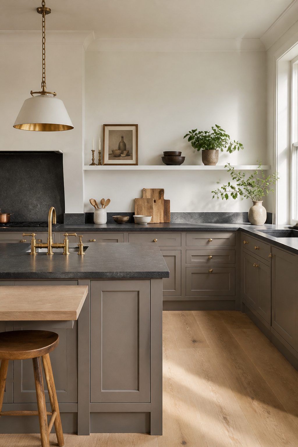
Pavilion Gray is the one color in this range that behaves itself when the sun moves.
Most Farrow and Ball grays shift warm or cool depending on the hour; Pavilion Gray stays neutral, which makes it the safer bet for kitchens with windows on multiple exposures or any space where the light changes dramatically from morning to evening.
That stability comes at a cost. Colors like Pigeon or De Nimes give a kitchen character through their variation; they look alive.
Pavilion Gray does not. It reads as deliberate and calm rather than interesting, which is exactly what you want if the cabinets are not the main event.
Pair it with a stone countertop that has movement, or with hardware in a warmer metal, and let those elements do the work.
I would reach for this in a rental refresh or a first home where I just need the room to stop feeling wrong, not to make a statement.
It is the color you choose when you need the cabinets to recede and the budget to go toward the backsplash or the pulls. Not every kitchen needs its paint to be the conversation.
6. Cornforth White
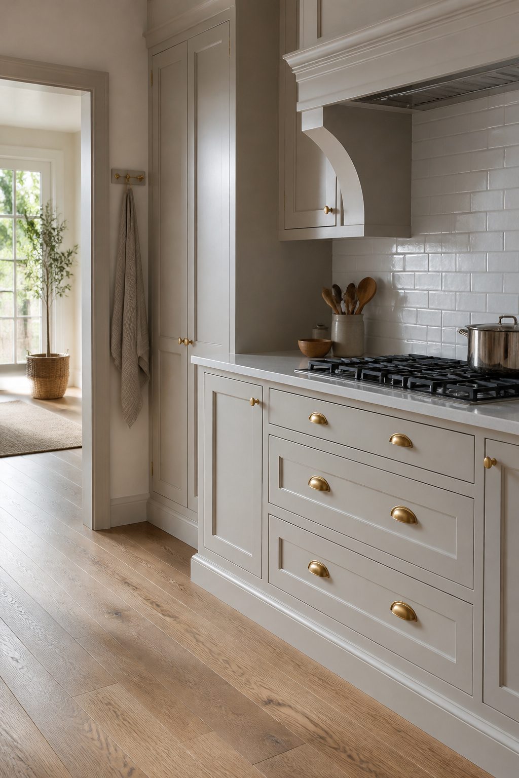
Cornforth White sits closer to the warm side of gray than it first appears, with just enough beige to keep a kitchen from feeling like a showroom floor.
That slight warmth makes it the bridge color you need when your countertops lean cool but your floors run warm; it meets both in the middle instead of forcing a choice.
I see it working best on cabinets with some detail to catch the light.
Shaker frames, beaded inset, even a simple chamfered edge all give Cornforth White something to do, because in flat slab doors it can read as simply "not quite white" rather than intentionally soft.
Where the color earns its place is in transition kitchens, the ones with existing honey-toned oak floors and a homeowner who wants to step toward something cleaner without ripping everything out.
The risk is pairing it with true warm whites elsewhere in the room.
Cornforth White next to a creamy subway tile or an ivory sink looks dirty by comparison, not sophisticated. I would keep trims and ceilings in a cooler white, or match them exactly, and let the cabinets carry the warmth alone.
In smaller galley kitchens the color can close in slightly; I would use it there only with strong natural light or on upper cabinets paired with something darker below.
7. Studio Green
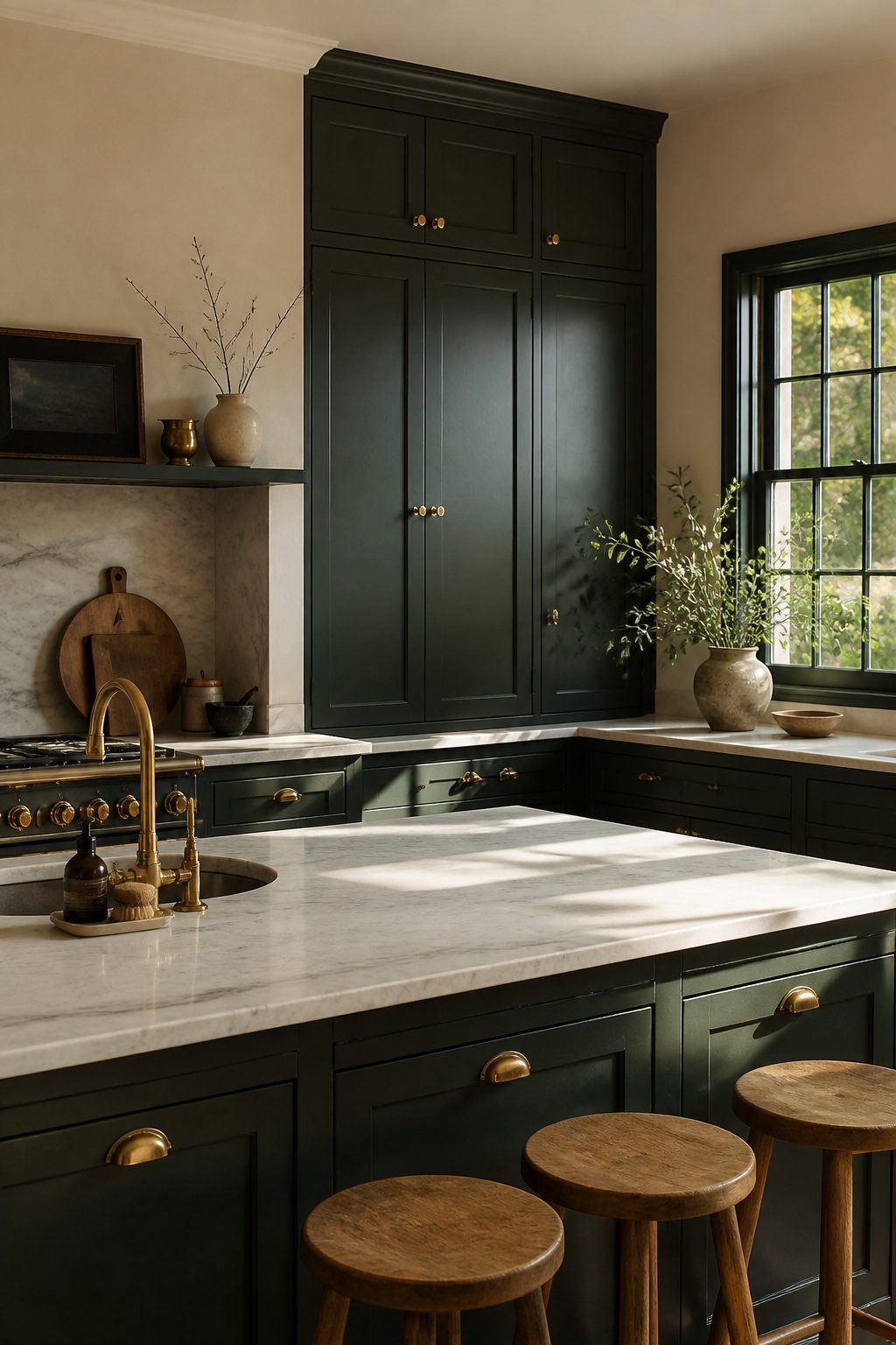
Studio Green sits at the edge of black on most Farrow and Ball chips, and in an average room it stays there.
The green only surfaces when strong natural light hits it directly, so south-facing windows or a space with little exterior wall will leave it reading as near-black with a vague forest suggestion.
I would only commit to this color after watching a sample board at the hour I actually use the kitchen, because morning light and evening shadow split the difference dramatically.
Where it does read green, the tone is deep and saturated, not earthy.
That saturation needs relief. Honed marble or a warm white zellige tile on the backsplash keeps the cabinets from swallowing the room, and unlacquered brass hardware adds the aged warmth that stops the combination from feeling theatrical.
Creamy wall colors like School House White on surrounding trim do more than contrast; they let the eye rest so the cabinets read as intentional architecture rather than a dark void.
I would skip aged oak countertops here, though. The green is already doing the mood work, and too many rustic notes tip toward lodge cliché.
8. Lamp Room Gray
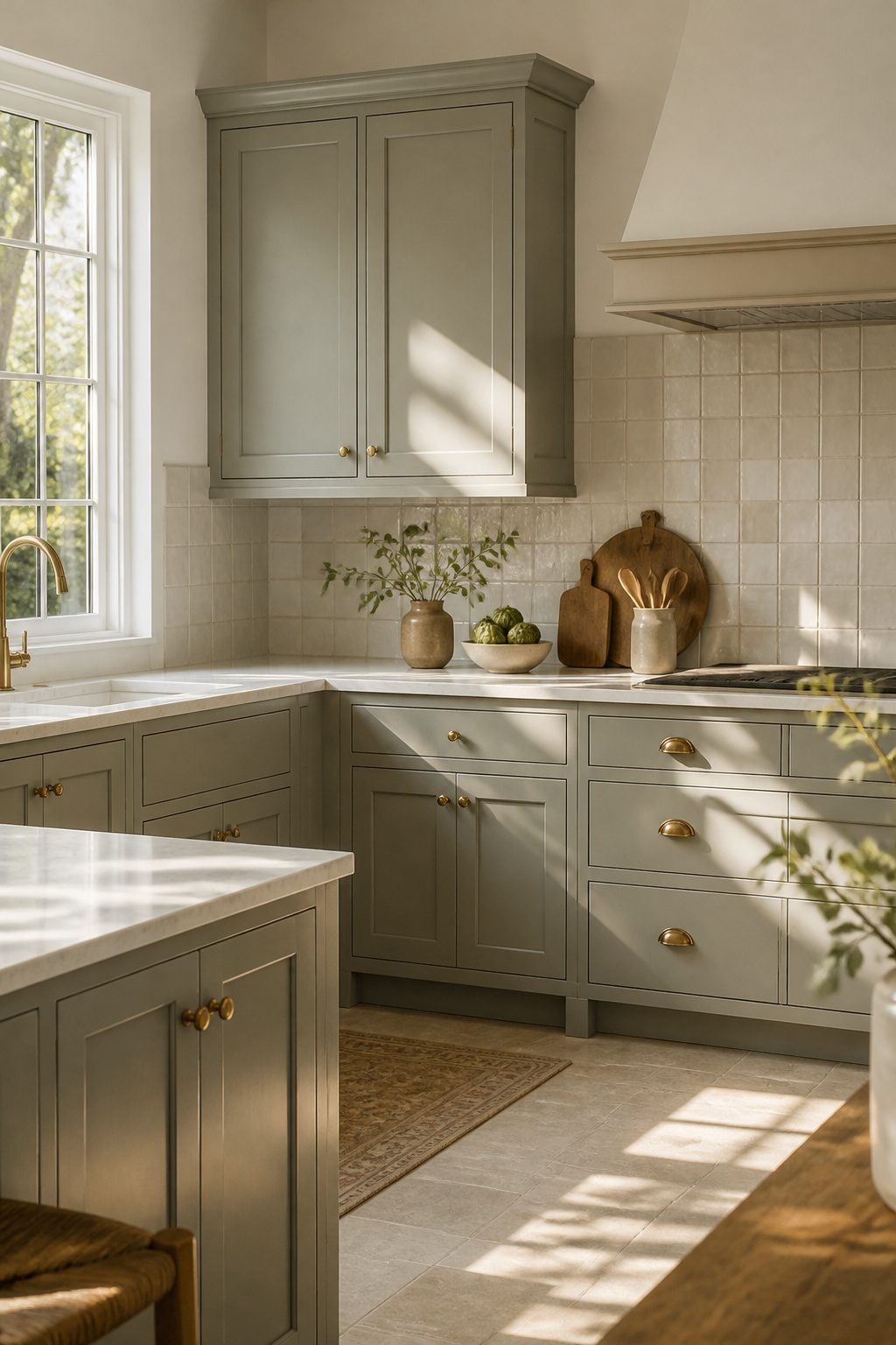
Lamp Room Gray carries blue and green in quiet enough measure that it reads as a sophisticated neutral first and a color second.
In morning light the green comes forward; by afternoon the blue takes over, so the same kitchen can feel like two rooms depending on the hour.
That shift makes it forgiving on imperfect walls but tricky if you are hoping for a static, stone-cold gray.
It suits both directions.
Traditional kitchens gain weight and history from it, especially with a wood pantry or unfitted cabinets. In modern kitchens the undertones keep flat-panel doors from feeling like office furniture; the color has too much life for that.
For the white that runs alongside it, Wimborne White is the cleaner choice. It has enough warmth to avoid a clinical contrast but stops short of clashing with Lamp Room Gray’s own temperature swings.
Simply White by Benjamin Moore sits in the same family if you need to match trim or a neighboring room on a tighter budget.
Save Shaded White for another cabinet altogether; its dirty cream and gray-green notes fight rather than harmonize here.
9. Treron
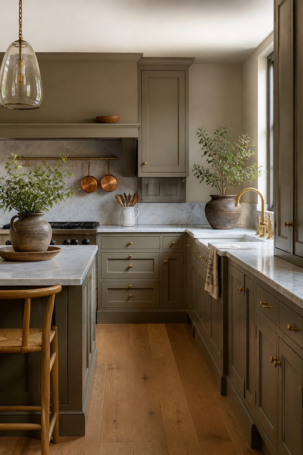
Treron sits in that useful space between neutral and green.
It is a subdued khaki that adds color without asking for attention, which makes it a safe choice for renters who want personality they will not tire of by next fall.
Designers often point to its calming effect in kitchens, where morning light and evening overhead pressure can both read harsh against brighter shades.
Treron absorbs that tension. It keeps cabinets quiet enough that hardware and countertops can lead.
I would pair it with Slipper Satin on walls or trim for a clean, lifted edge.
Old White works too, though it pushes warmer; use it when your floors run to honey oak or aged pine and you want the cabinet color to feel found rather than chosen.
The risk is pairing Treron with too many other earth tones and ending up with a kitchen that reads muddy in winter light. One cool element, a marble-look counter or a black faucet, corrects that balance.
10. Dimity
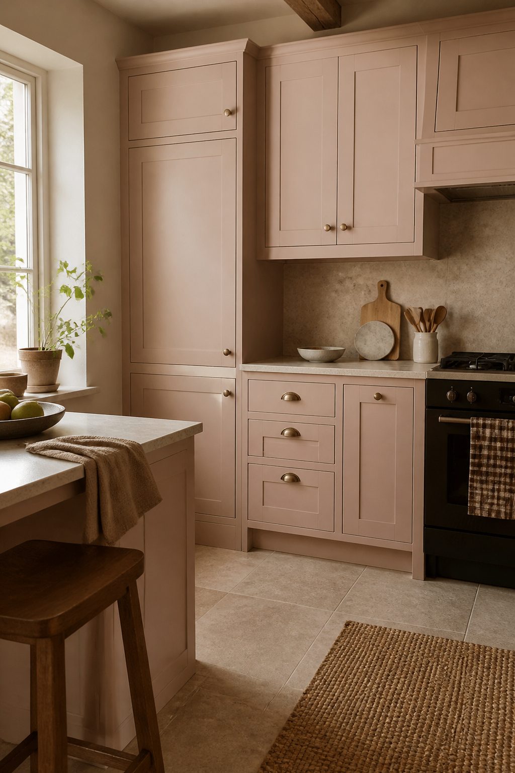
Dimity carries a warm, subtle pink undertone that reads as a soft blush rather than a true neutral white, and that underlying warmth is exactly what makes it work in kitchens with little natural light.
North-facing rooms or spaces blocked by neighboring houses tend to flatten cooler whites into something flat and institutional, but Dimity’s pink base reflects back enough warmth to keep the cabinets feeling alive.
The emotional quality sits closer to plaster than powder room. It feels lived-in, slightly sun-warmed, the kind of tone that makes a kitchen feel like it has been there longer than it has.
That is the appeal for renters and first-home owners who want character without committing to a bold color statement.
The risk is real, though. In rooms with strong southern exposure or under warm LED lighting, Dimity can tip from warm white into reading genuinely pink.
I would test it on a full cabinet face rather than a swatch, and I would check it at the hour you actually use the kitchen.
If your space already runs warm, this is probably not the shade to build around.
Pair it with Templeton Pink on an island or lower cabinets if you want to stay in the plaster family, or keep the perimeter in Dimity and let natural stone or oak bring the contrast.
11. Templeton Pink
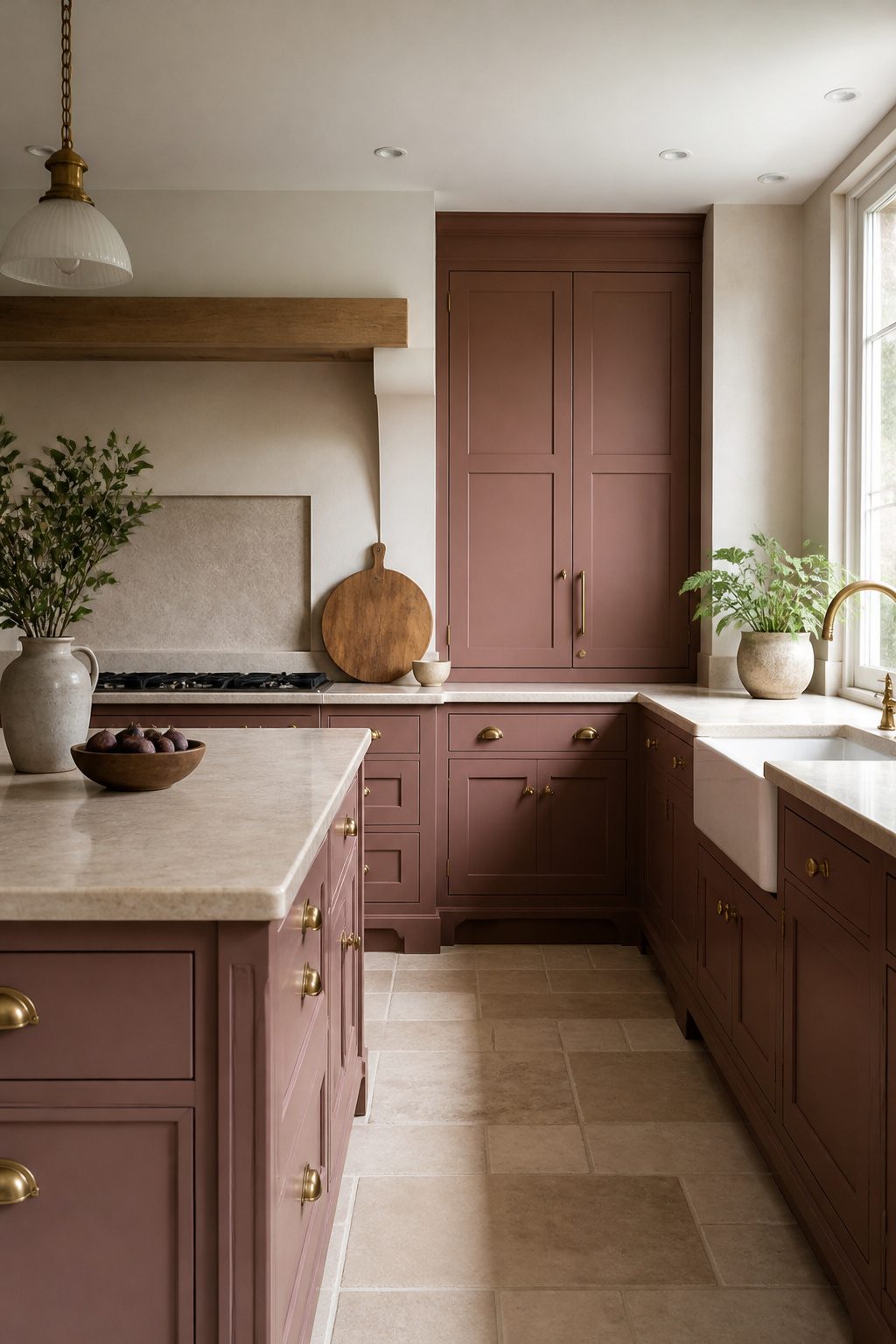
Templeton Pink carries enough intensity to read as a deliberate choice rather than a whispered accent.
Against Dimity’s softer blush, it gains real body, like plaster that has aged past its first pale coat into something with actual warmth and weight.
That extra saturation is what separates a background tint from a color that holds the room.
The line between accent and statement sits right where the kitchen’s light quality changes. In a poorly lit kitchen, Templeton Pink stays welcoming rather than demanding; the subdued light keeps it grounded in that earthy, plaster register.
Add strong natural light and it shifts toward something more assertive, almost leaning into pink rather than neutral. I would not use it on every cabinet in a bright, open kitchen unless I genuinely want a pink room.
For a balanced read, ground it with something that carries more gravity. Etruscan Red, that brick-baked tone with brown in its base, does the work without competing.
Use it sparingly, on a single island base or interior fittings, and Templeton Pink settles into its role as the main voice rather than running away with the conversation.
The combination works because both colors share that same dusty, mineral quality, neither clean nor candy-bright.
Styles that absorb it best draw on the same well: rustic English country, a renovated farmhouse with stone floors, anything where imperfection looks intentional rather than dated. In a sleek, high-gloss contemporary kitchen, Templeton Pink can feel like a costume.
12. Stone Blue
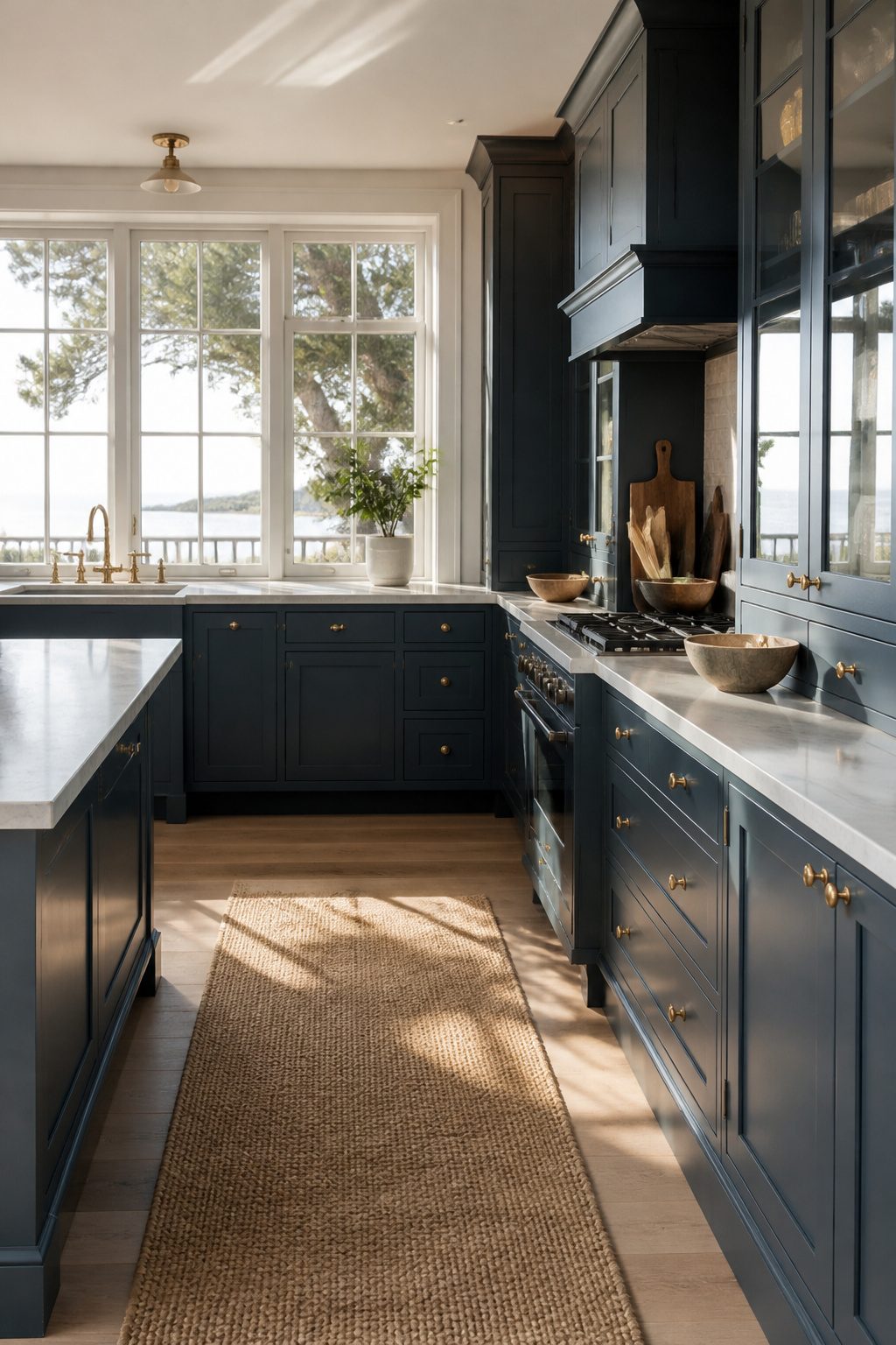
Stone Blue sits in the narrow space where gray turns into navy without ever committing to either. That restraint is what makes it useful: it brings color into a neutral kitchen without the brightness that reads as coastal or juvenile.
The passage calls it "uplifting" and "warming and cozy," which sounds contradictory for a blue until you see it in a room with warm light.
On cabinetry, it works best on freestanding pieces or the lower cabinets of a two-tone scheme, where it anchors the room without dominating. Full wall-to-wall use risks heaviness unless the kitchen gets strong natural light most of the day.
Pair it with Drop Cloth on the walls, a beige that carries enough depth to hold its own but stays quiet enough to let the cabinets lead.
For an accent, Hopper Head, a charcoal with slightly muted slate undertones, adds depth without the stark contrast of pure black. The three together build a scheme that feels considered rather than decorated.
Wood choice matters more here than with a true gray. Stone Blue can turn cold against pale or ashy finishes; mid-tone oak or walnut with visible grain warms it back toward that "cozy" promise.
Avoid bleached or heavily gray-washed woods, which push the whole palette toward institutional. Brass hardware, not nickel, completes the correction.
13. Drop Cloth
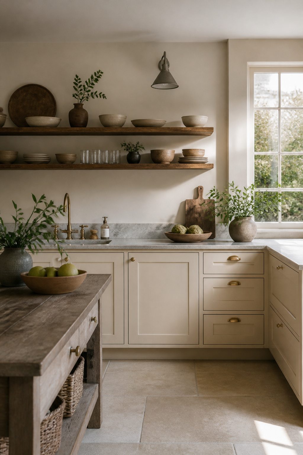
Drop Cloth sits in the narrow space between a true neutral and something warmer, a balanced beige that adds depth without tipping into the mid-tone range where kitchens start feeling closed in.
Patrick O’Donnell at Farrow and Ball describes it as "not dissimilar to Old White, but less green through it," which matters more than it sounds: that subtracted green keeps cabinets from reading institutional under fluorescent tubes.
In artificial light, especially the warm LEDs most renters install, the remaining yellow undertone comes forward just enough to keep the room from feeling flat.
This is the safe choice that still reads as intentional. It solves the problem of a north-facing kitchen or a rental with cheap cabinetry you cannot replace, because it neither fights the light nor disappears against white appliances.
Pair it with Stone Blue on a freestanding hutch or island base and you get the layered look without the risk of a bolder cabinet color dominating a small footprint.
That safety is also the limitation: it will not anchor a large open kitchen the way a deeper tone would, and in strong natural light it can wash toward plain off-white.
For a weekend project on a real budget, that predictability is usually worth more than drama.
14. Etruscan Red
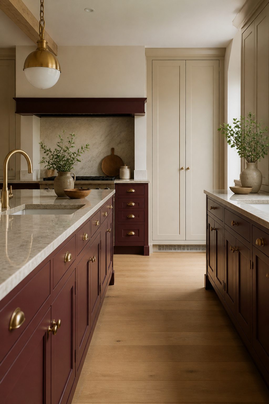
Etruscan Red carries enough depth to read as a near-burgundy rather than a true primary red, which is exactly what keeps it from shouting across the room.
I would use it only on a single bank of lower cabinets or a standalone pantry, never on uppers that sit at eye level where the color dominates your sightline.
The pigment leans so dark that it needs two balancing acts to contain it: pair it with warm brass hardware and a pale stone countertop, and keep adjacent walls in a flat white with no competing warmth.
Without that restraint, the red collapses the visual space and the kitchen starts to feel like a restaurant bar.
I have seen it work beautifully on an island base against pale oak flooring, but even there, the toe kick and any exposed sides had to stay in the stone or the white to give the eye somewhere to rest.
The risk with Etruscan Red is not that it reads too loud; it is that it reads too heavy, and the only fix is limiting where it lives.
How Light Changes These Colors
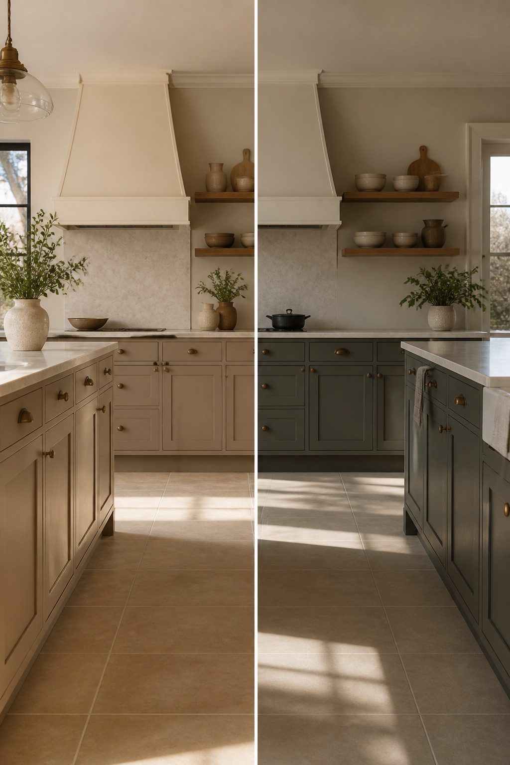
North-facing light stays cool and flat all day, so colors like London Clay that read warm and grounded in other rooms can turn slightly gray on cabinets there.
South light pours in warm and direct, which deepens brown undertones and can push the same shade toward amber by afternoon.
East and west exposures split the difference: morning light is cooler and bluer, evening light throws orange, and a kitchen that faces both will shift between the two.
That shift matters more on cabinets than on walls because cabinets sit at a different plane.
Light hits them at eye level and lower, where shadows pool and bounce light back up from countertops. A wall sample tells you almost nothing about how the color will read across a drawer front or inside a recessed panel.
Test on the cabinet plane itself, not the wall behind it, and watch the sample across a full day before you commit.
Artificial light changes the game again: LEDs with a high color-rendering index keep undertones truer than standard bulbs, which is worth the few extra dollars if you are already spending on Farrow and Ball paint.
Frequently Asked Questions
What are the best Farrow & Ball colors for a small kitchen?
Railings, London Clay, and Shaded White are the strongest choices for small kitchens. Railings recedes visually and makes walls feel farther away.
London Clay adds warmth and depth without heaviness, keeping the space intentional rather than busy. Shaded White brightens north-facing rooms that lack natural light, settling into a soft cream rather than turning cold or flat.
How do I choose a color for my kitchen cabinets?
Test your sample on an actual cabinet face, not the wall behind it, and watch it across a full day of light.
Morning and evening sun shift undertones dramatically, and cabinets sit at eye level where shadows pool differently than on vertical walls.
If your kitchen faces north, lean toward warm undertones; south-facing rooms can handle cooler or deeper shades without closing in.
What colors pair well with Farrow & Ball paints?
Natural stone, warm metals, and mid-tone woods are the most reliable partners. Honed marble and limestone echo the muted quality of colors like London Clay and Shaded White.
Unlacquered brass or aged bronze hardware draws out warmth without competing. Mid-tone oak or walnut with visible grain prevents cooler shades like Stone Blue from turning institutional.
What is the most popular color to paint kitchen cabinets?
White and soft off-whites remain the most widely chosen cabinet colors, but the trend has shifted toward complex neutrals that avoid clinical flatness.
Shades like Shaded White and Cornforth White carry enough gray or beige to stay interesting while still reading as clean. For darker kitchens, Railings and Down Pipe have gained ground as alternatives to pure black.
What are the top 5 kitchen cabinet colors?
The five most versatile Farrow & Ball cabinet colors are Shaded White for dim kitchens, London Clay for balanced warmth, Railings for depth without pure black, Pavilion Gray for stable neutrality across changing light, and Down Pipe for character where variability is welcome.
Each solves a different lighting problem rather than competing for the same kitchen.
Is Farrow and Ball paint good for kitchen cabinets?
The paint performs well on cabinets because its pigment density and matte finish respond to light in ways that keep colors alive across the day.
The cost is justified when you need that shift and complexity; for a flat color that behaves identically in every light, less expensive options suffice.
The real investment is in testing time: order sample pots and watch them for two full days before committing.




