
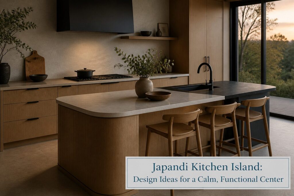
A Japandi kitchen island blends Japanese wabi-sabi restraint with Scandinavian warmth to create a calm, functional center for daily cooking and gathering. The style only holds, though, when the island carries natural materials honestly rather than styling them.
Curved stone or oak edges widen walkways and soften the room’s geometry better than any right angle, while light oak perimeter cabinetry paired with a single charcoal island keeps the palette grounded without tipping heavy.
Matte black or living-finish brass hardware, brushed stone countertops, and hidden appliance garages maintain the uncluttered surface this hybrid style demands.
Curved Islands That Soften the Room
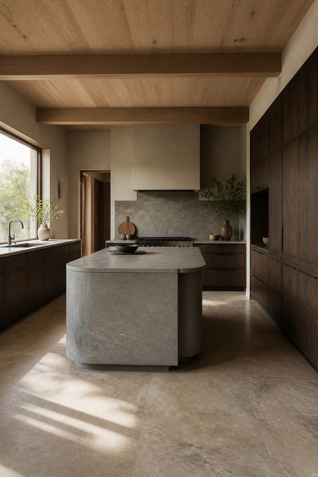
A curved kitchen island does two jobs that a rectangle struggles to pull off.
It widens the walkway around the work zone so traffic doesn’t bottleneck at the corners, and it turns the same footprint into a place where people actually want to stand. The rounded edge reads as an invitation, not a boundary.
Japandi design leans away from rigid geometry anyway.
The style builds calm through natural materials and lines that feel found rather than forced. A soft curve in stone or oak fits that aim better than a sharp corner ever could.
One direction pairs dark-stained oak cabinetry with a curved stone island for contrast; another keeps the palette quieter with matte gray quartzite against natural oak.
Both work. The darker pairing feels more grounded, the lighter one more open.
Three distinct takes on this show up in current kitchen design, all treating the curve as functional rather than merely decorative.
The detail that decides it for me: let the rounded edge extend slightly past the base for a waterfall effect.
It costs nothing extra in material but reads as intentional, and it keeps the silhouette clean from every angle you approach.
Light Oak Cabinetry With Darker Accents
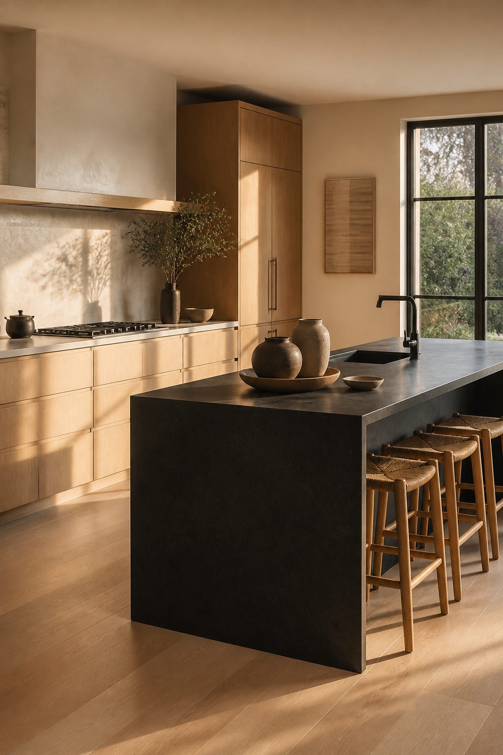
Light oak cabinetry forms the perimeter in almost every Japandi kitchen that pulls this off, with charcoal reserved for the island alone.
That single dark gesture gives the eye a place to land without stripping the room of the Scandinavian side’s openness.
The Japanese half of Japandi wants restraint and quiet drama; the Scandinavian half wants pale wood and air. Splitting them this way, perimeter versus center, satisfies both.
Four palettes circulating in current Japandi design all orbit this same pairing: light wood with white and sage, charcoal with taupe and light wood, or matte black with driftwood and cashmere.
The through-line is always light wood against something darker, and the island is where that darkness lives.
Keep it to one element, though. Two dark masses and the balance tips from grounded to heavy, and the calm you’re after becomes something closer to dim.
Natural Stone Countertops
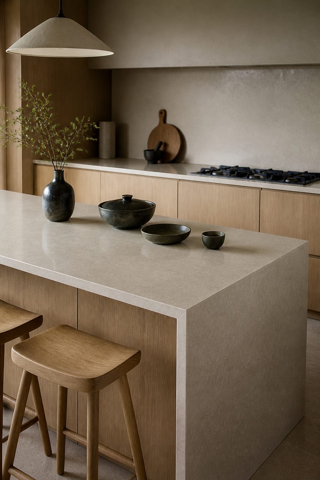
Natural stone anchors a Japandi kitchen island in a way laminate never quite manages.
The material carries weight, absorbs sound, and ages into itself rather than wearing out, which matters when the island is where morning coffee and evening prep both happen.
I look for honed finishes over polished; the softer surface catches light gently and hides the small scratches that come from actual cooking.
Quartz and porcelain both read as stone in this context, and designers often extend the same matte material up the backsplash wall to erase the visual break between counter and vertical surface.
That uninterrupted plane is what creates the calm Japandi pursues. Porcelain slabs like Laminam’s Pietra di Savoia Perla reproduce raw stone depth without resin content, which appeals if you’re sensitive to off-gassing.
The color range stays narrow: sandy beige, stone gray, the occasional charcoal.
No high-gloss, no veining that competes with the grain of oak or walnut cabinetry. Stone against wood is the tension that keeps the palette from going flat, but both materials need to stay muted for the effect to hold.
Open Shelving for Functional Display
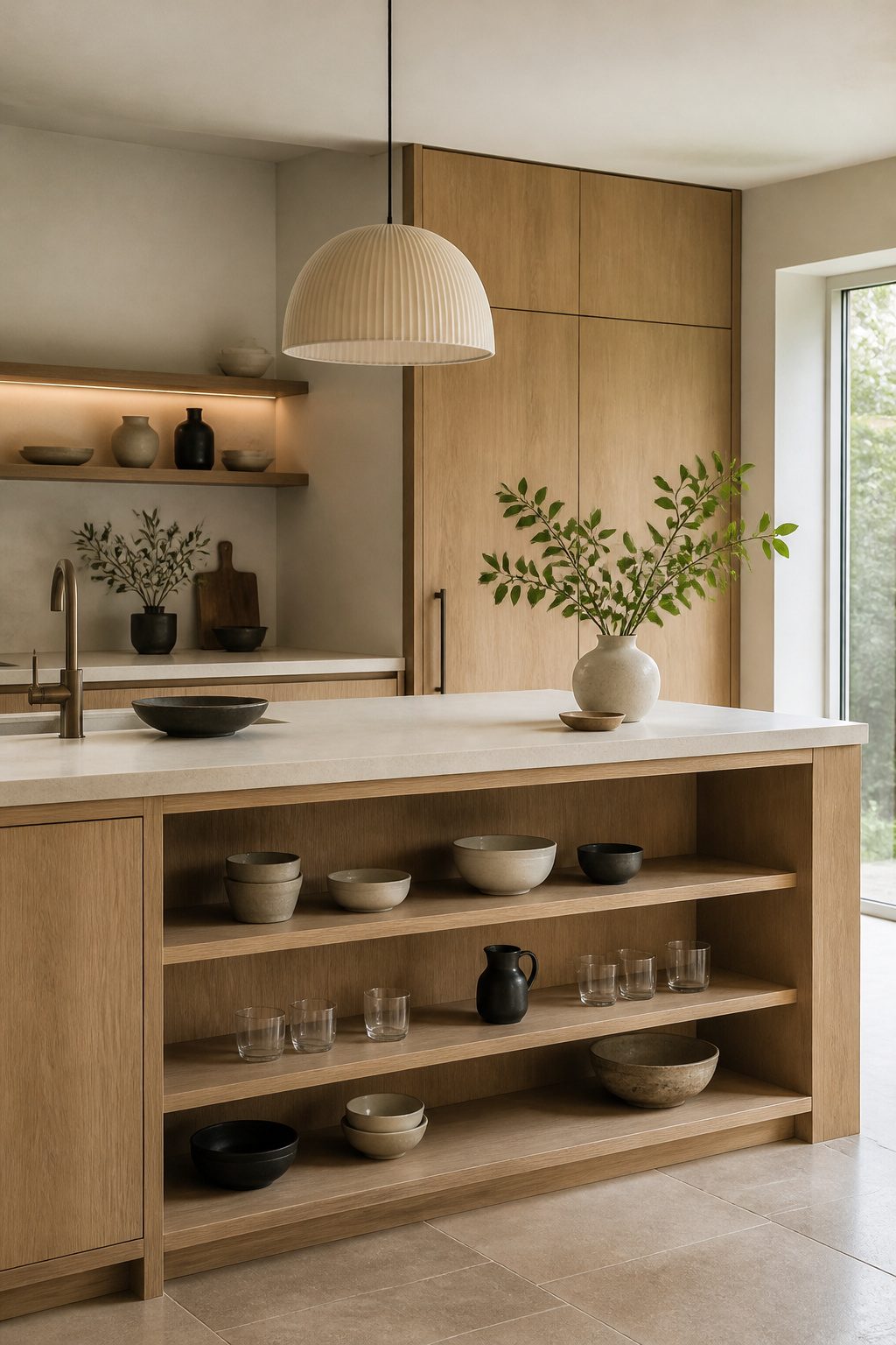
Open shelving integrated into the island body keeps the kitchen’s center feeling light rather than blocky.
Lower cabinets still hide the everyday clutter, but two or three rows of open wood shelves above eye level let you display chosen ceramics and glassware.
That split is what makes it work: practical concealment below, a careful selection of beautiful objects above.
The calm, uncluttered aesthetic central to Japandi depends on what you put there. Stick to monochrome or earthy dishware so the display reads as intentional, not busy.
Bowls that match keep the whole composition calm; a jumble of competing colors disrupts it fast. Ceramic and glass pieces work best because they catch light without adding visual weight.
I would skip open shelving entirely if the household runs on mismatched plastic storage and souvenir mugs. The look only holds when every visible item could plausibly sit in a minimalist gallery.
For renters or first-home owners building the collection, this is a slow finish: buy the island with the shelf cutout, add the display pieces as you find ones worth seeing.
Seamless Storage and Appliance Garages
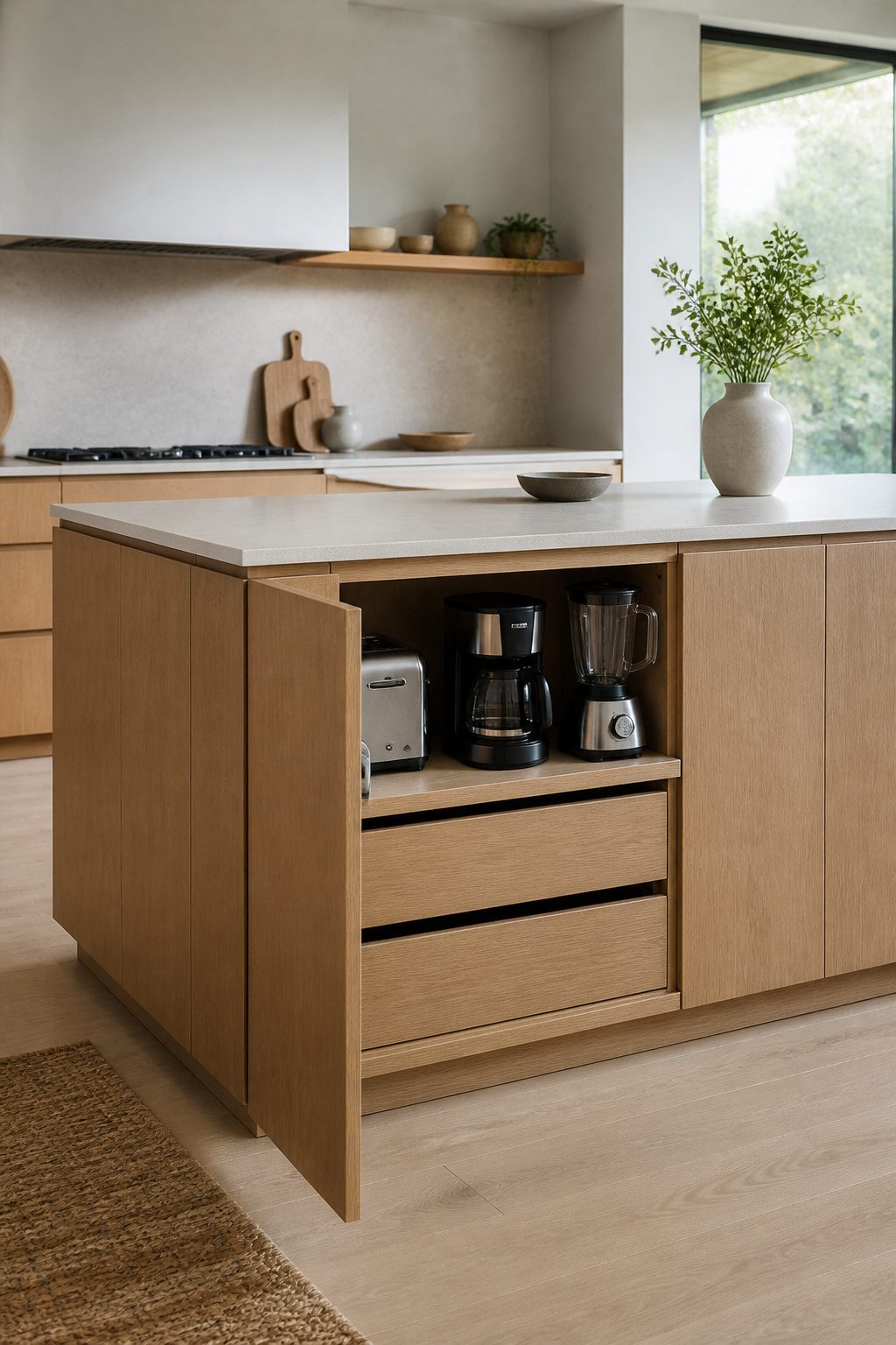
Pull-out systems and appliance garages are what keep a Japandi kitchen island from becoming a staging area for clutter.
A roll-up or sliding panel door hides the toaster, blender, and coffee maker while keeping them plugged in and ready. The counter stays visually empty, which is the point of the style.
Integrated storage is essential to Japandi’s calm, uncluttered aesthetic.
Panel-ready refrigerator fronts that match the cabinetry take the same idea further, letting large appliances fade into the architecture so materials and light hold focus instead. Handle-less push-to-open panels keep the surface uninterrupted.
Under-counter storage solutions from manufacturers like Thomasville Cabinetry keep utensils and small appliances out of sight without sacrificing function.
What you give up is ease of planning: you need outlets inside those garages and precise dimensions for the pull-outs during the design phase, not after the island is built.
Matte Black or Brushed Brass Hardware
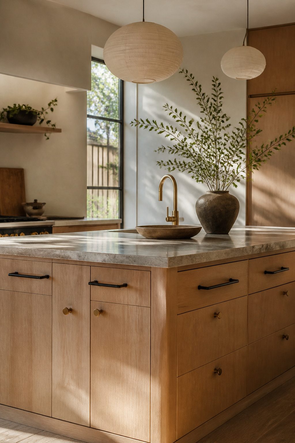
Hardware finishes are where I stop and look twice, because they are the last thing you install and the first thing your eye reads.
Matte black and brushed brass both earn their place on a Japandi kitchen island, but for different reasons and with different patience required down the road.
Matte black pulls and knobs add contrast without throwing light around the room. The finish stays flat against oak or stone, and it does not compete with the grain or the veining.
Aged brass, or the brushed version, brings in warmth that keeps the palette from reading too cold. Both finishes share the same restraint: no high shine, no ornamental scrollwork, just a clean bar or a rounded tab.
The aging is where the two split. Matte black holds its surface unless the coating gets chipped; then you see metal underneath, and touch-up is nearly impossible.
Brushed brass develops a living finish. The high-touch spots polish brighter over years, the recesses stay darker, and the hardware starts to look like it belongs to the house rather than the catalog.
I lean toward brass for an island that sees daily use, because the wear becomes character instead of damage.
Black wins if you want the look to stay identical for a decade, or if your lighting scheme already runs warm and you need the visual coolness to balance it.
Mixing the two is a move I have seen work: matte black for the drawer runs, brushed brass for the appliance pulls, so the eye travels without settling on either one.
The shapes have to stay identical. Two different finishes in the same profile read as intentional; two different profiles read as a mistake you are living with.
What Japandi Kitchen Island Means
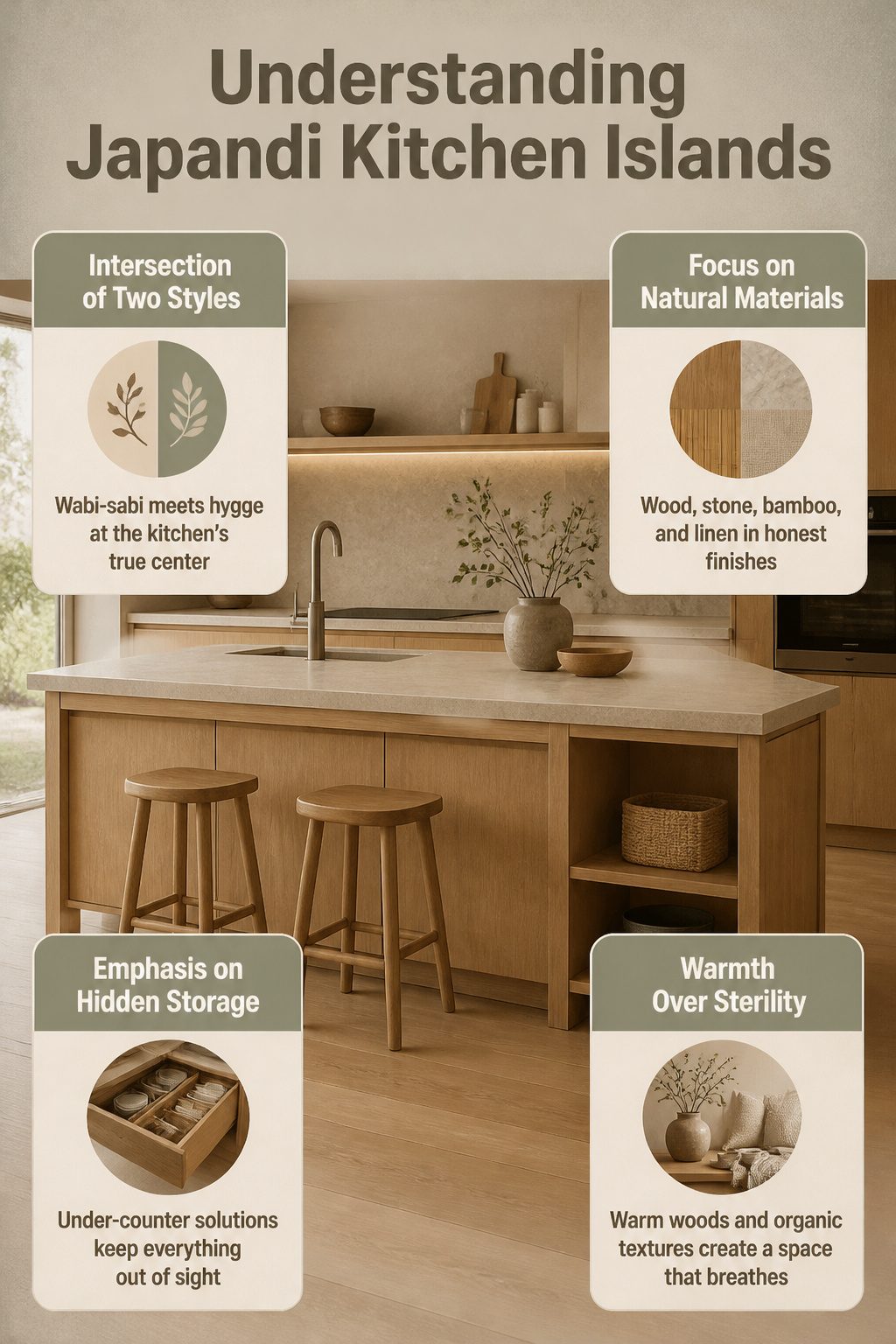
A Japandi kitchen island sits at the intersection of two design philosophies that value restraint over decoration.
Japanese wabi-sabi brings acceptance of imperfection and natural aging; Scandinavian hygge contributes warmth through texture and light. The island becomes the physical center where these ideas meet.
The defining traits are clean lines, natural materials, and functional design. Slab or minimalist shaker cabinetry keeps visual noise low.
Wood, stone, bamboo, and linen appear in honest finishes rather than high gloss. Neutral palettes run to soft whites, muted grays, beiges, and natural wood tones rather than stark monochrome.
Storage must be hidden to maintain the calm, uncluttered surface that makes daily cooking feel peaceful rather than chaotic.
Under-counter solutions keep utensils and small appliances out of sight. Built-in appliances and large, continuous surfaces contribute to coherence.
Every piece serves a purpose and looks good doing it. The island is workspace, gathering place, and visual anchor.
Unlike pure minimalism that can feel sterile, Japandi layers warmth through honey-toned wood and organic textures. The result breathes, stays uncluttered, and never feels cold or empty.
Wood Against Stone, Straight Against Curved
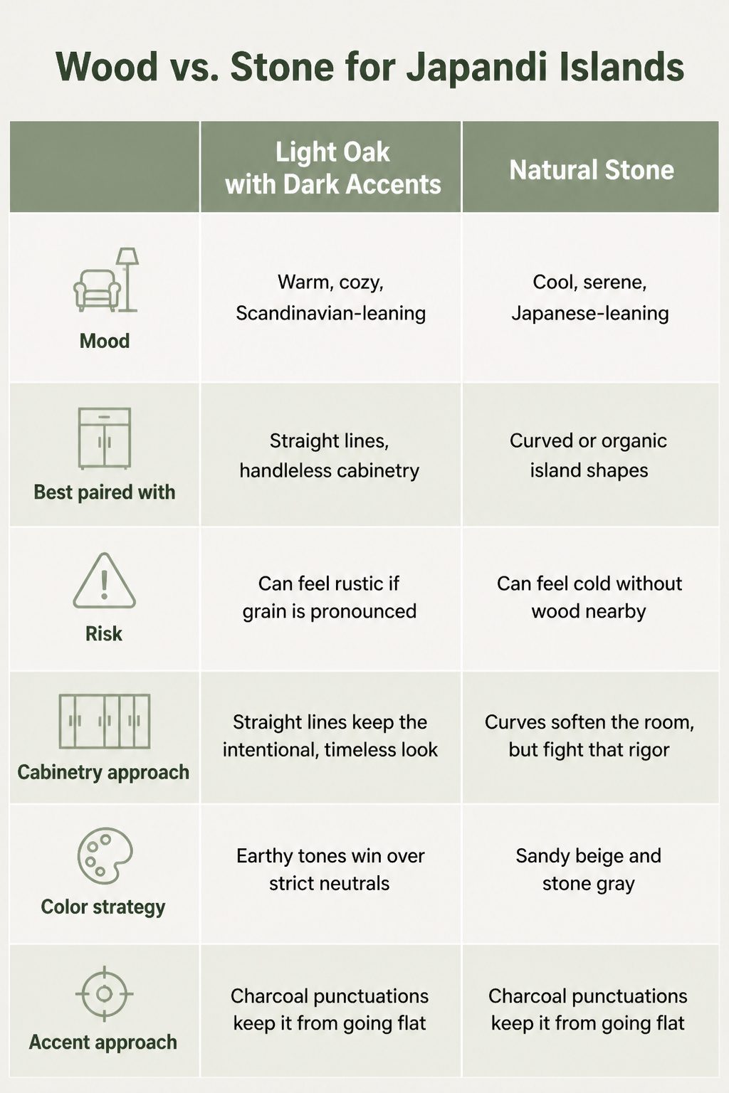
Light oak and natural stone each set a different temperature for a Japandi kitchen island.
Oak reads warm and Scandinavian; stone reads cooler and more Japanese. Dark accents on that oak, like the black faucets and pendant lighting in the Nordiska Kök build, add depth without breaking the calm.
The Silestone Lagoon quartz composite countertop in subtle gray plays between the two, giving clarity against wood while staying neutral enough to let either side lead.
| Light oak with dark accents | Natural stone | |
|---|---|---|
| Mood | Warm, cozy, Scandinavian-leaning | Cool, serene, Japanese-leaning |
| Best paired with | Straight lines, handleless cabinetry | Curved or organic island shapes |
| Risk | Can feel rustic if grain is too pronounced | Can feel cold without wood somewhere nearby |
Straight lines keep the intentional, timeless look that Japandi cabinetry demands, floor to ceiling with solid fronts. Curves soften the room, but they fight that rigor unless the material itself is soft, too.
A curved island in stone works because the material carries the warmth the shape lacks; a curved oak island risks reading farmhouse instead of Japandi.
Earthy tones win over strict neutrals if the kitchen opens to living space and you want the island to anchor rather than float. Sandy beige and stone gray let the island settle in; charcoal punctuations keep it from going flat.
Warm Lighting From Natural Materials
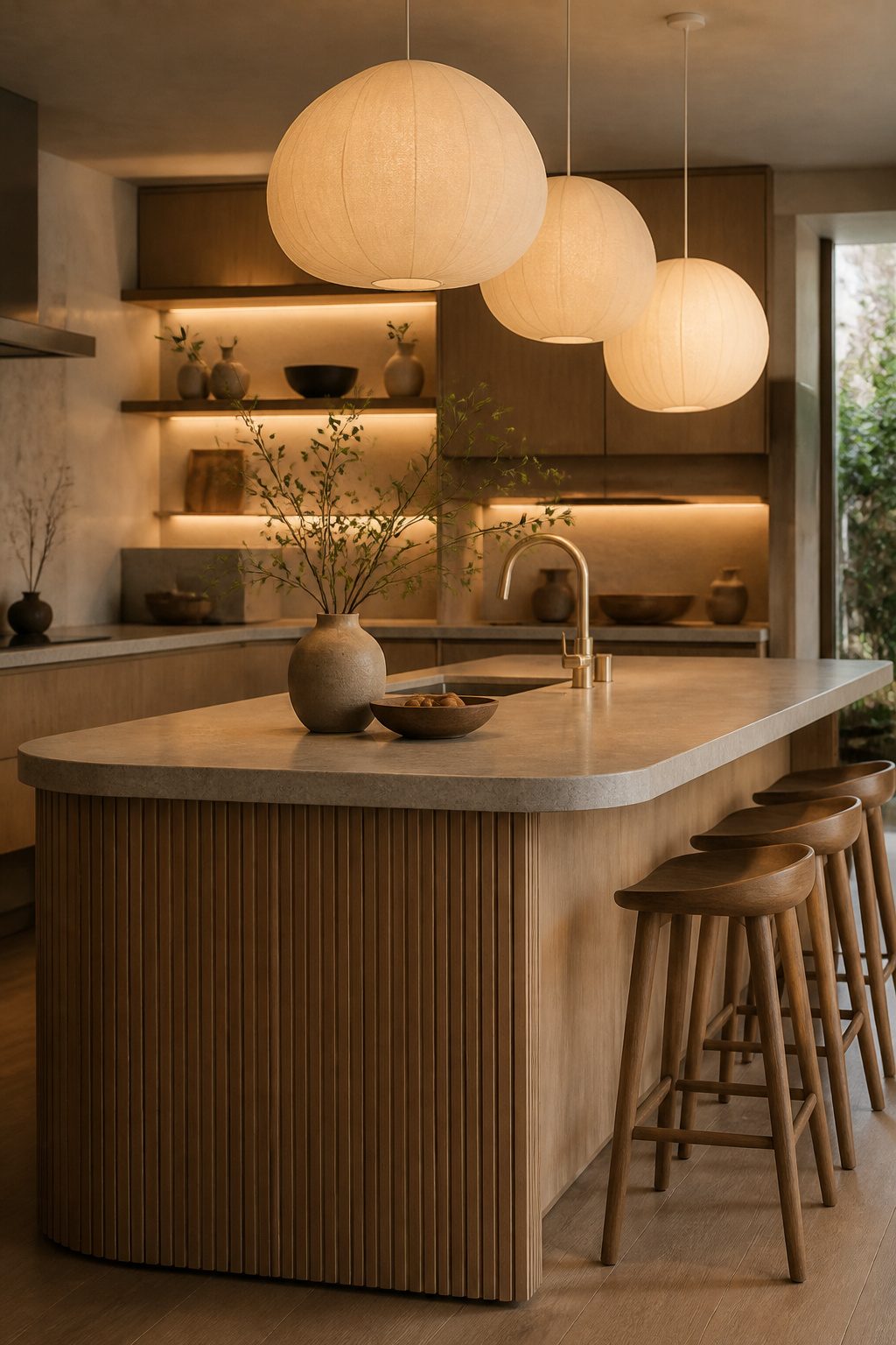
Pendant lights above the island carry as much weight as the cabinetry beneath them.
Paper or rice-paper pendants cast a warm, diffused glow that softens overhead light without turning harsh, and their sculptural shape adds the textural interest Japandi kitchens need.
I hang them in odd numbers at varying heights so the cluster reads intentional, not accidental.
Behind open shelving, recessed LED strips at 2700K with dimmers create ambient light that stays hidden while highlighting ceramics or glassware. The effect calms evening cooking and gives the island real depth.
Material choice in lighting matters because it is the last thing people notice and the first thing they feel.
Brushed brass or matte black hardware on a pendant ties back to cabinet pulls; paper or linen shades echo the natural materials in the rest of the room.
Skip the fixture with a plastic shade or chrome finish, even if the shape is right. The glow changes, and the whole island reads cheaper for it.
Warm light turns the island from a work surface into the place people actually gather. Get the temperature wrong and you have a cafeteria; get it right and the kitchen feels finished before the chairs are even pulled out.
Panel-Ready Appliances and Flush Cooktops
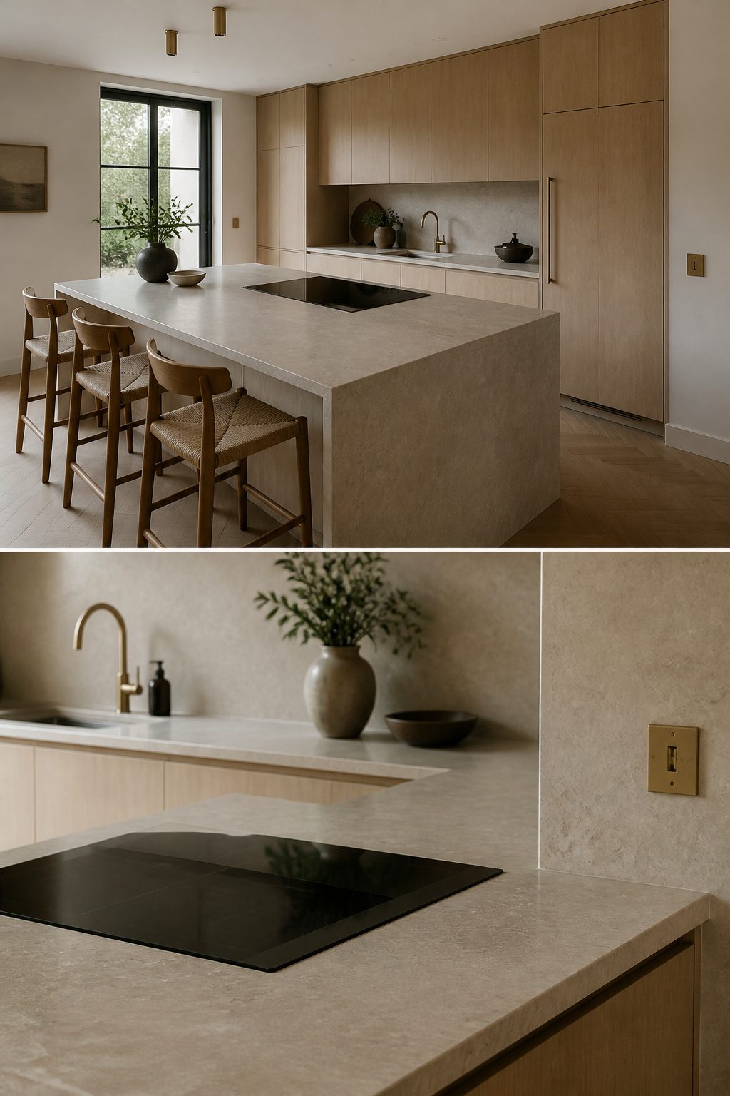
Panel-ready refrigerators let you cover the door with a cabinet-matching panel so the appliance fades into the wall.
In a Japandi kitchen island run, that continuity matters. The refrigerator stops reading as a bulky interruption and becomes part of the architecture, which keeps the sightlines calm.
Flush induction cooktops push the same idea further. The surface sits level with the counter, so when it is off you have one uninterrupted plane.
No raised grates or edges break the line, and wiping the counter stays simple. I would run black induction against pale counters for a quiet contrast that does not fight the minimal mood.
What you pay is money and time in planning.
Panel-ready units need precise panel sizing and often handle-less push-to-open hardware to really disappear. Flush cooktops demand counter fabrication that is accurate to the millimeter.
Neither is a weekend retrofit for most budgets. If I had to choose one, I would put the money into the cooktop first.
The island is where people gather, and a surface that reads as plain stone when idle does more for the Japandi feel than a hidden refrigerator across the room.
Frequently Asked Questions
What materials are commonly used in Japandi kitchens?
Light and mid-toned woods like oak and walnut, natural stone such as quartzite or porcelain with matte finishes, and matte metal hardware in black or brushed brass.
The style avoids high-gloss surfaces in favor of honest, tactile finishes that age naturally. Stone countertops often extend up the backsplash wall to create an uninterrupted, calm plane.
How can I incorporate Japandi elements into my kitchen?
Start with handleless, minimalist cabinetry in light oak with solid fronts from floor to ceiling. Choose a neutral palette of sandy beige, stone gray, and soft white, then layer in darker charcoal tones on the island alone.
Add natural stone countertops with honed finishes, paper or linen pendant lights, and hidden storage to keep surfaces visually empty.
Is Japandi style good for small kitchens?
Yes, the minimalist approach and emphasis on hidden storage make it especially suited to compact spaces.
Handleless cabinetry, panel-ready appliances, and appliance garages keep visual clutter off surfaces. The pale wood tones and unbroken planes of stone create openness without sacrificing the warmth that keeps small rooms from feeling sterile.




