
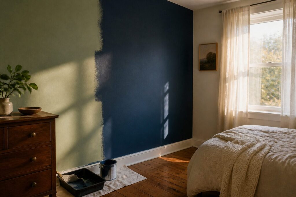
The right wall color for a small bedroom depends on whether you want the room to feel airier, deeper, or calmer; each goal points to a different part of the spectrum, and the wrong choice in a tight space has nowhere to hide.
A single white with a strong yellow undertone will turn a north-facing room muddy by afternoon, which is why testing on two walls for a full day beats buying the gallon blind.
Paint stores sell peel-and-stick samples for exactly this, and that hour of testing saves a weekend of repainting.
1. Light Colors for an Airy Feel
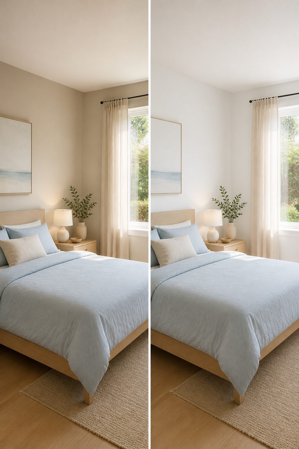
The palest colors do the most work in a small bedroom because they bounce light instead of trapping it.
A white like Pristine OC-75 reflects natural light across the walls and into corners, which matters more in tight quarters where shadows pool and make the room feel boxed in.
Pastels work the same way; Cloud Nine 2141-60 has just enough pigment to absorb shadow without turning heavy, so the walls read as dimensional rather than flat.
I would skip any white with a strong yellow undertone in a north-facing room. It turns dim by afternoon and the whole space goes muddy.
The fix costs nothing extra: sample the actual shade on two walls, one that gets morning light and one that does not, then live with it for a full day before buying the gallon.
Paint stores sell peel-and-stick samples for exactly this, and the hour spent testing beats a weekend spent repainting.
Recommended Products

30 PASTEL COLORS : Shuttle Art pastel colors acrylic paint set come with 30 soft pastel colors acrylic paint in 60 ml/2 oz bottles, and 10 paint brushes for painting and crafting. Pastel tones are perfect for creating lovely and dreamy art projects, and widely applied on warm and romantic backgrounds

VERSATILE PAINT - These artist-quality acrylic paints are rich and creamy and are perfect for basecoating, stenciling, and more. This color comes in a convenient 2 oz size

This DecoArt Americana Acrylics Paint Set includes 9 of our most popular, richly pigmented colors in 2 fl oz bottles. Perfect for beginners, artists, and crafters looking for the best acrylic paint for crafts, canvas, or DIY projects.
2. Bold Colors for Depth
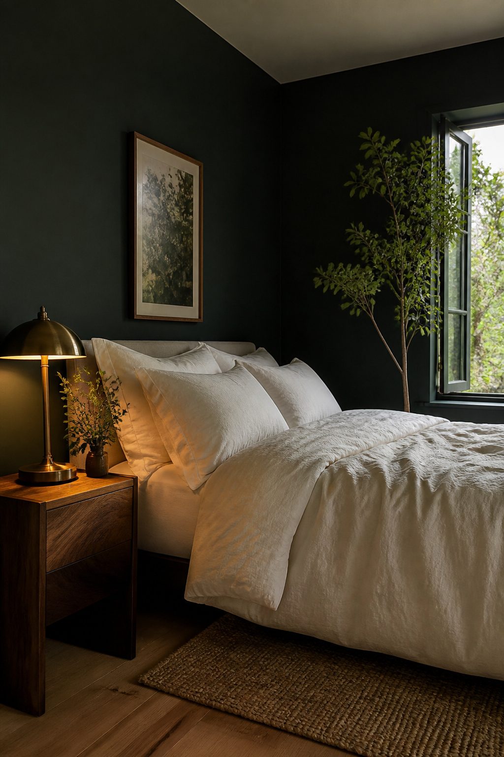
Jewel tones and dark hues do not close in a small bedroom the way intuition suggests.
Hunter Green 2041-10 reads almost black in low light but keeps enough green to feel alive, and the saturation makes the wall plane drop back visually, which stretches the room’s perceived depth.
Farrow & Ball’s Card Room Green works the same trick with a smokier, more muted cast; designer Gillian Segal has used it to "dunk" entire rooms, including trim and doors, for what she calls an extra luxe feel.
I would stop short of that in a bedroom unless the ceiling is at least eight feet, because even a receding wall needs somewhere for the eye to rest.
The balance comes from bedding in warm white or a pale natural linen, and from keeping any wood tones light: oak rather than walnut, raw brass rather than antique. Without that contrast, the room shifts from cocoon to cave.
Recommended Products

【Trendy Green Room Decor Set】Refresh your space with 9 coordinated green posters featuring leopard prints, cheetah artwork, cherries, playing cards, a retro telephone and Lucky 8 ball designs. This bold collection is perfect for green room decor, green room decor aesthetic, emerald green room decor, green pictures wall decor and stylish trendy wall art.

Package Include: you will receive 4 pieces of green bible verses wall decor in different styles, The quantity and style are sufficient to meet your daily home decoration needs, and can also be given as gifts to your family, relatives, and friends

Fashionable Leopard Wall Art: The animal posters are 12x16 inches in size and include a built-in wooden frame. You can choose your favorite space to display them
3. Neutrals for a Calm Backdrop
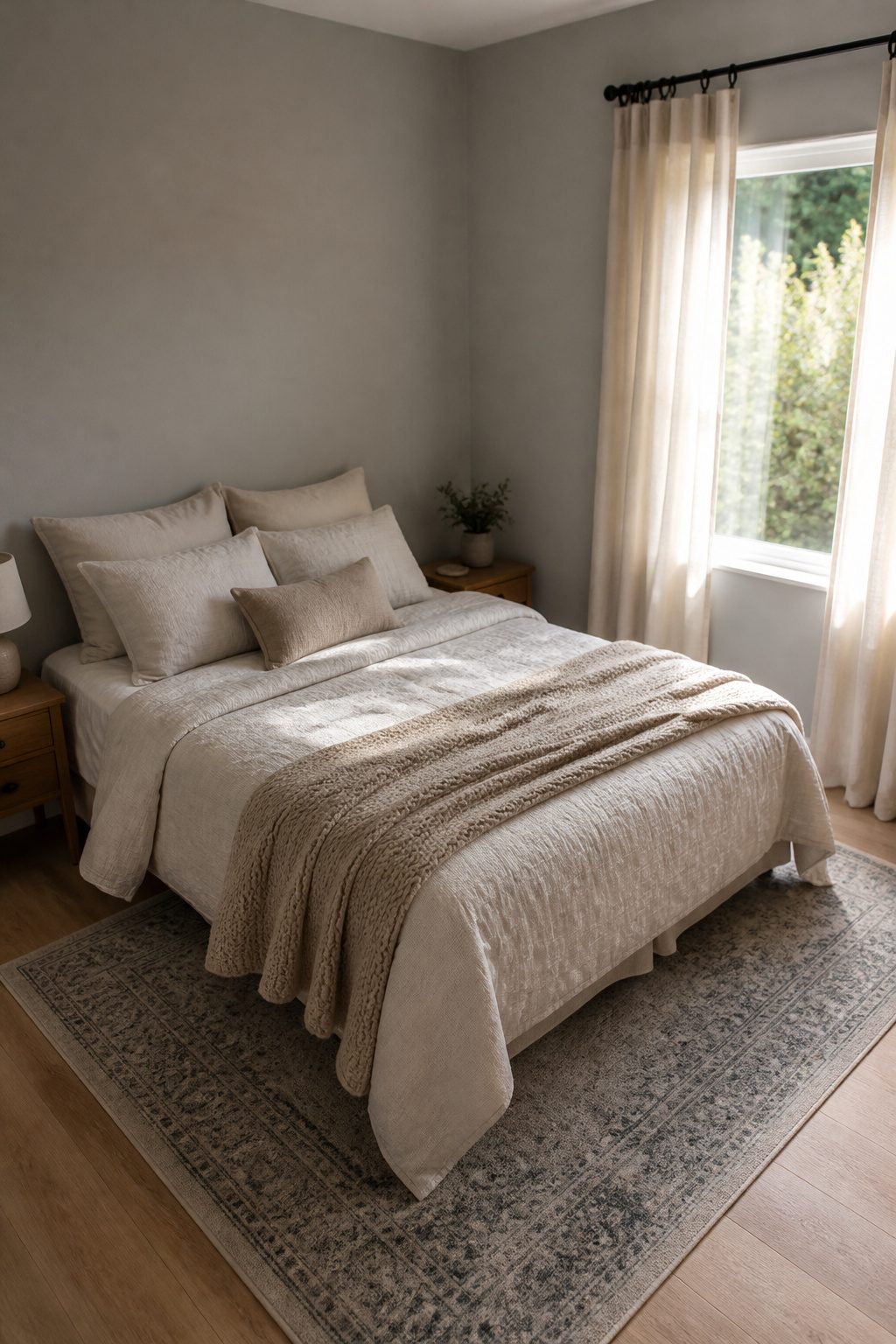
Light greys and beiges earn their place in small bedrooms because they shift with whatever you already own.
A wall that reads as a warm backdrop in the morning can settle the same room by evening without demanding new bedding or art. That versatility matters when square footage limits how many directions you can take the space.
Fog is the grey I would start with. It is light enough to stay calming in tight quarters but carries enough pigment to look intentional rather than like primer left unfinished.
It pairs with patterned bedspreads or bold curtains without competing, which is the real test in a room where one textile might be all the pattern you get.
For warmth, Birch Beige sits in the same useful middle ground.
Not so pale that it disappears, not so deep that it closes in. Its hue reads relaxing rather than stark, and it handles both subtle and colorful decor without turning muddy against them.
A versatile backdrop, this beige reads slightly pink when the sunlight hits it.
That shift with the light is what makes a neutral worth painting. A color that changes through the day keeps a small room from feeling static, and the calm base lets you swap accents seasonally without repainting.
I would skip anything darker than mid-tone here; I want a wall that holds the room together while the things in front of it do the talking.
Recommended Products

Mountain Forest Fog Wall Art Size:Each canvas panel is 20"x40" (50 cm x 100 cm);Mountain forest fog wall art decor provides aesthetic decoration for your room

PROFESSIONALLY RECYCLED PAINTS: Lower cost alternative to virgin paint, without sacrificing quality. One gallon of Recolor Interior Finish, Cloud covers about 450 square feet. This is interior, latex paint with a finish that is between flat and eggshell—produced in the USA!

PAINT + PRIMER IN ONE: Evolve’s paint-and-primer formula helps you get great coverage from the start, sealing your surface and reducing the extra work of multiple coats.
4. Accent Walls for a Focal Point
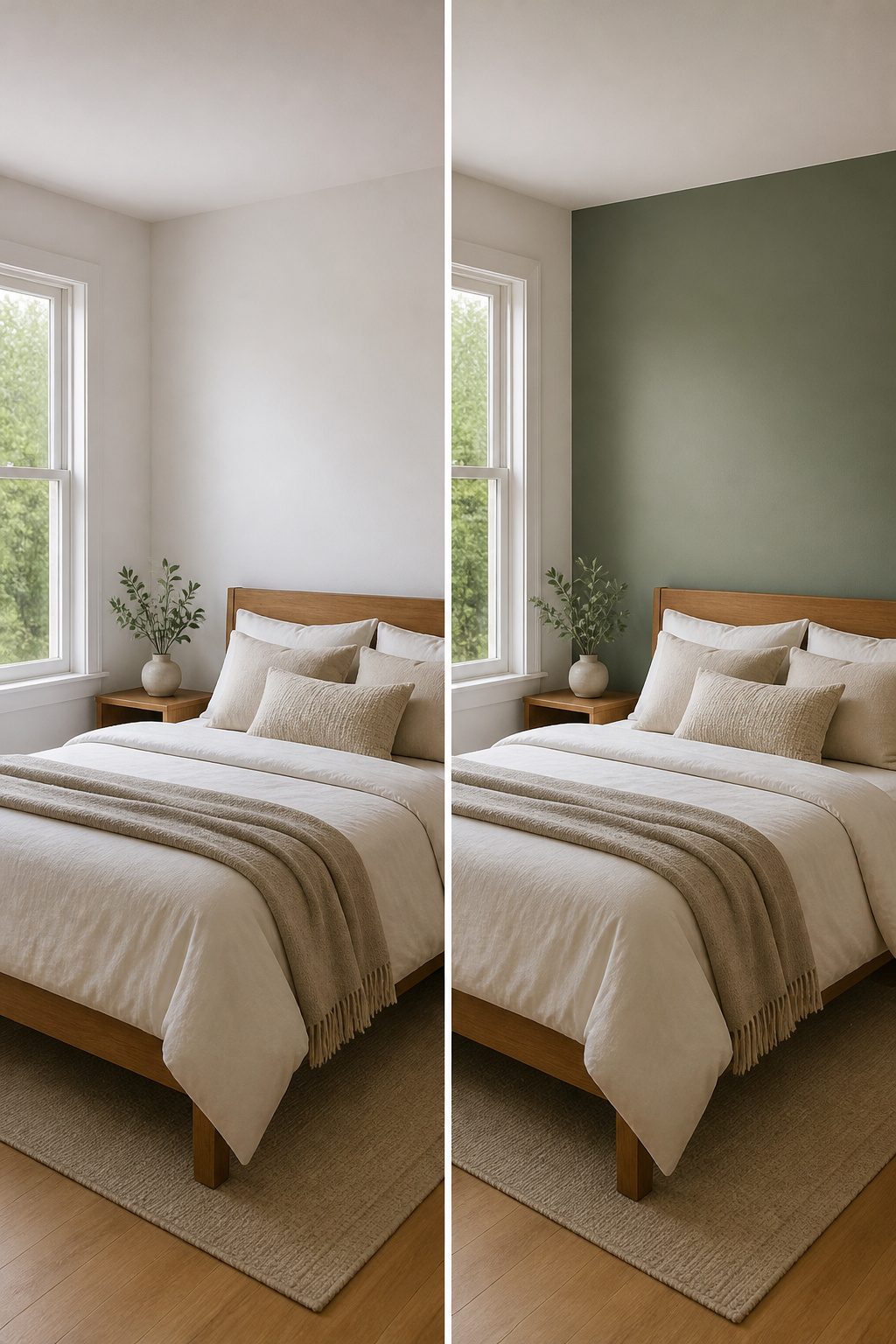
A single contrasting wall pulls the eye to a bed, a window, or any feature worth noticing without boxing the room in. Placement matters: paint the wall you face on entry, and the depth recedes rather than closes.
An accent wall can visually expand a small bedroom when it sits opposite the door or behind the headboard, not on the side walls where it would chop the space short.
Santa Barbara Green 2037-60 works for this. It is light enough to read as color rather than shadow, so you get the focal point without the cave effect that a navy or charcoal risks.
I would pair it with warm white on the remaining three walls and keep the ceiling the same white. The green wall advances just enough to matter, then stops.
Darker accent colors do absorb light and blur edges, which adds depth, but in a room under 120 square feet I find that effect works only if you already get strong natural light. Otherwise the wall goes flat and heavy.
Santa Barbara Green sidesteps that call entirely. It is the safer bet for a renter who wants one weekend project with one gallon of paint and no regret.
5. Monochromatic Schemes for Seamless Space
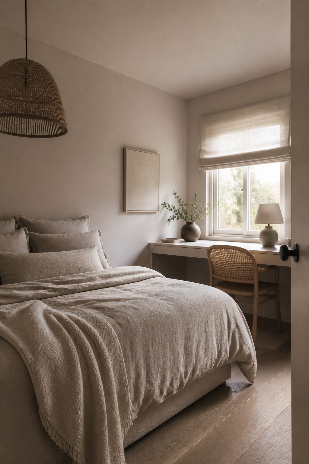
A monochromatic scheme works in a small bedroom because the eye travels without hitting a hard stop at the trim or ceiling. You are not picking a new color; you are stretching the one you already chose across every surface.
Farrow & Ball’s Cromarty, for instance, reads as a fresh pastel with enough dirty undertone to keep it from going saccharine; wrapped from wall to ceiling and over the millwork, it erases the edges that would otherwise chop the room into pieces.
Texture carries the interest here, not contrast. Linen, velvet, or a soft knit against the same tone gives the room dimension without breaking the plane.
Sherwin-Williams suggests cozy grays like Downy or warm beiges like Touch of Sand for this approach, and I would follow that lead over anything with a sharp yellow undertone that fights itself at every corner.
What you gain is volume. Where a two-tone room makes you notice the wall height, a single color lets you read the whole cube of space at once.
I would skip the picture rail or any accent line that reintroduces a horizon; I want to be less aware of where the walls start and stop, not more.
6. Color Combinations That Work
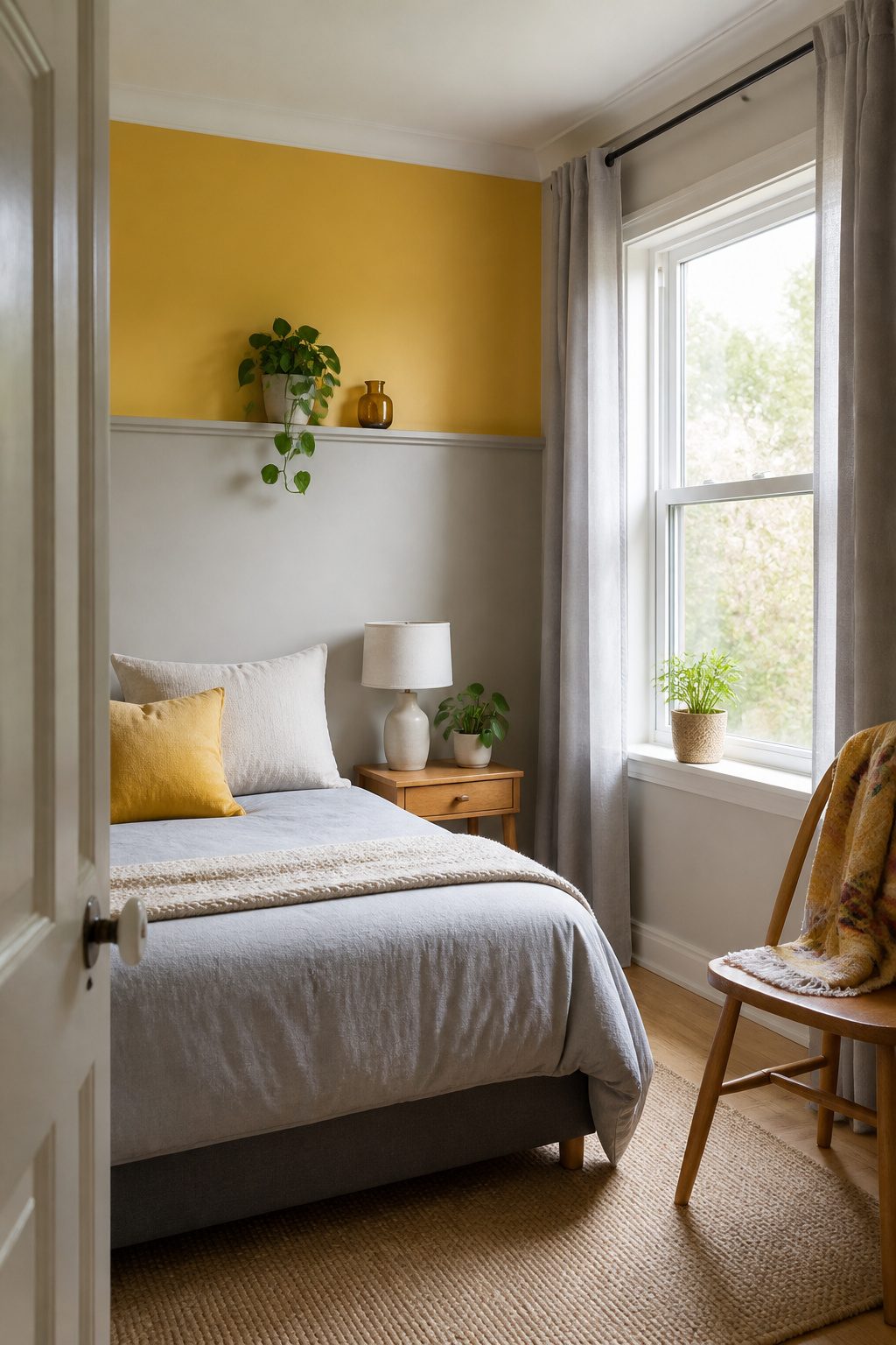
Yellow and grey is the pairing I would start with if the room gets decent morning light. The grey keeps the yellow from reading as nursery-bright, and the yellow stops the grey from going flat and office-like.
Sources point to Buttercup as a specific yellow that hits the mark: cheerful without overpowering, warm enough to feel like a retreat after a rough day.
I would keep the yellow on one wall or below a chair rail, let grey carry the rest, and add zero orange accessories even though they technically complement. Two warm colors in a small room fight each other.
Blue and green tones work the opposite way, and this is where I send anyone who needs the room to feel calmer than it is.
Clear Sky Blue captures that ocean-and-sky association that actually registers as soothing, not just conventionally so.
Pair it with a green that carries some grey in it, something like Green 02, and the combination reads as outside brought in without the clutter of actual plants.
The blue-green pairing suits renters who cannot change the flooring; it visually pushes walls apart and lets ugly carpet fade from notice.
Warm tones with metallic accents demand restraint to avoid flashiness. Peach or soft terracotta on the walls, one brass lamp or thin-framed mirror, and nothing else shiny.
The metallic is punctuation, not prose. Cooler tones need no metallic help; serenity is why you chose them, and extra reflection just breaks the spell.
7. Textured Paints for Added Interest
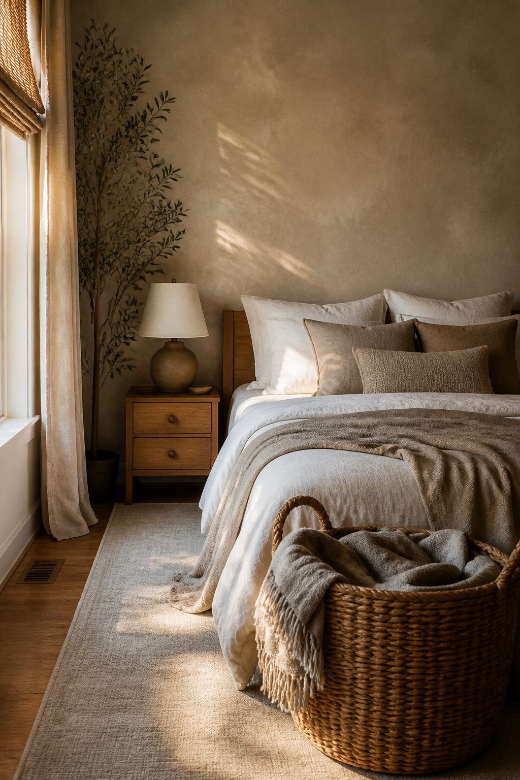
Roman clay is the textured finish I would actually use if I wanted a small bedroom to feel finished without hanging a single thing on the wall.
The plaster-like surface catches light unevenly, so the wall reads as one quiet color but never as flat paint.
Portola Paints makes the version I see referenced most; their Burrow is a warm neutral that layers like old plaster, and Charleston is the lighter tone that still carries enough warmth to keep a small room from feeling sterile.
Application matters more than the color here.
Roman clay goes on in thin layers with a trowel or spatula, and the hand marks stay visible. That variation is exactly why you are doing this.
In a small bedroom, a fully smooth wall can feel like the inside of a box; the slight undulation of clay plaster gives the eye somewhere to rest without adding pattern or clutter.
You give up something practical.
This is not a Saturday project you can roll on and sleep beside that night. The surface needs time to cure between coats, and touch-ups later are nearly impossible because the texture is hand-applied.
I would skip it in a rental or any room where I might need to patch nail holes. But for a permanent small bedroom where I wanted calm depth, I would pick Roman clay over flat paint every time.
How I Test Colors in a Small Room
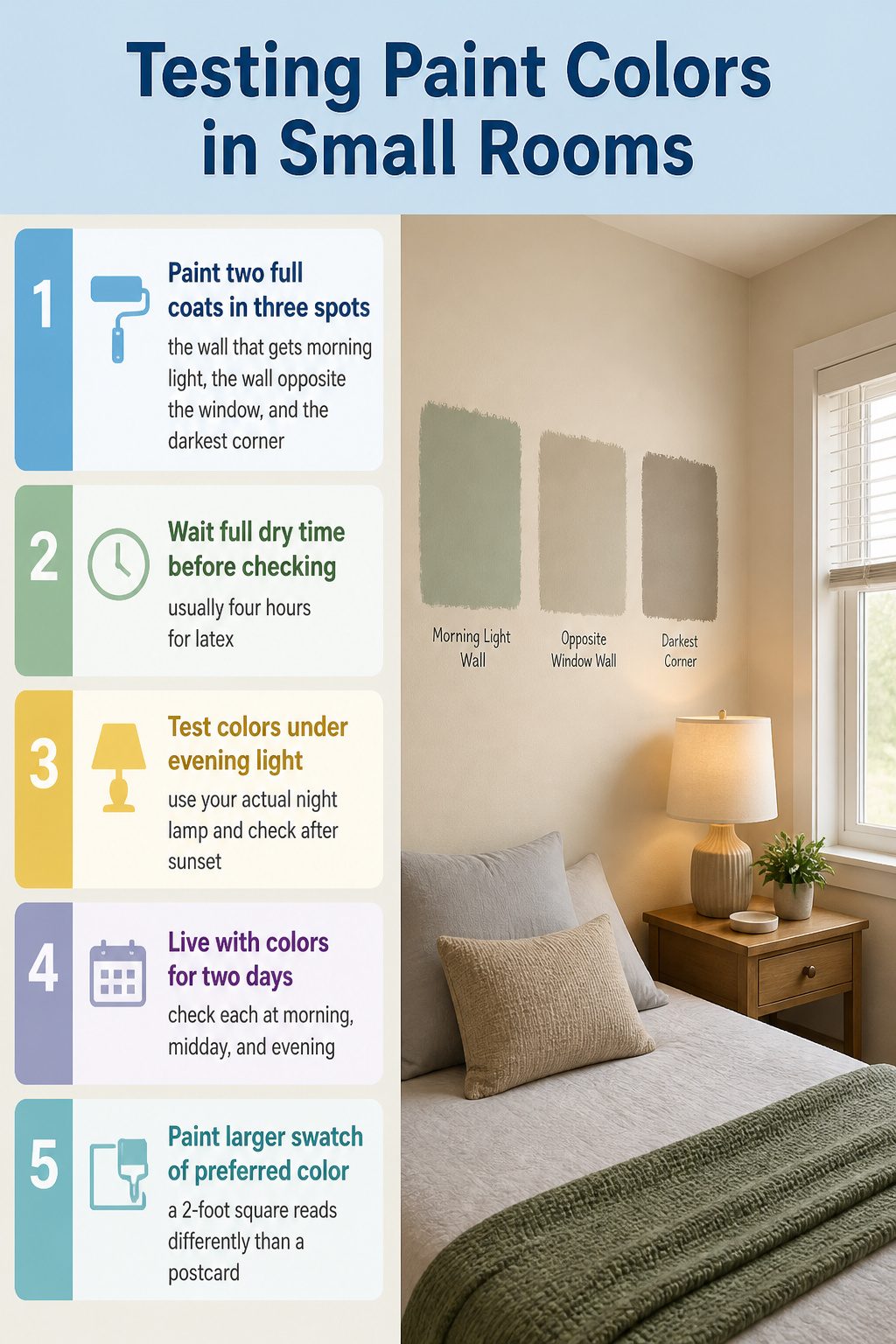
A single wrong color in a small bedroom takes over the whole space, so I test methodically before I commit.
- Paint two full coats on three spots: the wall that gets morning light, the wall opposite the window, and the darkest corner. One dab in the middle of a wall flatters everything.
- Wait the full dry time the can lists between coats, usually four hours for latex. Wet paint reads lighter and chalkier than the real color will be.
- Come back after sunset and turn on whatever lamp you actually use at night. The color you loved at 10 a.m. can turn muddy or neon under 2700K bulbs, and in a small room there is nowhere to escape it.
- Live with the swatches for two full days, checking each at morning, midday, and evening. If a color fails at any hour, it fails; the compact space means you see every wall from every angle.
- If two colors are close, paint the larger swatch of the one you are leaning toward. A 2-foot square reads differently than a postcard, and in a small bedroom that difference decides whether the room feels intentional or off.
Paint Finishes I Use and Skip
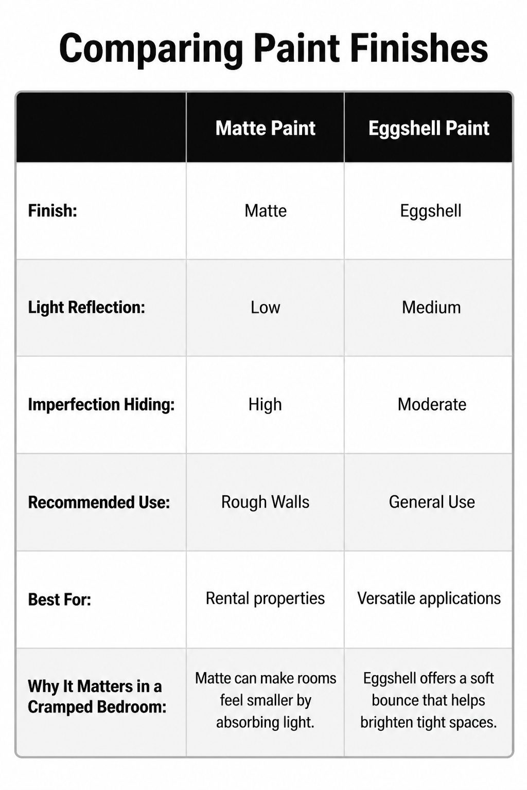
Matte paint swallows light whole, which is the last thing a cramped bedroom needs, but it does hide the dings and uneven spots that cheap rental walls collect.
I skip it unless the surface is genuinely rough and the room gets strong morning sun from another direction.
Eggshell splits the difference and ends up my usual pick: a faint sheen that catches a little bounce without turning into a mirror, and it still forgives minor imperfections better than anything glossier.
Satin steps up the reflectivity another notch, and in a small bedroom with one window I will use it on the ceiling to push that light back down.
Semi-gloss belongs on trim, not walls; the contrast against a flatter body color adds depth that makes the room feel built with intention rather than painted in a single hurried Saturday.
The glare of semi-gloss on a full wall would close the space in fast, and I have seen renters make that mistake trying to maximize brightness.
The finish matters as much as the color itself, and stores rarely flag this because it is harder to sample than a chip on cardboard.
What Cozy Actually Looks Like
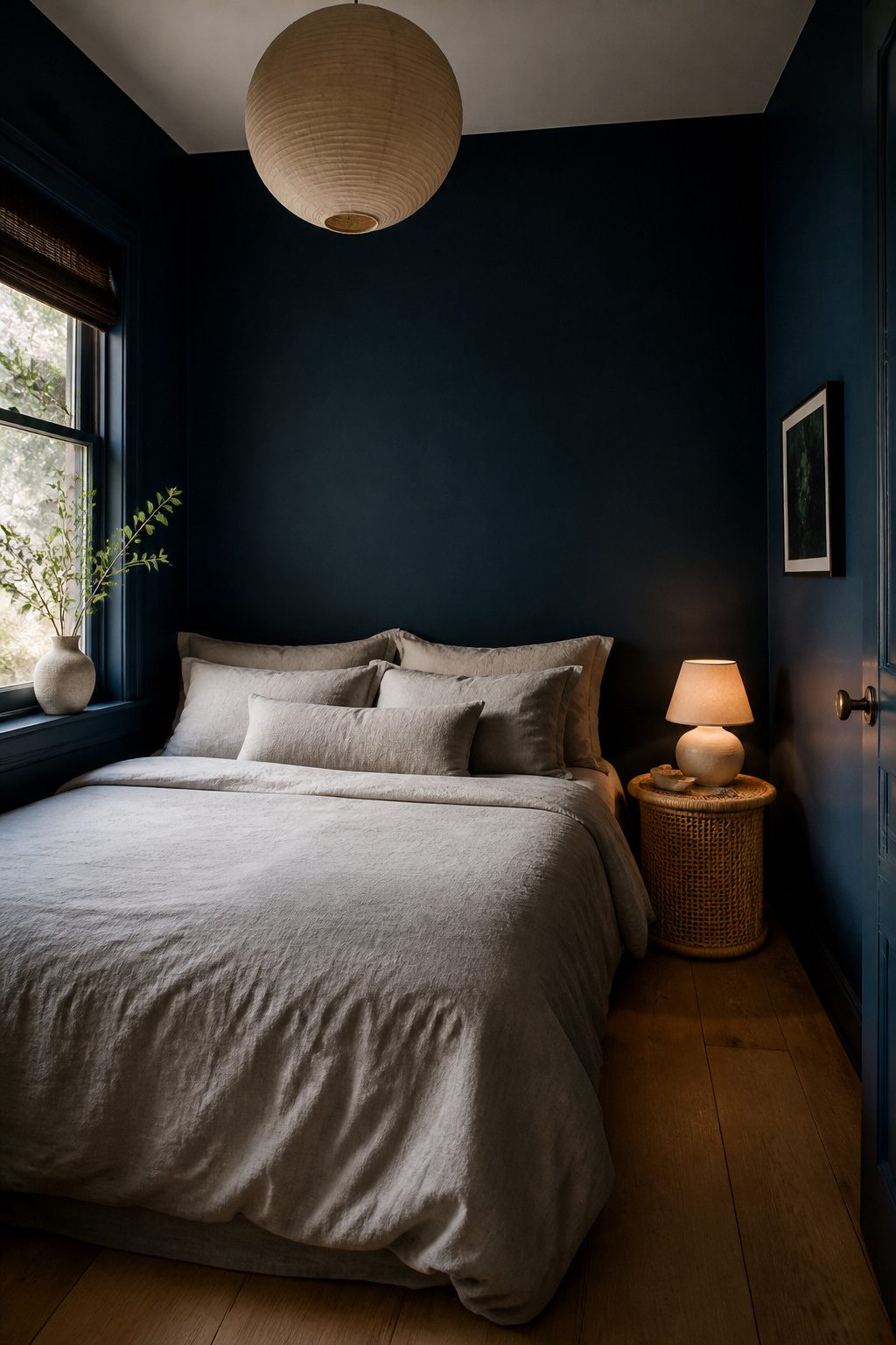
Deep navy blues, dark greens, and charcoal grays make a small bedroom feel cozy by leaning into its dimensions rather than fighting them.
Wrap all four walls in one color and the room reads as a single, enveloping shape instead of a box with edges you notice.
The difference between this and a bold, dramatic wall is the finish you layer on top.
Where a jewel tone might sit under gallery lighting, these darker shades work best with soft, neutral bedding and natural materials like rattan or raw wood to break up the flatness.
I would skip high-contrast trim and keep the ceiling the same tone, or at most a step lighter within the same family. That uninterrupted flow is what tricks the eye into perceiving more space, not less.
Jessika Gatewood of Gatewood Designs pairs light gray walls with darker gray bedding for subtle depth, and the same logic applies here: charcoal walls with mid-tone linens, or hunter green with olive textiles.
The texture does the work so the contrast does not have to. I have seen Gravel Gray by Benjamin Moore used this way in a den, and the cocooning effect holds up in a bedroom just as well.
For a weekend project on a few gallons of paint, this is the approach I would choose if I wanted warmth rather than statement.
You lose light: you will want a bedside lamp you actually enjoy reading under, because the walls will not bounce much back.
Budget Paints That Perform

Behr Premium Plus runs about $30 a gallon at Home Depot and covers well in two coats on bedroom walls, which matters when you’re painting a tight space and don’t want to cut in a third time around the trim.
The matte finish hides the uneven light that small rooms often get from a single window.
Sherwin-Williams Duration Home costs closer to $45 but the scrubbability is real; I would spend the extra if the bedroom doubles as a home office where chairs bump the walls.
Benjamin Moore Regal Select sits in the middle on price and levels out nicely, though I’ve found it easier to find at independent paint shops than big boxes, so plan the trip.
For a rental, Behr Premium Plus is my pick: cheap enough to leave behind, good enough to live with for two years, and the color range covers every off-white and muted blue a small bedroom needs.
You give up durability. Duration Home wins if you own the place and the kids share the room.
Accent Wall Placement in Tight Layouts
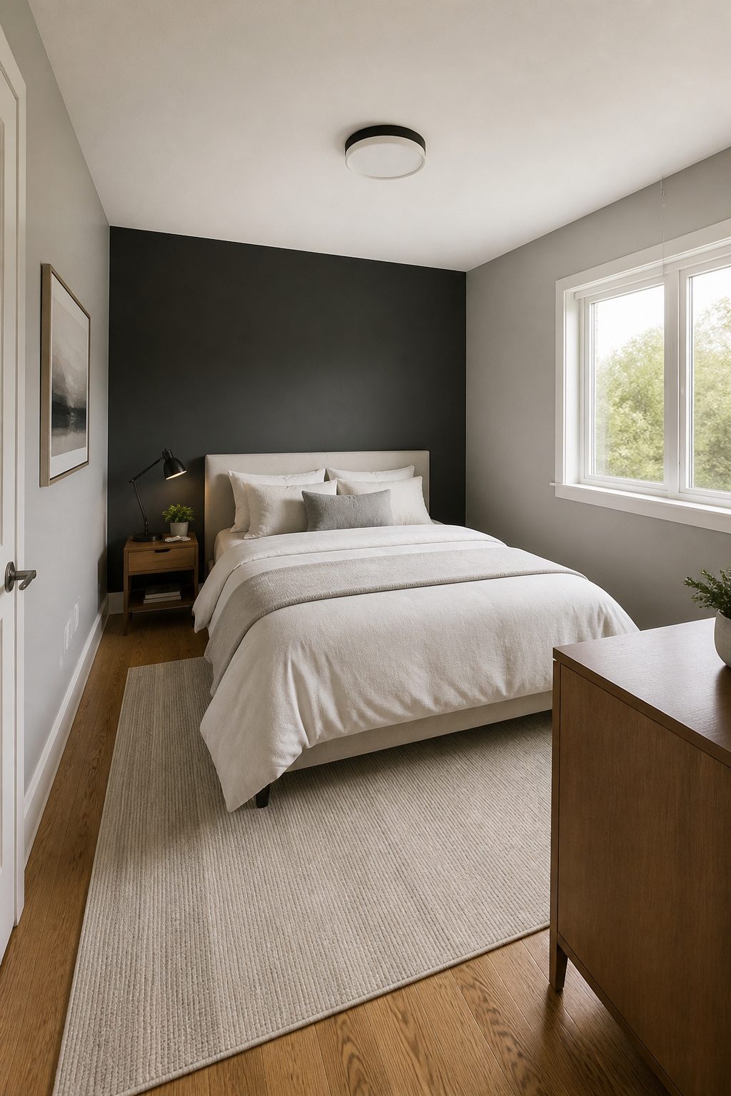
The wall behind the bed is the safest place for an accent color in a small bedroom. It gives the eye something to settle on without competing with the door swing or the path to the closet.
I would paint that headboard wall a shade darker than the other three, or go bold there and keep everything else quiet.
Opposite the door works too, but only if that wall is solid. When you walk in, the color pulls you through the room and the space reads larger than it is.
A wall broken by windows or doors will chop the color into pieces, and the accent becomes visual clutter instead of a statement. I skip those walls entirely.
In a room under about 10 feet in either direction, one accent wall is the limit. Two competing blocks of color will shrink the space faster than four matching walls ever could.
Frequently Asked Questions
What is the best color for a small room?
Lighter colors are usually the safest starting point because they reflect light and keep the walls from closing in, but the best color depends on what you want the room to do.
White like Pristine OC-75 bounces natural light into corners, while pastels such as Cloud Nine 2141-60 add just enough pigment to read as dimensional rather than flat.
If you want coziness instead of airiness, deep navy blues, dark greens, and charcoal grays wrapped across all four walls create an enveloping, uninterrupted space.
Should I paint an accent wall in a small room?
Yes, if you place it on the wall behind the headboard or directly opposite the door.
That positioning pulls the eye through the room so the depth recedes rather than closes. Keep the remaining walls warm white and the ceiling the same white to avoid chopping the space.
In a room under about 10 feet in either direction, stop at one accent wall; two competing blocks of color will shrink the space faster than four matching walls.
What colors make a small bedroom look cozy?
Deep navy blues, dark greens, and charcoal grays work best when you take them across all four walls and layer in neutral bedding plus natural materials like rattan or raw wood.
The uninterrupted flow tricks the eye into perceiving more space, not less. Skip high-contrast trim and keep the ceiling the same tone or at most one step lighter within the same family.
What is the best wall color for a small bedroom?
There is no single best color, but there are reliable categories.
Light colors like Pristine OC-75 or Cloud Nine 2141-60 create an airy feel by bouncing light. Bold jewel tones such as Hunter Green 2041-10 make walls recede visually and stretch perceived depth.
Neutrals like Fog or Birch Beige shift with your existing decor and keep the room from feeling static. The right choice depends on whether you want openness, drama, or flexibility.
What are some good paint colors for a small bedroom?
For light and airy: Pristine OC-75, Cloud Nine 2141-60.
For bold depth: Hunter Green 2041-10, Farrow & Ball Card Room Green. For calm neutrals: Fog, Birch Beige, Sherwin-Williams Downy or Touch of Sand.
For accent walls: Santa Barbara Green 2037-60. For cozy wraparound: Gravel Gray, deep navy, or charcoal.
For monochromatic schemes: Farrow & Ball Cromarty. Test any choice on two walls, morning and evening, before committing to a gallon.
What wall color makes a small room look bigger?
Pale colors with high light reflection make a small room read as larger, especially whites and soft pastels that bounce natural light across walls and into corners.
A monochromatic scheme stretched across walls, ceiling, and trim also helps because the eye travels without hitting hard stops at edges.
For a different approach, a saturated dark hue like Hunter Green 2041-10 can make the wall plane drop back visually, which stretches perceived depth rather than closing the space.




