
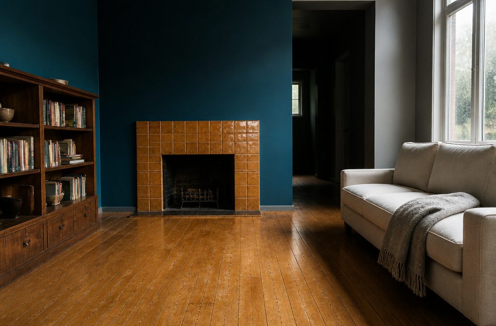
Accent walls in living rooms run from a $30 can of paint on one surface to $3,000 in tile or reclaimed wood, and the right choice depends on whether you rent, how much pattern the rest of the room already carries, and which wall catches light without a window flattening it.
A glossy ceramic tile or a two-tone paint treatment both work as focal points, but tile asks for specialized cleaners and cannot be undone on a Sunday afternoon.
1. Painted or Color-Blocked Walls
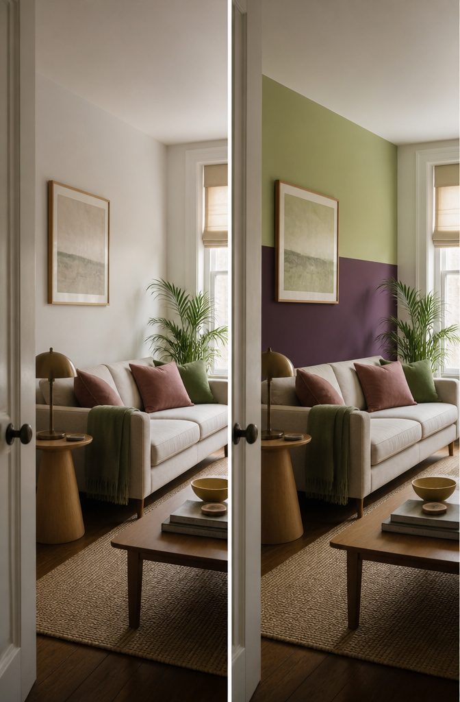
A single deep color on one wall anchors furniture and makes the room feel larger because the darker tone recedes.
Maroon red or forest green work when you want bold, and eggplant on the lower half of the wall grounds the space without closing it in—it pairs with blush, pale green, or turmeric if you’re layering accent colors.
Darker is the usual move, but a lighter accent can work in an already-dark scheme as long as the contrast is clear: a half-step reads as a mistake, a few steps reads as intentional.
You can paint the whole wall or get into two-tone treatments—color above a picture rail for high ceilings, or the top 25 percent in an accent shade if you want to draw the eye up.
Half-walls and painted trim let you test a color without committing four walls to it, and painted shapes turn the wall itself into the focal point when you don’t want to hang anything.
2. Wallpaper
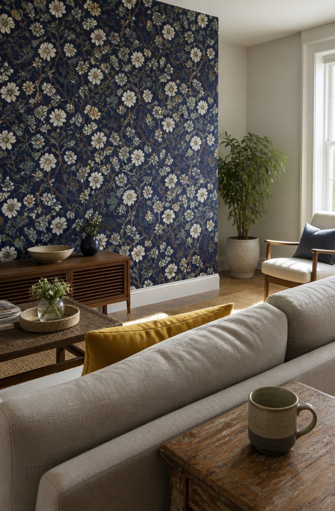
Wallpaper puts pattern on the wall without committing to paint, and you can hang it on one surface rather than wrapping the whole room.
Removable wallpaper comes off cleanly, which makes it workable in rentals or anywhere you want the option to change looks without a deposit on the line.
A textured grasscloth or a quiet geometric reads as intentional design, not leftover from the previous owner.
If the wallpaper carries enough pattern, the other walls can stay simple.
I’ve seen bold florals and jungle prints work when the rest of the room holds to one or two solid colors that either match tones in the paper or contrast with it outright.
A bright yellow next to a deep indigo wallpaper turns a traditional print into something that feels current.
3. Wood Treatments and Paneling
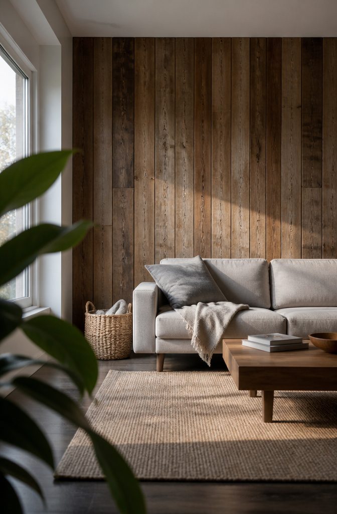
Wood pulls warmth into a living room faster than paint alone, and the texture matters as much as the tone.
Vertical slats in stained oak or walnut sit well behind a sofa, adding shadow lines and enough depth to hide a TV mount without looking like you tried.
Reclaimed wood or salvaged planks bring a rustic edge if that suits the room, and you can sand and paint them to shift the feeling entirely — budget-friendly if you source from construction leftovers or old pallets rather than paying retail.
Board and batten gives a cleaner grid, more traditional than slat walls but still dimensional; paint the whole thing one deep color so the battens read as architecture rather than trim.
Wood-look peel-and-stick panels work for renters who want the slat-wall effect without drilling into drywall or losing a deposit. They are lighter than real millwork and come off cleanly, though the grain never quite reads as real wood up close.
I would use them on a wall that does not get touched often — behind a console or a bed, not where hands lean against it daily.
4. Murals
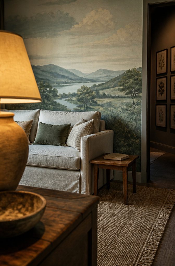
A painted mural lets you put a landscape, a city skyline, or a scene from memory on the wall instead of flat color.
It works as a conversation piece the moment someone walks in, and you can pick a subject that matters to you rather than choosing from what a catalog offers.
If you have friends who paint, the project becomes something you work on together over a weekend rather than hiring it out.
The best part for renters: you can paint over it when you move without dealing with adhesive residue or panel removal. Two coats of primer and your base color, and the wall goes back to what the lease requires.
5. Fabric, Tapestries, or Drapery
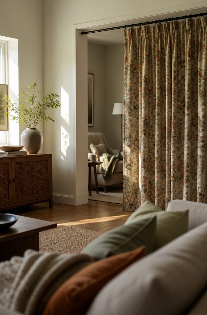
Fabric softens a wall without nails in every stud. A lightweight piece goes up with pushpins at the corners; heavier woven pieces need a curtain rod mounted above so the weight hangs evenly.
Thrift stores turn up vintage tapestries for $20 to $50, and you can pull them down in an afternoon when you want something new.
Curtains work the same way when you want to section off part of the room. A floor-length panel on a rod defines a reading corner inside a larger space, and the fabric adds pattern where paint would flatten it.
Floral or landscape motifs bring texture without covering the whole wall in it, and swapping the fabric later means unclipping rings rather than repainting.
6. Gallery Walls and Art
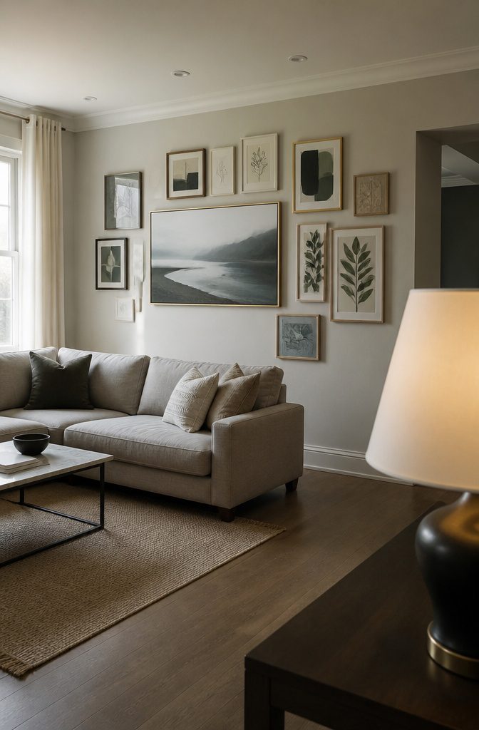
A single large piece pulls a living room together faster than a grid of small frames, and it skips the measuring tape entirely.
One canvas or print at 40 inches wide or better, hung at eye level above the sofa, acts as the anchor the room turns around.
If you want more coverage, a tight grid of framed photos or lithographs works the same way—treat the whole arrangement as one shape and keep the spacing between frames consistent, usually 2 to 3 inches.
Mixing frame finishes adds depth without adding color. Gold, black, chrome, and wood frames together on one wall read as collected rather than matched, and the variety keeps the eye moving.
Thrift stores and buy nothing groups are where I find frames that already fit odd-sized art, and reusing what someone else discarded cuts the cost to nearly nothing.
The art itself matters less than the commitment to hang it: an unfinished gallery wall reads as clutter, so plan the layout on the floor first and mount everything in one session.
7. Shelving and Bookcases
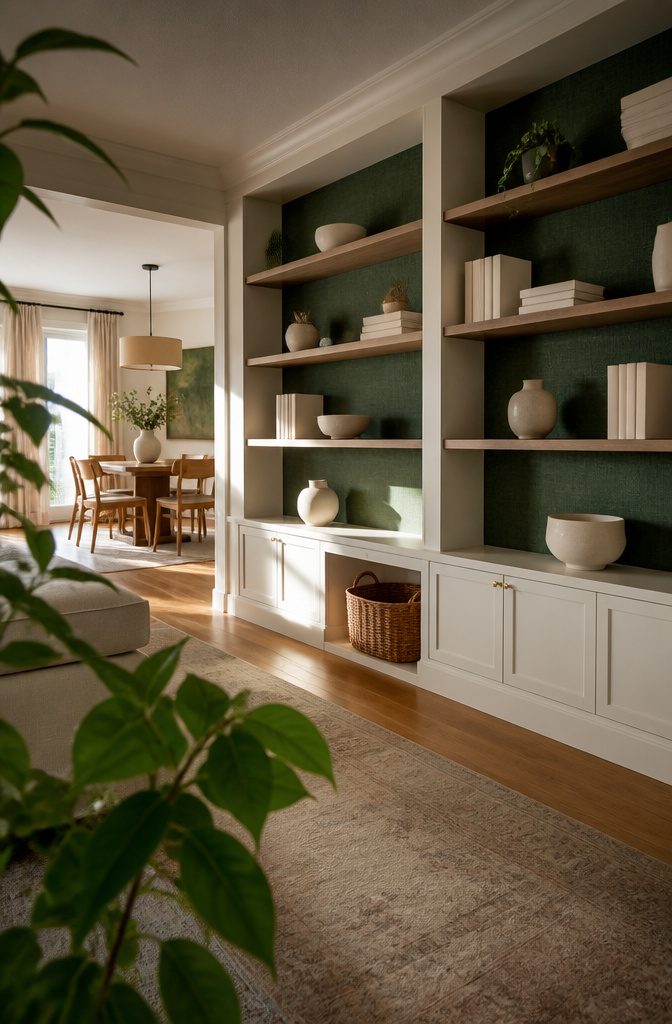
Shelving doubles as the accent when you color or paper the back wall of the unit.
A built-in that fills most of the wall becomes the focal point without adding furniture, and treating the recessed panels turns the structure into something layered rather than neutral.
A faux grasscloth wallpaper or a contrasting paint shade behind floating shelves gives enough color to read as deliberate without committing the full room.
The depth helps when you’re displaying objects—darker backing makes white ceramics pop, lighter tones soften a room that already carries heavy furniture. The joinery stays one color, the back another, and the contrast does the work.
This stretches a budget further than repainting everything. You’re working a few square feet, not four walls, and the rest of the room holds its existing finish.
8. Mirrors and Reflective Surfaces
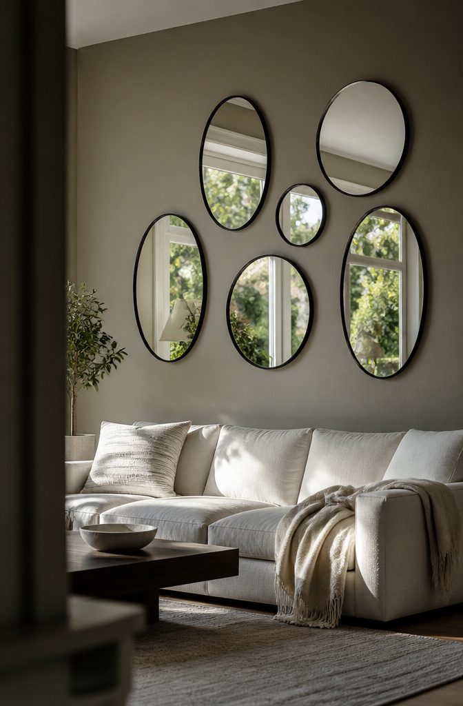
A mirror wall bounces light around the room and makes square footage feel like more than it measures. Sunburst mirrors work if your room runs mid-century; metal-framed rectangles fit a cleaner look.
Mix the sizes and shapes rather than hanging them in a grid — three circles and two ovals, or a tall arched mirror flanked by smaller rounds, breaks up the wall without reading as random.
The functional piece is that you get depth without losing floor space.
A 36-inch round mirror hung opposite a window doubles the daylight you’re working with, and the wall reads as finished even if the mirror is the only thing on it.
If the room is narrow, a horizontal mirror set low stretches it visually; a vertical one pulls the eye up in a room with low ceilings.
Metal frames in brass or matte black add structure. Frameless mirrors disappear into the wall and let the reflection do the work.
9. Lighting
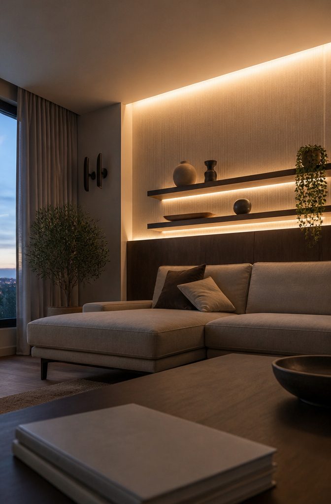
Wall sconces flanking an accent wall add depth without eating floor space, and dimmable ones let you shift the mood from full task light down to a soft wash.
I’d mount them about 60 inches off the floor if the wall sits behind a sofa, slightly higher if it’s bare—to graze the surface and catch texture, not flood it flat.
Minimalist LED strips tucked behind floating shelves or along the top edge of paneling work the same way: they outline the feature without competing with it, and the glow reads as part of the wall treatment rather than overhead room light.
If you’re renting or don’t want to hardwire, plug-in sconces with a fabric cord run along the baseboard do the job for under $100 a pair.
10. Tile
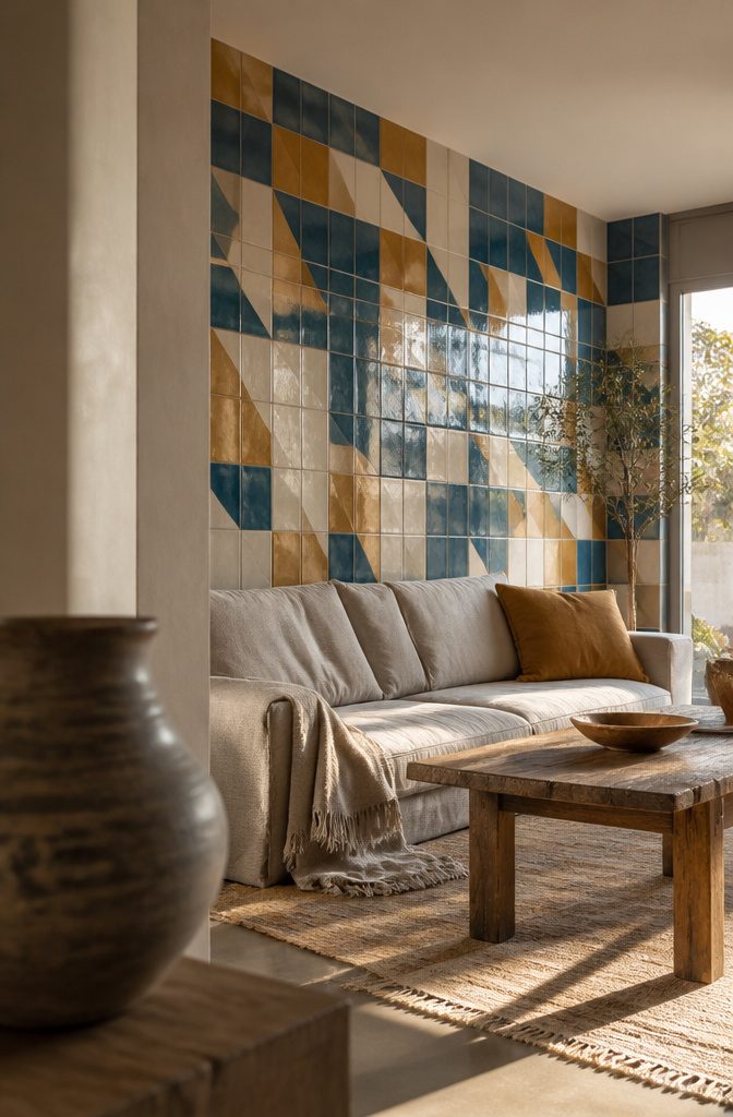
Tile opens up texture you can’t get from paint—glossy ceramic, matte stone, or geometric patterns that catch light differently as you walk past.
Designer Sig Bergamin used bespoke tiles as a backdrop for a banquette in a Miami breakfast room, treating the wall like a piece of decorative art rather than just surface. The shine made the space feel deliberate without adding furniture.
Marble works if you want something quieter. Jennifer Tulley Architects specified a marble accent wall in a San Francisco home to anchor the room without competing for attention.
The grain gave the wall presence, but the neutral tone kept it from dominating. It reads expensive, which matters if resale is on your mind.
Tile costs more to install than paint and can’t be undone on a Sunday afternoon, so commit to the spot before you order.
Behind a sofa or flanking a fireplace both work. A renter skips this one.
11. Brick
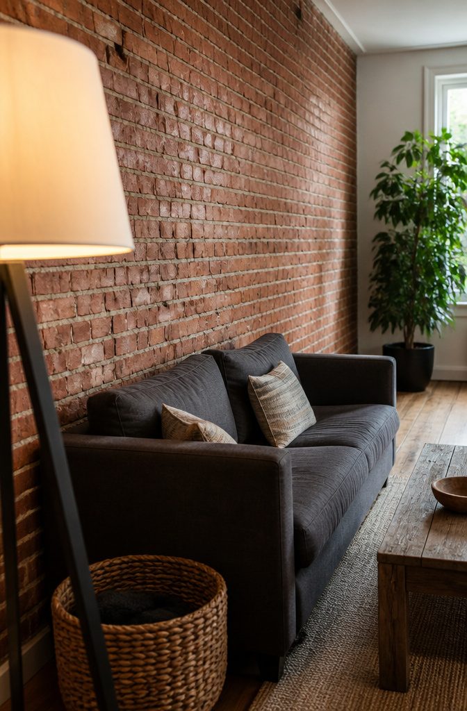
Brick works when the wall already has it or when you are willing to commit to the weight and cost of a veneer.
An exposed brick wall brings texture and color variation that painted drywall cannot match, and the effect reads as either industrial or rustic depending on what you put in front of it.
The raw surface anchors a room without needing anything else on that wall.
Brick does ask for specialized cleaners rather than the damp cloth that works on paint. Water alone will not pull grime out of the porous surface, and harsh chemicals strip the mortar or leave a film that dulls the color.
I would rather clean painted drywall twice a month than brick once, but the look justifies the effort if that texture is the thing you came for.
12. Molding and Architectural Details
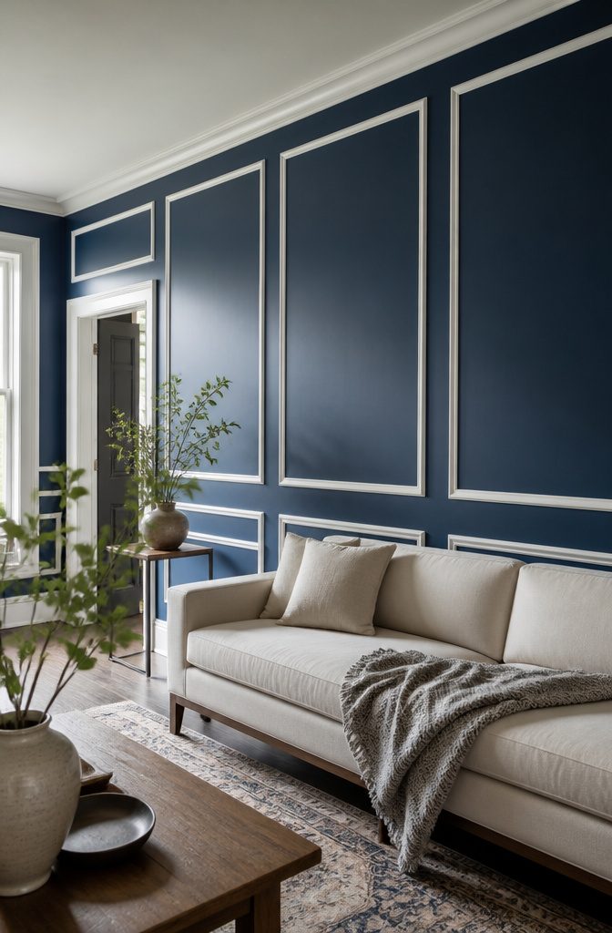
Applied molding turns a flat wall into something with structure.
Picture-frame panels in white or a contrasting trim color break up a single plane and give the eye lines to follow, which matters in a room with high ceilings or long stretches of blank drywall.
The frames read as deliberate rather than busy when you keep them symmetrical and space them at least 6 inches from baseboards and door casings.
You can paint the molding to match the wall for a tone-on-tone look that adds shadow without introducing new color, or run it in a crisp white against a darker field to sharpen the contrast.
Deeper profiles catch more light and read from farther across the room, so a 2-inch casing makes more of an impression than something under an inch.
The cost sits mostly in labor if you hire out, since the material itself runs $1 to $3 per linear foot for primed MDF.
13. Mounted Objects and Repurposed Doors
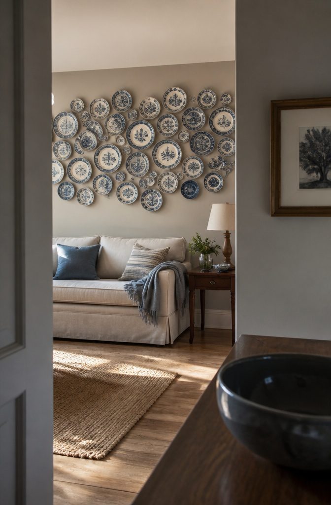
Plates hung edge to edge across one wall replace paint and paper with shape and pattern you already own.
Designer Susan Bednar Long mounted antique Delftware and faience pottery in a Provençe farmhouse dining room, treating the collection as the wall treatment itself rather than something hung over paint.
The irregular edges and varied glazes give you texture a single finish cannot, and swapping one piece later changes the whole composition without a brush.
Old barn doors work the same way. Designer Mikel Welch stood a pair against the wall in a New York City apartment, and the width and worn grain became the accent without framing or mounting hardware to plan around.
The scale grounds a small room better than a dozen smaller frames, and the warmth comes from the material rather than from adding another layer on top of drywall.
Which Wall to Choose
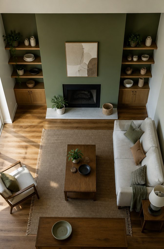
Pick the wall you see first when you walk into the room — the sofa wall or the fireplace wall tends to win that test.
Your eye should land on the accent before it wanders anywhere else, and the wall with an architectural feature like a fireplace or built-ins usually makes the strongest choice because it already has visual weight.
Skip the wall with the largest window.
Backlight flattens deep color and reads as a dark hole rather than a focal point. Walls without windows or doors give you an uninterrupted canvas, which matters more when you’re working with pattern or texture.
Room size changes the call. A small living room benefits from an accent that pulls focus without crowding the sightline, while a larger space can handle a bolder statement on a bigger surface.
Match the choice to your home’s overall aesthetic: if the rest of the house leans neutral, a dramatic accent wall either adds the contrast you want or feels like it walked in from someone else’s design.
Lighting conditions matter just as much — a wall in shadow needs a lighter hand than one that catches afternoon sun.
Testing Colors Before Painting
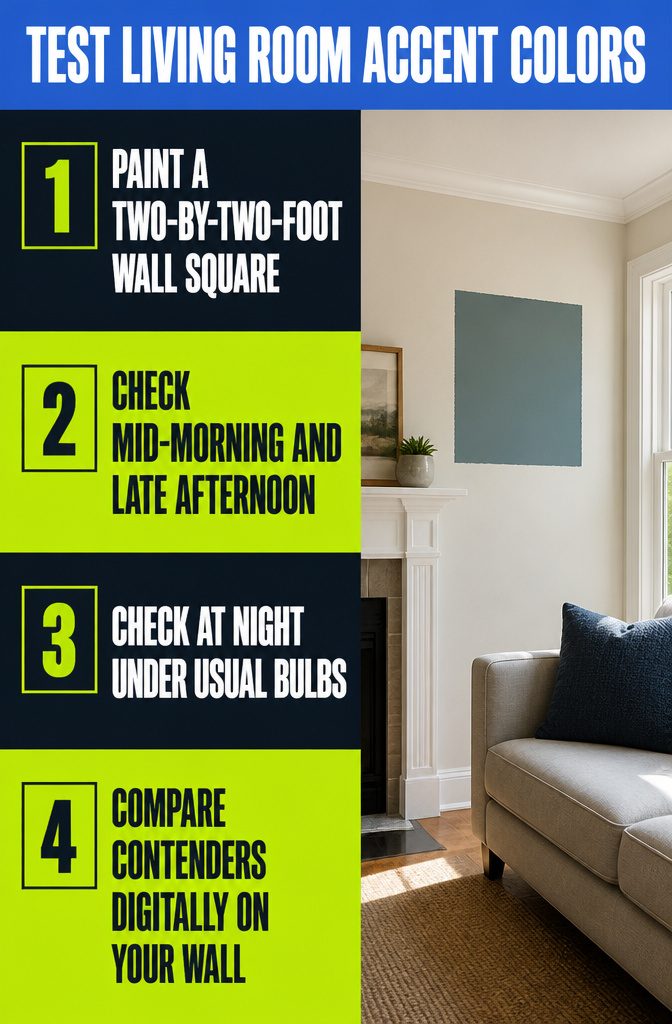
Paint a two-by-two-foot square directly on the wall you plan to treat as the accent, not on a scrap board or a different room with better light.
Deep colors shift the most across the day, so check the sample mid-morning, late afternoon, and at night under your usual bulbs.
A chip looks completely different at scale, and most repaints happen because someone picked the right color for 3 inches and the wrong one for 120 square feet.
If you want to skip the sample squares entirely, upload a photo of your living room and drop a few contenders onto the fireplace or sofa wall digitally first.
You see them side by side under your own light, and you only buy paint for the one that actually works.
Frequently Asked Questions
Which wall should be the accent wall in a living room?
Choose the wall you see first when entering the room, typically the sofa wall or fireplace wall. Walls with existing architectural features like fireplaces or built-ins make strong choices because they already carry visual weight.
Skip the wall with the largest window, since backlight flattens deep color and reads as a dark hole rather than a focal point.
Should an accent wall be darker or lighter than the other walls?
Darker is the usual move because it anchors furniture and makes the room feel larger as the darker tone recedes.
A lighter accent can work in an already-dark scheme as long as the contrast is clear: a half-step reads as a mistake, but a few steps reads as intentional.
How do I test an accent wall color before painting?
Paint a 2-by-2-foot square directly on the wall you plan to treat as the accent, not on a scrap board.
Check the sample mid-morning, late afternoon, and at night under your usual bulbs, since deep colors shift the most across the day.
You can also upload a photo of your living room and drop contenders onto the wall digitally to see them side by side under your own light.
What is the most popular accent wall color for a living room?
Deep navy, such as Benjamin Moore Hale Navy, is the most reliably popular choice.
Forest green and maroon red also work when you want bold, while eggplant on the lower half of the wall grounds the space without closing it in.
Are accent walls still in style in 2026?
Yes. The shift is toward deeper colors, texture, wood slats, and color drenching rather than the single painted wall of earlier trends.
What is an accent wall?
An accent wall is a single wall treated differently from the others in a room to create a focal point. The treatment can be paint, wallpaper, wood, tile, or any finish that contrasts with the surrounding surfaces.




